3,370 search results
(0.013 seconds)
- Falansia by Crowntype Studio,
$14.00 Falansia is a modern Calligraphy font created in an elegant and professional style with alternate characters. perfect font for creating signature logos and watermarks for photography studios or personal photography logos, best for initial logos or brand signatures. Falansia includes a full set of beautiful handwritten upper and lower case letters, numbers, assorted punctuation marks. All lowercase letters include starting and ending strokes, providing a realistic handwriting style.
 - Majapahit by Portype Studio,
$29.00 The Majapahit was a Javanese Hindu empire in Southeast Asia that was based on the island of Java. It existed from 1293 to circa 1527 and reached its peak of glory during the era of Hayam Wuruk, whose reign from 1350 to 1389 was marked by conquests that extended throughout Southeast Asia. I was inspired to make fonts with our history, by creating font names from our history
 - Painting Stencil JNL by Jeff Levine,
$29.00 Painting Stencil JNL was modeled in part from a vintage set of 8 inch Gothic stencils. Alphabets of this size were generally referred to as painting stencils because each letter could be painted individually in marking signs, streets or buildings, where the classic 'lettering guide' type of stencils were used for smaller projects and had alignment holes for accurate letter spacing as well as multiples letters per page.
 - Pendleton JNL by Jeff Levine,
$29.00 Pendleton JNL was created from some scant images found on military machinery housed at the Marine Corps Mechanized Museum at Camp Pendleton, California. The photos were provided by Brian Platzer, a volunteer at the base who specializes in equipment restoration. Having used other stencil fonts by Jeff Levine, Brian thought the design of these hand-crafted markings might make another addition to Jeff's vast library of vintage stencil alphabets.
 - Kleist Fraktur by RMU,
$25.00 In the late 1920s Walter Tiemann cut this font for Klingspor Brothers in Offenbach am Main. It comes close to Luthersche Fraktur and, though quite slender, possesses a good gray value and readability. This blackletter font fits excellently into narrow columns. Kleist Fraktur contains a bunch of useful ligatures, and by typing 'N - o - period', marking this combination and activating OT feature Ordinals you get an oldstyle numbersign.
 - Party Lover by Sinfa,
$12.00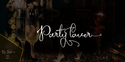 Party lover is a charming script font with a subtle and coarse signature font style, complemented by alternative fonts to make it look more charming, this font is perfect for completing your collection for logo, invitation, branding, label, trademark, and other needs. This font contains: Uppercase & Lowercase, and lowercase Alternative Symbols & Punctuation Marks OpenType Features attention ... that OpenType Features require software like Photoshop / Illustrator CC. Please try, thank you ...!
 - Arthur Serif by Gatype,
$16.00 Arthur is an edgy modern serif font. The long, classic serifs make for a unique high-contrast typeface that's all stylish. It appears regularly and boldly with lower and uppercase letters, numbers, punctuation marks plus multilingual letters. A must have for every modern graphic designer now! Features Include: Uppercase and lowercase Number Punctuation (OpenType Standard) Accents (Multilingual Characters) Alternative Style Ligatures and Style Sets Works on PC and Mac Simple installation
 - Frank Ruhl MF by Masterfont,
$59.00 The most popular Hebrew typeface, designed in 1908 by Raphael Frank and Otto Rühl. OpenType Pro Excellent support for Niqqud (Vowels). All marks are programmed to fit each glyph's shape and width. OpenType Pro includes new advanced features like Dagesh Hazak, ShevaNa, Qamatz Katan, Holam Haser and wide letters. Best used with Adobe InDesign CC that support complex Hebrew text. Please check these advanced features in this link: https://tinyurl.com/ybgdsxme
 - Libertat by Elyas Beria,
$9.00 In a not-too-distant future, humanity was ruled by a powerful, technologically advanced empire known as the Synod. The Synod controlled all forms of communication, and through this, they controlled the minds of the people. But a small group of rebels, known as the Resistance, had managed to evade the Synod's surveillance and formed a secret underground movement. They were determined to overthrow the Synod and restore freedom to the people. One of the Resistance's key members was a young artist named Trystån. He had a unique talent for creating powerful, visually striking posters that captured the spirit of the Resistance's message and spread it to the masses. Trystån had just completed a new poster, one that would be critical to the Resistance's plans. It depicted a single, outstretched hand holding a traditional Kimarii laser staff, with the words "Libertat!" emblazoned across the top. The poster featured a striking and powerful font that perfectly captured the spirit of the Resistance's message. The font was a combination of bold lines, elegant confident curves, and strong angles, giving it a sense of strength and determination. The lettering was large and prominent, filling up much of the poster, making it hard to miss. The letters seemed to be almost carved into the surface, giving the impression of something that was permanent and unshakable. The font was colored in dark shades, and was a sans serif typeface, that gives the message a very modern and current feel yet also feels vintage and retro, connecting the present with the struggles of the past. And with multilingual support, the typeface ensured that the message of the Resistance could be disseminated in every language on the planet. The background was minimalistic and in contrast, with a neutral palette, with just a hint of a sand-like color, representing the harsh conditions of the land that the people were fighting for their rights. The focus was all on the lettering, and how it conveyed the message. The poster was indeed a moving piece of graphic design, with its strong, striking font, and powerful imagery. It was clear that Trystån had put a lot of thought and care into its design. The poster, he hoped, would connect with people on an emotional level and inspire them to rise up against the oppression of the Synod Empire. The poster was set to be distributed at a major rally in the capital, where the Resistance was hoping to gain the support of thousands of citizens. But the Synod was not about to let this happen. They had long suspected the existence of the Resistance and had been working to infiltrate their ranks and discover their plans. The night before the rally, the Synod launched a surprise raid on the Resistance's hideout, capturing Trystån and several other members of the Resistance. Trystån was thrown into sand pits and interrogated by the Synod's top agents. They wanted to know everything about the Resistance's plans, including the details of the poster and the rally. Trystån, knowing the importance of the poster, refused to give in, even under the harshest of conditions. Meanwhile, the rally was drawing near, and the Resistance was desperate to get the poster out to the public. They knew that it was their only hope of gaining the support they needed to overthrow the Synod. They came up with a plan to smuggle the poster out of the hideout, but it would be a risky endeavor. As the rally began, the Resistance made their move, slipping the poster into the hands of the crowd. Trystån's poster had made a big impact in the rallies, and soon it became the symbol of hope for the resistance, and the visual representation of their struggle for freedom. The poster had become the catalyst for the revolution, and it would be remembered for many years to come as the symbol of the fight for freedom and democracy. The image of the outstretched hand holding the Kimarii laser staff struck a chord with the people, and they began to rise up against the Synod's oppression. Trystån, still locked away in the sand pits behind a stasis feild, could only imagine the scene unfolding outside. But he knew that his work had helped to spark a revolution, and he felt a sense of pride and accomplishment. The Resistance, with the help of the rally, was able to overthrow the empire, and Trystån was released, celebrated as a hero and hailed as the artist who helped to bring about the new era of freedom and democracy. The poster Trystån had designed had become the symbol of a new era, and it would hang in museums and public places as a reminder of the power of resistance and art, in the face of oppression. Features: regular and light weights numbers and punctuation multilingual characters
 - Happy Panda by Insan Perkasya,
$12.00 Let me introduce you, Happy Panda, is a font that combines tall uppercase letters and mini lowercase letters, both of which have their own uniqueness when used, especially when combined, they produce a unique font combination. This font is very suitable for designing quotes, magazine covers, and others. If you have any questions, don't hesitate to contact us
 - Wood Sans Narrow JNL by Jeff Levine,
$29.00 Wood Sans Narrow JNL is based on examples of an extra condensed Hamilton Wood Type. The design was cleaned up a bit to provide more uniform stroke widths, but still retains the nostalgic feel of a tall, narrow type face found on broadsides and posters of the late 1800s. It is available in both regular and oblique versions.
 - Daisy Lovers by Sarid Ezra,
$15.00 Introducing, Daisy Lovers, a tall handwritten sans! Daisy Lovers is a sans font with handwritten touch. This font will make your project or your design more human. You can use this font for your brands, quotes, book covers, etc. With unique lowercase, Daisy Lovers can make your project more stand out! This font also support multi language. Happy Creating!
 - Cookie Powered by PizzaDude.dk,
$15.00 Tall, thin, grid, legible and handmade! What's not to like?! The font was made using a squared paper as a base for the lines. However, I managed to keep the free spirit of the handmade look, despite the guides. Play around with the 4 different versions of each letter and the swashes to make your text stand out!
 - Scrawny by Maury McCown,
$39.00 Scrawny is a long-legged beanpole of a font. Quirky, a little retro — and most certainly smile-inducing — Scrawny sports tall and thin characters with high horizontal crossbars to give a feeling of "cute shyness" and "warm fuzziness." Scrawny works great for banners, announcement text, labels, and anything else that requires something with a bit of whimsy.
 - FM Ted by FontMeister,
$24.95 ‘Ted’ is a geometric typeface. It is a synthesis of the geometric and the humanistic. It has both mathematical straightforwardness, and humanistic refinement. It will shine in both headlines and text. It is well suited for graphic design and corporate identity design. It's tall shape, high middle line and form gives ‘Ted’ neo art-deco look and feel.
 - Blacker Strokes by Letterara,
$19.00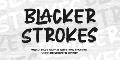 Dive into creativity with Blacker Strokes, a font embodying the wild beauty of natural brush strokes. Elevate logos, branding, and more with its mesmerizing design. Versatile and impactful, it adds character to any project. With PUA code for easy access to captivating glyphs, Blacker Strokes is your artistic ally for limitless design possibilities and lasting impressions.
 - Balboat by Ingrimayne Type,
$9.95 Balboat is a plain calligraphic face with a very small x-height, long descenders, and tall ascenders. Having the appearance of a pen-drawn sans serif, it has four styles: regular, bold, italic, and bold italic. Although Balboat is quite legible, it is condensed and may need to be printed at a larger point size than other typefaces.
 - Purple Bread by Balpirick,
$15.00 Purple Bread is a Tall Handwritten Font. Whether you’re using it for crafts, digital design, presentations, or making greeting cards, this font has the potential to become your favorite go-to font, no matter the occasion! This font only has allcaps letters. - also multilingual support Enjoy the font! Feel free to comment or feedback! Thank you!
 - Every Cloud by HOHOHtype,
$25.00 ‘Every Cloud’ is a cute hand-drawn type family. The family has 4 different weights and a matching inline style. It has a tall x-height, and the edges are rounded and soft. It was designed with applications such as advertising and packaging, editorial and publishing, logo, branding and creative industries, poster and social media, and marketing in mind.
 - Coronet I by URW Type Foundry,
$35.99 Coronet is a non-joining script font first issued by Ludlow. The capitals have been drawn with a degree of freedom whereas the lowercase are more formal in structure. The ascending lowercase letters of the Coronet font are quite tall, descenders are short. Coronet is a useful script for informal occasions, such as invitations, flyers and greetings cards.
 - Nice One by Mightyfire,
$9.00 Nice One is the font with a modern, clean and semi formal looks. We have three styles on Nice One; light, regular and bold. The characteristic of the font is tall, neat and thin almost like a serif font. Try this font on your book, magazine, or poster and believe me your work will be the nice one! :)
 - Skie by Adam Ladd,
$25.00 Skie is a simple gothic sans serif with normal, condensed, and wide widths. Its distinguishing characteristics are the small x-height with tall ascenders and a minimal amount of contrast, while the apertures are semi-open to help in readability. The simple design keeps the appearance fairly neutral and presents a blend of modern and vintage qualities.
 - Amy by AVP,
$19.00 Developed from the simplest possible curves, Amy is a wide hand lettered style with tall straight ascenders and generously looped descenders. The capitals are centred horizontally with the lower case. A handful of ligatures helps copy to flow for easy reading and optional proportionally spaced numerals make the font suitable for quite lengthy chunks of copy.
 - Zokak Arabic by FarahatDesign,
$39.00 Zokak is a first-of-its-kind ultra condensed Arabic typeface designed for display uses. The name means an alley in Arabic which comes from its very narrow letters, which makes it perfect in small spaces. Zokak has two main styles, the default style and the tall one to give more diversity and to be suitable for more uses.
 - Bruno Ace Pro by Stiggy & Sands,
$29.00 Our Bruno Ace Pro draws its inspiration from modern automotive logotypes. This geometric sans-serif has a wide stance with a tall x-height for a strong look and appeal, as well as ease of legibility. The SmallCaps and extensive figure sets offer a more extensive range of use as well as a more intense vibe.
 - Lion and Hare by Rook Supply,
$14.00 Lion & Hare is an ultra compressed, tall font family that portrays strength and power. The condensed characters maintain fairly square edges to give a more consistent geometric & industrial look to the font. The font family supports 27 languages and comes in 6 styles. Lion and Hare works fantastic for website headers, magazine layouts, logos, branding and much more.
 - Parkson by Rook Supply,
$18.00 Inspired by the grotesque fonts of the 19th century, Parkson is a tall sans serif typeface of 7 weights along with italic and several outline versions. The contemporary typeface aims to be one of the world's best condensed collection of fonts. Designed for optimum legibility, its clean, geometric look is perfect for logotypes, headers, titles and brochures.
 - Arnika by Typejockeys,
$50.00 This charming type family comes in four widths: Regular, Semi Condensed, Condensed and Extra Condensed – bringing flexibility and diversity to your drawing table. Crisp details convey confidence without losing fineness. Arnika is your ally for all things classy. Although it is a match made in heaven for beauty products and fashion magazines, we leave its usage to your imagination.
 - Insomniac by Hanoded,
$15.00 Insomniac is a tall, narrow, handwritten typeface. A little rough, a little shaky, a little uneven. The idea for this font came to me in the middle of the night - hence the name. Insomnia is an all caps font, but upper and lower case differ and glyphs can be freely interchanged. Comes with a diacritics dream team.
 - Breakfast Burrito by Hanoded,
$15.00 Recently I have been watching some re-runs of Dexter. In season 1, Debra has a rough morning and complains she cannot make it through the day without eating a breakfast burrito. The name stuck, a font was born and the result is Breakfast Burrito font. It is a tall, all caps typeface with a little twist.
 - Eckhardt Poster Deco JNL by Jeff Levine,
$29.00Eckhardt Poster Deco JNL is a continuation of a series of sign painter's fonts, and was modeled from a lettering example found within the pages of an old sign design manual. It is named, as always, in honor of the late Albert Eckhardt, Jr., the owner of Allied signs in Miami, Florida and Jeff Levine's good friend. - Dez Petranian by Dezcom,
$40.00 Dez Petranian is a story-telling fantasy friendly family of fonts. It is a warm face that looks like the spoken word, perfect for tall tails, fantasy-world adventure books, creative writing, and poetry. Dez Petranian includes multiple language support, nearly 1,200 glyphs, stylistic sets, and many alternates. Think of it as a warm souvenir of real story writing.
 - Eckhardt Inline JNL by Jeff Levine,
$29.00Jeff Levine's Eckhardt Inline JNL furthers a "mini series" of fonts and lettering styles popularized by sign painters and show card writers. Named in honor of the late Albert Eckhart, Jr. (owner of Allied Signs in Miami, Florida until his passing), this inline sans serif more closely resembles hand lettering than "perfectly designed" display type. Limited character set. - Over Under by Ingrimayne Type,
$5.00 OverUnder is a two font family that plays with the capabilities of the Opentype feature of Contextual Alternatives to alternate two sets of characters. One set is on tall vertical slabs and the other set is on wide horizontal slabs, and when the sets are alternated, the result is a pattern that has a woven appearance.
 - Ebdus by AdultHumanMale,
$12.00 Ebdus is a thin, modern, lightweight font, occasionally a little gawky and tall, sometimes a little plump and rounded. The font is available in 5 weights from Thin to Heavy but they all lean towards all things anorexia. It looks as good in copy as it does in headlines, it’s perfect for an angry letter to an uppity android.
 - P Funked Hollow - Unknown license

- Larrikin by HeadFirst,
$17.99 The distressed letterforms hark back to early printing process using hand carved wood cut letters. The typeface is available in 6 weight with both Rough & Solid variations.
 - Pinback by FaceType,
$20.00 Pinback was inspired by the science fiction movies of the 60s and 70s. The name is taken from one of the protagonists of John Carpenter’s Dark Star.
 - Metropolitan by Alias Collection,
$60.00 Originally developed as a logotype proposal for the Metropolitan Hotel in Park Lane, London. Available in upper case only, Metropolitan is a pure, streamlined, contemporary display typeface.
 - Malabar by Linotype,
$29.99 Malabar is a type family for extensive text. Its design was developed with a nod toward newspapers. Malabar's characters are seriffed and of the Old Style genre. A strong diagonal axis is apparent within the curves. Sturdy serifs help strengthen the line of text in small point sizes, as well as define the overall feeling of the face. Malabar's x-height is very high, a deliberate choice that makes the most important parts of lowercase letters visibly larger in tiny settings. The height of the capital letters is also rather diminutive, allowing for better character fit, as well as eliminating a bit of clumsiness in German, which often includes quite a few uppercase letters. Diacritical marks and additional alphabetic forms required by many Western, Central, and Eastern European languages are naturally a part of the character set, including those needed in the Baltic states, for Romanian, and for Turkish. Malabar's accents are bold and direct, sitting well with their base glyphs. The family includes three weights, each with a companion Italic. Malabar Regular is equipped with small caps, and both it and Malabar Italic include oldstyle figures. All members of the family have both proportional and tabular-width lining figures, as well as special variants of certain punctuation marks vertically adjusted for all-caps text setting. Malabar is informed both by contemporary ideas of typeface design (sheared terminals, the wider-drawn s) as well as by 16th-century masters. Malabar Heavy and Heavy Italic are very loud; their blackness almost shouts out from the page. The Regular's wedge serifs become more slab-ish in nature as the letters' weight increases. Malabar Heavy and Heavy Italic are best relegated to headline use only. Malabar Bold and Bold Italic may be used for text emphasis, a job for which the Heavy is to dark. Malabar received a Certificate of Excellence in Type Design at the Type Directors Club of New York TDC2 competition in 2009.
