10,000 search results
(0.057 seconds)
- Typewriter - a602 (dead postman 2004) - Unknown license

- Tempest - Unknown license

- Gusset by Pesotsky Victor,
$10.00 Gusset is a simple modular font. It was created for headlines and posters. It creates a dense and interesting texture in the text set. Simple rounded curves contrast with "wedges". Gusset supportsBasic Latin, Cyrillic and more than 100 languages all together. The font was designed by Viktor Pesotsky.
 - Drab by Pesotsky Victor,
$12.00 Drab is a neutral grotesque, but with decorative elements. Suitable for texts and titles. When you do not need a strong accidental but a boring set, Drab is also not suitable. Drab supportsBasic Latin, Cyrillic and more than 100 languages all together. The font was designed by Viktor Pesotsky.
 - Hazel by ITC,
$29.99Hazel is the work of British designer Phill Grimshaw. It is an all capital typeface with friendly, scratchy strokes ornamented with a whimsical, free-flowing embellishment. Hazel should be set slightly wider than usual letter and word spacing and will lend any headline or display both naturalness and elegance. - Rhoutte Ganol by madeDeduk,
$14.00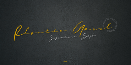 Really excited to introduce Rhoutte Ganol is a realistic signature to give a incredible impression for all your project design and come with more than 149 ligatures to make everything look realistic handmade signature. Included: Uppercase Lowercase Number & Symbol International Glyphs Multilingual Support Ligature Hope you enjoy it.
 - Underdoug by PizzaDude.dk,
$15.00 All caps font with squarish letters. At first sight, it may look a little bit ordinary, but watch it with massive text - then you will notice the bounciness and the contextual alternates that automatically switches between the 5 different versions of each letter! Comes with massive language support!
 - Alfreda by Monotype,
$30.00 Alfreda grotesque is not just another grotesque typeface. Its morphology mixes modulated and unmodulated strokes, and natural and reverse contrast. All that with a humanistic touch and subtle ink traps. Weird. Alfreda comes in 6 weights, it has open type features, more than 400 glyphs and 18 stylistic sets.
 - PB Carolingian Xc by Paweł Burgiel,
$32.00 PB Carolingian Xc is a font face designed for imitate Carolingian minuscule (from the region of the German southeastern scribal schools) found in 10th century manuscripts. All characters are handwritten by use ink and quill pen, scanned, digitized and optimized for best quality without lost its handwritten visual appearance. Character set support codepages: 1250 Central (Eastern) European, 1252 Western (ANSI), 1254 Turkish, 1257 Baltic. Include also additional characters for Cornish, Danish, Dutch and Welsh language, spaces (M/1, M/2, M/3, M/4, M/6, thin, hair, zero width space etc.), historical characters (overlined uppercase Roman numerals, many mediaeval abbreviations, d-rotunda, r-rotunda, I-longa, e-caudata, historical ligatures for “nomina sacra”) and wide range of ancient punctuation. OpenType TrueType TTF (.ttf) font file include installed OpenType features: Access All Alternates, Localized Forms, Fractions, Ordinals, Superscript, Tabular Figures, Proportional Figures, Case-Sensitive Forms, Stylistic Alternates, Contextual Alternates, Stylistic Set 1-11, Historical Forms, Historical Ligatures, Standard Ligatures. Include also kerning as single ‘kern’ table for maximum possible backwards compatibility with older software. Historical ligatures for additional glyphs are mapped to Private Use Area codepoints. OpenType features automatically exchange some default glyphs by stylistic alternates and create ligatures for better historical appearance.
 - LT White Fang - Personal use only

- Bronson by Ronny Studio,
$22.00 Bronson is a sans serif family that comes in 7 weights. The Bronson font has a very bold body, but still has high contrast. This font looks very modern when paired with contrasting design colors. This font is impressive and features a clean and elegant font, professionally shaped, and as a result, it will easily match a variety of creations that require a different touch. Add it with confidence to your projects, and you'll love the results. This typeface is perfect for elegant logos, branding, promotions, book covers, magazine layouts, or simply as a stylish text overlay onto any background image. Bronson Features : Uppercase Lowercase Numbers & Punctuation Multilingual Support Simple installation All of features and special characters of this font are included in one file. So it is easy to accessed by using program or software that support the opentype like Adobe Illustrator, Adobe Photosop, and Adobe Indesign). This font also very easy to use because compatible for all software even for non-opentype supported. Please comment us if you have any questions Thank you and have a nice day. thank you
 - Kicked Display by Prioritype,
$23.00 "Kicked Display" is a display font with a unique and bold contrasting style. It is this bold and thin that makes this font memorable. Designing with pastel colors also looks more maximal with this font. Features: Uppercase, Lowercase, Numeral, Punctuation & Multilingual. Multilingual contained: Afrikaans, Albanian, Asu, Basque, Bemba, Bena, Breton, Catalan, Chiga, Cornish, Danish, Dutch, English, Estonian, Filipino, Finnish, French, Friulian, Galician, German, Gusii, Indonesian, Irish, Italian, Kabuverdianu, Kalenjin, Kinyarwanda, Luo, Luxembourgish, Luyia, Machame, Makhuwa-Meetto, Makonde, Malagasy, Manx, Morisyen, North Ndebele, Norwegian Bokmål, Norwegian Nynorsk, Nyankole, Oromo, Portuguese, Quechua, Romansh, Rombo, Rundi, Rwa, Samburu, Sango, Sangu, Scottish Gaelic, Sena, Shambala, Shona, Soga, Somali, Spanish, Swahili, Swedish, Swiss German, Taita, Teso, Uzbek (Latin), Volapük, Vunjo, Zulu. Thanks!
 - TT Moons by TypeType,
$29.00 TT Moons update 1.1 What’s new. • Case Sensitive Forms • Tabular Figures • Fractions • Numerators • Denominators • Superiors • Scientific Inferiors TT Moons is a slim, high-contrast serif. This font family works especially smart in classic design themes. TT Moons is a typeface of the glyptal modern font family. The ideal application range for this typeface is magazines, books and newspapers layout. Thanks to its narrow proportions and 5 weights (Thin, Light, Regular, Bold, Black), TT Moons perfectly fits into any contemporary digital design, such as interactive and product design, editorial and corporate web design. This font family is the real work helper and your joker when you need to combine contemporary and classic styles.
 - ITC Needlescript by ITC,
$29.99It's been said that creativity requires ten parts to perspiration to one part inspiration. But not always. According to its creator, Mira Vucko, ITC Needlescript was designed in one breath." An accomplished lettering artist, Vucko was sketching letters one afternoon. "I was using a calligraphy nib and was drawing the alphabet without much thought," she recalls. "When I allowed the down strokes of a couple of letters to fall below the baseline, I realized that I had created the impression of movement. I kept drawing letters in this fashion and did the same with horizontal lines. I added a firm ending to the descenders. Instead of dots above the 'i' and 'j,' I placed strokes in the opposite direction." In this way, the first characters that were to become ITC Needlescript emerged. The finished design is a lively, distinctive alphabet that produces a striking texture on the page. Letters intertwine and overlap to create a sense of movement and graphic intensity, especially when reversed out of a dark background. Vucko lives, works and was educated in Zagreb, Croatia. She lived in France and Sweden while in her twenties, but then returned to Croatia to work as a graphic designer for the country's largest newspaper. It was here that her passion for type and typography was born. Vucko has since gone on to become one of Croatia's leading graphic designers, and has won many awards for her advertising and packaging design. Vucko recommends that ITC Needlescript be used for "titling, lively but 'thorny' content, and anywhere that a little typographic drama is called for."" - Cresta by James Todd,
$40.00 Loaded with personality and functionality, Cresta is built to look good while surviving the worst conditions. It is at home on screen and in a magazine. Its six weights are intended to be used everywhere. Unlike most typefaces, Cresta was built without a reference. For this project, everything design choice was based on what worked best for a workhorse sans serif family. Cresta was originally created as the primary typeface for this website. This meant it needed to work in copy, headlines, and navigation across all devices, browsers and operating systems. This meant it needed to be sturdy and have enough character to make it stand out from other UI typefaces. With its large x-height, ample counters, and giant apertures, Cresta is meant for easy utility in rough conditions. Even with all of this, that doesnít mean that its dull; as the weights increase, the style of Cresta becomes more appearant. This style is defined most apparently by the terminals on the lowercase r and the angle of the joins between the curved and straight strokes (such as in the connection on the n).
 - Dolsáb by Kent Barns,
$20.00 Dolsáb was designed from scratch with uniqueness in mind. The subtle movement from thick to thin and the variants of sharp to rounded make this cutting edge san serif a must have. The inspiration for Dolsab was a simple pairing of a rhombus and calligraphy. While neither of those two elements can be seen in their entirety in any instance, the influence of both is strong. The rhombus can be notice on most ascenders like on the lowercase t & l, for example. And the calligraphy inspiration is most easily captured on the descenders such as the lowercase y & g. The most beautiful characteristics of Dolsab is definitely the calligraphy-influenced movement. These features really stand out on the lowercase a & e. It's almost amusing to let your eye follow the contours of those two letter forms as they travel from thick to thin, sharp to rounded and back again. Users are welcomed to try all font styles of Dolsab in any applique of their choosing. However, it will be quickly noticeable that only Dolsab Air & Demi (the thiner of the styles) will be best suited for body copy. Personally I like to see these letterforms as large as they can be to really showcase the subtle movement, especially in Dolsab Heavy where these movements become much more dramatic. You'll never know what really works best unless you experiment. Dolsab surely isn't the answer to all projects, but it's certainly worth trying. No other typeface moves quite like Dolsáb.
 - H-AND-S by AND,
$89.00 A common creation: (to pass from one hand to the other): For the first time, various hand-signs from diverse sources are unified into one single visual style. This compendium is the result of 15 years of incubation and 7 years of creation. In his travels throughout the world, graphic designer Jean-Benoit Levy, principal of the visual studio AND, has collected pictures of multiple hand signage. Uncertain what to do with those signs, he kept them year after year until the idea came to unify almost 200 handsigns into one single family. In accordance with this entire collection, the name of the typeface is a mix: "h-and-s". A global collection: (To put in good hands): We all have one thing in common: Hand-signs are an international language, they are meant to be understood by all of us. Each of us regularly comes in contact with modern hieroglyphs such as the hand-sign-codes that are so prevalent in our daily life. This way of communication belongs to no one in particular and to all of us in general. Even if the sense of certain signs varies from one culture to the other, there is a common hand-sign language. We are surrounded by this language of handsigns each time we step in a store, we eat, open a container of milk, we clean up, use package of wash-powder, by shaving, when we work, use tools, at home, by tearing the envelope of a condom, by traveling, etc. When we encounter these signs, we all understand them easily. A visual connection: (To go hand in hand): This typeface is a global visual statement. Collecting, ordering, redrawing, unifying. Reconstructed and assembled into one original alphabet, H-AND-S is a unique and complex signs program. Our choice is based on daily gestures and global hand-codes. Logically this typeface starts with the "American Sign Language" and expands on two type-variations, each on two levels of keyboard. The international team of H-AND-S would like to send his special thanks to all of the anonymous graphic designers throughout the world who designed different hand-signage and who influenced and inspired to create such a sign collection into one unified family. We, the global nomad team of AND, hope that you will enjoy our H-AND-S. Additional Credits Production: Studio AND. www.and.ch. Concept, Idea & Creative Direction: Jean-Benoît Lévy, Switzerland / USA. Research & Sketches: Eva Schubert, Germany. Illustration, Graphic Design & Visual Fusion: Diana Stoen, USA. Transfer, Adaptation & Refining: Moonkyung Choi, Korea. Finalization & Checking: Sylvestre Lucia, Switzerland. Coaching & Technical Advice: Mike Kohnke, USA. Creative Energy & Implementation: Joachim Müller-Lancé, Germany / USA.
 - Rotulo Variable by Huy!Fonts,
$195.00 Rotulo Variable is a contrasted sans family which combines the Thick & Thin signpainter's style and some 70s feeling in a huge font family with three axis: Width, Weight and Slant. A visit to an exhibition of Spanish movie posters by Jano was the beginning of Rótulo (Spanish for Sign) project. Classic thick & thin signpainter style was featured in many letterings of those posters, as it was a very common style in 60s and 70s Spanish design. Unfortunately, today very few Contrasted Sans are seen, something that was quite common years ago has fallen into disuse in favor of Helvetic monotony. Rótulo recapture all that personality, with an extense range of weights and widths to be used in striking headlines and short texts.
 - Pixelfy - Personal use only

- Symphony Script - personal use - Personal use only

- Vampetica - Personal use only

- Elephants in Cherry Trees - Unknown license

- Bosque Encantado - Personal use only

- nevis - Unknown license

- BIRTH OF A HERO - Unknown license

- Systeme Robraille - Unknown license

- Cocaine Nosejob - 100% free

- You Wish You Were a Shirley - Unknown license

- BIRTH OF A HERO - Unknown license

- Circoex / ANTIPIXEL.com.ar - Personal use only

- Tasmin - Unknown license

- abc - Personal use only

- Kremlin Menshevik - Unknown license

- Engebrechtre Expanded - Unknown license

- Dispute - Unknown license

- Vital Formations - Unknown license

- BRETAGNE - Personal use only

- Kremlin Premier - Unknown license

- Spinach Outline - Unknown license

- Engebrechtre Expanded - Unknown license


