10,000 search results
(0.035 seconds)
- Chat Love by Sakha Design,
$9.00 Chat Love is a cute and adorable display font. Fall in love with it and bring your projects to the highest levels!
 - Pomthinq by Stringlabs Creative Studio,
$29.00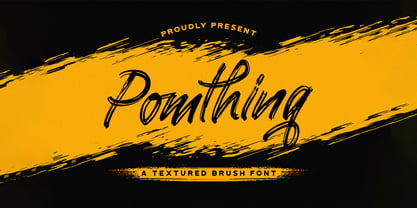 Pomthinq is a remarkable brush script font. Fall in love with its incredibly versatile style and use it to create spectacular designs!
 - Joyscript by Jonahfonts,
$25.00 Inspired by many hand-lettered European package designs. This script face is suitable for logos, casual headlines and designs calling for attention.
 - Signatria - Personal use only

- Movement - Personal use only

- Annabel Script - Unknown license

- PLASTIC PILL - Personal use only

- Crimson Petal - Personal use only

- the DEEPER - Personal use only

- Giant Head OT - Unknown license

- Bifurk - Unknown license

- Covington - Unknown license

- T-Air - Unknown license

- rokasfreestyle1 - Personal use only

- Plasmatica - Unknown license

- Avondale - Unknown license

- Fugue - Unknown license

- Abine by Olexstudio,
$16.00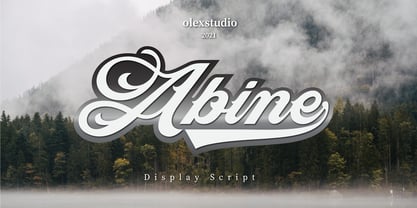 Abine - Display Script will look gorgeous on all your designs, invitation, poster design, book design, branding materials, logo's, t-shirt and all project design other. Abine - Display Script contains standard characters, Uppercase, Lowercase, Swashes, numbers, punctuation, ligatures and international glyphs
 - Rodentia by Olexstudio,
$10.00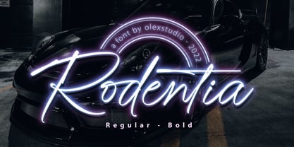 RODENTIA - Handwritten Brush Script Font will look gorgeous on all your designs, invitation, poster design, book design, branding materials, logo's, and all project design other. RODENTIA - Handwritten Font contains standard characters, Lowercase, alternates, Uppercase, numbers, punctuation, ligatures and international glyphs.
 - Jadran by Mina Arko,
$7.00 Jadran drew inspiration from holidays in the 80's, spent on the Adriatic coast. This all caps display face supports all European languages and comes with several illustrations. Jadran font is an homage to a cult children's magazine named 'Ciciban'.
 - Gretel Script by Typejockeys,
$25.00 This quirky script is packed with features. Best of all: Optical sizes! The three style family is based on the writing of calligrapher Natascha Safarik. All glyphs were redrawn manually to produce vector shapes that look perfect in literally every size!
 - Jumbled by Create Big Supply,
$15.00 Jumbled Display. This font is PUA encoded which means you can access all the glyphs and sweeps easily Features: All Uppercase Numbers and punctuation Multilingual PUA Encoding Full Character Set !"#$%&()*+,-./0123456789:;?@ABCDEFGHIJKLMNOPQRSTUVWXYZ[\]^_abcdefghijklmnopqrstuvwxyz{|}~ ¡¢£¤¥§©ª«®°±²³¹º»¿ÀÂÃÄÅÆÇÈÉÊËÌÍÎÏÑÒÓÔÕÖ×ØÙÛÜÝÞßàáâãäåæçèéêëìíîïñòóôõö÷øùúûüýþÿŒœŠšŸž–—‘’“”†‹›€−
 - Lomo by Linotype,
$29.99Lomo, PLC is a Russian optical manufacturer, whose cameras have built up an international cult following since 1992. Swiss designer Fidel Peugeot recently tapped into this phenomenon, creating an astounding series of pixel fonts for use in a variety of applications-from websites to mobile phone displays. Now available as a single family from Linotype, Lomo's versatility extends itself across 37 various faces. Whether on screen or online, Lomo's different weights deliver great legibility at low resolutions. Additionally, the amazing breadth of this family allows these pixilated faces to crossover into print, bringing a contemporary technology feeling to your more traditional pieces, too. Worth experimenting with is the Lomo Wall series, of which 14 of the Lomo family's 37 fonts belong to. In graphics applications like Adobe's PhotoShop of Illustrator, the Lomo Wall fonts may be layered over top of one another in various combinations. For example, Lomo Wall Chart 50 could be colored red, and layered behind Lomo Wall Pixel 50. The text in Lomo Wall Pixel 50 would then looked like it had been painted over top of a brick wall. With 14 fonts, and millions of colors in your application's color palette to choose from, the combination possibilities for this layering technique are endless! (If you really like this layering feature, check out what Karin Huschka, another Linotype designer, did with her Chineze Dragon family.) Convinced? Give the unlimited possibilities of Lomo a spin today! The entire Lomo family is part of the Take Type 5 collection, from Linotype." - Neues Bauen - Unknown license

- Mayonaise - Personal use only

- VTC SikleCell - Unknown license

- Star Crystals by Deniart Systems,
$20.00 Star bright tonight! Deniart’s StarCrystals typeface is an original design featuring 62 unique snowflake symbols. These geometric starburst snow crystals are sure to add elegance to all your winter designs. This font comes with a PDF guide to put all these special characters right to your fingertips! TIP: pair this one up with our SnowChrystals typeface for an even greater winter snow experience - a virtual snow storm of crystals for all your decorative needs.
 - Wildline by Mans Greback,
$59.00 Wildline is a fast logotype font, created to help you designing logotype or lettering that looks just like a hand-painted brush logo. Use it for designing signs, packaging, headlines, or a cool typographic print. Wildline has characteristics such as strength and confidence, while being dynamic, readable and very energic. Containing extensive lingual support, it covers all Latin European and Asian scripts. The font contains all characters you'll ever need, including all punctuation and numbers.
 - Zoney by Mans Greback,
$59.00 Zoney is a rustic slab serif typeface family. The lettering was hand-painted by Mans Greback between 2019 and 2021. It will give any project a handmade, natural and down-to-earth look. The font comes in four styles: Regular, Italic, Bold and Italic Bold It has very extensive lingual support, covering all European Latin scripts as well as Cyrillic. The font contains all characters you'll ever need, including all punctuation and numbers.
 - Mundbind DK by PizzaDude.dk,
$15.00 A few days ago, my good friend David from Hanoded.com visited me for a few days. We drank a lot of coffee and walked the streets of Copenhagen - we even took a trip up in Rundetårn! :) Well, on one of our walk (of course looking for inspiration for new fonts) we spotted this handmade sign. We agreed to make a font of the 7 letters available, using our own imagination and style! I called my font Mundbind DK and David named his Mundbind NL - of course it is the landcodes of Denmark and Holland. As you can tell, the font is uneven and somewhat unpredictable - following only the "rules" of the person who handprinted that sign ... and not many of the rules of the good old and respected painter who make beautiful signs ... however, this sign had it's beauty in a natural and innocent way.
 - Turntable Stencil JNL by Jeff Levine,
$29.00 A disc jockey-only promotional sleeve for a 1964 [45 rpm] release of “Close to Me” and “Let Them Talk” by Dan Penn featured the song titles printed in a stencil typeface on the record sleeve. Closely resembling a stencil version of Franklin Gothic but with its own unique characteristics, this design has been reinterpreted as Turntable Stencil JNL and is available in both regular and oblique versions. For trivia buffs, Dan Penn is a singer-songwriter-record producer, often collaborating with Dewey Lindon “Spooner” Oldham; both closely associated with the late Rick Hall’s Fame recording studios in Muscle Shoals, Alabama. In 1964, Hall started the Fame record label, and for a time it was distributed by Vee-Jay Records of Chicago, the first major Black-owned record label in the United States. Penn’s release was only the second for the new label; Fame 6402.
 - Ply by chicken,
$17.00 So the lumber was cheap - just a pile of offcuts - and so was the carpenter… And you couldn't say he was exactly lazy, but he was certainly efficient… mostly he would just cut a couple of planks to size, slice off a corner now and then, once in a blue moon hash up a curve… I guess he didn't have a drill, cos there are no holes… and he sure as hell didn't have a ruler… But he did have some kind of an eye, and until it falls off the wall it'll look pretty OK… Ply comes in six styles, offering differing degrees of neatness and adorned or not with fixings… There are money-saving packages too… It’s uppercase only, with variations between upper and lower case, and OpenType types can switch on Stylistic Set 1 to take the effort out of keeping things varied…
 - ABC Basisschrift by Elsner+Flake,
$35.00 During the last ten years of his life, Hans Eduard Meier (dec. July 17, 2014), together with Max Schläpfer, developed an innovative concept of a new Swiss Schulschrift (handwriting script for schools) called ABC Basisschrift®. His life’s work is crowned by the fact that now, since the fall of 2014, and beginning in Lucerne, this new didactic will replace the old Schnürlischrift in Switzerland. In contrast with the Schnürlischrift, the idea is to guide a child in three steps to learning a personal handwriting. ABC Schule 1 is for the first grade, ABC 2 starts to introduce the first connections and ABC 4 Ligaturen is designed with many ligatures to serve as a good example for handwriting. ABC Schule is also available with ruling and for visually impaired students.This version of the Basisschrift®, available from here, is the original version by Hans Meier.
 - Galore Snack by Yumna Type,
$12.00 It’s the ultimate way to be you. Galore Snack-with the combination between script and display font styles you can mix, match, and call your own. The script style generates modern and elegant vibes with its curvy strokes. Through the display font, it creates simple, clean yet versatile looks. This harmonious font duo supporting and advocating each other to make awesome result in your design. You also get 15 illustrations as special extra that you can use as you wish. Features: Stylistic Sets Swashes Multilingual Supports Uppercase and lowercase PUA Encoded Numerals and Punctuation This font would looks great on your branding, logos, social media quotes, stickers, posters, wall art, merchandise, social media, and many more. Get more inspiration about how to use it by seeing the font preview. Thank you for purchasing our fonts. If you have any further questions, don't hesitate to contact us. Happy Designing.
 - Monkton Book Condensed by Club Type,
$36.99 Packing more copy in a narrow space is the main reason for using a condensed type. Characters with a more ovular shape tend to be less wide than their circular counterparts and will allow for more letters per line. In narrow columns for example, this typeface can provide up to 25% more copy than the regular typeface in the same space. Another reason is when a larger type size is called for — used sparingly it is useful for headings or headlines. For emphasis, narrower letters can provide a stark contrast in the flow of reading, creating impact while retaining typographic character. Condensed types can specially useful in tables and charts because typically both use few words in each block. If space now allows, you may think about the luxury of a larger point size. This optimizes space while keeping your typography more easily legible.
 - Orotund by Canada Type,
$24.95 This is the digitization and considerable expansion of the cheeky and enormously popular film type Eightball, one of the most widely used faces of the 1970s and 1980s. Round and happy like a bouncy ball, these are letters after a sign maker’s own heart. Seen everywhere in its film version, from bingo and pool hall parlor signs to comic books, now this computer version opens the door for the happy roundness to be used on a much larger scale by anyone who designs layouts on a computer. The original film type included a few alternates. We included them, but we added many more as well. So make sure to check out the various OpenType features in your program while using this font. Eightball is great for a variety of applications, including signage, rubber stamps, poster design, titling, cartoons, comics, and pretty much anything where happy and round fit in.
 - Prototype by Barnbrook Fonts,
$30.00 Prototype is a typeface with a very contemporary identity crisis—is it old or new? uppercase or lowercase? serif or sans-serif? Prototype tries to be all things to all people. There have been many attempts at creating a universal typeface, one that rationalises the alphabet and removes the inconsistencies of upper and lower case, applying an unreasonable logic to something that has grown organically ...and is already perfectly usable! Prototype was the same experiment carried out at a time when design was experiencing an identity crisis of its own—letterforms that try to be all things to all people but end up being something else entirely.
 - Bodoni Classic Deco by Wiescher Design,
$39.50 Bodoni Classic Deco is against all rules. Giambattista Bodoni himself would probably hate me for doing it; he was a real purist. The whole idea of the Bodoni typeface is no embellishments and here I go and decorate those nice clear letters. Shame on me! But I find this is a very nice and useful typeface for all kinds of cards and certificates. So I just did it for all of you out there that are not born purists, but want a little embellishment to their lives. And to make things worse, I added a Small Caps cut. I even decorated it. Enjoy! Yours, breaking all the rules, Gert Wiescher
 - Ala Kazam by Scholtz Fonts,
$22.00 Ala Kazam is a new take on Calligraphic fonts. It has all the drama and pen-like quality of the calligraphy genre, but presents as a casual, quirky, magical font. Ala Kazam evokes many moods - it's fun, it's sophisticated, it's fashionable, it's contemporary romance. It's perfect for a host of uses - branding, packaging, kids stuff, fashion, wedding stationery, greeting cards. Vigorous and readable, Ala Kazam has all the features usually included in a fully professional font. Language support includes all European character sets, Greek symbols and all punctuation. Ala Kazam makes use of OpenType features to avoid the mechanical look caused by two identical characters side by side.
 - Kanilia by Mchcrafter,
$18.00 Kanilia Font is a Modern Stylistic Serif typeface. A new serif that we created specially for branding needs, with extra ligatures and alternates in a unique shape just to add value to your brand. It so nice to leverage designer or product owner that need solutions to make their design look more stylish and modern. And specially for Kanilia Font , We prepared all the ligatures, and the alternates characters to help you create unlimited variations for your creative needs. A wide range of useful glyphs are included – see preview image of all glyphs. Dakosta Font includes: All uppercase & lowercase letters All numbers 0-9 & Punctuation Ligatures & Alternates Symbols Multiligual Letters


