10,000 search results
(0.045 seconds)
- Valerie by Solotype,
$19.95 - Moi Non Plus by Hanoded,
$15.00
- Bedtime Jewel by PizzaDude.dk,
$19.00
- Jasmine Daily by Stringlabs Creative Studio,
$25.00
- Nuts Comic by Mvmet,
$12.00
- Free Form Showcard JNL by Jeff Levine,
$29.00
- Monte Carlo Script NF by Nick's Fonts,
$10.00 - Snow Bunny by Sipanji21,
$18.00
- Trochilida NF by Nick's Fonts,
$10.00 - Shaken, Not Stirred by Hanoded,
$15.00
- Adelita by Type-Ø-Tones,
$40.00
- Fearsome by Hanoded,
$10.00
- Buratino by ParaType,
$25.00
- Magic Vibes by Mvmet,
$12.00
- Printed Letters JNL by Jeff Levine,
$29.00 - Astone Blood by Just Lett,
$18.00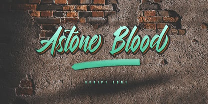
- HT Cartoleria by Dharma Type,
$19.99
- Karara Shadow by Kufic Studio,
$20.00
- Sulphur Springs NF by Nick's Fonts,
$10.00 - Montag by insigne,
$24.99
- Bandoleer by MADType,
$24.00
- Doublewide by Betatype,
$40.00 - TOCinRings by Ingrimayne Type,
$14.95
- Caterina by Calligraphics,
$30.00 - Southampton by Balevgraph Studio,
$14.00
- Megaphone by Red Rooster Collection,
$60.00
- MTF Groovy Giggles by Miss Tiina Fonts,
$15.00
- Dupliciter by JAF 34,
$9.90
- Feelin Sweet - Unknown license

- Chasing Miracles - Unknown license

- Aesthetikos - Personal use only

- Rachelle Sapphire - Personal use only

- Blantick Script - Personal use only

- Argillites - Personal use only

- LT Festive Medium - 100% free

- Romantyc Paradise - Personal use only

- Little Cupcakes - Unknown license

- Voice of the Highlander - Personal use only

- Hotel Coral Essex - Personal use only

- La Jolla ES - 100% free


