10,000 search results
(0.047 seconds)
- Croist by Flawlessandco,
$9.00 Croist is a modern retro with a fun and bold style that perfect for your retro-themed projects. Try out some alternate characters for another visual result! There's some connected letters and some alternates that suitable for any graphic designs such as branding materials, t-shirt, print, business cards, logo, poster, t-shirt, photography, quotes .etc This font support for some multilingual. Also contains uppercase A-Z and lowercase a-z, alternate character, numbers 0-9, and some punctuation. If you need help, just write me! Thanks so much for checking out my shop!
 - Helios Retro by Flawlessandco,
$9.00 Helios Retro is a modern retro with a fun and bold style that perfect for your boho-themed projects. Try out some alternate characters for another visual result! There's some connected letters and some alternates that suitable for any graphic designs such as branding materials, t-shirt, print, business cards, logo, poster, t-shirt, photography, quotes .etc This font support for some multilingual. Also contains uppercase A-Z and lowercase a-z, alternate character, numbers 0-9, and some punctuation. If you need help, just write me! Thanks so much for checking out my shop!
 - Brahmasta by Flawlessandco,
$9.00 Brahmasta is a modern serif with a classic retro style that perfect for your retro-themed projects. Try out some alternate characters for another visual result! There's some connected letters and some alternates that suitable for any graphic designs such as branding materials, t-shirt, print, business cards, logo, poster, t-shirt, photography, quotes .etc This font support for some multilingual. Also contains uppercase A-Z and lowercase a-z, alternate character, numbers 0-9, and some punctuation. If you need help, just write me! Thanks so much for checking out my shop!
 - Core Escher by S-Core,
$30.00 Core Escher is an optical illusion type family which has two sub-families: Core Escher A and B. Core Escher A has impossible shapes inspired by the optical illusion works of artist M.C. Escher. The letterforms in this type family are structurally twisted and complicated but it looks simple because of its simple strokes. And for easy color variations, it split into two fonts, Core Escher A Left and Right. Core Escher B has a different kind of optical illusion. The letters of Core Escher B look like three dimentions by just putting thin lines on bold letters. Also B has two sub-families that have different viewpoints. Core Escher Family supports complete Basic Latin, Cyrillic, Central European, Turkish, Baltic character sets. Each font includes proportional figures, tabular figures, numerators, denominators, superscript, scientific inferiors, subscript, fractions and case features. This family is really nice for book titles, headlines, logotypes and any artworks.
 - Dinky Rink NF by Nick's Fonts,
$10.00Handlettering on a 1934 WPA poster promoting skating in Central Park provided the pattern for the uppercase letters of this typeface, while the lowercase letters take their inspiration from Paul Renner’s Steile Futura. The result is a warm, friendly face that is both quaint and modern. Available in Roman and Italic versions. Both versions of the font include 1252 Latin, 1250 CE (with localization for Romanian and Moldovan). - Chubby Melisa by Sipanji21,
$15.00 Chubby Melisa is a Cute and Thick Handwritten Font with a relaxed theme, featuring a lovely style. No matter the topic, but this font is awesome for every kids or child project, this font will be an incredibly asset to your fonts’ library, as it has the potential to elevate any creation.
 - Cutie Olivia by Sipanji21,
$15.00 Cutie Olivia is a Cute and charm script font with a relaxed theme, featuring a lovely style. No matter the topic, but this font is awesome for every kids or child project, this font will be an incredibly asset to your fonts’ library, as it has the potential to elevate any creation.
 - Zero Output by PizzaDude.dk,
$15.00 You may recognize the shapes of this font - it's because it's my Universitet font, but this time it took some beating, and turned into a grunge font! The output was Zero Output! It has 5 different versions of each letter and of course multilingual support! Go ahead and grunge up your next project!
 - Circus Wagon by FontMesa,
$25.00 Circus Wagon is a revival of the old circus style font named Big Top in the Dan Solo catalog. This version has been freshened up with a new matching lowercase. Our original release of this font was named Buckhorn, this 2020 updated release changes the name and adds additional accented glyphs plus Opentype case sensitive forms. You will need an Opentype aware application to access Opentype features in this font.
 - Spiral by ARTypes,
$35.00 Spiral is a digital transcription of a design by Joseph Blumenthal (1897-1990) which was hand-cut by Louis Hoell and cast by the Bauer foundry in 1930. The design with an italic added was later cut for Monotype and issued in 1936 as Emerson 320.
 - Helvetian Times by Elemeno,
$25.00Helvetian Times is an unusual typeface. It clearly thinks it's a standard text font, but the offbeat letter shapes and inconsistent serifs combine to form something that defies conventional categorization. Helvetian Times works well at any size, but generally evokes the impression that something's not quite right. - Robot Monster NF by Nick's Fonts,
$10.00A design experiment run amok! To some, the upper case A of this font resembles a diving helmet. If you put same on a guy in a gorilla suit, you have the really cheesy 50s sci-fi movie that gives the font its name. Both versions of this font contain the Unicode 1252 (Latin) and Unicode 1250 (Central European) character sets, with localization for Romanian and Moldovan. - Pagoda by Studio K,
$45.00 This display font has an oriental character reminiscent of brush stroke calligraphy and all things Japanese. My original working title for this font was ‘Spanner’, because the lower case ‘c’, with which the design began, looked rather like the head of a spanner. I originally had in mind something more mechanical, but as it evolved and developed the font itself obviously had other ideas!
 - Athelas by TypeTogether,
$65.00 An attempt to go back towards the beauty of fine book printing, inspired in Britain's literary classics. Athelas takes full advantage of the typographic silence, that white space in the margins, between the columns, the lines, the words, the lettershapes and finally, within the characters themselves. It is also intended to take advantage of the great advances and technical developments made in offset printing. Athelas shows its best side in finely crafted book editions and good printing conditions. Athelas has a large character set that covers most of the languages that use the Latin script. Although inspired in British literature, this typeface respects the cultural values behind different languages, where diacritic marks have an utterly important role. Athelas features four weights and about 800 characters per weight, including small caps, discretionary ligatures, fractions, a complete range of numerals for every use and a set of ornaments and arrows.
 - Hobies by Flawlessandco,
$9.00 Introducing "Hobies" - a display font that combines firm boldness with a touch of uniqueness. With its strong and commanding letterforms, Hobies makes a bold statement, while its outline regular variant adds a distinctive edge to your designs. There's some connected letters and some alternates that suitable for any graphic designs such as branding materials, t-shirt, print, business cards, logo, poster, t-shirt, photography, quotes .etc This font support for some multilingual. Also contains uppercase A-Z and lowercase a-z, alternate character, numbers 0-9, and some punctuation. If you need help, just write me! Thanks so much for checking out my shop!
 - Petals BF by Bomparte's Fonts,
$39.00 Ooh so soft, so curvaceous, so voluptuous and so swash-buckling. Hey, I'm talking ’bout Petals BF! Here’s a design inspired by the work of Dave West and infused with a plethora of pleasingly plump letterforms, with swashes reminiscent of 60s and 70s types. But here’s the twist: where you might typically expect to find ball terminals, you'll experience some sensuous curls; and some playful letterforms such as lowercase h, k, m, and n, may even call to mind that groovy look of ’60s bell-bottoms. Spread across its capitals and lowercase are swash variants for beginning, middle and ending letterforms —candy for your eyes. Petals BF is where Didone style happily marries the organic and curvaceous forms of Art Nouveau. Strange I know, but so is a duckbill platypus —and somehow they all seem to work surprisingly well. Among the many typographic niceties you'll discover, are such Opentype features as Contextual and Stylistic alternates, Ligatures, Case-sensitive forms and Fractions. Please note: these magical features demand the use of opentype-savvy applications such as Adobe Creative Suite, QuarkXPress and etc. Petals BF is multilingual, and speaks the languages of Western, Eastern and Central Europe, in addition to Turkish and Baltic. It gets around. So let your creativity blossom with Petals in projects that involve headlines, magazine layouts, product packaging, logos, signage, branding and etc.
 - Contigo by Resistenza,
$39.00 Contigo Is our new brushy script for your summer cards and gifts. This script has a lot of contrast created with a lot of pressure and release of the brush pen. The icon set contains tropical elements like leaves, pink flamingos, pineapple and more.
 - Mugpie by PizzaDude.dk,
$14.00 Originally handdrawn, and then digitized by hand. But carefully keeping the characteristics of the handmade lines. Mugpie has that happy-go-lucky feeling to it - use it for your posters, postcards, packaging, wrapping - anything that could need a fresh breath of funkadelic comic boost! :)
 - Hooky by Comicraft,
$29.00 Originally created for Sound Effects in Marvel's GHOST RIDER 2099, our spraycan stylish HOOKY font has just the right Scrawl of the Wild for graph-iti enthusiasts everywhere -- and they wash right off with just a little splash of 'delete'. Spray it, don't Say it!
 - Calmsie by Timurtype,
$14.00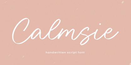 Calmsie A Handwritten Script Font Calmsie is perfect for product packaging, branding project, magazine, social media, weddings, or just used to express words above the background. This Calmsie font includes: Calmsie multilingual support. Embellish your designs with our original fonts. Enjoy the font, Thank you!
 - Peanut Gallery NF by Nick's Fonts,
$10.00Every type library needs a generic, comicbook-style “POW!” font, and this one is ours. Breezy, bouncy and bold, it’s the perfect choice for rock-em, sock-em headlines. Both versions of the font include 1252 Latin, 1250 CE (with localization for Romanian and Moldovan). - Ciroya by Twinletter,
$17.00 Welcome to Ciroya, a typeface universe full of passion and fun! Ciroya is the answer if you want a strong, bold, and vivid style for your projects. Ciroya is available in three different styles: regular, outline, and shadow. You can use this to create effects that suit your vision, such as colorful to lighter outlines or shadow effects. But wait, there's more! Ciroya also has a plethora of other ligatures and characters, allowing you to express your creativity and create genuinely unique and spectacular designs. Ciroya, of course, supports several languages, allowing you to engage with audiences worldwide. Make Ciroya your top choice for projects that require a playful, playful look. Let your message be combined with Ciroya's carefree touch and make an unforgettable impression. With Ciroya, every word becomes more vibrant and colorful. Explore your creative potential right away with this fun font!
 - TRACEROUTE - Unknown license

- Open Serif by Matteson Typographics,
$19.95 OPEN SERIF - answering the question “what font pairs well with Open Sans?”. Designed by Steve Matteson for extraordinary legibility and comfortable reading on screen and in print. Open Interpretation: Not quite Veronese – not quite Egyptian. A dash of panache in an otherwise sturdy serif typeface. Open Serif is an elegant text and display typeface family. Open Interiors: Visually open and legible at text sizes just like its cousin Open Sans. Open Serif reads smoothly but has an energetic texture. The chancery style italic contrasts nicely to the roman in a full bodied nod to Italian Renaissance forms. Open Type: Open Serif is full of OpenType features including Small Capitals for the Roman, Italic Swash Capitals and Old Style Figures for both. Open Translation: Supporting all the languages available in Open Sans, Open Serif completes the translation capabilities of international companies. Extended text is more pleasant to read in a serif typeface so go global with a unified typeface family! Open Face: Open Serif Titling is an elegant companion to round out the family. These ‘open-face' capital letters are ideal for initial letters, mastheads, titles and decoration.
 - Minoris Variable by Typeskets,
$15.00 Minoris is a Geometric font in the sans serif category with 10 styles or 5 weights with Oblique, this font is also included in the Variable font, so you can adjust the size according to the weight of this font according to a certain variable range using software like Adobe, I made it by drawing geometric shapes in every letter that has a minimalist and simple impression, is perfect for helping you create minimalist-style editorial designs, this font is also suitable for making typography designs, posters, logotypes, and many other designs that you can make with this font
 - Babylon Industrial - Unknown license

- MPI Deco by mpressInteractive,
$5.00 Deco is a minimal, easy-to-read gothic without fuss. Geometry is sharp, strokes are uniform throughout, and characters are slightly condensed. This version is based on wood type of unknown origin, but the design was likely based on lettering from the Art Deco period of the 1920s and '30s.
 - Shopping Guide by Jeff Levine,
$29.00 While watching the 1947 holiday classic “Miracle on 34th Street”, one scene in particular presented a chance to develop a retro type design. ‘Kris Kringle’ suggests to a mother visiting with her child in the Macy’s toy department to try Gimbel’s for a toy she couldn’t find at the store. The news of this behavior reaches Mr. Macy himself, who embraces the practice as a brilliant marketing strategy. A number of departments are then presented with reference books containing competitor ads, and the visual of the cover stating “R.H. Macy & Co. Shopping Guide for the Convenience of Our Customers” shows on screen. The thin, Art Deco sans serif monoline with a few serif-like hooks added onto some characters became the basis for Shopping Guide JNL, which is available in both regular and oblique versions.
 - Century Gothic by Monotype,
$40.99 Century Gothic™ is based on Monotype 20th Century, which was drawn by Sol Hess between 1936 and 1947. Century Gothic maintains the basic design of 20th Century but has an enlarged x-height and has been modified to ensure satisfactory output from modern digital systems. The design is influenced by the geometric style sans serif faces which were popular during the 1920s and 30s. The Century Gothic font family is useful for headlines and general display work and for small quantities of text, particularly in advertising. The Century Gothic family has been extended to 14 weights in a Pan-European character set from Thin to Black and their Italics. The already existing 4 weights of Regular and Bold with their Italics are additionally still available in the STD character set. The W1G versions featuring a Pan-European character set for international communications supports almost all the popular languages/writing systems in western, eastern, and central Europe based on the Latin alphabet including several based on Cyrillic and Greek alphabets. Looking for the perfect way to complete your project? Check out Aptifer™ Slab, ITC Berkeley Old Style®, FF Franziska™, Frutiger®, ITC Legacy® Square Serif or Plantin®.
 - Sol Pro by Canada Type,
$29.95 Based on the classic Sol design by Marty Goldstein and C.B. Smith, published by VGC in 1973, Sol Pro goes above and beyond the call of revival/retooling to include plenty of optical improvements to the original design, more weights, italics, small caps, biform shapes, alternates, and extended language support. This particular design is one of the more prominent forefathers and strong influencers of the soft, streamlined aesthetic that has been going strong in branding and geometric design for more than 40 years now. It cuts all links to melancholy and classic empire shapes, and introduces smooth contrast modulation that communicates sleek, adaptable youth, confidence, knowledge, and modern hi-tech presence. This is not your grandfather's Eurostile. This is your offspring's global hope, optimism, and total awareness. Sol Pro's extended character set and range of weights and widths makes it quite suitable for applications of all sizes, from small collateral to product branding and massive marketing campaigns. The Sol Pro complete family comes in 20 fonts, each containing over 520 characters. Available in single fonts or value-maximizing packages.
 - Hostilica by Heypentype,
$20.00 Hostilica is a semi-serif family designed by mixing classic serifs in the age of romanticism era with contemporary modern shape and curves. It gives a warm, friendly, and inviting feeling without losing a formality of text fonts. Every weight was designed carefully to provide a unique look while maintained the unity of the type family. A thin weight gives your content an elegant, luxurious design feel. While the regular weight, designed for body text, gives your content a warm and friendly design feel. The bold weight will make your headlines stand-out with its fat counters and curves. Therefore, Hostilica will accomodate all your design needs, from text to display, from catchy to luxury. The italics of each weight will spice up your design project especially with letter 'f,s,r,k, and y'. Those italic versions paired with alternate and discretional ligatures will add an organic feeling to your designs. The italic styles are designed by emulating a handwriting stroke, and will give a more personal feel while still maintained a formal sense.
 - View Roman Black - Personal use only

- PR8 London Ads - Unknown license

- BooRush by Nurf Designs,
$12.00 BooRush is a display font with a childish touch. The bold shape makes this font very suitable for any playful heading!
 - Zirkel by Ondrej Kahanek,
$35.00 Zirkel is a geometric sans serif typeface which includes 16 fonts – eight weights and eight matching italics. Each character is geometrical, but optically corrected for better readability. Featuring austere lines, the font gains its strength in the final layout, which is created by the user. Zirkel Sans is suitable for headlines of all sizes, but it can be used in variety of long text as well. This font supports Western, Central and Eastern European languages, ligatures, alternate characters such as A, V, w, etc., and will find its place in the beginning, centre or end of any word. Geometry rulezz...
 - Rantic Kafis by Product Type,
$17.00 Introducing Rantic Kafis, a classic modern font with a bold and elegant touch. This font features thick strokes and rounded edges, giving it a distinctive and sophisticated look. With its stylistic set options for upper and lowercase letters, Rantic Kafis adds a touch of individuality and creativity to any design. Rantic Kafis is the perfect font to add a classic modern feel to your work. Its thick strokes and rounded edges make it highly legible, ensuring that your designs are easy to read and understand. So if you’re looking for a font that combines the best of classic and modern design, look no further than Rantic Kafis. Download it now and start creating stunning designs that stand out from the crowd! What’s Included : - File font - All glyphs Iso Latin 1 - We highly recommend using a program that supports OpenType features and Glyphs panels like many Adobe apps and Corel Draw, so you can see and access all Glyph variations. - PUA Encoded Characters – Fully accessible without additional design software. - Fonts include Multilingual support
 - Salden by Canada Type,
$40.00 The Salden fonts are our tribute to the man who was dubbed the face of the Dutch book, and whose work is considered essential in 20th century Dutch design history. Helmut Salden’s exquisite book cover designs were the gold standard in the Netherlands for more than four decades. His influence over Dutch lettering artists and book designers ranges far and wide, and his work continues to be used commercially and exhibited to this very day. At the root of Salden’s design work was a unique eye for counter space and incredible lettering skills that never failed to awe, regardless of category or genre. This made our attention to his lettering all the more focused within our appreciation to his overall aesthetic. Though Salden never designed alphabets to be turned into typefaces (he drew sets of letters which he sometimes recycled and modified to fit various projects), we thought there was enough there to deduce what a few different typefaces by Salden would have looked like. The man was prolific, so there were certainly enough forms to guide us, and enough variation in style to push our excitement even further. And so we contacted the right people, obtained access to the relevant material, and had a lot of fun from there. This set covers the gamut of Salden’s lettering talents. Included are his famous caps, his untamed, chunky flare sans serif in two widths, his unique Roman letters and an italic companion and, most recognizable of all, his one-of-a-kind scripty upright italic lowercase shapes, which he used alongside Roman caps drawn specifically for that kind of combination titling. All the fonts in this set include Pan-European glyph sets. They’re also loaded with extras. Salden Roman (908 glyphs) and Salden Italic (976 glyphs) each come with built-in small caps (and caps-to-small-caps), quite a few ligatures, and two different sets of alternates. Salden Black and Salden Black Condensed (636 glyphs each) come with a set of alternates, and both lining and oldstyle figures. Salden Caps (597 glyphs) comes with a set of alternates, and Salden Titling (886 glyphs) comes with a quite a lot of swashed forms and alternates (including as many six variants for some forms), a few discretionary ligatures, and two sets of figures. There are also some form alternates for the Cyrillic and Greek sets included in all six fonts. These alphabets were enjoyably studied and meticulously developed over the past ten years or so. We consider ourselves very fortunate to be the ones bringing them to the world as our contribution to maintaining the legacy of a legendary talent and a great designer. The majority of the work was based on Salden’s original drawings, access to which was graciously provided by Museum Meermanno in The Hague. The Salden fonts were done in agreement with Stichting 1940-1945, and their sale will in part benefit Museum Meermanno.
 - Charlotte Sans by ITC,
$29.99Although designer Michael Gills was influenced by 18th century French type designer Pierre-Simon Fournier, Charlotte is best described as a modern roman typeface. Its clean cut style, accentuated by a strong vertical stress and unbracketed serifs, exudes an authoritative tone, guaranteeing its effectiveness for almost all text setting applications, but especially where a formal unmannered appearance is desired. - Cloudia by PHDesign,
$30.00 Cloudia is a versatile, modern font with an attention-grabbing angularity. It has a thoroughly mechanical, science fiction look; but with slightly unconventional vowel shapes to give it a dynamic edge. Its precisely cut letters need to be displayed as large as possible for maximum impact. Perfect for book titles, magazines, band logos, movie titles, stencils and video games.
 - Charlotte Serif by ITC,
$29.99Although designer Michael Gills was influenced by 18th century French type designer Pierre-Simon Fournier, Charlotte is best described as a modern roman typeface. Its clean cut style, accentuated by a strong vertical stress and unbracketed serifs, exudes an authoritative tone, guaranteeing its effectiveness for almost all text setting applications, but especially where a formal unmannered appearance is desired.


