4,613 search results
(0.013 seconds)
- Swim by Designpiraten,
$15.00 A typeface family inspired by water. The family comes with a text version of two weights and matching italics —Regular, Regular Italic, Bold and Bold Italic. In addition, both weights come with a characteristic “glitch” version wich makes the family outstanding and suitable for branding and visual communication projects. The fonts support 207 different languages.
 - Libel Suit - 100% free

- Buddy Suit by PizzaDude.dk,
$15.00A drippy text font, or slimy if you prefer! - Libel Suit by Typodermic,
$11.95 Libel Suit is a slim, efficient sans-serif typeface. This compact headliner has a unique industrial look with distinct post-modern curves. Using your application’s “stylistic alternates” functionality," you can access a more conventional “g” and “y.” OpenType numerical ordinals and fractions are included. Libel Suit is available in six weights and italics. Most Latin-based European, Vietnamese, Greek, and most Cyrillic-based writing systems are supported, including the following languages. Afaan Oromo, Afar, Afrikaans, Albanian, Alsatian, Aromanian, Aymara, Azerbaijani, Bashkir, Bashkir (Latin), Basque, Belarusian, Belarusian (Latin), Bemba, Bikol, Bosnian, Breton, Bulgarian, Buryat, Cape Verdean, Creole, Catalan, Cebuano, Chamorro, Chavacano, Chichewa, Crimean Tatar (Latin), Croatian, Czech, Danish, Dawan, Dholuo, Dungan, Dutch, English, Estonian, Faroese, Fijian, Filipino, Finnish, French, Frisian, Friulian, Gagauz (Latin), Galician, Ganda, Genoese, German, Gikuyu, Greenlandic, Guadeloupean Creole, Haitian Creole, Hawaiian, Hiligaynon, Hungarian, Icelandic, Igbo, Ilocano, Indonesian, Irish, Italian, Jamaican, Kaingang, Khalkha, Kalmyk, Kanuri, Kaqchikel, Karakalpak (Latin), Kashubian, Kazakh, Kikongo, Kinyarwanda, Kirundi, Komi-Permyak, Kurdish, Kurdish (Latin), Kyrgyz, Latvian, Lithuanian, Lombard, Low Saxon, Luxembourgish, Maasai, Macedonian, Makhuwa, Malay, Maltese, Māori, Moldovan, Montenegrin, Nahuatl, Ndebele, Neapolitan, Norwegian, Novial, Occitan, Ossetian, Ossetian (Latin), Papiamento, Piedmontese, Polish, Portuguese, Quechua, Rarotongan, Romanian, Romansh, Russian, Rusyn, Sami, Sango, Saramaccan, Sardinian, Scottish Gaelic, Serbian, Serbian (Latin), Shona, Sicilian, Silesian, Slovak, Slovenian, Somali, Sorbian, Sotho, Spanish, Swahili, Swazi, Swedish, Tagalog, Tahitian, Tajik, Tatar, Tetum, Tongan, Tshiluba, Tsonga, Tswana, Tumbuka, Turkish, Turkmen (Latin), Tuvaluan, Ukrainian, Uzbek, Uzbek (Latin), Venda, Venetian, Vepsian, Vietnamese, Võro, Walloon, Waray-Waray, Wayuu, Welsh, Wolof, Xavante, Xhosa, Yapese, Zapotec, Zarma, Zazaki, Zulu and Zuni.
 - Calorie Suit by PizzaDude.dk,
$17.00 Calorie Suit is a clean and super sharp comic font. Actually the use of Calorie Suit is quite wide. I'd like to dare you to use this font for massive texts, even though the real force of the font is for one liners or catchwords. Originally drawn in hand, and then cleaned up beyond recognition - but keeping the characteristics of the original sketch. You may notice influences from graffiti here and there too! :)
 - Suite Slab by Jonahfonts,
$39.00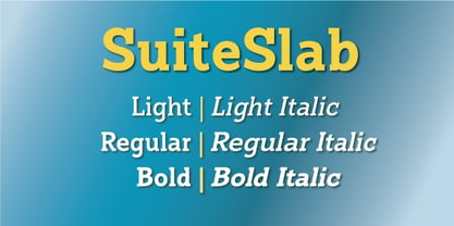
- Nuit by Eurotypo,
$28.00 Nuit, a delightfully handwritten family font with strong character designed by Carine de Wandeleer. Its slight bounce and intentional irregularity, gives your words a wonderful flow. The fatness and thinness of their strokes give an impressive harmony. This new font family includes Regular, Italic, Bold and Bold Italic. It has OpenType features such as Stylistics alternates, Swashes, Ligatures, up to four Stylistic sets by letter, initial and terminal forms in upper and lower, ornaments that allow you to mix and match pairs of letters and a Central European language support to fit your design. This OpenType features may only be accessible via OpenType-aware applications, or the Character Map to view and copy any of the extra characters to paste into your favorite text editor/app. This will help your creativity and make it easier to make expressive and elegant your typographic work. Also with Nuit it is possible to write all in capitals. Nuit looks lovely on wedding invitations, greeting cards, logos, posters, labels, t-shirt design, logos, business-cards and is perfect for using in ink or watercolor based designs, fashion, magazines, food packaging and menus, book covers and whatever your imagination holds! Nuit was made to make your project more beautiful and attractive.
 - Suti by Melvastype,
$29.00 Suti is a non-connected sign painters casual script with upper and lower cases. Suti was originally designed in 2010 but it was completely re-drawn in 2016. Casual lettering is a style sign painters use. Every sign painter has more or less their own style to make these letters. The casual alphabets are painted with speed and they don’t need to line perfectly but letters are still clean and easy to read. Suti has smooth and round forms. Friendly and casual looks. It is suitable for logos, titles, package design or where ever you need a fun and sympathetic display font.
 - SWEM - 100% free

- Suit Sans STD by Just in Type,
$15.00 Suit Sans STD is a typeface designed for multi-purposes with 4 weights plus matching italics. The set of 554 glyphs embraces all European languages, and it's perfect for branding, interfaces and everything else you could create on large and small sizes. But if Suit Sans STD is not enough for you, take a look at Suit Sans Pro with extended weight range, character set and more cool features.
 - Regal Suite JNL by Jeff Levine,
$29.00Add a touch of class and bring back the elegance of the 1930s with Regal Suite JNL. - Suit Sans Pro by Just in Type,
$29.00 Suit Sans Pro is a typeface designed for multi-purposes with a wide range of 12 weights plus italics. The large set of 1377 glyphs embraces a lot of latin languages, and it’s perfect for multi-national brands. Take a look at the specimen. Suit Sans Pro is too much for you? Take a look on Suit Sans STD, a simpler version for Suit Sans.
 - Hotel Suite JNL by Jeff Levine,
$29.00 This is a digital reinterpretation of Walter Huxley's 1935 evergreen "Huxley Vertical", which was originally cast for American Type Founders. A timeless classic which has been in use since the Art Deco era, this version is known as Hotel Suite JNL. As in the original metal type, alternates for A,K,M,R,W and Y are available and can be found on their respective lower case keys. Hotel Suite JNL is available in both regular and oblique versions.
 - Suited Horse PB by Pink Broccoli,
$19.00 An offbeat alternate caps typestyle inspired by the title screen of a 1968 Walt Disney film titled, The Horse in the Gray Flannel Suit. This playful and childish font comes with an extensive language set, a stylistic alternates feature that auto-alternates between capitals & lowercase (alt caps), as well as a contextual alternates feature that auto-alternates between sets only where double characters are typed like SS, TT, etc. The contextual alternate feature also enables a few titling word options like " the " " in " and " in the ". As noted in the quotes, when these word sets are typed with a space before and after them, it will trigger the swap when contextual alternates is on. Switching on Contextual Alternates enables automatic alternations between caps and alt caps like AlTeRnAtIoNs to create a more randomized look.
 - Shit Happens - Personal use only

- Quite Something by Hanoded,
$15.00 I have always liked the word ‘quite’ - you can stick it in a sentence and all of a sudden that sentence looks quite sophisticated! Quite Something may not be all that sophisticated; in fact, it is a rather messy font. But that’s where the fun begins! Use it for your children’s book covers, toy packaging and posters. I am sure people will say that your designs are Quite Something!
 - Quit Smoking by PizzaDude.dk,
$20.00Legible even at small sizes, when viewed at large sizes you'll notice the slight elegant twist! Besides, it always a good thing, if you conside quitting smoking! - Cheap Skit by PizzaDude.dk,
$11.00 It doesn’t take long to see that Cheap Skit is a super legible, easy going font. It is intended to be used where text needs to be clear and legible, but have certain amount of handmade energy. I’d say that products that has something to do with children (toys, clothes, games, posters …) or something organic, recipes, bookcovers …
 - Reske Wuite by Putracetol,
$18.00 Reske Wuite - Elegant Serif Font. Introducing the new Reske Wuite !! Reske Wuite is a elegant and classy serif typeface. Reske Wuite Font is a very versatile serif font. you can use this font to various design & Reske Wuite inspired by elegant and luxury typography. Reske Wuite is perfect for a professional touch which makes it to form unique & elegant typography designs. Reske Wuite is perfect for headings, flyer, greeting cards, product packaging, book cover, printed quotes, logotype, apparel design, album covers, etc. The alternative characters were divided into several Open Type features such as Swash, Stylistic Sets, Stylistic Alternates, Contextual Alternates, and Ligature. The Open Type features can be accessed by using Open Type savvy programs such as Adobe Illustrator, Adobe InDesign, Adobe Photoshop Corel Draw X version, And Microsoft Word. This font is also support multi language.
 - Quite Delicious by Bogstav,
$17.00 "It is quite delicious" - a quote by an English speaking kid, aged 3 in the kindergarten in which I work. Not only is that a very fine way of expressing your self (and remarkable at the age of 3!) But "Quite Delicious" also appear in the song "Why can't I be you" by The Cure.
 - Spitting Image by preussTYPE,
$25.00 SpittingImage is a font which speaks of mechanical exactness, cool and reserved. The SpittingImage font family is formed by two different weights (regular and bold), each one with uppercase and lowercase letters, numbers, punctuation marks and diacritic characters in regular and italic. The outline version included as a part of OpenType-Feature. There are in all styles numerous ligatures, alternate characters, small caps, and different sets of numbers that you can put both headlines and short texts without any problems. OpenType features: contains over 1.000 Glyhps Central European Glyhps Standard Ligatures Small Capitals Stylistic Alternates Discretionary Ligatures OldStyle Figures Ordinals Slashed Zero Feature
 - Sitting Duck by Kitchen Table Type Foundry,
$15.00 I have no particular affection for ducks, nor do I keep them, but I thought it was about time someone named a font after them! Sitting Duck is a jolly comic/kids font. Handmade (of course), cute and useful. Comes with extensive language support and a cool alternative asterisk in the shape of a duck.
 - Sui Generis by Typodermic,
$11.95 Looking for a typeface that’s as unique as your personality? Look no further than Sui Generis, the rounded square sans-serif that’s unlike any other. With its technical letterforms and boxy curves, Sui Generis has an industrial character that’s all its own. It’s the kind of typeface that demands attention, without ever feeling pushy or obnoxious. In fact, its understated charm is part of what makes it so special. But don’t let its quirky personality fool you—Sui Generis is as practical as it is unique. With four weights, two widths, italics, and an outline style, it’s incredibly versatile and perfect for any project that requires a touch of character. So if you’re tired of bland, run-of-the-mill typefaces that all look the same, give Sui Generis a try. Its square letterforms and distinctive voice will make your design stand out from the crowd, and leave a lasting impression on anyone who sees it. Most Latin-based European writing systems are supported, including the following languages. Afaan Oromo, Afar, Afrikaans, Albanian, Alsatian, Aromanian, Aymara, Bashkir (Latin), Basque, Belarusian (Latin), Bemba, Bikol, Bosnian, Breton, Cape Verdean, Creole, Catalan, Cebuano, Chamorro, Chavacano, Chichewa, Crimean Tatar (Latin), Croatian, Czech, Danish, Dawan, Dholuo, Dutch, English, Estonian, Faroese, Fijian, Filipino, Finnish, French, Frisian, Friulian, Gagauz (Latin), Galician, Ganda, Genoese, German, Greenlandic, Guadeloupean Creole, Haitian Creole, Hawaiian, Hiligaynon, Hungarian, Icelandic, Ilocano, Indonesian, Irish, Italian, Jamaican, Kaqchikel, Karakalpak (Latin), Kashubian, Kikongo, Kinyarwanda, Kirundi, Kurdish (Latin), Latvian, Lithuanian, Lombard, Low Saxon, Luxembourgish, Maasai, Makhuwa, Malay, Maltese, Māori, Moldovan, Montenegrin, Ndebele, Neapolitan, Norwegian, Novial, Occitan, Ossetian (Latin), Papiamento, Piedmontese, Polish, Portuguese, Quechua, Rarotongan, Romanian, Romansh, Sami, Sango, Saramaccan, Sardinian, Scottish Gaelic, Serbian (Latin), Shona, Sicilian, Silesian, Slovak, Slovenian, Somali, Sorbian, Sotho, Spanish, Swahili, Swazi, Swedish, Tagalog, Tahitian, Tetum, Tongan, Tshiluba, Tsonga, Tswana, Tumbuka, Turkish, Turkmen (Latin), Tuvaluan, Uzbek (Latin), Venetian, Vepsian, Võro, Walloon, Waray-Waray, Wayuu, Welsh, Wolof, Xhosa, Yapese, Zapotec Zulu and Zuni.
 - Slim Chef - Personal use only

- Radioland Slim - Unknown license

- Blutter Slim - Unknown license

- Vaporbyte Slim - 100% free

- Vaporbyte Slim - 100% free

- Aphrodite Slim by Typesenses,
$57.00 Aphrodite Slim Pro is not just a lighter version of its sister Aphrodite Pro. Aphrodite Slim Pro has duplicated the quantity of characters of its partner, and that means more than 500 new glyphs, reaching a total of more than 1000. More delicate and meticulous, Aphrodite Slim Pro is once more a new typography with deep calligraphic ideals: We immersed ourselves into the world of each calligraphy ductus and each calligraphy masters by studying from decoration to lettering books. This was the key for the logic of Aphrodite Slim’s behavior. The new concept of Aphrodite Slim Pro was to join diverse styles of calligraphy in one in order to achieve an autonomous expressiveness, in fact, this is what calligraphy aims to, and we agreed to bring those ideals to the world of typography: It is justifiable to be inspired in hundred-year-old calligraphies, but it is even better if the results you obtain have a plus. A personal plus. During the creation process we were wondering whether it was possible to mix certain strokes of such rigid styles as uncial, (Li·n’s favourite style), with strokes of the copperplate, (Sav’s favourite style), and also to take and mix cualities of cancelleresca cursiva, formata and moderna; finally giving our creation a roman-transition italic look. So Aphrodite Slim takes ideals and aspects from those formal styles, following its own logic though, and emphasizing the fact of being a decorative typography. Calligraphy masters of our past are who we are in debt with. They are the cause we have lovely letters now. They have been spontaneous at the moment of creation, what differs from the type-designers of nowadays, whose spontaneity is more limited. Digital faces that we are used to see these days are a result of long hours of optical adjustments, grids, macros and inspirations of other existing typography, but without personal contributions. Aphrodite Slim wants to refute this. Its mission is to rescue de spontaneity of the artesanal lettering in order to obtain unique words; those which only calligraphy masters of our past or lettering artists of our present could give us. We have worked hard to achieve this, making Aphrodite the most universal font we could: It was necessary to study the most common words, focalizing more in the ones referring to “sensitivity”, of four of the most spoken languages in the world. Aphrodite Slim has an enormous quantity of decorative characters and special ligatures for phrases and words in English, French, Spanish and German. (See English, Français, Español, Deutsch PDF in the gallery section). We promise there is no existing type that decorates/ligates glyphs and words like Aphrodite Slim does: It is the first time a font like this really considers its purpose. -The way glyphs are ligated is insane- : Aphrodite Slim rescues some ideals of persons like Jan van den Velde (Italian cancilleresca writing of XVI Century) who understands ascenders and descenders as possibilities to beautify the lines of writing with curved strokes that seem to be dancing above and below of the words. This master also creates ascenders and descenders even where they are not necessary, on letters that do not actually need them: Aphrodite Slim takes this ideal. The font counts with a wide range of glyphs that seem not to be satisfied with its more primitive form and prefer to extreme their parts to be decorative. It also existed masters of calligraphy like José de Casanova of XVII Century, who, with a magnificant skill and a really personal mark, had the particularity of ligating words that were actually separated with spaces. This is another innovative feature in Aphrodite Slim. An investigation of the most common beginnings and endings words of the English language was done. Having that feature activated (discretionary ligatures), common words will start to ligate or to be decorated even when they are separated by spaces. Impossible to forget Francesco Periccioli of XVII Century and our experience us designers to face with works of him: His letters, that today are included in the group of cancellerescas modernas, have been a direct inspiration to the oldstyle figures and historical forms variables in Aphrodite Slim. Giovanni Antonio Tagliente (XVI Century) and his particular way of making tails and diagonals longer than usual, qualities that our creation reflects too. Finally, our adventures in Biblioteca Nacional and Barrio San Telmo, Buenos Aires, were essential for us to make Aphrodite Slim more complete and interesting: Sav did an excellent work when studying how the decorative miscellanea and swirls of early XX century were. She also investigated what particularities made those roman titling characters look antique so she could rescue some ideals for the oldstyle figures and historical forms variables. This also leaded her to create the ornaments variable in Aphrodite Slim. We are really proud of presenting Aphrodite Slim Pro, a typography that was the result of days and nights of working hard, because we do love what we do; and we are glad we are living in a present that gives us the possibility to spread this kind of art, because that is the way we consider our job: Aphrodite Slim Pro is Art. Hope you can appreciate the enormous work this type has. Features. Aphrodite Slim Pro is the most complete variable. It includes more than 1000 glyphs. Thanks to the Open-Type programming, it counts with a easy way to change/alternate glyphs if the application in which the font is used supports this. The variables contained in Aphrodite Slim Pro are also offered separately. Aphrodite Slim Text: It is the variable for lines and paragraphs. Thus it is the least ornamental and the most accurate to achieve a satisfying legibility. It has the Standard Ligatures feature in order to improve the possible conflicts some glyphs could have by others. Aphrodite Slim Contextual: It is the one that makes emphasis in decorating. It has the particularity of ligating/decorating words of common use in English, French, Spanish and German. It also has the quality of ligating common beginnings and endings of the common words in English. Aphrodite Slim Stylistic: With similar features of Slim Contextual. It includes a set of decorative numbers for a display use. Aphrodite Slim Swash: This one has special beginnings and endings to decorate words. Aphrodite Slim Endings: It makes words look as a signature. Aphrodite Slim Historical: It adds an antique look to the written word. It also has the special historical ligature function. Aphrodite Slim Titling: This one is the most decorative. Its copperplate inspired ornaments give words a special color, in order to handle the quantity of decoration, it comes with the standard ligature feature, which has the most common ligatures plus others that make decorative swirls not to be conflictive. Aphrodite Slim Ornaments: A set of 52 ornaments. Aphrodite Slim Pro includes all this features plus the Stylistic Set 1; Stylistic Set 2 and the possibility of Slashed Zero. We recommend you to check out the gallery in order to see all these features in action.
 - Askan Slim by Hoftype,
$49.00 Askan Slim has the same design features as Askan , cap-height, x-height, descenders and ascenders. It is a moderately condensed version of Askan and works superbly as an addition to Askan or as independently for space saving applications. It is the perfect complement of the Askan family. Like Askan, Askan Slim consists of 18 styles and is well equipped for advanced typography. It comes in OpenType format with extended language support. All weights contain small caps, ligatures, superior characters, proportional lining figures, tabular lining figures, proportional old style figures, lining old style figures, matching currency symbols, fraction- and scientific numerals, matching arrows and alternate characters.
 - Modern Slim by Throndsen,
$19.00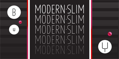
- Lust Slim by Positype,
$50.00 Check out the new Lust Pro & Lust Pro Didone to see how the series has grown and evolved. Confident and versatile, Lust is an exercise in indulgence—an attempt to create something over the top and vastly useful. If Lust Slim seems both new and familiar, that’s because it is. The series unapologetically channels Herb Lubalin, but produced with a deliberate, contemporary twist. There is an intentional slyness infused in the letterforms—the extreme thick and thin lines flow effortlessly without becoming gratuitous. It’s always just enough, not too much. What makes the type series so appealing? The curves. When asked to describe the letterforms, most people unwittingly allude to the human form, using adjectives usually reserved for describing physical traits… creating all-too-familiar comparisons. Summerour has grown to accept this as unavoidable and reasonable given his acknowledgement of its influences and has provided nuances within the letterforms to accentuate that. Intended to be set large, the typeface has both Standard (Lust, Lust Didone and a single unified Italic) and Display variants making it perfect for editorial use and a flexible solution for any display need.
 - Slim Pro by WAP Type,
$25.00 This font is stylish, clean, clear, firm and still looks luxurious. Slim Pro is a fine and all round sans serif font. No matter the topic, this font will be a genuine asset to your fonts’ library, as it has the potential to elevate any creation. Slim Pro is a modern and futuristic sans serif font. The combination of futuristic and geometric elements renders a modern design.
 - Crescent Slim by Letterhend,
$19.00 Introducing, Crescent Slim, A sophisticated ligature serif from us. This typeface has been made carefully to make sure its premium quality and luxury feel. The ligatures makes this typeface unique and stands out rather than the regular serif font, very suitable for logo, headline, tittle, and the other various formal forms such as invitations, labels, logos, magazines, books, greeting / wedding cards, packaging, fashion, make up, stationery, novels, labels or any type of advertising purpose. Features : numbers and punctuation multilingual ligatures alternates PUA encoded We highly recommend using a program that supports OpenType features and Glyphs panels like many of Adobe apps and Corel Draw, so you can see and access all Glyph variations.
 - Magie Slim by Eurotypo,
$48.00 Magie Slim is a handwritten font with a strong informal and expressive character to use together with Magie. It has the peculiarity of being able to combine uppercase and lowercase letters in the same word or in capital letters. It has OpenType features such as stylistic and contextual alternates, swashes, ligatures, initial and terminal forms, up to seven stylistic sets per letter (in uppercase and lowercase). We also include catchwords and ornaments. Imagine the amount of combinations you might do giving your text freshness and naturalness without equal! Magie Slim has a Central European language support to fit your design. This font looks beautiful on wedding invitations, greeting cards, logos, posters, labels, t-shirt designs, logos, business cards and is perfect for use in ink or watercolor works, fashion, magazines, packaging and food menus, children's books and whatever your imagination contains! Magie Slim was created to give a more youthful, expressive and casual look to your project!
 - Quan Slim by Typesketchbook,
$40.00 The typeface of Quan Slim is based on the successful Quan font family by font foundry Typesketchbook. Font designer Chatnarong Jingsuphatada created Quan Slim as a condensed version to Quan. Both type families consist of eight weights plus obliques and additional rounded versions. Quan Slim’s typeface has a clean and modern sans serif appearance. This modern geometric font is very legible and can be used for headlines as well as small and long text.
 - Slim Kim by Wiescher Design,
$39.50 Slim Kim is the sister font of Julienne. It mixes perfectly with Julienn. So whenever you need an especially slim serif font this is it! Slim Kim has very spiky serifs, so I did not want to make an extra-slim version. Enjoy this spiky font, your Gert Wiescher.
 - Slim Pickens by Dear Alison,
$19.00Have you ever seen lettering that you can connect with but have no clue where you've seen it before? It strikes a chord with certain feelings but you don't know why. Slim Pickens was inspired by the lobby card and poster titling from the 1949 Doris Day film "My Dream is Yours", and keys into the look and feel of vintage handwritten film poster titling. Something about that era in film made it easy to tie visuals with getting swept up in all sorts of emotions, good and bad. A narrow font, full of life and wonderfully hand-drawn, Slim Pickens is an accent font you'll want to have in your font collection for those tight fits, so buy it today and fill in the gaps of your designs with a little nostalgia! - Quite Animated JNL by Jeff Levine,
$29.00 Quite Animated JNL is based on hand-lettered Art Deco titling for a 1930 advertisement promoting a group of Columbia Pictures cartoons featuring George Herriman's "Krazy Kat". Available in regular and oblique versions.
 - Be Quite Duration by Absonstype,
$21.00 Be Quite Duration is the Unique Serif display typeface with combine uppercase and lowercase looks and feel nice balanced. Provide with alternates and ligatures font in variant style make the design letter looks nice. Honestly it works perfectly for headlines, logos, posters, packaging, T-shirts and much more. Recommended to use in Adobe Illustrator or Adobe Photoshop with opentype feature. Ligatures feature is default setting in Adobe Illustrator or Adobe Photoshop in Uppercase character. So when you want not to use the ligatures. Open glyphs panel : In Adobe Photoshop choose tool Window >> Character and then please click fi symbol In Adobe Illustrator choose tool Window >> Type >> Open Type and then please click fi symbol How to access Alternates Character? Open glyphs panel : In Adobe Photoshop choose tool Window glyphs In Adobe Illustrator choose tool Type glyphs If you have questions, just send me a message and I’m glad to help. Have a great day, Absonstype


Page 1 of 116Next page