10,000 search results (0.027 seconds)
  1. AT Move Quipo by André Toet Design, $39.95
    QUIPO is a typeface based on my recent survey (Freeflow) on hand drawn logotypes used by American and English pop groups in the 60-70s. We thought it an interesting project and a free flow exercise to design this particular font just in capitals and well... yes it’s rather ‘bulky’. Needless to say it comes with numbers and the normal punctuations ! Concept/Art Direction/Design: André Toet © 2017
  2. AT Move Billiard by André Toet Design, $39.95
    BILLIARD was born from the numerous sketches André Toet did for the design of a series of postage stamps in 2011. It’s a capital monospaced and ‘fun’ alphabet, based on the classic billiard play with two white and one red ball. Actually snooker and pool were derived from this rather old sport! In Europe it used to be a sport played by elderly people, practiced in traditional bars, including the smell of beer and the at that time prevalent smell of cigarettes and cigars. These days billiard, snooker and pool are quite popular once again with young people. Hopefully our new font will get the same attention the ‘old sport’ deserves and who knows it might even be used in a sportive way. Concept/Art Direction/Design: André Toet © 2017
  3. AT Move Strano by André Toet Design, $39.95
    STRANO Like the name indicates it’s a strange typeface. Just capitals (including punctuation marks and numbers), composed from early sketches for a corporate identity in 2005 by André Toet. The complete font was restyled and translated to a Monospaced version. It’s a quite versatile font: it can be used in a lot of different cases, not only in print but also in architecture and street furniture. Think about lettering on benches, bridges, buildings. Concept/Art Direction/Design: André Toet © 2017
  4. AT Move Artu by André Toet Design, $39.95
    Artù ! Strano ma vero, strange but true. A beautiful, intelligent and lively Italian dog and a great friend, unfortunately no longer among us ... but his memory lingers. A typeface designed in Rosennano (Tuscany), its Italian, but executed in Amsterdam. This monospace typeface might prove to be extremely useful for household products like washing powder or any anything like that. Just use it in your designs, let it live! Concept/Art Direction/Design: André Toet © 2017
  5. AT Move Tremelo by André Toet Design, $39.95
    TREMELO a typeface based on a logotype (Microtel). We designed it as a complete capital alphabet. The original idea for the logotype font came from the products the firm produced. They provided the parts that go into hearing-aids. We thought the type should have some visual tremor in it. Concept/Art Direction/Design: André Toet © 2017
  6. Tipo Movin CDMX by Ixipcalli, $-
    La versión propuesta por la SEMOVI (Secretaria de Movilidad) es un estilo más angosto y ortográfico, creadó con la finalidad de aligerar las aplicaciones tipográficas del sistema. Se emplea oficialmente en todas las aplicaciones del sistema de Movilidad Integrada de la Ciudad de México. El creador de la tipografía es Lance Wyman. En esta edición, los tipos minúsculas son una adaptación “no oficial” para el Tipo Movin CDMX, enriqueciendo la tipografía a un estilo visual de altas y bajas, por lo que se prescinde del diseño base como trabajo propio para enfatizar los tipos minúsculas exclusivamente, además de que se han añadido algunos caracteres de acentuación extendiendo su uso a otros lenguajes. Los tipos son una nueva propuesta por Ixipcalli en el presente año 2023. The version proposed by SEMOVI (Secretary of Mobility) is a narrower and more orthographic style, created with the purpose of lightening the typographic applications of the system. It is officially used in all the applications of the Integrated Mobility system of Mexico City. The creator of the typeface is Lance Wyman. In this edition, the lowercase types are an “unofficial” adaptation for the Tipo Movin CDMX, enriching the typography to a visual style of highs and lows, so the base design is dispensed with as my own work to emphasize the lowercase types exclusively, In addition, some accentuation characters have been added, extending their use to other languages. The types are a new proposal by Ixipcalli in the current year 2023.
  7. Moving Van JNL by Jeff Levine, $29.00
    Moving Van JNL is a classic sign painter's block Roman with angled [instead of rounded] corners and slab serifs. This style of lettering was most popular in the 1920s and 1930s.
  8. AT Move Bloggy by André Toet Design, $39.95
    BLOGGY designed in 2010 by André Toet. In the series of typefaces that were created by our team, BLOGGY stands out as a rough typeface based on a grid. Within this square grid the typeface is enlarged and reduced in size in order to create a dazzling font. A complete ‘extra alphabet’ was added to the font by cutting the letters diagonally. To us typedesign doesn't only mean designing fonts for books but also advertising, posters, film or digital use. We hope that BLOGGY will do the trick ! Concept/Art Direction/Design: André Toet © 2017
  9. AT Move Herengracht by André Toet Design, $39.95
    HERENGRACHT (Patricians' Canal or Lord’s Canal) is the first of the three major canals in the city centre of Amsterdam. The canal is named after the heren regeerders who governed the city in the 16th and 17th century. The most fashionable part is called the Golden Bend, with many double wide mansions, inner gardens and coach houses on Keizersgracht. Former bureau of André Toet (SO)Design was situated there for over 32 years, it was about time to name one of our fonts to: HERENGRACHT. Concept/Art Direction/Design: André Toet © 2017
  10. VelvetQuilt Display font - Personal use only
  11. Kick The Font - Personal use only
  12. Kawaii Food Font - Personal use only
  13. BILLY ARGEL FONT - Personal use only
  14. FC Basic Font - Unknown license
  15. A Charming Font - Personal use only
  16. el&font gohtic! - Unknown license
  17. <El&Font! Brush> - Unknown license
  18. El&Font Tag! - Unknown license
  19. Simpsons Mmmm...Font - Unknown license
  20. HELLO WEEN FONT - Personal use only
  21. National First Font - Unknown license
  22. (el&font BLOCK) - Unknown license
  23. 20th Century Font - Unknown license
  24. The Go Font - 100% free
  25. My Left Font - Unknown license
  26. Failed Font 2 - Unknown license
  27. nya-memo Font - Unknown license
  28. Tour de Font - 100% free
  29. Sonic Mega Font - Unknown license
  30. T-piyo Font - Unknown license
  31. KISS My Font - Unknown license
  32. The Real Font - Unknown license
  33. Ste-ani Font - Unknown license
  34. The Guru Font - Unknown license
  35. Petit-w Font - Unknown license
  36. Xmas Font Dingbats - Unknown license
  37. KR Font Fishin - Unknown license
  38. KR Font Sleigh - Unknown license
  39. Serenity Font Duo by Nicky Laatz, $18.00
    An elegant duo of fonts and floral illustration extras - designed to work together in harmony, to produce a plethora of beautiful, sophisticated & feminine designs. The luxurious modern calligraphy script works perfectly together with the delicate hand-drawn florals - ideal for elegant branding projects, greeting cards, packaging, social media, logo design and of course, wedding invitations. Also included is Serenity Serif, a rustic serif font, with a touch of imperfection as you'd find in old printed press inks - to contrast with and therefore compliment the more refined luxurious contemporary flow of the script font . Serenity Script includes handy OpenType features that makes the font look more natural - it includes a universal beginning swash for lowercase letters , a full set of lowercase letters with ending swashes, a beginning swash that can be added via OpenType Ligatures by typing either { } or ( ), and a full set of alternate lowercase letters , as well as 70 beautifully crafted ligatures . A more slanted, and heavier version of the script is also included for you. OpenType capable software is required to access these features - The most popular of which is and Photoshop CC, any version of Illustrator, Indesign, Word (new versions).  The Serif font comes in 4 versions: Regular, Bold, Heavy and Italic - when used together with different tracking settings and weights, they produce beautiful looking type designs to compliment the Script.
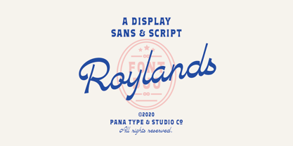
  40. Roylands Font Duo by Panatype Studio, $9.00
    Royland Font Duo is a mathing pair of fonts, inspired by a simple yet elegant vintage graphic design, carefully crafted, and opentype features to support is perfect for graphic design needs.
Looking for more fonts? Check out our New, Sans, Script, Handwriting fonts or Categories
abstract fontscontact usprivacy policyweb font generator
Processing