10,000 search results
(0.023 seconds)
- Undergrad by Thomas Käding,
$10.00 This font began its life as a project to design a T-shirt for a student group on a large midwestern university. It has now grown up into a unicode font, including Greek and Cyrillic. It has that look and feel of the T-shirts that are ubiquitous on the campuses of colleges and universities over the world. It would make an ideal tool for designing them, as well as posters and banners. Characters in these fonts include Latin, for English and other European languages; small a and c for names like MacDonald; many fractions, including 0/3 needed in baseball; Latin with diacritical marks for Eastern and Western European, Turkish, and Baltic languages; thorn, eth, cedilla, AE, OE, and sharp S for French, German, Icelandic; Latin extensions for clicks of some African languages; Greek (with tonos); Cyrillic for Russian and many other Slavic and Asian languages that use it; most Runes (the full Futhark plus a few more); six-point Brialle; currency symbols for dollar, cent, pound, yen, euro; and a few other extras like the peace sign. Available styles are regular block letters, outlines, and bold.
 - Marujo by PintassilgoPrints,
$15.00 Marujo is a highly decorative typeface inspired by painted pieces of Arthur Bispo do Rosário, a striking Brazilian artist who lived for 50 years in a psychiatric institution. Besides its spirited Regular and Light cuts, Marujo family brings nifty eye-catching variations adorned with dots and stripes. It also brings complementary fonts to spice things up even more: there are 2 shadow options and yet a picture font packed with doodles, mostly on nautical subjects (which are strongly present on Bispo do Rosário, a former seaman apprentice.) Bispo do Rosário's works employs a multitude of materials and are often very intricate. Words are everywhere, painted or embroidered at most. He produced a vast amount of works, and is now - posthumously - widely recognized in Brazilian art scene. The psychiatric institution in which he lived is now a museum dedicated exclusively to his work. Marujo draws inspiration not only from Bispo's works, but also from this man's potency, a persistent man who produced amazing art locked in such a tough environment for a life-long. Marujo fonts are positively adventurous and will safely navigate through a sea of feelings, reaching free spirits everywhere. To navigate is precise...
 - Pedrita by PintassilgoPrints,
$24.00 Sometimes you want to go unnoticed, sometimes you don't. This font is definitely for the second option. Pedrita is a generous type, a bit bold, somewhat showy, quite authentic. When you need that extra-something, go with caps and turn on the stylish interlocking pairs: added eye-catchingness guaranteed. And let the good times roll!
 - Pukupuku by yamayama,
$20.00 Pukupuku is a cute round font. This font is designed based on the shape of clouds and beans, which looks somewhat like handwritten letters.
 - Illinoise by Just in Type,
$18.00Illinoise is a mutation of one of the most beautiful screen fonts ever. But, there are no straight lines. Everything is shaking. Let's party! - Limine by TeGeType,
$29.00 The Limine family was designed to give a 3D effect; to look like engraved letters. Those letters are based on the roman capital design.
 - Decomic Oblique by Volcano Type,
$19.00 Decomic Oblique is one of the handmade fonts of illustrator Paul Hoppe who lives in New York. The font was digitized by Boris Kahl.
 - TT Frantz by TypeTrends,
$24.00 Useful links: Using the variable font in Illustrator Working with a variable font in Photoshop TT Frantz is an experimental variable font, distinguished by its slimness and lightness. The variation in the font affects the change in the height of the mean line - by moving the axis adjustment slider you can easily raise or lower the mean line of the font. In TT Frantz, you can find small references to the art deco aesthetics, which are expressed in significantly lowered or, conversely, heightened waist of the letters. In addition, depending on the position of the axis adjustment slider, the closedness of the aperture changes for some letters. In order to preserve the main feature of the font—the change in the height of the main line—we made lowercase characters as tall as uppercase ones, but at the same time we kept small kerns. An interesting fact is that in Cyrillic letters з с а е, the variability of the aperture follows a different scenario in comparison with their Latin sisters. When working on TT Frantz, we tried to make it so that when changing the variability, the width of the characters would not change, and the font would remain monospaced. And in order to avoid holes in the set, we made contextual alternates and several ligatures. Frantz consists of 470 glyphs, and in addition to broad language support (Latin and Cyrillic) it can offer standard and old-style figures, including their tubular versions, as well as ligatures. Important clarification regarding variable fonts. At the moment, not all graphic editors, programs and browsers support variable fonts. You can check the status of support for the variability of your software here: v-fonts.com/support/ But do not despair—even if you do not have access to the necessary software, you still have the opportunity to use TT Frantz in your projects. Especially for you, we have prepared three separate non-variable styles (Frantz A, Frantz B, Frantz C), each of which is responsible for a certain location of the mean line of the font and where this line is already fixed in a certain position (high, medium and low).
 - OakPark by Ingrimayne Type,
$9.00 OakPark is a decorative or display family with an Art-Deco feel. It has high contrast with very thick stems that invite decoration. Eight members of the family have interior decoration and can be used individually or in layers over the regular style and under hollow style to create colorful text displays. These ten members are all-caps, but about half of the letters on the lower-case keys differ in some way from their counterparts on the upper-case keys. There is also a shadowed style and it can be layered with a shadowinside style. Completing the family are a style that has true lower case characters with an accompanying italics, and a style that has small caps on the lower-case keys.
 - Santoria by Maulana Creative,
$14.00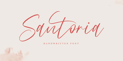 Give your designs an authentic handcrafted feel. "Santoria Font" is perfectly suited to signature, stationery, logo, typography quotes, magazine or book cover, website header, clothing, branding, packaging design and more.
 - Karstar by Maulana Creative,
$12.00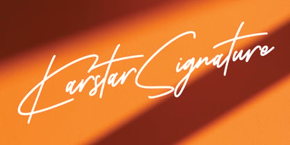 Give your designs an authentic handcrafted feel. Karstar Signature is perfectly suited to signature, stationery, logo, typography quotes, magazine or book cover, website header, clothing, branding, packaging design and more.
 - Always Good by Seemly Fonts,
$12.00 Always Good is a brand new handwritten font perfectly suited for stationery, logos, t-shirts, paper, print design, website headers, photo frames, flyers, music covers, posters, image sliders, and more.
 - Oturllis by Maulana Creative,
$14.00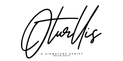 Give your designs an authentic handcrafted feel. "Oturllis Signature" is perfectly suited to signature, stationery, logo, typography quotes, magazine or book cover, website header, clothing, branding, packaging design and more.
 - Retro Signature by Nirmana Visual,
$19.00 Retro Signature a classy, contemporary of script font, inspired by 1980’s and neon lights. Ideally suited for advertising and packaging, festive occasions, editorial and publishing, creative industries and posters .
 - How Lovely by Seemly Fonts,
$14.00 How Lovely is a brand new handwritten font perfectly suited for stationery, logos, t-shirt, paper, print design, website header, photo frame, flyer, music cover, poster, image slider, and more.
 - Magwey by Hazztype,
$24.00 Magwey is a fun and friendly retro groovy font, with experimental ink traps. suit for magazine cover, brochure, logos, Headlines or Quotes, Stand alone displays, and short paragraphs or contents.
 - Ashery by Viswell,
$16.00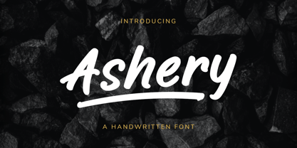 Ashery is a handwritten font, made with a natural marker brush. This font will be suit for your design project such as branding, logo design, packaging, quotes, and many more.
 - ND Gestalt by NeueDeutsche,
$9.00 If you watched ND Gestalt glitter in the dark near the Tannhauser gate. You know all these sans serifs will be lost in time, like tears in rain… If you like circles you will like ND Gestalt just as much. The unconventional stem to counter bridge in the lowercase gives this one its rather unique appeal. Fonts like this are unlike any other font – they’re either a benefit or a hazard. Beware!
 - Shed Light by Olivetype,
$18.00 Shed Light is not your average brush font - it's a bold and dynamic typeface that could add a touch of coolness to any design. With its unique texture, every letter seems to come to life on the page, creating an eye-catching visual experience. Whether you're designing a poster, crafting headlines, or working on branding materials, this font is here to make your text stand out from the crowd. Thank You.
 - Uniform Italic by Miller Type Foundry,
$25.99 Now Uniform comes in Italics! Uniform is a multi-width geometric type family designed around the circle. The O of the Regular width is based on a circle, the O of the Condensed width is based on 1.5 circles stacked (with straight sides) and the O of the Extra Condensed width is based on two circles stacked with straight sides as well, and all other characters are derived from this initial concept. This unique idea creates a remarkably fresh type family that bridges the gap between circular geometric typefaces and condensed straight-sided typefaces. Uniform also includes many opentype features like Old Style Figures, Tabular Lining Figures, Alternate characters, Ligatures and more. Uniform was first drawn starting with the Black weight. This careful process allows each character to look consistent and balanced through all weights. As a result, the typeface does not ‘break down’ or lose its form in the boldest weights like many typefaces do. The three widths of Uniform Italic make an ideal type family for a host of various uses. From branding to web design, book covers to signage, Uniform is a very versatile solution to complex typographic needs.
 - Uniform by Miller Type Foundry,
$25.99 Uniform is a multi-width geometric type family designed around the circle. The O of the Regular width is based on a circle, the O of the Condensed width is based on 1.5 circles stacked (with straight sides) and the O of the Extra Condensed width is based on two circles stacked with straight sides as well, and all other characters are derived from this initial concept. This unique idea creates a remarkably fresh type family that bridges the gap between circular geometric typefaces and condensed straight-sided typefaces. Uniform also includes many opentype features like Old Style Figures, Tabular Lining Figures, Alternate characters, Ligatures and more. Uniform was first drawn starting with the Black weight. This careful process allows each character to look consistent and balanced through all weights. As a result, the typeface does not ‘break down’ or lose its form in the boldest weights like many typefaces do. The three widths of Uniform make an ideal type family for a host of various uses. From branding to web design, book covers to signage, Uniform is a very versatile solution to complex typographic needs.
 - Junkwerk by PizzaDude.dk,
$20.00 Junkwerk is my heavy metal grunge font! It has got that feel like something that was stamped on, jumped on, shaken and headbanged for hours...just like how you would feel after hours of heavy metal! Comes with different upper- and lowercase letters, alternate letters and ligatures for both double letters and double numbers - and ofcourse it has got unique accented letters! You will need to use OpenType supporting applications to use the ligatures.
 - Braga Huis by Juru Rancang Studio,
$15.00 Braga Huis typeface is a font family that is inspired by the famous street in Bandung that was made to embodies the atmosphere and the environment of Netherland-Indie city at its golden time, whereby all the elements were designed to give the impression of structural, artistic, and advance. Braga Huis typeface has a strong Art Deco character, where the impression is depicted from the strong lines, curvy passion so it is very appropriate to describing the future atmosphere from the perspective of the 19th century. Braga Huis typeface has 3 font styles consisting of uppercase, lowercase and various alternative options that can be customize to your taste, poster is one of the media form of presentation that we believe is very appropriate for this type of font. But whatever the medium is, honestly we say; using Braga Huis typeface will make your artwork will never be cracked by time.
 - Slim James JNL by Jeff Levine,
$29.00Tall, condensed and square in shape... Slim James JNL balances well against bolder Deco-style sans or novelty type faces. - TOMO Astoria by TOMO Fonts,
$10.00 TOMO Astoria is a handmade typeface with clear Art Deco roots. Ideal for illustrative posters and subtle details. Have fun!
 - Brookhurst JNL by Jeff Levine,
$29.00Brookhurst JNL has strong Art Deco influence, and features an ultra-compressed width to set copy into a tighter space. - Nature Boy by Adorae Types,
$20.00 Nature Boy was born in a fantasy world of old, where you can find magic, elegance, dreams and fun all together... just like nature in its purest form with its leafy curves and shapes that make it peacefully enjoyable. Soft and simple yet fairly ornamental, attributes that create an enchanting atmosphere but keep the texts legible at the same time when combined. Nature Boy can bring life and magic to every design, from editorial to posters, brands and packagings. Just picture this font on any product intended to move your soul and take you on a journey into a different and most beautiful place and time and let the adventure begin. This font family is made up of optically corrected regular, italic and bold types. All of them contain functional ligatures with alternative glyphs for texts and words to be dynamical and fluently graphed.
 - RANXEROX - 100% free

- Kardust by ARToni,
$9.00 Kardust is geometric basic typeface with smooth touch of rounded corner. It is based on single line brings consistent width and character on each style. Each style is crafted separately without auto transformation to maintain the consistency as well as the characteristic itself.
 - Square Dance by Solotype,
$19.95Animated types like this one have been around for fifty or more years. They certainly add a sense of liveliness to a headline. This one trades upon the "wrong way weights" of the old French Clarendon. Think of it as Barnum with Bounce. - Flabioga by PizzaDude.dk,
$20.00Flabioga may look like your every day stencil font - but it's not. It contains two sets of letters, one for uppercase and one for lowercase + ligatures for double letters and numbers! You will need to use OpenType supporting applications to use the autoligatures. - Brandold by Krisp Designs,
$18.00 Brandold is based on the repetition of one shape, the equilateral triangle. Using these triangles as pixels I built a medieval-like font that looks new, but follows an old aesthetic. I chose to make this font because I hadn’t seen anything similar.
 - Woodhaven Initials JNL by Jeff Levine,
$29.00 Woodhaven Initials JNL were designed using an outline cast shadow wood type set against a rectangle with horizontal "engraving" lines to add background texture to the initials. An ampersand is on the corresponding keystroke, and a blank rectangle is on the period key.
 - FiftiesHollow - Unknown license

- Nuclear Standard by Zang-O-Fonts,
$25.00Strong, hard lines inspired the name of this font, based on the "nuclear standard" set by the U.S. and the Soviets during the cold war. - Papercute Inline by S&C Type,
$9.00 Papercute Inline is a cute layered hand-drawn font designed by Fanny Coulez & Julien Saurin in Paris. Inspired by paper cutting, this font is easy to read, and easy to play with 8 different styles, including 3D, outline, full or dotted line, that you can use alone or together. To do so, you can simply superimpose them with a compatible software like Photoshop, then choose a color for each, making your works charming and unique. This font, finely designed for cards, book titles, headlines or any artworks is the Inline version of Papercute . Just click on our foundry name to see it! You could follow us on our Instagram: instagram.com/sc.type We hope you will enjoy our work. Merci beaucoup!
 - Kavitta by Pixesia Studio,
$23.00 Introducing Kavitta - Modern Clean Serif Kavitta is a modern and classic serif typeface that exudes nostalgia and elegance in equal measure. With its clean lines and bold strokes, Kavitta offers a touch of luxury and sophistication to any design project. Its fancy and retro look make it the perfect choice for creating eye-catching headlines, logos, and branding materials. Whether you're designing for print or digital media, Kavitta is the ideal choice for any project that requires a touch of vintage charm and modern aesthetics. FEATURES - Stylistic Alternates - Ligatures - PUA Encode - Uppercase and Lowercase letters - Numbering and Punctuations - Multilingual Support - Works on PC or Mac - Simple Installation - Support Adobe Illustrator, Adobe Photoshop, Adobe InDesign, also works on Microsoft Word Hope you Like it. Thanks.
 - Lexington by Canada Type,
$24.95A revival and major expansion of a 1926 Ludwig Wagner Schriftgiesserei typeface called Titanic, Lexington is the ultimate art deco expression of the high times of signage and theater during the first half of the twentieth century. Big feminine caps and cozy direct minuscules make for a unique combination rarely found in other deco faces. Topped off with the humorous and quite suave tall and pointy ascenders and descenders of the alternates, Lexington makes for a versatile and uniquely eye-catching display face beneficial to poster art, book covers, classy menus, product packaging and music paraphernalia. The original specimen Hans van Maanen worked from showed the majuscules, minuscules, figures, and 4 alternates of some ascending minuscules. This new digital version includes all of the above, plus many more additions: - Plenty more alternates, for some caps as well as for all the ascending and descending lowercase. - Three different size variations for the comma and the period. - Oldstyle figures. - A full complement of accented characters to support more Latin-based languages than ever, including Baltic, Celtic, Turkish, and Central/Eastern European languages. - A Handtooled style variation that covers both the main character set and the alternates. Lexington was named after Manhattan's Lexington Avenue, home of the some of the most famous and polished art deco architecture of the 1920s and 1930s. Lexington and Lexington Handtooled come in all popular font formats. The OpenType versions combine their respective alternates with the main character sets, for ease of use within OpenType-savvy applications. - LGF Besitos Square by LGF Fonts,
$18.00 BESITOS is a deconstruction INSPIRED on a sans serif type, in which the weights of the source did not mark the width of the letter but the lines that compose it is made in two variants according to their lines end up at right angles or curves.
 - LGF Besitos Round by LGF Fonts,
$18.00BESITOS is a deconstruction INSPIRED on a sans serif type, in which the weights of the source did not mark the width of the letter but the lines that compose it is made in two variants according to their lines end up at right angles or curves.

