10,000 search results
(0.029 seconds)
- Lonear by Liartgraphic,
$22.00 Introducing our latest product, we call this product the Lonear serif font Lonear is a modern type font With a unique and firm touch Lonear hight font is great to use on: fashion magazines, logos, photography, landing pages, flyers, social media and so on What's included - Lonear font - multilingual support - alternatives - ligatures Thank you, best regards Liarttyype
 - Raker by Wordshape,
$20.00 Raker is a science fiction-inspired geometric sans serif text typeface family with a humanist influence and solid spacing/kerning. Regular, Display, stencil, and display stencils versions are included. Think NASA. Think the Space Race. Think Geometric. Think “works with text, too.” Detailed spacing, Western and Eastern European language support, and automated ligatures. Think hidden glyphs.
 - LD Franks Friends by Illustration Ink,
$3.00Do the Monster Mash with DB Frank's Friends! Makes great Halloween party invitations, spooky adornments or fun additions to any scrapbook project. LD Frank's Friends Distressed is just in time for Halloween! This spookified font and it's distressed style makes it perfect for your Halloween party invitations, journaling, or adding a nice touch to your scrapbook pages. - Mislab Std by Typofonderie,
$59.00 A brighter slab n’ sans in 18 styles Referred to as Egyptian’s in the early years of the nineteenth century, today slab serifs are primarily used in display sizes but seldom used in body text. With Mislab, Xavier Dupré has designed a brighter and more legible slab serif than most. Mislab aptly combines the strength of a slab serif with the lightness of a sans serif. Bold and thick serifs make for strong impact in display uses while performing extremely well under the most stressful body text conditions. A slight cursive feel adds spice to the text while its delicate rounded rectangular structure is naturally adapted to screen displays. The capitals have fully assumed serifs while the lowercases have more discreet versions. Notable features include sanserif endings on the lowercase a, c, e & s, inducing fluidity and enhanced readability. This highly versatile typeface brings clarity to headlines. Mislab will provide foolproof stability to your layouts. Mislab, a new design by Xavier Dupré Type Directors Club 2014 Tokyo TDC 2014 Communication Arts Typography Awards 2014 Club des directeurs artistiques, 45e palmarès Slanted: Contemporary Typefaces #25
 - The Overspray font, developed by Michael Tension, is a vivid embodiment of artistic freedom and dynamic expression. It stands out for its ability to capture the spontaneous, rebellious spirit of stre...
- Tiki Tangle by Shakira Studio,
$19.00 Introducing Tiki Tangle - A Decorative and Classic Font Full of Retro Fun! Tiki Tangle is the answer for designers looking for a retro touch and uniqueness in their designs. This decorative font captures the retro fun that's all the rage right now, creating a balance between nostalgic memories of the past and timeless uniqueness. Each letter in Tiki Tangle is a work of art in itself, embracing a cute and unconventional retro aesthetic. Suitable for designers who want to add a touch of uniqueness to their projects, in line with contemporary design trends. With Tiki Tangle, you have the creative freedom to turn your designs into eye-catching works of art. Whether you're designing a classic poster, eye-catching product labels, or unique social media graphics. Here's what you get: Regular and Italic Version All Multilingual symbol Opentype features ( ligature, alternate ) Accessible in the Adobe Illustrator, Adobe Photoshop, Adobe InDesign, even work on Microsoft Word. PUA Encoded Characters - Fully accessible without additional design software. Multilingual character supports : (Afrikaans, Albanian, Catalan, Croatian, Czech, Danish, Dutch, English, Estonian, Finnish, French, German, Hungarian, Icelandic, Italian, Lithuanian, Maltese, Norwegian, Polish, Portuguese, Slovenian, Spanish, Swedish, Turkish, Zulu) Follow my shop for upcoming updates, and for more of my work, Thank you!
 - Casual Deco JNL by Jeff Levine,
$29.00 The hand lettered sans serif title on the1931 sheet music for “(Potatoes are Cheaper-Tomatoes are Cheaper) Now’s the Time to Fall in Love” presented another opportunity to create a typeface from the wealth of unusual alphabets found on the covers of vintage and antique song sheets. However, it seems that even as late as the 1930s, song writers had the urge to pen long-worded titles for their musical compositions. This thirteen word verbal excursion became the model for Casual Deco JNL, which is available in both regular and oblique versions.
 - Hughoney by Arterfak Project,
$17.00 Introducing our new exploration of a brush font, Hughoney . This freestyle script font is created by creative randomization the letter shapes. Gives minimalist, sweet, elegant and solid looks to your creative projects. This font has a lot of feature that you can apply as you need. The features in this font have a consistent adjustment with the basic letters. This sweet brush font is suitable for your poster, quotes, t-shirt design, menu, product design, invitation, etc. Very recommended for Headline or your display. We hope you are interested.
 - Andeeta by Tlatous Type,
$19.00 Andeeta! A sweet handwritten font that will add fun to your creativity. the font consist of a charming all-caps font and a sweet handwritten script font for the perfect and fun blend of your content. Andeeta has also added 26 doodles to add interest to your content in separate files. Each font file includes uppercase, lowercase, numbers, punctuation, and multilingual support. That's it! I hope you enjoy it. Feel free to comment if there are issues or queries. You can also say hi to me on Instagram: https://www.instagram.com/tlatoustype/ Thank You!
 - Guilty Pleasure by Hanoded,
$15.00 Some time ago, my kids asked me what kind of sweets I really liked. To be honest, I don’t actually like sweets at all - never have, never will. BUT… you can wake me up for chocolate and ice cream! Those are my guilty pleasures! Guilty Pleasure is a handmade font. I used China Ink and a brush to create all the glyphs. Guilty Pleasure is a very distinct display font. I recommend you use it for your ice cream or chocolate packaging… but that, of course, is entirely up to you!
 - Greenaway Mignonettes by Wiescher Design,
$29.50 Kate Greenaway was a very famous British (1846-1901) author and illustrator of childrens books. Her books were an outstanding success in English publishing during the Victorian period. Recently I found these sweet Mignonettes in an old foundry specimen book. Mignonettes is derived from the French word "mignon" which stands for lovely, charming, sweet, delightful, pleasant and that does exactly describe these little drawings. I already published a Kate Greenaway's Alphabet a couple of years ago. So here is my second installment. Yours, Kate Greenaway fan Gert Wiescher
 - Supaduper PB by Pink Broccoli,
$16.00 Supaduper PB is a font inspired by some wonderfully funky hand-lettered greeting cards from the 1980's. The delightfully awkward and animated playfulness of this lettering style was maintained throughout the fleshing out from the original specimens - and I think you're going to have a lot of fun typing with this. Even if you haven't seen these old greeting cards, the lettering style has a familiar visual to it. Bring back a little nostalgia, add a little wonkiness, or just have fun typing with Supaduper PB today!
 - Marsha & Joshua by Tlatous Type,
$19.00 Marsha & Joshua! A sweet handwritten font that will add fun to your creativity. the font consist of a charming all-caps font and a sweet handwritten script font for the perfect and fun blend of your content. Marsha & Joshua has also added 26 doodles to add interest to your content in separate files. Each font file includes uppercase, lowercase, numbers, punctuation, and multilingual support. That's it! I hope you enjoy it. Feel free to comment if there are issues or queries. You can also say hi to me on Instagram: https://www.instagram.com/tlatoustype/ Thank You!
 - Zeitung Pro by Underware,
$50.00 Zeitung is a sans serif family which works equally well on print and web. First of all: Zeitung is a sans serif made according to contemporary standards: 8 weights, romans and italics, all equipped with small caps. Lots of OpenType features, like uppercase punctuation or 5 figure styles to make sure any of your mathematical or financial charts, tables and diagrams look cool. Zeitung’s typographic palette focuses on utility and legibility, but in the farthest corners you’ll discover a rich array of flavours: punchy black weights, fashionable thin styles, carefully hand crafted true italics, distinct small caps. But Zeitung has more to offer. Its optical sizes offer the best style for each size of your text. Zeitung fonts are devided to two optical families: Zeitung Standard and Zeitung Micro. Zeitung Standard works great in most sizes, while Zeitung Micro fonts are specially made for very small sizes in print and web. Zeitung Micro fonts are perfectly legible in web, where the same technical font styles have to survive in many environments, from older browsers to most up to date mobile screens. Next to that: the lightest weights also function as grades, because they share the same metrics. This can be very handy for selecting the optimal weight for your specific situation, especially on screens or when type is printed by a newspaper press. Letters are rendered in many various ways on different screens. Maybe the interface of your next app requires a different grade than your latest website? Zeitung allows you to change the weight of your text without any further consequence for the design. That is a welcome relief during the design process. Zeitung will help to bring your message across in many different circumstances, from large text in print to small type on screens.
 - Cabrito Inverto by insigne,
$- Life’s always more fun when you reverse the stress. The same goes for the new member of the Cabrito family. Cabrito itself is a recently developed slab serif made for the kid’s book The Clothes Letters Wear. Cabrito proved to be more popular than I thought, and I promised I would create an inverted style for this new addition to the font world--a variant that would pair well with the original or even stand well on its own. And so now, here it is. Cabrito Inverto, which features the reversed stress of the strokes from a font’s “normal” traits. Inverted stress fonts are most often associated with cowboys and the Old West. The inverted stress gives it a happy-go-lucky appearance, not to be taken too seriously. It’s a pleasantly rounded, not-so-strictly geometric typeface with handwriting-inspired forms. Whew, that’s a mouthful! Inverto’s bundle of alternates is accessible in any OpenType-enabled program. It contains a workforce of alternates, swashes, and alternate titling caps to embellish the font. Also bundled are swash alternates, aged design and style figures, and compact caps. Peruse the PDF brochure to examine out these solutions in action. OpenType-enabled purposes such as Adobe suite or Quark will allow ligatures and alternates. This font family also includes the glyphs for 72 different languages. Cabrito Inverto does pair well with Cabrito. There is even an extra font weight, Black, for when you want to punch it up a bit. Jeremy Dooley designed Inverto to be a welcoming, day-to-day font family. Use it to express friendliness on just about anything, from candy to food to children’s toys. Cabrito Inverto’s one-of-a-kind visual appearance brings a bundle of fun to the party. Buy Cabrito Inverto to give a boost to your designs every day of the week.
 - Contribute by Fontscafe,
$39.00 The Contribute font is one that takes you back to the days of the fountain pen. To those who are old enough to remember, fountain pens were tiresome to fill and use – but also a pleasure to own, something to cherish that became so much a part of your daily life, a symbol of etiquette and sometimes even a style statement! Our Contribute fonts will definitely remind you of that, and everything else to do with a touch of vintage class. This 30s-like font is sure to become one of your favorite cursive fonts, be it for use on a poster or a web page. This font is ideal for those situations where you need your viewer to connect on a more personal level than formal. Think ‘writing a letter rather than typing it out’, and you will know what we mean!
 - HS Almajd by Hiba Studio,
$50.00 HS Almajd is an Arabic display typeface, under “titles” category. It is useful for book titles, creative designs and modern logos. Also, it is used when a contemporary and simple look is desired that can fit with the characteristics of Kufi fatmic where horizontal parts are equal than vertical ones. The font is based on Kufi Fatmic calligraphy along with some derived ideas of decorative fonts, maintaining the beauty of the Arabic font and its fixed rates. Undoubtedly, the insertion of curved ornament in some parts adds more beauty and fascinating diversity in the flow line between sharp, soft and curved parts. This font supports Arabic, Persian, Pashtu, Kurdish Sorani, Kurdish Kirmanji and Urdu, consisting only one weight which can add to the library of Arabic Kufic fonts contemporary models that meet with the purposes of various designs for all-purpose all tastes.
 - Jim Lee by Comicraft,
$39.00 When Jim Lee sent us pages of his latest project, DIVINE RIGHT, we knew we had to do something special for him. Something Unique. We knew we had to create a whole new look for his book. We spent weeks holed up in our Colorado mountain retreat, meditating on the true nature of leading and kerning, sketching out ideas and rejecting all but the best of the best. As the dreaded deadline doom rapidly approached, we suddenly knew we had the answer: A line of 'Celebrity' fonts -- digitally remastered lettering based on handwriting samples of the many Artists and Creators we all know and love. Of course, our first font would have to be...the SAMMY DAVIS Jr font! But Jim didn't like that idea and made us create a font based on his handwriting instead. You're no fun, Jim.
 - Anaglyph by Luxfont,
$18.00 Introducing incredible COLOR ANAGLYPH font. Unique font family with anaglyph stereo effect - a novelty in the field of color fonts. Inspired by global trends in contemporary design with a touch of retro 90s, electric music and minimalistic purity of glyphs. Truly a reflection of modern POP culture. Font is ideal in entertainment design. Night club poster design, fashionable business card, website title, magazine illustration - there are countless options for using it. Font family has two thicknesses - bold & regular, 3 types of stereo effect, 2 font colors with stereo effect (black and white). Font consists of letters of the same height without division into uppercase and lowercase glyphs. This font family is based on the Regular & Bold fonts Boldini - which means that if necessary you can combine these two families and they will be absolutely stylistically identical and complement each other. Check the quality before purchasing and try the FREE DEMO version of the font to make sure your software supports color fonts. Features: Free Demo font to check it works. 36 OTF SVG fonts in the family 2 thicknesses: Bold, Regular 3 types of stereo anaglyph effect 6 font colors with stereo effect Kerning IMPORTANT: - OTF SVG fonts contain vector letters with gradients and transparency. - Multicolor OTF version of this font will show up only in apps that are compatible with color fonts, like Adobe Photoshop CC 2017.0.1 and above, Illustrator CC 2018. Learn more about color fonts & their support in third-party apps on www.colorfonts.wtf - Don't worry about what you see all fonts in black and not in multicolor in the tab “Individual Styles” - all fonts are working and have passed technical inspection, but not displayed in multicolor they, just because the website MyFonts is not yet able to show a preview of colored fonts. Then if you have software with support colored fonts - you can be sure that after installing fonts into the system you will be able to use them like every other classic font. Question/answer: How to install a font? The procedure for installing the font in the system has not changed. Install the font as you would install the classic OTF | TTF fonts. How can I change the font color to my color? · Adobe Illustrator: Convert text to outline and easily change color to your taste as if you were repainting a simple vector shape. · Adobe Photoshop: You can easily repaint text layer with Layer effects and color overlay. ld.luxfont@gmail.com
 - Cachiyuyo by MendozaVergara,
$9.99 Cachiyuyo is a bitmap font designed for screen titles and to be printed, has a large x height, is very tight and orthogonal. Cachiyuyo is meant for short texts and simple layouts. Is optimized for screen at 8px, 16px, 32px etc.
 - Hunkster by Heypentype,
$20.00 HUNKSTER is heypentype journey to simplified a stencil fonts. Simplified means it must easy and fast to cut when creating stencil art. Hence, this typeface inspired a lot from stencil arts and fonts right from the beginning of its creations. When a lot of stencil fonts out there used to create political message and self-expression, Hunkster take it beyond that. This typefaces can be applied to anything, from motorsports, branding, logo or logotype, industrial design, products packaging, software, games, website headlines,etc. Whatever it will be used, the spirit of the stencil and street art remains. Include in this typeface family is plenty of ligatures because the nature of stencil and our design aims, easy-to-cut but still beautiful. Most importantly its thrown away an image of stencil fonts bound on military themes. This ligatures will be developed in the future release along with updates on Hunkster variable fonts.
 - Chicago Ornaments by HiH,
$6.00 Chicago Ornaments is a collection of decorative cuts cast by the Chicago Type Foundry of Marder, Luse & Co. of 139-141 Monroe Street in Chicago, Illinois. This collection was shown in their 1890 Price List. According to William E. Loy, at least some of them were designed by William F. Capitain. Chicago was one of the innovative Midwest type foundries, introducing the American Point System. These designs represent the late Victorian period. After 1890, with the posters of Jules Cheret taking Paris by storm, Art Nouveau gradually began to displace Victorian style. In type design, both styles competed against each other until about the end of the century. Designers may want to consider using these ornaments when using Victorian style typefaces, like our Cruickshank, Edison and Freak - as well as faces by others such as Karnac, Kismet and Quaint Gothic. Included in the font are a set of Dormer-inspired caps, numerals and a few other glyphs - also from the Victorian period.
 - Stamen by Wordshape,
$20.00 Stamen is the answer to a big question: What would happen if one tried to create a typeface that was ‘out of time’? If a type designer was to turn off the internet and put away the type specimens and just try to explore limbic, phantom history, what might that look like? No slavish explorations of the past. No gropings toward the future. No exhaustive core sample of the contemporary. Instead, using what one remembers of history and our collective vision of the future (usually a future imagined from the past) and channeling that into something that is, hopefully, new… The Bentons meet Frutiger for a Manhattan on a space station while Matthew Carter sways to the sweet sounds of the chorale that occasionally played through the halls of Stephenson Blake. This smear of implicit history expressed without explicit reference—this is Stamen: a family of 12 typefaces with a ton of alternate characters. The bold weight was designed for the LP “I Thought the Future Would Be Cooler” ( http://ittfwbc.com/ ) by the band YACHT in response to their request for a typeface that was ‘lost in time’, and refers to neither strict historical models nor purely futuristic forms. I built a small family out from there. It works well in text, but just as well for display setting. I think you’ll enjoy using it.
 - Biblia Serif by Hackberry Font Foundry,
$24.95 This all started with a love for Minister. This is a font designed by Carl Albert Fahrenwaldt in 1929. In the specimen booklet there’s a scan from Linotype’s page many years ago. They no longer carry the font. I’ve gone quite a ways from the original. It was dark and a bit heavy. But I loved the look and the readability. This came to a head when I started my first book on all-digital printing written from 1994-1995, and published early in 1996. I needed fonts to show the typography I was talking about. At that point oldstyle figures, true small caps, and discretionary ligatures were rare. More than that text fonts for book design had lining OR oldstyle figures, lowercase OR small caps—never both. So, I designed the Diaconia family using the Greek word for minister. It was fairly rough. I knew very little. I later redesigned and updated Diaconia into Bergsland Pro—released in 2004. It was still rough (though I impressed myself). Now, with 4-font Biblia Serif family 13 years later, I’ve cleaned up, made the fonts more consistent internally, added more functional OpenType features, and brought the fonts into the 21st century. I used the 2017 set of features: small caps, small cap figures, oldstyle figures, fractions, lining figures, ligatures and discretionary ligatures. These are fonts designed for book production and work well for text or heads. Finally, in 2021, I went over the fonts entirely and remade them in Glyphs.
 - Pen Nouveau JNL by Jeff Levine,
$29.00 Pen Nouveau JNL is a perfect example of the fluid, free-form pen lettering popularized during the Art Nouveau era of the early 1900s. The type face was modeled from the lettering on the cover of a piece of sheet music from 1911 entitled "If You Talk in Your Sleep, Don't Mention My Name".
 - Modjola by Hasta Type,
$20.00 Modjola is an elegant brushed handwritten font. It looks beautiful on a variety of designs requiring a personalized style, such as wedding invitations, thank you cards, weddings, greeting cards, logos and so on.
 - Little Aliens by Sealoung,
$10.00 Little Aliens is a sweet and friendly display font. Its natural and cute style makes it incredibly fitting to a large pool of designs. This font is perfect for school and kids projects!
 - Qundeasy by Tanya Savchenko,
$12.00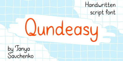 Qundeasy is a sloppy and cute handwritten font. First of all, it is suitable for handmade style design. Сan create interesting logos, posters, banners, social media creatives, postcards and greetings with this font.
 - P22 Roanoke Script by IHOF,
$24.95 Roanoke Script is a hand-written script inspired by 18th century forms. The visual effect is of a steel nib pen writing on uncalendered paper. Ideal for a few words in display sizes.
 - Mafieso by Rometheme,
$6.00 Mafieso is a fun, playful display font created for a large range of different designs. It features a sweet, cute style with bold letters, that will help you with getting your message across.
 - New Year Poster by FontaZY,
$10.00 This display font is perfect choice for the whole variety of New Year greeting cards, advertisements, posters and banners. It has alternative graphic symbols, that fills any word or line with holiday spirit.
 - North Storm Typeface by FoxType,
$50.00 Introducing North Storm Display new generation Decorative Typeface. North Storm Typeface created with the vision of to attract the audience to your brand. The finest details of this typeface are methodically and mathematically created. North Storm is created with all the tasks of a corporate font and also for the usage in a variety of projects, including branding, logos, titles, headlines, posters, screens, display, digital ads, and everything else.
 - Golden Opportunity JNL by Jeff Levine,
$29.00 The cover of vintage sheet music for "With Plenty of Money and You (The Gold Diggers' Lullaby)" from the Warner Brothers musical "Gold Diggers of 1937" had the movie title hand-lettered in a classic Art Deco style. Bold, brash and totally fun, this became the model for Golden Opportunity JNL.
 - Dirty Headline - Unknown license

- Merry Baubles by Greater Albion Typefounders,
$6.00 Merry Baubles is a set of fleurons in the form of traditional painted glass Christmas Tree ornaments. That's really all there is to say about this piece of typographic fun.
 - Jungle by Yuanchen Jiang,
$30.00 A wild yet elegant typeface designed for screen display.
 - Glossy by Volcano Type,
$19.00Glossy, a font for starlets designed by Sandra Hofacker. - Town And Country JNL by Jeff Levine,
$29.00 Town and Country JNL features a mix of block-style characters along with rounded ones found so often in the Art Deco fonts of the 1940s. Modeled from the hand-lettered title on a piece of sheet music from that era, this unusual coupling of two distinct design styles works despite it breaking all of the obvious rules of typography.
 - Gridlocker by Device,
$29.00 An isometric grid of a font, Gridlock takes an italicised modular approach to its letterforms. It is, however, not willfully strict about the application of that grid - the W and V and S, for example, have carefully considered diagonals that freely intersect the layout. More strictly designed but possibly less attractive versions are available as alternate characters.
 - Sadi Sans by Koray Özbey,
$19.00 Sadi Slab is designed to be used on small scales like book texts, newspapers, magazines etc. Also its large counters make the font suitable for digital screens. The anatomy of the typeface gives a formal appearance which is a more fitting choice for subjects like law, finance, medical science etc. Another member of Sadi family is Sadi Slab.
