10,000 search results
(0.04 seconds)
- Chicken Lovers by Almarkha Type,
$25.00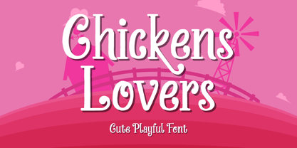 Chickens Lovers is a cute & playful display font that will make your designs look modern, unique and fun. It’s perfect for labels, quotes, posters, DIY projects, branding, packaging, greeting cards, websites, photos, photography overlays, signs, window art, scrapbooking, tags and so much more!
 - Pepita by Monotype,
$29.99 Pepita was drawn for Monotype in 1959 by Hungarian designer Imre Reiner. It is a brush script face with a lively personality, adding an impulsive feel to informal display purposes. The Pepita font is often chosen for greeting cards, menus, calendars and packaging.
 - Black Mud by Stripes Studio,
$20.00 Black Mud a new font that is brushed is very attractive with a natural, detailed and perfect texture, also has an additional Black Mud Underlines. Perfect for brand projects, logos, product packaging, posters, invitations, greeting cards, news, blogs, everything including personal charm etc.
 - Sheree by Typadelic,
$14.95 Inspired by mid-century greeting card hand-lettering, Sheree is a unique serif font with some really fun qualities. While some characters are distinctly calligraphic and conformist in nature, Sheree bounces all over the baseline, displaying an unconventional attitude all her own.
 - Belgian Chocolate by Double Z Studio,
$16.00 Belgian Chocolate Font. Carefully crafted. It is a sweet chic, beautiful, modern, and elegant script. Smoothly flowing, perfect for designing blog logo, website logo, print ads, book covers, film covers, apparel, cards, logos, posters, etc. Opentype features give you more alternatives in designing.
 - Timeless Nature by Gassstype,
$25.00 Timeless Nature - Authentic Natural Handwritten Typeface Font that will make your designs look modern, unique and fun. It’s perfect for labels, quotes, posters, DIY projects, branding, packaging, greeting cards, websites, photos, photography overlays, signs, window art, scrapbooking, tags and so much more!
 - Momotako by Almarkha Type,
$22.00 Momotako is a Cute Playful Display font that will make your designs look modern, unique and fun. It’s perfect for labels, quotes, posters, DIY projects, branding, packaging, greeting cards, websites, photos, photography overlays, signs, window art, scrapbooking, tags and so much more!
 - Kopi Arabica by Gassstype,
$22.00 Kopi Arabica is Unique Playful Display Font that will make your designs look modern, unique and fun. It’s perfect for labels, quotes, posters, DIY projects, branding, packaging, greeting cards, websites, photos, photography overlays, signs, window art, scrapbooking, tags and so much more!
 - White Secret by Just Lett,
$17.00 Whitesecret is modern script with swashes, lowercase and Uppercase alternate. So this font is beautiful on invitation cards, wedding cards, quotes, greeting cards, business cards, and more design concept. Features: Uppercase lowercase puncuation and numeral 2 alternates lowercase and Uppercase And Multilingual language
 - Mia Love by Dhan Studio,
$20.00 Mia Love is a special brush font designed to look bold, with a perfect texture, suitable for today's designs. Perfect for use in design titles such as invitations, signboards, book titles, stationery designs, quotes, branding, logos, greeting cards, packaging designs, posters, and more.
 - Martin Luther by Harald Geisler,
$59.00 ❧ Useful links: Luther’s Manuscripts at the UNESCO Memory of the World at Google Arts and Culture Martin Luther font on Kickstarter (with Film about the creation) Each letter of the Martin Luther font is strictly based on original samples found in Martin Luther’s 500 year old handwritten manuscripts. Letters that occur more often for example vowels have two or more different versions stored in the font. (➶ Figure 4) These alternative forms are exchanged automatically by the font as you type, and create a vivid look that comes close to actual handwriting. The font avoids that two identical letters are placed next to each other like, for example the two “o” in the word “look”. ➸ What Historic Sources is the Font based on? Two historic documents were used to base the font on. The notes Luther took before giving his speech in Worms in 1521 and a 6 page letter he wrote immediately after to Emperor Charles V., summarising his speech (➶ Figure 2). Both documents have been added to the UNESCO “Memory of the World” and can be seen at the Google Arts and Culture website. ➸ The Creation of a Handwriting Font The creation of a handwriting font is very different from the creation of a regular font. Harald Geisler has specialised in recreating handwriting in preceding projects with Albert Einstein’s, Sigmund Freud’s and his own handwriting. His experience working with Archives and Museums has gone into this project. First Geisler analyses the movement in the writing to understand how each letter is drawn. This involves partially learning how to write like a person. In this process not the outlines of the sample are reproduced but the original movement path of the handwriting (➶ Figure 3). In a second step width and contrast is added to reproduce Martin Luther’s characteristic impetus and the writing tools used at the time. (Link: Youtube Playlist showcasing the creation of individual letters) How about signs that can’t be found in archives? Some Glyphs can not be found in 500 year old manuscripts, for example the @-sign. Towards the end of the creation one collects a profund amount of details about how a writer moves on paper and addresses certain tasks moving the pen. Keeping this knowledge in mind an improvisation can be based on similar letter forms. For example the @ sign is based on of the movement of a lowercase a and parenthesis. ➸ Features of the Martin Luther font ❶ Extensive Documentation of the creation of the font, including high quality reproduction of the used manuscripts. ❷ Additional texts from Historian Dr. Henning Jürgens and Palaeographer (and Luther handwriting expert) Prof. Ulrich Bubenheimer ❸ Alternating Letters - in handwriting every word looks a bit different. To avoid that two identical letterforms are placed next to each other (for example in the word look) the font actively changes between different versions of letters as you type. ❹ Ligatures - characteristic writing forms when two letters are combined (for example “ct”) (➶ Figure 5) ❺ Terminal Letterforms - renders a special letterform when letter is at the end of a word. (➶ Figure 8) ❻ ‘’’Initial and Medial Letterforms''' - some letterforms are different when placed in the beginning or middle of a word, for example the lowercase s. ❼ Luther Rose - is a seal Luther used to authorise his correspondence. Today it is a widely recognized symbol for Luther. When you enter the numbers of Luthers year of birth and death 14831546 using the Martin Luther PRO font, it will render a stylised version of the Luther Rose. (➶ Figure 7) ❽ Historic letter-forms - letter-forms that are specific to medieval writing around 1500. For example the long-s or h with a loop at the bottom. (➶ Figure 6) ⚑ Multi language support - see the technical information tab for a full list of supported languages. (➶ Figure 11) ➸ The different Styles explained ❋ Martin Luther PRO - this includes all features listed above and is geared towards writing texts that are more readable today. It features alternating letters to create a natural handwriting look as well as two stylistic sets accessible through the OpenType menu. Historic forms are available through the glyph picker. ❋ Martin Luther Historic - this font creates a historically correct reproduction (i.e. with long-s) of Luther’s medieval latin handwriting. It features alternating letters to create a natural handwriting look as well as two stylistic sets accessible through the OpenType menu. ❋ Martin Luther Expert-1 - Dedicated access to the first set of letters only. ❋ Martin Luther Expert-2 - Dedicated access to the second set of letters only. ❈❈❈ Family Pack - recieve all fonts at a discounted price. ❈❈❈ ➸ Kickstarter The creation and development of the Martin Luther font was financed by 500 supporters on ➸Kickstarter.
 - Fat Sally by Autographis,
$39.50 FatSally is written with a broad felt-tip marker, scanned and finished by hand on screen, taking care to emphasize the typical "marker" feeling.
 - Tyma Garamont by T4 Foundry,
$49.00The TYMA Garamont Roman was inspired by the Berner-Egenolff type sample from the 1560s. The Italic was inspired by a sample from Robert Granjon, also from the 1560s. The name TYMA is short for AB Typmatriser, a Swedish company founded 1948, because the Second World War stopped all import of matrices for Linotype and Intertype typesetting machines. It took until 1951-52 before the import was up to speed again. Until then, Sweden had to fend for itself. TYMA produced all technical equipment needed for type production, including the pantograph to cut the matrices, a complete set for each size and version. The templates for Garamont Roman were initiated by Henry Alm 1948. Bo Berndal was hired the following year, and continued the work by drawing and cutting templates for the rest of Garamont Roman, as well as for the remaining Garamont family. Bo Berndal stayed at TYMA until it went bankrupt in 1952. At that time Bo Berndal had already kick-started his career as type designer by drawing the typeface Reporter for one of the big daily newspapers, Aftonbladet, a version of Cheltenham for another daily, Dagens Nyheter, and copied several old typefaces for other customers. Librarian Sten G. Lindberg at The Royal Library of Stockholm, Kungliga Biblioteket, procured copies of original type samples. Henry Alm started the work in 1948, and Bo Berndal completed it - finally in this OpenType version. - Forgotten Playbill by Lauren Ashpole,
$15.00 Years ago, I came across a vintage playbill and was struck by its lettering. The detailed floral pattern surrounded by thick outlines stayed in my mind even though the play's name and cast have faded. I finally tried to recreate the style from memory and Forgotten Playbill is the result. While all letters are actually capitals, the uppercase rotate slightly counterclockwise and the lowercase slightly clockwise. I suggest alternating between the two to reproduce my mystery inspiration.
 - DIN Mittel EF by Elsner+Flake,
$35.00The typeface DIN Mittel, offered by Elsner+Flake, is based on the DIN 1451 used in Germany since 1931. The DIN 1451 which was primarily seen in the areas of technology and traffic had to adhere to the so-called DIN Norms. Variations of the DIN 1451 are also employed in Austria, Eastern Europe, Greece and the Near East. With its new release Elsner+Flake has expanded the DIN Mittel with the characters EuropaPlus and Cyrillic. - Template Sans by Jeff Levine,
$29.00 The Wright-Regan Instrument Company (Wrico) was one of the leading manufacturers of lettering templates for many years. Aside from their own line of products, they also did custom manufacturing. A series of lettering guides called “Mimeostyle” for the A. B. Dick Company of Chicago (produced for use in making mimeograph machine printing stencils) featured an art Deco squared letter design with rounded corners. This is now available digitally as Template Sans JNL, in both regular and oblique versions.
 - Bulldog Slab by Club Type,
$36.99 Figgins and Caslon may be names familiar to many as Type Founders. Indeed they are, but they are perhaps less well known for the emergence of Sans Serif type styles which have become part of our lives since 1889. The first hundred years of this style is celebrated with this design by Adrian Williams, completed in 1989. It echoes many features of the Gothic, Grotesque and Sans Serif models of the period, based particularly on the 1870 Figgins.
 - Professor by Three Islands Press,
$39.00 My father is retired from teaching after a distinguished career as a professor at the University of Texas (and other colleges). He's also retired from writing in longhand, ever since I digitized his script several years ago. Professor is a slightly modified version of my ol' dad's cursive hand -- a good, strong, helpful, friendly, personable hand, much like the man. Use Professor for all your casual handwriting needs: my father doesn't mind. Comes in a single, medium-weight style.
 - Wittingau by Storm Type Foundry,
$39.00 Wittingau is the original German expression for “Třeboň”, which is a beautiful town near my studio in South Bohemia. I love it for its calm and inspiring atmosphere and rich cultural past dating from the 12th century. The present typeface family is released as homage to Třeboň in the style of its greatest glory – Gothic Revival with classicistic decorativeness. Wittingau is excellent for music covers, book and catalogue jackets, invitations and posters. Contains many ornaments for creating decorative wallpapers.
 - Bauen by Tipo Pèpel,
$22.00 Bauen (worker in German) is a tribute to the Bauhaus school that has just completed its first centenary and whose ideas are still relevant. It is a geometric typeface inspired by the sans serif typefaces prevailing in those years, and whose cradle resides in the Bauhaus school. It has a wide language coverage, and a generous range of OpenType functionalities, to make it an all-rounder for our day to day, and especially for corporate use.
 - Epic by Positype,
$30.00 What started out as a typographic exercise to produce the TypeTrust logotype turned out to be the product of obsession. Epic is the culmination of two years of work that has yielded a versatile and respectful contemporary garalde. With a full complement of six weights and true italics, the family offers itself as a true workhorse. Numerous standard and discretionary ligatures, majuscule ligatures, stylistic alternates and swash characters ensure visual interest as an effective headline face.
 - Nonchalant by PizzaDude.dk,
$20.00 Nonchalant was inspired by an old Peter Sellers poster from the around 1970 (the year that I was born!) I wanted to keep the funky look of the 70's but update with a more modern 21st century look. That's how Nonchalant ended up looking like a hybrid between funk, grafitti and sans serif! Use Nonchalant for your posters, commercials, postcards, invitations, shout-outs or whatever needs something funky! Comes with an extensive amount of international letters!
 - Bulldog by Club Type,
$36.99Figgins and Caslon may be names familiar to many as Type Founders. Indeed they are, but they are perhaps less well known for the emergence of Sans Serif type styles which have become part of our lives since 1889. The first hundred years of this style is celebrated with this design by Adrian Williams, completed in 1989. It echoes many features of the Gothic, Grotesque and Sans Serif models of the period, based particularly on the 1870 Figgins. - Setsuko by Pelavin Fonts,
$20.00 Setsuko finds its origins on the ancient Silk Road, a network of trade routes crossing the continent of Asia, named for the Chinese silk trade which began in the Han Dynasty more than two thousand years ago. Originally designed to brand and package products celebrating the charm and mystery of the Ancient East, the characters in Setsuko are intended to express admiration and respect, not stereotyping or parody hoping to leave room for a designer's creativity and personal interpretation.
 - Location JNL by Jeff Levine,
$29.00 The lettering style of Location JNL is based on sets of "vintage" metal house identification letters and numbers seen for sale online. As these sets are available from overseas sources, it's not clear whether those metal characters are cast from original vintage dies that have been used for years or just designed to look like a vintage style of lettering. Nonetheless, they make for a great digital interpretation and the design is available in both regular and oblique versions.
 - Sanchez Slab by Latinotype,
$- Sánchez, designed by Daniel Hernández, is a serif typeface belonging to the classification slab serif, or Egyptian, that bears a strong resemblance to the iconic Rockwell. Offering contrast and balance to the square structure, Sánchez Slab is a new version, more robust with straight edges, that give greater character and power. Sanchez Slab comprises 12 variants, ranging from extra light to black, each of the same x-height. Regular and Italic variants are available for free.
 - Le Monde Sans Std by Typofonderie,
$59.00 Humanist sans in 8 styles Designed by Jean François Porchez, Le Monde Sans is a sanserif based on Le Monde Journal — a practice that become commonplace from early nineties. Designed originally in 1994 for the Le Monde newspapers, it was expended over the years to the large family we know today. Le Monde Sans features a “traditional g” in addition to the usual 1994’s g. Le Monde Sans is offered in numerous weights — in roman, italic to meet all kinds of situations. It will help designers to select the best weights depending their needs, from glossy paper printing to high resolution screen. Superfamily The design of Le Monde Sans continues the basic common structure found in the members of the Le Monde family: its proportions, a relatively narrow width, a fairly oblique axis, etc. The typographer can, at all times, switch between Sans & Journal or Courrier without any disruption in the composition. The verticals metrics and proportions of Le Monde Sans are calibrated to match perfectly others Typofonderie families. This family was designed in 1994 as bespoke typeface family for the French newspaper Le Monde. The family is not used any more by this newspaper from November 2005. Type Directors Club .44 1998 European Design Awards 1998
 - Ysobel by Monotype,
$29.99 The Ysobel™ typeface family is not only elegant; it is also exceptionally legible and space economical. A collaborative design effort between Robin Nicholas, as lead designer and project director, Delve Withrington and Alice Savoie of Monotype Imaging, the project had the primary design goal of creating a typeface family for setting text in newspapers and periodicals. The result, however, is also ideal for any application that requires quick and easy assimilation of text. According to Nicholas, “The idea for the design started when I was asked to develop a custom version of Century Schoolbook. I wanted to give the design a more contemporary feel, although the client ultimately decided to keep their typeface closer to the original. The project nevertheless gave me ideas for a new design. Since designing Nimrod, some 30 years ago, I had wanted to make a more modern typeface family for newspapers and magazines – this seemed the ideal candidate.” Ysobel (pronounced “Isabel”) has the soft, inviting letter shapes of Century Schoolbook but contrasts these with more incised serifs and terminals. Its capitals are also narrower than those of Century Schoolbook, and care was taken to ensure that they harmonize perfectly with the lowercase. Ysobel’s x-height is full-bodied without disrupting lowercase proportions. In addition, curved terminals, such as those in the “C,” “c” and “e,” were drawn more open as an aid to legibility and readability in text copy. Weight stress is near vertical, and hairlines are robust to ensure character fidelity in small point sizes. Development began with the text version of the family, which has four weights, each with an italic companion. All weights feature lining and old style numerals, fractions, superiors and extended Latin language coverage. Small caps are also available in the Roman Regular design. Ysobel Display is a completely redrawn version of the typeface; it is narrower, and has a slightly smaller x-height, thinner hairlines and subtle design changes to improve its appearance when set at large sizes. The Display Italic received particular attention to make it ideal for setting headlines, subheads and short blocks of copy. Changes include a slightly greater italic angle and more cursive treatment of some letter shapes. Alternative styles of capital “J” and “Q,” to provide variation, are available in all weights.
 - HWT Gothic Round by Hamilton Wood Type Collection,
$24.95 Gothic Round was first introduced as wood type by the George Nesbitt Co. in 1838. The font is a softened variation of a standard heavy Gothic typeface. The style evokes a much more recent history of the 1960s and 70s and can be seen in such places as donut shops and on children's toys as well as inspiration for such fonts as VAG Rounded. Gothic Round has not previously been available as a digital font until now. The font was digitized by Miguel Sousa from a wide variety of historical sources, including visits to the Cary Collection at RIT (Rochester, NY), WNY Book Arts Center (Buffalo, NY) and the Hamilton Wood Type Museum (Two Rivers, WI). The result is a very solid and contemporary font with a 175 year history. For more information about this release, check out the Hamilton Wood Type Foundry website .
 - Blacklunar by Din Studio,
$25.00 Do you want to create the vintage mood for your design? Blacklunar is set to captivate. Truly a style statement script font for your vintage vibes that will make heads turn. It's easy to read and works equally good as well in header and body text. The curvy and unique strokes at some particular characters give this font the sense of vintage. Even more, this font has fascinating features that helps you maximize your design. Features: Ligatures Stylistic Sets Multilingual Supports PUA Encoded Numerals and Punctuation It is perfect to be used for many design projects, such as poster, logo, book cover, branding, heading, printed product, merchandise, quotes, social media campaign, etc. Learn more about how to use it by seeing the font preview. Thank you for purchasing our fonts. Please don’t hesitate to contact us, if you have any further question or issues. We’re happy to help. Happy Designing.
 - Baobab by Artcity,
$8.00 Super heavy font inspired by the wide trunk of African trees known as baobabs, available in two versatile styles, with sharp, and rounded corners.
 - CorTen by The Northern Block,
$12.80 An industrial-weight typeface inspired by graphics laser-cut from sheet metal.
 - Treasury Pro by Canada Type,
$79.95 The Treasury script waited over 130 years to be digitized, and the Canada Type crew is very proud to have done the honors. And then some. After seven months of meticulous work on some of the most fascinating letter forms ever made, we can easily say that Treasury is the most ambitious, educational and enjoyable type journey we've embarked upon, and we're certain you will be quite happy with the results. Treasury goes beyond being a mere revival of a typeface. Though the original Treasury script is quite breathtaking in its own right, we decided to bring it into the computer age with much more style and functionality than just another lost script becoming digital. The Treasury System is an intuitive set of fonts that takes advantage of the most commonly used feature of today's design software: Layering. Please do help yourself to the PDF and images in the MyFonts gallery for a quick look at the some of the limitless possibilities Treasury has to offer, from simple attractive elegance expressed in the main script, all the way into mysteriously magnificent calligraphic plates. To date in digital type history, this is the most comprehensive and versatile work of its kind. Every designer loves many options to experiment. Experimentation has never been as much fun and productive as it is with Treasury. If you're "compudling" your initial ideas for a layout, or you're just an alphabet fan who loves spending time with letters, working with Treasury is very inspiring and fulfilling. Some of Treasury's features are: - No more endless searching for initial caps that fit your project. The Treasury System lets you build your own initial caps, in any combination of colors, fills, linings or dimensions you like, with a few simple clicks of the mouse. - With two base styles and nine layer fonts, the Treasury System set helps you produce endless possibilities of alternation and variation in dimension, color, and calligraphic combinations to fit your layout's exact needs, down to the very last detail. - 12 pre-combined Treasury fonts are also there to help and inspire layout artists who love shortcuts and don't want to fiddle with too many layers in their layout. Available in small packages on their own, or as part of the complete Treasury package, these 12 fonts can start you up on your way to discovering the perfect fit for your layout. - Every single letter in the Treasury System comes with at least one alternative. Some characters have even three or four alternates. Although the main character set is an authentic rendition of Ihlenburg's 1874 classic, we made sure to include a treasure trove of alternates for maximum usability. - The most gorgeous set of numerals we have seen in a long, long time. The Treasury numbers are what really turned us onto this project in the first place. - Treasury Pro, the incredibly sophisticated OpenType version, combines the complete Treasury System into a single font, programmed for compatibility with Adobe's latest CS and CS2 software programs. Over 2000 characters in one font, for thousands of possibilities. Setting the ideal elegant wordmark, logotype, intitial cap, or headline, no matter how simple or complex, is as easy as taking a minute or two to push a few buttons in Illustrator, Photoshop, or InDesign. We can go on endlessly about the beauty and functionality of this Treasury set, but we really cannot do it justice with words. So try Treasury for yourself and see the amazing possibilities of fun and creativity it has. It can be used pretty much anywhere - signs, book covers, certificates, music inserts, movie posters, greeting cards, invitations, etc. Much thanks are due to the generous and considerable help Canada Type received from the Harvard Library in Boston, Klingspor Museum in Frankfurt, and many type hobbyists and researchers in Canada, England, Germany, the Netherlands, and the United States. Without them it would was near-impossible to track down the lost history of Hermann Ihlenburg, the most prolific German/American type designer and punch cutter of the 19th century. We hope Mr. Ihlenburg is proudly smiling down on us from type designer heaven.
 - Lovely Morentia by Mercurial,
$19.00 Lovely Morentia is lovely script calligraphy made with a touch of sweet, lovely and charming attraction that adds to the impression of a beautiful and elegant. a charming typeface and So beautiful on invitation like greeting cards, sublimation, wedding invitation, branding materials, business cards, quotes, posters, aheadings, signature, logos, t-shirt, letterhead, signage, lable, news, posters, badges and more What is interesting? Imagine you get a beautiful and very charming font in the design you make. that would be the answer you wanted right now. Lovely Morentia has a script typeface and extra letters that allows you to be more free in designing. Lovely Morentia come as OTF Files, and requires no special software to use or access the alternate letters. You can even use Lovely Morentia in basic writing apps like Word For those with Opentype capable software ( Photoshop CC or any version of Illustrator/ Indesign), Lovely Morentia also comes with Opentype features such as access to all the alternate letters and double letter ligatures. And this Font has given PUA unicode (specially coded fonts). so that all the alternate characters can easily be accessed in full by a craftsman or designer. Don't forget to check out other cool fonts on our store and wait for new fonts.
 - Wubble by Typodermic,
$11.95 Welcome to Wubble Labs—where we don’t just think outside the box, we dissolve it! Our team of mad scientists has been busy experimenting with the latest in colloidal glopulation technology, and we’re thrilled to present our latest creation: Wubble, the blobbiest, squishiest, most liquid font you’ve ever seen! We know what you’re thinking, “liquid font? What the heck does that even mean?” Well, let us tell you, Wubble is more than just a font—it’s a living, breathing, dripping typographical workfish. Each letter is like a tiny blob of ooze, flowing and shifting in a mesmerizing dance of liquidy goodness. But don’t let Wubble’s gooey exterior fool you—this font is the product of years of careful research and development. Our team of scientists have spent countless hours studying the precise characteristics of colloidal glopulation, perfecting every last detail to bring you the finest liquid font ever produced. So if you’re ready to take your design game to the next level, come on down to Wubble Labs and see what all the fuss is about. We promise, once you go Wubble, you’ll never go back! Most Latin-based European writing systems are supported, including the following languages. Afaan Oromo, Afar, Afrikaans, Albanian, Alsatian, Aromanian, Aymara, Bashkir (Latin), Basque, Belarusian (Latin), Bemba, Bikol, Bosnian, Breton, Cape Verdean, Creole, Catalan, Cebuano, Chamorro, Chavacano, Chichewa, Crimean Tatar (Latin), Croatian, Czech, Danish, Dawan, Dholuo, Dutch, English, Estonian, Faroese, Fijian, Filipino, Finnish, French, Frisian, Friulian, Gagauz (Latin), Galician, Ganda, Genoese, German, Greenlandic, Guadeloupean Creole, Haitian Creole, Hawaiian, Hiligaynon, Hungarian, Icelandic, Ilocano, Indonesian, Irish, Italian, Jamaican, Kaqchikel, Karakalpak (Latin), Kashubian, Kikongo, Kinyarwanda, Kirundi, Kurdish (Latin), Latvian, Lithuanian, Lombard, Low Saxon, Luxembourgish, Maasai, Makhuwa, Malay, Maltese, Māori, Moldovan, Montenegrin, Ndebele, Neapolitan, Norwegian, Novial, Occitan, Ossetian (Latin), Papiamento, Piedmontese, Polish, Portuguese, Quechua, Rarotongan, Romanian, Romansh, Sami, Sango, Saramaccan, Sardinian, Scottish Gaelic, Serbian (Latin), Shona, Sicilian, Silesian, Slovak, Slovenian, Somali, Sorbian, Sotho, Spanish, Swahili, Swazi, Swedish, Tagalog, Tahitian, Tetum, Tongan, Tshiluba, Tsonga, Tswana, Tumbuka, Turkish, Turkmen (Latin), Tuvaluan, Uzbek (Latin), Venetian, Vepsian, Võro, Walloon, Waray-Waray, Wayuu, Welsh, Wolof, Xhosa, Yapese, Zapotec Zulu and Zuni.
 - Sunchilla by Hydric Design,
$8.00 Hi there! Hydric Design proudly present the Sunchilla Script font, inspired by The Day of the Dead is a Mexican holiday celebrated throughout Mexico, in particular the Central and South regions, and by people of Mexican heritage elsewhere called "Dia De Muertos" design with a touch of Sweet, Unique and Fun style. Sunnchilla Script font is made in a handwriting style so it is suitable for use in product design and display titles. Sunchilla Script font are included in the display font category so can be used for any designs that have a cheerful, elegant and sweet impression. and also will be very suitable when used on titles, logos, product posters, websites, menu books, books, and many designs that can be explored using document fonts. it will looks very beautiful because it will easy to remember and very easy to use.
 - Misha Gergoval by Rotterlab Studio,
$15.00 Misha Gergoval Script is a new and fresh font script that comes in a vintage and neat style. This font can be used easily, even in mixing and matching with other fonts so that it can provide alternatives and new sensations for designers or craftsmen, in working on various projects. Misha Gergoval comes with uppercase letters, lowercase letters, numbers, punctuation, and so many variations on each character including OpenType alternatives to allow you to customize the design. This font is perfect for all your projects such as wedding invitations, greeting cards, branding materials, business cards, quotes, posters, badges, greeting cards, or you can use these fonts for various (vintage) logo projects and more. The characters are ideal for creating interesting messages, mixing and matching Misha Gergoval with a group of alternative characters that are suitable for your project.
 - Gotti by Resistenza,
$39.00 Introducing Gotti. Where Timeless Precision Meets Seventies Flair We are thrilled to unveil our latest creation, Gotti font family, born and meticulously crafted during an inspiring journey to Goteborg. This typeface seamlessly fuses the Bauhaus essence with the spirited vibes of the seventies, resulting in a font that's not just a visual treat but a design experience. Gotti draws its creative fuel from the geometric elegance of the Bauhaus movement, prioritising functional simplicity and razor-sharp lines. However, its design journey doesn't end there. Imbued with the unmistakable energy of the Seventies, Gotti emerges as a font family that encapsulates both nostalgic charm and contemporary boldness. At its core, Gotti boasts a geometric skeleton that has been intricately designed to redefine precision. Ranging from light to black, the weight variations offer a broad spectrum of expressive possibilities. Gotti is perfect for display use, advertising, and branding, it transforms your creative vision into a visual masterpiece. Stand out with confidence, whether it's a captivating logo, a compelling headline, or an unforgettable advertisement. Elevate your brand identity with Gotti. It brings strategic branding to life, communicating sophistication and modernity. Your advertising materials become memorable works of art, leaving a lasting impression on your audience. Curious about the magic Gotti can bring to your designs? Our showcase reveals real-world applications, demonstrating its adaptability and aesthetic appeal. See for yourself how this font family turns ordinary designs into extraordinary visual experiences. Follow us on social media for updates, inspiration, and a glimpse behind the scenes. Have questions or just want to share your thoughts? We're here for you!
 - Capitolium 2 by TypeTogether,
$58.00 Capitolium was designed in 1998 at the request of the Agenzia romana per la preparatione del Giubileo for the Jubilee of the Roman Catholic Church in 2000. This type design was the central part of the project for a wayfinding and information system to guide pilgrims and tourists through Rome. Capitolium also continues Rome’s almost uninterrupted two-thousand-year-old tradition of public lettering . It is a modern typeface for the twenty-first century and strongly related to the traditions of Rome. Soon after the completion of this project Unger began contemplating the possibility of bringing the atmosphere of this design to newspapers. Though Capitolium works well in most modern production processes and also on screens, it is too fragile for newsprint. For newspapers sturdier shapes were required as well as more characters to a line of text, and Capitolium News has a bigger x-height than Capitolium. Capitolium News is a thoroughly modern newsface, with classic letterforms linked to a strong tradition. Capitolium News for running text comes in the variations regular, italic, semibold, semibold italic, bold and bold italic. As is possible with most of Unger’s type designs, Capitolium News can be condensed and expanded without any harm to the letterforms. The update to this beautiful font family, Capitolium News, includes the addition of over 250 glyphs featuring full Latin A language support, new ligatures, 4 sets of numerals, arbitrary fractions and superiors/inferiors. Furthermore, kerning was added and fine tuned for better performance.
 - Ambroise Std by Typofonderie,
$59.00 An exquisite Didot font in 18 series Ambroise is a contemporary interpretation of various typefaces belonging to Didot’s late style, conceived circa 1830, including the original forms of g, y, &; and to a lesser extent, k. These unique glyphs are found in Gras Vibert, cut by Michel Vibert. Vibert was the appointed punchcutter of the Didot family during this period. It is the Heavy, whom sources were surest that Jean François Porchez has been used as the basis for the design of the typeface family. In the second half of the 19th century, it was usual to find fat Didots in several widths in the catalogs of French type foundries. These same typefaces continued to be offered until the demise of the big French foundries in the 1960s. Ambroise attempts to reproduce more of what we see printed on paper in the 19th century; a more accurate representation of Didot punches. So, the unbracketed serifs are not truly square straight-line forms but use tiny transitional curves instead. The result on the page appears softer and less straight, particularly in larger sizes. The illustrious Didot family of type founders and printers Every variation of the typeface carries a name in homage to a member of the illustrious Didot family of type founders and printers. The condensed variant is called Ambroise Firmin. The extra-condensed is called Ambroise François. Ambroise Pro brought back to life: fifteen years in the making! Club des directeurs artistiques, 48e palmarès Bukva:raz 2001