9,574 search results
(0.034 seconds)
- Generis Sans by Linotype,
$29.00The idea for the Generis type system came to Erik Faulhaber while he was traveling in the USA. Seeing typefaces mixed together in a business district motivated him to create a new type system with interrelated forms. The first design scheme came about in 1997, following the space saving model of these American Gothics. Faulhaber then examined the demands of legibility and various communications media before finally developing the plan behind this type system. Generis’s design includes two individually designed styles; each of with is available with and without serifs, giving the type system four separate families. Each includes at least four basic weights: Light, Regular, Medium, and Bold. Further weights, small caps, old style figures, and true italics were added to each family where needed. The Generis type system is designed to meet both optical criteria and the highest possible measure of technical precision. Harmony, rhythm, legibility, and formal restraint make up the foreground. Generis combines aesthetic, technical, and economic advantages, which purposefully and efficiently cover the whole range of corporate communication needs. The unified basic form and the individual peculiarity of the styles lead to Generis’ systematic, total-package concept. The clear formal language of the Generis type system resides beneath the information, bringing appropriate typographic expression to high-level corporate identity systems, both in print and on screen. The condensed and aspiring nature of the letterforms allows for the efficient setting of body copy, and the economic use of the page. A range of accented characters allows text to be set in 48 Latin-based languages, offering maximal typographic free range. This previously unknown level of technical and design execution helps create higher quality typography in all areas of corporate communication. Optimal combinations within the type system: Generis Serif or Generis Slab with Generis Sans or Generis Simple. - Cooper Nouveau by House Industries,
$33.00 Few fonts reach cult status. Despite its ubiquity—and perhaps because of its lack of subtlety—for a hundred years Cooper continues to draw the faithful. It’s even come to define an entire typographic genre and recently starred in its own documentary. Cooper Nouveau is Dave West’s imaginative contribution to the Cooper oeuvre. Drawn in 1966, Nouveau refreshes Oswald Cooper’s original italic with an energetic pitch, simplified contours, and a plump friendly figure. Uniform strokes and generous curves push the font’s playful personality and springy silhouette even further. A selection of swashed characters and ligatures offers options for lively logos and strong captions. While Cooper Nouveau looks laid-back and easy-going, it’s more than capable of pulling it’s own typographic weight. Put it to work where relaxed needs to project confident. Set Nouveau large for eye-magnet posters, packaging, and advertisements. Maximize its youthful energy for kids’ themes, craft action, and apparel bounce. Or set it alongside a master like Benguiat Buffalo or Chalet to show how Cooper Nouveau can communicate on paper and screens with an inherent ability to speak the language of style in many tongues. But like any cult icon: beware! Cooper has a way of setting the needle, and Nouveau just may become your go-to design fix. FEATURES ALTERNATES: Cooper Nouveau contains several alternate characters, which add flair to your designs and can help solve spacing issues LIGATURES: Many letter combinations in Cooper Nouveau form a ligature to solve spacing issues and produce more pleasing designs. COOPER NOUVEAU CREDITS Typeface Design: Dave West Digitization: Dave Foster Typeface Direction: Ben Kiel, with Ken Barber Like all good subversives, House Industries hides in plain sight while amplifying the look, feel and style of the world’s most interesting brands, products and people. Based in Delaware, visually influencing the world.
 - SCR-N by URW Type Foundry,
$39.99 SCR fonts are screen optimized (also called 'pixel fonts'). Unlike standard fonts (and like the few well-hinted fonts like Verdana or Arial), they give a crisp look on screen at very small sizes, thus increasing legibility. The perfect applications for those fonts are web pages and software user interfaces (computer, cellular phones, console games and any other system that uses a screen interface). Unlike most pixel fonts, SCR fonts contain kerning information. Kerning is the adjustment of space between certain pairs of characters (like 'AV') to make text look more fluid, thus increasing legibility and appeal. To benefit from this feature, auto-kerning must be activated in the application. In Photoshop, kerning must be set to 'Metrics'. Although SCR fonts are optimized for screen, they can be used for print (in Illustrator or Indesign for example) for a decorative 'computer text' effect. In this case, there is no constraint: they can be used as any other font. For screen use (in Photoshop, Fireworks, Flash... ), they have to keep aligned with the screen pixel grid not to look blurred or distorted. To achieve this, here are the guidelines to follow: RESOLUTION If the application permits it (Photoshop, Fireworks), document resolution must be set to 72 pixels per inch. SIZE The font size must be set to 10 (or multiples of 10) points. POSITIONING & ALIGNMENT The reference points of text fields and text blocks (upper left corner for left aligned text, upper right for right aligned text) must be positioned at integer values of pixels. In Photoshop, text can be precisely moved with [Edit Free Transform]. In Flash, movie clips containing text fields must also be positioned at integer values on the stage. Text must be aligned to the left or right only. Center alignment can be simulated with left alignment by adding spaces at the begin of each line. To dispense with the positioning and alignment constraints, text anti-aliasing can be turned off if the application permits it (Photoshop, Flash MX 2004). OTHER SETTINGS Leading (line spacing), tracking (letter spacing), manual kerning and baseline shift must be set either to integer values of points or to multiples of 100 units (depending on the application). Vertical and horizontal scaling must be set to 100%. Faux bold or Faux italic must not be used. The document must neither be resized on export, nor allow resizing (Flash Movies).
 - SCR-I by URW Type Foundry,
$39.99 SCR fonts are screen optimized (also called 'pixel fonts'). Unlike standard fonts (and like the few well-hinted fonts like Verdana or Arial), they give a crisp look on screen at very small sizes, thus increasing legibility. The perfect applications for those fonts are web pages and software user interfaces (computer, cellular phones, console games and any other system that uses a screen interface). Unlike most pixel fonts, SCR fonts contain kerning information. Kerning is the adjustment of space between certain pairs of characters (like 'AV') to make text look more fluid, thus increasing legibility and appeal. To benefit from this feature, auto-kerning must be activated in the application. In Photoshop, kerning must be set to 'Metrics'. Although SCR fonts are optimized for screen, they can be used for print (in Illustrator or Indesign for example) for a decorative 'computer text' effect. In this case, there is no constraint: they can be used as any other font. For screen use (in Photoshop, Fireworks, Flash... ), they have to keep aligned with the screen pixel grid not to look blurred or distorted. To achieve this, here are the guidelines to follow: RESOLUTION If the application permits it (Photoshop, Fireworks), document resolution must be set to 72 pixels per inch. SIZE The font size must be set to 10 (or multiples of 10) points. POSITIONING & ALIGNMENT The reference points of text fields and text blocks (upper left corner for left aligned text, upper right for right aligned text) must be positioned at integer values of pixels. In Photoshop, text can be precisely moved with [Edit Free Transform]. In Flash, movie clips containing text fields must also be positioned at integer values on the stage. Text must be aligned to the left or right only. Center alignment can be simulated with left alignment by adding spaces at the begin of each line. To dispense with the positioning and alignment constraints, text anti-aliasing can be turned off if the application permits it (Photoshop, Flash MX 2004). OTHER SETTINGS Leading (line spacing), tracking (letter spacing), manual kerning and baseline shift must be set either to integer values of points or to multiples of 100 units (depending on the application). Vertical and horizontal scaling must be set to 100%. Faux bold or Faux italic must not be used. The document must neither be resized on export, nor allow resizing (Flash Movies).
 - Dirty Headline - Unknown license

- Paris ND by Neufville Digital,
$29.60 Paris was designed by Crous-Vidal in 1953 and is part of the Grafía Latina collection. Paris Bold originally had two alternative capital letters O, one with pronounced 45° stress; they are both incorporated in the ND version. París is a Trademark of BauerTypes SL
 - Alterous Text by ZetDesign,
$15.00 Alterous is made for a bold impression on each of your works. This font can be used for title and text display so it is suitable for all types of designs, whether posters, flyers, banners, t-shirts, screen printing, magazines, newspapers, logos, and others.
 - Alterous Display by ZetDesign,
$15.00 Alterous is made for a bold impression on each of your works. This font can be used for title and text display so it is suitable for all types of designs, whether posters, flyers, banners, t-shirts, screen printing, magazines, newspapers, logos, and others.
 - Ellisea by cm5dzyne,
$10.00Ellisea (pronounced L-S-E) blends traditional letter shapes with straight lines to project a strong, unique image perfect for display purposes or medium-length text blocks. Ellisea is best used in printed material but is attractive in small sizes on screen as well. - Fan Magazine JNL by Jeff Levine,
$29.00 In the December, 1934 issue of Modern Screen magazine, a number of feature article headlines were hand lettered in a condensed slab serif with a relatively uniform stroke weight. This is now available digitally as Fan Magazine JNL, in both regular and oblique versions.
 - The Corporate font, designed by Vic Fieger, is a typographic creation that embodies the essence of modern professionalism and efficiency. This font is distinguished by its clean lines and straightfor...
- Inline Square JNL by Jeff Levine,
$29.00 Inline Square JNL is modeled from the hand lettered title found on the 1935 sheet music for "Cielito Lindo (Beautiful Heaven)", and is available in both regular and oblique versions.
 - VA Fluttered Lashes by V Anderson Designs,
$14.00 Fluttered Lashes is a handwritten monoline font with both discretionary and standard ligatures to give your products that handwritten feel. It's perfect for greeting cards, fun branding, and crafting files.
 - Artful Nouveau JNL by Jeff Levine,
$29.00 Artful Nouveau JNL was modeled from the hand lettering on the sheet music cover for the 1910 song "Gee, But It's Great to Meet a Friend from Your Home Town".
 - Strawberry Gossip by PizzaDude.dk,
$20.00 Here is something to talk about! Spread the word - spread the gossip! An elegant combination of thin and fragile lines, made with a fine pen. Fine lines, crunchy, sweet curls.
 - Kinglet by Atlantic Fonts,
$26.00 Digging a typeface with a sweet mood? Kinglet is sassy, hand-drawn, and sports a royally fun set of double letter ligatures. Like it's namesake, Kinglet is lively and lovable.
 - Nouveau Work JNL by Jeff Levine,
$29.00 Based on the sheet music title lettering for Al Jolson's 1920 song "Grieving for You", the casual style of Nouveau Work JNL is available in both regular and oblique versions.
 - LD Enquirer by Illustration Ink,
$3.00Have you Enquired lately? It's time...so choose the thick lines and slightly uneven character placement of LD Enquirer...perfect for light-hearted scrapbook pages, journaling, greeting cards, and tags. - Rhineland Roman JNL by Jeff Levine,
$29.00 Rhineland Roman JNL was modeled from the hand lettered title of some 1939 German sheet music entitled "Ich Hab'Mir Fur Grinzing", and is available in both regular and oblique versions.
 - Drexel JNL by Jeff Levine,
$29.00 The bold hand lettered title on the 1940 sheet music for the band piece "Drexel Marching Song" was the inspiration for Drexel JNL; available in both regular and oblique versions.
 - Summer Ink by Seemly Fonts,
$12.00 Summer Ink is a sweet and friendly handwritten font. Its natural and unique style makes it incredibly fitting to a large pool of designs. The only limit is your imagination!
 - Almond Cake by Epiclinez,
$14.00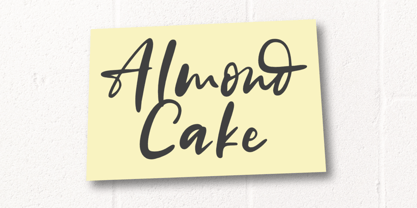 Almond Cake is a sweet and stylish handwritten font. Its natural and unique style makes it incredibly fitting for a large pool of designs. The only limit is your imagination!
 - Wonderful JNL by Jeff Levine,
$29.00 A little bit of thick-and-thin Art Deco hand lettering is offered up in Wonderful JNL, based on some promotional text found on an old piece of sheet music.
 - Jumping Unicorn by Subectype,
$15.00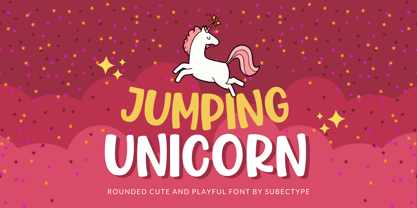 Jumping Unicorn is a sweet and friendly display font. Its natural and cute style makes it incredibly fitting to a large pool of designs. The only limit is your imagination!
 - Lets Sparkle by Lucky Type,
$12.00 Let’s Sparkle is a brand-new handwritten font that will be perfect for books, wedding invitations, greeting cards, logos, posters, or anything else that needs a fun and happy look!
 - Delina by Letterena Studios,
$9.00 Delina is a romantic and sweet calligraphy typeface with characters that dance along the baseline. It will add a luxury spark to any design project that you wish to create!
 - Grotley by Owl king project,
$39.00 Grotley is designed with a sweet shape, supported by several weights, making the equipment very supportive for all design needs or projects that look premium. let's start designing. Be happy
 - Berdina by TM Type,
$12.00 Berdina feels equally charming and elegant. It looks stunning on wedding invitations, thank you cards, quotes, greeting cards, logos, business cards, and every other design which needs a handwritten touch.
 - Listingloves by Sulthan Studio,
$14.00 Listingloves - new, fresh, funny, interesting, cute calligraphy font with two cute hearts that can be connected. It is suitable for greeting cards, branding materials, business cards, quotes, posters and more!
 - Deco Style JNL by Jeff Levine,
$29.00 The hand lettered title on the 1943 sheet music for "This Love of Mine" formed the basis for Deco Style JNL, which is available in both regular and oblique versions.
 - Bandage by Kyooti Bun,
$11.00 Bandage font is very emotional and innovative products! unique look to company branding, logos, greetings, magazine layout, homeware, prints and invitations. I hope you like it Available : uppercase, lowercase, numerals
 - HOME ROCK by Letterafandi Studio,
$16.00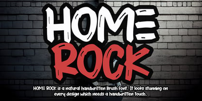 HOME ROCK is a natural handwritten brush font. It looks stunning on thank you cards, quotes, greeting cards, logos, business cards, and every other design which needs a handwritten touch.
 - Lyanna by Jonahfonts,
$35.00 Free flowing legible connected-script with glyph terminals including all diacritics. Suitable for various applications such as captions, fashion headlines, packaging, invitations, cards, posters, ads, greeting cards and book jackets..
 - Blue Dino by Sakha Design,
$10.00 Dino Blue is a sweet and friendly handwritten font. Its natural and unique style makes it incredibly fitting to a large pool of designs. The only limit is your imagination!
 - Butter Paste by Aestherica Studio,
$12.00 Butter Paste is a handwritten font that blends perfectly and is perfect for your project. You can use it for logos, branding, greeting cards, t-shirts, cases, posters, and more.
 - Delighted Panda by Seemly Fonts,
$12.00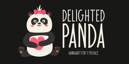 Delighted Panda is a sweet and simple handwritten font. Its natural and unique style makes it incredibly fitting to a large pool of designs. The only limit is your imagination!
 - Bridgers by Fargun Studio,
$13.00 Bridges is a hand-painted uppercase brush font and includes swashes. Bridges works well for logos, name tags, handwritten quotes, product packaging, merchandise, social media, greeting cards and much more.
 - Dog Heaven by Letters by Wordsworth,
$10.00 'dog heaven' is a sweet font featuring lower case, symbols, numerals & diacritics. channel your e. e. cummings and forgo those cumbersome caps! perfect for any occasion where fun is required.
 - Qundart by Tanya Savchenko,
$12.00 Qundart – simple handwritten font. Can be used in postcards, greetings, promotional banners. The font is cute and lightweight. Composition: Latin and Cyrillic (full set of symbols of the Ukrainian alphabet).
 - Malibbie by Aldedesign,
$13.00 Malibbie is a sweet and fun handwritten font with a unique charm. Fall in love with its bold style, and turn any design project into an original piece of art.
