10,000 search results
(0.021 seconds)
- Plague Master by Hanoded,
$15.00 I admit: I had a bit of a crazy week when I thought up an drew this font. I broke my arm during kickboxing training on monday, leaving me in a cast - unable to do most everyday things, like getting a good night's sleep (try sleeping with a humongous cast on your arm). Thank goodness, it is my left arm, so I can still draw letters and use my laptop. So… this font has been made entirely using one arm! It is a bit of a horror font - it sort of sums up my mood right now. Glyphs have very little spacing, adding to the evil look of Plague Master. Comes with a lethal amount of diacritics.
 - 1913 Typewriter Carbon by GLC,
$38.00 1913 Typewriter Carbon is the bold version of GLC foundry's 1913 Typewriter. It is available in two styles: Normal, and Underlined (Bold). It is a complete alphabetic font. It is used as variously as web-site titles, posters design or books editing. It may be preferable, if possible, when printing, to choose a pale color - dark grey instead of heavy black, for exemple - to give a good appearance, just like the real one, and still benefit from the full details. With inkjet printers, it may be used the economic or draft option with a good result too. The old typewriter characters size is 11 or 12 points, but this font supports easily enlargement.
 - Mister Earl by Bitstream,
$29.99Mister Earl, released by Bitstream in 1991, was designed by Jennifer Maestre. Inspiration came from a page in a ‘how-to’ book published in the 1930s. Later versions of Extra Light, Light and Bold were added by Jim Lyles, with the help of Wally Petty. Mister Earl is named in honor of Earl Biscoe, a Bitstream designer who retired in the mid-1980s because of illness. In the winter of 1994–1995, Richard Stetler accidentally left a copy of Mister Earl outside his Alaska home... In the spring, amazed to discover the unfortunate font was still just about alive, he decided to release the result to a wider public as Snow Cap. - Nightales by Trim Studio,
$15.00 Introducing Nightales a simple, bold and light font style perfect for kids' books! With a playful and rounded design, this font is both whimsical and fun, making it perfect for capturing the imagination of young readers. The brush pressure adds a touch of creativity and charm, while still being easy to read and understand. The bold and light variations provide versatility for different design elements, and the rounded edges make it safe and friendly for kids. Let Nightales bring joy and excitement to your next kids' book project! even so contains All Standard glyphs and punctuations Thank you for let us be your design partner, If you have any questions please don't hesitate to drop me a message
 - Halifax by Hoftype,
$49.00 Halifax represents a new interpretation of classic English Sans types such as Gill and Johnston. The main focus in this approach is on a more open appearance and balanced proportions, which results in an even line flow. Although Halifax adds some of the rationality of the central-European sans tradition, it still preserves a distinctly English flavor. The Halifax family consists of 16 styles and comes in OpenType format with extended language support. Halifax is very well suited for ambitious typography. All weights contain semi-ligatures (design optimized single characters), proportional lining figures, tabular lining figures, proportional old style figures, lining old style figures, matching currency symbols, fraction- and scientific numerals and arrows.
 - Cartes by insigne,
$39.00 Cartes has a bit of a strange origin story, as far as fonts go. It’s a combination of ideas from 1920’s advertising and hand-painted letters from the 1500s. The typeface was designed to flow with elegance and speed yet retain a sense of the handmade. The serifs flow with indentations implying movement and terminate with inky globules that lend your copy a sense of gravitas. This typeface can be used for headlines, short texts, posters, logos, headlines, headlines in big sizes or just as easily for ad text. At large sizes, pen strokes can be seen that give the typeface a touch of humanity and vigor. At smaller sizes the type is still unique, but readable.
 - Naughty Monster by Ardyanatypes,
$10.00 Say hello to Naughty Monster, a hand made font that has many interrelated characters. Naughty Monster has an OpenType features that will automatically change each character into ligatures, so they can become unique characters. Naughty Monster has 2 different styles including Regular and Rounded. This is made to give a choice of each style. Naughty Monster has a strict style, but still gives a cheerful impression, making it very easy to read and apply in all design projects such as poster designs, clothing, logos, quotes, album covers, books, business cards, product designs, and many more design projects. Naughty Monster has its own charm when used. We made this font look funny, easy to remember, and easy to use.
 - Nouveau Poster JNL by Jeff Levine,
$29.00 When master letterer Hugh Gordon and his student, Ross F. George developed a set of lettering pens between June 16, 1913 and Sept. 1, 1914, they had no idea that their invention (which they named Speed-Ball®) would still be in use nearly a hundred years later. The C. Howard Hunt pen company [originally of Camden, New Jersey] became the original (and sole) distributor of these pens. By 1915 an instructional booklet entitled "Modern Pen Lettering" was produced, and it was copiously illustrated with examples of layouts, lettering techniques and an assortment of alphabets for the user to learn. Nouveau Poster JNL is Jeff Levine's interpretation of a sanserif design found within the pages of this vintage publication.
 - Dark Kids by Pixesia Studio,
$12.00 Introducing Dark Kids - A Funny & Playful Sans Font Dark kids is a funny sans typeface. This type is formed with rounded-letter to make it more playful and cute vibes. This type is also designed to be bold yet it still spreads the bubbly vibes which is suitable for kids. This font is meant to attract kids so it is better used for any non-formal kids product such as children-books, baby products, and any writing which related to kids. FEATURES - Stylistic Alternates - PUA Encoded - Uppercase and Lowercase letters - Numbering and Punctuations - Multilingual Support - Works on PC or Mac - Simple Installation - Support Adobe Illustrator, Adobe Photoshop, Adobe InDesign, also works on Microsoft Word Hope you Like it. Thanks.
 - Silver Lovely by Selotype,
$12.00 Silver Lovely is a script that is both narrow and modern. It is slender, feminine and classy, while still maintaining a friendly feel. Silver Lovely is versatile and will work perfectly for fashion, e-commerce brands, trend blogs, wedding boutiques or any business that wants to appear upscale and chic. With its many different stylistic characters, Silver Lovely is perfect for creating original and functional designs. It has extensive language support and tons of ligatures, alternates, stylistic sets that add visual interest to every letter. The overall feel of the font is elegant, sophisticated with a touch of informal and it is ideal if you want to convey a sense of class and style. Thanks so much for looking.
 - Freewill by Gassstype,
$27.00 Freewill - Handmade Rough Brush Font with ligature and Multilanguage support.inspired by the famous minimalist logo, perfect for the purposes of designing templates, brochures, videos, advertising branding, logos and more. Perfect for adding a unique twist to word-mark logos, as well as numbers and punctuation making it super fantastic. Like all of my fonts it is inspired by lettering from the good old past, but it still has a strong modern appearance. Its wide range of stylistic alternates allows versatile design options and works perfectly for headlines, logos, posters, packaging,,coffee shops, restaurants, magazine's headers, signs or gift/post cards,cafe's and weddings.Best for halloween poster, horror poster, childrenbook, cartoon, comic etc
 - Risolla Calisto by HansCo,
$12.00 Risolla Calisto is an elegant handwritten font with a little bold style also stay look clean and modern. This font carries a slightly masculine feel while still working on a background with a feminine theme. This font come with many ligature style that give you a sleek, elegant look for your logos, business card, wedding invitations, quotes, advertisements, and more. Highly recommended to use it in OpenType capable software - there are plenty out there nowadays as technology catches up with design. The OpenType features can be accessed by using programs such as Adobe Illustrator, Adobe InDesign, Adobe Photoshop Corel Draw X version, Afinity and more. Let's create something beautiful today with Golden Stanbury. Enjoy!
 - Turesco by Letterhend,
$17.00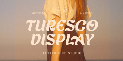 Turesco Display is a display typeface with unique letterform. It looks great to be used for modern and minimalistic yet still playful and fun theme. This font perfectly made to be applied especially in logo, and the other various formal forms such as invitations, labels, logos, magazines, books, greeting / wedding cards, packaging, fashion, make up, stationery, novels, labels or any type of advertising purpose. Features : uppercase & lowercase numbers and punctuation multilingual alternates & ligatures PUA encoded We highly recommend using a program that supports OpenType features and Glyphs panels like many of Adobe apps and Corel Draw, so you can see and access all Glyph variations. How to access opentype feature : letterhend.com/tutorials/using-opentype-feature-in-any-software/
 - Oksana Sans Compressed by AndrijType,
$33.00 Oksana Sans Compressed is the most skinny part of Oksana Sans font family, but still it retains most features of this humanist sans serif. The Compressed version is designed to get most of your page and fill a minimum space with maximum information. It can be useful in multiple columns typesetting — like magazines, newspapers or business documentation. Oksana Sans Compressed could be a good minor companion for other Oksana fonts as well. It has six weights from Thin to Heavy plus free and funny Fat Compressed Italic face, supports Western, Central European, Baltic Latin and Slavic Cyrillic codepages. Old-style digits, some ligatures, alternative characters and modern currency signs are also included.
 - Halis Rounded by Ahmet Altun,
$19.00 The Halis Rounded Font Family from Ahmet Altun comes in eight weights. In addition, all weights have small caps for romans. Halis Rounded is the smoother version of the Halis Grotesque family. With rounded corners, this new font seems much softer and eye-pleasing even though it still has geometric and straight borders. Halis Rounded is legible from very small size to very large ones and also suitable for letterpress. Thanks to small caps accommodation, this font family makes their use in web typography even easier. As with the small caps, all fonts can be used to create great works on the web as logos, texts, presentations etc. and in prints as posters, t-shirts, magazines, and notices.
 - Babylon by Haksen,
$15.00 Babylon is a playful and elegant family, perfect for branding projects, headlines, posters and packaging also for logos! Primarily it is characterized by a modern look with straight shapes, but on closer view, one sees a wide range of alternate characters, as well as five style typeface! Furthermore it is a unicase typeface, all of the Babylon play with uppercase initials. Babylon is 5 Weights (Regular – Outline) Character set A-Z with uppercase with some special alternate options Numerals & Punctuation Multilingual support language characters Feel free to convert the fonts to web fonts for your personal/business website If you still have questions, just send me a message and I'm happy to help ;) Thank you, Haksen
 - Natalle by Masinong Studio,
$10.00 Natalle Brush is a handmade brushed signature font font with stunning characters. Ideal for logos, name tag, handwritten quotes, product packaging, merchandise, social media & greeting cards. It contains a full set of lower & uppercase letters, a large range of punctuation, numerals, and Multi-Lingual support. The font also contains several alternatives for lowercase characters, accessible in the Adobe Illustrator Glyphs panel, or under Stylistic Alternates in the Adobe Photoshop OpenType menu. But If you don't have any OpenType specific software, you can still use Natalle as is with its standard lowercase and uppercase letters. Natalle Brush comes with Regular and Underlines style. If you have any question, don't hesitate to contact me by email masinong.studio@gmail.com Thank you!
 - Destacy by Alandya TypeFoundry,
$15.00 Destacy script is a magical script font, carefully created with a touch of elegance. This is a beautiful combination of timeless elegance and authentic calligraphy. It features an incredibly classic style, while still keeping a friendly feel. Destacy script is the perfect font for making original and outstanding designs. This script has multilingual support and many alternative lowercase characters, as well as many additional swashes options, allowing you to make your design truly unique. The Destacy script is a beautiful, classic calligraphic font which will add a sweet, elegant, and perfect feel to your design. It’s perfect for logo projects, wedding invitation cards, branding, home designs, product packaging, and every other design that needs an elegant typeface.
 - Transport by Monotype,
$29.99The idea of Transport originates from text found on the large wooden boxes used for transport. Such text is still stencilled on them in the same way as the companies have done for decades, at least. That explains the typeface's name, too. If you find some similarities with Devin, you are right. Transport is nothing other than a special variant of Devin. But since the two are aimed for totally different uses, I decided to use two different names for them. Transport is a mecane and its use is primarily as a headline typeface. But in small quantities it can be used even for body setting, if special effects are desired. Transport was released in 1994. - Kingstoner Font by Great Studio,
$10.00 Kingstoner Font is handmade signature style font with stunning characters. Ideal for logos, name tag, handwritten quotes, product packaging, merchandise, social media & greeting cards. It contains a full set of lower & uppercase letters, a large range of punctuation, numerals, and multilingual support. The font also contains several ligatures and contextual alternates for lower case characters, accessible in the Adobe Illustrator Glyphs panel, or under Stylistic Alternates in the Adobe Photoshop OpenType menu. But If you don't have any opentype specific software, you can still use Kingstoner Font as is with its standard lowercase and uppercase letters. If you have any question, don't hesitate to contact me by email Greatstudio92@gmail.com. Thank you!
 - Roclette Pro by FoxType,
$25.00 Roclette Pro Display is a Brand Elegant Typeface from Roclette powerful font family. It has a dependable and uncompromising style, with controlled letterforms and modern touches. It looks amazing in logos, magazines, and movies. Roclette Font would be perfect for branding, headlines, Captions, paragraphs, and posters. The various weights allow you to experiment with a wide range of applications. It's created to make an impression without sacrificing its beauty and readability. It's shown a clean, minimalist, warmth, quirky, yet still purposed to be versatile The Typeface includes Eight Weights - Thin, ExtraLight, Light, Regular, Medium, SemiBold, Bold and ExtraBold Numerals and extended punctuation (200+ Glyphs). Expert kerning and quality crafting. Normal, Italics, Outline and Outline Italics Included.
 - Protagonice by Invasi Studio,
$17.00 Designed by hand-drawn slab serif style font, Protagonice font comes in two varieties of regular and dotted textures. You can enhance your project with a retro-style using Protagonice Font. Ensuring carefully crafted styles result from the use of this font. Its imperfections keep it casual but allow it to still be legible. There is an incredibly wide range of uses for it, so give it a try and see how it inspires your creativity! It's ideal for headlines, flyers, posters, greeting cards, product packaging, book covers, printed quotes, logotype, and album covers, among other applications. Because this font is PUA encoded, you can easily access all of the glyphs and swashes!
 - Architype Renner by The Foundry,
$99.00 The geometry of Paul Renner’s sans letterforms was tempered by optical correction to follow earlier typeface proportions, with capitals close to old-style forms, yet still retaining the spirit of the New Typography. His early experimental characters were included as alternatives in the sans which was to become the Futura released by Bauer in 1927–30. Unusually, old style figures also appeared in his early versions but they too were soon discarded. Foundry Architype Renner as a new four weight family has been developed from the original Renner Regular and Bold, created by The Foundry for the first Architype Collections in the early 1990s. This new family features the old style figures and the experimental elements.
 - Florida Rose by Yahya Type,
$16.00 Florida Rose is a Sharped version of "Peroba Rosa" Font. It is a modern sans serif type family featuring a blend of modern, classical, and playful characteristics. The simple, clean forms and classically inspired proportions give it a timeless quality and interesting visual rhythm. Florida Rosa is perfect for logo design, magazine headers, product packaging, branding projects, clothing or simply as a stylish text overlay to any images or websites. WHAT’S INCLUDED? • Comes with regular, thin, light, italic, bold, thin italic, light italic, bold italic and bold italic font styles. • Uppercase & lowercase letters, numbers, punctuation Ligature & Huge Stylistic alternate, Multilingual support. Still got a question? Send me a message and I’ll be happy to answer! qura.yahya@gmail.com
 - Zomsenso by Pootis Type Corp.,
$31.99 Zomsenso is an angular, semi-modular typeface that supports OpenType alternates. The angular part means that the entire* font uses only angular segments and shapes. The alternate glyph shapes are under Stylistic Set 01. This font includes Seven Segment display (U+E000 to U+E07F) and arbitrary fractions (U+E1nd, n=numerator; d=denominator) that are mapped to the Private Use Area, so users can easily insert them via Unicode input. You can combine these fractions with the superscript and subscript numerals to create more fractions. This font can be used for essays, signs, logos, posters, commercial projects, videos, and many more. *except the circles in the Geometric Shapes block, which are still round
 - TG Frekuent Mono by Tegami Type,
$30.00 TG Frekuent Mono a new modern geometric sans serif with monospaced style. This typeface is made with precise calculations so that it displays a beautiful and modern appearance. Besides this new typeface is also equipped with six different styles, ranging from ultra light to extra bold plus variable font. This typeface also has various alternative characters that can be used according to the needs in the design. Alternative characters that exist in this type of font have a touch of script typeface so that it makes the alternative character of this type of letter a little quirky and different but still fits well with the combination of modern main characters. And supports approximately 100 languages.
 - Bellfort by GRIN3 (Nowak),
$19.00 Bellfort family features 7 different sub-families: Regular, Rough, Press, Shadow, Press shadow, Shadow Only, Script. Each of these sub-families contains up to four font weights. When the font is used in OpenType-savvy applications, the 3 variants of glyphs are automatically alternated to achieve a random-like effect. When not using the Contextual Alternates feature, you can still pick the alternates in the Glyphs palette or use the alternates available from the keyboard upper and lower case. Bellfort Script is a handwritten, fully connected script with ligatures and contextual alternates to help with flow and readability. Language support includes Western, Central and Eastern European character sets, as well as Baltic and Turkish languages.
 - Candida by Linotype,
$50.99Candida roman was designed by Jakob Erbar and appeared after his death with the typeface foundry Ludwig & Mayer in Frankfurt am Main in 1936. Due to the original designer’s death, the italic was designed by Walter Höhnisch shortly thereafter. In 1945 the roman was reworked, the breadth of the figures was reduced and the strokes made heavier. The bold weight followed in 1951. Later the typeface was expanded with further weights, which have for the most part fallen out of use. Three weights can still be found in catalogues, available as early as 1937 for the Linotype machine. Candida is a modest text font which retains its legibility even in smaller point sizes. - Blingtastic Script by Seniors Studio,
$17.00 Blingtastic Script is a modern & clean calligraphy script. Its characters dance along the baseline while it still has an elegant touch. It can be used for various purposes such as logos, wedding invitations, headings, t-shirt, letterheads, signage, labels, news, posters, badges etc. OpenType features include stylistic alternates, ligatures and extensive language support. To enable the OpenType Stylistic alternates, you need a program that supports OpenType features such as Adobe Illustrator CS, Adobe Indesign & CorelDraw X6-X7, Microsoft Word 2010 or later versions. There are additional ways to access alternates/swashes, using Character Map (Windows), Nexus Font (Windows), Font Book (Mac) or a software program such as PopChar (for Windows and Mac).
 - Roundkind by Letterhend,
$17.00 Round Kind is a vintage display typeface with the touch of nostalgic feel yet still looks luxury in a modern design concept. This typeface has unique looks and strong character with illustration pack as bonus. This font perfectly made to be applied especially in logo, and the other various formal forms such as invitations, labels, magazines, books, greeting / wedding cards, packaging, fashion, make up, stationery, novels, labels or any type of advertising purpose. Features : Uppercase & lowercase (alternates) Numbers and punctuation Stylistic alternates multilingual PUA encoded Illustration pack in vector We highly recommend using a program that supports OpenType features and Glyphs panels like many of Adobe apps and Corel Draw, so you can see and access all Glyph variations.
 - Sztos by Borutta Group,
$39.00 Sztos (2018-2022) is a remix of one of the most famous grotesques used in Poland – Baccarat (published by Jan Idźkowski i S-ka in 1922). My version loosely refers to the original. On the one hand, I wanted to modernize the drawing and proportions, on the other hand, I did’t want to lose the historical flavour and details in which you can still feel traditional printing. In addition to the fairly wide version of the normal style, there is also a narrow version. Thanks to this contrast, Sztos gives the possibility of expressive combinations of different styles. The whole family consists of 10 weights, two widths and an additional slant version. Design Support: Małgorzata Bartosik, Karol Mularczyk
 - Plecnik by Type Salon,
$44.90 This typeface follows the principles of the numerous and diverse architecture and graphic design works from the most famous Slovene architect Jože Plečnik, and so unfolds a piece of Slovene’s rich, yet still undiscovered typographic legacy. Typeface Plecnik is defined by classical elements and shapes. With classic proportion, humanist stroke endings and low contast, Plecnik comunicates a modern, elegant and sophisticated message. Due to Plecnik's recognisable shapes the typeface remaines memorable and irreplaceable. When used for book and editorial designs, branding, packaging or display, Plecnik will perform in its purpose. Designed in four weights and accompanied with italics, Plecnik also offers a Display style, which is even more distinctive and perhaps even more attributable to Plečnik.
 - Transport by Linotype,
$29.99The idea of Transport originates from text found on the large wooden boxes used for transport. Such text is still stencilled on them in the same way as the companies have done for decades, at least. That explains the typeface's name, too. If you find some similarities with Devin, you are right. Transport is nothing other than a special variant of Devin. But since the two are aimed for totally different uses, I decided to use two different names for them. Transport is a mecane and its use is primarily as a headline typeface. But in small quantities it can be used even for body setting, if special effects are desired. Transport was released in 1994. - Treacle by Hanoded,
$15.00 One of the best desserts I have eaten in my life was a treacle tart. I do know that it was in England and I do know that it was delicious. I really don’t know why I was thinking of that, but that pleasant memory did give me a name for this font. I am still learning my new font software, which is a bit of a slow process. The software I used for this font allows me to add several languages, which, hitherto, I couldn’t access. So, in short, this is my most multilingual font ever: it even includes Vietnamese and a bit of Hiragana and Katakana for you to get creative with!
 - Mushmouth PB by Pink Broccoli,
$14.00 If your looking for a vintage animated typestyle that still feels current today, you've just found it! Mushmouth PB started as a digitization of a film typeface called "Albert" by LetterGraphics. This all capitals font has a super subtle bounce and a playful heavy weight. An extruded film variation of this typeface was used back in the day on Post's Frosted Rice Krinkles cereal. Named in tribute to the original font name "Albert", we picked a fellow member of Fat Albert's gang for the name of this font. We think it is fitting, even though the original film font naming had nothing to do with the cartoon at all. Give Mushmouth a spin and pick it up today!
 - Chelsea Queen by D&K Project,
$18.00 Chelsea Queen was built with OpenType features and includes numbers, punctuation, alternates, ligatures, swash and icon sign and it also supports other languages. Chelsea Queen is a very unique font, because there are 85 sets of ligatures that will make writing natural and elegant. This is very suitable for use Logo, Wedding, Fashion, Poster, Menu, Invitation and there is still much that can be done with this font. Chelsea Queen File Downloaded: - 85 set of LIGATURES (make your natural handwriting) - Both OTF and TTF file formats (Regular, Italic, and swash and sign) - UPPERCASE and lowercase - Swash and sign font ( A-Z and a-z ) - Panctuation and numeral - extended Latin characters for language support.
 - Reina Neue by Lián Types,
$29.00 Hey! See Reina Neue in action here! INTRODUCTION When I designed the first Reina¹ circa 2010, I was at the dawn of my career as a type designer. The S{o}TA, short for the Society of Typographic Aficionados, described it as complex display typeface incorporating hairline flourishes to a nicely heavy romantic letterform². And it was like that; that’s what I was pursuing at that time since I was very passionate about ornaments and accolades of Calligraphy. Why? I felt that Typography, in general, needed more of them. These subtle flourishes could breathe life into letters. Maybe, I thought it was the only way I could propose something new into the field of type. However, after some years, I came across a very interesting quote: –Beautiful things don’t ask for attention– Wow! What did this mean? How could something be attractive if it’s not actually showing it. Could this be applied to my work? Sure. I think every type-designer goes through this process (aka crisis) regarding his or her career. At the beginning we love everything. We are kind of blind, we only see the big picture of a project. And that’s not because we are lazy. We actually can’t see the small mistakes nor the subtleties that make something simpler beautiful. We are not able. But, the small subtleties… They are actually everything: With experience, one puts more attention into the details and learns that every single decision in type has to be first meticulously planned. Here I am now, introducing a new Reina, because I felt there was a lot of it that could be improved, also the novelty of Variable Fonts caught my attention and I had to take that to my type library. THE FONT A thing of beauty is a joy forever Now, a decade later, I’m presenting Reina Neue. This font is not just an update of its predecessor: –A thing of beauty is a joy forever– is the first line of the poem ‘Endymion’ by John Keats, and despite the meaning of “beauty” may vary from person to person, and even from time to time (as read in the last paragraph), with Reina I always wanted to bring joy to the eye. In 2010, and now, in 2020. I believe the font is today much better in every aspect. It was entirely re-designed: Its shapes and morphology in general are much more clean and pure. The range of uses for it is now wider: While the old Reina consisted in just one weight, Reina Neue was converted into a big family of many weights, even with italics, smallcaps and layered styles. The idea behind the font, this kind of enveloping atmosphere made out of flourishes, is still here in the new Reina. This time easier to get amazing results due to the big amount of available alternates per glyph and also more loyal from a systemic point of view. However, and as read in the introduction -Beautiful things don’t ask for attention-, if none of the flourishes are activated the font will look very attractive anyway. Reina Neue is ready to be used in book covers, magazines, wedding cards, dazzling posters, storefronts, clothing, perfumes, wine labels and logos of all kind. Like it happened with the previous Reina, I hope this new font satisfies every design project around the world if used, and can be a joy forever. SOME INSTRUCTIONS Before choosing the right style for your project, hear my advice: -Reina Neue Display was meant to be used at big sizes. If you plan to print the font smaller than 72pt, I suggest using Reina Neue, not Display. Otherwise, if the font will be BIG or used on a digital platform, Reina Neue Display should be your choice. For even smaller sizes, use Reina Neue Small. This style was tested and printed in 12pt with nice results. (Note for variable fonts: Print them in outlines) -Reina Italic is not a slanted version of the roman, and this means some flourishes are different between each other. The Italic version has other kind of swirls. More conservative, in general. -All the styles of Reina Capitals have Small Capitals inside. -Reina Capitals Shine should be used/paired ONLY with Reina Capitals Black. The engraved feeling can be achieved if Reina Capitals Black and Reina Capitals Shine are used as layers, with the same word. Variable fonts instructions: -For more playful versions, choose Reina Neue VF, Reina Neue Italic VF or Reina Neue Capitals VF: With them you can adjust between 3 axes: Weight (will change the weight of the font) – Optic Size (will thicken/lighten the thin strokes and open/close the tracking) – Accolades (will modify the weight of the active flourishes). SOME VIDEOS OF REINA NEUE VF https://youtu.be/8cImmT5bpQM https://youtu.be/1icWfPmKAkg https://youtu.be/YC9GkJDL1a8 NOTES 1. The original Reina, from a decade ago: https://www.myfonts.com/fonts/argentina-lian-types/reina/ 2. In 2011, Reina received an honourable mention by S{o}TA. “Great skill is shown in the detailing, and an excellent feel for the correct flow of curves and displacement of stroke weight.” https://www.typesociety.org/catalyst/2011/ Reina was featured in the “Most Popular Fonts of the year” in MyFonts in 2011 https://www.myfonts.com/newsletters/sp/201201.html In 2012, the font was also selected in Tipos Latinos, the most prestigious competition of type in Latinoamerica. https://www.tiposlatinos.com/bienales/quinta-bienal-tl2012/resultados Also, chose as a “Favorite font of the year” in Typographica. https://typographica.org/typeface-reviews/reina/
 - CorTen by The Northern Block,
$12.80 An industrial-weight typeface inspired by graphics laser-cut from sheet metal.
 - Morning Coffee by Sebastian Cabaj,
$19.00 Hand-drawn typeface, inspired by sunny mornings with cup of good coffee.
 - Or Halevana MF by Masterfont,
$59.00 Pure romantic and personal with lots of grace and tender designed curves.