2,084 search results
(0.261 seconds)
- Revolution Gothic by Dharma Type,
$19.99 This font family is an arranged and extended version of PAG Revolucion released from Prop-A-Ganda type foundry in 2008. The original font is inspired by retro propaganda posters and wallpainting in Cuba from the 60s to 80s. And the original PAG Revolucion is the most popular font from Prop-A-Ganda. In redesigning this font, their detail and spacing was modified and new weights with matching slanted and also lowercase in each style were added to fit contemporary design needs. Then, Revolution Gothic became big family containing 10 styles and will be perfect family for your retrospective project. Be sure to check out distress version Revolution Gothic P.
 - Urbane Rough by Device,
$39.00 Urbane Rough is a distressed version of Urbane, giving it an urgency and immediacy reminiscent of photocopied flyers or inky printing. A versatile all-purpose sans-serif family of six weights plus italics, it explores the same idea-space as early geometric modernist sans such as Futura, Erbar, Spartan and Elegant Sans, with a single-story a, a contemporary high x-height and very slightly condensed bowls. Perfect for headlines and running text, it is clear, classic and authoritative. Unusually for a geometric moderne sans, letter-widths are optically balanced, giving an even colour in setting. Includes a full international character set, lining, tabular and old-style numerals.
 - Fd Massive by Fortunes Co,
$19.00 Massive moon is headline font with a retro feel transports readers to a bygone era, invoking nostalgia and charm. Its bold strokes and quirky serifs harken back to the golden age of design, reminiscent of vintage posters and classic advertisements. The typeface exudes a timeless appeal, seamlessly merging the flair of yesteryear with modern readability. Each character carries a sense of character, mirroring the craftsmanship of mid-century typography. The warm color palette and slightly distressed texture further amplify the retro vibe, adding a touch of authenticity. This font doesn't just convey information; it tells a story, bridging the gap between the past and present.
 - Krenzy Crispy by Arterfak Project,
$17.00 Krenzy Crispy is crunchy, delicious, and playful! Inspired by the typography in the packaging snack. This font gives you a yummy impression that keeps you hungry! Krenzy Crispy is perfect for food design, snack packaging, posters, comics, logotype, labels, decals, display, and more! Designed with 2 styles: Regular & Distressed, Krenzy Crispy also has a retro feel that you can apply to vacation themes, beach, and retro events. Equipped with a lot of alternate characters, playful ligature, and multilingual support that allows you to create hand-drawn typography! Fonts featured : Uppercase Lowercase Numbers & Symbols Stylistic alternates Stylistic Set Ligatures Accented characters Thank you for watching and happy designing!
 - Freehouse by Device,
$39.00 Freehouse is a reinterpretation of the well-remembered Watney’s logo, a brewery and pub chain infamous for its poor quality beer and brutalist decor. In Design Research Unit’s corporate guidelines from 1966 the font is described as Clarendon Bold Expanded — however, this is not the case. Clarendon has square serifs, whereas the Watney’s font is rounder and friendlier. A fixture of the British high street landscape for decades, this digitisation adds a full international character set, numbers, punctuation and many other characters that did not exist in the original. A distressed version that evokes rough print on a wet beermat has also been developed.
 - LHF Black Rose Script by Letterhead Fonts,
$59.00 Nearly 2 years in the making, LHF Black Rose Script is the perfect blend of hand-lettering and modern technology. This beautiful script is loaded with features, such as automatic ligatures, discretionary ligatures, bonus ending characters, swashes, and several alternates (302 glyphs to be exact). You receive 3 versatile fonts to match different moods: Regular, Block Shadow (placed under Regular), and an expertly-crafted Inked version which has been distressed to look like freshly inked lettering. One look at your designs and your clients will fall in love with Black Rose Script. And with so many carefully designed alternates to use, they'll probably think you hand-lettered it yourself!
 - Stubby Rough by Tipos Pereira,
$10.00 Stubby Rough is a display type family with 4 styles, inspired by the vernacular landscape. It was made for titles, headlines and also packages, posters and everything that provide space for a rude, fat and widish type. Nonetheless it can be a type for text if you are looking for an informal shape, with eleven styles mixing from a narrowed thin to a sloppy ultrabold. Stubby has a tight spacing looking to fit in squeeze places, trying to simulate some real spirit of the botecos from Brazil, always serving very cold beer in stubby brown bottles. Stubby Rough is a distressed version of the original Stubby.
 - Heathen by Canada Type,
$24.95A few emails sent to Canada Type have asked for more “bad scripts”. A few others asked for "more Mascara-like treatments". And some asked for more fonts of “distressed elegance”. Whatever you like to call this style of doubled-script font, sightings of designs using it have become common within the last few years. Such fonts have become the standard in expressing elegant confusion, old chaos in modern settings, recycled histories, and rebellious ideas. This style is quite often seen on chic clothing, music packaging, some sports paraphernalia, surfer and skateboarder gear, even book covers. That said, the Heathen font was made to include an advantageous feature that other distressed scripts do not normally have: More intertwined over-swashing in the majuscules. This over-swashing is quite useful in settings where the stroke and fill colors differ, or complement each other. It is also quite the point of emphasis where the idea is to show elegance gone ancient, old thoughts in a modern wrapper, rust never sleeping, or the very basic limits of the world’s nature. The original Heathen was made by redrawing Phil Martin’s Polonaise majuscules and superposing them over the majuscules of Scroll, another Canada Type font. The lowercase is a superposition of Scroll’s lowercase atop a pre-release version of Sterling Script, yet another Canada Type font. Heathen Two was made in a similar way, by combining two pre-release Canada Type scripts. - ITC Oldbook by ITC,
$29.99For some time, Eric de Berranger had wanted to create a distressed typeface design - one that gave the appearance of antique printing and showed signs of wear, yet was still highly readable. He was busy designing a new face called Maxime, when an idea struck: I realized that I could use these lettershapes as the basis for my antique typeface," he says. The two faces ended up being designed in tandem. While ITC Oldbook clearly captures the flavor of aged, uneven and imperfect printing, it also meets de Berranger's goal of being exceptionally readable in text sizes. Beginning with well-drawn characters was the key, and these were carefully modeled into the distressed forms. "The process was more difficult than I originally thought," says de Berranger. "The antique letters had to be tested and modified several times to work correctly." ITC Oldbook elegantly simulates antique printing in both text and display sizes. And while stroke weights are uneven and curves are irregular, the design has remarkably even color when set in blocks of text copy. Add to this the design's inherent legibility, and ITC Oldbook acquires a range far beyond replication of things old; it's suitable for any project that calls for warm and weathered typography. ITC Oldbook is available in roman and bold weights with complementary italic designs. Small caps, old style figures and a suite of alternate characters and ornaments provide additional flexibility and personality to the design." - Insider by Characters Font Foundry,
$25.00 Insider is a warm & legible grotesque. It’s custom made for Insider Consulting in Düsseldorf, Germany. It’s highly legible in small sizes because of the basic proportions and the balanced inner forms. It’s optimized for setting longer texts, but also works very well in headlines and leads. The fonts contain loads of OpenType features to spice up your design. The matching Stencil font is very suited for creative designs. The Stencil Regular has the same dimensions as the Insider Regular, so you can mix them without hassle. The font family has real italics and not just mathematically slanted romans. The dynamic cursive shapes root in handwriting. With 9 styles (5 weights + 4 italics), the family is very versatile and can be used for designs with a complex typographical hierarchy.
 - Brocades by Edignwn Type,
$16.00 The font collection is called "Brocades", it is a crafted display with vintage themes. These collections contain monoline script, sans serif stencil and serif stencil. Every font comes with 4 style typefaces (regular, rounded, rough and stamp). Brocades give more extras 2 pack illustrations (animals and motorcycle). This script font includes 3 sets alternates and swashes. The Brocades matches apply in some designs such as the logotype, poster, label, badge, packaging, apparel, branding, and more custom design. Brocades features : 4 style typefaces (regular, rounded, rough and stamp) Uppercase, lowercase, numeral, symbol, punctuation, alternate and swash in monoline script All-caps, numeral, symbol and punctuation in sans serif and serif font Multilingual PUA Encoded Brocades includes : 14 fonts (script, sans serif, serif and dingbat) 52 illustrations in dingbat Thank you for your support and choosing us.
 - Joschmi by Adobe,
$29.00Joost Schmidt?s (1893?1948) name is undoubtedly connected with monolinear condensed letters of geometric appearance ? his unfinished draft of a stencil alphabet, constructed on grid paper in 1930, is much lesser known. These modular shapes simply consist of half circles, quarter circles and square strokes with half-round terminals. From just six original letterforms (a, b, c, d, e, g), Flavia Zimbardi completed Schmidt?s draft and extended it to a full character set for contemporary use, adding upper case letters and different figure sets including old-style. Joschmi overcomes legibility issues usually associated with this stencil style, with special attention to the design of white space. Zimbardi lends the face even more character by carefully adding round terminals in subtle spots of the alphabet, accessible through stylistic sets. - Rinzler AOE by Astigmatic,
$19.00 Rinzler AOE is a revival of a LetterGraphics film type called Caren. A modular, mechanical, sans-serif stencil all rolled up into one retro typeface. It's not an all-purpose typeface, it's not an everyday typeface, but it is a cool typeface for the right design projects. Rinzler AOE carries itself with a bold weighted style, and stencil cutouts that don't follow standard stencil formatting. It might be considered more of a techno stencil (if there is such a thing). It reminded me in a vague way of TRON, hence the main poster graphic styling, although it looks NOTHING like the Tron titling typeface. Nevertheless, it's a fun typeface that needed to be preserved and used again. WHAT'S INCLUDED: Extensive language support. Rinzler has accented and special characters that support the following languages: Afrikaans, Albanian, Basque, Bosnian, Breton, Catalan Cornish, Corsican, Croatian, Czech, Danish, Dutch, Embu, English, Esperanto, Estonian, Faroese, Filipino, Finnish, French, Galician, German, Hungarian, Icelandic, Irish, Indonesian, Italian, Kurdish, Leonese, Luxenbourgish, Malay, Maltese, Manx, Maori, Meru, Morisyen, North Ndebele, Norwegian Bokmål, Norwegian Nynorsk, Nyankole, Occitan, Oromo, Polish, Portuguese, Rhaeto-Romanic, Romanian, Scottish Gaelic, Scots, Serbian (Latin), Slovak, Slovenian, Spanish, Swahili, Swedish, Tagalog, Turkish, Walloon, & Welsh. One of my guilty pleasures is in taking the time to recreate historical typefaces as digital fonts, but a lot of incredible historical typestyles created as wood or metal or film type usually have bare bones character sets and have been lost or only exist as limited specimen proofs in old books. These typefaces may have more niché uses than modern typefaces, but I believe it is important nonetheless to preserve these typefaces for future generations. These typefaces, if nothing else, can often inspire new creations.
 - Monotype Modern MT by Monotype,
$29.99 Monotype Modern, the first typeface produced by Lanston Monotype, was released in 1896, the same year the company introduced its hot metal typeseting machine. It is a Victorian variation on the vertically stressed, high-contrast Bodoni model.
 - Wildcard - Personal use only

- BD Alm - 100% free

- Nu School Munitions - Unknown license

- Zig Zag ML - Personal use only

- MattsDinosaurStencils by Ingrimayne Type,
$11.95 This typeface is mostly composed of images of dinosaur skeletons drawn by Matthew Schenk and used as stencils for decoration. I thought they would also make a nice typeface. Check the key map—some of the very large critters are cut into pieces and put on several keys—this may help printing in some situations.
 - C Elle F by TeGeType,
$19.00 The "C Elle F" is a typographic family, as a stencil letter, originally intended for cutting and engraving to carry out marking and signaling work. But of course, the very characteristic shape of these letters evokes much more. This typographic family can therefore be used for communication in various fields, commercial, import-export, military, etc.
 - Catalog Serif JNL by Jeff Levine,
$29.00 Based on text used as sub-headings within a reproduction of a sales catalog for stencil punch dies manufactured by S.M. Spencer & Co. (originally of Brattleboro, VT), circa 1868. Catalog Serif JNL is available in regular, oblique, condensed, condensed oblique, extra condensed, extra condensed oblique, ultra condensed, ultra condensed oblique, compressed and compressed oblique versions.
 - Basis by MADType,
$19.00 Basis is a bitmap font family which is happy being used at both small and large sizes. Designed as a 9 point bitmap face for the web, it offers different styles than most normal bitmaps. The stencil style can be used for display purposes, while the SmallCaps lowercase is great for website navigation menus.
 - BD Motra by Typedifferent,
$20.00 BD Motra is fat wide uppercase font with some variants on the small character keys. The inspiration source for this typeface is the stencil lettering on Honda’s rare Motra CT50 off-road scooter made in Japan 1982. The font usage ranges from big lettering on vehicles, cargo boxes, products, buildings with an industrial approach.
 - Hackish Script by Letterhend,
$17.00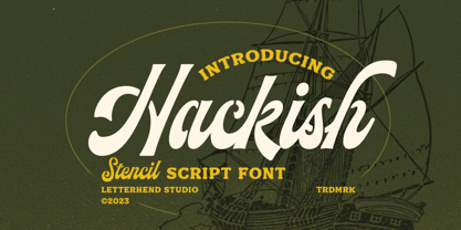 Hackish is a captivating stencil script font that effortlessly infuses your designs with a touch of class and a dash of vintage charm. Its unique blend of elegance and ruggedness makes it the perfect choice for projects seeking a timeless and sophisticated appeal Features : Uppercase & lowercase Numbers and punctuation Alternates & Ligatures Multilingual PUA encoded
 - Kubrickle by Discourse Type,
$29.00Kubrickle is an unique typeface release by the Discourse Type foundry. It comes in three styles a block, stencil and swash. The swash types comes with an large set of special ligatures that can give you titles an edge. Combine the three different styles to create dynamic typography suitable for album covers, magazines and flyers. - Bunker by Omine Type,
$24.00A versatile stencil type family with lowercase characters and a extensive character set. Bunker has four styles, and all of them are interchangeable, which means that a character occupies the same space (advance-width) in all of the fonts. It also has four styles of figures: tabular-lining, tabular-oldstyle, proportional-lining and proportional-oldstyle. - Wide Plump by Kaer,
$19.00 Wide Plump is a bold Stylish Stencil Font. Most of the glyphs are without any holes, it's provide powerful impact. You can use it in fashion magazines covers, short advertise slogan and so on. * Uppercase and some lowercase * Numbers * Symbols * Multilingual support Please feel free to request to add characters you need: kaer.pro@gmail.com
 - Karara Shadow by Kufic Studio,
$20.00 Karara Shadow, a complete font set and additional font style of Karara. The word Karara means patience & steady. The style is achieved by practicing and studying the modern techniques to deliver high-end professional font. This specific font had a tint of wall chalking & texture. Carefully engraved and stenciled to delivery clean cuts and design.
 - Dittem Datum NF by Nick's Fonts,
$10.00A few simple rules govern the letterforms of this decidedly digital-age typeface, and the nonstandard stencil treatment adds a gentle sense of motion to the overall design. Available in two weights, all versions of this font include the Unicode 1250 Central European character set in addition to the standard Unicode 1252 Latin set. - Bandoleer by MADType,
$24.00 The inspiration for this versatile typeface came from both Art Deco and Military sources. It comes with both a clean geometric and hand drawn version so you don't have to get carpal tunnel sketching it out yourself. This typeface is equally at home stenciled with paint on a wall or used on a music poster.
 - Kaos by Wiescher Design,
$39.50 On a huge garbage bin in Lisbon I saw the sentence, “Perdidos no kaos”, which means lost in chaos and I really liked the rough stenciled lettering. Back home I designed a typeface that wasn't quite as chaotic as the lettering on the garbage container. Yours – always on the lookout for great typefaces – Gert Wiescher
 - DF Ko by Dutchfonts,
$33.00 The Ko family was developed for the text posters at the Holland Festival in 1997, based on the filling of a lettering stencil with different pen thicknesses. Ko Heavy and the Ko KAP were the first weights; the family was completed in 2002 with a Ko Light, a second Ko KAP and two italics.
 - King George by Chank,
$59.00King George is a chaotic, bouncy, flyer display font that harkens back to Chank's roots as a grunge alphabetician. It also has a ransom note feel that reflects the stresses and randomness of this American life. Pure rebellion! - Rozza by Serebryakov,
$49.00 Rozza is a single weight stencil cursive fat face font for extremal display use. Looking at this font the story of beauty and the beast comes to mind. That is how I would describe it. On the one hand prickly and dangerous, and on the other - pulsating beauty and passion. Try to combine Rozza together with Displace — great pair!
 - Vanage by Katatrad,
$29.00 Vanage is is an elegant high contrast contemporary sans-serif stencil typeface provides advanced typographical support with features such as ligatures and alternate characters. It is rooted in the style of a classic high contest typeface, excluding the typical serifs and ball terminals. Vanage is made for display use, Available in 5 weights and their Italics.
 - The City Burn by Alien,
$40.00 The City Burn, formerly called "The city burn night after night and we spray-paint the walls", was especially designed for Mad Skills Mag issue#3 Urban Flavour. It needed to be street, and urban, so I made a stencil font. It’s used by Fox5 tv for the rant TV show, the website infected.com, Fried chillies TV, and others!
 - Futura ND Black by Neufville Digital,
$45.25 Designed by Paul Renner and published in 1929. It shows an alternative method of giving maximum thickness to a font by being designed to resemble the use of a stencil. It was a very fashionable typeface during the avant-garde period. It is still an excellent typeface for display use. Futura is a Trademark of BauerTypes SL
 - Export Drive by Studio K,
$45.00 Export Drive is a bold condensed stencil font of the kind traditionally used to mark tea chests, packing cases and other goods in transit. Nowadays of course its applications are universal, although it is particularly well suited to branding or publishing projects which strive for a sense of freshness, urgency and immediacy, or a rugged, rough-and-ready feel.
 - Old Trail JNL by Jeff Levine,
$29.00 An image of an antique metal marking stencil [circa late 1890s or early 1900s] reading “Folck’s Roller Mills #196 New Surprise manufactured by Wolfe Brothers, Cumberland, MD” had the words “New Surprise” rendered in a Western/Victorian typeface. Those letters served as the model for Old Trail JNL, which is available in both regular and oblique versions.
 - Dance and Sing JNL by Jeff Levine,
$29.00 A 1932 fan magazine from Spain entitled “Films Selectos” (“Select Films”) had those words hand lettered in a decorative Art Deco type style that was a cross between the “Futura Black” style of stencil influenced display lettering and “Fiesta” lettering. This hybrid design is now available digitally as Dance and Sing JNL in both regular and oblique versions.


