1,379 search results
(0.009 seconds)
- Shockfest by Arendxstudio,
$15.00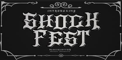 ShockFest is a very powerful Blackletter font in terms of design, has a unique and fancy character making every design project with that style look perfect. ShockFest came with opentype features such stylistic alternates, stylistic sets & ligatures good for logotype, poster, badge, book cover, tshirt design, packaging and any more. Features: -Uppercase & Lowercase -Multilingual support -Numbers -Symbols -Punctuation -Ornament
 - Tarotee One by Monotype,
$29.99Traditional as Gutenberg, fresh as a sealed deck of playing cards - Tarotee One Arabesques is a remarkable set of ornaments that combine and recombine in endlessly beautiful combinations. Created by Tony Lansbury (and if you're still wondering what "tarotee" means, here's a hint - tear open that deck of cards mentioned above and look at the backs). - Hermann by W Type Foundry,
$29.00 Hermann is one of our most readable typefaces so far. Since last year, the W Design team had been examining closely the possibility of developing a text font. Thus, we dug into concepts within some of our favorite novels, such as The Steppenwolf and Brave New World, written by Hermann Hesse and Aldous Huxley respectively. Ideas like duality, surrealism, and wildness mainly appeared. With these concepts in mind, we analyzed carefully the typefaces used in both Hesse’s and Huxley’s creations; Sabon and Garamond showed up catching our attention and, of course, awakening our admiration. Consequently, the challenge was to combine the key features of these fonts with the concepts already identified. At first, we made a text font which was suitable to compose long texts. However, we realized that we needed to refine some characteristics to convey all the ideas. A full set of capital discretionary ligatures was designed, which convert Hermann in a display font when is required. We also designed swashes (from A-Z) and final forms (in letters h, k, m, n, r and x in romans, and in letters a, d, e, h, i, l, m, n, r, t, u, x and z in italics), conveying more dynamism and versatility when it comes to composing visually. Hermann was designed not only to be accurate in terms of legibility but also to be wild and bold. That is why we took a big leap and designed from the beginning a font that is inspired by the world of 20th-century novels, using the name of one of its greatest exponents, Hermann Hesse.
 - Batman Beat the hell Outta Me - Unknown license

- The NFL Packers font captures the spirit and passion of the Green Bay Packers, one of the most storied franchises in the National Football League (NFL). This font is not merely a set of characters; i...
- Discordia by Naipe Foundry,
$60.00 Discórdia is a type-family of contrasting contrasts. Each of the four members of the family has a different contrast type. Regular has broad-nib contrast, Bold has horizontal contrast, the Italic is monoline, which means it has no apparent contrast, and Bold Italic is... Well, it’s probably best if see for yourself. These different design structures were fine-tuned to work well together in the same line, creating emphasis and hierarchy through a mini-super-family that groups a wedge-serif Regular, a slab-serif Bold, a sans-serif-ish Italic and a twisted Bold Italic. Naipe teamed up with Ben Nathan of Hafontia to extend Discórdia and give full Hebrew Support. Coming soon!
 - Universal College by Fontscafe,
$39.00 If there is one Fonts Café specially-priced pack that deserves the title "TEAM" it's "Universal College." Together, these two vintage, college-style fonts: the original CLASSIC, and our latest "DRAFT" pick, are the no-sweat, first line players for all your varsity design challenges and goals. Classy enough for every sport, season or celebration, and casual enough for any campus clothing creation. "Universal College" typefaces are also available individually: our original classic version has the handcrafted, retro feel that Fonts Café best-selling typefaces are world famous for. "Draft" has the edge that designers worldwide have come to expect from fontscafe.com and that you can find in many of our other retro and vintage typefaces.
 - Gardens by The Rivertown Inkery,
$20.00 Gardens is a nostalgic arena font. Inspired by a soon-to-be demolished arena, this font was created to capture the memories and good times this building once contained. Upon hearing the news of the demolition, our team was struck with sadness and nostalgia. As youngsters we can recall attending a wide variety of events, such as hockey games, pro wresting and the circus. Our hope is that others can share in our nostalgic love of this once prominent arena. With curvy retro styling Gardens is unique and will fit in with many retro and vintage logos and design. Wether its t-shirts, posters or digital, Gardens will surely make your work stand out!
 - Unusually Deco JNL by Jeff Levine,
$29.00 The hand lettered words “Pere Noel” under a vintage French magazine’s photo of Santa with two bikini-clad beauties inspired the digital version of this quirky, condensed type style. Unusually Deco JNL is available in both regular and oblique versions From Wikipedia: “Père Noël “Papi Christmas”, sometimes called ‘Papa Noël’ (“Daddy Christmas”), is a legendary gift-bringer at Christmas in France and other French-speaking areas, identified with the Father Christmas and/or Santa Claus of English-speaking territories. Though they were traditionally different, all of them are now the same character, with different names, and the shared characteristics of a red outfit, workshop at the North Pole/Lapland, and a team of reindeer.”
 - Neue Frutiger Thai by Linotype,
$79.00 Neue Frutiger Thai was created by Anuthin Wongsunkakon and a team of designers and font engineers from the Monotype Studio, under the direction of Monotype type director Akira Kobayashi. The family is available in 10 weights from Ultra Light to Extra Black in both Traditional (loop terminals) and Modern (loop-less terminals) styles. Neue Frutiger Thai embodies the same warmth and clarity as Adrian Frutiger's original design, but allows brands to maintain their visual identity, and communicate with a consistent tone of voice, regardless of the language. It is part of the Neue Frutiger World collection, offering linguistic versatility across environments – suited to branding and corporate identity, advertising, signage, wayfinding, print, and digital environments.
 - Behover by Martype co,
$15.00 Introducing Behover Font Pack, the bold and strong character in every letters to make variable style typograhpic design. This fonts comes with 8 styles typefaces to complete your design story, perfect for your sports team, logotype, branding, gaming logo, and badges. Support for 67 languages Afrikaans, Albanian, Basque, Bemba, Bena, Breton, Catalan, Chiga, Cornish, Danish, Dutch, English, Estonian, Faroese, Filipino, Finnish, French, Friulian, Galician, German, Gusii, Indonesian, Irish, Italian, Kabuverdianu, Kalenjin, Kinyarwanda, Luo, Luxembourgish, Luyia, Machame, Makhuwa, Meetto, Makonde, Malagasy, Manx, Morisyen, North, Ndebele, Norwegian, Bokmål, Norwegian, Nynorsk, Nyankole, Oromo, Portuguese, Quechua, Romansh, Rombo, Rundi, Rwa, Samburu, Sango, Sangu, Scottish, Gaelic, Sena, Shambala, Shona, Soga, Somali, Spanish, Swahili, Swedish, Swiss, ,German, Taita, Teso, Uzbek (Latin), Volapük, VunjoZulu, *
 - Aquiline by GroupType,
$24.95 Handsome, adventurous, legible and elegant, this script has the feel of practical handwriting from past centuries. Aquiline is based on a cursive italic style influenced by the 16th century European writing masters. The Aquiline design team turned to Ludovico degli Arrighi, the great 16th century writing master, for period ideas on how to improve, strengthen and add grace to the font. Aquiline has strokes and gestures that seem very like the writing of Arrighi and Mercator, such as the flamboyant balloon of a flourish on the cap A; the graceful flourishes on the cap B, D, and L; and the compact lowercase with tall ascenders. Aquiline has a strong personality and is historically correct.
 - Sana Sans by Latinotype,
$29.00 Sana Sans is a humanist functional typeface with a modern feel. It is intended to be a face well-suited for multiple purposes, especially in publishing. Sana Sans looks perfectly legible and clean in long texts, and neat and simple in headlines. Thanks to its versatility, this font is also ideal for both screen and print usage. Sana Sans consists of 32 styles and 8 weights—ranging from Thin to Heavy—italics, small caps and an alternative family. The alternative family offers slight variants in many glyphs, some of which include the lowercase a, e, l, q, y and uppercase G, L, and Q. Sana Sans was designed by Felipe Sanzana, under the supervision of Latinotype Team.
 - Neue Frutiger Devanagari by Linotype,
$99.00 Neue Frutiger Devanagari was created by Mahendra Patel and Kimya Gandhi and a team of designers and font engineers from the Monotype Studio, under the direction of Monotype type director Akira Kobayashi. The family is available in 5 weights from Light to Extra Black, with matching italics to support the Devanagari script and languages such as Hindi. Neue Frutiger Devanagari embodies the same warmth and clarity as Adrian Frutiger's original design, but allows brands to maintain their visual identity, and communicate with a consistent tone of voice, regardless of the language. It is part of the Neue Frutiger World collection, offering linguistic versatility across environments – suited to branding and corporate identity, advertising, signage, wayfinding, print, and digital environments.
 - Mike Wieringo by Comicraft,
$29.00 SPIDER-MAN! THE HULK! THE FANTASTIC FOUR! BATMAN! SUPERMAN! Superstar artist Mike Wieringo has worked with the most well-known characters in comic books, and just a few short years ago Comicraft teamed up with Mike and writer Todd DeZago in the pages of their creator-owned comic book fantasy adventure series, TELLOS! At Mike's request, we created a special Wieringo font which incorporated Mike's distinctive, slick-and-easy, backward-sloping letters, as well as a slightly heavier font -- carrying just a little more ink -- for the Shadow Jumper characters featured in the first TELLOS story arc. Now the Mike Wieringo font can be yours as it joins our ever growing library of Masters of Comic Book Art fonts.
 - Latino Gothic by Latinotype,
$39.00 “Latino Gothic” is the result of two years of hard work by the Latinotype design team under the artistic direction of Alfonso García. We are really proud to present a superfamily with the magnitude and characteristics of "Latino Gothic". A very complete typographic font made up of no less than 90 styles. "Latino Gothic" offers a new interpretation of the original design totally focused on the needs of visual communication of the 21st century. «Latino Gothic» is designed to respond to the most varied communication needs thanks to its 5 widths and 9 weights, with their respective italics. 90 different styles make it the most versatile and complete gothic family on the market!
 - Alfazine Script by Mysterylab,
$24.00 Alfazine Script is a bold and spirited script with extensive ornate detailing. This versatile font is evocative of antique signpainters' letters, circus wagon & carnival booth graphics, groovy 1960s psychedelic scripts, and even sportswear team insignias, all combined with a modern approach towards lively curlicues and ball finial stroke ends. As with all other font offerings from Mysterylab Designs, we take great care with artful kerning and weight-matching of glyphs to allow this font to be used not only at attention-grabbing headline and logo sizes, but also at small body copy sizes in extended passages. Alfazine also features an extruded shadow version that's very useful for designing logos and customized layered lettering.
 - CAL Bodoni Terracina by California Type Foundry,
$47.00 Bodoni Terracina is a legible, fun-formal script face, with lots of curls. Sometimes script faces are hard to read. Sometimes being formal means that there’s no personality and there’s no fun. Enter Terracina: one of the masterpieces of font design. Some of the most personable italics ever carved. Includes powerful new features for: • Dates • Pricings • Addresses Not is only Terracina formal but fun, it’s also fun to use! In a program like Adobe Indesign or Illustrator, just highlight a word and see lots of fun options. Bodoni himself etched these symbols, and his fun-loving personality shines through. As a semi-script, it can go together with many script fonts, but it is more readable. When you need something equal parts elegant and whimsical, Terracina strikes a perfect balance to let the fun shine through, such as for holiday designs or fairytales. Terracina is a subheads font, but Bodoni also used it for paragraphs. So Terracina works well doing subhead paragraphs, especially when contrasting with the mood of the first font. And because of the swash variety, it works well for setting German and other European languages. CAL Bodoni Terracina is a member of our Origins Series. Origin Fonts are designed to be true to the original designer's intentions and fonts. Our Bodoni origin fonts ARE Bodoni fonts, not imitations or interpretations. They were drawn by Bodoni, our team just expanded it for modern use. For Terracina, Bodoni's original weight is the "Quasi-Lite" option, all other weights have been meticulously matched by the CAL Origins Team.
 - Valute by Authentype,
$12.00 Valute is a custom font with variable typeface, but at first glance it looks very mischievous. Very thincontrasting lines are very legible with heavy use of paragraph text. We made Valute with 9 weights that include ligatures and are multilingual. We will make language and feature updates in the future as this is a long-term project that we will be building on.
 - Soft Block by fontgeneration,
$19.00 The letters possess some of the most characteristic features of this type of font, used for communication and advertising in various mechanized and motor sports, as well as in the gaming industry. The technological-engineering constructiveness is achieved through the strict geometry of the forms, and the sporty competitive look is stylistically expressed through the slopes and contrasts of the beams.
 - Happy Phantom - Personal use only

- H-AND-S by AND,
$89.00 A common creation: (to pass from one hand to the other): For the first time, various hand-signs from diverse sources are unified into one single visual style. This compendium is the result of 15 years of incubation and 7 years of creation. In his travels throughout the world, graphic designer Jean-Benoit Levy, principal of the visual studio AND, has collected pictures of multiple hand signage. Uncertain what to do with those signs, he kept them year after year until the idea came to unify almost 200 handsigns into one single family. In accordance with this entire collection, the name of the typeface is a mix: "h-and-s". A global collection: (To put in good hands): We all have one thing in common: Hand-signs are an international language, they are meant to be understood by all of us. Each of us regularly comes in contact with modern hieroglyphs such as the hand-sign-codes that are so prevalent in our daily life. This way of communication belongs to no one in particular and to all of us in general. Even if the sense of certain signs varies from one culture to the other, there is a common hand-sign language. We are surrounded by this language of handsigns each time we step in a store, we eat, open a container of milk, we clean up, use package of wash-powder, by shaving, when we work, use tools, at home, by tearing the envelope of a condom, by traveling, etc. When we encounter these signs, we all understand them easily. A visual connection: (To go hand in hand): This typeface is a global visual statement. Collecting, ordering, redrawing, unifying. Reconstructed and assembled into one original alphabet, H-AND-S is a unique and complex signs program. Our choice is based on daily gestures and global hand-codes. Logically this typeface starts with the "American Sign Language" and expands on two type-variations, each on two levels of keyboard. The international team of H-AND-S would like to send his special thanks to all of the anonymous graphic designers throughout the world who designed different hand-signage and who influenced and inspired to create such a sign collection into one unified family. We, the global nomad team of AND, hope that you will enjoy our H-AND-S. Additional Credits Production: Studio AND. www.and.ch. Concept, Idea & Creative Direction: Jean-Benoît Lévy, Switzerland / USA. Research & Sketches: Eva Schubert, Germany. Illustration, Graphic Design & Visual Fusion: Diana Stoen, USA. Transfer, Adaptation & Refining: Moonkyung Choi, Korea. Finalization & Checking: Sylvestre Lucia, Switzerland. Coaching & Technical Advice: Mike Kohnke, USA. Creative Energy & Implementation: Joachim Müller-Lancé, Germany / USA.
 - Teacup by Hanoded,
$15.00 I remember a tea ceremony I attended in Fukuoka, Japan. The teahouse was set in a small, but beautiful garden and the whole idea of the ceremony was to appreciate the view from the porch. I thought the tea was quite bitter, but the view was unsurpassed. From time to time these memories pop up and I have to use them - that is why I named this font Teacup. Teacup is a slightly eroded all caps font, made entirely by hand with a Japanese marker pen and some high quality textured paper. It comes in a romantic open style and a more solid closed style. Teacup is filled to the brim with diacritics.
 - Night Train by FontMesa,
$19.95 Night Train is a new font built from the ground up; while Night Train may resemble an old classic wood type there are a few lines that make this font a little more modern setting it apart from other wood type revivals. If you're a railroad enthusiast you're sure to enjoy the steam locomotive graphic located on the less than and greater than keys on all versions of this font, due to the fine detail of this train illustration the best printing results will be at 600dpi or higher on a laser printer. An alternate K and R are within the Night Train fonts, for Win Type1 these alternates are on the left and right bracket keys, for Truetype and OpenType you may access the alternates by using the Character Map in Windows or Adobe Illustrator, for OpenType you may also find them on the stylistic alternates page of the glyph map in Illustrator. There's something new with Night Train that the sign making people will love, for the first time FontMesa is pleased to offer a block shadowed version in four directions. One fill font is all that is needed for all four open faced fonts, you'll need an application that works in layers in order to use the fill font with the open faced fonts, simply place the fill font in its own layer then move it behind one of the open faced fonts of Night Train. The Night Train name has been on my list to use as a font name for a few years, a friend from years ago used to sail his boat in the Mackinac race from Chicago to Mackinac Island, the name of that boat was the Night Train. Watching the 2010 Olympic four man U.S. bobsled team win gold with their sled also called Night Train has inspired me to complete this font.
 - Vrångö - 100% free

- Café Brasil by Sofia Mohr,
$39.00 Café Brasil is a font designed to represent coffee, especially for use in packaging, brand titles, logos and menus. Based on the shape of a coffee bean, Café Brasil has delicate details and ligatures that represent the liquid, foam and steam of a good cup of coffee. In March 2014, Café Brasil was chosen to be part of the main exhibition at the “Tipos Latinos 2014”.
 - Kodama Forest by Hanoded,
$15.00 Kodama are spirits in Japanese folklore that inhabit trees. The term is also used for trees in which a kodama houses. Kodama Forest is a rough, spikey and inky font, in the style of the great Ralph Steadman. Kodama Forest comes with a bunch of alternates, some interesting ligatures and a lot of splatter. And, of course, all the diacritics you can throw a tree spirit at.
 - Gimbo by Halbfett,
$30.00 Gimbo is bold. This heavy sans-serif design features thin counters. The interior spaces inside letterforms have been reduced as much as possible. Often, they seem abstract. There are three fonts in the Gimbo family: Black, Ultra, and Ultra Shadow. What do those terms mean? Well, Ultra is wider than Black. It takes up more pixels on-screen or brings more ink to the page.
 - Greissler by Markus Fetz,
$21.00 GREISSLER is a Retro Display Font inspired by old letterings on store fronts and building facades in Vienna. "Greißler" is a term used in the east of Austria and means small grocer. In Vienna you can still see some of the letterings "Lebensmittel", "Feinkost", etc. on the storefronts of mostly abandoned shops. Similar letters can be found on "Gemeindebauten" (council housing) from the 1920s.
 - Nationale by Greater Albion Typefounders,
$15.00 Nationale is inspired by the lettering of early 20th century share certificates and bonds. It includes a complete set of stylistic alternates for all letter forms, and two sizes of numerals. National speaks of the steam age, and the age of traditional design and engineering, when aesthetic concerns mattered just as much as function. Bring a touch of the elegant past to your work with Nationale.
 - Knitting And Sewing Doodles by Outside the Line,
$19.00Knitting & Sewing Doodles are just that. If you type all caps you get 15 knitting icons and lower case is 15 sewing doodles. Knitting items include yarn, knitting, needles, ball winder, spinning supplies, stitch counter, etc. Sewing machine, buttons, thread, pin cushion, bobbin, thimble and needles, scissors, label, tape measure, darning egg, zipper, seam ripper, and pins, all in the Outside the Line style. - LT Oksana - Personal use only

- Helvetica World by Linotype,
$149.00 Helvetica is one of the most famous and popular typefaces in the world. It lends an air of lucid efficiency to any typographic message with its clean, no-nonsense shapes. The original typeface was called Neue Haas Grotesk, and was designed in 1957 by Max Miedinger for the Haas’sche Schriftgiesserei (Haas Type Foundry) in Switzerland. In 1960 the name was changed to Helvetica (an adaptation of Helvetia, the Latin name for Switzerland). Over the years, the original Helvetica™ family was expanded to include many different weights, but these were not as well coordinated with each other as they might have been. At the beginning of the 21st Century, Linotype released an updated design of Helvetica, the Helvetica World typeface family. This family is much smaller in terms of its number of fonts, but each font makes up for this in terms of language support. Helvetica World supports a number of languages and writing systems from all over the globe.
 - Sedid World by Fontuma,
$28.00 Sedid, “solidity; It is an Arabic term meaning “righteousness”. In particular, the correctness and soundness of a word is indicated by this word. The fact that I gave this name to the writing family is to point out its accuracy and robustness. This typeface, which is sans serif, consists of three families: ▪ Sedid: Font family containing Latin letters ▪ Sedid Pro: Font family including Latin, Arabic and Hebrew alphabets ▪ Sedid World: A family of typefaces including Latin, Cyrillic, Greek, Arabic and Hebrew alphabets Do you want a difference in your work? Then meet the Sedid World font family. This font will meet all your expectations in terms of the languages it supports and the variety of glyphs it contains. You can easily use the Sedid World font family in every project. Because this font has beautiful and soft lines. The font family includes open type features, as well as a large number of ligatures, small caps, modifiers, and currency symbols of many countries.
 - Eggad by Ingrimayne Type,
$9.00 Eggad features letters on eggs. It can be a fun font to use at Easter or for any egg-related message. Some of the eggs - those on the upper-case keys - have their large end on the bottom and others - those on the lower-case keys - have their large end on the top. The font uses the contextual alternatives feature of OpenType to alternate the big-bottom and big-top eggs. If you only want eggs with big tops or with big bottoms, turn this feature off. Eggad comes in two styles, a regular style in which the eggs are outlined and a bold style in which the eggs are solid. Both are monospaced. The two styles can be layered to color the eggs. Alternatively, background color can be added (dot accent and ring characters) or the outline color can be changed (sterling and yen characters) using layers in the regular style. If you are typing numbers and you want the start to be big-bottom number, switch on OpenType style set 1.
 - Shackle One by Christoph Reichelt,
$18.00 Shackle One is a geometric Sans Serif with a twist. As a modern classic that does not wear out visually it is suitable, for example, for luxury items, leather goods, watches and jewelry, high-class sports, documentation of historical technology or graphics in the field of art and design. It works excellently for huge headlines, but can also show particular strengths in continuous text – its gray value is almost flawlessly uniform. All line connections and terminations are perpendicular, which means that slopes or curves have a light bend at their ends, similar to the lordosis of the cervical spine. This makes the font look upright and straight and at the same time agile and dynamic, like an athlete with good posture – a typeface that is powerful and confident without appearing steely or violent. Shackle One is a classic but casual looking font with sophisticated details. It has a classy appearance without being pretentious. It can appear stern and serious as well as playful and humorous. Its strong character also makes it an excellent corporate font for certain branches. You will love it.
 - PF Handbook Pro by Parachute,
$79.00 This typeface incorporates round smooth corners and distinct design elements in several characters like 'a, g, k, m', without compromising legibility. In order to retain its sharpness, inner corners as well as junction points were left steep. This is a balanced typeface which works very well in long texts at small point sizes. Since its first release it has been used in numerous magazines, advertising campaigns and corporate applications. Handbook Pro comes loaded with a number of special features. The family consists of 14 fonts -from black to extra thin- including true italics. It supports 21 special OpenType features like small caps, fractions, ordinals, etc. and offers multilingual support for all European languages including Greek and Cyrillic. There is also a set of very interesting stylistic alternates which can be used to add a refreshing flair to your designs. Finally, every font in this family has been completed with 270 copyright-free symbols, some of which have been proposed by several international organizations for packaging, public areas, environment, transportation, computers, fabric care and urban life.
 - Grogie by Luhop Creative,
$16.00 Grogie font family consists of 06 families,is a high-contrast typography inspired by transitional and contemporary typography. Fonts extend their use by giving weights ranging from thin to black. The natural curve, a swollen and sloping stem, grows in character as the font gains weight. While the thinner weight has lowered contrast and optical correction to create a warm and soft look. Featuring beautiful, excellent weight and extensive language support. The elegant modern font creates a unique design and is sure to steal the eye of the design target audience. Besides being unique, the Grogie font also has a luxury simple character that makes the design charming and luxurious. Grogie excels in display settings such as headlines, titles, branding projects, Logo design, packaging, magazine headings, advertising, short or long text. Grogie Features: Multilanguange PUA Encoded Alternates Ligatures. Open Type LatPro To be able to access alternative fonts, make sure the software you use can support opentype features such as Microsoft Word, Paint, Adobe, Corel draw, Cricut and other applications. If you need help, please contact me :)
 - Paneur by Craft Supply Co,
$20.00 Introducing Paneur – Expressive Serif Typeface Serif Playfulness Paneur – Serif Typeface is far from your typical, formal serif font; it introduces a delightful touch of playfulness to traditional design. Informal Strokes Notably, Paneur’s strokes take on an informal quality, adding an expressive flair to your projects while steering clear of the formality usually associated with conventional serifs. Endless Expressivity What sets Paneur apart is its ability to offer endless expressivity. It’s the perfect choice for those who wish to break the monotony in design, infusing each project with an invigorating energy and dynamic spirit. Never Boring Design Indeed, Paneur is the antidote to boring and conventional design. Its informal serifs guarantee that your creations are never dull, but rather lively, captivating, and bursting with personality. In Conclusion In summary, Paneur – Serif Typeface is the font of choice for non-traditional expressiveness. It introduces a playful and informal touch to your projects, breaking free from the constraints of traditional serif fonts. By choosing Paneur, you ensure that your designs are engaging, full of life, and far from mundane.
 - Hello Radio by Invasi Studio,
$18.00 Say hello to Hello Radio font, the perfect font to add a touch of vintage charm to your designs! With its monoline stroke script style, this font brings back the good old days with a fun and quirky twist. The best part? It supports multilingual characters, so you can spread the retro vibes in any language you desire. Every character in Hello Radio font has a delightful imperfect shape, giving your designs a natural and handcrafted feel. It's like having your vintage radio station right at your fingertips! This font is a true team player, cooperating effortlessly with other elements in your design. Whether you're creating traditional-style logos, labels, package designs, or awesome lettering for t-shirts, Hello Radio Font has got you covered.


