1,263 search results
(0.017 seconds)
- Print Marks JNL by Jeff Levine,
$29.00 Print Marks JNL assembles more old print shop cuts into a varied assortment of embellishments, border elements, designs and printer's marks. Newly re-drawn from vintage source material, they will brighten text with their nostalgic and charming look.
 - Odisean One - Personal use only

- Odisean Tech - Personal use only

- Bucanera - Personal use only

- Via Sans by Latinotype,
$26.00 Via sans is a font inspired by classics like Steile Futura and Din 1451, with neo-humanist characteristics. It was designed as a font for fast reading from a distance, which saves horizontal space in the text composition, making it a very good alternative when composing long phrases in reduced spaces, with high readability in various sizes due to its ample counters. With round corners that reduce the irradiation that reflective materials in signs produce. This family is composed by 8 fonts, 4 weight variations and 4 inclination variations, which include European accents marks, ligatures, fractions, ordinals and tabular numbers, in addition to a pictogram set that complement applications for wayfinding and maps.
 - Acies by Alexander Stephenson,
$26.00 Acies is a sharp sans with accented stroke width contrast and slightly condensed proportions. Its shapes are reduced to the bare minimum, conveying simplicity and sophistication. It has steep joins, aligning horizontal stroke endings and vertically ending ascenders and descenders, freely mixing typographic norms to create something refreshing and new. It is designed to function in a wide variety of environments, ranging from screen to print. Acies is available in 6 weights with matching obliques, that have the same pitch as their upright counterparts. With 690 Glyphs per font, it supports 100+ languages and offers a wide range of OpenType features like stylistic alternates, petite caps, old style figures, ligatures or case sensitive forms.
 - Monolith Pro by Gravitype,
$12.90 Monolith Pro is a futuristic heavy display that steals the show. This typeface is inspired by the popular Kubrick’s movie 2001: a space odyssey, from which the iconic monolith scene. The glyphs, in fact, have been designed to fill the rectangular shape, with the addition of minimal inlays to differentiate them consistently. While the uppercase is perfect for impactful headings and titles, the lowercase completes the main headline masterfully - but can also stand out alone due to its own distinguishable personality. The family includes 4 styles: regular, italic, outline and outline italic, to give more dynamism and sense of lightness when needed, in contrast with the heavy weight. Multilingual support is available.
 - Straits Light by AdultHumanMale,
$12.00 Straits is an oddball fun ALL-CAPS font, a modern take / re-imagining of some old Art Deco signage and a sister to my other font Penang. The font is available in 2 weights for now, a light and a medium. In general I think ALL-CAPS steal 26 characters from you, so each letter in each case is a little different, however subtly. This being an ALL-CAPS font I imagine it will work best in Headlines and other bold statements, but buy it and find out. The font is loaded with plenty of extras and glyphs. This was designed to be fun, so I hope you can have some with it.
 - Runegifter by Typeskets,
$15.00 Rune Gifter is a bold, modern and cool Stylish Display Serif font. It is defined by smooth curves and is perfect for fashion branding or editorial designs. Add it confidently to your projects, and you will love the results.
 - Terazza Tiling by Greater Albion Typefounders,
$8.95 Terazza Tiling was brought to mind by old-fashioned tiled fireplace surrounds. It's a system of geometric tiles intended for constructing page borders and rules. Their geometric nature makes them adaptable for any sort of period or modern look.
 - SoftTimes Roman by Wiescher Design,
$39.50 Designing SoftTimes has been easy on my nerves after the strain of HardTimes. The harder the Times are the more do we need some soft typefaces, this one is the soft counterpart for HardTimes. -Your softspoken typedesigner, Gert Wiescher
 - LTC Ornaments Two by Lanston Type Co.,
$29.95 LTC Ornaments Two is the first Lanston Ornament font which uses OpenType features to assist in decorative border creation. The ornaments themselves features designs of Fournier and other classic fleurons and ornaments whose origins date back to the earliest printers.
 - LTC Keystone Ornaments by Lanston Type Co.,
$24.95 LTC Keystone Ornaments is a set of over 100 glyphs based on "running border" ornaments from Keystone Type Foundry of Philadelphia, circa 1903. These geometric dingbats can be used individually for decorative emphasis, or combined in repetitive lines or complex patterns.
 - Christmas Style by Yoga Letter,
$15.00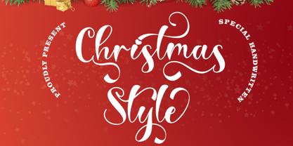 "Christmas style" is a beautiful and unique handwritten font. This font is very beautiful and elegant. includes uppercase, lowercase, swashes, titling, alternative uppercase and lowercase, multilingual support, binders, numbers, and punctuation. It is suitable for Christmas greetings, invitations, weddings, and more.
 - After Midnight by Natural Ink,
$18.00 After Midnight - a serif look with simple, clean and visual elegance with smooth curves and beautiful ligatures, A very versatile font that works in both large and small sizes. This font is suitable for a wide variety of projects such as: headlines, logos, labels, branding projects, magazines, homeware designs, product packaging, mugs, quotes, posters, and more. It can also be more expressive and fun, thanks to the many alternatives and binders that combine harmoniously in this font and make it more interesting and versatile. Try to change alternatives, binders and you will get many options for your project which will make it Smooth & beautiful.
 - Linotype Minos by Linotype,
$29.99Linotype Minos is part of the Take Type Library, chosen from contestants of Linotype’s International Digital Type Design Contests of 1994 and 1997. This fun font was designed by Swiss artist Christian Goetz, who named it after King Minos of Crete of the Bronze Age. Typical of scripts of this time were the ornamental borders around the characters, found on palaces of Knossos, Phaistos and Mallia. These borders surround every character of Linotype Minos, making it exclusively for headlines in larger point sizes. Single characters can also be used as initials mixed with other alphabets, especially with constructed sans serif and modern serif fonts. - Balgino Display by Natural Ink,
$12.00 Balgino Display - a serif look with simple, clean and visual elegance with smooth curves and beautiful ligatures, A very versatile font that works in both large and small sizes. This font is suitable for a wide variety of projects such as: headlines, logos, labels, branding projects, magazines, homeware designs, product packaging, mugs, quotes, posters, and more. It can also be more expressive and fun, thanks to the many alternatives and binders that combine harmoniously in this font and make it more interesting and versatile. Try to change alternatives, binders and you will get many options for your project which will make it Smooth & beautiful.
 - Glade by Dear Alison,
$24.00 My latest typeface is a formal, copperplate script named Glade. Beginning as a project for a client who wanted several widths of a formal script style, the project never saw fruition. However, it did get me excited about the idea of a width family of steel nib scripts, ranging from extra narrow to extra wide, and the result is the Glade family. To give Glade a minor modern makeover from the original intent, the lowercase has been scaled up, and the Capitals scaled down for a more friendly personality. The character set has been expanded, and OpenType support has been added for unlimited fractions, ordinals, superiors and inferiors. So if you have the need for a formal connecting script, but are short on space, try Glade Narrow or Glade Extra Narrow. If space is not an issue, then the Regular, Wide or the generously gracious Extra Wide should do nicely. And if you get the whole family, well then you are set for anything that comes your way.
 - Kade by Re-Type,
$45.00 Kade is a display/semi display sans family of fonts based on vernacular lettering photographed over the last ten years in and around the harbors of Amsterdam and Rotterdam. Hence the name Kade that translates into English as ‘quay’, also the name of its designer. Kade grew slowly from many different ideas and elements. The letters reflects the industrial method in which they are cut for the side of ships from large steel plates. Frequently subtleties of curves are compromised due to the cutting tools and the fact engineers are in control. Kade’s italics have an experimental character and were produced in an unorthodox manner by rotating 8 degrees, rather than slanting the roman characters, a method sometimes employed in shipyards. Kade constructed character is ideal for contemporary editorial works, architecture magazines, museums communication and posters. The six distinct styles are published in OpenType format, featuring small caps and four sets of numbers (proportional old style, tabular old style, proportional lining and tabular lining), as well as matching currency symbols and a complete set of fractions.
 - TXT101 by 101 Editions,
$19.00 TXT101 is a fresh, friendly typeface for mock text and borders. As a retro-cool digital successor to the pencil marks that were hand-drawn as placeholder text in the analog era, TXT101 includes 52 styles, from Arch to Zigzag, with a couple of loops, several slants, and a swell set of waves. If your final copy is TBD, use TXT101 to mock up roman, bold, italic or light. TXT101 looks GR8 and is EZ to set. BWTM! Corner pieces make TXT101 a complete and charming bordering typeface. All patterns come in four weights, so you can make frames and borders for everything from little labels to big broadsides. Corners (north, south, east, west) are TTLY a snap to select from their own stylistic sets. DIY: MIX & MATCH TO CREATE COOL PATTERNS! Many styles have aligning baselines, so glyphs will connect. Single- and double-line variations abound, and you can combine weights (light, regular, bold, black) as well as styles. BTW, feel free to insert word spaces or leave them out.
 - Cabaret by Solotype,
$19.95We've always liked Art Gothic (you've seen it on the titles and credits for TV's Murder She Wrote) but felt it was far too animated for most uses. Here is our super-simplified version, a calmer font that will fit many display uses. - Lonely Annie by Sander's Conspiracy,
$20.00Lonely Annie is a fun font for titles or body text. Each letter of the font appears hollow, but with thick borders -- like a little stained glass window. It looks great in small and large sizes, especially with "Outline" or "Shadow" turned on. - Castle Fleurons by CastleType,
$29.00 A delightful collection of classic fleurons. Useful for adding a tasteful accent to your documents or for creating borders. Left-facing fleurons are complimented by right-facing ones (and vice versa). Some fleurons have four 90-degree rotations for creating interesting tiling patterns.
 - But by Nicole Fally,
$40.00 Bold, black and square. But was first drawn as a logotype for the magazine "BUT – Bilder und Texte" (pictures and texts) which was published by an experimentally-oriented non-commercial initiative. In consideration of the unusual dimensions of the magazine (6 x 14 cm / 2,4 x 5,5 inch), I decided to fill as much space as possible with the body of type. This formal idea refers to the meaning of the title by blurring the border between legible letters and abstract shapes. Because of its origin, But is ideal for short messages in headline point size. Despite its blocky shapes, But creates a friendly atmosphere. The details are as playful as the restrictions that are given by the concept allow them to be. Punctuation marks and other special characters contrast the boldness of the design since they are matching the thin parts of upper- and lowercase letters. This also avoids gaps when longer texts are set. But is available in open type format and has an extended character set (Latin extended A). Two sets of numerals, one matching the x-height and another one matching the cap-height, are provided.
 - P22 Nebiornaments by IHOF,
$24.95 P22 Nebiornaments contains over 100 ornaments based on the Italian Nebiolo Type Foundry designs of the 1950s. Many of these ornaments are designed to create complex patterns and continuous borders. The simple geometric shapes allow for endless combinations for a wide variety of uses.
 - Amanet by Tour De Force,
$25.00 Amanet is original old fashion typeface that comes as Regular weight followed with stylistic compatibile Borders. It's pretty readable in small sizes which recommends it for use on packages, labels or specific corporate identities. "Amanet" is an archaic Serbian word for English word "legacy".
 - Alamanda by Goodigital13,
$20.00 Alamanda will be great for any projects including : branding, logo, stationery, business card, signage, flyer, brochure, and more. Almost all industries will be fall for this typeface: wedding, events, real estate, architect, law firm, florist, gardening, makeup artist, travel, hotel, musician, and many more .
 - Evening Gown JNL by Jeff Levine,
$29.00 Evening Gown JNL comes from the lettering displayed on a printed ad for the fictional "Gowns by Roberta" in a scene in the 1935 film of the same name. "Roberta" starred Fred Astaire and Ginger Rogers and was based on the successful 1933 stage play.
 - LoveHearts by Karandash,
$20.00 A lovely valentine inspired set of calligraphic ornaments and frames including seamless borders and patterns. With more than 160 hand drawn unique designs LoveHearts is the perfect choice for designing romantic greeting cards and beautiful wedding invitations as well as letter signatures and anniversary accessories.
 - Tripoca by Panatype Studio,
$9.00 TRIPOCA is a Handcraft Vintage inspired typeface with tropical summer vibes, come with 2 family style ( Regular, Slant ) Plus FREE Illustrations & Borders which is perfect for your designs that want a rough style, modern vintage, tropical, summer and carefully crafted for all graphic design needs.
 - XTextures by Ingrimayne Type,
$9.95 The XTextures package contains two typefaces that can be used to create borders or backgrounds. The elements are simple stripes, spots, and cracks. Some of them are flipped and rotated so that they can be combined to create endless patterns that connect and repeat.
 - Stitching Love by Studio Indigo,
$10.00 Stitching Love is a cross-stitch font made to add that crafty feeling to your design projects. It has both upper- and lowercase sans serif letters and comes with a number of decorative ornaments and border elements that you can combine in many different ways.
 - Libertine by Canada Type,
$24.95 Taking its cue from the lettering of 1930s Dutch commercial artist Martin Meijer, Libertine is a script where expert calligraphy and total wrist control are on display. With strokes stopping and starting at very steep angles and extreme contrasts, every character is a high riff jolting from within a stunning epic that brands the message home. This is the rebel yell, the adrenaline of scripts. Libertine comes in three interchangeable fonts, each of which containing extended language support. The complete set comes with a fourth font that includes tons of alternates and ligatures and, more importantly, Libertine Pro, the 1160+ character behemoth that combines all four fonts for advanced typography environments, where automatic ligatures, stylistic alternates, and position-sensitive forms are seamlessly put to good use.
 - Grandis by Eimantas Paškonis,
$- Grandis ("chainlink") was initially intended for a first person shooter’s UI, so this guided the design. The font had to be readable while maintaining sci-fi feel and also to not rely on kerning (most video games don’t support it). This meant a large x-height, steep diagonals and squared bowls to reduce the amount of white space between letters. Tabular numbers as default facilitate UI design where timers or tables are involved. What makes the font stand out from similar grotesks is the letters’ classical proportions with wide bowls and narrow rectangles. The result is a readable, versatile workhorse with an interesting dynamic rhythm and where extreme weights/widths can also be used for display purposes. Supports multilingual Latin and Cyrillic, including Bulgarian and Serbian alternates.
 - Alfina by Eurotypo,
$39.00 Alfina is a chancery typeface that shows a modern temperament, but is inspired by the eponymous town of Torre Alfina, one of the most beautiful medieval villages of Italy, situated on the edge of the plateau Alfina, a few miles from of Orvieto. The place where is the castle is steeped in history. Its roots date back to the Lombard kingdom (seventh century); later it was under the rule of Monaldeschi (1200-1700) and more recently (1880) the property of the rich French banker Count Edoardo Cahen of Antwerp, who was responsible for the present aspect of the Castle. Alfina has soft lines, very slender upper cases and thin overlapping strokes; The stylistic alternates are particularly important, and the type is enriched by many, different OpenType features.
 - Kristen Curly - Personal use only

- Fempowering by Franziska Herrmann Sustainable graphic design,
$14.00 GENDER DIVERSITY Introducing 'Fempowering' – designed to champion gender diversity in typography, created by a sustainable graphic designer who recognized the need for balance in a predominantly male field. SPACE-SAVING In the world of typography, space is often a precious commodity. 'Fempowering' is designed with this in mind. Its space-saving characteristics make it an ideal choice for print materials, editorial layouts, and any project where readability within confined space is paramount. GLYPH COLLECTION At the core of Fempowering lies an extensive glyph collection. It goes beyond the standard characters and numbers, embracing specialized symbols, mathematical notations, and even phonetic transcription. This comprehensive assortment opens new creative avenues, enabling you to craft unique and captivating designs. Franziska Herrmann
 - Bellflower by Celebrity Fontz,
$24.99 Bellflower is a collection of highly ornamented letters contoured with flourishes and tiny bellflowers. Romantic and classic, this stylized collection looks like something straight out of a fairy tale typography garden and comes with a full set of extended accented characters. Accented characters are also included. This digital format allows colorizing of type and is a perfect font for publications that want to capture the feel of the Victorian and Art Deco eras. Article abstract: Bellflower is a collection of highly ornamented letters contoured with flourishes and tiny bellflowers. Romantic and classic, this stylized collection looks like something straight out of a fairy tale typography garden and comes with a full set of extended accented characters.
 - Calisga by Mega Type,
$19.00 Calisga - Glamour Serif Display Font Calisga is a Serif Display Font with a modern, classy, fun, unique and versatile style. It looks amazing at display size and is easy to read in text size. This font also has lots of unique alternatives and binders that will make for stunning design projects. Calisga - Glamor Serif Display Font works well for branding projects, logos, wedding designs, social media posts, advertisements, product packaging, product designs, labels, photography, watermarks, invitations, or any project you are working on. Feature · All Uppercase and Lowercase · Numbers & Symbols · Supported Languages · Substitutes and Binders · PUA Encoded I really hope you enjoy it! Thank you so much for checking out my shop!
 - Printers Lot JNL by Jeff Levine,
$29.00 Printers Lot JNL is another eclectic mix of cartoons, ornaments, catch words, decorations and embellishments re-drawn from vintage source material used in the days of letterpress printing. For those who like to assemble their own larger borders, a set of elements is on the 2-9 keystrokes, but it must be noted that some manual adjustment is necessary to line up all of the parts in a complete border pattern. From a Happy New Year greeting to whimsical cartoon characters; from singular ornamental design elements to beautiful brackets, this mix of subjects is a great overview of the kinds of cuts found in printers' job case drawers in years gone by.


