10,000 search results
(0.032 seconds)
- Kutai by Eko Bimantara,
$18.00 Kutai is an explorative typeface that created to pursue unique display typeface fuse with ethnic look. It's consist of three styles or instance; Normal, Tall and Taller which have different height between each other, especially the x-height.
 - Alfrere Banner by Greater Albion Typefounders,
$12.00 Alfrere Banner is a 1950s inspired masthead typeface, designed to complement our ‘Alfrere Sans’ typeface family. These two Banner faces, offered in regular and incised forms, emphasise horizontal lines and have a distinct ’streamline-era’ feel to them.
 - M Yoyo HK by Monotype HK,
$523.99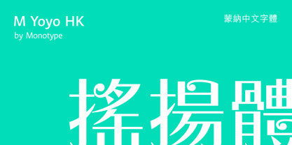 M Yoyo HK is a graphic style Traditional Chinese typeface. Graphic font designs have strong personalities and visual impact. Graphic style Traditional Chinese fonts feature decorative elements and pronounced graphics characteristics, suitable for catching attention in display applications.
 - HU Mois KR by Heummdesign,
$25.00 HU Mois KR is a calligraphy typeface with a sense of speed and a naturally slanted feel as if writing. It also gave a sense of free rhythm of handwriting. Includes Korean from the existing 'HU Mois' font.
 - M Windy PRC by Monotype HK,
$523.99 M Windy PRC is a graphic style Traditional Chinese typeface. Graphic font designs have strong personalities and visual impact. Graphic style Traditional Chinese fonts feature decorative elements and pronounced graphics characteristics, suitable for catching attention in display applications.
 - Skizzors by Fonthead Design,
$19.00Skizzors is a family designed by Ethan Dunham created by cutting letters out of paper. The fonts have an irregular edge but are clean and legible. The bold version is almost black and complements the regular version nicely. - Velvet Script by Typadelic,
$19.00A pretty handwriting typeface. Smooth and feminine. You'll find an alternate "r" and "s" (Option 9 and Option 10 on the keyboard) which have a beginning stroke to achieve a finished look. Try it and see for yourself. - Bilhete by Vernacular,
$9.99 Bilhete ('note') is a font for a quick writing. You can write a poem, a shop list or your name in a coffee cup. Any note on your project will have a personal taste with Bilhete by Vernacular. :)
 - HF Monorita by HyFont Studio,
$29.00 HF Monorita is the first monospace we have created. It is perfect for coding, display and design. The subtle curves on the diagonal strokes create a friendly vibe and can create a better reading flow for the users.
 - Nanu by Gustav & Brun,
$20.00 Nanu is a hand drawn font where lower and upper cases have the same cap height. It is multilingual and contains a lot of open type features. When purchasing Nanu you get the Nanu Simple Ornaments for free.
 - Lecory by vuuuds,
$16.00 Introducing Lecory Font! Lecory is modern serif font, every single letters have been carefully crafted. This font including beautiful alternate glyph. You can access the alternate glyph via Font Book (Mac user) or Windows Character Map (Windows user).
 - M Rocky PRC by Monotype HK,
$523.99 M Rocky PRC is a graphic style Simplified Chinese typeface. Graphic font designs have strong personalities and visual impact. Graphic style Simplified Chinese fonts feature decorative elements and pronounced graphics characteristics, suitable for catching attention in display applications.
 - M Circus PRC by Monotype HK,
$523.99 M Circus PRC is a graphic style Simplified Chinese typeface. Graphic font designs have strong personalities and visual impact. Graphic style Simplified Chinese fonts feature decorative elements and pronounced graphics characteristics, suitable for catching attention in display applications.
 - M Rocky HK by Monotype HK,
$523.99 M Rocky HK is a graphic style Traditional Chinese typeface. Graphic font designs have strong personalities and visual impact. Graphic style Traditional Chinese fonts feature decorative elements and pronounced graphics characteristics, suitable for catching attention in display applications.
 - Al Crystasea by Aluyeah Studio,
$119.00 Crystasea, a Dawn Seeker Display Serif Font with Stunning 4 weight Style. Very suitable for magazine, headline, website, ads, product package and all type of design project you have. Features: OpenType support Multilingual support (15 languages) PUA Encoded
 - Conqueror Sans by Letterhead Studio-YG,
$45.00 This sanserif has 18 faces from Light to the Black Italic. Conqueror Sans keeps the vigorous design peculiar to all members of this family, but at the same time it is more neutral, than its having serifs relatives.
 - Talloween by Ingrimayne Type,
$9.00 Talloween is a bizarre typeface in which the letters have a fraktur form, but look as if they had been made of wax that has partially melted. It comes in four styles, regular, oblique, shadow, and oblique shadow.
 - Olifant by Hipopotam Studio,
$25.00 Typeface originally designed as a monospace font (single standard width for all glyphs). We needed that for a project where letters stood directly above each other. Eventually it became proportional, and only the digits have a fixed width.
 - Razzle by Ayca Atalay,
$18.00 Razzle Sans | A Whimsical Sans Serif Razzle Sans is a clean sans serif typeface with a whimsical attitude. Playful yet legible letterforms that have a high x-height makes Razzle Sans an excellent choice as a display typeface.
 - Butterflies by Typadelic,
$-Can one have enough butterflies? I think not, which is why I created these little creatures. Another release of Butterflies, containing more butterflies and perhaps a few other critters thrown in, will be available later in the year. - Poison Ivy by Hanoded,
$15.00 Poison Ivy is a messy, scrawled font. It looks like the glyphs have been etched by an unsteady hand. Poison Ivy is ideal for use in books, albums and posters. Comes with a witches' kettle full of diacritics.
 - M Computer HK by Monotype HK,
$523.99 M Computer HK is a graphic style Traditional Chinese typeface. Graphic font designs have strong personalities and visual impact. Graphic style Traditional Chinese fonts feature decorative elements and pronounced graphics characteristics, suitable for catching attention in display applications.
 - Crypick by Grontype,
$14.00 Crypick is a Modern Serif Font, created with unique design. the parts of the font is simply watery looks inspired by ocean wave. this font comes with some ligatures and alternates, and already PUA encoded for easily accessed into optional Glyphs. Crypick Font is simply designed to ease any design project such as invitational card, logo tagline, attentional flyer, magazine header, and much more Features : Complete standard glyphs ligatures and alternates PUA encoded Numeral and Punctuation Multilingual Support Thankyou for your attention, Regard : Grontype
 - "OldStyle 1" refers to a typeface that draws inspiration from the early forms of serif typography, characteristic of the period when printing was first invented and became widespread. This era, rough...
- Bethlehem Ephrath by HiH,
$10.00 One menorah that I have long found particularly appealing was named The Tree of Life Menorah, a replica of which I gave as a gift one holiday to a kindly old couple who were neighbors and became friends. It had a simple, organic elegance that I see in the best of Art Nouveau sculpture. To me personally, Judeism is a celebration of life, like the triumph of the flower that blossoms in the crack of the city sidewalk. Just as Hanukkah celebrates the rededication of the temple and the miracle of the oil, it celebrates the victorious quest for freedom of the Hebrew people led by Judah Maccabee. Hanukkah represents determination and courage and faith — and it represents the presence of God in the lives of His people. It is interesting to note that the founding of the Albanian nation in the early twentieth century grew out of the resistance of the Albanian people to the imposition of Greek language and culture in the aftermath of the dissolution of the Ottoman Empire. The typeface, HADASSAH, designed by Henri Friedlander (1904-1996), is my favorite Hebrew typeface. Thirty years in the crafting, I believe it is unsurpassed for its shear beauty, combining a subtle modulation of stroke with a simplicity and clarity of form. No doubt, that is why it has become so popular. For me, the Sîyn/Shîyn characters are especially satisfying. For a Hanukkah message in Hebrew, I would choose HADASSAH LIGHT for a headline and print it as large as I could. If, however, you are looking for a friendly, warm face for a seasonal message in a roman-letter based language, may I suggest BETHLEHEM EPHRATH. It will be as comfortable as a bulky, hand-knit sweater on a frosty afternoon and reflects the solid, encompassing, family orientation of this holiday. It was on the way to Ephrath that Jacob’s beloved wife Rachel gave birth to Benjamin and then died from her labor. It was to Ephrath that Naomi and Ruth returned and in Ephrath that we have the wonderful, heart-warming story of the marriage between Ruth and her Redeemer-Kinsman, Boaz. And it was to Ephrath that prophet, Samuel, went to find a new king and there in Ephrath that the prophet annointed a small shepherd boy named David. The Proverbs tell us to seek wisdom. Never underestimate the impact you have on others. Words of kindness can change people’s lives. The Talmud says that the highest form of wisdom is kindness. Be wise this holiday season. The font BETHLEHEM EPHRATH is based on the typeface Accent with the permission of URW++ of Hamburg, Germany. Like most display fonts, it is most effective at 18 points and larger. Like most script fonts, it is most effective when set with both upper and lower case. Although this font is readable in all caps (many scripts are not), that does not make it a good idea. Do so only with caution.
 - Geiger by WyldType,
$14.99 Geiger is a geometric typeface inspired by type found in the intros of Commodore 64 games, its attention to the grid and its limited set of building blocks. The design of Geiger respects these criteria to create a sturdy alphabet without diagonals, and loosen its grip on the classic limitations to produce a complete character set worthy of today`s high-resolution displays with a retro touch. The properties of classic computing platforms, like their limited memory and low-resolution displays, required that the designers and programmers of the time devise and use certain techniques to produce interesting visual results. These platforms offered limited sets of default building blocks from which to build more complex graphics and type, and some skilled coders would work around these limitations to produce the unexpected. One of the areas that saw experimental digital type flourish is the Commodore 64 intro scene. The Geiger family includes four styles (regular, oblique, bold and bold oblique), all include common ligatures (fi, ff, ffi, fj, fl, jj, tt, Th, TT) and a few stylistic alternates (K, L). A particular attention was paid to the pattern created by the vertical stem and negative spaces of tightly set text, especially for Geiger Bold. Geiger produces good results at a size of 30pt or more, but we suggest using it at higher display sizes.
 - Josefov by Ingo,
$28.00 A narrow, modern Slab Serif. JOSEFOV is directly derived from the sans serif text font ”Hedwig“. Therefore, of course, it pairs best with “Hedwig”. The basic thought was to create a font with heavy rounded serifs in the style of ”Clarendon“ but which hardly reminds one of that particular font. The form principle of rounded serifs is applied whenever possible — for example at the points where the individual strokes of the characters join one another. JOSEFOV seems very technical, very constructed (and truly is). In order to soften up the rigid impression, the serifs are applied at some points contrary to the tradition handed down, as with the upper case A C G K M V W and the lower case a b d h i j k l s t. Historically there is no example of the laterally oriented serifs of capital and small s (S) and C G. On the other hand, the double-sided serifs on the stems of b d h k l appear at the beginning of modern times in the very first serif types from five hundred years ago. The double-sided serifs of A M V W were also customary in the first decades of printing. JOSEVOV is particularly suitable for topics such as nature, folklore, culture, music, nutrition.
 - DT Skiart Serif Mini by Dragon Tongue Foundry,
$9.00 ‘Skiart Serif Mini’ is now available online. Originally inspired by the san serif font ‘Skia’ by Mathew Carter for Apple. ‘Skiart’ was designed to feel more like a serifed font, but without any serifs. It took a step between sans serif and serif fonts. Next on the path towards a serif font comes Skiart Serif Mini, with tiny serifs added. This is a true serif font, all be it on the small side. It remains fully readable and feels as clean and normal as any of the best body copy serifs, and yet still has the strong solid bones of all the other Skiart font familys. If compared to one of the more commonly used serifs like ‘Times New Roman’, the ‘Skiart Serif Mini’ lowercase is more open with a taller x-height, increasing its readability and friendliness. The serifs are smaller and less distracting. They are not pretending to be ligatures. Where ‘Times’ makes its p q b d forms out of a barely touching oval and stem, the ‘Serif Mini’ forms are much more firmly attached, appearing clearly as single letters. The standard setting for the g’s are round single storied, (the italic a’s are also), feeling warmer and more inviting in the ‘Serif Mini’ font. Much more friendly than the stuffy double storied versions in fonts such as ‘Times’ etc.
 - Leftfield by Fenotype,
$35.00 Leftfield - stylish vintage font collection. Leftfield collection includes following: •Leftfield Brush -a bold baseball style script with Clean and Rough version •Leftfield Swoosh -a set of swooshes designed to go with Leftfield Brush. Clean and Rough version. •Leftfield Sans -a sturdy all caps sans serif with Regular and Bold weight and Clean and Rough version of both •Leftfield Serif -a sturdy all caps serif with Regular and Bold weight and Clean and Rough version of both Leftfield Brush is a bold and strong sports team style vintage connected script. It’s great for any kind of display use from impressive logos to packaging and headlines. Brush is equipped with automatic Contextual Alternates that keep the connections smooth. In addition there is Swash, Titling and Stylistic alternates for standard characters. Try combining Leftfield Swoosh to make stunning compositions. Leftfield Sans and Serif work great as themselves, they make striking word blocks and they are designed to go with the Brush. Try Leftfield Serif in large sizes to make the best out of the subtle serif’s. Leftfield Rough versions simulate a printed version of the font for authentic vintage look. They’re otherwise the same font but with a rugged outline and print texture inside the characters. Leftfield has a wide language support including West European, Central European, Baltic, Turkish and Romanian character sets.
 - Beachwood by Swell Type,
$25.00 Los Angeles’ distinctive “shotgun” style street signs were last produced over sixty years ago, but these durable porcelain and steel signs are still in use all over the city, by both humans and birds, who like to build their nests between the panels. The street names were drawn at wildly different widths to fit on panels which were manufactured in only one size. Beachwood faithfully re-creates the extreme range of widths & weights on these vintage signs, and adds a new matching lowercase. Use the Beachwood Variable font file to access any width, weight or italic angle between the presets — a technology 20th Century sign painters could only dream of! Each weight of Beachwood includes numbers based on the street signs, plus four alternate number sets based on the jerseys of Los Angeles' pro football teams. Beachwood is named for Beachwood Drive, the street which leads to the famous HOLLYWOOD sign, so we just had to include a bouncy HOLLYWOOD mode! FAMILY FEATURES: Five widths (from XTall to XWide), with eight Weights (from ExtraLight to UltraBold), each with matching italics Variable font to access any width, weight or italic slant EACH WEIGHT INCLUDES: 584 glyphs to support 223 languages in Western Europe, Central Europe, Vietnam and Oceania, plus Cyrillics Five styles of numbers, plus Tabular Lining for screen display Ordinals, Fractions and Arrows Hollywood mode!
 - Futura Now Variable by Monotype,
$383.99 For nearly 90 years, Paul Renner’s Futura has been as popular as it is versatile—from children’s books to fashion magazines to the plaque on the Moon. Futura is a typographic icon. Futura Now offers designers a chance to see Futura with fresh eyes. It’s more truly Futura-like than any digital version you’ve ever worked with. “It brings some much-needed humanity back to the world of geometric sans serifs,” says Steve Matteson, Monotype’s Creative Type Director who led the design team. “Despite its reputation as the ultimate modern typeface, Futura Now is surprisingly warm,” he explains. “It’s just as at home set next to a leafy tree as it is next to a stainless-steel table, because it skillfully navigates the border between super-clean geometry and humanist warmth.” Futura Now—the definitive Futura—contains 102 styles, including: new Headline and Text weights; new Script and Display weights and styles; and new decorative variants (outlines, inlines, shadows, and fill). Its contemporary alignment of names and weights makes the family easier to understand and use, and its comfortable Text and judicious Headline subfamilies provide instantly refined spacing. With a large Latin, Greek, and Cyrillic character-set, Futura Now serves a wider international creative community. Futura Now is available both as individual OpenType fonts and as a set of Variable fonts, delivering limitless styles in a tidy digital footprint.
 - Kuschelfraktur by Catharsis Fonts,
$36.00 Kuschelfraktur is a unique, eye-catching take on the theme of blackletter that replaces the broad nib with a brush pen and achieves stroke modulation through stencil-like gaps. It combines the texture and dignity of blackletter with the human warmth of informal handwriting. Kuschelfraktur offers five separate sets of capital letters and several additional customization option via stylistic alternates. The degree of ornamentation in the blackletter capitals can be increased (SS02) or decreased (SS07), while SS04 and SS05 offer two simpler approaches to capital letters that bridge from blackletter to Roman letters (Antiqua). The default single-storey �a� can be replaced with a two-storey version in SS01, and SS08 offers a single-storey capital �A� for the simple capitals. Finally, SS03 restores some of the more unique letter shapes of the Fraktur style of blackletter. The old-style figures can be replaced with lining and/or tabular figures. All these stylistic sets are accessible via OpenType from the main font, Kuschelfraktur, whereas the spin-off fonts (Traditional, Verziert, Text, Schlicht, Antiqua) offer convenient access to those sets even in environments without OpenType support. I am grateful to the helpful souls on the TypeDrawers and Typographie.info forums for encouragement and constructive feedback, and to the Glyphs team for their fantastic type editor. Kuschelfraktur is dedicated to my son Marius.
 - Shocka Family by Skinny Type,
$23.00 Shocka Family is a confident serif. Designed to reflect nature, it creates a sense of softness and natural expression. We pushed the concept in a usability-focused direction, to work as a bold tool and a beautiful communicator. Variable Shocka enables fluid design in 9 weights, italics and 2 styles with major latin based languages. The right slant advances aesthetics, brings energy and makes it suitable for modern designs. The type family blends organic curves and soft repetition into strong and harmonious types. At large dot sizes you can appreciate the shape of the letters, while the same control and focus creates an even texture for small dot sizes and long reads. Fonts extend their use by giving weights ranging from light to black. The natural curve, a swollen and sloping stem, grows in character as the font gains weight. While the thinner weight has lowered contrast and optical correction to create a warm and soft look. The Shocka Family character set combines additional symbols, style alternatives, unique binding, and case sensitive punctuation - resulting in a stable, hard-working family ready to tackle projects of any size. I can't wait to see what you do with Shocka Family! Feel free to use the #Skinny_Type and #Shocka Family font tags to show what you've done visit my Instagram : https://www.instagram.com/skinny.type/ Thank you!
 - Core Sans G by S-Core,
$40.00 The Core Sans G Family is a part of the Core Sans Series, such as Core Sans N SC, Core Sans N, Core Sans NR, and Core Sans M. Core Sans G is constructed of straight, circular or square shapes. These geometric shapes are inspired by classic geometric sans (Futura, Avenir, Avant Garde etc.). Every stem is a rectangle or a straight line and every letter, lowercase or uppercase, seems to be in perfect geometric form and even weighted. The small x-height makes readability clean and clear. Core Sans G can be used equally well in headings or in body copy. The Core Sans G Family consists of 9 weights (Thin, Extra Light, Light, Regular, Medium, Bold, Extra Bold, Heavy, Black), 3 for rounded (Medium, Bold, Extra Bold) with matching Italics. It also includes 4 effects fonts (Outline, Neon, Shadow, Dimensional), Alternate Characters (a,g,t) and a bunch of ligatures. The Core Sans G provides a wide range of character sets to support (Cyrillic, Central and Eastern European characters) and advanced typographical support with features such as proportional Figures, tabular Figures, numerators, denominators, superscript, scientific Inferiors, subscript, fractions, standard ligatures, discretionary ligatures and stylistic alternates. Core Sans G is an ideal font family for use in magazines, web pages, screens, displays, and so on.
 - Banana Yeti by Zetafonts,
$29.00 Banana Yeti is a brush script typeface with a condensed vertical slant, inspired by a handmade sample drawn by the calligrapher Ross Frederic George and depicted in Speedball 1947 Textbook Manual. Banana Yeti has a vintage brush script look, perfect for food packaging, display and logo design and period advertising. The original design has been completely reworked and extended by the Zetafonts Masterclass 2016 Team to provide three lighter weights, and a monoline variant, as well as to produce an extended character set with open type support for ligatures, alternates, European languages and ending swashes. Banana Yeti covers over 40 languages that use the Latin alphabet, with a full range of accents and diacritics. It comes in four weights plus a special monoline weight. Banana Yeti makes full use of Open Type ligatures to provide swashes, arching letters and a wide array of ligature characters for a more handmade, natural look. Swashes can be accessed through glyph palette or by typing one to six underscores after the letter. Typing an underscore before a phrase creates arching text; close arch with another underscore. Variant ampersands can be accessed through glyph palette or by typing multiple ampersand characters. Take care: open type features are developed using open type technology, fully compatible with Adobe software and major design softwares and OS, but not supported by every software. Check before buying!
 - Futura Now for Leica by Monotype,
$53.99For nearly 90 years, Paul Renner’s Futura has been as popular as it is versatile—from children’s books to fashion magazines to the plaque on the Moon. Futura is a typographic icon. Futura Now offers designers a chance to see Futura with fresh eyes. It’s more truly Futura-like than any digital version you’ve ever worked with. “It brings some much-needed humanity back to the world of geometric sans serifs,” says Steve Matteson, Monotype’s Creative Type Director who led the design team. “Despite its reputation as the ultimate modern typeface, Futura Now is surprisingly warm,” he explains. “It’s just as at home set next to a leafy tree as it is next to a stainless-steel table, because it skillfully navigates the border between super-clean geometry and humanist warmth.” Futura Now—the definitive Futura—contains 102 styles, including: new Headline and Text weights; new Script and Display weights and styles; and new decorative variants (outlines, inlines, shadows, and fill). Its contemporary alignment of names and weights makes the family easier to understand and use, and its comfortable Text and judicious Headline subfamilies provide instantly refined spacing. With a large Latin, Greek, and Cyrillic character-set, Futura Now serves a wider international creative community. Futura Now is available both as individual OpenType fonts and as a set of Variable fonts, delivering limitless styles in a tidy digital footprint. - Futura Now by Monotype,
$53.99 For nearly 90 years, Paul Renner’s Futura has been as popular as it is versatile—from children’s books to fashion magazines to the plaque on the Moon. Futura is a typographic icon. Futura Now offers designers a chance to see Futura with fresh eyes. It’s more truly Futura-like than any digital version you’ve ever worked with. “It brings some much-needed humanity back to the world of geometric sans serifs,” says Steve Matteson, Monotype’s Creative Type Director who led the design team. “Despite its reputation as the ultimate modern typeface, Futura Now is surprisingly warm,” he explains. “It’s just as at home set next to a leafy tree as it is next to a stainless-steel table, because it skillfully navigates the border between super-clean geometry and humanist warmth.” Futura Now—the definitive Futura—contains 102 styles, including: new Headline and Text weights; new Script and Display weights and styles; and new decorative variants (outlines, inlines, shadows, and fill). Its contemporary alignment of names and weights makes the family easier to understand and use, and its comfortable Text and judicious Headline subfamilies provide instantly refined spacing. With a large Latin, Greek, and Cyrillic character-set, Futura Now serves a wider international creative community. Futura Now is available both as individual OpenType fonts and as a set of Variable fonts, delivering limitless styles in a tidy digital footprint.
 - Engria by Eclectotype,
$40.00 Engria is a type family of four weights with corresponding italics that treads the fine line between sans and serif. There are serifs, of a sort, inspired by the brush. Not the marks made by a brush, but the actual splayed shape the bristles make when clamped together. Wedge-like chunks that resemble engraved forms, as the name Engria hints at. But it also has the appearance of a stressed, flared sans. This mixed approach lends a unique voice. Highly legible at text sizes, as indeed it is optimized for, Engria does however shine at display sizes thanks to its characteristic details – flared stems, angular counterforms, rugged ink traps and fluid curves. (I would recommend tracking it a little tighter at larger sizes.) Engria started life way back in 2014, and has been worked and reworked tirelessly to get to this finished product. My intent was to really push the idea of the white shapes being as important, if not more so, than the black. Engria is equipped for typographically demanding applications, boasting as it does an array of OpenType features, including small caps, automatic fractions, stylistic sets, various figure styles, arrows, case sensitive forms and more. It will make a very useful addition to your typographic arsenal, with a flare (ahem) for editorial work, but the individuality for packaging, branding, and logo work.
 - Slowglass by Adam Jagosz,
$29.00 Slowglass is a geometric semi-serif accompanied by geohumanist italics. Softly rounded edges lend it a friendly tone. The typeface includes two categories of stylistic alternates, available as font features as well as complementary font subfamilies. Text forms for increased legibility (Slowglass Text) and uncial-inspired unicase variants (Slowglass Alt). At over 1500 glyphs per weight, the fonts support 80+ Latin-based languages (incl. Vietnamese), 14 Cyrillic-based languages and polytonic Greek. OpenType features: Six sets of figures: proportional / tabular × oldstyle / lining / petite (ss20) Superscript and subscript figures Fractions, numerators, denominators Optional slashed zero Case-sensitive forms Glyph composition/decomposition (support for Navajo and Greek) Localization (Dutch, Marshallese, Bulgarian) Stylistic Sets: ss01 Roman: Two-story a, loopy α / Italic: Loopy α ss02 Roman: Simple g / Italic: Simple k ss03 Unicase r ss04 Alt f t г п т γ ss05 Descending η χ ss06 Unicase β ζ θ ξ ss07 Alt в г д ж з к п т ю ss08 Latinized ς, cursive и й ss09 Round Δ Λ Д д Л л Љ љ ss10 Full-stem a q ss11 Seriffed I ss12 Unicase A ss13 Unicase E Ω ss14 Descending F T Г П ss15 Descending G P Q Y ss16 Unicase M N И H Y ss17 Extending Φ Ψ ss20 Petite figures
 - Basileus - Unknown license

