2,140 search results (0.07 seconds)
  1. Serif Formal Oblique JNL by Jeff Levine, $29.00
    An advertisement in a 1936 issue of “The Film Daily” for the movie “Mr. Deeds Goes to Town” had much of its copy set in an extrabold typeface similar to the Beton/Stymie/Karnac group of slabserif designs. This is now available digitally as Serif Formal JNL in both regular and oblique versions.
  2. Oblivious font - Unknown license
  3. Texas Moliqu by Evo Studio, $15.00
    Texas Moliqu is a retro and western-looking display font. This bold, and vintage font can easily become your favorite. It can be used for books, magazine covers, social media posts, invitations, and so much more! So add this to your creations and take your designs to the next level!
  4. Ubiquity BRK - Unknown license
  5. Oblik Serif by Tour De Force, $25.00
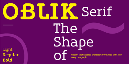
  6. Oblik Classic by Tour De Force, $25.00
    Like Refused said in their song ”The Shape of new Punk to come”, Oblik could be “The Shape of new Fonts to come”. We present to you our uprising star - Oblik - that could shine in your monitors. Modern family, stylish and secure, with its own personality (it’s photogenic, too), available for all kinds of use, even if you're a doctor or policeman or butcher or truck driver or maybe rock star, this font will rock your world.
  7. Obloquy Solid BRK - Unknown license
  8. Obloquy Outline BRK - Unknown license
  9. Obloquy Outline (BRK) - Unknown license
  10. Legal Obligation Serif by Wing's Art Studio, $4.00
    Legal Obligation - Serif Version A dedicated compressed Serif font for movie poster credit blocks and cinematic title designs. A workmanlike tool for adding extensive cast and crew information to movie posters without dominating the overall layout. Supplied with lowercase characters and three weights. Contents: - Legal Obligation (Serif Version) - Light, Regular and Bold Weights
  11. GEOspeed SC - Personal use only
  12. Legal Obligation Sans Serif by Wing's Art Studio, $4.00
    Legal Obligation - Sans Serif Version A dedicated compressed Sans Serif font for movie poster credit blocks and cinematic title designs. A workmanlike tool for adding extensive cast and crew information to movie posters without dominating the overall layout. Supplied with lowercase characters and three weights. Contents: - Legal Obligation (Sans Serif Version) - Light, Regular and Bold Weights
  13. Bigplace ExtBd ExtCond - Personal use only
  14. AnglosaxOblique - 100% free
  15. GEOspeed - Personal use only
  16. Fulmar by CAST, $45.00
    Named after a practical seabird, Fulmar is a modern Scotch intended for extended reading. More European than American, it draws on a range of influences from around the North Sea, from Fife’s Alexander Wilson to 17th-century French experiments in modulation and 18th-century Belgian flash, and combines them with contemporary structure and proportions. The result is crisp yet warm, steadfast yet lively, sharp yet robust, rational but humane. It can be appropriate for new translations, new histories and new understanding. With five weights, ten styles, small caps, a clamjamfry of OpenType features and unicorn manicules, Fulmar dispenses with sprawl while retaining range and dexterity.
  17. Minister by Linotype, $29.99
    Designed by M. Fahrenwaldt for the Schriftguss foundry in 1929, Minister font is a contemporary design based on Garalde types. The letters have an oblique stress, capitals are wide, serifs are prominently concave. Minister font has obvious calligraphic overtones, making it a good informal text face.
  18. Meno Text by Lipton Letter Design, $29.00
    Richard Lipton designed Meno in 1994 as a modest yet elegant workhorse serif family in seven styles. In 2016, he expanded this spirited oldstyle into a 78–style superfamily. The romans gain their energy from French baroque forms cut late in the 16th century by Robert Granjon, the italics from Dirk Voskens’ work in 17th-century Amsterdam. Meno consists of three carefully drawn optical sizes—Text, Display, and Banner, with Condensed and Extra Condensed widths added to the latter two cuts. Steadfast in text settings, Meno is replete with alternate forms, swashes, and other enhancements that showcase Lipton’s masterful calligraphic hand. The series offers a complete solution for achieving high-end editorial typography.
  19. Meno Display by Lipton Letter Design, $29.00
    Richard Lipton designed Meno in 1994 as a modest yet elegant workhorse serif family in seven styles. In 2016, he expanded this spirited oldstyle into a 78–style superfamily. The romans gain their energy from French baroque forms cut late in the 16th century by Robert Granjon, the italics from Dirk Voskens’ work in 17th-century Amsterdam. Meno consists of three carefully drawn optical sizes—Text, Display, and Banner, with Condensed and Extra Condensed widths added to the latter two cuts. Steadfast in text settings, Meno is replete with alternate forms, swashes, and other enhancements that showcase Lipton’s masterful calligraphic hand. The series offers a complete solution for achieving high-end editorial typography.
  20. Meno Banner by Lipton Letter Design, $29.00
    Richard Lipton designed Meno in 1994 as a modest yet elegant workhorse serif family in seven styles. In 2016, he expanded this spirited oldstyle into a 78–style superfamily. The romans gain their energy from French baroque forms cut late in the 16th century by Robert Granjon, the italics from Dirk Voskens’ work in 17th-century Amsterdam. Meno consists of three carefully drawn optical sizes—Text, Display, and Banner, with Condensed and Extra Condensed widths added to the latter two cuts. Steadfast in text settings, Meno is replete with alternate forms, swashes, and other enhancements that showcase Lipton’s masterful calligraphic hand. The series offers a complete solution for achieving high-end editorial typography.
  21. Rieux by Tetradtype, $50.00
    Named after the steadfast doctor from Albert Camus’ The Plague, Rieux is an even-tempered slab-serif that is confident without being cocky and approachable without being casual. The aesthetic of Rieux is inspired by the industrial age. While the design is not directly derived from typefaces of that era, the shapes of letter-forms are informed by images of over-sized steel machines and the monolithic brick buildings that housed them. Rieux is available in 5 weights and is ideal for uncatalogued, magazines, short publications and company collateral. In addition to supporting Western, Central and Eastern European languages, Rieux includes an array of OpenType features to provide a range of typographic options.
  22. Saccule - Unknown license
  23. SF Junk Culture - Unknown license
  24. Nosferatu - Unknown license
  25. Nascent - Unknown license
  26. SF Junk Culture Shaded - Unknown license
  27. SF Junk Culture Condensed - Unknown license
  28. SF DecoTechno - Unknown license
  29. SF Baroquesque - Unknown license
  30. SF Speedwaystar - Unknown license
  31. SF Laundromatic - Unknown license
  32. Catalog Serif JNL by Jeff Levine, $29.00
    Based on text used as sub-headings within a reproduction of a sales catalog for stencil punch dies manufactured by S.M. Spencer & Co. (originally of Brattleboro, VT), circa 1868. Catalog Serif JNL is available in regular, oblique, condensed, condensed oblique, extra condensed, extra condensed oblique, ultra condensed, ultra condensed oblique, compressed and compressed oblique versions.
  33. SF Piezolectric - Unknown license
  34. SF Chaerilidae - Unknown license
  35. SF Speedwaystar Condensed - Unknown license
  36. SF Baroquesque Condensed - Unknown license
  37. SF DecoTechno Shaded - Unknown license
  38. SF DecoTechno Condensed - Unknown license
  39. SF Laundromatic Condensed - Unknown license
Looking for more fonts? Check out our New, Sans, Script, Handwriting fonts or Categories
abstract fontscontact usprivacy policyweb font generator
Processing