10,000 search results
(0.038 seconds)
- Coats by Piñata,
$9.90 We've created a lively antiqua that is perfect for short emotional inscriptions. Coats will warm you up on a cold day and add a little kindness and easiness into any layout. Lines typed with this typeface start “trembling” in long texts, so be careful to use this family for special occasions and in small amounts. Imagine: on a cold day, you've just arrived home from a frosty walk to be rewarded with a cup of hot cocoa topped with marshmallows. We call this feeling the Coats effect. Add to your collection this unique font family that works perfectly in the contemporary digital age.
 - Ingy Ding MCD by Ingrimayne Type,
$21.00 This font began as an attempt of draw alternatives to the images of Microsoft’s Wingdings, but then grew beyond that. This new version from late 2010 has over 1400 characters, including almost all of the geometric shapes in unicode 2500 and 2B00 ranges, almost all of the arrows in the unicode 2100, 2700, 2900, and 2B00 ranges, almost all of the dingbats and symbols in the unicode 2600 and 2700 ranges, many of the pictures, symbols, and emoticons in the 1F300 to 1F600 ranges, and a few of the miscellaneous technical items in the 2300 range. There are also pictures on the standard open type letters, most of which can be accessed from the keyboard. However, most of the characters in this typeface have to be accessed using their unicode designation. In Windows this is done with the alt key and the unicode hex number. On the Macintosh the easiest way (and for the five digit unicode characters, perhaps the only way) is to use the “Special Characters” window under the Edit Menu in the Finder. A unicode index of the font is provided in a pdf file that was generated using FontLab. However, it only has four of the unicode digits for the five-digit elements. Almost all of the unicode numbers starting with F should have a 1 in front of the F.
 - Alimentary by Missy Meyer,
$12.00 Alimentary (adjective): relating to nourishment or sustenance. If you've seen my other fonts, you know I tend to lean into food-based names. This name has to do with food and science combined, so it's double nerdy in the ways I like to be nerdy! I started with Alimentary Medium, which was inspired by my shorter, wider font MacGuffin - I wanted something taller, narrower, with a hip and retro feel. When I finished the Medium weight, I felt like I wanted a Light weight. Then a Heavy weight. Then I figured, "what the heck," and made an outline version of the Medium weight too. In the end, I wound up with four members of the Alimentary family, each with over 700 glyphs! Not only do they all have the basics (A-Z, a-z, 0-9, and tons of punctuation), but they also each have 330 characters for European language support, and a limited selection of Greek, Coptic, and Cyrillic characters. Plus a double handful of alternates and ligatures to add a little variety to your designs! And of course, all of the Alimentary fonts are super-smoothed, with reduced nodes and clean curves, so whether you're cutting them out, printing them, engraving them, or using them in a way I haven't even thought of, these fonts will be sharp and crisp!
 - The Turbayne Running Hand is a font that evokes the elegance and fluidity of classic handwriting. It is designed to mimic the natural variations and movements of a skilled penman, bringing a personal...
- Gaulois by Canada Type,
$24.95 A couple of years before the second World War, Marcel Jacno, the popular French graphic designer who in the 1930s designed iconic posters for Gaumont and Paramount and famously illustrated the Gaulish helmet that first adorned the Gauloises cigarette packs in 1936, was asked by Deberny & Peignot to design a calligraphic typeface for the advertising market. Jacno's Scribe design, billed by D&P as a "virile ad writing" typeface, was released to some great fanfare in 1937, enjoyed some time of French spotlight, and was ready to make waves in the rest of Europe before the war broke out and snuffed its chances at international recognition. However, samples of it can still be found in some specialty post-war publications as an example of a trend that lasted a couple of decades, when Western European type manufacturers commissioned famous visual artists to design typefaces in order to capitalize on the artists' fame - the trend that brought us standards like Futura and the long list of Lucien Bernhard and Imre Reiner faces. This exclusive digital version of Jacno's design expands on the original concept with a large character set that includes plenty of alternates, a couple of different ways for seamless lowercase connections, three sets of figures, and extended Latin language support, adding up to over 540 characters in a one big, contextually-programmed font.
 - Hydrargyrum by Type Minds,
$15.00 Hydrargyrum is the Latin form of a Greek word meaning "liquid silver" - mercury. The Hydrargyrum typefaces are designed with characteristics both of a metal and a liquid. The basic shapes of the letters are generally rigid and rectangular (particularly in style C), but the forms are enhanced by fluid curves and gently rounded corners. Hydrargyrum is not recommended for use at small sizes or in lengthy passages of text. It performs best in display-sized settings. Hydrargyrum consists of three styles, each in medium and semibold weights with matching obliques. The A style features solid, standard letterforms including the two-story a and g. Style B substitutes the a, g, M, and N (and related glyphs including numero and trademark symbols) for alternate shapes. The third subfamily takes the rectangular theme to an extreme, eliminating as many slanted strokes as possible from the letterforms. This makes some C-style letters ambiguous with one another, such as the U's and V's. As such, the C style is best used carefully even at larger sizes. The Hydrargyrum fonts are style linked within each style subfamily with, for example, Hydrargyrum A Medium as the regular style, Hydrargyrum A Medium Oblique as the italic, Hydrargyrum A SemiBold as the bold option, etc.
 - Moving Headlines JNL by Jeff Levine,
$29.00 For decades, visitors to Times Square could look up and read the up-to-the-minute news flashes that moved across a giant electric sign on the face of the old New York Times Building (now known simply as One Times Square). According to Wikipedia's article on OneTimes Square: "On November 6, 1928, an electronic news ticker known as the Motograph News Bulletin (colloquially known as the "zipper") was introduced near the base of the building. The zipper originally consisted of 14,800 light bulbs and a chain conveyor system; individual letter elements (a form of movable type) were loaded into frames to spell out news headlines. As the frames moved along the conveyor, the letters themselves triggered electrical contacts which lit the external bulbs (the zipper has since been upgraded to use modern LED technology)." An example of this was seen in the 1933 Warner Bothers film "Picture Snatcher" starring James Cagney. This example inspired Moving Headlines JNL.
 - Vallassina by Wilton Foundry,
$29.00 Vallassina is named after Vallassina, a village in the valley of the upper tract of the river Lambro in northern Italy. The most important settlement in the area is the town of Asso, from which the valley takes its name. Spasell is a slang of Insubric language, spoken until 19th century by inhabitants of Vallassina, when they used to go out from the valley for business and they didn't want to be understood by the people. What makes this valley unique is that the locals use a unique whistle language to communicate to each other. Vallasina is confidently irreverent yet curiously attractive. How many ways can you use Vallassina to whistle to your neighbors? Vallasina is available in OpenType format.
 - Ratfern by Muksal Creatives,
$10.00 Raftern is a unique and modern family of Sans serif fonts. Simply Conception has 10 families Regular font, starting from the small thin to the largest Heavy. This typeface is versatile and can be used successfully in magazines, posters, branding, websites.
 - Woebegone by Hanoded,
$10.00 Woebegone is a cute little handmade font. I started off by drawing the glyphs with a Pilot pen, then added some strokes with a Japanese brush pen. Woebegone comes in Regular and Italic and has all the accents you need.
 - Aeron by District,
$15.00 Aeron started with a no-nonsense geometric sans-serif structure that grew into a functional semi-serif family of fonts. Half-rounded slabs mix with curvy and squared-off terminals for a personable yet structured family that works in all sizes.
 - Retrade by Muksal Creatives,
$14.00 Retrade is a unique and modern family of Sans serif fonts. Simply Conception has 9 families Regular font, starting from the small thin to the largest Black. This typeface is versatile and can be used successfully in magazines, posters, branding, websites.
 - Rutter by Letterara,
$14.00 Rutter is a handwritten brush font bursting with energy. It features extra attention to quick strokes and sharp details. To stay up to date for my latest job, follow me and let’s be friends because there will be many promos.
 - Magefin by Muksal Creatives,
$10.00 Magefin is a unique and modern family of serif fonts. Simply Conception has 9 families Regular font, starting from the small thin to the largest Black. This typeface is versatile and can be used successfully in magazines, posters, branding, websites.
 - Lady Cleo by Solotype,
$19.95This started out to be a font with an Egyptian hieroglyphic look, but took a detour just beyond the first pyramid. A young lady we know said many of the letters reminded her of the hooks on a bra strap. Whatever. - Stadia by Device,
$29.00 Stadia is designed around a series of modular units: quartercircles, teardrop shapes, squares, circles and variations thereon. The versatility of these basic shapes is such that a teardrop, for example, can represent a looped bowl, as in the lower part of the a, while also representing a curved arc at the top of the same character. The strict grid is broken for the T and the Y, and the placement of accents. The alternative – basing a T, for example, across three units – though rational, is far less aesthetically pleasing. As always with type design, one has to know when the internal structural rules should be bent for a more beautiful result. The horizontal lines appear to travel through the letters, bursting into stars in the counters of lower-case characters such as the o and p. The outline version is weighted to the same width as the gaps between the units.
 - Code Monkey by Comicraft,
$19.00 Underpaid? Overworked? If you like Fritos, Jolt and Mountain Dew in your cubicle, your big warm fuzzy Donkey Kong heart is going to like these fonts a lot. Developed in conjunction with actual Code Monkeys*, this user-defined type IS defined -- it's loud and proud, and available in functional monospace for screen or elegant proportional spacing for print. When your pet project needs a soft, pretty face that's visible from across the office, sit down and pretend to work with CodeMonkeyVariable. Released from the captivity of monospacing, these lovely letters can convey even your wildest story ideas. When your syntax needs to line up on screen, get monospaced out with CodeMonkeyConstant. Copy from other sources and your screen captures will look so sweet you'll no longer have to pray your code complies to specs, because even your login page will look like dynamic rock star programming.
 - The Slant font by Altsys Metamorphosis is a unique typeface that embodies a dynamic and forward-moving aesthetic, embodying the essence of motion through its distinctive slanted characters. Altsys, a...
- Happiness by Omotu,
$18.00 Happiness! A handwrittent script font with 2 styles, regular and slant. Happiness font is suitable for branding, logotype, apparel, T-shirt, Hoodie, product packaging, quotes, flyer, poster, advertising, etc. Whats Include? 1. Uppercase and lowercase characters 2. Multilingual support. 3. Numerals, punctuations, end titling, alternate, and ligarures 4. Accessible in the Adobe Illustrator Glyphs panel, or under Stylistic Alternates in the Adobe Photoshop OpenType menu, Adobe InDesign, Corel Draw, even work on Microsoft Word. Please message me if you're unsure of any language support. Thanks for looking, and I hope you enjoy it! Please don't hesitate to drop me a message if you have any issues or queries. Omotu Studio
 - Matross by Omotu,
$18.00 DETAILS Matross! A handbrush script font with 2 styles, regular and slant. Matross font is suitable for branding, logotype, apparel, T-shirt, Hoodie, product packaging, quotes, flyer, poster, advertising, etc. Whats Include? 1. Uppercase and lowercase characters 2. Multilingual support. 3. Numerals, punctuations, end titling, and ligarures 4. Accessible in the Adobe Illustrator Glyphs panel, or under Stylistic Alternates in the Adobe Photoshop OpenType menu, Adobe InDesign, Corel Draw, even work on Microsoft Word. Please message me if you're unsure of any language support. Thanks for looking, and I hope you enjoy it! Please don't hesitate to drop me a message if you have any issues or queries. Omotu Studio
 - Determite Country by Letterhend,
$17.00 Introducing, Determite Country - A Western Display Typeface. The reverse contrast make this font looks different and stand out from the crowd. Suitable for design needs with a touch of classic western, especially in logo, and the other various formal forms such as invitations, labels, logos, magazines, books, greeting / wedding cards, packaging, fashion, make up, stationery, novels, labels or any type of advertising purpose. Features : lowercase and uppercase regular and slanted numbers and punctuation multilingual PUA encoded We highly recommend using a program that supports OpenType features and Glyphs panels like many of Adobe apps and Corel Draw, so you can see and access all Glyph variations
 - White Oleander by Nicky Laatz,
$20.00 White Oleander is a stylish handwritten font, with subtle texture imperfections, to appear as authentic as possible while remaining clearly legible in your projects. With four versions of the font: Regular, Slanted, Upright, and Compact, each with a slightly different feel, White Oleander is a truly versatile font — displaying a sophisticated, casual, and even playful tone — depending on which style you use. A comprehensive set of upper and lower case letter alternates, as well as a second set of lower case alternates is accessible via its handy Opentype features. White Oleander also features 32 natural-looking ligatures, along with ten swooping swashes, to add authentic variation to your design.
 - Rhodeport by Omotu,
$16.00 Rhodeport! A handbrush font with all uppercase glyphs, regular and slant. Rhodeport is suitable for branding, logotype, apparel, T-shirt, Hoodie, product packaging, quotes, flyer, poster, advertising, etc. Whats Include? 1. Uppercase characters 2. Multilingual support. 3. Numerals, punctuations, and alternates 4. Accessible in the Adobe Illustrator Glyphs panel, or under Stylistic Alternates in the Adobe Photoshop OpenType menu, Adobe InDesign, Corel Draw, even work on Microsoft Word. Please message me if you're unsure of any language support. Thanks for looking, and I hope you enjoy it! Please don't hesitate to drop me a message if you have any issues or queries. Omotu Studio
 - LD Cherries by Dikas Studio,
$15.00 Hello... this is Cherries, a cute and bounch hand drawn font family. Cherries have 5 weight: light, regular, medium, semibold and bold with 2 styles: regular and slanted also included with pairing font Cherries Display. Cherries included with some alternate character and ligature to make your design awesome. Cherries is fun and very suitable for cute or girly design needs such as cover design, typography, sticker, greetings card, logo, merchandise and many more. Cherries also easy for read and you can use it for quote or caption. Add this beautiful handwritten font to each of your creative ideas and notice how it makes them stand out!
 - Reghitta by Jinan Studio,
$10.00 Hello World, Introducing, Reghitta! is a stylish script font with 89 stylish ligatures that exudes elegance and charm. Its versatility makes it an excellent choice for various design purposes, including weddings, branding, social media post, quotes, prints, and more. No matter the project, Reghitta will elevate your designs to the next level, leaving a lasting impression on anyone who lays eyes on them. Features A set of uppercase and lowercase glyphs Number, symbol, and punctuation Multilingual Support Alternates Ligatures Swash Slant Version Thank you a million times for buying and using this font for your projects. Enjoy this font and happy creating! Jinan Studio
 - Gerucht 2.0 by Rumors Foundry,
$11.00 Gerücht Typeface is a family of digital fonts designed in 2019 by Gabriele Bellanca for Rumors Foundry in three different weights and their corresponding slanted versions. All rights reserved. Gerücht (in English rumor) is the name of the font-family: today the name of a font is part of the graphic design itself, unlike in the past, where it usually consisted of a simple retrospective description (such as in the case of Gothic Condensed No.2) of its characteristics. It's a "one-word advertising slogan", writes Tobias Frere-Jones, which serves to build an idea and a charm to associate with that type of character.
 - Bonitto by Omotu,
$18.00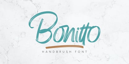 Bonitto is a handwritten script font with 2 styles, Regular and Slant. Bonitto is suitable for branding, logotype, apparel, t-shirts, hoodies, product packaging, quotes, flyers, posters, advertising and more. What's Included? 1. Uppercase and lowercase characters 2. Multilingual support. 3. Numerals, punctuations, and ligatures 4. Accessible in the Adobe Illustrator Glyphs panel, or under Stylistic Alternates in the Adobe Photoshop OpenType menu, Adobe InDesign, Corel Draw, even work on Microsoft Word. Please message me if you're unsure of any language support. Thanks for looking, and I hope you enjoy it! Please don't hesitate to drop me a message if you have any issues or queries. Omotu Studio
 - Louislemon by Letterhend,
$19.00 Introducing, Louislemon Display - a unique display script with a reverse slant style. The unusual look of the script makes this typeface one of a kind. This type of font perfectly made to be applied especially in logo, and the other various formal forms such as invitations, labels, logos, magazines, books, greeting / wedding cards, packaging, fashion, make up, stationery, novels, labels or any type of advertising purpose. Features : uppercase & lowercase numbers and punctuation multilingual alternates and ligatures PUA encoded We highly recommend using a program that supports OpenType features and Glyphs panels like many of Adobe apps and Corel Draw, so you can see and access all Glyph variations.
 - Pitch Or Honey by Ana's Fonts,
$15.00 Pitch or Honey is a hand-lettered font trio with matching ornaments and floral elements. It includes: a faux-calligraphy style script font, with a bonus slant version a cute sans serif font, in roughly the same height as the lowercase script a tall, all-caps sans serif font, in roughly the same height as the uppercase script a set of 52 floral elements, with a bonus filled-in version a set of 52 ornamental swashes All you need for beautiful and easy designs with a hand-lettered, rustic feel, such as postcards and notes, creating logotypes, social media posts, branding and packaging, etc.
 - Fresh Milk by Omotu,
$16.00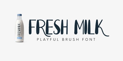 Fresh Milk! A handbrush font with all uppercase glyphs, regular and slant. Fresh Milk font is suitable for branding, logotype, apparel, T-shirt, Hoodie, product packaging, quotes, flyer, poster, advertising, etc. Whats Include? 1. Uppercase characters 2. Multilingual support. 3. Numerals, punctuations, and alternates 4. Accessible in the Adobe Illustrator Glyphs panel, or under Stylistic Alternates in the Adobe Photoshop OpenType menu, Adobe InDesign, Corel Draw, even work on Microsoft Word. Please message me if you're unsure of any language support. Thanks for looking, and I hope you enjoy it! Please don't hesitate to drop me a message if you have any issues or queries. Omotu Studio
 - Billy Signature by Omotu,
$16.00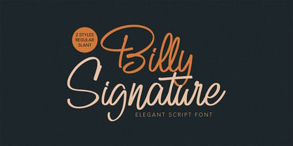 DETAILS Billy Signature! A handwrittent script font with 2 styles, regular and slant. Billy Signature font is suitable for branding, logotype, apparel, T-shirt, Hoodie, product packaging, quotes, flyer, poster, advertising, etc. Whats Include? 1. Uppercase and lowercase characters 2. Multilingual support. 3. Numerals, punctuations, and ligarures 4. Accessible in the Adobe Illustrator Glyphs panel, or under Stylistic Alternates in the Adobe Photoshop OpenType menu, Adobe InDesign, Corel Draw, even work on Microsoft Word. Please message me if you're unsure of any language support. Thanks for looking, and I hope you enjoy it! Please don't hesitate to drop me a message if you have any issues or queries. Omotu Studio
 - Kaligane by ArimaType,
$18.00 Kaligane is a type family designed with passion. A geometric typeface, first designed in a muscular black weight with a high-powered dynamic typographic aesthetic used in various communications, and later developed in a lighter weight where the shape exhibits some vintage-inspired proportions. With these diverse influences, typefaces allow for the use of impressive displays and effective logo designs as well as the use of more subtle editorials in body text - with a natural inclination for effective and powerful advertising. Sports typography typically uses italics for added dynamism and impact, and Kaligane complies by offering a choice of three alternative italic shapes with different slants.
 - Comfy Cozies by Letterhend,
$14.00 Looking for a font that feels both cozy and stylish? Look no further than Comfy Cozies. This organic sans serif font has a skinny form that gives it a light and airy feel, while the regular and slanted styles offer versatility and creative potential. Whether you're designing for a playful brand or a casual event, this font will add a touch of warmth and charm to your work. Features : Uppercase & lowercase Numbers and punctuation Alternates & Ligatures Multilingual PUA encoded We highly recommend using a program that supports OpenType features and Glyphs panels like many of Adobe apps and Corel Draw, so you can see and access all Glyph variations.
 - Zidler by MKGD,
$13.00 One of my all time favourite movies is Baz Luhrmann’s Moulin Rouge. In it, there’s a brief scene where the proprietor of the Moulin Rouge (Harold Zidler) signs away the deeds to the establishment. The actual signing of his signature is what motivated me to create this script font. Although it’s not an exact replica of the character’s hand, I like to think that it has the same crisp immediacy of the original. With its consistent oblique slant, narrow and long ascenders and descenders, and the occasional blobbing of letters, the overall effect, gives the appearance of a correspondence penned by lamplight while a storm rages outside.
 - Pask by Valentino Vergan,
$16.00 Pask is a retro inspired variable font family. Pask has a high-contrast and a thin hairline, this gives the typeface a bold and retro look. Pask comes with standalone fonts and a variable version, the variable version allows you to adjust the width and slant. Pask can cover a wide range of project such as: branding, mastheads, magazines, logos, blog posts, quotes, product packaging, advertisements and much more. WHAT YOU GET: Pask - Condensed Pask - Condensed Oblique Pask - Semi Condensed Pask - Semi Condensed Oblique Pask - Regular Pask - Oblique Pask - Semi Expanded Pask - Semi Expanded Oblique Pask - Expanded Pask - Expanded Oblique I hope you enjoy using the Pask typeface.
 - SK Coisa by Shriftovik,
$32.00 SK Coisa is a decorative slanted geometric typeface with a daring character. Its sharp shapes and angles, and indeed the whole structure, scream for its extraordinary nature. It is unusual and stands out, and most importantly, it does not hesitate to be not like everyone else. SK Coisa is built on the contrast of rounded and sharp geometric shapes, and because of it, its appearance is impossible to forget. The typeface has both capital and lowercase characters. It supports the basic and expanded Cyrillic and Latin alphabet, as well as many other languages and character sets. If you want your design to scream, then SK Coisa is exactly what you need!
 - Rogshire by Letterhend,
$14.00 Introducing, Roghsire.A stylish displa font with chic & classic looks. This typeface has been made carefully to make sure its premium quality and luxury feel. It comes with Slant Version. Very suitable for logo, headline, tittle, and the other various formal forms such as invitations, labels, logos, magazines, books, greeting / wedding cards, packaging, fashion, make up, stationery, novels, labels or any type of advertising purpose. Features : Uppercase & lowercase Numbers and punctuation Alternates & Ligatures Multilingual PUA encoded We highly recommend using a program that supports OpenType features and Glyphs panels like many of Adobe apps and Corel Draw, so you can see and access all Glyph variations.
 - Manees by Omotu,
$16.00 DETAILS Manees! A modern calligraphy font with two styles, regular and slant. Manees font is suitable for branding, logotype, apparel, T-shirt, Hoodie, product packaging, quotes, flyer, poster, advertising, etc. Whats Include? 1. Uppercase and lowercase characters 2. Multilingual support. 3. Numerals, punctuations, and alternates 4. Accessible in the Adobe Illustrator Glyphs panel, or under Stylistic Alternates in the Adobe Photoshop OpenType menu, Adobe InDesign, Corel Draw, even work on Microsoft Word. Please message me if you're unsure of any language support. Thanks for looking, and I hope you enjoy it! Please don't hesitate to drop me a message if you have any issues or queries. Omotu Studio
 - Mantika Book by Linotype,
$50.99 Mantika Book was originally conceived and drawn parallel to the first Agilita drawings. *[images: pencil drawings] It took several years before having a chance looking at these designs again. But then, my first impulse was to turn this alphabet into a new sanserif, which was to become Mantika Sans. This was the starting point to conceive a super family consisting of different design styles and corresponding weights. The initial drawings of Mantika Book were refined and an Italic was developed to go with it. The aim was to create a modern serif typeface which is reminiscent of humanistic Renaissance typefaces, yet without following a particular historic model. Its large x-height for one is far away from original Renaissance models. Mantika Book was designed as a companion serif typeface to Mantika Sans that can be set for lengthy texts as in books, hence its name. It shares the same x-height with Mantika Sans but has longer ascenders and descenders, making for better word shapes in long, continuous reading. The approach of an ›old-style‹ looking typeface with large minuscules makes Mantika Book also a choice for magazine text settings where one often needs smaller point sizes to fit in a multiple columns layout. The unique details of Mantika Book are the asymetric bracketed serifs in the upright font and its higher stroke contrast than usual in a Renaissance style. The stems are slightly curved inwards. Also, the Italics have a low degree of inclination, which makes longer passages of text set in Italic rather pleasing to read. Another feature Mantika Book shares with Mantika Sans is that all four weights take up the same line length. It covers all European languages plus Cyrillic and Greek, is equipped with lots of useful scientific symbols [double square brackets, angle brackets, empty set, arrows] and the regular weight has small caps. There is a kind of an old-style feeling to Mantika Book, yet these citations were turned into a contemporary serif typeface with a soft but sturdy character.
 - Promenade by Jen Wagner Co.,
$17.00 Introducing Promenade – a calligraphic serif that started on paper with a flat nib pen (see the 6th image), and blossomed into a full serif with italics. At its core, this font is just... beautiful. It's elegant, it's crisp, it's delicate, but can still hold its own. As I was creating the graphics, I just couldn't get over the flow of the letters – especially the italic. It's got class, but also isn't afraid to rock a pair of Doc Marten's. Funny enough, Jen from Tonic (they make beautiful websites) saw a preview of this font and said, "I'd take that font to prom." Which of course spurred a conversation about how this font would take a Mercedes G-Series instead of a limo, and wear Doc Marten's instead of heels, but still wear the most gorgeous dress, and that is 100% Promenade (and inspo for the name – thanks, Jen!). I've also been loving combining the regular and italic, especially for logos (see the "Friendfolk" logo) One thing to note about Promenade is the letter spacing. It was spaced for clean reading and intentional balance, so I recommend setting the spacing a little tighter if you want to create the display look found in many of the logo mockups(around -20 to -40 should do!).