10,000 search results
(0.059 seconds)
- MFC Brass Rules Petit by Monogram Fonts Co.,
$9.95 Although brass line rules were a common feature in almost every vintage type catalog, these were recreated from those by the Franklin Type Foundry. Filling the Numerals and all Capital and Lowercase glyph slots are a total of 62 traditional Brass Rule designs, all extendable by combining with other rules, or by extending the pin line by simply typing a dash "-". A truly sleek and simple utilitarian font for invitations, menus, business cards, and whatnot. Download and view the "MFC Brass Rules Petit Guidebook" if you would like to learn a little more.
 - Aetna JY Pro by JY&A,
$49.00 JY Ætna was designed originally by Francesco Griffo in 1495, and appeared in a book by Cardinal Bembo the following year. The typeface was re-created by Jack Yan in 1994, in time for its 500th anniversary. The original x-heights, quaint letters and other niceties have been restored. An italic complement, based on the design by Giovantonio Tagliente, has also been developed. JY Ætna has been one of JY&A Fonts’ more popular families over the years, with some typographers preferring its taller ascenders and descenders for headline work.
 - Magistral by ParaType,
$30.00The first three weights of the family were designed at ParaType (ParaGraph) in 1997 by Dmitry Kirsanov . They were based on the artworks of Moscow graphic designer Andrey Kryukov (1923-1997). The original version was developed by Kryukov at the end of the sixties for Russian railways. The proportions and elements of construction were inspired by Eurostile (1962) by Aldo Novarese. It is intended for use in advertising and display typography. In 2009, Dmitry added the new styles, corrected the old ones, and enhanced them with extended character sets. - Chucara Next by Letritas,
$25.00 Chucara next is the newest font designed by Juan Pablo De Gregorio, a typeface aimed at high readability when set in paragraphs or large chunks of text. Its predecessor "Chúcara", born in 2003, sought after increasing readability by achieving big and simple counterforms. This time around Juan Pablo went further by increasing the X-height and trimming both ascenders and descenders, thus the font appears to be much larger than it is and can be readable at smaller sizes. The DNA of the whole font is marked by the terminal of the "a" character. Juan Pablo used a specially crafted cut to design this counterform, and this shape together with the graceful and winding forms of the letter resembles the form of a horse, hence the name Chúcara, or untamed. The italic version has a 10-degree angle and a 10% condensation, making it way more streamlined than a regular italic font. The Philosophy of a larger counterform is maintained through and through in the italic variant. This version looks different not only due to its inclination, but the sheer effort put into carefully taking care of the condensation and the gestures allow the italic to enrich the texts gracefully, for the highlighting of the words stands out without affecting the grey of the paragraph. Chucara next is a typeface optimal for being used in books, newspapers, magazines, texts, printing, headlines, editorial, quotes, corporate identity, and lo res printing. The typeface has 8 weights, ranging from “thin” to “black”, and two versions: "regular" and "italic". Its 16 files contain 635 characters with small caps, stylistic sets and different kind of numbers. It supports 219 Latin-based languages, spanning through 212 different countries. Chucara next supports this languages: Abenaki, Afaan Oromo, Afar, Afrikaans, Albanian, Alsatian, Amis, Anuta, Aragonese, Aranese, Aromanian, Arrernte, Arvanitic (Latin), Asturian, Atayal, Aymara, Bashkir (Latin), Basque, Bemba, Bikol, Bislama, Bosnian, Breton, Cape Verdean Creole, Catalan, Cebuano, Chamorro, Chavacano, Chichewa, Chickasaw, Cimbrian, Cofán, Corsican Creek,Crimean Tatar (Latin),Croatian, Czech, Dawan, Delaware, Dholuo, Drehu, Dutch, English, Estonian, Faroese, Fijian Filipino, Finnish, Folkspraak, French, Frisian, Friulian, Gagauz (Latin), Galician, Ganda, Genoese, German, Gikuyu, Gooniyandi, Greenlandic (Kalaallisut)Guadeloupean, Creole, Gwich’in, Haitian, Creole, Hän, Hawaiian, Hiligaynon, Hopi, Hotc?k (Latin), Hungarian, Icelandic, Ido, IgboI, locano, Indonesian, Interglossa, Interlingua, Irish, Istro-Romanian, Italian, Jamaican, Javanese (Latin), Jèrriais, Kala Lagaw Ya, Kapampangan (Latin), Kaqchikel, Karakalpak (Latin), Karelian (Latin), Kashubian, Kikongo, Kinyarwanda, Kiribati, Kirundi, Klingon, Ladin, Latin, Latino sine Flexione, Latvian, Lithuanian, Lojban, Lombard, Low Saxon, Luxembourgish, Maasai, Makhuwa, Malay, Maltese, Manx, M?ori, Marquesan, Megleno-Romanian, Meriam Mir, Mirandese, Mohawk, Moldovan, Montagnais, Montenegrin, Murrinh-Patha, Nagamese Creole, Ndebele, Neapolitan, Ngiyambaa, Niuean, Noongar, Norwegian, Novial, Occidental, Occitan, Old Icelandic, Old Norse, Oshiwambo, Ossetian (Latin), Palauan, Papiamento, Piedmontese, Polish, Portuguese, Potawatomi, Q’eqchi’, Quechua, Rarotongan, Romanian, Romansh, Rotokas, Sami (Inari Sami), Sami (Lule Sami), Sami (Northern Sami), Sami (Southern Sami), Samoan, Sango, Saramaccan, Sardinian, Scottish Gaelic, Serbian (Latin), Seri, Seychellois Creole, Shawnee, Shona, Sicilian, Silesian, Slovak, Slovenian, Slovio (Latin), Somali, Sorbian (Lower Sorbian), Sorbian (Upper Sorbian), Sotho (Northern), Sotho (Southern), Spanish, Sranan, Sundanese (Latin), Swahili, Swazi, Swedish, Tagalog, Tahitian, Tetum, Tok Pisin, Tokelauan, Tongan, Tshiluba, Tsonga, Tswana, Tumbuka, Turkish, Turkmen (Latin), Tuvaluan, Tzotzil, Uzbek (Latin), Venetian, Vepsian, Volapük, Võro, Wallisian, Walloon, Waray-Waray, Warlpiri, Wayuu, Welsh, Wik-Mungkan, Wiradjuri, Wolof, Xavante, Xhosa, Yapese, Yindjibarndi, Zapotec, Zulu, Zuni.
 - Fluire by Lián Types,
$37.00 MAS AMOR POR FAVOR (1) (more love, please) Fluire means -to flow- in Italian and that’s what this font is all about. The story began when a friend of mine asked for a tattoo with the word -Fluir- (to flow in Spanish). She didn't want a tattoo full of swashes and swirls, like I'm used to doing, but something more fluent, soft and minimal. My very first attempts were more related to copperplate calligraphy but I wasn't even close: I discovered that I needed to forget a little bit about the classic contrast and speed of the engrosser's nib and started playing with a tiny flat metal nib. Letters started to flow, and I immediately thought of turning them into a font. Inspired by the tattoo I created and by other tattoos I saw, I started the journey of what would be a very fun process. The result is a very cute, almost monoline font with a wide range of uses. USES If not used for a tattoo (my first ‘target’), the font delivers amazing results in combination with Fluire Caps: These two need each other, they go together, they talk. I designed Fluire Caps Down and Fluire Caps Up so it’s easier to manage their colors. Also there’s Fluire Caps Down Lines, which has a decorative thin line to add yet another dimension. Use the fonts in magazines, book covers, posters, greeting cards, weddings, lettered walls, storefronts! TIPS Since the font is Open-Type programmed, I strongly recommend using it in applications that support that feature. Also, the font looks way better when -contextual alternates- are activated, but it’s your choice :) Try Fluire, and keep flowing. NOTES (1) The phrase alludes to maybe the most tattooed phrase in Latin America.
 - Usuzi is a captivating typeface that captures the essence of sleek, dynamic motion and modern aesthetics. It's a font that effortlessly radiates a sense of speed and fluidity, making it uniquely suit...
- Sure! Picture this: the font Titan by onezero is the typographical equivalent of a superhero landing in the middle of a bustling city. It doesn't just enter a room; it makes a grand, indelible impres...
- BPtypewrite - 100% free

- Kenza by Alex Camacho Studio,
$20.00 Kenza is a serif geometric font, which is inspired by letterpress printing. Hand crafted wood letters used in the mid-20th century. It is characterized by being large, bold poster-block movable type.
 - Xenia by ParaType,
$25.00 Designed for ParaType in 1990 by Lyubov Kuznetsova. A bold square-serif style. For use in advertising and display typography. The decorative style was added in 1993 by Lyubov Kuznetsova and Alexander Tarbeev.
 - Winnetka JNL by Jeff Levine,
$29.00Winnetka JNL was inspired by Cooley Antique Tuscan Condensed - a printer's wood type manufactured in 1859 by J.G. Cooley. Given an additional hand-made treatment, the lettering resembles characters made from cut paper. - Starry Night by Lauren Ashpole,
$15.00 This slighty messy handwritten font was inspired by the scrawl of a teenager given a marker. Meaning it was inspired by my own quick writing at the time. Right down to the stars.
 - Hypocrite by ParaType,
$30.00 Hypocrite is a wide and black display serif face with a hint of decay and black humor. Handle with care. Shelf-life unlimited. Designed by Alexander Lubovenko and released by Paratype in 2017.
 - Cannot Write by Forberas Club,
$16.00 Introducing Can't Write. This new Handwritten font is written by our team, and ready to pop up your project by using this font for your party, event, invitation or at your wedding decor.
 - Birch by ParaType,
$25.00 Designed at ParaType (ParaGraph) in 1995 by Tagir Safayev. Based on informal pen handwriting. For use in advertising and display typography. A set of Western characters was added in 2011 by Gennady Fridman.
 - Vataga by ParaType,
$25.00Non-alphabetic typeface based on Yana Kutyina drawings. It includes 82 images of human faces as well as several typical interjections. Designed by Yana Kutyina and Andrey Belonogov. Released by ParaType in 2008. - SK One Block by Salih Kizilkaya,
$3.50 SK One Block was designed by Salih Kızılkaya in 2020. Inspired by Kufic typeface, this font includes many typographic material you will need. SK One consists of 8 different fonts and 2696 glyphs.
 - Melrose - Unknown license

- Pavarotti - Unknown license

- NewSymbolFont5 - Unknown license

- Cyborg45 - Unknown license

- BetterthanBefore NewSymbolFont5 - Unknown license

- Souvenir Gothic Antique by URW Type Foundry,
$35.99Original design by Phil Martin - Scotch FB by Font Bureau,
$40.00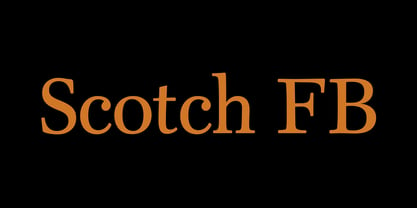 Scotch FB by David Berlow.
 - Bernhard Gothic by URW Type Foundry,
$35.99 Original design by Lucian Bernhard
 - Senator by Emigre,
$39.00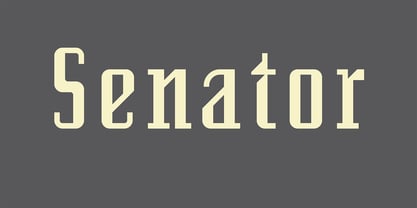 Greek version by Dimitris Arvanitis.
 - Superchunk by Prototype Fonts,
$20.00Inspired by punk rock flyers. - Bree by TypeTogether,
$37.50 The Bree font family is a spry sans serif by Veronika Burian and José Scaglione that delivers a spirited look and feel for branding and headline usage. As an upright italic, Bree shows a pleasant mix of rather unobtrusive capitals with more vivid lowercase letters, giving text a lively appearance. Bree is clearly influenced by handwriting. As such, some of its most characteristic features are the single-story ‘a’, the cursive ‘e’, the outstroke curves of ‘v’ and ‘w’, the flourished ‘Q’, and the fluid shapes of ‘g’, ‘y’, and ‘z’. Alternates of these letters are available when a more neutral look is desired. Bree has a touch of cheekiness, a wide stance for each character, and an extra-large x-height. All this adds up to a big personality, so even when set in small text there is no skimming past the words Bree voices. In 2019, the Bree font family got a huge update. A few shapes were updated or added (the ‘k’ and German capital ‘ß’), two entirely new weights were added (Book and Book Italic), and spacing was perfected. More than that, Vietnamese support was added to Bree Latin, and the Bree Greek and Bree Cyrillic scripts were designed from scratch to parallel the Latin’s tone. Additionally, Bree was designed in variable font format for those who want complete control over the font’s appearance while simultaneously saving digital weight in the form of kilobytes and megabytes. Bree is in the perfect position for the next digital revolution. The complete Bree font family, along with our entire catalogue, has been optimised for today’s varied screen uses. Bree has been chosen for such wide-ranging uses as Breast Cancer Awareness Month in the US, the branding for the country of Peru, and numerous layouts including mobile apps, magazines, newspapers, and books. Awards – Tipos Latinos exhibition 2008 – Several best-of-the-year typeface lists of 2008 MyFonts Top 10 Fonts of 2008 Smashing Magazine: 60 Brilliant Typefaces For Corporate Design https://www.smashingmagazine.com/2008/03/60-brilliant-typefaces-for-corporate-design/ Die besten Schriften 2008 http://www.fontwerk.com/619/die-besten-schriften-2008/ – Selected for Typographica’s Best Typefaces of 2008 – Won Bronze for Original Typeface in the 2009 European Design Awards
 - KG Turning Tables - Personal use only

- MANHATTAN - 100% free

- CrawfishPopsicle - Unknown license

- Cinderella - Unknown license

- Triad XS - Unknown license

- Tradizione - Unknown license

- Doppel Mittel Lapidar Azure by Intellecta Design,
$20.90 Doppel Mittel Lapidar Azure is a decorative display font great for large header-like usage. A classic font design remastered by the type foundry Intellecta Design, inspired by wood types from the XIX century.
 - Lumberyard Stencil JNL by Jeff Levine,
$29.00 Lumberyard Stencil JNL was inspired by the image of an antique brass stencil that was probably used for marking various wood products by a lumber company. It's available in both regular and oblique versions.
 - Quarz 974 by Domenico Ruffo,
$40.00 Quartz 974 is a typology of font inspired by simple and geometric lines as triangle. It is very suitable for titles, logos, posters, that’s why it is composed by only capital letters and numbers.
 - Stanhope by Red Rooster Collection,
$45.00Designed by Les Usherwood. Digitally engineered by Paul Hickson. Les based the design on a turn-of-the-century typeface of the same name. The foundry is believed to be Soldans & Payvers, circa 1904. - Heart on a string by PizzaDude.dk,
$15.00 "Heart on a string" is from a song by Paul McCartney, and is one of his romantic ones. I tried to do the same by creating a font that has the same romantic feeling.
 - Paper Cutout Pro by Kimmy Design,
$10.00 Paper Cutout Pro is a playful typeface inspired by paper letterforms cutout by scissors. It's imperfect letters create the feel of an authentic hand-cut school project. It comes in regular and round versions.


