10,000 search results (0.056 seconds)
  1. Montreal Architect Px by Letradora, $15.00
    Inspired from blueprints of old Montreal buildings, this font is a hand lettered, all caps face with influences from the arts & crafts movement.
  2. Nouveau Impression JNL by Jeff Levine, $29.00
    Inspired by an image of some Art Nouveau wood type spotted online, Nouveau Impression JNL is available in both regular and oblique versions.
  3. Lambola by ARToni, $12.00
    Lambola is a casual and smooth handwritten font with a playful vibe. Us it to add a personal touch to any design idea!
  4. Shunsine by Portograph Studio, $19.00
    Shunsine is a distinct and elegant display serif font. Its stylish alternates and ligatures make this font the perfect match for any project.
  5. "OldStyle 1" refers to a typeface that draws inspiration from the early forms of serif typography, characteristic of the period when printing was first invented and became widespread. This era, rough...
  6. The Sangkuriang font, designed by Gregorius Wisnu Prastowo, represents an intriguing blend of traditional elegance and contemporary design sensibilities. It is a typeface that evokes a sense of nosta...
  7. Imagine a font that decided to wake up one morning, pull on its intergalactic superhero suit, and dive headfirst into an epic adventure across multiple dimensions. Ladies and gentlemen, meet *Battlef...
  8. DejaVu Sans Mono - Unknown license
  9. DejaVu Serif - Unknown license
  10. DejaVu Serif Condensed - Unknown license
  11. Allrounder Grotesk by Identity Letters, $40.00
    A true workhorse. The only Grotesk you’ll ever need. Allrounder Grotesk is a neutral, powerful Neogrotesk member of the Allrounder superfamily. An unobtrusive teamplayer as well as an excellent soloist, this hard-working sans-serif typeface is ready for any task you’ll throw it at. A workhorse that lives up to its name, Allrounder Grotesk consists of ten weights ranging from a delicate Air to a powerful Black with 900+ glyphs per font. Each weight is accompanied by carefully hand-corrected italics. Allrounder Grotesk supports more than 200 Latin-based languages, containing the complete “LatinPlus” glyph set developed by Underware. It also provides you with plenty of OpenType features and additional goodies: small capitals, ten sets of figures, case-sensitive forms, ligatures, superiors, fractions and arrows. Equipped like this, you’ll be ready for any kind of sophisticated typesetting scenario you might encounter. With Allrounder Grotesk, you’ve got a sans that works great for body text, yet looks crisp and clean in headlines and display sizes. Whether annual reports, magazine and editorial layouts, nonfiction books, branding and packaging work, large-scale advertising, forms and contracts, or contemporary posters: Allrounder Grotesk is up for it. This multitalented font family was developed in a 2-year process by Moritz Kleinsorge. It was the first release of the Allrounder superfamily, a series of typefaces sharing the same color and horizontal metrics (cap height, small cap height and x-height): a typesetting system whose components match each other perfectly. Any other part of this design kit, e. g., Allrounder Antiqua or Allrounder Monument, may be easily combined with Allrounder Grotesk. Perfect Pairing: Allrounder Antiqua + Allrounder Grotesk Allrounder Antiqua is the ideal complement to Allrounder Grotesk. They both share common vertical metrics and a common color. This allows you to pair both typefaces within the same layout—even within the same paragraph—without creating visual disruption. Head over to the Family Page of Allrounder Antiqua to get more information about this typeface. Design Trick: Bilingual Design With the Allrounder Superfamily Combining Allrounder Grotesk with Allrounder Antiqua is an ideal approach for bilingual designs, wherein both languages get the same emphasis yet are distinguished with two different typefaces. It's also best practice to set headlines in a different typeface than the body text if they harmonize with each other. Allrounder Grotesk and Allrounder Antiqua provide you with the perfect pair for this purpose. In any kind of design, in any type of medium, working with Allrounder fonts is effortless. That’s why Allrounder got its name.
  12. Rogers2 - Unknown license
  13. JiggeryPokery - Unknown license
  14. Hitormis by Forberas Club, $16.00
    Hitormis is handwritten font with uppercase style. Recommended to use for wall art, children theme, funny theme, comics, cartoon, simple write, poster and display.
  15. Obsessed by Zang-O-Fonts, $25.00
    Eroded, skeletal and gaunt, Obsessed was one of Zang-O-Fonts first typefaces, and is loosely based on a couple of Art Deco faces.
  16. Faux Angst by The Arborie, $11.00
    This rough and angsty font is perfect to add a punk edge to any project. It's asymmetrical and handwritten for the authentically angsty font.
  17. Kidprint by Monotype, $50.99
    The Kidprint font is designed to look like a child´s printing. Kidprint is useful any time a playful or whimsical look is required.
  18. Biotech by Arendxstudio, $20.00
    Biotech is hand painted typeface with a messy, rough and strong feel, perfectly suited for any design occasions. Get inspired by its bold charm!
  19. TAN Aegean by TANTypeCo., $17.00
    TAN AEGEAN is an elegant display serif. It's classic and versatile with a touch of playfulness, it's perfect for any of your design needs.
  20. PR Arco by PR Fonts, $10.00
    Arcs for framing curved lines of text, in a style common on Victorian posters and almanac covers, and still seen on modern food packaging.
  21. Heraldic Devices Premium by Intellecta Design, $16.90
    A collection of shields, crowns and heraldry designs. Represents heraldry devices, Spanish city seals, world nations seals, coats of arms, helms, crowns, crests etc.
  22. Crosstown JNL by Jeff Levine, $29.00
    Crosstown JNL is a serif treatment of Midtown JNL, an Art Deco typeface displayed in the pages of an old 'how to' lettering book.
  23. Good Thinking by Letterara, $14.00
    Good Thinking is a beautifully designed handwritten font that’s both authentic and charming. Use it to turn any design project into a true standout!
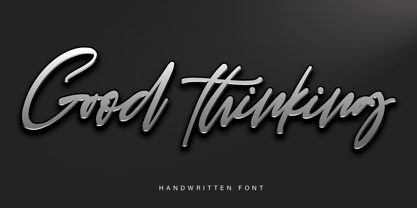
  24. Gallegos by profonts, $51.99
    Gallego Pro is a classical, pen-drawn upright script useful for many applications, e.g. book titles, ads, magazines or any kind of display work.
  25. Bollard by Kraken, $12.00
    Bollard is a smooth and cuddly font, with the ability to make any title look instantaneously fun and fresh. Features lower case and numerals.
  26. Srikaya by HandletterYean, $10.00
    Srikaya is a display typeface with a cheerful vibe and autumn nuance. Use it for any creative project in need of a whimsical vibe.
  27. Jot by Typadelic, $19.00
    A playful slab-serif font. This typeface is versatile enough to be used in any type of design work, be it serious or fun.
  28. Oh Beloved by Nissa Nana, $19.00
    Oh Beloved is a beautiful script font with a classy, elegant, and modern look. It will add a personal touch to any design project!
  29. Witches Crow by Forberas Club, $16.00
    Witches Crow is a Halloween Treat by our team. It's perfectly matches for any invitation type, and children theme, cartoon, poster, display, and comics.
  30. Stahlhelme Und Kronen by Intellecta Design, $22.90
    A collection of shields, crowns and heraldry designs. Represents heraldry devices, Spanish city seals, world nations seals, coats of arms, helms, crowns, crests, etc.
  31. Cyborg by Jelloween, $14.95
    Cyborg is a futuristic and stylish font, that fits perfectly in any modern design. Cyborg is available in Truetype, Opentype and Windows PostScript formats.
  32. Dinila Script by Aldedesign, $13.00
    Dinila is a fashionable and quirky handwritten font with a unique style. It will add an authentic and personal touch to any design project!
  33. Roadart Grafiti by Sipanji21, $13.00
    Amanzinc Graffiti is an awesome display font that features the street art vibe. Take your designs to the next level with this stunning font!
  34. Kidprint Paneuropean by Monotype, $92.99
    The Kidprint font is designed to look like a child´s printing. Kidprint is useful any time a playful or whimsical look is required.
  35. ArTarumianAfrickian by Tarumian, $40.00
    The influence for this font came from the Fred Africian's uppercase letter composition shapes, published in "The Art of Letter-type" album, Yerevan, 1984.
  36. Window Treatment JNL by Jeff Levine, $29.00
    Window Treatment JNL gives a classic thick-and-thin line treatment to the Art Deco design found in the monoline font Window Dressing JNL.
  37. Gemline by Liz Conley, $18.00
    Gemline is an Art Deco inspired display font featuring Inline and Black weights with 2 fill options for adding colorful effects quickly and easily.
  38. Kids Scratch by Struggle Studio, $12.00
    Kids Csrattch is a font made with children's handwriting.great for cafe websites, restaurant menus, children's books, art exhibition posters and anything else you fancy.
  39. Univers Next Cyrillic by Linotype, $49.00
    Linotype Univers is a completely reworked version of the original Univers typeface family designed by Adrian Frutiger in 1957. After a long process of painstakingly detailed revision, Frutiger and the design staff at Linotype completed this large joint project in 1997. The result: a brilliant and cohesive font family of 63 weights and styles including the 4 monospaced typewriter weights. All the existing weights were completely redrawn, with careful attention paid to making the proportions more consistent with each other and improving fine details such as curves and thick-to-thin stroke ratios. The family was expanded from 27 to 63 weights, providing a much larger framework to graphic designers for choosing just the right style. The bold and condensed weights were reworked for improved legibility and on-screen application. The stroke weights were revised for consistency within each face as well as in relationship to the other weights. By following Frutiger's original designs, the humanist character of the sans serif Univers now comes through more distinctly. The systemized numbering system has also been updated. With its sturdy, clean forms Univers can facilitate an expression of cool elegance and rational competence. In fact, the strong familial relationships between all the styles and weights make it a serviceable choice for large graphic design projects that require versatility with consistency. Frutiger was successful in staying true to his initial aims; the new Linotype Univers does indeed work in longer texts as well as for display settings. In 2010 the typeface family was extended and renamed into a more logical naming of "Univers Next" to fit better in the Platinum Collection naming.
  40. Univers Next Paneuropean by Linotype, $89.00
    Linotype Univers is a completely reworked version of the original Univers Univers typeface family designed by Adrian Frutiger in 1957. After a long process of painstakingly detailed revision, Frutiger and the design staff at Linotype completed this large joint project in 1997. The result: a brilliant and cohesive font family of 63 weights and styles including the 4 monospaced typewriter weights. All the existing weights were completely redrawn, with careful attention paid to making the proportions more consistent with each other and improving fine details such as curves and thick-to-thin stroke ratios. The family was expanded from 27 to 63 weights, providing a much larger framework to graphic designers for choosing just the right style. The bold and condensed weights were reworked for improved legibility and on-screen application. The stroke weights were revised for consistency within each face as well as in relationship to the other weights. By following Frutiger's original designs, the humanist character of the sans serif Univers now comes through more distinctly. T he systemized numbering system has also been updated. With its sturdy, clean forms Univers can facilitate an expression of cool elegance and rational competence. In fact, the strong familial relationships between all the styles and weights make it a serviceable choice for large graphic design projects that require versatility with consistency. Frutiger was successful in staying true to his initial aims; the new Linotype Univers does indeed work in longer texts as well as for display settings. In 2010 the typeface family was extended and renamed into a more logical naming of "Univers Next" to fit better in the Platinum Collection naming.
Looking for more fonts? Check out our New, Sans, Script, Handwriting fonts or Categories
abstract fontscontact usprivacy policyweb font generator
Processing