10,000 search results
(0.029 seconds)
- FS Joey by Fontsmith,
$80.00 Kangaroo FS Joey was the offspring of a project with Rudd Studio to develop a logotype for an online streaming TV service, in 2008. While under wraps, the secret project was code-named Kangaroo. The logotype led to a second project, to design a corporate typeface for the service. It was the first big project Fernando Mello had worked on with Jason Smith. “Like any designer who just joined a team, I was very excited about it, drawing and sketching lots of ideas. I remember Jason and I experimenting with lots of possibilities, for both the logo and the typeface.” Online As the font for a Spotify-style, internet-based service, FS Joey needed to be highly legible on-screen, including at very small sizes. There had to be a range of weights, and they’d have to work well in print, too. It was also important that it felt corporate, not too quirky, while still having a strong character of its own. Quirkiest “We designed three weights specifically for use on the Web,” says Jason Smith. “There was the usual fight between me and my team. I wanted at least one identifiable letter that was a quirk. As always I went straight for the lowercase ‘g’, and it was drawn numerous times with lots of variation. I got the quirkiest one accepted by the client.” But, later in 2009, the Competition Commission blocked Project Kangaroo, and Fontsmith were left with a couple of weights of an as yet unused font. From Kangaroo, Joey was born. A favourite “Straight away, people started to notice the typeface,” says Jason. “I can take the credit for pushing the art direction and standing up for the quirks. But it was Fernando who was the key to pulling it all together and adding his own distinct flavour. Now it’s one of my favourite designs in our library.” Fresh and friendly, geometric and energetic, Joey is available in five weights, all with italics, all finely-tuned for both screen and print.
 - Sana Sans by Latinotype,
$29.00 Sana Sans is a humanist functional typeface with a modern feel. It is intended to be a face well-suited for multiple purposes, especially in publishing. Sana Sans looks perfectly legible and clean in long texts, and neat and simple in headlines. Thanks to its versatility, this font is also ideal for both screen and print usage. Sana Sans consists of 32 styles and 8 weights—ranging from Thin to Heavy—italics, small caps and an alternative family. The alternative family offers slight variants in many glyphs, some of which include the lowercase a, e, l, q, y and uppercase G, L, and Q. Sana Sans was designed by Felipe Sanzana, under the supervision of Latinotype Team.
 - Folkloric by Inumocca,
$20.00 FOLKLORIC is A Retro Sans-Serif Style They were particularly common in the 70s, this is a great choice for expressing a summer. The Typeface comes with Stylistic Set and Ligature Combinations Exellent typeface to use for covering your Project, like Branding, Movie Title, Headline Letter, Bookcover or Book Content, Magazine cover, Poster, Quotes Lettering, Logos, and more your project design. - Unique glyphs - Multilingual Characters Support - UPPERCASE - Lowercase - Numeric - Symbol - Punctuation Character - Ligature - Stylistic Set inumocca type
 - Howl Castel by Inumocca,
$20.00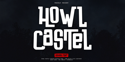 Howl Castel is Vintage and Modern Display Font, Handlettering Bold Font, Powerfull and has a very Strong Character, Great for expressing a summer,The Typeface comes with Stylistic Alternates and Ligature Combinations Exellent typeface to use for covering your Project, like Branding, Headline Letter, Flyer, Signage, Quotes, Poster Typography, Bookcover, Magazine cover, Poster, Quotes Lettering, Logos, and more your project design. - Unique glyphs - Multilingual Characters Support - UPPERCASE - Lowercase - Numeric - Symbol - Punctuation Character - Ligature - Stylistic Alternates inumocca type Studio
 - Corelia by Hurufatfont,
$24.00 Corelia; It has a compact, lean, industrial and neutral body structure. Text and Display versions provide a very wide usage area. Ideal for modern brand designs. It includes rich OpenType features with custom number styles.
 - Boot Camp JNL by Jeff Levine,
$29.00 Boot Camp JNL has the same roots as Jeff Levine's Condensed Stencil JNL, as they were both modeled from a set of vintage brass interlocking stencils made by the Stafford Manufacturing Company. The previous font was drawn from limited examples of the stencils seen in an online photograph, so a number of the basic characters had to be improvised. Since then, a nearly complete set was obtained and the alphabet and numerals are truer to the original design. Additionally, both Regular and Oblique versions of Boot Camp JNL are available.
 - Stencil Playthings JNL by Jeff Levine,
$29.00 A circa-1951 toy set called “Kusan Kavalcade of Letters” was comprised of molded plastic letters and numbers a child could play with, trace and arrange to learn their alphabet and numerals. Typographically, the design was all over the place – from sans serif characters to those with some spurred serifs and even some stenciled characters because of the nature of manufacture. As odd as this combination seems, it was novel enough to be turned into a digital typeface called Stencil Playthings JNL, which is available in both regular and oblique versions.
 - Big Ballpen by Simonkoba,
$18.00 Big Ballpen is a modern, slightly naive handwriting typeface, which has the feel of graffiti with its rough lines. The font lines are basically fat and the thickness is not regular from letter to letter. Some numbers are inspired from Tony Buzan concept of picture-number. For example, the number 2 resembles a swan. Some special characters like €$*#@&{Ç~• are available.
 - Ziletti Pop by RM&WD,
$20.00 ZILETTI POP is a font used by Girolamo Ziletti in Venice in mid/late 1500. A typographic caracter characterized by a Venetian style cage with slight geometrical imperfections but with a great perceptual level. This is a multilayered variant with a wide range of possibility in variations in terms of end results. With the use of the color your artworks will have news optical effects. Ideal for Covers, Posters, Logos…
 - LT Oksana - Personal use only

- Etrusco Now by Italiantype,
$39.00 Etrusco Now is the revival of a lead typeface originally cast in lead by Italian foundry Nebiolo in the early 1920s. Heavily inspired by the design of the Medium weight of Schelter & Giesecke's Grotesk, Etrusco was, like Cairoli, an early precursor of the modernist grotesque superfamilies: a solid, multi-purpose "work-horse" typeface family that could solve a wide range of design problems with its range of widths and weights. When designing the new incarnation of Nebiolo's Etrusco, the Italiantype team directed by Cosimo Lorenzo Pancini and Mario de Libero decided to extend the original weight and width range to keep this "superfamily" approach. Etrusco Now has twenty-one styles widths in three widths of seven weights each, with matching italics; the original weights for the typeface have been collected in the Etrusco Classic subfamily. Etrusco Now new widths allowed the team to include in the design many nods and homages to other vintage classics of Nebiolo. The lighter weights of the normal width have been heavily influenced by the modernist look of Recta, while the heavy condensed and compressed widths refer to the black vertical texture of Aldo Novarese's Metropol. This infuses the typeface with a slightly vintage mood, making Etrusco at the same time warmly familiar and unexpected to eyes accustomed to the formal and cold look of late modernist grotesques like Helvetica. Contemporary but rich in slight historical quirks, Etrusco Now is perfect for any editorial and branding project that aims to be different in a subtle way. Etrusco Now's deviations from the norm are small enough to give it personality without affecting readability, while its wide range of open type features (alternates, stylistic sets, positional numbers) and language coverage make it a problem solver for any situation. Like its cousin Cairoli, Etrusco is born out of love for lost letterforms and stands like its lead ancestor from a century ago, at the crossroads between artsy craftsmanship and industrial needs.
 - Omibez by PizzaDude.dk,
$20.00Omibez contains a number of more-or-less weird and funny drawings. The font was used for the first pizzadude poster which contains 18 of these pizzadudeish drawings. - Kidspace by Monoco Type,
$18.00 Kidspace is playful style font, with alphabet, numbers, symbol, and multilingual feature. You can use this on kids project, logo, social media post, book cover, and other project.
 - Valute by Authentype,
$12.00 Valute is a custom font with variable typeface, but at first glance it looks very mischievous. Very thincontrasting lines are very legible with heavy use of paragraph text. We made Valute with 9 weights that include ligatures and are multilingual. We will make language and feature updates in the future as this is a long-term project that we will be building on.
 - Soft Block by fontgeneration,
$19.00 The letters possess some of the most characteristic features of this type of font, used for communication and advertising in various mechanized and motor sports, as well as in the gaming industry. The technological-engineering constructiveness is achieved through the strict geometry of the forms, and the sporty competitive look is stylistically expressed through the slopes and contrasts of the beams.
 - Compote by Factory738,
$15.00 Compote is a fashionable sans serif font that is both retro and sophisticated. The sans serif font pays homage to tradition, while the smooth curves evoke a 70s groovy vibe. Compote is the ideal complement to vintage bringing it up and logos. There are numbers, punctuation, and multilingual letters, as well as a distinct lower and uppercase. The ligature and italic fonts will be useful for anything your imagination can dream up! 5 Weights (Light, Regular, Semibold, Bold and Black) 2 Styles (Regular and Italic) Basic Latin A-Z and a-z Numerals & Punctuation Stylistic Ligatures Multilingual Support for ä ö ü Ä Ö Ü ... Free updates and feature additions Thanks for looking, and I hope you enjoy it.
 - Mirtha Display by Nois,
$24.00 Mirtha Display is a modern display font with distinct Art Nouveau details. Its lighter weights are condensed and sophisticated, while the heavier weights have a more powerful effect, making it perfect for headlines, posters, branding, logos, packaging and more. With a set of over 450 glyphs, this font supports a wide range of languages. Key OpenType Features include numerators and denominators, Old Style and Lining numbers, standard ligatures and localized characters such as Uppercase and Lowercase Sharp S. Mirtha Display covers 5 weights, 10 styles and 2 Variable cuts (regular and italic) to give you more design flexibility. Any suggestion to continue improving Mirtha Display will be welcome, do not hesitate to contact us!
 - Abygaer by Sealoung,
$25.00 Abygaer - a stylish OpenType rich serif with letters that seem to dance and twist harmoniously together - to form unique & elegant typography designs. A large selection of interwoven Opentype ligatures and alternates, means ample selection and variety in your finished look. To access these OpenType features, you will need Opentype capable software such as : Word, Textedit, Photoshop, Sketch, Pages, Keynote, Numbers, iBooks Author, QuarkXPress, Indesign and Illustrator. A wide range of useful glyphs are included - see preview image of all glyphs. Abygaer is also included full set of: -uppercase and lowercase letters -multilingual symbols -numerals -punctuation -stylish alternates -ligature Wish you enjoy our font and if you have a question, don't hesitate to drop message & I'm happy to help :)
 - Paramour by Redy Studio,
$15.00 Paramour is a handwritten font that is the perfect way to add some flirty elegance to your design. Use it to create inked-style logos, wedding stationery & photographer watermarks, or to add a handwritten look to your website's typography. Paramour includes a full set of gorgeous uppercase and lowercase letters, numerals, a large range of punctuation, and 93 ligatures. This handcrafted typeface has been engineered to perfectly fit together. Paramour Features: A full set of upper & lowercase characters Numbers & punctuation 93 Gorgeous ligatures Multilingual symbols PUA Encoded Characters – Fully accessible without additional design software. Thank you for checking out Paramour! I hope you find it enjoyable, and feel free to give it a try below!
 - WriteHand by Scholtz Fonts,
$21.00 WriteHand is a light-hearted, fluid, freeform script font. It is one of Anton Scholtz's contemporary designs. Based on actual handwriting, the font contrasts a strong, artistic nature with a feminine sensitivity. WriteHand successfully combines exuberant capitals with devil-may-care swashes, and toned down lower case characters to make an extremely readable handwritten font. The font is most versatile and has a number of uses, among which are contemporary invitations, greeting cards, magazine pages, adverts, cosmetic packaging and promotions, clothing swing tags and promotions, and book covers. It has been carefully letterspaced and kerned. It contains a full character set: all upper and lower case characters, punctuation, numerals and accented characters are present.
 - Chelsea Queen by D&K Project,
$18.00 Chelsea Queen was built with OpenType features and includes numbers, punctuation, alternates, ligatures, swash and icon sign and it also supports other languages. Chelsea Queen is a very unique font, because there are 85 sets of ligatures that will make writing natural and elegant. This is very suitable for use Logo, Wedding, Fashion, Poster, Menu, Invitation and there is still much that can be done with this font. Chelsea Queen File Downloaded: - 85 set of LIGATURES (make your natural handwriting) - Both OTF and TTF file formats (Regular, Italic, and swash and sign) - UPPERCASE and lowercase - Swash and sign font ( A-Z and a-z ) - Panctuation and numeral - extended Latin characters for language support.
 - Signyard by Albatross,
$19.00 Based on the popular Microbrew Family (Rising Star, May 2014), Signyard is a display family trapped in time. Inspired by vintage restaurant and hotel signs, Signyard comes decked out in incandescent bulbs for a an authentic retro feel. The family has a unique vintage cinema style, but also works well with a variety of subject matter including weddings, birthdays, breweries, coffee houses, cigar shops, and many more. Signyard is an all caps display font, but the lowercase act as alternates. For super-easy alternates, just mix uppercase and lowercase letters. To add to the realism, Signyard includes double-letter ligatures. Sporting a healthy compliment of features and languages, Signyard is a very versatile display family. Signyard features 6 styles, 4 layers, symbols and opentype features. Opentype features include automatic fractions, subscript numbers, superscript numbers, and double-letter ligatures. Also included are old style numerals, and catchwords. (in the symbols font)
 - CA Saygon by Cape Arcona Type Foundry,
$40.00 CA Saygon was originally conceived for a large corporate design project, but as this was never implemented, the way was free to make a public font. As a striking corporate typeface, it transports the fractions of a society after the post-modernist phase. After hundreds of sketches a bunch full of letters were selected, some of them quite twisted, others rather conventional. The combination of these letters reflects a rebellion of individuality but also leads to a coherent typeface. Additionally there are alternative letterforms in the Stylistic Sets or in the glyphs palette, which keeps the font always exciting to the designer. Thanks to the Cyrillic and Latin Extended character sets, a huge language area is covered that even extends to Vietnam! Numerous OpenType features make life easier for the professional typographer: There are fractions, superscript and subscript numbers, as well as proportional and tabular numbers.
 - Crox Narrow by NumidiaType,
$25.00 Crox™ Narrow is the second family of Crox™, designed for long texts and gaining paragraph spaces. It's available in 19 styles, including upright and italic, and the majority of glyphs are compressed to make a different spacing between characters. The basic English characters are provided as both numerator and denominator sets in the narrow version too; this feature may assist with the creation of fractions with letters and numbers, such as in advanced scientific fraction form scripting. Within each style, all weights support over 25 professional OpenType features, with significant coverage of western languages. and include multi-alternative characters in Styles 1, 2, 4, 10, and 11, which were initially intended for advanced usage. Specimen Crox™ is a trademark of Yassine Abdi.
 - Adobe Bengali by Adobe,
$29.00The Adobe Bengali typeface was designed by Neelakash Kshetrimayum, with Bengali script expert Fiona Ross consulting on the design. This type family was designed to harmonize with Adobe?s other Brahmic fonts, both in terms of apparent size and style, to ensure that this suite of typefaces families can be typeset together as a system. The primary intended usage ? for printed outputs, particularly continuous text settings ? guided the design direction. - Adobe Kannada by Adobe,
$29.00The Adobe Kannada typeface was designed by Erin McLaughlin, with Brahmic script expert Fiona Ross consulting on the design. This type family was designed to harmonize with Adobe?s other Brahmic fonts, both in terms of apparent size and style, to ensure that this suite of typeface families can be typeset together as a system. The primary intended usage ? for printed outputs, particularly continuous text settings ? guided the design direction. - Apron by Hurufatfont,
$29.00 The genesis of Apron font type family is inspired by soft-vertical structure of airplane window. On the other hand Apron is making a reference to technological design mentality of early 2000's. In short texts it has stable view and also humanist effect. Very suitable for mobile apps, web designs, sportive & technological product packs and ads designs. Especially Narrow Bold and Condensed Bold Italic weights have fluid and strong expression for striking headlines. User friendly Apron serves rich opentype properties; small capitals, alternative letters (a, c, e, g, k, l, q, s, y, A, C, G, K, M, N, R, S, 3, 6, 9), stylistic sets, standart and optional ligatures, oldstyle figures, tabular linings, arrows, bullets and wide money currencies, fractions and math symbols. Now please fasten your seat belts and enjoy it.
 - Matcha by Los Andes,
$59.00 We decided to explore the concept of fitness, but from a more natural perspective. With so many people drinking detox drinks and eating raw food, we were inspired to create a font that mixes the ‘strength’ of sports and the organic nature of natural products. The result is ‘Matcha’: a strong and energetic typeface that also flows at the same time. Matcha consists of a stable, very friendly Slab face and a calligraphy Script with a handmade style: spontaneous and fickle with some reverse-contrast alternative characters. Can you guess who is the designer behind each style? The duo contains OpenType features and is perfect for labeling natural products, cookbooks, magazine photography, fashion & beauty magazines covers, health & fitness publications, and more. For both print and digital communication. Matcha: the new black coffee!
 - ApronSoft by Hurufatfont,
$19.00 The genesis of ApronSoft font type family is inspired by soft-vertical structure of airplane window. On the other hand ApronSoft is making a reference to technological design mentality of early 2000's. In short texts it has stable view and also humanist effect. Very suitable for mobile apps, web designs, sportive & technological product packs and ads designs. Especially Narrow Bold and Condensed Bold Italic weights have fluid and strong expression for striking headlines. User friendly ApronSoft serves rich opentype properties; small capitals, alternative letters (a, c, e, g, k, l, q, s, y, A, C, G, K, M, N, R, S), stylistic sets, standart and optional ligatures, oldstyle figures, tabular linings, arrows, bullets and wide money currencies, fractions and math symbols. With reduced file size, it’s softer now!
 - Code 128 is a high-density linear barcode symbology that is widely used in various industries for encoding alphanumeric or numeric-only data. Introduced in 1981, Code 128 has become a standard in man...
- Haute Couture JNL by Jeff Levine,
$29.00A style of die-cut cardboard letters and numbers used for signs, displays and show cards was the basis for Haute Couture JNL, an Art-Deco flavored typeface from Jeff Levine. A direct cousin to Signboard JNL, this font shares some similar characteristics in letterforms. Both styles of die-cut lettering were manufactured by a number of companies, and were most popular from the 1940s through the mid-1960s. - Outer Loop NF by Nick's Fonts,
$10.00Here’s the follow-up to my Route 66 series, patterned after the typeface used on signage on the U.S. interstate highway system for fifty years. The numbers and uppercase letters are true to the original, while a number of the lowercase letters show the influence of the new Clearview type. Both versions of the font include 1252 Latin and 1250 CE (with localization for Romanian and Moldovan) character sets. - Whipsmart - Personal use only

- ST Remona Neue by Skinny Type,
$18.00 ST Remona Neue is a confident serif. Designed to reflect nature, it creates a sense of softness and natural expression. We pushed the concept in a usability-focused direction, to work as a bold tool and a beautiful communicator. ST Remona Neue allows for fluid designs in 3 styles. Regular, Italic, Outline and Latin based main language. The right slant advances aesthetics, brings energy and makes it suitable for modern design. The type family blends organic curves and soft repetition into strong and harmonious types. At large dot sizes you can appreciate the shape of the letters, while the same control and focus creates an even texture for small dot sizes and long reads. Fonts extend their use by providing a variety of unique language and style supports. The ST Remona Neue character set combines additional symbols, style alternatives, unique binding, and case sensitive punctuation - resulting in a stable, hardworking family ready to tackle projects of any size. Happy Designing
 - Hayseed by Typadelic,
$19.00Round and square, curly and straight are contradictory in terms but aptly describe this unclassifiable typeface from Typadelic. Readable at small sizes but meant for display purposes, Hayseed will fill the bill in a variety of design applications. - Flivver JNL by Jeff Levine,
$29.00Flivver JNL takes its name from the slang term applied to Model T's in the 1920s, and it's design is a first-cousin to Two Reeler JNL (inspired by lettering on titles from a Charlie Chaplin silent film). - MOO! - Personal use only

- Bajt by Fontsphere,
$12.00 Geometric, pixel-art-style, minimalist font. BAJT contains uppercase letters, numbers and a large range of punctuation. Use for awesome display, illustrations, posters, logos, t-shirts, titles, and more..
 - Shutdown Brush by Rockboys Studio,
$23.00 Shutdown Brush is textured brush font using a contemporary approach to design. Handmade naturally with an irregular baseline, Amithen is suitable for a number of display or decorative designs.
 - Anecdote JNL by Jeff Levine,
$29.00Anecdote JNL gives a serif treatment to Haute Couture JNL, which in turn was modeled after die-cut cardboard letters and numbers used for displays, signs and show cards.


