5,003 search results
(0.026 seconds)
- Rohn by Nine Font,
$29.00 Rohn is a modern squarish typefamily with a large x-height. Its letterforms are based on the shape of square with rounded corners. With particular details and large x- height, it is more legible at small sizes both on screen and paper. It has seven weights from Thin to Black with corresponding oblique styles and each weight includes ligatures, fractions, old style numbers, case-sensitive forms and more. Rohn is ideally suited for branding, logo, packaging, magazine, poster and editorial design.
 - Mellar by Creativemedialab,
$20.00 We are introducing Mellar, a Variable display font. Mellar is an obese font with a simple and bold modern look. It consists of 2 styles: round and square, also three widths on each type: Toppo - Medio - and Botto. Mellar is a variable font, officially known as Open-Type Font Variations. You can generate many styles with the three available slider axes. Mellar will add fresh fun vibes to your designs. This font is perfect for clothing, book covers, titles, etc.
 - Changa by Tipo,
$12.00 Changa is a layered font intended for titles or short texts blocks, with its short ascenders and descenders and a set of lowercase letters inscribed within a square. The uppercases case gains slightly more in height and develops its morphology in a single height in order to make it possible to create text composition with minimum line spacing. Its counter-shapes are rectangular, featuring small curvatures in opposite vertexes which accompany and break the shapes, thus evoking a modern style.
 - Texas Chili by FontMesa,
$29.00 Texas Chili is a modified version of our Philadelphian font family. With Texas Chili we've squared the curved inside brackets from the Philadelphian font which helps open up the inside of some letters for a sharper appearance. The Texas Chili font family also includes a Unicase i that's balanced to the weight of the uppercase. You need an application such as Adobe Creative Suite or any other Opentype aware program to access the alternate Unicase i in the Chili font family.
 - Byte 105 by Talbot Type,
$15.00 Byte 105 is a modular font, resulting from experiments in creating a practical, legible font from a minimum set of geometric components on a uniform grid. It has full upper and lower case character sets and includes all accented characters for Western and Central European languages. It's available in three styles – 105, 205 and 305. Each style has different corners, 105 is square, 205 is bevelled and 305 is round. Each style is available in three weights, Light, Medium and Bold.
 - VT Redzone Classic by VarsityType,
$18.00 Raw and uncut, this sharp square sans is ready to rip. Originally released in October 2017, VTF Redzone Classic is the first published typeface by CJ Zilligen. It’s raw and uncut — built with sharp terminals and spur serifs that give off an aggressive appearance. VTF Redzone Classic was refreshed in May 2020 to include nearly 200 new characters, extensive language support, and a sleek and long-anticipated Oblique version. This titlecase display typeface is tooled to give any project a competitive edge.
 - Ticketing by K-Type,
$20.00 Ticketing is a monospaced font loosely based on the pixel style lettering of electronic ticketing, designed for clarity when cheaply printed at small sizes. Ticketing, however, has a larger x-height than is often found on ticket type. The glyphs were drawn on a square grid 13 wide by 22 high, though some accented characters are taller or extend below the baseline. The Space is a full character width, but the Non-Breaking Space is set to half the width of the glyphs.
 - Lost Arcade by Chris Rogers Fonts and Symbols,
$19.00 Are you a game developer, retro enthusiast or lover of pixel art? Ever had trouble tracking down an 8-bit display font that's classy, coherent and truly complete? This type enthusiast and veteran pixel artist once had the same problem, and cut no corners to solve it. Lost Arcade features four styles, a myriad of special characters, broad language support and an accompanying symbol font with 64 pixel art symbols. For the purists out there, each square is proportional to its neighbor.
 - Kakadu by Ludwig Type,
$55.00 Kakadu is a squarish sans serif, designed to work equally well on paper and on screen. The angular curves in this typeface create a firm and dependable appearance. The square-like forms also provide an inward openness and allow large and open letterforms, adapting perfectly to the orthogonal pixel grid of the monitor. Kakadu works well in small sizes while, it appears strong and distinguished in larger ones. Play the classic snake game and see the Kakadu fonts in action here.
 - MC Syntak by Maulana Creative,
$16.00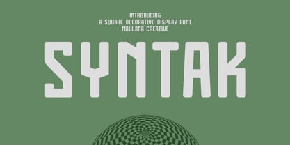 Syntak is an all caps Tech vibe square-is Display Sans font. Regular stroke, fun character with a bit of ligatures and alternates. To give you an extra creative work. Syntak font support multilingual more than 100+ language. This font is good for logo design, Social media, Movie Titles, Books Titles, a short text even a long text letter and good for your secondary text font with script or serif. Make a stunning work with Syntak font. Cheers, Maulana Creative
 - Byte 305 by Talbot Type,
$15.00 Byte 305 is a modular font, resulting from experiments in creating a practical, legible font from a minimum set of geometric components on a uniform grid. It has full upper and lower case character sets and includes all accented characters for Western and Central European languages. It's available in three styles – 105, 205 and 305. Each style has different corners, 105 is square, 205 is bevelled and 305 is round. Each style is available in three weights, Light, Medium and Bold.
 - NewNerdish by Ingrimayne Type,
$9.95 A sans-serif face in which the circular elements have become almost square, NewNerdish resembles a number of typefaces which have become associated with a modernistic, computer look. There is little or no variation in the weight of horizontals, diagonals, and verticals. It comes in two widths each with five weights and each weight has an oblique version, which has the same letter shapes as the upright version. The ShadowedInside style is designed to be used in a layer with the Shadowed style.
 - Keymer Radius by Talbot Type,
$19.50Talbot Type Keymer Radius is related to Talbot Type Keymer ; where Keymer is square-edged, Keymer Radius is subtly rounded for a softer look. Keymer Radius mixes geometric and humanist traits to achieve a modern, clean, elegant appearance. It is a legible and versatile text and display face available in six weights. Keymer Radius features an extended character set to include old style numerals, accented characters for Central European languages and bespoke characters in the italic for a more flowing look. - Tomkin by Typesketchbook,
$55.00 Tomkin font is an extra large super family of 54 fonts! Tomkin have such a big abundance of contrast, styles, weights, width. Typesketchbook consists of a very usable, clean and modern sans typeface with Semi-square struture. The complete Tomkin type family includes 9 weights with italic and 3 width (normal, narrow, condense) versions for each of them all in all 54 fonts for a multifunctional usage, especially for cooperative work, such as website, magazine, editorial, publishing , as well as packaging.
 - Legere by B2302,
$35.00 Legere is a slim, light and decorative font, based on the idea to work as close as possible on the geometric forms of the circle, the triangle and the square. As a natural conclusion the number of angles is limited. Legere comes in these weights: THIN, LIGHT, REGULAR and a very special DECO version. Legere might be used as a headline font, for posters or cover layout, it might also be transformed into that fashion label logotype you are working on. Have fun!
 - Capri Pro by Floodfonts,
$49.00 Capri is an expressive constructed sans serif typeface in the tradition of Kabel and Avant Garde. The proportions of the letters and the overall impression are modern and contemporary but also retain the crude charme of the constructivist concept. The design is based on basic forms as square, circle and triangle and was developed by drawing not writing. The dominant diagonal forms and the vertically cut endings of the curved strokes give the font its sharp-edged look and its puristic elegance.
 - NEON LED Light - Personal use only

- Eighty-Eight - Personal use only

- LT Yorkshire - 100% free

- Sturkopf Grotesk - 100% free

- Modern Vision - 100% free

- Saarland - 100% free

- Pop Warner - 100% free

- Letra Libre - Unknown license

- Xilosa - Unknown license

- Squid - Unknown license

- CoasterPoster - Unknown license

- Stahlbeton - Unknown license

- SWEM - 100% free

- Mutter - Unknown license

- Berkelium Type - Personal use only

- NewMedia - Unknown license

- Pixel - Personal use only

- Young Techs - Personal use only

- Pinocchio - Unknown license

- Roos by Canada Type,
$24.95 The Roos family is a digitization and expansion of the last typeface designed by Sjoerd Hendrik De Roos, called De Roos Romein (and Cursief). It was designed and produced during the years of the second World War, and unveiled in the summer of 1947 to celebrate De Roos's 70th birthday. In 1948, the first fonts produced were used for a special edition of the Dutch Constitution on which Juliana took the oath during her inauguration as the Queen of the Netherlands. To this day this typeface is widely regarded as De Roos's best design, with one of the most beautiful italics ever drawn. In contrast with all his previous roman faces, which were based on the Jenson model, De Roos's last type recalls the letter forms of the Renaissance, specifically those of Claude Garamont from around 1530, but with a much refined and elegant treatment, with stems sloping towards the ascending, slightly cupped serifs, a tall and distinguished lowercase, and an economic width that really shines in the spectacular italic, which harmonizes extremely well with its roman partner. The Roos family contains romans, italics and small caps in regular, semibold and display weights, as well as a magnificent set of initial caps. All the fonts contain extended language support, surpassing the usual Western Latin codepages to include characters for Central and Eastern European languages, as well as Baltic, Celtic/Welsh, Esperanto, Maltese, and Turkish.
 - Tyma Garamont by T4 Foundry,
$49.00The TYMA Garamont Roman was inspired by the Berner-Egenolff type sample from the 1560s. The Italic was inspired by a sample from Robert Granjon, also from the 1560s. The name TYMA is short for AB Typmatriser, a Swedish company founded 1948, because the Second World War stopped all import of matrices for Linotype and Intertype typesetting machines. It took until 1951-52 before the import was up to speed again. Until then, Sweden had to fend for itself. TYMA produced all technical equipment needed for type production, including the pantograph to cut the matrices, a complete set for each size and version. The templates for Garamont Roman were initiated by Henry Alm 1948. Bo Berndal was hired the following year, and continued the work by drawing and cutting templates for the rest of Garamont Roman, as well as for the remaining Garamont family. Bo Berndal stayed at TYMA until it went bankrupt in 1952. At that time Bo Berndal had already kick-started his career as type designer by drawing the typeface Reporter for one of the big daily newspapers, Aftonbladet, a version of Cheltenham for another daily, Dagens Nyheter, and copied several old typefaces for other customers. Librarian Sten G. Lindberg at The Royal Library of Stockholm, Kungliga Biblioteket, procured copies of original type samples. Henry Alm started the work in 1948, and Bo Berndal completed it - finally in this OpenType version. - ITC Chivalry by ITC,
$29.99ITC Chivalry is a calligraphic hybrid that honors the tradition of combining Roman capitals with italic lowercase letters. Drawn by Missouri lettering artist Rob Leuschke, who used a flat-nib pen on textured watercolor stock and then converted the drawings into a digital font, the design combines an old world" feel with "new world" legibility. A companion set of black letter caps completes the suite of characters. "I've loved drawing letters for as long as I can remember," says Leuschke. "Even in kindergarten, I tried to draw letters like my teacher." After graduating from college, Leuschke worked for a short time at a sign company in St. Louis, and in the early 1980s began working at Hallmark Cards in Kansas City. His talent as a calligrapher and lettering artist eventually brought him back to St. Louis to begin a freelance career. Since then Leuschke has created over 250 fonts, primarily for the greeting card industry, that are now being used on work for his clients all over the world. Leuschke first conceived of the face as just the black letter caps; he later added the Roman letters to give the design more versatility. The Roman caps of ITC Chivalry combined with the lowercase are well suited to blocks of copy, while the more decorative black letter caps are ideal for showcasing short text of just a few words. Both sets of capitals also make great initial letters." - Block Paper by Dumadi,
$20.00 Block Paper – Playful Typeface is a square font inspired by squares/cubes. a font specially designed for designers with fun and colorful kids projects. Block Paper is perfect for design, logos, social media, branding, advertising, product design, handwritten quotes, product packaging, headers, posters, merchandise, and other designs. What’s Included : + Standard glyphs + Ligature + Multilingual Accent + Works on PC & Mac, Simple installations This Font Support Languages : Afrikaans, Albanian, Asu, Basque, Bemba, Bena, Breton, Catalan, Chiga, Cornish, Danish, Dutch, English, Estonian, Faroese, Filipino, Finnish, French, Friulian, Galician, German, Gusii, Indonesian, Irish, Italian, Kabuverdianu, Kalenjin, Kinyarwanda, Luo, Luxembourgish, Luyia, Machame, Makhuwa, Meetto, Makonde, Malagasy, Manx, Morisyen, North, Ndebele, Norwegian, Bokmål, Norwegian, Nynorsk, Nyankole, Oromo, Portuguese, Quechua, Romansh, Rombo, Rundi, Rwa, Samburu, Sango, Sangu, Scottish, Gaelic, Sena, Shambala, Shona, Soga, Somali, Spanish, Swahili, Swedish, Swiss, German, Taita, Teso, Uzbek (Latin), Volapük, Vunjo, Zulu. Accessible in Adobe Illustrator, Adobe Photoshop, Adobe InDesign, even work on Microsoft Word. PUA Encoded Characters – Fully accessible without additional design software. Fonts include multilingual support + Image used: All photographs/pictures/vectors used in the preview are not included, they are intended for illustration purposes only.
 - Lorraine Braille by Echopraxium,
$9.50 This is a decorative and steganographic Braille font based on Lorraine Cross pattern. As the Lorraine cross splits space into six areas, it may be used to represent Braille glyphs. Provided Glyphs * Lowercase letters (a..z): a White cross and Black square dots * Uppercasecase letters (A..Z): a Black cross and White square dots * Special characters (e.g. !#$%*+<>{}()[]...) * Decorative glyphs (provided in black and white as well) Glyph code intervals - Codes 48..57: Bullets (0..9 digits) - Codes 130..150: 'White Stars' - Codes 192..233: 'Black Stars', Black border glyphs and other black patterns. - Codes 214..233: Border/Decorative glyphs (Black) - Codes 235..255: Border/Decorative glyphs (White) - Codes for Cross w/o dots: Black (192), White (235) - Codes for Cross and 6 dots: Black (191), White (234) - Code for 'Half-width space' (166) Posters 1. Logo: illustrates usage of border glyphs 2. Meta: Two big Lorraine Braille glyphs drawn with pattern glyphs 3. Stars: illustrates usage of 'Star' and pattern glyphs 4. Bullets: illustrates usage of bullet glyphs (0..9) 5. Human rights - Article 1 NB: - Encoding is: Windows Latin ("ANSI") - Published in two versions: Commercial and Free for personal use


