10,000 search results
(0.012 seconds)
- Amatohoso Font by Amato,
$29.00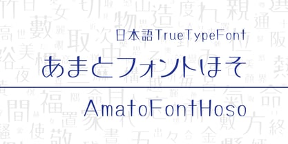
- Chrymez Font by Maulana Creative,
$11.00 Chrymez is a modern sans serif display font. With Bold stroke, fun character with adding alternates "O". To give you an extra creative work. Chrymez font support multilingual more than 100+ language. This font is good for logo design, Social media, Movie Titles, Books Titles, a short text even a long text letter and good for your secondary text font with signature script typeface. Make a stunning work with Chrymez font. Cheers, MaulanaCreative
 - Tacky Font by Ingrimayne Type,
$14.95 Four letters for this font came from a puzzle in a 1983 Games magazine. After seeing them, I could not resist the temptation to do a complete set of letters made from push pins or tacks, a truly tacky font. Most of the letters on the lower case keys are alternatives--choose the one works best for your purposes.
 - Karlostine Font by Tebaltipis Studio,
$15.00 Karlostine Font with a handmade calligraphy style, decorative characters and a dancing baseline! So beautiful on invitation like greeting cards, branding materials, business cards, quotes, posters, and more!! Karlostine Font come with 250+ glyphs. The alternative characters were divided into several Open Type features such as Swash, Stylistic Sets, Stylistic Alternates, and Ligature. The Open Type features can be accessed by using Open Type savvy programs such as Adobe Illustrator, Adobe InDesign, Adobe Photoshop Corel Draw X version, And Microsoft Word. And this Font has given PUA unicode (specially coded fonts). so that all the alternate characters can easily be accessed in full by a craftsman or designer. Karlostine Font Features : Uppercase & Lowercase International Languange & Symbols Support Punctuation & Number PUA Unicode Range Standard Ligatures Discretionary Ligatures Stylistic Alternates Stylistic Set 01-03:
 - Mockejoe Font by Tebaltipis Studio,
$13.00 MOCKEJOE FONT was born in the modern era which was inspired by the letters found in various print and digital media. Comes with a modern and futuristic style that will rock your great design! It is suitable for you to use in logotype designs, posters, typography, t-shirts, tickets, and other modern designs. The alternative characters in this font were divided into several OpenType features such as Stylistic Alternates, Stylistic Sets, and Ligature. The OpenType features can be accessed by using the OpenType program such as Adobe Illustrator, Adobe Photoshop, and Adobe InDesign.
 - Hont by Remedy667,
$18.00 Hont, the original Haunted Font is here. We've captured the essence of an old-school horror film and now you can use it to create awesome-looking titles for all your projects. With its chunky appearance, this font is perfect for vintage poster designs, t-shirt designs, logos, or anything that needs a hint of spooky. Hont is the ultimate Haunted Font that looks amazing on all projects. Inspired by classic mid-century horror films, it will give your projects just the right amount of classic horror. Features Doubles Elimination gives you a more natural look. Inspired by classic mid-century horror films. Includes a Remedy667 Font Catalog PDF, all your favorite fonts in one handy catalog. Possibly haunted, may possess you to create awesome work.
 - Fone by Volcano Type,
$19.00 - Fonty by RodrigoTypo,
$29.00 Fonty, inspired by Spiro, is a very gestural typography special for titles. It contains Regular, Extrude and Spring, with which you can further enhance the message! I hope you enjoy it!
 - Ponte by SilkType,
$47.50 Ponte is a high-contrast display typeface with smooth serifs, designed for impactful headlines. The ten-style typeface features over 80 decorative ligatures, with roman and italics available in five weights, ranging from extra light to bold. This offers a variety of options for sophisticated design applications. Elevate your compositions with Ponte's timeless elegance and aesthetic precision.
 - Forte by Monotype,
$29.99 Forte was designed by the Austrian commercial artist by Carl Reissberger who was trained as a compositor and later taught typography and drawing in Vienna. The idea for the Forte script font came from the study of plants, individual letter forms being inspired by the long stems and furry heads of the reed. Slightly inclined, it gives the impression of having been made with a bold brush or marker, and can therefore be used in work that requires an informal appearance. Forte is a strong design which contrasts well with sans serif faces and classical modern types. Use the Forte font in advertising, flyers and labels.
 - Gonte by Dear Alison,
$29.00 If you are like me, you love to doodle in a sketchbook when traveling abroad to capture the indescribable moments that a camera or video would miss. Years ago, on a trip to Spain, I penned out this fanciful handwritten script and just fell in love with it. I came across that old sketchbook recently, and the love affair was renewed. Gonte brings back all of the magic and charm of that trip, and I hope that it will bring a little magic to whatever flights of fancy you might use it for. Double letter Ligatures, Contextual Swashes to start and finish letterforms, and Stylistic Alternates for the lowercase v and w all lend to keeping the carefree hand-penned style.
 - Mont by Fontfabric,
$39.00 *Mont Specimen: http://bit.ly/montsp *Scroll down for the FREE DEMO fonts Features: • 744 glyphs in 20 styles; • Extended Latin, Cyrillic and Greek; • Perfect for headlines and logos; • Prominent x-height; • Distinctive pointed triangular bracketed “t”; • Coverage of multiple OpenType features; • Suitable for web, print, motion graphics etc. Mont is a geometric sans serif consisting of 10 weights ranging from Hairline to Black with matching italics. It supports Extended Latin, Cyrillic and Greek — more than 130 languages all together. The balanced characteristic of Mont with unique details, such as the pointed “t” and the prominent x-height makes it perfect for strong headlines and outstanding logos, but also suitable for long text. Mont comes with a range of OpenType features — including tabular figures, advanced typographic features such as ligatures, fractions, case-sensitive forms, superscripts, subscripts etc. The typefaceʼs versatility and merits make it easy to confront any graphic design challenge — web, print, motion graphics etc. Up with Mont to the top and beyond!Mont™ Font Field Guide including best practices, font pairings and alternatives.
 - Fono by GarageFonts,
$39.00 - Font formerly known as FONT - Unknown license

- CartoGothic Std - 100% free

- Bergamo Std - 100% free

- Eye Spy - Unknown license

- Sad Films - Unknown license

- Sid-theKid - Unknown license

- Sad Jane - Unknown license

- Sad Films - Unknown license

- Parisine Std by Typofonderie,
$59.00 Ultra legible forceful sanserif in 32 fonts Parisine was born as official parisian métro signage typeface. This family of typefaces has become over years one of the symbols of Paris the Johnston for the London Underground or the Helvetica for the New York Subway. The Parisine was created to accompany travelers in their daily use: ultra-readable, friendly, human while the context is a priori hostile. Meanwhile, Parisine is now a workhorse and economical sanserif font family, highly legible, who can be considered as a more human alternative to the industrial-mechanical Din typeface family. More human, but not fancy: No strange “swashy” f, or cursive v, w etc. on the italics, to keep certain expected regularity, important for information design, signages, and any subjects where legibility, sobriety came first. Born as signage typeface family, the various widths and weights permit a wider range of applications. In editorial projects, the Compress version will enhances your headlines, banners, allowing ultra large settings on pages. The Narrow version will be useful as direct compagnon mixed to standard width version when the space is limited. The various Parisine typeface subfamilies Parisine is organised in various widths and subsets, from the original family Parisine, Parisine Gris featuring lighter versions of the usual weights and italics, Parisine Clair featuring extra light styles, to Parisine Sombre with his darker and extremly black weights as we can seen in Frutiger Black or Antique Olive Nord. Many years of adjustments were necessary to refine this complex family. Initially, Parisine was designed by Jean François Porchez in 1996 for Ratp to solely fulfil the unique needs of signage legibility. Parisine remain the official corporate typeface of the public transport in Paris, the worldwide capital for tourism, and now integral part of the French touch. Directly related, Parisine Office was initially created for Ratp’s internal and external communication, Parisine Office is available at Typofonderie too. Not connected with Ratp and public transports, Parisine Plus was created as an informal version of Parisine. Parisine: Introducing narrow and compressed families About Parisine Parisine helps Parisians catch the right bus Observateur du design star of 2007
 - Supernova Std by Martina Flor,
$79.00 Supernova is a new family that combines the spontaneity of a script typeface with the versatility of multiple weights and cuts. The development of script typefaces has largely been limited to variations in shape and proportion (and with the advent of OpenType technology, the addition of alternate letterforms). Their application has continued to be primarily linked to their emotional attributes, while roman types predominate in body texts. Supernova takes a step in a different direction and was conceived as a script typeface family comprised of several weights and cuts, including a versatile, eye-catching display version and a highly legible body-text version with five weights.
 - Apolline Std by Typofonderie,
$59.00 A Venetian serif in 6 styles The Apolline typeface family was created by Jean François Porchez as a means to study the transition from Renaissance writing into the first printing types. Rather than sticking to the method commonly used these days for the creation of revivals of Jenson or Bembo types, it seemed more interesting to try and get in the same mindset as those exceptional designers during this pivotal period in the history of typography. Thus Apolline is an exploration of the design methods used by people like Nicolas Jenson and his contemporaries for adapting handwriting with its multiple occurrences (a, a, a, b, b, b…) into single, unique signs (a, b…). Initially Jean François made drawings modelled after his own calligraphy. They were done at a very small size on tracing paper (2 cm high for the capitals) to preserve the irregularity of human handwriting. Besides emphasising the horizontal parts of the letter forms, the serifs were designed asymmetrically to reinforce the rhythm of the writing. The final drawings were produced at a large size (10 cm high for the capitals) to allow for subtle optimisation of specific details. The very narrow and fluid Apolline italic Influenced by various concepts for an ideal italic by Van Krimpen, Gill, etc. Apolline italic was designed at 8° degrees. Although the structure of the letterforms were informed by chancery scripts, the italic has full serifs like the roman. Very narrow and fluid, its unique design creates a good contrast when used in combination with its upright counterparts. Thanks to the presence of the serifs similar to roman typefaces it sets very neatly in large sizes. The next step was digitising the drawings with Ikarus (the pre-Bézier-curves era) to create the final roman and italic fonts. Two years later, when the family was expanded to six series the same method was used, this time with Fontographer. This was necessary for correcting a few problems caused by the conversion to Bézier outlines, and to add intermediate weights. Before the advent of feature-rich OpenType, quality type families consisted of several separate fonts for each weight to provide users with various sets of numerals, an extended ligature set and alternates, ornaments, and so on. Introducing Apolline Morisawa Awards 1993
 - Monk SPF by S6 Foundry,
$19.00 Monk is a multi-language geometric harmoniously balanced font in Arabic and Latin. The font family has its origins in Benedictine and Franciscan writing. Both Arabic and Latin work seamlessly together having shared counters, stem thickness, and curved forms. Monk is a type family that seeks a balance between the openness and legibility of humanist sans serifs. Letterforms have a distinct direction of the ductus, a wide overall stance, large open counters that help in its legibility. The typeface is versatile and can be successfully used in magazines, posters, branding, websites, headlines, large-format prints, brand identities, social media, advertising, editorial design, posters. The family contains over 40 alternative glyphs and over 50 ligatures in each style and comes in 10 styles with their corespondent italics. The family Latin supports Western, Central, South Eastern, South American, Oceanian, Pan African, Vietnamese, Sámi & Arabic
 - Allumi Std by Typofonderie,
$59.00 Technology in mind in 12 fonts Allumi is a different font. Different from anything Jean François Porchez has designed in the past. Allumi is a sleek typeface designed with technology in mind. It’s a perfect font family for any communication concerning design, robotics, or functionality. Pushed to its extreme limits, the Allumi shapes are neither perfectly round or geometrically square. It’s a human design with a high tech touch. Allumi can be described as the Eurostyle (designed by Aldo Novarese in 1964) of the new century, mixed with Frutiger. Allumi is a serious typeface because of the unique design and sturdy form. The pure shapes can create a global presence today with an eye on the world of tomorrow. Two widths The Allumi family has been built around two series of widths, standard and extended. Italics have been carefully designed as slanted roman with all necessary optical and human corrections to create a perfect and neat italic. I Love Typography 2009
 - Mariné STD by TipoType,
$19.90Mariné STD is a geometric sans but with the softness of humanistic strokes. It’s mild contrast and multiple different styles allow Mariné to work well as both a text and display font. Mariné STD is a selected version of Mariné Family. - Ideal for print and identity works. - Works well for text or display uses. - Designed for web and apps. - Look serious or look casual. - Mencken Std by Typofonderie,
$59.00 An American Scotch remixed in 27 fonts Mencken has twenty seven styles, divided into three widths, three optical sizes, romans and italics. Generally, optical size typeface families belong to a same common construction. It falls into the same category of type classification, while presenting different x-heights or contrasts. Mencken is unique because it is designed according to different axis and optical sizes. Firstly, Mencken Text is a low-contrast transitional typeface, designed on an oblique axis, asserting horizontal with featuring open counters. Its capitals follow Didots to better harmonize the rest of the family. On the other side of the spectrum, Mencken Head (and narrow variations) is designed on a vertical axis, high contrast, in a contemporary Didot style. The Mencken is therefore a typeface answering to different sorts of uses, whose design is different according to its uses: from oblique axis in small size to vertical axis in large sizes. Vertical proportions (x-height, capitals height, etc.) were calibrated to be compatible with many Typofonderie typeface families. Lucie Lacava and I followed the idea launched by Matthew Carter few years ago for some of his typefaces intended for publications. From Baltimore Sun’s project to Typofonderie’s Mencken It is a bespoke typeface for American newspaper The Baltimore Sun started at the end of 2004 which marks the beginning of this project. The story started with a simple email exchange with Lucie Lacava then in charge of redesigning the American East Coast newspaper. As usual, she was looking for new typeface options in order to distinguish the redesign that she had started. At the time of its implementation, a survey of the newspaper’s readers has revealed that its previous typeface, drawn in the mid-1990s, was unsatisfactory. The Mencken was well received, some reader responses was particularly enjoyable: “It’s easier to read with the new type even though the type is designed by a French.” Why it is called Mencken? The name Mencken is a tribute to H. L. Mencken’s journalistic contributions to The Sun. According to the London Daily Mail, Mencken ventured beyond the typewriter into the world of typography. Because he felt Americans did not recognize irony when they read it, he proposed the creation of a special typeface to be called Ironics, with the text slanting in the opposite direction from italic types, to indicate the author’s humour. Affirming his irreverence, the Mencken typeface does not offer these typographic gadgets. Henry Louis Mencken (1880 — 1956) was an American journalist, satirist, cultural critic and scholar of American English. Known as the “Sage of Baltimore”, he is regarded as one of the most influential American writers and prose stylists of the first half of the twentieth century. He commented widely on the social scene, literature, music, prominent politicians and contemporary movements. Creative Review Type Annual 2006 Tokyo TDC 2018
 - Retiro Std by Typofonderie,
$59.00 Full of life Hispanic Didot in 2 optical sizes Retiro is a daring interpretation of Spanish typography. Severe, austere and yet, full of life, Retiro is a vernacular version of Castilian and Andalusian in a typical Didot. Named after a lovely park in Madrid, Retiro started life as a a bespoke typeface designed to give a unique voice to the magazine Madriz. In 2006, the founder of Madriz was looking for a Didot for his new magazine. The Didot is the archetypal typeface used in high-end magazines. Retiro is a synthesis of these high contrast styles mixed with an Hispanic mind. Result is then, after 2-3 years of work, a typeface with countless variations to establish typographic shades adapted to different sections and pages of the Madriz. In 2014, it was necessary to further revise the typeface before its launch at Typofonderie. In order to keep its originality, the unique weight was retained, but complemented with optical size variants to set highly contrasted headlines into various sizes, visually balanced. How to use Retiro optical sizes? Each font provided in Retiro family is named according to the scale of body size: 24 pt and 64 pt. Of course, these names are referring to the body sizes used in typographic design. In the “glorious old days,” the letterpress period, it was customary to cut punches directly to the size at which typefaces would be used. The punchcutter had to visually adapt his design to the engraving size. The aim was to optimize the best contrast and general weight, but also to respect both design’s and reader’s needs. In Retiro’s case, intended for large titling sizes, it’s an adaptation of this ancient practice for our contemporary uses. Although each font is named by a typographic point size, do not feel obliged to use this font at this precise size, but why not, in larger or smaller. It’s rather the concept of gradients that must be preserved in layouts, rather than strictly size numbers. It’s up to the designer to select the right font size for his own designs. Granshan Awards 2012 Creative Review Type Annual 2011 Designpreis 2011 Club des directeurs artistiques, 41e palmarès Type Directors Club 2010 Certificate of Type design Excellence
 - Shearman Std by UFF,
$25.00 Shearman STD has a simple design, based on industrial fonts, in particular at the typewriters fonts. It's a geometric font with curves elimination, noting in particular the O and Q letters. It has smooth angles and clean forms which combine in a font with modern appearance. It include five weights with two italics and an extended European character set.
 - Robox Std by Elemental Type,
$19.99 A unique sans serif typeface created from geometric shapes like perfect circles and straight stems with half-rounded endcaps. Simple, yet complex, this typeface is akin to other classics, like Avant Garde and Bauhaus, in that it can be used in modern, friendly or futurist designs. Whether your intent is serious or playful, the versatility of Robox has you covered.
 - Anisette Std by Typofonderie,
$59.00 A geometric Art Déco multi-widths type family Anisette has sprouted as a way to test some ideas of designs. It has started with a simple line construction (not outlines as usual) that can be easily expanded and condensed in its width in Illustrator. Subsequently, this principle of multiple widths and extreme weights permitted to Jean François Porchez to have a better understanding with the limitations associated with the use of MultipleMaster to create intermediate font weights. Anisette is built around the idea of two widths capitals can be described as a geometric sanserif typeface influenced by the 30s and the Art Deco movement. Its design relies on multiple sources, from Banjo through Cassandre posters, but especially lettering of Paul Iribe. In France, at that time, the Art Déco spirit is mainly capitals. Gérard Blanchard has pointed to Jean François that Art Nouveau typefaces designed by Bellery-Desfontaines was featured before the Banjo with this principle of two widths capitals. A simple sentence will be as diverse in its representations, as the number of Anisette variables available to the user. With Anisette, typography becomes a game, as to design any title page as flamboyant as if it has been specially drawn for it. Two typefaces, many possibilities The complementarity between the two typefaces are these wide capitals mixed with narrow capitals for the Anisette while the Anisette Petite – in its latest version proposes capitals on a square proportions, intermediate between the two others sets. Anisette Petite proposes capitals in a square proportion, intermediate between the two other sets, all of which are interchangeable. In addition, Anisette Petite also includes a set of lowercase letters. Its style references shop signs present in our cities throughout the twentieth century. Anisette, an Art Déco typeface Anisette: Reveal your typographic expertise Club des directeurs artistiques, 46e palmarès Bukva:raz 2001 Slanted: Contemporary Typefaces #24
 - Mislab Std by Typofonderie,
$59.00 A brighter slab n’ sans in 18 styles Referred to as Egyptian’s in the early years of the nineteenth century, today slab serifs are primarily used in display sizes but seldom used in body text. With Mislab, Xavier Dupré has designed a brighter and more legible slab serif than most. Mislab aptly combines the strength of a slab serif with the lightness of a sans serif. Bold and thick serifs make for strong impact in display uses while performing extremely well under the most stressful body text conditions. A slight cursive feel adds spice to the text while its delicate rounded rectangular structure is naturally adapted to screen displays. The capitals have fully assumed serifs while the lowercases have more discreet versions. Notable features include sanserif endings on the lowercase a, c, e & s, inducing fluidity and enhanced readability. This highly versatile typeface brings clarity to headlines. Mislab will provide foolproof stability to your layouts. Mislab, a new design by Xavier Dupré Type Directors Club 2014 Tokyo TDC 2014 Communication Arts Typography Awards 2014 Club des directeurs artistiques, 45e palmarès Slanted: Contemporary Typefaces #25
 - Chevin Std by G-Type,
$60.00 Chevin is a contemporary rounded type family in 6 weights which was designed with functionality and legibility in mind. With its open counters and slightly condensed style Chevin can be used for text and is particularly suited to signage. Erik Spiekermann is a fan, noting that Chevin “is charming without being cute, and very legible even in small sizes because of its restrained shapes and simple construction.” Chevin is named after a hill on the outskirts of Otley in West Yorkshire. Since 2007 the type family has been highly prominent in the UK as Royal Mail’s corporate font and the typeface that adorns every Post Office in the country. The Chevin Pro set includes additional Greek and Cyrillic layouts.
 - Ambroise Std by Typofonderie,
$59.00 An exquisite Didot font in 18 series Ambroise is a contemporary interpretation of various typefaces belonging to Didot’s late style, conceived circa 1830, including the original forms of g, y, &; and to a lesser extent, k. These unique glyphs are found in Gras Vibert, cut by Michel Vibert. Vibert was the appointed punchcutter of the Didot family during this period. It is the Heavy, whom sources were surest that Jean François Porchez has been used as the basis for the design of the typeface family. In the second half of the 19th century, it was usual to find fat Didots in several widths in the catalogs of French type foundries. These same typefaces continued to be offered until the demise of the big French foundries in the 1960s. Ambroise attempts to reproduce more of what we see printed on paper in the 19th century; a more accurate representation of Didot punches. So, the unbracketed serifs are not truly square straight-line forms but use tiny transitional curves instead. The result on the page appears softer and less straight, particularly in larger sizes. The illustrious Didot family of type founders and printers Every variation of the typeface carries a name in homage to a member of the illustrious Didot family of type founders and printers. The condensed variant is called Ambroise Firmin. The extra-condensed is called Ambroise François. Ambroise Pro brought back to life: fifteen years in the making! Club des directeurs artistiques, 48e palmarès Bukva:raz 2001
 - Airco Std by Typofonderie,
$59.00 Designed between italic and script styles Airco is a typeface designed between italic and script styles. The letterform finish is rounded. Designed ultra slanted (27°), the shapes evoke a fast and assertive movement. The result is a human typeface, dynamic, that will visually work well in technology and sport, without ever being dry, rigid or dehumanized. The structure of the letters is influenced by Renaissance italics, at the difference that in the case of Airco, the lowercases and capitals are visually homogeneous thanks to the giants lowercases. In fact, the default numerals can be used in capital as well lowercases settings.
 - Diversa Std by DSType,
$10.00 DSType proudly presents Diversa Std, the same system as Diversa, but with separate styles: Serif, Serif Stencil, Inline, Soft Serif, Sans, Sans Stencil, Slab, Slab Stencil and Baroque. Diversa Std: Because uniformity still sucks!
 - Audace Std by Typofonderie,
$59.00 Between geometry & shapes inspired by nature, in 4 fonts Audace was born as a response to a simple brief: how to visually express human interaction and technology with abstract forms? The starting point is a humanistic sanserif, to which are added external references: design pieces, furniture, buildings. Architects shape our world with the intention to reconnect nature, human and address a perfect functionality. Not so far to typeface design which combines a personal vision and ensures good legibility in a certain context. Audace — like the works of those artists, designers, architects — is clearly influenced by the tension of the line, the play with negative space, the dynamics, the surprise, the nature that will influence the shapes of the letters. So if a v is asymmetrical, and the y based on similar asymmetry but in reverse, these two shapes help to distinguish from one to the other. This is a consequence of the influence of forms from design and art in the design of the Audace. And this small example illustrates the confrontations of the designer’s influences: the search for the most unique shapes, but without compromising on function: to be read, to be legible, even at very small size in the worst conditions. Audace, between geometry and shapes inspired by nature
 - Sad Angel by Senekaligrafika,
$12.00 “Sad Angel” has hard strokes and signature style that speak to instant unique sensation. Take your creative projects to the highest level with this font. “Sad Angel” will help you to create special and touching typographical design for your projects, for every day or the happiest day in life, greeting card, headings, flyer, product packaging, book cover, printed quotes, logos, and many more. It is really universal and modern font. The owner of endless possibilities!
 - Nexgen SLD by Alphabet Agency,
$20.00 Nexgen SLD font family is a modern sans serif font. The family includes 6 fonts, 3 weights each with 2 styles; regular and italic. The fonts are designed to be clean and easy to look for readability. The straight lines and diagonal cut at the corners of each character give the fonts their solid modern tech look. The family works great in all kinds of themes especially in tech, science and sports themes.


