1,570 search results
(0.017 seconds)
- Rosabella by ParaType,
$30.00 Rosabella is a script typeface with plenty of decorative details — flourishes, swashes, twists and other elements, which impart to the face a gorgeous festive look. An unusually large number of alternates and ligatures make it possible to imitate live calligraphic writing. Lower case letters are divided into several stylistic sets from relatively modest variants to the most decorative contextually-dependent swash shapes. Besides that there are two sets of upper case letters — the second one contains larger and more complex shapes. Letters from the different stylistic sets can be used in a wide variety of combinations with the different levels of embellishments. Rosabella was designated for display material, greetings and advertising.
 - Sommet Serif by insigne,
$22.00 The Sommet superfamily has been updated with a new serifed member. Expanding on Sommet’s successful design principles, Sommet Serif is there when you need legibility for continuous text. Its interesting forms lend it to use as headlines as well. Sommet Serif is available with six weights and complementary italics and plenty of OpenType features. Sommet Serif features a tall x-height, and its letterforms are compact, perfect for when layout space is at a premium. Sommet Serif also includes oldstyle figures and small caps. Use Sommet Serif whenever you need a powerful and contemporary serif. In addition, be sure to check out the sans, rounded, and slab members of the superfamily.
 - Balistone by HansCo,
$15.00 Balistone is an elegant handwritten font with a clean and modern touch. This font was inspired by a handwriting with a feminine style in distinctive ballpoint ink and a few additional modifications from me. This font come with many ligatures that gives a sleek, elegant look for your logos, business card, wedding invitations, quotes, advertisements, and more. Highly recommended to use it in OpenType capable software - there are plenty out there nowadays as technology catches up with design. The OpenType features can be accessed by using programs such as Adobe Illustrator, Adobe InDesign, Adobe Photoshop Corel Draw X version, Afinity and more. Let's create something beautiful today with Balistone. Enjoy!
 - Hazelnut Pro by Eimantas Paškonis,
$- This small family can be counted as 4 fonts in 2. Because both weights contain small caps, 12 sets of stylistic alternates, and a decorative swashed form. That’s not counting dozens of ligatures in both multilingual latin and Cyrillic scripts. Plus ordinals, case-sensitive forms, and manual hinting. Due to its geometric nature, designers can manipulate vectors to change letters' dimensions for logotypes. They may seem modular, but every glyph was shaped individually to give handmade imperfections, reminiscent of wood type press. This allows for plenty of details at large sizes. Regular versions are multilingual but include only standard ligatures and case-sensitive forms.
 - Song Merchant JNL by Jeff Levine,
$29.00 Although the early 1900s through the 1920s seemed to be the "Golden Age" of ridiculously long novelty song titles, it appears that even the decade of the 1940s had its fair share as well. Song Merchant JNL was modeled from the hand lettered [but exhausting] title of the sheet music for "Princess Poo-Poo-Ly Has Plenty Pa-Pa-Ya (and she Loves to Give it Away)". Despite the obvious double-entendre inferences of the title, the square block letters with rounded corners make for a useful headline font (even if the source material it was drawn from is quite forgettable). Available in regular and oblique versions.
 - Zing Script Rust by Fontfabric,
$29.00 Zing Script Rust is created to add extra vitalness in your designs, highlighting it’s unique charm. It is being fully programmed with OpenType features—including the smart Contextual Alternatives, Swashes and Standard Ligatures — in order to visualize the characteristics of a true script. Zing Goodies As a dessert we serve you Zing GoodiesTM that tops off the whole package, making it the extraordinary delicacy! It has 4 basic forms—Bakery, BBQ, Banners and Words —with two style each, which contain plenty of adorable icons for any food and taste, elaborated banners, ribbons and ornaments, and even beautiful selection of useful words accentuating your design.
 - Chopsee by TypeUnion,
$35.00 Chopsee is a fun, fluid, versatile font family of 8 weights and matching italics designed by Dan Jones for TypeUnion. The font aims to encompass movement and fluidity with its accentuated curves and terminals. The raised x-height creates more synergy between the lowercase and uppercase characters thus enhancing the visual appearance. The family of 8 weights & italics means you have plenty of usage options whether digital, branding or print - Chopsee black is perfect for that new brand idea you have, while the lighter weights provide a subtle support to clean layouts whether it’s call out text on a website or in print applications such as posters or magazine layouts.
 - Monteria by Melvastype,
$29.00 Monteria is a clean brush script font with nice flow and soft forms. The basic letters are quite simple but if you want to make it look more showy there is a plenty of alternates to make it happen. It is suitable for logos, titles, t-shirts, packages and where ever you will need this kind of lining and legible script font. Monteria includes lots of Stylistic Alternates that gives you many options to customize your text. There are multiple options for upper case letters. Lower cases has options for initial forms, final forms, end swashes and multiple options for ascenders and decenders. All the Stylistic Alternates has also language support.
 - Bouwsma Script by Canada Type,
$24.95Bouwsma Script, based on Philip Bouwsma's own handwriting, was originally released in 1994 and settled for nothing less than being an instant classic. One of Bouwsma's widely used works in the 1990s, Bouwsma Script finds its home now at Canada Type, where it was updated with the Euro symbol and complete support for Turkish, Baltic, and Central and Eastern European languages. It now also comes in all popular font formats, including OpenType. Real, casual, friendly, and loaded with the designer's artistic touch, Bouwsma Script can be seen around the globe on plenty of store signs, book covers, product packaging, promotional posters and a variety of other paraphernalia. - Butter Slices by Letterhend,
$19.00 Introducing, Butter Slices - Brush Script. A beautiful modern calligraphy script based on manual hand writing. The natural flow with the swashes make this font looks even more prettier. This type of font perfectly made to be applied especially in wedding invitation, labels, logos, magazines, books, greeting / wedding cards, packaging, fashion, make up, stationery, novels, labels or any type of advertising purpose. Features : uppercase & lowercase numbers and punctuation multilingual swash and ligature alternates PUA encoded We highly recommend using a program that supports OpenType features and Glyphs panels like many of Adobe apps and Corel Draw, so you can see and access all Glyph variations
 - ITC Spirit by ITC,
$29.99While designing ITC Spirit, Patty King was influenced by classic typeface styles. The letter forms are clearly based on those of the Unziale, which, like ITC Spirit, is also composed of only capital letters. Hints of the Asian brush script style also show in this font. The irregular outer contours are best highlighted in larger point sizes and give the font the look of handwriting. ITC Spirit with its calligraphic style is best used for headlines and short texts in point sizes of 12 and larger. - Imagine, if you will, Stroke Dimension by Måns Grebäck as the James Bond of the typography world—sophisticated, yet oozing with personality. Created by the masterful artist Måns Grebäck, a name that ...
- Rolling Pen by Sudtipos,
$79.00 After doing this for so many years, one would think my fascination with the old history of writing would have mellowed out by now. The truth is that alongside being a calligraphy history buff, I'm a pop technology freak. Maybe even keener on the tech thing, since I just can't seem to get enough new gadgets. And after working with type technologies for so many years, I'm starting to think that writing and design technologies as we now know them, being about 2.5 post-computer generations, keep becoming more and more detached from what the very old humanity arts/tasks they essentially want to facilitate. In a world where command-z is a frequently used key combination, it’s difficult to justify expecting a Morris-made book or a Zaner-drawn sentence, but accidental artistic “mutations” become welcome, marketable features. When fluid pens were introduced, their liquid saturation influenced type design to a great extent almost overnight an influence professional designers tend to play down. Now round stroke endings are a common sight, and the saturation is so clean and measured, unlike any liquid-paper relationship possible in reality. Some designers even illustrate their work by overlaying perfect circles at stroke ends, in order to illustrate how “geometric” their work was. Because if it’s measured with precise geometry, it’s got to be meaningful design. And once in a while, by a total freak accident, the now-cherished mutations prove to have existed long before the technology that caused them. Rolling Pen was cued by just such a thing: A rounded, circular, roll-flowing calligraphy from the late nineteenth century seemingly one of those experimental takes on what inspired Business Penmanship, another font of mine. Looking at it now it certainly seems to be friendlier, more legible, and maybe even more practical and easier to execute than the standard business penmanship of those days, but I guess friendliness and simplicity were at odds with the stiff manner business liked to present itself back then, so that kind of thing remained buried in the professional penman’s oddities drawer. It would be quite a few years before all this curviness and rounding were thought of as symbolic of graceful movement, which brought such a flow closer to the idea of fine art. Even though in this case the accidental mutation just happens to not be a mutation after all, the whole technology-transforms-application argument still applies here. I'm almost sure “business” will be the last thing on people’s minds when they use this font today. One extreme example of that level of disconnect between origin and current application is shown here, with the so-called business penmanship strutting around in gloss and neon. Rolling Pen is another cup of mine that runneth over with alternates, swashes, ligatures, and other techy perks. To explore its full potential, please use it in a program that supports OpenType features for advanced typography. Enjoy the new Rolling Pen designed by Ale Paul with Neon’s visual poetry by Tomás García.
 - 1906 French News by GLC,
$38.00 We have created this family from the numerous derivatives in use for newspapers since the middle of the 1800s to the 1970s, inspired by the well known Clarendon. Mainly, the patterns are those used to print Le Petit Journal, a popular French Newspaper of the era (published from 1863 to 1937). The present version contains Normal, Italic, Bold and Bold Italic styles, in two sub families: 1906 French News for texts and titlings with upper and lower case, and 1906 French News Caps (Caps, small caps, small numerals, for texts and titlings).
 - Tripper Pro by Underware,
$50.00 Tripper is a rock-hard display font family. The six styles – from Light to Black – of this robust stencil typeface will assure your text grabs all the attention it can get. Instead of settings large amount of texts, just use this font for a small amount of words. Or even better: just one word. But most importantly: make it really, really, really big. The lightest weight is pretty condensed, and slowly expands when the weight increases. The bridges – essential to a stencil font – have the same width across all styles, so you can safely apply all styles in the same size without the risk of stencils falling apart. Due to the absence of curves throughout the whole family, Tripper is suitable for more limited, industrial applications too. Tripper comes in several flavours. Next to the basic flavour, there is a stencil family which automatically creates borders around every letter, word or line. Then there is Tripper Rough, a textured version with that intelligent random, grungy look. Together with the previously released multi-colour font Tripper Tricolor, the complete family consists of 24 styles. Tripper is equipped with a bunch of OpenType features, like different figure styles, fractions, superiors, etc. But if all the OpenType ding-dong is not enough for you, just try the ornaments. The separate ornament font comes with icons, indicators, manicules, banderoles and patterns.
 - Normandia by Canada Type,
$30.00 Designed over three years after the second World War, and published in 1949 by the Nebiolo foundry, Normandia was Alessandro Butti’s take on the fat face. As it usually was with Butti’s designs, this face effectively injected a catchy yet expertly calculated calligraphic spin into its source of inspiration — which was the essentially geometric/deco, thicker model of Bodoni’s very popular aesthetic. The metal Normandia saw some widespread use for a handful of years after its publication, not least because of the multitude of sizes in which it was available. It stepped out of the limelight by the mid-1950s, due to a combination of the popularity of cold type and Nebiolo’s refusal to retool its faces for new technologies. It was copied by a few small film typesetting outfits on both sides of the Atlantic, but never really found its way back to the mainstream. By the time computer type became the norm, Normandia was pretty much relegated to a type historian’s collection of anecdotes. This digital update of the classic series revives and refines the three original metal designs (Tonda/Regular, Corsiva/Italic, and Contornata/Outline) and expands the character set to more than 600 glyphs per font, including small caps, six types of figures, fractions and nut fractions, a full set of f-ligatures, some stylistic alternates, and other fine typography niceties.
 - Abrect by Hackberry Font Foundry,
$24.95 My first font for the summer of 2009, Abrect is a new sans serif font where I try to maximize the x-height and keep the design fresh and personal. It fits in with my continuing objective of designing book fonts that I can really use. Abrect is a tangent for me just taking an idea out to its end. In particular, it is a radical modification of my first font in 1993, Nuevo Litho. The hand-drawn shapes vary a lot, many pushing the boundaries of the normal character. With many of the new releases I see, the digital perfection is getting pretty extreme. It’s looking like a Rococo stage of development for many with decoration taking over from function. I'm consciously trying to head a different direction. This is not a normal font for me in that it has caps, lowercase, with the appropriate figures for each case, no small caps. This is the first time I have skipped small caps in over a decade. This font has all the OpenType features in the display set for 2009 except for the small caps. There are several ligatures for your fun and enjoyment: bb gg ff fi fl ffi ffl ffy fj ft tt ty Wh Th and more and many of them are experimental in form. Enjoy!
 - Warm Curves by Nathatype,
$29.00 Most traditional display fonts are old-fashioned and hard to read in small sizes and are not applicable for any contexts in which you need to deliver messages to the audience clearly. Therefore, think about a beautiful, clean, legible modern font which is multipurpose and applicable anywhere along with the pretty serif style. Warm Curves is a display serif font to meet your needs. This elegant, modern, legible display serif font is perfectly applicable to formal, serious contents. It looks more stylish and has its own protruding characters to strengthen the points delivered. Furthermore, this display serif font is legible due to the thick, regular serif to ease readers to recognize every letter accurately. For that reason, you can use this font for any text length and size due to its great legibility. Also enjoy interesting features available in this font. Features: Alternates Multilingual Supports PUA Encoded Numerals and Punctuations Warm Curves fits best for various design projects, such as brandings, posters, banners, logos, magazine covers, quotes, headings, printed products, invitations, name cards, merchandise, social media, etc. Find out more ways to use this font by taking a look at the font preview. Thanks for purchasing our fonts. Hopefully, you have a great time using our font. Feel free to contact us anytime for further information or when you have trouble with the font. Thanks a lot and happy designing.
 - Bruschetta by Canada Type,
$24.95The problem with scripts in general, and brush scripts in particular, is that the majority of them cannot be set in all-caps words or sentences. So as a rule of thumb most designers try to avoid brush scripts when they know they will be entering an all-cap zone. But here comes Bruschetta, so you won’t need to reduce your design options. Bruschetta is a great flowing brush script that can be attractively used in upper-lower, lower-lower, or upper-upper settings. Bruschetta also has so much variety in its design features – original, funny, natural, friendly, legible, and even somewhat psychedelic – it just may be the most versatile brush script ever made. Bruschetta also has an historical value as the revival of the Helmut Matheis’ Contact design from 1963. Why it hasn’t been digitized until this point is beyond us! So we digitized it from original specimen, expanded the character set to completion, and even added a few built-in alternates. Bruschetta’s versatility allows it to be used in a variety of applications. It is great for signage, posters, product labels, menus, book covers, and pretty much anywhere where a friendly bold brush type is needed. Get yourself a copy and show your friends and clients why the overused Choc and Cooper aren’t the last word in cool! - Agretta Hills Cyrillic by Ira Dvilyuk,
$18.00 Agretta Hills Cyrillic Textured Script Font adds hand look style to all your design projects: logos, signatures, labels, packaging design, and blog headlines. Also, it will look great in mugs, cards, gorgeous typographic designs, wedding stationery, and much more. An additional font Agretta Hills Symbols can help you to make a lot of pretty designs and logos. Agretta Hills script includes a full set of uppercase and lowercase letters, numerals, a large range of punctuation, and 16 ligatures, giving a realistic hand-lettered style. The Cyrillic part of the font contains the uppercase letters and lowercase letters and 16 ligatures, giving a realistic hand-lettered style. Agretta Hills Symbols is a font with over 36 unique, hand-drawn elements and swashes that can help to make your design more original. A different symbol is assigned to every uppercase or lowercase standard character plus numbers 0-9 so you do not need graphics software just simply type the letter you need. Multilingual Support for 32 languages: Latin glyphs for Afrikaans, Albanian, Basque, Bosnian, Catalan, Danish, Dutch, English, Estonian, Faroese, Filipino, Finnish, French, Galician, Indonesian, Irish, Italian, Malay, Norwegian Bokmål, Portuguese, Slovenian, Spanish, Swahili, Swedish, Turkish, Welsh, Zulu. And Cyrillic glyphs support Russian, Belorussian, Bulgarian, Ukrainian, and Kazakh languages. Works perfectly on the Canva platform. For Cricut & Silhouette recommended.
 - Schnebel Slab Pro by URW Type Foundry,
$35.99 The refreshingly clear Antiqua Schnebel Slab is a refreshingly clear and strong interpretation of a contemporary Antiqua with subtle contrast and firm serifs, which offer excellent readability at very small size, and, at the same time, provide a lot of expression for use in headlines. The italics, drawn specifically for this purpose, contribute to a harmonious picture, which never loses creative tension, thanks to its aesthetics. The careful addition of ligatures, small caps, and proportional and old-style figures allows for well-proportioned typesetting. The condensed and expanded variants, which also come in 6 weights each, offer plenty of freedom to design with numerous combinations. Schnebel Slab Pro combines especially well with Schnebel Sans Pro.
 - Imagist by Fenotype,
$35.00 The mystic sadness of the sight Of a far town seen in the night. Like the poetry movement of the early 20th century, from which the font takes its name, Imagist relies on the power of concrete images and brings an organic vibration to the words it forms. Imagist is a lively and decorative serif typeface with prominent features that appear especially in the letters K, R, M, N, W, V, k, w, v and y. Powerful ball terminals also bring recognizable attraction. Imagist contains six weights and corresponding Italics. Italics have a cursive-style letter s for as Stylistic Alternate. Old Style Numerals and Small Caps can be found in all cuts. Poem by T. E. Hulme.
 - Amorino by Eurotypo,
$34.00 Amorino is a new casual and organic calligraphic font. Is the perfect blend of elegant and casual. With the total number of 889 glyphs, is equipped with plenty of OpenType features. Uppercase letters can alternate between at least four different forms and lowercase letters have up to thirteen choices more to avoid repetition. These effects include start and end forms words. To activate the optional glyphs you may click on Swash, Contextual, Standard Ligatures, Stylistic or Discretionary Ligatures buttons in any OpenType savvy program or manually choose the characters from Glyph Palette. Amorino font might be the choice to use on creating headlines, logos & posters for branding and packaging purposes. Hope you enjoy.
 - 1492 Quadrata by GLC,
$38.00 Font designed from that used in France in 1492 to print the peace treaty between French and Enqlish Kings in Etaples, French town in Normandy. This font include "long s", naturally, as typically medieval, and only a few special characters as there were not very often used in the text, no more than abbreviations. Added, a lot of accented characters no longer existing on this time. A render sheet, joined with the font file, makes it easy to identify on a keyboard. This font is used as variously as web-site titles, posters and fliers design, editing ancient texts, greetings... This font supports as easily enlargement as small size, remaining a readable and beautiful regular gothic.
 - Radnick by Letterhend,
$19.00 Introducing, Captivate Script - A beautiful modern calligraphy script based on manual hand writing. The natural flow with the swashes make this font looks even more prettier. This type of font perfectly made to be applied especially in wedding invitation, labels, logos, magazines, books, greeting / wedding cards, packaging, fashion, make up, stationery, novels, labels or any type of advertising purpose. Features : uppercase & lowercase numbers and punctuation multilingual swash and ligature alternates PUA encoded We highly recommend using a program that supports OpenType features and Glyphs panels like many of Adobe apps and Corel Draw, so you can see and access all Glyph variations. How to access opentype feature : letterhend.com/tutorials/using-opentype-feature-in-any-software/
 - Frenchute by Tipo Pèpel,
$22.00 France 1727, the book Le chemin Royal de la Croix is published. Centuries later the historical publication comes into the hands of Josep Patau, who uses its printed pages as a reference for a new digital typeface. Previously created for printing, those shapes adapt now to the screen and show the sophistication and authenticity of true Garalde types. Frenchute is a multipurpose typeface with 3 optical sizes. All the shapes were modified to cover different typographic needs. The diagonal axis and the moderate stroke contrast are taken further in the italics letterforms, where the design is far more expressive. The character set includes decorative forms and italic capitals with swashes, so the text looks prettier.
 - Maleryan by Letterhend,
$19.00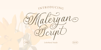 Script Maleryan Script - Modern Calligraphy Maleryan is a beautiful modern calligraphy script based on manual hand writing. The natural flow with the swashes make this font looks even more prettier. This type of font perfectly made to be applied especially in wedding invitation, labels, logos, magazines, books, greeting / wedding cards, packaging, fashion, make up, stationery, novels, labels or any type of advertising purpose. Features : uppercase & lowercase numbers and punctuation multilingual swash and ligature alternates PUA encoded We highly recommend using a program that supports OpenType features and Glyphs panels like many of Adobe apps and Corel Draw, so you can see and access all Glyph variations. How to access opentype feature : letterhend.com/tutorials/using-opentype-feature-in-any-software/
 - Black Script by Fenotype,
$35.00 Black Script is a bold connected script family with plenty of weights: Regular, Bold, Inline versions, Caps, Ornaments and Printed versions of all those. For the best price purchase either Black Script Family or Black Script Printed Family or Black Script Complete Pack which contains all versions of the font. Black Script is equipped with automatic OpenType Ligatures, Swash and Stylistic Alternates to let you customise your designs. Find even more alternates from Glyph Palette. Black Script Caps is a block letter font designed to work alone or to support the script. Caps is equipped with Swash alternates. Black Script is a great font family for creating ambitious headlines, logos & posters with a custom-made feeling.
 - Risolla Calisto by HansCo,
$12.00 Risolla Calisto is an elegant handwritten font with a little bold style also stay look clean and modern. This font carries a slightly masculine feel while still working on a background with a feminine theme. This font come with many ligature style that give you a sleek, elegant look for your logos, business card, wedding invitations, quotes, advertisements, and more. Highly recommended to use it in OpenType capable software - there are plenty out there nowadays as technology catches up with design. The OpenType features can be accessed by using programs such as Adobe Illustrator, Adobe InDesign, Adobe Photoshop Corel Draw X version, Afinity and more. Let's create something beautiful today with Golden Stanbury. Enjoy!
 - Maxim by profonts,
$39.99Splendor was originally produced and released in 1930 by Schriftgu� AG, Dresden. The typeface was designed by Berlin designer Wilhelm Berg. Ralph M. Unger, who in the last few years has created a whole series of revivals and redesigns from the hot metal era, ?retrieved? this jewel of a typeface design, redesigning, complementing and digitally remastering it for profonts. Splendor is a broad nip, non-connecting handwriting script of timeless elegance, charm and beauty. It needs tight setting with plenty of space around it. The font contains a number of alternate characters: Two uppercase As, Ss (with descender); in addition, two uppercase Ms, Ns and Zs as well as two lowercase zs. - Duktus by Eurotypo,
$49.00 Duktus is a script typeface with a 1940’s flavour. It is a delicate script with letters not quite connected, having large, flourished capitals and small lowercase with long ascenders and descenders. It has a crisp, precise appearance, but is not rigidly formal. The design was inspired by the typeface Donatello by Wagner & Schmidt in 1935 and published by Società Nebiolo, Torino. Some other Influences: 1927 Trobadour by Wagner & Schmidt 1927 Liberty Script by Willard T. Sniffin 1933 Trafton Script by Howard Allen Trafton, 1937 Coronet designed by Robert Hunter Middleton Duktus fonts come with plenty of alternates small caps, old style numerals, ornaments and swashes. They include also CE language support.
 - Theory Of Signature by Aminmario Studio,
$20.00 This font was created to look as close to a natural handwritten script as possible by including some alternates lowercase, ligature and underlines. Perfect for any awesome projects that need hand writing taste. Comes with regular and italic. Built in Opentype features, this script comes to life as if you were writing it yourself. Also support multilingual. It's highly recommended to use it in opentype capable software - there are plenty out there nowadays as technology catches up with design ... Other than Photoshop, Illustrator and Indesign, many standard simple programs now come with Opentype capabilities - even the most basic ones such as Apple's Text Edit, Pages, Keynote, iBooks Author, etc. Even Word has found ways to incorporate it.
 - Monday by Fenotype,
$35.00 Monday is a bold and strong script family of two weights and a matching ornament set. Monday has a polished 1950s hand lettering feeling to it and it is ideal for logo, packaging and brand design purposes. Monday is equipped with plenty of alternates and features: To activate the alternates click on Swash, Contextual, Stylistic or Titling Alternates or Lining Figures in any OpenType Savvy program or manually choose from even more alternate characters from Glyph Palette. If you need to write in caps Monday pairs up nicely with Peaches and Cream Caps. Monday is loosely based on Fenotypes earlier release No. Seven. For the best price purchase the complete Monday Family.
 - Apricosa by SG Type,
$19.00 Apricosa – A beautiful bold serif with vintage swashes, alternate letters and ligatures. Apricosa is a delightful, modern take on a vintage font. Packed with plenty of alternates and ligatures to really bring it to life! Create stunning designs that are truly unique to your brand. Vary between a light and heavy vintage look based on how many letters you alter. Due to its large selection of alternate letters and ligatures, Apricosa is very versatile, covering a wide range of project types, from unique branding, to bold magazine design, to vintage wedding invitations, and so much more. FEATURES Uppercase alphabet Lowercase alphabet 41 alternate glyphs 36 ligatures big range of numbers, symbols & punctuation comprehensive language support
 - No. Seven by Fenotype,
$35.00 No. Seven is a bold brush style script family of three weights, ornament set and a block capital "small caps" font. No. Seven is equipped with plenty of OpenType features: To activate the alternates click on Swash, Contextual, Stylistic or Titling Alternates or Discretionary Ligatures, Tabular or OldStyle Lining in any OpenType savvy program or manually select the characters from Glyph Palette. Always keep on Standard Ligatures for the best outcome. Combine No. Seven with No. Seven Ornaments and No. Seven Small Caps to complete your designs. No. Seven is an effective font for creating ambitious headlines, logos & posters with a custom-made feeling. For the best price purchase the complete No. Seven Family.
 - OMORIKA by Posterizer KG,
$19.00 OMORIKA font is very unique, with rough, rustic and raw handwritten serif typefaces with unformal look. It makes a perfect font to create the hand-made character look, or to supplement illustrations with typography. Technicaly this is a Condensed, Headline, Grunge Serif, Sketch, Hand Display Font. There are plenty of Standard and Discretionary Ligatures to avoid frequent repetition of letters. If you find a single repeating glyphs, you can change that by toggling between Stylistic Alternates. It contains ligatures created for Cyrillic... more then 100 languages supports, and more then 100 dingbats. OMORIKA would look good in headlines, magazines or websites, party flyers, movie posters, music posters, music covers or web banners... all natural and authentically beautiful things.
 - Acklebury by Studio Buchanan,
$32.00 Acklebury is a chunky, reverse contrast, slab-serif typeface available in two styles. It has heaps of personality, plenty of open type features, and a whole host of special characters and dingbats. Although it's drawn from historical sources, Acklebury is not a straight revival, rather more of an homage to the many, varied, extended lining figures of the late 1800's. Acklebury celebrates the once labelled 'hideous' combination of wide rounded forms and hard slab serifs. Only using modern type technology to fix the spacing and kerning issues that would of been impossible with metal or wooden type. Acklebury is not a French Clarendon, neither is it really an Italienne... but it is phat, wide and hella funky.
 - Signature Zetterd by Aminmario Studio,
$20.00 This font was created to look as close to a natural handwritten script as possible by including lowercase swash, ligature and underlines. Perfect for any awesome projects that need hand writing taste. Comes with regular and italic. Built in Opentype features, this script comes to life as if you were writing it yourself. Also support multilingual. It's highly recommended to use it in opentype capable software - there are plenty out there nowadays as technology catches up with design ... Other than Photoshop, Illustrator and Indesign, many standard simple programs now come with Opentype capabilities - even the most basic ones such as Apple's Text Edit, Pages, Keynote, iBooks Author, etc. Even Word has found ways to incorporate it.
 - LiebeOrnaments by LiebeFonts,
$19.90 You think swirls, swashes and curls are kitsch? Wait till you've seen our self-confident set of uncomplicated hand-drawn ornaments. If you're looking for the right flourish to spice up your greeting cards or prettify your wedding invitations, look no further! With LiebeOrnaments your designs will look as accurate as if you had spent three weeks in calligraphy boot camp—while maintaining an aura of softness and loveliness. This single font includes an impressive set of almost 200 variations on classical ornaments (many accessible directly with the keyboard). LiebeOrnaments is the perfect companion for our best-selling typeface LiebeErika, which has a cameo appearance on some of the samples shown above.
 - Beletrio by Storm Type Foundry,
$29.00 Beletrio was made as companion to Beletria, it has many shapes in common. We already have plenty of sans-serif fonts with classical proportions in the Stormtype library, such as John Sans, Sebastian or Andulka, but Beletrio is certainly the most peaceful of the bunch – it shares not only the feel of its serif originator, but its soft curves provide lovely visual caress as well. The smooth endings are not visible at first, they are balanced for easy reading as they solve some critical relations such as "rv, ry, rt", but in larger sizes you'll fully enjoy the picturesque details. It handles the smallest point sizes as well as large billboards, fashion magazines and philosophic tractates.