10,000 search results
(0.027 seconds)
- Arazatí by Underground,
$9.99 Arazatí was inspired by Edward Johnston’s typefaces, although its design is not based on a literal reconstruction. It has 48 variants of 422 glyphs each. In addition, it offers two monospaced variants for free. Arazatí is the name of the place where Johnston was born in 1872, located in San José, Uruguay. This typeface is a tribute to his birthplace.
 - Fox Realistic by Fox7,
$12.00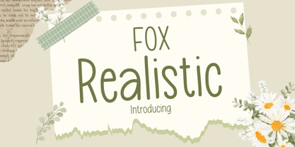 Fox Realistic is your versatile companion, ready to enhance a wide range of projects. Whether you're working on blog posts, branding materials, advertisements, invitations, greeting cards, planners, photo albums, decorations, or anything else your creative heart desires, this font has you covered. Infuse your projects with personality and charm. Try Fox Realistic today and experience the magic of handwritten simplicity, sans serif style.
 - Aether by Sryga,
$18.00 I'm thrilled to introduce Aether, a seriously cool typeface. Picture this: a sans grotesk vibe with some artsy inktraps and a dash of diamond-cut feature on certain letters. It's like mixing timeless human warmth with a touch of edgy-modern style. Perfect for adding that extra oomph to anything you're creating. Give Aether a spin and let your creativity run wild!
 - Gandhi by Skiiller Studio,
$20.00 Gandhi is a beautiful font script, suitable for promotion of products, companies, logos, websites, song titles, and many others. What's include: more than 200+ of glyphs Ligature Stylistic alternate for lowercase PUA Encoded Characters - Fully accessible without additional design software. Basic Latin Language Support (AÀÁÂÃÄÅCÇDÐEÈÉÊËIÌÍÎÏÑOØÒÓÔÕÖUÙÜÚÛWYÝŸÆß ) How to access alternate glyphs? you can see it on this link ( http://goo.gl/1vy2fv )
 - Show Card Deco JNL by Jeff Levine,
$29.00 Show Card Deco JNL is a hybrid of examples from hand lettered titles found on various song folios from the Carl Fischer Music Library circa the 1930s and is available in both regular and oblique versions. This particular typeface lends itself perfectly to show cards, posters, headlines and display titling which captures the modern, streamlined design of the Art Deco era.
 - Impact by URW Type Foundry,
$35.99 Impact As its name suggests, Impact, a bold sans serif, is designed to make an impression on the reader. Obviously a display font, Impact makes use of its thick strokes and blocked style, to catch and hold the eye. Because Impact is so striking, it is best placed in plenty of white space so that it does not overwhelm any accompanying text.
 - Los Niches by Latinotype,
$39.00 Los Niches is a stylized sans serif typeface that combines modern, monoline characters with strokes and loops reminiscent of manuscript lettering. With a consistant, harmonious style Los Niches takes on a youthful flair when presented in bright colors, but is elegant and contemporary when dressed all in black. The flexible personality of Los Niches makes it ideal for catalogs, magazines or product packaging.
 - Enovella by Wontenart,
$25.00 Enovella is a cool and modern Sans Serif font. writing for a magazine that requires a lot of text is the strength of this font. easy to read, and not tired on the eyes. No matter the topic, this font will be an incredible asset to your fonts’ library, as it has the potential to elevate any creation. Thank You
 - Gestia Decorative by Struvictory.art,
$18.00 GESTIA is a modern sans serif font with mystical motives. The font is created in classic proportions and decorated with candle inspired elements. GESTIA is represented by sans serif lowercase and ornate uppercase. The font is suitable for the design on the theme of candle design, astrology, mysticism, spirituality, witchcraft, magic, esotericism. GESTIA has extensive language support, it includes English, French, German, Italian, Spanish, Portuguese, Danish, Norwegian, Swedish, Finnish, Estonian, Turkish.
 - Vitage by Fractal Font Factory,
$10.00 This sans-serif type family of two weights plus matching italics. Influenced by the geometric-style sans serif faces that were popular during the 1920s and 30s, the fonts are based on geometric forms that have been optically corrected for better legibility. Vitage has a functional look with a warm touch. It is manually hinted and optimized for screens, so it will be a good choice for Websites, eBooks or Apps.
 - Sunshine Susie JNL by Jeff Levine,
$29.00 Sheet music for the song "Today I Feel So Happy" from the 1932 motion picture "Sunshine Susie" provided both the visual model and the name for Sunshine Susie JNL, available in both regular and oblique versions. The lettering is a bold Art Deco thick-and-thin design, and comes not from the song's title, but the hand lettered name of the movie as it appeared on the cover the song folio.
 - Arlette by TypeTogether,
$49.00 Pilar and Ferran based Arlette on the fast stroke of one letter from a Roger Excoffon family, but along the way they abandoned that starting point in favour of experimentation. Many sans serifs are like a svelte black dress: functional, beautiful, and the unfussy outfit for a nice evening get together. The Arlette family isn’t like this. It’s a stunner — an incandescent reimagining of what defines a sans and how it can look. Arlette explores the boundaries of the sans serif landscape and returns with forms developed from gestural vigour. Thinking of it as “painterly” may at first seem to fit, but it underestimates Arlette’s ability to master an unseen world of countless emotions and physical applications: magazines, branding, editorial, teen and young adult works, book covers, and a host of products and packaging whose content will be amplified with Arlette’s voice. Not only does Arlette use its eight weights plus italics to speak in Latin-based scripts, it is also fluent in Thai and has six weights (hairline through bold) with which it meets that challenge, whether in text or display. Arlette Thai’s modern nature is seen in two features for the script. One is the decorative Thai characters that are based on original palm leaf manuscripts. Another is a version of the Latin numerals adapted to the height of the script due to their wide use in Thailand. Arlette Thai has been meticulously developed, including contextual kerning to avoid mark clashes. Arlette’s OpenType capabilities include mathematic and scientific figures, positional forms, pointers, arrows, and oldstyle, lining, and tabular lining numerals. In addition to all this, it’s packed with swashes and swash ligatures in both scripts for enthusiastic typesetting. Because it pushes experimentation without compromising readability, both Arlette Thai and Latin are surprisingly legible in small sizes and arrestingly beautiful when their details can be seen.
 - Postmodern Moderne by Jeff Levine,
$29.00 First published in 1938, Letters and Lettering by Paul Carlyle and Guy Loring was a textbook on lettering examples and how to do them. On one of the pages was found a solid black (counterless) Art Deco sans serif design that in its many variations so typified the era. The example shown in that book served as the model for Postmodern Moderne JNL, which is available in both regular and oblique versions.
 - Hoxton North by The Northern Block,
$32.00 Hoxton North came out of the concept to create something distinctly British, drawing on modernist influences such as Edward Johnston's typeface for the London Underground and Gill Sans. A humanistic san serif typeface with a British modern quality. Open forms with subtle contrast promote good readability across a wide range of media in both print and screen. The compact letterforms give it a strong lateral dynamic that is space efficient across design layouts. Details include 620 characters, seven weights with true italics, small caps, manually edited kerning and Opentype features.
 - Magnify PRO by XdCreative,
$32.00 About Magnify Pro Magnify Pro Geometric sans 2 Style in 1. Magnify PRO Geometric sans is the latest version of "Magnify" by. Faldykudo. Comes up with more complete language support and features, including ink-trap and reverse contrast will add more different taste & style to the art of modern typography. Magnify PRO has two style in one font, normal & inverse contrast. If you are like normal: just type with regular letters, if you are like reverse contrast: just access your opentype features to find the alternate letters. Thank You.
 - Kurdis by That That Creative,
$32.00 Kurdis Varibel Font Family is a modern sans serif family with six widths and five Weights Making 30 Set Styles and of course 10,000 more combinations when considering the Variable options. This Typeface is a real work horse for titles. At its condensed Width it is sophisticated and professional with well considered ink traps that help it really stand out at Large Sizes. the Regular width works well for longer bodies of text on websites or posters and the Wide Styles give an elevated look to your average wide sans serif.
 - Nono by Wiescher Design,
$39.50 Nono is the nickname of my oldest son, Konstantin. His little brother could not really speak yet, but he was always looking for him and said something to the tune of, "wea is a nono". From that time on I call Konstantin Nono. I designed a handwritten script with his real name, that i named Konstantin. Now I made this slick version of that script – hence – Nono! I made three basic sets of characters plus a smallcaps version. To top things off, I designed a set of endletters that I throw in for free. Everything can be mixed! I sell single cuts but the best deal would be the entire packet, it goes for a very fair price. Your generous typedesigner, Gert Wiescher
 - ITC Johnston by ITC,
$29.00ITC Johnston is the result of the combined talents of Dave Farey and Richard Dawson, based on the work of Edward Johnston. In developing ITC Johnston, says London type designer Dave Farey, he did “lots of research on not only the face but the man.” Edward Johnston was something of an eccentric, “famous for sitting in a deck chair and carrying toast in his pockets.” (The deck chair was his preferred furniture in his own living room; the toast was so that he’d always have sustenance near at hand.) Johnston was also almost single-handedly responsible, early in this century, for the revival in Britain of the Renaissance calligraphic tradition of the chancery italic. His book Writing & Illuminating, & Lettering (with its peculiar extraneous comma in the title) is a classic on its subject, and his influence on his contemporaries was tremendous. He is perhaps best remembered, however, for the alphabet that he designed in 1916 for the London Underground Railway (now London Transport), which was based on his original “block letter” model. Johnston’s letters were constructed very carefully, based on his study of historical writing techniques at the British Museum. His capital letters took their form from the best classical Roman inscriptions. “He had serious rules for his sans serif style,” says Farey, “particularly the height-to-weight ratio of 1:7 for the construction of line weight, and therefore horizontals and verticals were to be the same thickness. Johnston’s O’s and C’s and G’s and even his S’s were constructions of perfect circles. This was a bit of a problem as far as text sizes were concerned, or in reality sizes smaller than half an inch. It also precluded any other weight but medium ‘ any weight lighter or heavier than his 1:7 relationship.” Johnston was famously slow at any project he undertook, says Farey. “He did eventually, under protest, create a bolder weight, in capitals only ‘ which took twenty years to complete.” Farey and his colleague Richard Dawson have based ITC Johnston on Edward Johnston’s original block letters, expanding them into a three-weight type family. Johnston himself never called his Underground lettering a typeface, according to Farey. It was an alphabet meant for signage and other display purposes, designed to be legible at a glance rather than readable in passages of text. Farey and Dawson’s adaptation retains the sparkling starkness of Johnston’s letters while combining comfortably into text. Johnston’s block letter bears an obvious resemblance to Gill Sans, the highly successful type family developed by Monotype in the 1920s. The young Eric Gill had studied under Johnston at the London College of Printing, worked on the Underground project with him, and followed many of the same principles in developing his own sans serif typeface. The Johnston letters gave a characteristic look to London’s transport system after the First World War, but it was Gill Sans that became the emblematic letter form of British graphic design for decades. (Johnston’s sans serif continued in use in the Underground until the early ‘80s, when a revised and modernized version, with a tighter fit and a larger x-height, was designed by the London design firm Banks and Miles.) Farey and Dawson, working from their studio in London’s Clerkenwell, wanted to create a type family that was neither a museum piece nor a bastardization, and that would “provide an alternative of the same school” to the omnipresent Gill Sans. “These alphabets,” says Farey, referring to the Johnston letters, “have never been developed as contemporary styles.” He and Dawson not only devised three weights of ITC Johnston but gave it a full set of small capitals in each weight ‘ something that neither the original Johnston face nor the Gill faces have ‘ as well as old-style figures and several alternate characters. - Haboro Serif by insigne,
$- The polls are in. Now here by customer request--Haboro Serif, the newest edition of the Haboro Hyperfamily. The Haboro fonts are an outstanding upstart success from the first part of 2016. Following the release of the popular Haboro, Haboro Sans and Haboro Slab have both been welcomed additions to the family, too. Now, Haboro Serif continues to build on the base of these related designs. Serif maintains the unique, script-like terminals of the original. These terminals, along with the optimized stroke weight of this face, make it useful for text settings. Prefer standard serifs? These are also available as OpenType alternates within the font, giving you a wider variety of options without compromising its effectiveness in the same text settings.. Haboro Serif works with many other members of the Haboro family as well. Try the original Haboro for your headlines, and pair your Serif text with Haboro Sans for a balanced design that appeals to the reader. Add Serif to your box today, and try this all-around “Renaissance man” of a typeface for a touch of practical elegance on your next job.
 - Gulim by Microsoft Corporation,
$129.00Gulim™ features plain strokes similar to sans serif designs, and works well for on-screen display such as user interfaces. This Gulim font file is 5.2 MB in size. Gulim is a trademark of Microsoft Corporation. Gulim Character Set: Latin 1, Korean code page 949 - Headline by Monotype,
$29.99 Headline Bold is a sans serif face in the nineteenth century English Grotesque tradition. The Headline Bold font is based on types from the Stephenson Blake type foundry called Grotesque no. 9. A bold and compact font, its name gives a strong indication of its primary use.
 - Mono and Friends by Alit Design,
$12.00 Mono and Friends font is inspired by monoline style font. Mono and Friends consists of 6 unique and cool family packs. Especially if it is combined between several fonts. You get a cool font package for design projects that are non-formal, funny, kidy and so on.
 - Alinea Serif by Présence Typo,
$36.00Alinea is a typeface in 3 styles (Sans, Incise, and Serif) conceived for being mixed in the same document. The elegant one of the family, Alinea Serif, is a transitional, a style represented by Caslon and Times. It is a contrasted typeface, strong stems and thin hairlines. - Bokis by Sign Studio,
$10.00 Bokis is a sans serif family that has simple and strong characters. This font will provide a confident and impressive base headline to any of your designs. Balance on each side is well maintained. It's ideal for headlines, titles, posters, branding, and logotypes that require big impact.
 - Relix by Intellecta Design,
$11.25 Relix, emulating the old videogame's screen fonts, that's a good font to non-formam small texts, names, logotypes, titles, headers, topics etc., developed from the original Reliant's Intellecta typeface. Big sizes of this font can be used for texts on posters, t-shirts and other surfaces.
 - Chomixi by Alit Design,
$14.00 Presenting the 🗯️💬CHOMOXI Comic Typeface💬🗯️ by alitdesign. The CHOMOXI Comic Typeface is inspired by the style of letters in comics that have less serious and fun characters. The lettering of CHOMOXI Comic Typeface is a serif with display font characters which gives a fun and design impression for retro pop art. The CHOMOXI Comic Typeface has 2 style font regular and brushed style and has 2 characters solid and 3D. The CHOMOXI Comic Typeface is perfect for creating designs with non-serious concepts, designs for children, book headers, and of course for text on comics. The CHOMOXI Comic Typeface also gets a bonus character of 230 Comic-themed illustrations that make creating designs even easier. Simply by downloading The CHOMOXI Comic Typeface creating a Comic and non formal themed design is very quick and easy. The CHOMOXI Comic Typeface is perfect for magazine cover designs, brochures, flyers. Instagram ads, Canva Design and so on with comic, non-serious, pop art, game mobile and fun design. Besides that this font is very easy to use both in design and non-design programs because everything changes and glyphs are supported by Unicode (PUA). The CHOMOXI Comic Typeface contains 579 + 230 bonus glyphs with many unique and interesting alternative options.
 - Chomiku by Alit Design,
$14.00 Presenting the 🗯️💬CHOMIKU Typeface💬🗯️ by alitdesign. The CHOMIKU Typeface is inspired by the style of letters in comics that have less serious and fun characters. The lettering of CHOMIKU Typeface is a serif with display font characters which gives a fun and design impression for retro pop art. The CHOMIKU Typeface has 2 style font regular and italic and has 3 characters solid, line and 3D. The CHOMIKU Typeface is perfect for creating designs with non-serious concepts, designs for children, book headers, and of course for text on comics. The CHOMIKU Typeface also gets a bonus character of 230 Comic-themed illustrations that make creating designs even easier. Simply by downloading The CHOMIKU Typeface creating a Comic and non formal themed design is very quick and easy. The CHOMIKU Typeface is perfect for magazine cover designs, brochures, flyers. Instagram ads, Canva Design and so on with comic, non-serious, pop art, game mobile and fun design. Besides that this font is very easy to use both in design and non-design programs because everything changes and glyphs are supported by Unicode (PUA). The CHOMIKU Typeface contains 559 + 230 bonus glyphs with many unique and interesting alternative options.
 - Chomiqy by Alit Design,
$15.00 Presenting the 🗯️💬CHOMIQY Typeface💬🗯️ by alitdesign. The CHOMIQY Typeface is inspired by the style of letters in comics that have less serious and fun characters. The lettering of CHOMIQY Typeface is a serif with display font characters which gives a fun and design impression for retro pop art. The CHOMIQY Typeface has 2 style font regular and italic and has 3 characters solid, line and 3D. The CHOMIQY Typeface is perfect for creating designs with non-serious concepts, designs for children, book headers, and of course for text on comics. The CHOMIQY Typeface also gets a bonus character of 230 Comic-themed illustrations that make creating designs even easier. Simply by downloading The CHOMIQY Typeface creating a Comic and non formal themed design is very quick and easy. The CHOMIQY Typeface is perfect for magazine cover designs, brochures, flyers. Instagram ads, Canva Design and so on with comic, non-serious, pop art, game mobile and fun design. Besides that this font is very easy to use both in design and non-design programs because everything changes and glyphs are supported by Unicode (PUA). The CHOMIQY Typeface contains 560 + 230 bonus glyphs with many unique and interesting alternative options.
 - Ben by Motokiwo,
$20.00 Ben is a simple sans serif font that we made for use on projects that require a touch of elegance. We believe simplicity is the ultimate form of sophistication and give all the idea to Ben. This font is a mirror of our personality. Ben consist of 18 faces (9 weights with italics). All fonts include uppercase, lowercase, numeral, punctuation, and special characters. The weights will give you dynamic control to use Ben in any typography projects.
 - Parangon by ParaType,
$25.00 PT Parangon™ was designed in 1986-2002 by Anatoly Kudryavtsev and licensed by ParaType. This type family belonges to Neogrotesque subclass of closed Sans Serif. Letterforms of lower case is based on the tradition of 1710 Civil type and some modern Italic types. The family has a lot of weights and styles including Extra Condensed, Condensed, Regular, Extra Light, Light, Bold, Extra Bold. For advertising and display matter. Also it can be used for texts in advertising magazines.
 - Blah Blah Blah by Comicraft,
$49.00 It Had to Happen! Here Comes The World's Greatest Comic Book Font! It's A Collector's Item Classic! It's One of Comicraft's Greatest! You Wanted Our Silver Age Style Font -- last seen in the Pulse Pounding Pages of DC's SUPERBOY and Marvel's FLASHBACK titles -- and Now You've Got It! Three Thrilling Feature-Length Fonts! They're the Strangest Sans Serif Fonts of All! Proof Yet Again That This is Indeed the Comicraft Age of Comics! Etcetera, etcetera, etcetera, Blah Blah Blah...
 - Velino Compressed Headline by DSType,
$50.00 Velino is one of our most complete type families. The serif version comes in two packages with three widths: Velino, Velino Condensed, and Velino Compressed. The display package contains high-contrast typefaces, with a modern flair—very feminine but with plenty of character, specially designed for fine print in big text sizes. The text package was designed for any running text. Its proportions and colors make it ideal for text, even in very difficult conditions such as newspaper printing. We also designed the perfect companion to this enormous type system: Velino Poster, a slab serif typeface with only one weight and its respective italic, but with plenty of muscle, for every time some extra strength is needed, such as setting very big text, magazine covers or newspapers’ special sections. Finally, we designed Velino Sans and Velino Sans Condensed to perfectly match the weight and proportions of Velino, all with matching italics.
 - Velino Condensed Headline by DSType,
$50.00 Velino is one of our most complete type families. The serif version comes in two packages with three widths: Velino, Velino Condensed, and Velino Compressed. The display package contains high-contrast typefaces, with a modern flair—very feminine but with plenty of character, specially designed for fine print in big text sizes. The text package was designed for any running text. Its proportions and colors make it ideal for text, even in very difficult conditions such as newspaper printing. We also designed the perfect companion to this enormous type system: Velino Poster, a slab serif typeface with only one weight and its respective italic, but with plenty of muscle, for every time some extra strength is needed, such as setting very big text, magazine covers or newspapers’ special sections. Finally, we designed Velino Sans and Velino Sans Condensed to perfectly match the weight and proportions of Velino, all with matching italics.
 - Velino Ultra by DSType,
$50.00 Velino is one of our most complete type families. The serif version comes in two packages with three widths: Velino, Velino Condensed, and Velino Compressed. The display package contains high-contrast typefaces, with a modern flair—very feminine but with plenty of character, specially designed for fine print in big text sizes. The text package was designed for any running text. Its proportions and colors make it ideal for text, even in very difficult conditions such as newspaper printing. We also designed the perfect companion to this enormous type system: Velino Poster, a slab serif typeface with only one weight and its respective italic, but with plenty of muscle, for every time some extra strength is needed, such as setting very big text, magazine covers or newspapers’ special sections. Finally, we designed Velino Sans and Velino Sans Condensed to perfectly match the weight and proportions of Velino, all with matching italics.
 - Velino Condensed Ultra by DSType,
$50.00 Velino is one of our most complete type families. The serif version comes in two packages with three widths: Velino, Velino Condensed, and Velino Compressed. The display package contains high-contrast typefaces, with a modern flair—very feminine but with plenty of character, specially designed for fine print in big text sizes. The text package was designed for any running text. Its proportions and colors make it ideal for text, even in very difficult conditions such as newspaper printing. We also designed the perfect companion to this enormous type system: Velino Poster, a slab serif typeface with only one weight and its respective italic, but with plenty of muscle, for every time some extra strength is needed, such as setting very big text, magazine covers or newspapers’ special sections. Finally, we designed Velino Sans and Velino Sans Condensed to perfectly match the weight and proportions of Velino, all with matching italics.
 - Velino Headline by DSType,
$50.00 Velino is one of our most complete type families. The serif version comes in two packages with three widths: Velino, Velino Condensed, and Velino Compressed. The display package contains high-contrast typefaces, with a modern flair—very feminine but with plenty of character, specially designed for fine print in big text sizes. The text package was designed for any running text. Its proportions and colors make it ideal for text, even in very difficult conditions such as newspaper printing. We also designed the perfect companion to this enormous type system: Velino Poster, a slab serif typeface with only one weight and its respective italic, but with plenty of muscle, for every time some extra strength is needed, such as setting very big text, magazine covers or newspapers’ special sections. Finally, we designed Velino Sans and Velino Sans Condensed to perfectly match the weight and proportions of Velino, all with matching italics.
 - Velino Compressed Ultra by DSType,
$50.00 Velino is one of our most complete type families. The serif version comes in two packages with three widths: Velino, Velino Condensed, and Velino Compressed. The display package contains high-contrast typefaces, with a modern flair—very feminine but with plenty of character, specially designed for fine print in big text sizes. The text package was designed for any running text. Its proportions and colors make it ideal for text, even in very difficult conditions such as newspaper printing. We also designed the perfect companion to this enormous type system: Velino Poster, a slab serif typeface with only one weight and its respective italic, but with plenty of muscle, for every time some extra strength is needed, such as setting very big text, magazine covers or newspapers’ special sections. Finally, we designed Velino Sans and Velino Sans Condensed to perfectly match the weight and proportions of Velino, all with matching italics.
 - Gigafly by ROHH,
$39.00 Gigafly™ is a contemporary high-contrast sans-serif display typeface designed for branding and impactful posters. The family features very modern and sharp design language, opening a world of lively compositions full of strength, energy and movement. Its playful contrast makes it stand out from the crowd and gives it a unique type of cheerful elegance. Gigafly features lots of stylistic alternates, allowing to create a collage-like, dynamic compositions by mixing the styles and weights of the letters. To make things even more fun, the family contains a set of quirky icons that will inject even more personality into your designs (do not miss out on the super cool manicules!). The family is very powerful, extravagant, playful, yet it manages to keep its elegance - it can be more calm, measured and simple when needed as well. It has a vibe of modern, crisp sans-serif as well as fashion magazine type didone. The full family consists of 15 styles - 5 weights in 3 different optical sizes for headlines, display sizes and big posters. The family offers a 2-axis variable (weight and optical size) font that contains every style and gives even more flexibility and versatility. Each font features 1400 glyphs, including uppercase, lowercase, icons, tons of alternates, as well as other OpenType features such as stylistic sets, case sensitive forms, lining and old style figures, basic fractions and superscript/subscript, slashed zero, currencies and symbols.
 - Grillmaster by FontMesa,
$25.00 Grillmaster is a nice clean sans serif that you'll find many uses for with eight widths and eight weights in each width set plus italics. It’s always grillin' season with Grillmaster; at 128 font files strong Grillmaster is ready to serve large crowds and dinner parties. So put on some cheap shades and cutoff jeans, then fire up the grill and turn up that perfect song on the radio: the Grillmaster is here to satisfy your appetite; I guarantee you won't go home hungry.
 - Hot Rush by Set Sail Studios,
$16.00 Prepare yourself for a wild retro ride with Hot Rush – 80s nostalgia is about hit you harder than a DeLorean at 88 miles per hour. This Sans & Script font duo were simply meant to be together; the unmistakeable clean & condensed sans is complimented perfectly by the long, fast, textured strokes of the script. It’s the ideal font pairing for retro-inspired high impact display text, merchandise design, logos, packaging & more. The Hot Rush font family consists of; Hot Rush Script • A fast, textured script font hand-made with a marker pen. Hot Rush Script contains uppercase-only characters, however a full alternate set of uppercase letters is available when you switch to lowercase. Supports a full set of numerals & punctuation. Hot Rush Sans • A condensed sans-serif font with a big impact, containing uppercase-only characters. Supports a full set of numerals & punctuation. Hot Rush Sans Striped • A second version of Hot Rush Sans, with vertical stripes running through each letter for added retro style. Italic Versions • For Hot Rush Sans & Hot Rush Sans Striped are also included as separate fonts. Extra Stuff; End Forms For Hot Rush Script are available for the letters A, C, E, F, G, H, K, L, R & T. These have elongated horizontal strokes and look great as the last letter of a word. Simply turn on ‘Stylistic Alternates’ with any Opentype capable software to access these characters. 4 Swashes For Hot Rush Script are available, these are great for underlining your text for extra style. Simply type any of the square brackets [ ] { } in the Hot Rush Script font to access the swashes. Language Support; All fonts support English, French, Italian, Spanish, Portuguese, German, Swedish, Norwegian, Danish, Dutch, Finnish, Indonesian, Malay, Hungarian, Polish, Turkish, Slovenian