10,000 search results
(0.026 seconds)
- Stunning Christmas Monogram by AEN Creative Studio,
$15.00 Stunning Christmas Monogram is a stunning and comprehensive duo font (display and decorative), ideal for giving your projects a branded but friendly feel. The two included styles can be combined together perfectly but are also beautiful on their own.
 - Sammy Boy by Hanoded,
$20.00 Sammy Boy is sweet and cuddly when he wants to, but also loud and boisterous. Sammy Boy keeps you awake at night, but smiles at you in the morning. Sammy Boy can speak most languages. Sammy Boy is amazing.
 - Display University by Gerald Gallo,
$20.00 Display University is a display font not intended for text use. It was designed specifically for display, headline, logotype, branding, and similar applications. The character set is in outline but the uppercase letters are the same shapes but solid.
 - KG Begin Again by Kimberly Geswein,
$5.00 The cute, playful handwriting of a teenage girl.
 - KG Faith Hope And Love by Kimberly Geswein,
$5.00 The cute, fun handwriting of a teen girl.
 - Morris Freestyle by Monotype,
$29.00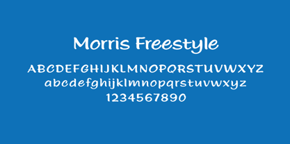 The perfect font for fun and cute handwriting!
 - Monosphere by Mans Greback,
$59.00 Monosphere is a monospaced font, regular but futuristic.
 - Two Turtle Doves - 100% free

- FF Real Text by FontFont,
$50.99 FF Real is a convincing re-interpretation of the German grotesque style from between 1998 and 1908, but with much more warmth and improved legibility as well as a hint towards the warmer American grotesques. Later on, not just slanted styles, but a “proper” italic version was added inspired by the way Roman and Italic are distinguished in traditional serif faces. NEW: a specially created set of obliques were added in 2018 to give designers more design flexibility, for those looking for a less calligraphic look. In 2020 the family was extended with matching condensed weights. FF Real was originally conceived by Erik Spiekermann as one text weight and one headline weight to be used as the only faces in his biography ‘Hello I am Erik’, edited by Johannes Erler, published in 2014. While Spiekermann drew the alphabets, he passed on the font data to Ralph du Carrois and Anja Meiners who cleaned it up and completed it. In the meantime, FF Real has been extended to a family of two styles and 65 weights each. The design of FF Real is rooted in early static grotesques from the turn of the century. Several German type foundries – among them the Berlin-based foundries Theinhardt and H. Berthold AG – released such designs between 1898 and 1908. The semi-bold weight of a poster-size typeface that was lighter than most of the according semi-bolds in metal type at the time, gave the impetus to FF Real’s regular weight. In the words of Spiekermann, the historical example is “the real, non-fake version, as it were, the royal sans serif face“, thus giving his new typeface the name “Real” (which is also in keeping with his four-letter names, i.e. FF Meta, FF Unit). FF Real is a convincing re-interpretation of the German grotesque style, but with much more warmth and improved legibility. With a hint towards the warmer American grotesques, Spiekermann added those typical Anglo-American features such as a three-story ‘g’ and an ‘8’ with a more defined loop. To better distinguish characters in small text sizes, FF Real Text comes in old style figures, ‘f’ and ‘t’ are wider, the capital ‘I’ is equipped with serifs, as is the lowercase ‘l’. What’s more, i-dots and all punctuation are round.
 - FF Real Head by FontFont,
$50.99 FF Real is a convincing re-interpretation of the German grotesque style from between 1998 and 1908, but with much more warmth and improved legibility as well as a hint towards the warmer American grotesques. Later on, not just slanted styles, but a “proper” italic version was added inspired by the way Roman and Italic are distinguished in traditional serif faces. NEW: a specially created set of obliques were added in 2018 to give designers more design flexibility, for those looking for a less calligraphic look. In 2020 the family was extended with matching condensed weights. FF Real was originally conceived by Erik Spiekermann as one text weight and one headline weight to be used as the only faces in his biography ‘Hello I am Erik’, edited by Johannes Erler, published in 2014. While Spiekermann drew the alphabets, he passed on the font data to Ralph du Carrois and Anja Meiners who cleaned it up and completed it. In the meantime, FF Real has been extended to a family of two styles and 65 weights each. The design of FF Real is rooted in early static grotesques from the turn of the century. Several German type foundries – among them the Berlin-based foundries Theinhardt and H. Berthold AG – released such designs between 1898 and 1908. The semi-bold weight of a poster-size typeface that was lighter than most of the according semi-bolds in metal type at the time, gave the impetus to FF Real’s regular weight. In the words of Spiekermann, the historical example is “the real, non-fake version, as it were, the royal sans serif face“, thus giving his new typeface the name “Real” (which is also in keeping with his four-letter names, i.e. FF Meta, FF Unit). FF Real is a convincing re-interpretation of the German grotesque style, but with much more warmth and improved legibility. With a hint towards the warmer American grotesques, Spiekermann added those typical Anglo-American features such as a three-story ‘g’ and an ‘8’ with a more defined loop. To better distinguish characters in small text sizes, FF Real Text comes in old style figures, ‘f’ and ‘t’ are wider, the capital ‘I’ is equipped with serifs, as is the lowercase ‘l’. What’s more, i-dots and all punctuation are round.
 - Palamecia by Typodermic,
$11.95 Palamecia is a typeface that embodies the very essence of organic design. It is a testament to the power of the creative process, one that is imbued with the spirit of experimentation and the thirst for innovation. Its unique appearance, at first glance reminiscent of a cartoon typeface, is just the beginning of what sets it apart from the competition. Palamecia was designed with a specific purpose in mind—to withstand the rigors of scaling and blurring on a variety of user interface devices. The creators of Palamecia recognized that the legibility of typefaces can be compromised by the impact of pixel scaling, and they set out to design a typeface that would not only overcome this challenge but also thrive in its wake. What makes Palamecia truly exceptional is its design process. Unlike many other typefaces, Palamecia’s designs were not born from pen strokes, but rather from cut-out silhouettes that were meticulously chiseled and chipped away. This unique approach allowed the designers to create a typeface that is both rugged and refined, with a natural aesthetic that seamlessly blends into any interface. The end result is a typeface that is both durable and versatile. Palamecia’s unique design allows it to pierce through any type of display, regardless of resolution, making it an ideal choice for designers and developers who are looking for a typeface that can deliver the goods under any circumstances. In conclusion, Palamecia is a triumph of organic design, a typeface that is as beautiful as it is functional. Its rugged yet refined aesthetic and its ability to withstand the rigors of scaling and blurring make it a must-have for any designer or developer who values both form and function. So why wait? Try Palamecia today and experience the power of organic design for yourself. Most Latin-based European writing systems are supported, including the following languages. Afaan Oromo, Afar, Afrikaans, Albanian, Alsatian, Aromanian, Aymara, Bashkir (Latin), Basque, Belarusian (Latin), Bemba, Bikol, Bosnian, Breton, Cape Verdean, Creole, Catalan, Cebuano, Chamorro, Chavacano, Chichewa, Crimean Tatar (Latin), Croatian, Czech, Danish, Dawan, Dholuo, Dutch, English, Estonian, Faroese, Fijian, Filipino, Finnish, French, Frisian, Friulian, Gagauz (Latin), Galician, Ganda, Genoese, German, Greenlandic, Guadeloupean Creole, Haitian Creole, Hawaiian, Hiligaynon, Hungarian, Icelandic, Ilocano, Indonesian, Irish, Italian, Jamaican, Kaqchikel, Karakalpak (Latin), Kashubian, Kikongo, Kinyarwanda, Kirundi, Kurdish (Latin), Latvian, Lithuanian, Lombard, Low Saxon, Luxembourgish, Maasai, Makhuwa, Malay, Maltese, Māori, Moldovan, Montenegrin, Ndebele, Neapolitan, Norwegian, Novial, Occitan, Ossetian (Latin), Papiamento, Piedmontese, Polish, Portuguese, Quechua, Rarotongan, Romanian, Romansh, Sami, Sango, Saramaccan, Sardinian, Scottish Gaelic, Serbian (Latin), Shona, Sicilian, Silesian, Slovak, Slovenian, Somali, Sorbian, Sotho, Spanish, Swahili, Swazi, Swedish, Tagalog, Tahitian, Tetum, Tongan, Tshiluba, Tsonga, Tswana, Tumbuka, Turkish, Turkmen (Latin), Tuvaluan, Uzbek (Latin), Venetian, Vepsian, Võro, Walloon, Waray-Waray, Wayuu, Welsh, Wolof, Xhosa, Yapese, Zapotec Zulu and Zuni.
 - Westmore by Solotype,
$19.95Based on one of the earliest Tuscans, from Thorowgood's foundry. The original was very poorly rendered in 1822, but keep in mind that decorative types were still quite new in the early 1800s. We redrew it, but kept it recognizable. - Glorious Easter by Selvia Design,
$14.00 "Glorious Easter" is a unique and cute display font with an easter theme. This font is decorated with cute bunny ears and also a carrot. "Glorious Easter" is equipped with uppercase, lowercase, lowercase alternates, numerals, punctuations, and also multilingual support.
 - Blastered by PizzaDude.dk,
$17.00 Blastered was originally inspired by an old horror movie poster - but I find it more laid back and less horrifying…but feel free to use Blastered for your next horror project and use the more than 300 interlocking ligatures! Wow!
 - Defect Scam by PizzaDude.dk,
$12.00 Defect Scam could easily have been a name for a punk band. But it's not - it's the name of my stencil wannabe font. But, it was inspired by a combination of some punkband's LP cover and the vibes of that genre of music - but not overdoing it by making an obvious punk font! Well, you get 4 different versions of each letter in the Regular, Black and Fill versions, as well as multilingual support!
 - Gaheris by Scriptorium,
$12.00Gaheris is a decorative font in the same tradition as our Goddard and Ganelon fonts, but with a somewhat more calligraphic look. It is suitable for use as a text or title font, but has some characteristics of a script font, which gives it an unusual and appealing appearance. It's based on early 20th century advertising type of a style which you don't see much any more, but which deserves to be preserved. - Monden by Tour De Force,
$29.00 If you'd like to scream, but you have no self esteem, or you'd love to start a fight, but you're scared of the night, I made this font for you all, whether you're short or tall. Monden is wide, gentle and fun, but it wasn't born under the Sun, it was my intention to make it unique, I surely hope I didn't make some freak, it looks a bit classical, in moments maybe here and there radical, but it surely is really graphical with a dose of something magical. Want a logo, poster or any other design, but you'd rather cry and then run, even this description sounds lousy, at least it isn't so drowsy, so meet Monden family from our hood and keep your spirit in good mood, and do the things on any way you think they should.
 - Nexusbold Sans by Ferry Ardana Putra,
$14.00 Introducing Nexusbold, a modern condensed sans font that redefines typographic excellence. With its sleek and contemporary design, Nexusbold is the epitome of elegance and functionality, enhanced by an extensive array of meticulously crafted ligatures. Nexusbold's condensed form is carefully crafted to optimize space without compromising legibility. Whether you're creating headlines, logos, packaging, or web designs, this font's compact structure ensures a visually striking impact that commands attention. But what truly sets Nexusbold apart is its vast collection of expertly designed ligatures. With an abundance of ligatures at your disposal, Nexusbold empowers you to create seamless connections between characters, infusing your typography with a sense of fluidity and artistry. These ligatures add a touch of sophistication, taking your designs to new heights and captivating viewers with their visual allure. Nexusbold is a versatile font suitable for a myriad of design applications, including editorial layouts, branding materials, advertising campaigns, and digital interfaces. Its modern condensed sans style exudes a sense of professionalism and contemporary aesthetics, making it the perfect choice for projects that demand a refined and sleek visual identity. Whether you're pursuing a minimalistic, high-tech, or cutting-edge look, Nexusbold provides the ideal canvas for your creativity. Its modern condensed form, coupled with a plethora of ligatures, empowers you to create captivating and memorable designs that stand out from the crowd. In summary, Nexusbold is an exceptional modern condensed sans font that combines functionality, elegance, and a wealth of ligatures. Unlock the full potential of your typographic endeavors with NexusBold—a font that seamlessly merges form and function, enabling you to craft visually stunning and harmonious designs. Nexusbold features: A full set of uppercase Numbers and punctuation Multilingual language support PUA Encoded Characters OpenType Features Condensed Style +400 of Total Glyphs +156 of Total Ligatures ———
 - Landa by Sudtipos,
$39.00 As good as Nylon is, there’s nothing better than a nice woolly blanket. The smell and coarse, uneven texture are relaxing and feel reassuring. More comfortable. In a world where technology can reach millimetric precision, sometimes it’s good to connect with the imperfect and controlled impurity that is nature. Font design in particular has matured through software that can generate the most perfect letters in the world. But most of them don’t have soul. Landa is a glimpse from the cutting edge into the past. Inspired by Venetian lettering from the 15th century, whilst giving them new meaning, its letters become expressionist and have a modern touch. A rendez-vous between Nicolas Jenson, Oldřich Menhart, and nature itself. In Landa you can feel the texture of trunks and branches, from full fertile splendour to dried-out frailty. It takes the reader for a stroll through the woods on a late autumn evening, or on an adventure through the Amazonian rainforest, depending on the weight chosen. In the lighter and italic options, Landa text is organic and rustic, and very comfortable to read. What’s more, while it’s discreet on smaller screens, when enlarged it reveals brittle and expressive calligraphic shapes. This also makes it ideal for packaging or display elements. Landa provides advanced typographical support in several languages and OpenType features including case-sensitive forms, small caps, contextual alternatives, stylistic alternates, fractions, proportional and tabular figures. In this case it is technology that serves lettering, not the latter being technology dependent. Let’s not forget, as Erik Spiekermann said “we are still analogical beings. Our brains and eyes are analogical.” Perhaps that’s why to disconnect we always need to go back to forests, rivers, nature. Perhaps that’s why we still prefer wood to steel or wool to nylon.
 - Meisuer by Craft Supply Co,
$20.00 Introducing Meisuer – Handwritten Font A Delightfully Cute and Fun Script Meisuer – Handwritten Font is more than just a font; it’s a charming and whimsical script cursive typeface that brings a cheerful and playful vibe to your designs. Irresistibly Cute Meisuer is undeniably cute; each character exudes cuteness with its endearing strokes and whimsical swirls. It’s perfect for creating designs that radiate positivity and cuteness, making it impossible to resist. Infusing Playfulness Furthermore, this font effortlessly injects playfulness into your projects. Whether it’s greeting cards, invitations, or children’s books, Meisuer adds a touch of joy and lightheartedness that takes your design to the next level. Versatile Cheerfulness Meisuer’s versatility shines in various design applications. Its friendly appearance appeals to all age groups, making it a go-to choice for cheerful projects that need to reach a wide audience. In Conclusion In conclusion, Meisuer – Handwritten Font is your ultimate tool for creating designs that are cute, fun, and filled with cheerful vibes. Embrace the whimsical charm of Meisuer, and infuse your projects with a delightful playfulness that captivates hearts and brings smiles to faces.
 - Plantin Infant by Monotype,
$29.99Plantin is a family of text typefaces created by Monotype in 1913. Their namesake, Christophe Plantin (Christoffel Plantijn in Dutch), was born in France during the year 1520. In 1549, he moved to Antwerp, located in present-day Belgium. There he began printing in 1555. For a brief time, he also worked at the University of Leiden, in the Netherlands. Typefaces used in Christophe Plantin's books inspired future typographic developments. In 1913, the English Monotype Corporation's manager Frank Hinman Pierpont directed the Plantin revival. Based on 16th century specimens from the Plantin-Moretus Museum in Antwerp, specifically a type cut by Robert Granjon and a separate cursive Italic, the Plantin" typeface was conceived. Plantin was drawn for use in mechanical typesetting on the international publishing markets. Plantin, and the historical models that inspired it, are old-style typefaces in the French manner, but with x-height that are larger than those found in Claude Garamond's work. Plantin would go on to influence another Monotype design, Times New Roman. Stanley Morison and Victor Larent used Plantin as a reference during that typeface's cutting. Like Garamond, Plantin is exceptionally legible and makes a classic, elegant impression. Plantin is indeed a remarkably accommodating type face. The firm modelling of the strokes and the serifs in the letters make the mass appearance stronger than usual; the absence of thin elements ensures a good result on coated papers; and the compact structure of the letters, without loss of size makes Plantin one of the economical faces in use. In short, it is essentially an all-purpose face, excellent for periodical or jobbing work, and very effective in many sorts of book and magazine publishing. Plantin's Bold weight was especially optimized to provide ample contrast: bulkiness was avoided by introducing a slight sharpening to the serifs' forms." - Neonrec by Ditatype,
$29.00 Neonrec is an innovative display font that merges futuristic aesthetics with the mesmerizing allure of neon lights. With its bold uppercase letterforms and a luminous neon backlight, this typeface commands attention, creating a visually stunning and forward-thinking experience. The special characteristic of this font lies in the sleek and cutting-edge design, embodying the essence of a futuristic world. Each letter is meticulously crafted with precision and sharp lines, exuding a sense of technological advancement and modernity. The neon backlight adds a striking visual element that elevates the font to new heights. Inspired by the captivating glow of neon lights, Neonrec infuses a sense of energy and innovation into each character. The luminous backlight creates a radiant glow that casts a captivating hue, reminiscent of the neon signs that adorn the streets of a futuristic metropolis. This futuristic neon effect adds depth and dimension to the font, creating an eye-catching visual impact. Features: Ligatures Multilingual Supports PUA Encoded Numerals and Punctuations Neonrec is perfect for attention-grabbing headlines, logos, and sleek branding applications that require a touch of futuristic sophistication. It is thrives in designs that embrace a forward-thinking and cutting-edge style. Whether you're creating posters, digital interfaces, sci-fi themed artwork, or anything in between, this font will add a captivating futuristic element that sets your project apart. It shines particularly bright in applications related to technology, gaming, science, and futuristic-themed designs. Find out more ways to use this font by taking a look at the font preview. Thanks for purchasing our fonts. Hopefully, you have a great time using our font. Feel free to contact us anytime for further information or when you have trouble with the font. Thanks a lot and happy designing.
 - Plantin Headline by Monotype,
$29.00Plantin is a family of text typefaces created by Monotype in 1913. Their namesake, Christophe Plantin (Christoffel Plantijn in Dutch), was born in France during the year 1520. In 1549, he moved to Antwerp, located in present-day Belgium. There he began printing in 1555. For a brief time, he also worked at the University of Leiden, in the Netherlands. Typefaces used in Christophe Plantin's books inspired future typographic developments. In 1913, the English Monotype Corporation's manager Frank Hinman Pierpont directed the Plantin revival. Based on 16th century specimens from the Plantin-Moretus Museum in Antwerp, specifically a type cut by Robert Granjon and a separate cursive Italic, the Plantin" typeface was conceived. Plantin was drawn for use in mechanical typesetting on the international publishing markets. Plantin, and the historical models that inspired it, are old-style typefaces in the French manner, but with x-height that are larger than those found in Claude Garamond's work. Plantin would go on to influence another Monotype design, Times New Roman. Stanley Morison and Victor Larent used Plantin as a reference during that typeface's cutting. Like Garamond, Plantin is exceptionally legible and makes a classic, elegant impression. Plantin is indeed a remarkably accommodating type face. The firm modelling of the strokes and the serifs in the letters make the mass appearance stronger than usual; the absence of thin elements ensures a good result on coated papers; and the compact structure of the letters, without loss of size makes Plantin one of the economical faces in use. In short, it is essentially an all-purpose face, excellent for periodical or jobbing work, and very effective in many sorts of book and magazine publishing. Plantin's Bold weight was especially optimized to provide ample contrast: bulkiness was avoided by introducing a slight sharpening to the serifs' forms." - KG I Want Crazy by Kimberly Geswein,
$5.00 The handwriting of a teenager- cute, quirky, and fun!
 - Cafe Fumante by Funk King,
$5.00 A cup of coffee with every letter on it.
 - Sticky Melody by Nathatype,
$29.00 Sticky Melody is a charming display font that combines cuteness with a bold and prominent style. With its thick weight, rounded shapes, and distinct contrast, this typeface is designed to capture attention and infuse your designs with a playful and lively energy. The thick weight of Sticky Melody gives each letter a robust and substantial presence, making it stand out effortlessly. The rounded shapes add a touch of softness and friendliness, creating an endearing and approachable feel. The font's unique feature lies in its prominent contrast, which accentuates the curves and contours of each character, elevating the overall visual impact. Let the thick weight, rounded shapes, and prominent contrast of this font bring your creative visions to life, ensuring that your message stands out in the most charming and captivating way possible. You can use it in big text sizes to be greatly legible and enjoy the available features here. Features: Stylistic Sets Ligatures Multilingual Supports PUA Encoded Numerals and Punctuations Sticky Melody fits in children's books, toy packaging, posters, headlines, logos, social media designs, and any design project that require a touch of delightful playfulness. Find out more ways to use this font by taking a look at the font preview. Thanks for purchasing our fonts. Hopefully, you have a great time using our font. Feel free to contact us anytime for further information or when you have trouble with the font. Thanks a lot and happy designing.
 - Rothek by Groteskly Yours,
$25.00 Rothek is a geometric sans serif type family with a strong and unique character. It comes in 22 weights — 11 uprights and 11 italics — and is a perfect tool for any designer who needs a versatile font for a variety of projects. While retaining its uniqueness and whimsicality, Rothek is highly legible even at smaller weights, which makes it a perfect fit for app and web design. But what’s really great about Rothek is its OpenType features, which make it really stand out. Not only does it know how to do fractions, but it also does subscript and superscript; it’s equipped with case-sensitive punctuation, which adjusts the height of your parentheses, hyphens (and many more) to the height of your capital letters. But there’s still more: Rothek is loaded with various figures — from default proportional numerals to oldstyle figures, tabular figures and tabular old style figures. Throw in a bunch of stylistic alternates and you’ve got a perfect typeface for any project. Rothek supports all European languages and Vietnamese. On top of that there’s Extended Cyrillic set for most Slavic languages. As a cherry on top, there are stylistic alternatives for selected glyphs both in Latin and Cyrillic layouts and lots of extra symbols to work and experiment with. With 900+ glyphs in each style, Rothek is a perfect workhorse font for those who need a modern sans serif font with a strong character. Two weights are free to try and use!
 - Magent by Craft Supply Co,
$20.00 Introducing Magent – Display Typeface A Fusion of Style Magent sets itself apart as a striking Display Typeface that seamlessly merges the timeless elegance of serifs with the contemporary allure of sans serifs. This extraordinary fusion not only shatters monotony but also injects a vibrant energy into your designs. Fun and Playful Typography Magent exudes an unmistakable aura of fun and playfulness. It’s the font to choose when you want to infuse your projects with a touch of whimsy and character. The result is content that not only stands out but also leaves a lasting and memorable impression. Endless Creative Versatility An outstanding attribute of Magent is its sheer versatility. This font effortlessly adapts to a multitude of design contexts, spanning from posters to branding and beyond. Its adaptability makes it a true chameleon in the world of creativity. Memorable and Engaging Magent’s dynamic blend of serif and sans serif elements guarantees that your content remains not only memorable but also engaging. It captivates your audience and leaves them with a vivid and enduring impression, ensuring they keep coming back for more. In Conclusion In summary, Magent – Display Typeface is a font that defies conventions. It’s a design masterpiece that harmoniously combines aesthetics with a playful spirit. Whether it’s branding, posters, or an array of creative projects, Magent is a one-of-a-kind font that captivates your audience and infuses your content with vibrancy and charm.
 - Mighty Monday by Nathatype,
$29.00 Mighty Monday is an adorable serif display font that will bring a smile to your designs. With its cute and playful letterforms and a fairly thick weight, this typeface exudes a delightful and charming vibe. This font duo special feature lies in its cute and endearing serifs, which add a touch of whimsy and character to each letter. The fairly thick weight of the font enhances its boldness and creates a visual impact. This font is perfect for projects that require a standout and attention-grabbing typographic choice. Inspired by the charm of playful design, Mighty Monday captures the essence of cuteness and joy. The letterforms are carefully designed to be friendly and approachable, making them perfect for designs targeted at children or any audience that appreciates a lighthearted and cheerful aesthetic. This font brings a sense of fun and playfulness to your designs. The uppercase letterforms are carefully crafted to maintain legibility and clarity, even in the thick weight. Each letter retains its distinctive characteristics, allowing your message to be easily understood. You can use it in big text sizes to be greatly legible and enjoy the available features here. Features: Stylistic Sets Ligatures Multilingual Supports PUA Encoded Numerals and Punctuations Mighty Monday fits in children's books, packaging, greeting cards, headlines, titles, logos, branding materials, and any design project that aims to evoke a sense of cuteness and playfulness. Find out more ways to use this font by taking a look at the font preview. Thanks for purchasing our fonts. Hopefully, you have a great time using our font. Feel free to contact us anytime for further information or when you have trouble with the font. Thanks a lot and happy designing
 - Modern Techno by Nirmana Visual,
$24.00 Introducing our cutting-edge techno font, designed to add a futuristic and sleek aesthetic to your designs. Inspired by the sleek designs of technology and the digital age, this font captures the essence of innovation and progress. Its clean and precise letterforms, along with its distinct futuristic style, make it an excellent choice for technology-based branding, gaming graphics, sci-fi posters, and digital interfaces.
 - Aegipti 7 by 2D Typo,
$28.00 Aegypti 7 is a digital revival of Font No.7 or Egyptian Narrow - a Soviet display face cast for hand composition. I settled on the 12pt version as a basis for my digital version, as larger sizes added too much contrast to an otherwise quite orderly slab serif. The Soviet Font No.7 itself was based on an older Semi-Egyptian narrow cut before the revolution.
 - Derojela by UICreative,
$25.00 Introducing of our new product the name is Derojela Serif Font with its unique curves and cut-ins making it one of the most memorable caps fonts on the market .This font is perfect for fashion related branding or editorial design and displays both masculine and feminine qualities. Also you use this font on Logo & Label Design, Apparel Design, Music, Advertising, T-shirts, Brochures And more!
 - Johabu by Monotype,
$29.99Johabu is based on Gebrochene Fraktur, a lighter softer sort of type, compared to the German forms of the same period. Johabu was drawn by Johannes Bureus, around 1620, cut and cast by Peter van Selow in Stockholm. Johannes Bureus, archaeologist and linguist, designed and let Selow cast runes in 1598, and he became the first Swedish keeper, archivist, of the National Record Office State Archives. - Marking Stencil JNL by Jeff Levine,
$29.00 With electronics taking over virtually every aspect of manufacturing, packaging and shipping, it's almost difficult to envision a time when wooden crates were marked for identification by using brass stencils. Many of these stencils were hand-cut or manufactured with special punches that perforated the brass sheets with pre-formed letters and numbers. One such stencil was the design model for Marking Stencil JNL.
 - Poynter Old Style by Font Bureau,
$40.00 In the 1670s, Christopher Plantin was the largest publisher of his day. Hendrik van den Keere cut for him an astounding series of romans. As Stanley Morison once observed, such types adopted features of Flemish blackletter to strengthen elegant French romans. Large on the body, strong in color, economical in fit, widely (if anonymously) distributed, they established effective standards for all that followed; FB 1997–2000
 - NorB Croquis by NorFonts,
$28.00 NorB Croquis is a handwritten text font witch can be used with any word processing program for text and display use, print and web projects, apps and ePub, comic books, graphic identities, branding, editorial, advertising, scrapbooking, cards and invitations and any casual lettering purpose… or even just for fun! It comes with 12 weights: Normal, Medium, Bold and Cut Tip along with their Italic and Oblique versions.
 - Sketchzone by Mozatype,
$13.00 Sketch Zone is a unique and interesting display font. Incredibly versatile, this font fits a wide pool of designs. Fall in love with its quirky style and use it to create spectacular projects! What’s Included : – Works on PC & Mac – Easy to use ( Installations ) – Easy Convert to webfont – Compabilty Windows, Apple, Linux, Cricut, Silhouette and Other cutting machines Thanks for downloading, and I hope you enjoy it!
 - Marfanco by UICreative,
$25.00 Introducing of our new product the name is Marfanco Serif Display Font with its unique curves and cut-ins making it one of the most memorable caps fonts on the market .This font is perfect for fashion related branding or editorial design and displays both masculine and feminine qualities. Also you use this font on Logo & Label Design, Apparel Design, Music, Advertising, T-shirts, Brochures And more!
 - Ademo by astype,
$48.00 Ademo is a classic, shaded and perspective looking display font. The design is based on two typefaces designed by Carl Albert Fahrenwaldt and published between 1931– 1932 by the German Schriftguss AG type foundry. pdf specimen Ademos special Fill fonts can be used for building multi colored text or for special finishing needs like blind imaging, embossing, stamping, partial UV coating and laser cutting.
 - ITC Veljovic by ITC,
$29.99ITC Veljovic was designed by Jovica Veljovic and displays an obvious calligraphic heritage. The designer was strongly influenced by German designer Hermann Zapf and Israeli designer Henri Friedlander. ITC Veljovic exhibits a crisp precision, as if the letters were cut in stone rather than drawn with pen and ink. In 2014 Veljovic revised this family and ITC New Veljovic was released with many more weights and styles
