10,000 search results
(0.039 seconds)
- FF Flava by FontFont,
$41.99 Dutch type designer Donald Beekman created this display FontFont in 2003. The family contains 4 weights and is ideally suited for advertising and packaging, music and nightlife as well as poster and billboards. FF Flava provides advanced typographical support with features such as ligatures. It comes with proportional lining figures.
 - The Bentley by Bosstypestudio,
$14.00 The Bentley Script in a beautiful handwritten style. Equipped with 350 glyphs. The Bentley Script is perfect for branding projects, home appliance design, product packaging, use in business cards, invitation cards, etc. Simply as a stylish text overlay onto a background image or anything that requires a touch of elegance.
 - November Script by Fenotype,
$29.95 November Script is a continuously flowing and spinning font family. It was originally designed for an award winning art calendar published by TAIK (University of Industrial Art & Design) In 2007. Afterwards the font has been waiting for its second coming. November Script is well suitable for headlines, posters, flyers and schoolbooks.
 - Minimal by Kmaz,
$10.00 Minimal is a distinguished sans serif display family with minimalistic modern edges, designed by Khalid Al-Mazrouei and published by Kmaz. Minimal packs a complete set of uppercase and lowercase letters, numbers and punctuation and comes in 3 weights (Thin, Regular, and Bold). Perfect for headlines, magazines, and much more.
 - Always Lovely by Sronstudio,
$15.00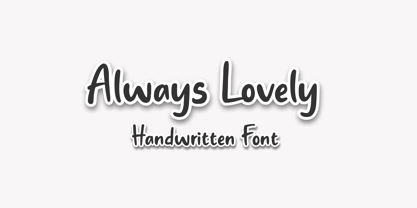 Always Lovely is a Handwritten Font, this font Is perfect for product packaging, product designs, label, photography, watermark, special events, or anything. Always Lovely comes with uppercase and lowercase letters, multilingual symbols, numerals, punctuation. If you have any questions please don't hesitate to drop me a message :) Thank You, Sronstudio
 - Connectica by Tour De Force,
$25.00 Connectica, as the name itself refers, is joined monolinear script family. Comes in two weights, Light and Regular. Due to specific design, we added fake Swash OpenType feature for initial capital characters, where letters like E, F, U, V, W, Y lack joining line on the left side of the characters.
 - CA Rusty Nail by Cape Arcona Type Foundry,
$19.00 Rusty Nail is a carefully hand-made uppercase only typeface with a full Central European character set which comes in two styles, Regular & Bold. It was created for a liquor company where hand-made letters were part of the corporate design. It’s perfect for labels or lettering with a "used look".
 - JAF Zalamander by Just Another Foundry,
$42.00 Blackletter, sans serif, graffiti, constructivism: all these influences are combined into a lively and dynamic – and somehow “disobedient” – typeface. Since blackletter fonts typically don’t look great when used in all-caps, Zalamander comes with a special Caps version that contains letter variants that combine nicely in uppercase. All fonts support Cyrillic.
 - Kemading by Differentialtype,
$10.00 Kemading is a retro serif font that has a vintage, cute, fun and bold feel. Comes with four styles, regular, italic, outline and outline italic. Kemading's design is unique and energetic, making it perfect for adding a touch of fun nostalgia to logos, crafts, posters, branding, stickers and many other projects.
 - Vishenka by Supfonts,
$9.00 Vishenka Cyrillic will be perfect for wedding lettering, beautiful frame for your home, book covers, greeting cards, logos, marketing, magazines or anything that requires cute handwritten lettering :) What's inside: Vishenka Script Multilingual support Cyrillic support Cricut support If you have any questions, please contact me directly or in instagram @superdizigner
 - Ahimsa by Satori TF,
$12.00 Ahimsa is a dynamic humanist sans serif family. It comes in 6 weights with matching italics. It contains a lot of contrast in the connection to the stems in order to give it a more dynamic feel, and also has low descenders and a large x-height and great legibility.
 - Freaky Prickle by ParaType,
$25.00Freaky Prickle script was written using ink and various wooden sticks and digitized/ Autor’s target was to create the spontaneous, light, flying script with dynamics and energy at the same time. Upright and cursive styles are available. The type was planned for use as headline in fiction and display matter. - Oyscake by Allouse Studio,
$16.00 Proudly Present, Oyscake a Handwritten Font. Oyscake is perfect for any titles, logo, product packaging, branding project, megazine, social media, wedding, or just used to express words above the background. Oyscake also come with Multi-Lingual Support. Enjoy the font, feel free to comment or feedback, send me PM or email.
 - Sunday Snow by Sronstudio,
$15.00 Sunday Snow is a fun Handwritten Font, this font Is perfect for product packaging, product designs, label, photography, watermark, special events, or anything. Sunday Snow comes with uppercase and lowercase letters, multilingual symbols, numerals, punctuation. If you have any questions please don't hesitate to drop me a message :) Thank You, Sronstudio
 - Chellaras Script by FadeLine Studio,
$20.00 Introduce Chellaras Script! This time is different, This font comes with a thin and italic style. Giving rise to an elegant, sweet and simple style. Made very slowly to make it look beautiful. Available 544 glyphs in it! Believe me, this font can increase your creativity in making certain designs!
 - Verger by David Engelby Foundry,
$25.00The inspiration behind the design of the Verger typeface family comes from the classic Golden Type, which was originally crafted by William Morris. Although Verger is inspired by this classic typeface, it has several modern, expressive and distinctive styles of its own, especially in the design of its italic versions. - Ingeo by Blancoletters,
$40.00 Between the most rigid geometric letterforms and the most expressive calligraphy works there are, undoubtedly, countless combinatory possibilities. Ingeo is just one of them. Located very close to a geometric approach it shows, however, a clear willingness to accommodate in its structure the calligraphic traits of our alphabet. In Ingeo geometry grows from the inside, meaning that all its counters are based on geometric shapes. Around them, contours are later defined. The solid mass resulting from that interaction is modulated in specific areas in a way that evokes the way a writing hand finishes a letter and starts the following one. Ingeo seeks to accommodate calligraphic features in its geometric structure without any complexes, in the same way a computer engineer writes a song or a poet admires the orbits of planets and satellites. In this vast and unmapped realm between seemingly opposing concepts is where Ingeo finds its playground. There, that interaction is pushed to its limits and the resulting letterforms are later confronted with typographical conventions to assess whether they survive. Ingeo comes with 695 glyphs in its character set with support for more than 270 languages. Among these glyphs you can find 5 stylistic sets, 19 useful science-related icons as well as 7 different designs for ampersands.
 - Surfbars by Creative Toucan,
$13.90 Surfbars is a handmade multi-language Latin / Cyrillic font that was inspired by surfing, sand, and playful style. Comes in Regular, Italic, Underlines, and Splashes This font includes a full set of fun and unique uppercase and lowercase letters, numerals, and a large range of punctuation. Overall it contains more than 760 glyphs with 220 alternatives and +10 interesting ligatures, swashes, and underlines. With this font, you have complete freedom to use and combine various different letters, alternatives, and ligatures, by that you can be sure that your design or any kind of project will be a unique masterpiece. Also, the combination and usage of different letters and ligatures gives you the opportunity to have fun and at the same time create your own unique style. THE PRODUCT CONTAINS: • More than 760 glyphs, 220 alternatives, 60 ligatures which are unique and playful • This font includes Latin Plus diacritics. • Surfbars support Latin Plus languages (Latin Multilingual language support) • Surfbars support the Cyrillic alphabet. Ideal for loud messages. Made with flat marker adding realistic moves in it. Very interesting to use for logos, name tags, handwritten quotes, product packaging, merchandise, social media & greeting cards. Also, ideal to make t-shirts designs and other clothing products.
 - Tablet Gothic by TypeTogether,
$35.00 Graphic designers of any nationality and background know very well that the art of composing titles correctly is not easy, Especially when it comes to periodical publications where there is need for both flexibility and graphic coherence. Tablet Gothic was originally engineered as a titling type family, meant to help designers working on publications that require output as hard copies and a variety of digital platforms at the same time. As such, it is a grotesque sans serif that looks to the future of publishing with a clear understanding of its history, and reminiscences that go back to nineteenth century Britain and Germany. Tablet Gothic delivers the sturdy, straightforward and clean appearance expected from a grotesque, but it allows itself a good measure of personality to make it stand out on the page. Its 84 styles –six series of condensation and seven weights in each series plus obliques– guarantee that, whatever the publication format is, there's a Tablet Gothic font that will do the job and perform well both technically and aesthetically. Furthermore, the rounder styles, Tablet Gothic Wide, Normal and Narrow achieved amazing results at very small sizes, producing a beautiful texture and highly readable text blocks. Tablet Gothic fonts can be purchased individually, by series or as a complete bundle (best value!)
 - Brahma Rounded by Tall Chai,
$15.00 Brahma Rounded is a modern geometric rounded sans-serif font family with weights ranging from Thin (100) to Black (900). It is a sibling of the Brahma font family. Features: Available in 9 weights Over 550 glyphs supporting extended Latin Ideal for display texts: Titles, Logos and Headlines etc. Perfect for branding and rebranding Supports OpenTypes features like Ligatures and Stylistic Alternates Tabular Numerals included Symbols for 10 major currencies including Bitcoin provided in all weights Description: The name comes from Brahmā who is known as the god of creation. And manifesting the same spirit, the Brahma font family focuses on modern creativity. With its smooth and polished curves, Brahma Rounded provides friendly, casual vibes to all its characters. Every character effortlessly integrates with current design standards and interfaces. The fonts are professional yet have a hint of informal personality in them. This makes Brahma Rounded perfect for use in modern apps and websites. Brahma Rounded is built for the influencing, designing and marketing squads. It has a trendy geometric characteristic which is ideal for any branding and rebranding. Brahma has lot of OpenType features (like ligatures and tabular numerals) and the Extended Latin character set supports over a hundred languages. Start Creating!
 - Litza by Marianna Orsho,
$35.00 Litza is a layered, condensed, all-caps cross stitch display type family. It is made up of 10 layers that show different stages of stitching and can be stacked, moved around, and coloured separately in order to create interesting effects. The ten layers come in 3 weights; Light, Medium, and Bold. The 3 weights can also be mixed with one another to create a vast range of combinations when stacking the layers. Litza has multilingual support and includes glyphs for a wide range of Latin and Cyrillic languages. The family also contains a set of ornamental borders and over 80 decorative symbols in the shape of various animals and objects. Combining the various Litza layers allows you to create eye-popping, intricate, experimental typographic compositions that are rich in detail - with ease. The condensed, geometrics sans-serif letterforms and playful nature of the Litza layering system give a contemporary feel - while at the same time retaining a nostalgic and tactile quality due to its reference to traditional needlework techniques and patterns. Ideal for use at larger point sizes where the unique, stylish effects can be best expressed - Litza will add a touch of intrigue and work best in headings and emphasised text for poster design, editorial design, packaging design, and motion design.
 - Shark Snack by Comicraft,
$19.00 Dumm DUM. Dumm DUM. Duh dum duh dum duh dum DUMMMM... Just when you thought it was safe to get back in the water, this font surfaces to take one last bite out of your summer vacation skinnydip! Scream and scream again — it won’t do you any good, SHARKSNACK is rough and ready to EAT YOU ALIVE! It’s too late to close the beaches, Chief Brody, this particular set of saw tooth letters has already consumed Dracula, the Werewolf, the Frankenstein Monster and any number of 70s comic book characters foolish enough to dip a toe in its maw!
 - Softie by Tail Spin Studio,
$20.00This typeface was designed to be used as the page heading font for MyFonts. Originally only the letters needed to make up the required phrases were drawn. Then amazingly enough, people started asking where they could get the font, so I decided to complete the character set, and named it Softie. This name was chosen because the round and rather bulbous shapes that make up the letters reminded me of marshmallows. Softie, almost good enough to eat. The Bold version, called Softie Bloated, was added in late 2003. Rumor has it that the name came to Steve after Thanksgiving dinner. - Brimley by Chank,
$49.00This slinky number will seduce you with its linking letters and special ligatures. Brimley's strokes are tight and sharp, and its characters are tied together with slender, whispy hooks. Although its elegance is timeless, this is a style that typifies lettering of last century's late '50s and early '60s. Chank Co. intern Tim Drabandt created Brimley with inspiration from antique type books. He named the font after Wilford Brimley. You know... the chubby old guy who tells you to check your blood sugar and eat your Grape Nuts and Quaker Oats. Haven't you ever seen Cocoon? - Tom's Headache - Unknown license

- Blessing and Struggle by Colllab Studio,
$7.00 Presenting Blessing and Struggle! A Spontaneous Handwritten Font with all-caps glyphs. This font made with the perfect combination of each character. You can combine with Extra to get a unique combination. It looks original and can be used for all your project needs. Each glyph has its own uniqueness and when meeting with others will provide dynamic and pleasing proximity. This font can be used at any time and in any project. You can see in the presentation picture above, Blessing and Struggle looks unique and authentic style on design projects. So, Blessing and Struggle can't wait to give its touch to all your design projects such as quotes, poster design, personal branding, promotional materials, website, logotype, product packaging, etc. WHAT'S INCLUDED? 1. Blessing and Struggle Regular • The first version comes with uppercase, lowercase, ligatures, numeral, punctuation, symbols, and Standard Latin Multilingual Support (Afrikaans, Albanian, Catalan, Danish, Dutch, English, French, German, Icelandic, Indonesian, Italian, Malay, Norwegian, Portuguese, Spanisch, Swedish, Zulu, and More). 2. Blessing and Struggle Slant • The first version comes with uppercase, lowercase, ligatures, numeral, punctuation, symbols, and Standard Latin Multilingual Support (Afrikaans, Albanian, Catalan, Danish, Dutch, English, French, German, Icelandic, Indonesian, Italian, Malay, Norwegian, Portuguese, Spanisch, Swedish, Zulu, and More). 3. Blessing and Struggle Slant Bold • The first version comes with uppercase, lowercase, ligatures, numeral, punctuation, symbols, and Standard Latin Multilingual Support (Afrikaans, Albanian, Catalan, Danish, Dutch, English, French, German, Icelandic, Indonesian, Italian, Malay, Norwegian, Portuguese, Spanisch, Swedish, Zulu, and More). 4. Blessing and Struggle Semi Bold • The first version comes with uppercase, lowercase, ligatures, numeral, punctuation, symbols, and Standard Latin Multilingual Support (Afrikaans, Albanian, Catalan, Danish, Dutch, English, French, German, Icelandic, Indonesian, Italian, Malay, Norwegian, Portuguese, Spanisch, Swedish, Zulu, and More). 5. Blessing and Struggle Minus Slant • The first version comes with uppercase, lowercase, ligatures, numeral, punctuation, symbols, and Standard Latin Multilingual Support (Afrikaans, Albanian, Catalan, Danish, Dutch, English, French, German, Icelandic, Indonesian, Italian, Malay, Norwegian, Portuguese, Spanisch, Swedish, Zulu, and More). 6. Extra Swashes • Included 7 Dingbats. You can feature all with typing c_1 until c_7 (in all versions) A Million Thanks Colllab Studio
 - Seized Future, crafted by the talented Justin Callaghan, is an emblem of modern creativity melded with an adventurous spirit. At its core, Seized Future carries the essence of a futuristic vision, en...
- Haboro Slab Soft by insigne,
$32.99 Haboro Slab Soft is a scion of the Haboro hyperfamily. This concept powers through with its well built, accommodating nature. Haboro Slab Soft’s serifs are rounded, giving it a softer look. The Haboro hyperfamily is a comprehensive design suite that provides solutions for many projects. The iconic angled wedge makes this family ideal for apparel, packaging, apps, corporate identities and advertising campaigns. Subfamilies in the hyperfamily include the original Haboro, a Didone face, Haboro Sans, Serif, Soft, and Slab. The Haboro hyperfamily is known for its ability to make your copy appear clear and simple. The Haboro typeface is built on a common underlying model. It has the same cap height, the same x-height, and the same basic character shape. This unification of shape and proportion results in a complementary set of typefaces. Haboro Slab Soft’s wide variety of ligatures and OpenType alternatives give your message the clarity it deserves. The Haboro Slab Soft family includes seven weights, from Thin to ExBold, three widths, and matching italics. There are over 550 glyphs per style and support for over 70 Latin-based languages. Haboro Slab Soft includes features such as small caps, ligatures, fractions, and alternatives. Haboro Slab Soft is there when you need to present information in a clear and friendly fashion.
 - Pentecoste by Tegaki,
$16.00 Pentecoste is created with stylist and handwritten characters. This handwritten font was PUA encoded. Pentecoste is a natural handwritten style that comes with Extended Latin Characters. Pentecoste works perfectly for logos, display, product branding, wedding invitation card, stationary, packaging, clothing, flyer, apparel, magazines, brochures, lable, posters, badges, etc. Pentecoste comes with 317 glyphs and 87 alternate characters contain with opentype features (supported with contextual alternates mode). Pentecoste also comes with 15 extended ligatures that allowing you to make stuff looks more exclusive and pro standard. You can access all those alternate characters by using OpenType savvy programs such as Adobe Illustrator, Adobe InDesign and CorelDraw X6-X7, Microsoft Word 2010 or later versions. There are additional ways to access alternates/swashes, using Character Map (Windows), Nexus Font (Windows), Font Book (Mac) or a software program such as PopChar (for Windows and Mac). For other programs that doesn't support OpenType features or Glyphs Panel such as Photoshop, you can use Character Map in Windows to access the alternate characters. Files included: Pentecoste (otf) How to access all alternative characters, using Windows Character Map with Photoshop: http://youtu.be/cxonI5QvULk How to access all alternative characters using Adobe Illustrator: https://www.youtube.com/watch?v=y5XTaWYwWA4 If you need help or advice, please contact me by e-mail "tegakiscript@gmail.com"
 - TT Rationalist by TypeType,
$39.00 Please note! If you need OTF versions of the fonts, just email us at commercial@typetype.org TT Rationalist useful links: Specimen | Graphic presentation | Customization options We thought, "What if we provide the user with a collection of matching fonts, each of which would still be unique?"—and so we started developing TT Rationalist. For those familiar with the bestsellers TT Norms® Pro and TT Commons Pro, the new font will be intuitive to use. It has similar proportions, characteristics and functionality, but yet it is an independent and original font family. Unlike the geometric sans serifs TT Norms® Pro and TT Commons Pro, TT Rationalist is a slab serif typeface. It is functional and original. Slabs are characterized by massive rectangular serifs, but in TT Rationalist they are trapezoidal and refined, which makes them look modern. Speaking of modernity, when creating the typeface, we wanted to avoid the excessive historicism that can be seen in many slab serif fonts. We have been particularly careful working on the Black style, which in the first sketches had something in common with the Wild West posters. When we balanced out the excessive contrast caused by visual compensation, the font stopped evoking retro associations. Now TT Rationalist Black is perfect for headlines, especially on posters and posters, and works great with Light styles in TT Norms® Pro and TT Commons Pro. The new typeface works well for both headings and text arrays. It looks especially aesthetically pleasing in printed production (books, magazines, brochures). The TT Rationalist typeface consists of 22 two styles: 10 upright, 10 real Italics and two variable fonts, each with over 950 glyphs. It supports over 200 languages and contains 27 OpenType features. In addition to the standard ones, there are Small Capitals for Latin and Cyrillic languages, alternative versions of the ampersand and the letter g. The italics have two stylistic sets allowing to switch the design of style-forming characters (k, v, w, y, z) between italic and classical forms. TT Rationalist font field guide including best practices, font pairings and alternatives. FOLLOW US: Instagram | Facebook | Website
 - LTC Italian Old Style by Lanston Type Co.,
$39.95LTC Italian Old Style is not to be confused with the English Monotype font also called Italian Old Style, which is an earlier design from 1911 based on William Morris’s Golden Type that is based on Nicholas Jenson’s Roman face. Goudy went back to Jenson’s original Roman and other Renaissance Roman faces for his inspiration and the result is what many consider to be the best Renaissance face adapted for modern use. Bruce Rogers was one of the biggest admirers of Italian Old Style and designed the original specimen book for Italian Old Style in 1924 using his trademark ornament arrangement. These ornaments are now contained in the pro versions of the Roman styles—Regular Pro and Light Pro. With most digitizations of old metal typefaces, one source size is often used as reference (as was Goudy’s method for his own cuttings of his Village foundry types) so that all sizes refer to one set of original artwork. The original hot metal fonts made by Lanston Monotype (from Goudy’s drawings) and other manufacturers used two or three masters for different size ranges to have optimal relative weights—smaller type sizes would need proportionally thicker lines to not appear thin and larger sizes would require thinner lines to not appear to bulky. The variations in size ranges can also be affected by the size of the cutter head in making the master patterns. The light weights of LTC Italian Old Style were digitized from larger display sizes (14, 18, 24, 30, 36 pt) and the regular weights were digitized from smaller composition sizes (8,10,12 pt). The fitting for the regular weights is noticeably looser to allow for better setting at small sizes. Very few font revivals take this approach. Italian Old Style, originally designed by Frederic Goudy in 1924, was digitized by Paul Hunt in 2007. In 2013, it has been updated by James Grieshaber and is now offered as a Pro font. The newly expanded Pro font includes all of the original ligatures, plus small caps and expanded language coverage in all 4 Pro styles. - Oita by insigne,
$- Oita might be a carefully crafted typeface family, created by a meat-bag human. Or, it might have been made by a supremely clever sentient robot. Found in the dark recesses of a top secret spy agency’s quantum computer, this font came with this somewhat unusual description, which is presented without comment. "To conquer, we cannot simply overcome. Success is found in supremacy--in the dominance of Oita. While looking for the right tool for this success, our research has led us to the finely executed forms found of military domination throughout history. In our labs, we've used our specialized machines to harness these forms' power and refined their impact through elements of contemporary and computer design. The structure proves to be robotic and squared on its edges. However, the chutzpah of this technical face still allows it to pass as if created by human hands. Our resulting payload, Oita, is modern and sturdy. While based on a practical, octagonal structure, make no mistake; this new instrument will drive forward the energy you want to push through your projects. Oita has 42 cuts certain to encompass your designs on world domination. Each font contains the glyphs to support over 52 languages. The font also includes tabular and lining figures, numerous ligatures, and selected advanced Opentype options, including stencil and experimental options to bring out the dynamic characteristics that have already been crafted into Oita. Early tests have found that the new instrument is easily scalable to smaller dimensions without reducing its impact. The font remains highly readable across a variety of applications. We speculate from our findings that it will be successful for sporting and technical applications. So for you who venture to use Oita, use it boldly. Don't just overcome. Dominate. Go and conquer mightily with Oita. We'll be watching." We may never know whether Oita hails from mind or mechanism. What we do know is that, should you choose to take on Oita, you'll be acquiring a dynamic poster and packaging face, a minigun-toting bad robot of a font that exudes pace and power.
 - Tall Paul - Unknown license

- Le Film - Unknown license

- FF Graffio by FontFont,
$41.99 Italian type designer Alessio Leonardi created this script FontFont in 1995. The family contains 3 weights and is ideally suited for festive occasions, editorial and publishing as well as poster and billboards. FF Graffio provides advanced typographical support with features such as ligatures and alternate characters. It comes with proportional oldstyle figures.
 - Braveold by Trustha,
$25.00 Braveold is a serif font family with swashes, making it multifunctional. It is inspired by classic and retro fonts in the 70 and comes with 5 weights which can be selected for body text or headlines. Alternative swashes will be an attractive choice, so that your project becomes more beautiful and dynamic.
 - Auldroon by Ingrimayne Type,
$12.00 Auldroon was inspired by the pseudo-medieval fonts that were fairly popular in the late 19th century. Auldroon comes in two variants. Auldroon-Eld was designed first and is a bit more compact than the regular version. Both are decorative and distinctive and neither was created with a specific use in mind.
 - FF Motel Gothic by FontFont,
$41.99 American type designer Jim Parkinson created this display FontFont in 1996. The font is ideally suited for advertising and packaging, festive occasions, film and tv as well as poster and billboards. FF Motel Gothic provides advanced typographical support with features such as ligatures and stylistic alternates. It comes with proportional lining figures.
 - FF Priska Serif by FontFont,
$30.99 Italian type designer Alessio Leonardi created this display FontFont in 1993. The family contains 3 weights and is ideally suited for festive occasions and poster and billboards. FF Priska Serif provides advanced typographical support with features such as ligatures and case-sensitive forms. It comes with tabular lining and proportional oldstyle figures.
 - New Hotinok 2D by 2D Typo,
$36.00 The type family New Hotinok 2D continues Ukrainian tradition and in the same time connects it with Art Deco style. It is good for presentation, literary, arts and foods, especially sweets and coffee. Connection of geometry and ornamental effect can help in logo design. Includes four styles, Latin diacritics for many languages.


