10,000 search results
(0.035 seconds)
- Dingos by Antipixel,
$18.00 Dingos is a display typeface specially handcrafted for potent usage. It is compact, solid, and dense, with a heavy-built structure, tight internal space, and a versatile touch. Dingos is perfect for large settings due to its precise shapes. The 'Display' and 'Display Outline' styles have sharp and clean paths with angular ink traps, while 'Stamp' and 'Stamp Outline' have round ink traps and irregular, soft, curvy outlines optimized to ensure high-quality contours. Stamp textured styles have three sets of alphabets that slightly differ from one another. Thanks to the Contextual Alternates, these alphabets are automatically alternated to avoid repeating the same curvy textures. Some of Dingos' features are ligatures, discretionary ligatures, stylistic sets, numerators, fractions for any number combinations, arrows, special decorative characters, and a glyph coverage that ensures extended language support.
 - Al Fresco by Laura Worthington,
$39.00 Al Fresco is a breezy, light, expressive typeface perfect for packaging products and titling. Al Fresco is versatile. When titling is activated, the loops are removed from the lowercase letters, giving the typeface a cleaner aesthetic and more contemporary feel. When contextual alternates are activated, the ending strokes become minimized, offering a more natural look—a special touch that reveals the warmth and uniqueness of the human hand. 157 lowercase swash forms, 46 decorative ligatures, and 16 ornaments are included along with two additional sets of uppercase letters. See what’s included! http://bit.ly/2c5NVHy *NOTE* Basic versions DO NOT include swashes, alternates or ornaments These fonts have been specially coded for access of all the swashes, alternates and ornaments without the need for professional design software! Info and instructions here: http://lauraworthingtontype.com/faqs/
 - ALS Meringue by Art. Lebedev Studio,
$63.00 Meringue, a transitional serif face, is designed specially for modern glossy magazines. It is ideal for fashion photography, fashion publications and mag covers, and can be used for headings and captions, as well as for body copy. The italic version, with its wave-like vertical strokes, creates yet more stylishly expressive feel. Text set in Meringue has an elegant weightless look, and the strongest effect can be achieved with high-quality printing. The typeface includes old style figures, ligatures, and alternative characters that allow creating truly versatile design by means of typography. Designers may also find Meringue perfect for beautiful presentations, invitations and other special occasion papers. Meringue was designed during the Type and Typography course at the British Higher School of Art and Design, supervised by Ilya Ruderman.
 - Cinque Donne by Debi Sementelli Type Foundry,
$44.99 Cinque Donne means “Five Women” in Italian. It was inspired by the five sisters in my family as well as a group of five high school friends I have known for 46 years, aka “The Club Girls”. The Pro version has 3370 glyphs with all the bells and whistles! Women are connectors, encouragers and supporters. Young, old, shy, extroverted, when you put us together, somehow we make a beautiful impact on each other’s lives. This is what Cinque Donne does in a visual way. Some letters are simple and prefer to sit quietly. Others are flourished and proud and like the limelight in the middle of a word. And then there are alternates that are flexible and work in any number of surprising places. Stylistic sets can add a vivacious feel while contextual alternates bring better understanding. Classic or contemporary, subdued or flamboyant, these letters represent the variety of women that make life interesting for us all. Within the varied glyphs, I hope you find characters that remind you of the special women in your life. Let Cinque Donne salute them on the page! The Cinque Donne Family includes: Cinque Donne, Cinque Donne Bold, Cinque Donne Swash and Cinque Donne Pro. Check out the Buying Choices tab to see special discounted combinations! Crafters: All of my fonts have been specially coded for PUA (Private Use Area) so you can access all of the swashes and alternates using Character Map (PC) or Character Viewer (Mac) or with any number of apps including PopChar. If you would like to purchase PopChar at a special discount email me and I will send you the link. Cinque Donne Pro and Cinque Donne Swash include Swash, Stylistic and Titling Alternates, Contextual Alternates, Standard and Discretionary Ligatures, Roman Numerals & Fractions.
 - The Tropicana font crafted by Listemageren is an embodiment of the vibrant energy and lush aesthetics of tropical environments. This font captures the essence of a paradise filled with exotic flora a...
- Storyteller by My Creative Land,
$18.00 A lovingly handwritten, hand-traced and developed font family that you can use in all sort of design projects - branding, invitations, quotes design etc. The family contains 33 fonts in total. Script fonts all have initial and end swashes as well as ligatures and contextual alternates. Serif and Sans serif fonts are all capitals fonts and all of them have stylistic alternates and catchwords ligatures. The fonts are fully unicode mapped so you can use them basically in any software. If the software you are working in is not OpenType-aware one, you'll need an additional software to help you to find the glyphs you want - PopChar (MAC & Windows) or Ultra Character Map (MAC) will do the job. Take a look at the How-to PDF in the Gallery Section showing how to use OpenType features within the font.
 - Garden by Los Andes,
$18.00 Last year, we visited Brazil and we were totally captivated by its cheerful and warm people. Its wild nature is absolutely amazing and very noticeable in textile printing as well as in floral design. That was precisely what inspired us to create some ornaments and dingbats, which we then turned into a single typographic work. The resulting typeface was called Garden , a serif display handmade font with a playful and spontaneous feel. The Garden family offers a font with a set of original “catchwords” (‘Garden Catchwords’, based on brush calligraphy), floral dingbats and botanical ornaments. Please be aware, “Garden Catchwords” is a ‘Catchwords’ font, and does not offer standard AlphaNumeric characters. The OpenType version provides a wide range of creative options. Garden is well-suited for text composition, posters, headlines, label design and handmade-style items. Garden is inspiration, nature and joy!
 - Brushability by My Creative Land,
$29.00The Brushability is a brush-written font family that contains 9 fonts, all united by a brushy look. All fonts compliment each other perfectly and can be used either together or with many other brush-looking fonts on the market. The script contains a lot of alternates, swashes, ligatures, arrows etc. while the Extras font has quite a few design elements with the same brush look - such as arrows, frames and swashes - to add more personality to the design. The 5 sans serif fonts (ranging from Light to Black) also contain alternate glyphs for certain letters - just to make your design process even more fun. All fonts, as usual, are fully unicode mapped so you can use them in any application. Just be aware that if your application doesn’t support OpenType features, you’ll have to choose the glyphs you need manually. - VAL - Personal use only

- Waxahachie NF by Nick's Fonts,
$10.00This unusual take on a typical woodtype typeface is based on a 1950s Stenso lettering template and, appropriately, takes its name from a small town in Texas not far from Dallas, locally noted for its grand Victorian homes. - Marcus Traianus by Eurotypo,
$48.00 The famous lettering “Capital Trajana” (inscription at the bottom of the column that bears its name erected in the year114 A.D.) is usually identified as the classic example that defines Imperial Capital forms. However, much earlier, there were already countless examples of Greco-Roman epigraphy of excellent execution, as evidenced by the monumental inscriptions from year 2 b.C. sculpted in the Portico di Gaio e Lucio Cesari in front of the facade of the Basilica Emilia, in the Roman Forum, erected by Augustus, dedicated to his two grandchildren for propaganda and dynastic needs. It has been more than two thousand years and the forms of these letters are still part of our daily life, product of their qualities of readability and beauty. It is probably the added semantic value that have made them an icon full of symbolism that expresses majesty, monumentality, order and universal power. Numerous authors, calligraphers and designers have studied this legacy such as Giovanni Francesco Cresci, Edward Catich, L.C. Evetts, Armando Petrucci, Carol Twombly, John Stevens, Claude Mediavilla, just to name a few. Marcus Traianus font is a fitted version of the two models mentioned, which is accompanied by Small Caps, lowercase (carolingas) and a set of numbers (Indo-Arabics) in addition to the Romans figures and diacritics for Central European languages Marcus Traianus is presented in two weight: Regular, Italic, Bold and ExtraBold.
 - Lafemme Vibe by Jolicia Type,
$27.00 LaFemme Vibe is a conceptual serif font that exudes a modern and elegant aesthetic, tailored specifically for women. Featuring uppercase characters with distinctive curly signatures, LaFemme Vibe combines the following elements to create a unique visual experience: Classy Serifs: LaFemme Vibe boasts serif characters with soft, graceful serifs that add an element of sophistication to each letterform. Asymmetrical Charm: This font is intentionally imperfect in its symmetry, as if crafted by a gentle, artistic hand. It radiates an inviting and charming quality. Curly Signature Flourish: The curly, signature-like embellishments that adorn the letterforms in LaFemme Vibe infuse a personal and artistic touch. This imparts the sense that each word written with this font is a unique work of art. Modern Harmony: Despite its classical elements, LaFemme Vibe maintains a modern sense of harmony. The letters appear assertive yet gentle, making it perfectly suited for contemporary women seeking timeless elegance. Elegance and Chic: LaFemme Vibe embraces an elegant and chic aesthetic that is particularly fitting for products or designs targeted towards women who aspire to exude luxury and style. LaFemme Vibe is a typographic masterpiece created to bring a modern and elegant sensibility to women who appreciate beauty in every detail. It’s a font that effortlessly blends classic charm with contemporary allure, making it an ideal choice for a wide range of design projects aimed at celebrating the essence of femininity.
 - Address Sans Pro by Sudtipos,
$39.00 History is always in sight; it is constantly being reconsidered and reformulated in the context of now. We see approaches to art, fashion, textiles, homewares, furnishings … not to mention music, graphics and everything else that culturally enriches our daily lives, revisited and made anew for today. Address Sans indulges in the spirit and aesthetics of mid-century Modern – Italian industrial design, sleek coffee makers, stylish cars, seductive jazz pressed on vinyl – with a charm and charisma that defies time. It evokes history but is decisively created for today. Its design, in reality, is rooted in the condensed structure and block modulation of early 1950s German lettering intended for use in street signage, but when we started to work on the various weights and widths, the result was a set of fonts in a style similar to the typographic work developed by Butti and Novarese in the 60s. The multitude of potential applications for Address Sans then became clear. In a range of 3 widths and 8 weights each, Address Sans includes little verses, true italics, small caps and numerous alternative signs for a total of 48 fonts. The result is a functional typeface that is effortlessly seductive, with geometric features and design details that ooze cool, and take it away from mere reinterpretation towards typographic forms that adapt perfectly for contemporary use.
 - Duvall by John Moore Type Foundry,
$19.95 Duvall is an idealization created from the Edward J. Duvall lettering. Mr. Duvall was a teacher in lettering, who was well known for his book “Modern Sign Painting” in the late 40s and early 50s. Duvall cursive script is presented in five weights, Duvall 1, as a light version, to Duvall 5 as a bold version, and Duvall Style a decorative typeface with Inline, ideal for set in color layers combined with Duvall 5. Duvall is a Script font with low contrast, not intended to be used as a type of reading, but is however well adapted to small sizes because its simple form is easy to read. It is advisable to use this font for large to medium sizes. Duvall is ideal for composition, ordinal, superior and inferior numbers, and thanks to the OpenType features you can compose with alternate characters, old style numbers and with a complete set of glyphs for Eastern and Western European languages. The Duvall set comes with a font called Duvall Ribbons, a dingbats font with which you can create interesting headlines with the taste of the advertising of the 50s. Duvall FunWords is a dingbats playing with funny words in English, French and Spanish phrases. Duvall is ideal for packaging, signs, banners, branding and graphic design in general and can be combined harmonically with your favorite sans fonts.
 - Studio Neon by LLW Studio,
$22.00 Studio Neon is an all-caps display font constructed with three rounded-end strokes; the lowercase set is included as a repeat of the uppercase to make setting type just that little bit easier. It’s a modern rendition of neon sign lettering, with a decidedly art deco pedigree, and is intended for use in larger sizes of type, upwards of 36 pt. It’s perfect for a design that wants to imitate neon — use Photoshop layer effects to light it up! I originally started this font with only a few letters, since I could not find a neon-style font made with 3 strokes that looked modern. (Once I started, I found out why. It's a LOT of work!) Most traditional neon fonts include a “bent tube” element in the design; however, not all modern neon signage is constructed with the tubes bent. I also wanted to design a fun font that would have more life than just as an imitation of signage — something to inspire designers who love the geometry of art-deco type. So I made all the corners consistent, with no references to bent tubes. Use this font for any application that needs a bold and decorative look. Studio Neon should work well for sign production and even vinyl cut applications at larger sizes.
 - DT Skiart Serif Mini by Dragon Tongue Foundry,
$9.00 ‘Skiart Serif Mini’ is now available online. Originally inspired by the san serif font ‘Skia’ by Mathew Carter for Apple. ‘Skiart’ was designed to feel more like a serifed font, but without any serifs. It took a step between sans serif and serif fonts. Next on the path towards a serif font comes Skiart Serif Mini, with tiny serifs added. This is a true serif font, all be it on the small side. It remains fully readable and feels as clean and normal as any of the best body copy serifs, and yet still has the strong solid bones of all the other Skiart font familys. If compared to one of the more commonly used serifs like ‘Times New Roman’, the ‘Skiart Serif Mini’ lowercase is more open with a taller x-height, increasing its readability and friendliness. The serifs are smaller and less distracting. They are not pretending to be ligatures. Where ‘Times’ makes its p q b d forms out of a barely touching oval and stem, the ‘Serif Mini’ forms are much more firmly attached, appearing clearly as single letters. The standard setting for the g’s are round single storied, (the italic a’s are also), feeling warmer and more inviting in the ‘Serif Mini’ font. Much more friendly than the stuffy double storied versions in fonts such as ‘Times’ etc.
 - Lovers Pro by Scholtz Fonts,
$35.00 Lovers is a romantic, elegant handwritten calligraphic script, with well over 300 additional characters, including standard and discretionary ligatures, swashes and stylistic alternatives. Use of its extensive OpenType features enable the designer to create text that constantly changes, giving the impression of genuine handwriting, but handwriting that has all the flair and styling of hand-done calligraphy produced towards the end of the twentieth century. Lovers is based on traditional calligraphic ideals, but I've combined these with my own brand of relaxed, handwritten spontaneity, to design a font that is formal yet free and accidental, traditional yet contemporary. The font’s extravagant curves and swashes make it perfect for valentine’s day and wedding media, book covers, greeting cards, and certificates, in fact for any design work that requires a romantic or opulently elegant look. The range of stylistic alternatives and swashes enable users to create a wide range of moods in their work. In many ways it is a calligraphy toolkit. Lovers contains the accented characters used in the major European languages. What sets it apart from most other calligraphic fonts is that it appears so genuinely handwritten and avoids the uptight formality that characterizes so many of the fonts in this genre. Try Lovers, enjoy its wealth of OpenType features and let its vigorous yet elegant exuberance delight you and enhance your creativity!
 - Farao by Storm Type Foundry,
$21.00Originally designed in 1998 as a 3-font family, updated in 2016 by new italics, small caps and many OpenType functions, resulting in a set of highly visible poster typefaces. If a text is set in a good Egyptienne, we can observe a kind of sparkle in the lines. Slab-serifs are cheerful typefaces, possibly due to the fact that they developed simultaneously with Grotesque typefaces. The design principle originating from the first half of the 19th century does not have such firm and long-established roots as for example, the Venetian Roman typefaces, hence it’s much more prone to a “decline”. We know of Egyptiennes with uneven color, with letters falling backwards (this often happens in the case of “S”), and especially with slightly bizarre modeling of details. In the course of time, however, it was realized that such things could be quite pleasant and tempting. After a century and a half, we find that such Egyptiennes could refresh uniform computer typography. The forms of many twisted letters resemble the gestures of a juggler: others, rectangularly static ones, reflect the profile of a rail or a steel girder – things which, in their times, were new and were observed by the first creators of Egyptiennes. These typefaces are ideal for circus posters and programs for theatre performances, just as for printing on cement sacks. - Stamen by Wordshape,
$20.00 Stamen is the answer to a big question: What would happen if one tried to create a typeface that was ‘out of time’? If a type designer was to turn off the internet and put away the type specimens and just try to explore limbic, phantom history, what might that look like? No slavish explorations of the past. No gropings toward the future. No exhaustive core sample of the contemporary. Instead, using what one remembers of history and our collective vision of the future (usually a future imagined from the past) and channeling that into something that is, hopefully, new… The Bentons meet Frutiger for a Manhattan on a space station while Matthew Carter sways to the sweet sounds of the chorale that occasionally played through the halls of Stephenson Blake. This smear of implicit history expressed without explicit reference—this is Stamen: a family of 12 typefaces with a ton of alternate characters. The bold weight was designed for the LP “I Thought the Future Would Be Cooler” ( http://ittfwbc.com/ ) by the band YACHT in response to their request for a typeface that was ‘lost in time’, and refers to neither strict historical models nor purely futuristic forms. I built a small family out from there. It works well in text, but just as well for display setting. I think you’ll enjoy using it.
 - Serapion by Storm Type Foundry,
$39.00Another variation on the Renaissance-Baroque Roman face, it extends the selection of text type faces. In comparison with Jannon, the contrast within the letters has been enhanced. The dynamic elements of the Renaissance Roman face have been strengthened in a way which is illustrated best in the letters "a", "b" and "s". These letters contain, in condensed form, the principle of this type face - in round shapes the dark stroke invariably has a round finial at one end and a sharp one at the other. Another typical feature is the lower-case "g"; the upper part of this letter consists of two geometrically exact circles, the inner of which, a negative one, is immersed down on the right, upright to the direction of the lower loop and the upright knob. The vertical strokes slightly splay out upwards. Some details of the upper-case letters may seem to be too daring, but they are less apparent in the text sizes. It has to be admitted that typographers tend to draw letters in exaggerated sizes, as a result of which they stick to details. Serapion Italic are italics inspired partly by the Renaissance Cancelleresca. This is obvious from the drop-shaped finials of its lower-case descenders. The type face is suitable for illustrated books, art posters and short texts. It has a rather ugly name - after St. Serapion. - Polin Sans by Borutta Group,
$39.00 For several years I have been thinking about the design of a type family that explores, on the one hand, the modernist aesthetic that we know, from the Alphabet "a.r." designed by Władysław Strzemiński, and on the other, to the multiscript pre-war Warsaw. This is how the idea of creating the Polin Sans typeface was born. After researching on geometric variants of the Cyrillic alphabet, I was inspired by the text "Towards an open layout: A letter to Volodya Yefimov". I was intrigued by the fact that circular forms, which we are mostly familiar with in the Bulgarian Cyrillic, can be implemented in the classical version, without disrupting the reading process. At the same time, while working on typoteka.pl, I was fascinated by the Hebrew typeface jaffa, published by the Idźkowski & Sk-a foundry, which at some points looks like the Hebrew equivalent of the Alphabet "a.r.". Ben Nathan from Israel joined the project and was responsible for creating his native script. The idea of creating a multiscript family expanded to include Greek and Vietnamese. As a result, Polin Sans is a historical journey through the nooks and crannies of Polish modernism, which was created by people with diverse cultural backgrounds. The Polin Sans family was designed by Mateusz Machalski and Ben Nathan with the support of Michał Gorczyca and Małgorzata Bartosik.
 - Schotis Text by Huy!Fonts,
$35.00 Schotis Text is a workhorse typeface designed for perfect reading on running texts. Its design is based in Scotch Roman 19th-century style but designed from scratch, with a more contemporary and not nostalgic look. It has seven weights plus matching italics, with 1100 glyphs per font, with a very extended character set for Latin based languages as well as Vietnamese, and shows all its potential with OpenType-savvy applications. Every font includes small caps, ligatures, old-style, lining, proportional and tabular figures, superscript, subscript, numerators, denominators, and fractions. The Scotch Romans were one of the most used letters during the 19th and early 20th century, but they don’t have their own place in the main typographical classifications. They appeared at the beginning of the 19th century with Pica No. 2 in the catalog of William Miller (1813) and assumed the British route towards high contrast and vertical axis modern Romans. In fact, they were called just Modern. In opposition to the continental route of Fournier, Didot, and Bodoni, the English way opted for a wider, more legible letter also resistant to bad printing conditions. The name Schotis comes from the misspelling of Scottish that gave the name to a popular dance in Madrid in the 19th-century. It first was called Schotis and today is knows as Chotis.
 - Regarding your inquiry, as of my last update in April 2023, "Cher Font" specifically may not refer to an officially recognized font type or widely used typeface named after the iconic singer and actr...
- KR Beautiful Flowers 3, crafted by the talented Kat Rakos, is an enchanting font that captures the essence of a meticulously tended floral garden. At its core, this font represents a harmonious blend...
- The SF Collegiate Solid font, crafted by ShyFoundry, evokes the spirit of academic excellence and sportsmanship that is often associated with college and university life. Its design pays homage to th...
- Rabert Conan by Muksal Creatives,
$10.00 Rabert Conan Modern Bold serif Font typeface with beautiful alternate and Ligature, special glyphs, ornament and multilingual support. It's a very versatile font that works great in large and small sizes. Perfect for editorial projects, Logo design, Clothing Branding, product packaging, magazine headers, or simply as a stylish text overlay to any background image.
 - Print Damosel JNL by Jeff Levine,
$29.00 Kevin Curtis runs a site called Damosel's Printer's Blocks, specializing in rare an unusual examples from the years when letterpress was the main source of printed material. He graciously provided the source material for Print Damosel JNL. The collected images represent a varied cross-section of ornamentation, embellishments, attention getters, decorations and whimsical illustrations.
 - Screenfont_8_Sans by fontkingz,
$19.00The Screenfont_8 font-family is specially designed for use with Flash and other Screendesign applications so that it doesn't blur or fill. In contrast to most other pixelfonts Screenfont_8 also works well in Flash dynamic and input text fields. Screenfont_8 fonts include a full character set and also contain outlines for any print application. - Monlea by Awan Senja,
$14.00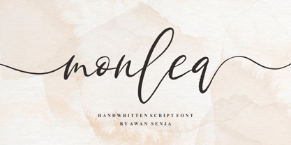 Monlea is a handwritten script font with an incredibly friendly feel. It features gorgeous swashes and ligatures that make this script incredibly versatile. This font is PUA encoded which means you can access all of the cute glyphs and swashes with ease! It also features a wealth of special features including alternate glyphs and ligatures.
 - Rebelion by Gassstype,
$23.00 Here comes a New font,Introducing REBELION It's Unique Rough Brush Font is a Strong Style and classy style, this font is great for your creative projects such as watermark on photography, and perfect for logos & branding, invitation,advertisements,product designs, stationery, wedding designs,label ,product packaging, special events or anything that need handwritting taste.
 - Chatoyer by SG Type,
$19.00 Chatoyer - A luxurious typeface with elegant swashes, special characters and multilingual support. This elegant display font has a seductive, feminine appeal. It features beautiful swashes and numerous creative ligatures incl. nested or overlapping caps. The large selection of stylistic alternations and ligatures makes this font extremely versatile. Perfect for elegant projects and luxurious branding.
 - NT Brick Sans by Nurrontype,
$17.00 Back to the future! NT Brick Sans is a pixelated sans serif. Inspired by the Pixel Art phenomenon and Lego bricks, bringing back the good old 16-bit era with open-type features. It's bold, soft rounded, supports multi-language, featuring low caps option. Brick Sans will make your project special. Grab it now.
 - Willful by Mr. Typeman,
$12.00 Take a look at my new font Willful with its light and airy outlines, which will add something cute and soft to your designs. The font is amazing in itself and will be perfectly combined with thin handwritten typefaces. Willful comes with uppercase, lowercase, standard punctuation, numerals, special letters for most of the European languages.
 - Syaipul by Mightyfire,
$15.00 Syaipul is font that looks like Arabic letter. The ornament of each letter make the font is unique but still easily to read. This font perfectly suit for calligraphy, Islamic book, headline title, poster, Arabic ornament and many more. We're honored and hope this font can be the part of your special works. Thank you.
 - Awendela Beloved by Muksal Creatives,
$10.00 Awendela Beloved Modern sans serif Font typeface with beautiful Ligature and alternate special glyphs, ornament and multilingual support. It's a very versatile font that works great in large and small sizes. Perfect for editorial projects, Logo design, Clothing Branding, product packaging, magazine headers, or simply as a stylish text overlay to any background image.
 - Branca Poster by UFF,
$39.00 Branca Poster is a heavy font with triangular serifs and with three versions of horizontal contrast. It was inspired by the Romantic fonts of vertical axis, with small openings and pronounced contrasts. Specially designed for posters, it has a wider characters map, with some Ligatures, Stylistic Alternates and Swashes, providing greater versatility to the user.
 - Allektra by Hackberry Font Foundry,
$24.95Allektra is a humanist sans serif with a modern feel. It is not as whimsical as many of my fonts, but there are many special dingbats for bullets, and so on. It has oldstyle numbers and the small caps versions have lining numbers and small caps numbers. The Fat version is especially interesting and useful. - Captain Kangaroo by Letterara,
$16.00 Captain Kangaroo is a cute and sweet handwritten font with an incredibly friendly feel. This font will turn any creative idea into a true piece of art! This font is PUA encoded which means you can access all of the cute glyphs with ease! It also features a wealth of special features including ligatures.
 - Aulletta by Nissa Nana,
$25.00 Aulletta is a beautiful and flowing script font. Its modern and classy look makes it the perfect font for creating outstanding DIY projects! This font is PUA encoded which means you can access all of the cute glyphs and swashes with ease! It also features a wealth of special features including alternate glyphs and ligatures.
 - Kailey by Great Lakes Lettering,
$40.00 Kailey font is a hand lettered, voluptuous typeface that is very special to the Great Lakes Lettering team. This oblique font is inspired by Molly Jacques’ “signature” lettering style, using bold brush strokes, fluid flourishes, and distinctive characters. Kailey has a distinct feminine feel that takes on a bold attitude to match her curves.
