10,000 search results
(0.045 seconds)
- White Rainbow by Wyarecreatype,
$13.00 Please welcome, White Rainbow. Fun and casual vintage retro decorative font. The definition of real versatility and flexibility. You can rock on both vibes, retro and modern by using a single font. Yes, just like your favourite day-to-day sneakers. Wide variety of Stylistic Alternates and Ligatures in every single letter to elevate your design game to the next level. Cut the process more because it should be easy. Perfectly fit for the visual project such as logo, branding, poster, food and beverages, social media content, website, UI/UX design, youtube thumbnail, CV, mood board, wedding, you name it. FEATURES Uppercase and Lowercase letters ligature and alternates feature Numbering and Punctuations Multilingual Works on PC or Mac Simple Installation Support Adobe Illustrator, Adobe Photoshop, Adobe InDesign, also works on Microsoft Word Hope you Like it. Thanks. Helotype
 - Tecna Dark Up Triangle BNF by Descarflex,
$30.00 The Tecn@ Dark&Light Triangle Background Nomenclature Font family is differentiated by the direction of the triangle tip in the 4 cardinal points. The family were designed to head, enumerate, indicate or highlight writings or design plans, for this reason, the characters are available only in capital letters and some signs or symbols that can serve such purposes. A triangle or empty character is included so that the user can use it overlaying any character of his choice or to be used alone. What is Lorem Ipsum? Lorem Ipsum is simply dummy text of the printing and typesetting industry. Lorem Ipsum has been the industry's standard dummy text ever since the 1500s, when an unknown printer took a galley of type and scrambled it to make a type specimen book. It has survived not only five centuries, but also the leap into electronic typesetting, remaining essentially unchanged. It was popularised in the 1960s with the release of Letraset sheets containing Lorem Ipsum passages, and more recently with desktop publishing software like Aldus PageMaker including versions of Lorem Ipsum. Why do we use it? It is a long established fact that a reader will be distracted by the readable content of a page when looking at its layout. The point of using Lorem Ipsum is that it has a more-or-less normal distribution of letters, as opposed to using 'Content here, content here', making it look like readable English. Many desktop publishing packages and web page editors now use Lorem Ipsum as their default model text, and a search for 'lorem ipsum' will uncover many web sites still in their infancy. Various versions have evolved over the years, sometimes by accident, sometimes on purpose (injected humour and the like). Where does it come from? Contrary to popular belief, Lorem Ipsum is not simply random text. It has roots in a piece of classical Latin literature from 45 BC, making it over 2000 years old. Richard McClintock, a Latin professor at Hampden-Sydney College in Virginia, looked up one of the more obscure Latin words, consectetur, from a Lorem Ipsum passage, and going through the cites of the word in classical literature, discovered the undoubtable source. Lorem Ipsum comes from sections 1.10.32 and 1.10.33 of "de Finibus Bonorum et Malorum" (The Extremes of Good and Evil) by Cicero, written in 45 BC. This book is a treatise on the theory of ethics, very popular during the Renaissance. The first line of Lorem Ipsum, "Lorem ipsum dolor sit amet..", comes from a line in section 1.10.32. The standard chunk of Lorem Ipsum used since the 1500s is reproduced below for those interested. Sections 1.10.32 and 1.10.33 from "de Finibus Bonorum et Malorum" by Cicero are also reproduced in their exact original form, accompanied by English versions from the 1914 translation by H. Rackham. Where can I get some? There are many variations of passages of Lorem Ipsum available, but the majority have suffered alteration in some form, by injected humour, or randomised words which don't look even slightly believable. If you are going to use a passage of Lorem Ipsum, you need to be sure there isn't anything embarrassing hidden in the middle of text. All the Lorem Ipsum generators on the Internet tend to repeat predefined chunks as necessary, making this the first true generator on the Internet. It uses a dictionary of over 200 Latin words, combined with a handful of model sentence structures, to generate Lorem Ipsum which looks reasonable. The generated Lorem Ipsum is therefore always free from repetition, injected humour, or non-characteristic words etc.
 - Initiate by Stiggy & Sands,
$24.00 A Stylish Technology Sans Serif Initiate began as a digitization of a film typeface from LetterGraphics in the early 70's known as "Kent". The original specimen was only in a Black weight with a tall x-height and included standard Capitals, Lowercase, Numerals and minimal Punctuation. It was a techno style sans-serif, ripe with potential. As a single weight typeface, it yearned for so much more: from family weight development to stylistic variants. We also decided to create a more normalized x-height version as well, leaving the original design as the Display series. Extras we developed for this family are Unicase variants, High & Low hairline position glyphs, as well as other alternate styled characters. The Initiate standard family has 1154 characters per font, while the Display family and Monoline font has 685 characters per font. A comprehensive character map preview is at the end of the poster graphics collection. Opentype features for Initiate Family include: Ligatures Unicase Stylistic Alternate Set Stylistic Set 02 - Limited Alternate Characters (A,K,X,Y,k,u,x,y and variants) Stylistic Set 03 - Lower Hairline Characters (B,C,E,F,G,H,P,R,Æ,a,c,e,r,s and variants) Stylistic Set 04 - M & N alternates Stylistic Set 05 - I alternates Smallcaps Set Smallcaps Lower Hairline Set when Stylistic Set 03 is enabled Limitless Fractions Ordinals Superscript & Subscript Opentype features for Initiate Display Family & Monoline font include: Ligatures Unicase Stylistic Alternate Set Stylistic Set 02 - Limited Alternate Characters (A,K,X,Y,k,u,x,y and variants) Stylistic Set 03 - Lower Hairline Characters (B,C,E,F,G,H,P,R,Æ,a,c,e,r,s and variants) Stylistic Set 04 - M & N alternates Stylistic Set 05 - I alternates Limitless Fractions Ordinals Superscript & Subscript
 - Irongate by CozyFonts,
$25.00 The Irongate Font Family has a retro personality. The common denominators, in all the glyphs, is a blunt center serif. The main top & bottom of each Cap & lower case glyphs have 'fan serifs', yep serifs that fan out. This font's influence is based on a monogram I designed for my daughter's wedding where she described her image of the event being 'Classic with a Vintage Flair'. Irongate can be pictured on many things dated from 1918 - 2018. The font is available in 4 basic weights Light, Regular, Bold & Extra Bold. An additional pdf is included that gives the code for an additional 14 Dingbats, with each weight. Irongate works extremely well with Invites, Stationary, Signage, Embroidery, Letterpress, Ads, Logos and anything that feels Industrial or Hand-Crafted, eg. Coffee, Breweries, Antiques, Woodcuts, Western Styles, Sports Styles, etc.
 - Dewave by Luxfont,
$12.00 Introducing a distorted wavy Sans Serif font family. Interesting combination of elongation and distortion is embodied in the Dewave typeface. This font family is best suited for headlines and short text as an eye-catching accent. Due to its appearance, the font is well suited for the entertainment industry and everything connected with it both in offline life and in online projects. Dewave family has two types of tilt in different directions and 2 types of distortion - calm and strong, and all this is done in 3 types of thickness - this gives a lot of freedom of choice for the use of the font in the design. Features: Distorted letters in waveform 12 fonts in family: - 2 types of tilt - 3 thicknesses - 2 types of distortion Kerning ld.luxfont@gmail.com
 - FS Millbank by Fontsmith,
$80.00 A sign of something better When designer Stuart de Rozario surveyed the fonts used in signage on London’s public transport systems, he reached a dead end. They seemed staid, sterile, lacking in personality, and ill-suited to use by modern brands. He was pointed in another direction entirely. ‘The driving force behind my thoughts was to design something more current and fresh without compromising legibility and clarity. A font with both personality and function, that’s versatile and large and small sizes, and effortless to read, but which also says something new.’ Speed reading Late for a meeting and can’t find your way? Trying to catch a flight? Lost in a hospital? Reading signs is a different business to reading a book or a newspaper. Text on signs needs to be deciphered quickly and effortlessly. So the legibility criteria for signage letterforms are different to those for normal reading, too. Throughout FS Millbank’s uppercase and lowercase alphabets, characters have been given features for extra definition, including: wide ink traps on the A, K, M, V, W, X and Y; a serifed i, accentuated spurs on the a, d, l u; and different x-height shapes on the b, g, p and q. Distinctive forms and generous, open internal shapes all help the quick reading of sign text, and wide, open terminals and counters allow similar letter shapes to be distinguished easily when viewed at different angles. Running down a corridor, maybe... Positive/negative Standard type tends to glow on the kind of dark backgrounds often used for signage, and look heavier than its true weight. To correct the imbalance caused by this optical trick, special weights of the typeface have to be drawn for these ‘negative’, light-on-dark applications. These are lighter than their comparable positive weights to overcome the ‘glow’ effect. After extensive tests of the negative weights, at all sizes, we achieved the right optical balance. Glowing, glowing, gone. Icons This wouldn’t be a signage typeface without its own set of icons, or symbols, to help people find what they’re looking for. So, to sit alongside the positive and negative fonts, we’ve created a comprehensive set of 172 icons, covering a wide range of applications from transport and user interface to information and directional. Designed within the typeface capital height, they sit on the baseline and are spaced centrally.
 - Defused - Personal use only

- THE BOKRUN by Twinletter,
$17.00 Welcome to the futuristic world with The Bokrun, a future-themed font that will color your design projects! Get a unique experience with a modern, futuristic, and sci-fi touch that radiates from each letter. The Bokrun presents impressive futuristic styling with a sophisticated and dynamic design. This font will give a fresh and innovative look to any project that needs a touch of the future. With The Bokrun, you can easily create modern and evocative designs. Not only that but The Bokrun is also equipped with great features that will give you unlimited creativity. Alternate ligatures and characters allow you to create unique and interesting letter combinations. Also, the different font variations give you the flexibility to express your ideas in greater depth. Another advantage of The Bokrun is its multilingual support, so you can communicate with audiences from different languages without any barriers. This font will take you on an international and worldwide design journey. Explore a futuristic world with The Bokrun, and let your every design be a window into the future. Get a modern, futuristic, and stunning design experience with this font. Don’t miss the chance to own The Bokrun, the perfect solution for your future projects that require a modern and futuristic touch. What’s Included : File font All glyphs Iso Latin 1 Alternate, Ligature Simple installations We highly recommend using a program that supports OpenType features and Glyphs panels like many Adobe apps and Corel Draw so that you can see and access all Glyph variations. PUA Encoded Characters – Fully accessible without additional design software. Fonts include Multilingual support
 - Baroniene ML by HiH,
$12.00 Genovaite Baroniene is former school teacher and a native of Lithuania who loves fancy letters. When she writes, she likes to add extra flourishes to her handwriting and printing. It simply appeals to her to do so. While living in the United States a few years ago and working in the health care field, she put pen to paper to provide a specimen of her writing from which a font could be developed. The process has taken longer than either of us expected. Now we are finally able to present Baroniene ML, a stylishly unique example of what we call Lithuanian Folk Baroque. Baroniene ML has a total of 362 glyphs, including the Unicode Latin Extended-A glyphs (0100 to 017F), covering the more widely-used Central European languages. To resolve the cedilla/undercomma conundrum, we have chosen to design a hybrid disconnected accent for use with C, G, K, L, N, R, S & T. We hope this solution is acceptable to users of Albanian, Catalan, French, Latvian, Portuguese, Romanian and Turkish. Baroniene ML also comes with four ligatures: gh, Th, th and Ch (167, 172, 177 and 181). Baroniene ML is certainly not the polished script of a professional calligrapher. It is very personal. The human source is still visible in its form. The letter spacing is uneven. Some of the curves are not quite perfect. In sum, the individuality has not been refined out of it. That is why it is so charming. If you want for a font that has a very different look, perhaps Baroniene ML is what you need.
 - Zig Zag ML - Personal use only

- As of my last update in April 2023, the font named Calico Cyrillic, attributed to Page Technology Marketing Inc. or Mr. Nobody, represents an intriguing case within typography, primarily due to its n...
- Arlette by TypeTogether,
$49.00 Pilar and Ferran based Arlette on the fast stroke of one letter from a Roger Excoffon family, but along the way they abandoned that starting point in favour of experimentation. Many sans serifs are like a svelte black dress: functional, beautiful, and the unfussy outfit for a nice evening get together. The Arlette family isn’t like this. It’s a stunner — an incandescent reimagining of what defines a sans and how it can look. Arlette explores the boundaries of the sans serif landscape and returns with forms developed from gestural vigour. Thinking of it as “painterly” may at first seem to fit, but it underestimates Arlette’s ability to master an unseen world of countless emotions and physical applications: magazines, branding, editorial, teen and young adult works, book covers, and a host of products and packaging whose content will be amplified with Arlette’s voice. Not only does Arlette use its eight weights plus italics to speak in Latin-based scripts, it is also fluent in Thai and has six weights (hairline through bold) with which it meets that challenge, whether in text or display. Arlette Thai’s modern nature is seen in two features for the script. One is the decorative Thai characters that are based on original palm leaf manuscripts. Another is a version of the Latin numerals adapted to the height of the script due to their wide use in Thailand. Arlette Thai has been meticulously developed, including contextual kerning to avoid mark clashes. Arlette’s OpenType capabilities include mathematic and scientific figures, positional forms, pointers, arrows, and oldstyle, lining, and tabular lining numerals. In addition to all this, it’s packed with swashes and swash ligatures in both scripts for enthusiastic typesetting. Because it pushes experimentation without compromising readability, both Arlette Thai and Latin are surprisingly legible in small sizes and arrestingly beautiful when their details can be seen.
 - Iwan Stencil by Linotype,
$40.99 Iwan Stencil is a new revival of an old display typeface. Based on type originally designed by Jan Tschichold in 1929, the style was revived by Klaus Sutter in 2008. The letterforms in this peculiar design are very high contrast; all of the thin bits are much thinner than the thick parts. They have a modern, upright axis. All in all, the creation has a bit of a Bodoni-gone-crazy touch. The thin elements are the unique part of the design that binds this face together. They almost naturally fade away in the stencil gaps (or pylons), making you wonder if you are really looking at a stencil face at all. These thins contribute greatly to the typeface's overall serif-style, making the design at least a semi serif typeface, if not a full serif one. The lowercase n, for instance, has no serifs of its own, but many of the other letters have clear ones, or serif-like terminals. A serif stencil face is a peculiar variety, especially in this day and age, but in the past they were much more common, if not the norm, The Iwan Stencil typeface has only one weight. Naturally, this is just for display. Use Iwan Stencil to cut real stencils, or only to create the effect of stenciled type in your design work. Ivan Stencil includes all of the characters that you have come to expect in a font. Just because this design was originally made in 1929 does not mean that is has a 1929 character set. Instead, it includes a 21st century, with extended European language support Jan Tschichold, who we have to thank for today's Iwan Stencil inspiration, was a man of many faces. A trained calligrapher who went on to codify the New Typography, would go on to become a teacher, a classical book designer, and the creator of the Sabon typeface. Like all young designers, he was occasionally in need of money. Before his emigration from Germany in 1933, he took on many kinds of commissions. In the late 1920s, a time full of waves of economic turmoil within Germany and across the world, he began designing a typefaces for different European companies, mostly display things like this. For a time during the mid-1920s, Jan Tschichold went by the name Iwan" "
 - Holitter Titan - 100% free

- Holitter Tittanium - 100% free

- CFT masapunk - Unknown license

- Alger Blanche Pixel by GrafikarFonts,
$159.00 AlgerBlanchePixel est une variante de AlgerBlanche, inspirée du Kufi et naskh, supporte l'Arabe, Tifinagh, Farsi, Ourdou et Latin
 - Nihilism by RagamKata,
$14.00 Introducing Nihilism, a meticulously crafted script font that strikes the perfect balance between graceful curves and distinctive personality. Ideal for crafting logotypes that leave a lasting impression, designing captivating posters, and so much more. Let Nihilism infuse your designs with a touch of charm and style.
 - Aristeo by MysticalType,
$10.00 Aristeo is a font family that is specifically designed for sports-related designs, although it can also be used for other designs. Aristeo is special because it is made with a balanced thickness and full of caution so that it emits a dynamic aura when viewed.
 - Loose Jeans by Epiclinez,
$18.00 Loose Jeans is a fun, playful, and quirky display font. It has a modern yet whimsical style an it will undoubtedly immerse your designs into a magical world. So what's included : Basic Latin A-Z & a-z Numbers, symbols, and punctuations Accented Characters : ÀÁÂÃÄÅÆÇÈÉÊËÌÍÎÏÑÒÓÔÕÖØŒŠÙÚÛÜŸÝŽàáâãäåæçèéêëìíîïñòóôõöøœšùúûüýÿžß Thank you
 - Rhythmics by Fauzistudio,
$12.00 Rhythmics is a smooth and simple monoline script font, but intricately worked on. suitable for retro or modern style designs with a minimalist and elegant impression. with PUA encoded so all characters are easily accessible. The supporting font is the Satisfactory font. Hope you enjoy. Intuisi Creative
 - Wildstreet by Runsell Type,
$18.00 Wildstreet – Script Urban Street Style A natural script textured brush, matching for urban street themes. The features uppercase, lowercase, numeral, punctuation & symbol, ligatures, alternates, multilingual support, PUA encoded (fully accessible without additional design software). It inspires a handcrafted aesthetic that pairs so well with san serif display.
 - Mono and Friends by Alit Design,
$12.00 Mono and Friends font is inspired by monoline style font. Mono and Friends consists of 6 unique and cool family packs. Especially if it is combined between several fonts. You get a cool font package for design projects that are non-formal, funny, kidy and so on.
 - Fd Neueral by Fortunes Co,
$- Neueral is a semi-round and geometric sans serif font, with flexibility and modern every glyphs, neutral font variable so it is very functional in making logo designs, article, wayfinding, system fonts, branding, business cards and many others. There are 18 fonts including Latin simple ligatures
 - Fortune Coin by Gassstype,
$25.00 Fortune Coin is a Cartoon Display Font with alot of ligature. it will make your designs look modern, unique and fun. It’s perfect for labels, quotes, posters, DIY projects, branding, packaging, greeting cards, websites, photos, photography overlays, signs, window art, scrapbooking, tags and so much more!
 - Digdope by Holis.Mjd,
$10.00 Digdope is a fun and natural font like a handwritten sans font, so you will get a more realistic feel. Digdope is a layered font available in three styles, REGULAR/NORMAL, OUTLINE &, SHADOW. Perfect for branding, logos, posters, quotes, headlines, movie titles, book titles, and other designs.
 - Designer by Artyway,
$12.00 I suggest you to pay attention to the "Design" font. It's bold, with softened corners and some slope for dynamic effect. "Design" font has a unique charm and easy visual readability, so it's perfect for headlines, whether for sports events, automotive posters, logo or monograms designs.
 - Ambleside by Hanoded,
$15.00 Ambleside is a town in the English Lake District. I used to live and work there, so I decided to name a font after it. Ambleside font is a handmade connected script font. It’s a little rough, but loveable nonetheless. Comes with all the diacritics you need!
 - Fedot by Oleg Stepanov,
$20.00 Fedot is a hand-drawn font, based on shapes of early cyrillic scripts (so-called "ustav" and "poluustav"). Lowercase typesetting with its variable letter heights is more brisk and authentic, and uppercase is more equable and neutral. Some of letters are the same in lowercase and uppercase.
 - Greedy Goose by Wilton Foundry,
$29.00Greedy Goose is a fresh new font that's full of character and unexpected surprises. Its thin, condensed strokes are ideal for elegant presentations that include Invitations, Brochures and Menus. So next time you need a fun, creative font with ATTITUDE, stick your neck out with Greedy Goose! - Belton by Matra Creative,
$12.00 Belton is a unique handwritten font. It includes elegant swashes which can be used to give a luxurious look to your designs. It can be used for various purposes such as logos, wedding invitations, headings, t-shirts, letterhead, signage, labels, news, posters, badges and so much more.
 - Stiff by Edyta Demurat,
$20.00 We present to you STIFF - a simple, characteristic typeface in a nice, retro style which is angular, geometric and extra narrow. Stiff makes the text look distinctive and unique so it's perfect for titles, subtitles, logotypes or short parts of text which need to be exposed.
 - Qallegro by Rochart,
$12.00 Qallegro typeface is original handcrafted font. Qallegro typeface is great for Branding, Logo Design, Lettering,Logotype, Clothing, Poster, magazine and other design project. Qallegro has 8 styles, one of which gives you the ability to change colors in one style, so that makes your design more amazing!
 - Pigalle Swing by Autographis,
$39.50 Pigalle Swing is a very elegant script from the 1950s which I found some time ago in a similar but not so elegant version on Place Pigalle in Paris. I designed lots of alternate capitals and lowercase letters to make the font more usable and interesting. Enjoy!
 - Ardegan by Muksal Creatives,
$15.00 Ardegan is a vintage and elegant serif font. Looks cool on various designs that require style such as wedding invitations, greeting cards, logos, fashion, photography, and so on. Ardegan The scenes are PUA coded which means you can access all the glyphs and sweeps with ease!
 - Paviljoen by Hanoded,
$15.00 Paviljoen (meaning Pavilion or Gazebo in Dutch) is an Art Deco typeface which was modeled on cast-iron lettering on some monumental buildings in Amsterdam. I only had a few glyphs to work with, so I designed the remaining ones myself. Paviljoen comes with extensive language support.
 - Elecstrom by Typefactory,
$14.00 Elecstrom is a storm display font. Elecstrom has a bad weather feels so it has thrilling yet cool experience. Elecstrom is perfect for product cover, signpost, cover album, movie with disaster theme, game, and many more! Features: – Uppercase – Lowercase – Symbols & Punctuation – Numeral – Alternates – Ligature – Multilingual Support
 - Simple Pen by Zeenesia Studio,
$10.00 Simple Pen Font Duo, Introducing of our new product the name is Simple Pen, Simple Pen is a Quirky Serif Font. came with two style, Solid and Line who make your design so classy, Simple Pen very good for crafting, kids poster, promotion poster, cartoon, comic etc
 - Burnin Water by Supfonts,
$18.00 Burning Water - a fun and modern marker font. Ideal for creating bright and catchy designs. Clear lines, dense structure, playful mood. Bold font for bold projects Language support: All European languages Don't forget to subscribe so you don't miss out on the new awesome fonts Dima
 - Bonthing by madeDeduk,
$22.00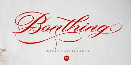 Bonthing is a luxury calligraphy script with beautiful ligatures and a lot of special alternative glyphs so you can create great layouts and compositions. Bonthing is perfect for poster design, book covers, merchandise, fashion campaigns, newsletters, branding, advertising, magazines, greeting cards, album covers, quote designs and more.


