10,000 search results
(0.032 seconds)
- Prumo Text by DSType,
$40.00 Prumo is a new type system, based on a unique skeleton that flows, like a pendulum, from high contrast to low contrast. It’s a sort of typographic journey, from the 18th century typefaces to the 19th century slab serif typefaces, gathering information from the Scotch Roman fonts on its journey. Prumo is a type family with classic proportions that takes advantage of the recent type production technology while looking carefully at the most important historical references.
 - Toothpaste by Eclectotype,
$15.00 Toothpaste is a font based on the idea of a continuous line creating connected script, as if written by a squeezed tube of toothpaste. Every letter and number connects, and there are 48 contextual alternate characters and ligatures to make the script flow even more smoothly. There's also some swirls and curls included as ornaments. This is a fun, decorative font. It would look good on kids' websites, scrapbooks, or maybe it's the perfect font for a dentist's logo.
 - Ms Claudy by Calamar,
$20.00 Ms. Claudy is an elegant modern calligraphy font that will look awesome on wedding and event stationery, logos and branding materials, cards and so on. Ms Claudy includes includes full set of Uppercase and Lowercase Basic Characters, Numerals and Punctuation. Also it contains ligatures and a lot of stylistic alternates to perfectly re-create natural calligraphy (check the previews in order to see them all). You can check your language typing characters in text box above.
 - Modern West JNL by Jeff Levine,
$29.00 Presenting… a Western style alphabet from the 1960 edition of Samuel Welo’s “Studio Handbook for Artists and Advertisers”… Extra bold, featuring slab serifs and concave corners, this type style could easily have been found on building signage in the Old West… but in redrawing it digitally, it’s been named Modern West JNL because at one time, this would have been considered a modern style of lettering. Modern West JNL is available in both regular and oblique versions.
 - Photomark Signature by MJB Letters,
$17.00 Photomark Signature is a Casual and Stylish Signature font, it has unique style in uppercase and lowercase character and very perfect for branding, signature, card designs, wedding designs, watermarks, logos and other. Photomark Signature includes full set of uppercase and lowercase letters, numeral, punctuations and ligatures. Included in this set: Works on PC & Mac Simple installations Accessible in the Adobe Illustrator, Adobe Photoshop, Adobe InDesign, even work on Microsoft Word. PUA Encoded Characters – Fully accessible without additional design software
 - Brer Rabbit by Kitchen Table Type Foundry,
$15.00 Brer Rabbit (or Brother Rabbit) is the central figure in an oral tradition passed down by African-Americans. Brer Rabbit is a trickster, just like the other popular trickster character in African stories called Anansi the spider. Brer Rabbit was based on an old font of mine called Rabbit On The Moon. It is a nice, cute children’s book font that comes with extensive language support and Brer Rabbit himself, in the shape of the alternative asterisk glyph.
 - Old Tijuana JNL by Jeff Levine,
$29.00 Old Tijuana JNL was modeled from the hand lettered title on the cover of the 1939 sheet music for "Class Will Tell" and is available in both regular and oblique versions. Casual, playful and reminiscent of the "serape" style of pseudo-Mexican lettering found on ad designs of the 1930s and 1940s, the type face isn't just for South of the Border themes. Use it for any festive occasion and the design will blend in well.
 - Fresh Garden by Epiclinez,
$18.00 Fresh Garden is an elegant, cursive font. It's a great fit for any project you have in mind! Use it as your wedding invitation text or to create a logo design with a feminine touch. Whether you're taking on a fun project or tackling something serious the script font will always please and soothe your senses. So what’s included : Basic Latin Uppercase and Lowercase Numbers, symbols, and punctuations Ligatures Multilingual Support. Simple Installations Works on PC & Mac
 - Megattor by Letterhend,
$14.00 Introducing: Megattor typeface! This font is beautifully made to look like natural hand writing. As you can see, the flow of the bold and thin lines creates a realistic hand lettering just by typing on your keyboard! It has many OpenType features like ligatures, stylistic alternate, and lots of Stylistic Set, also support many languages. This typeface is based on handwriting which is very suitable for any design needs you have especially for script logotype project.
 - Primaria by PeGGO Fonts,
$18.00 Primaria is a display font, inspired on the very first basic handwrite style teaching at primary school, designed in cursive and print styles in three weights each one: light, Regular and Bold, considering stylistic and typographic needs, it also contain OpenType initial lowercase alternative forms in order to get better links in those case where pairs of letters could be look better. Recommended playful and friendly design, teaching and learning stuff, children toys projects, food & drink and soft stuff.
 - Greenwich Village JNL by Jeff Levine,
$29.00 For decades, the Greenwich Village area of New York was a home for artists, poets, writers and free-thinkers of their time who were labeled "Bohemians" because of their non-conformist approach to life and the arts. Greenwich Village JNL is an Art Nouveau-influenced typeface with a Bohemian approach in its double crossbars on the A and H; all the while being a nice example of hand lettering found on a vintage piece of sheet music.
 - Alanta Rosery by Multype Studio,
$19.00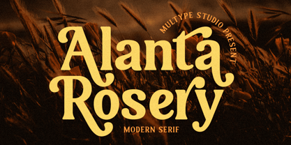 Alanta Rosery is a modern serif font. Alanta Rosery is perfect for branding, logos, social media, advertisements, product packaging, watermark, invitation, stationery, tshirt, prints, posters and more What’s Included : Uppercase & Lowercase Stylistic Alternate Ligature Numbers & Symbols Works on PC / Mac Simple installations Accessible in the Adobe Illustrator, Adobe Photoshop, Adobe InDesign, even work on Microsoft Word PUA Encoded Characters, Fully accessible without additional design software. Multilingual support Thank you for your purchase! Hope you enjoy with our font!
 - Michel Elisha Script by Fargun Studio,
$14.00 Michel Elisha Script! A new fresh and modern hand lettered font with decorative characters and a dancing baseline. So beautiful on invitation like handicraft, greeting cards, branding materials, business cards, quotes, posters, and more design concepts. Features : Unique ligatures Unique Alternates Stylistic sets Basic Latin A-Z and a-z Numbers International Symbols included Punctuation Please send a message if you have questions or problems, and don't hesitate to say hello on Instagram https://www.instagram.com/fargunstudio/ Thank you.
 - Miramar by Linotype,
$29.99Miramar font has elegance in every detail, which means that it isn't very easy to use. I like it very much, but would use it myself on rare occurencies, for very special tasks and even then in small portions. The name refers to the castle of Miramar just north of Trieste on the Adriatic coast, once the weekend resort of the Austrian imperial family. Now it is a museum with a marvellous park. Miramar was released in 1993. - Gain And Reverb by takoliko,
$9.00 Gain and reverb is a awesome raw typeface. Basicly its a serif hand drawn typeface. Inspired by the gain and reverb sound of a guitar and a rock band. It has a little bit rebellion vibe and a handmade touch on the characters. You can add a different weight to create a variation and uniqueness on the letters, make even more look like its a raw hand made design. So enjoy and have a great project with our typeface!
 - Niko by Ludwig Type,
$50.00 Niko is a contemporary, humanist sans with a friendly yet clear and distinct personality. It is designed for excellent legibility, particularly for long continuous reading. The wedge-shaped stem heads add liveliness and variety to the carefully crafted letterforms. Niko, a highly versatile type family consisting of 54 styles that are designed to work equally well on paper and on screen. The family includes condensed, as well as extra-condensed variations, for situations where space-saving typography is required.
 - Adriane Lux by Typefolio,
$49.00 Adriane Lux is the decorative, "inline" or "openface" titling companion to Marconi Lima's acclaimed Adriane Text family. This single weight offering is modeled after the Regular weight of the primary family. While Adriane Text is intended for thoroughly classical book design, Adriane Lux enters the fold as an equally traditional display face. Have it foil-stamped on your next faux-leather book cover design or embossed on your personal calling card for a touch of well-behaved, regal formalism.
 - Polaris by AVP,
$10.00 Polaris is a rounded sans-serif family with four styles designed for easy reading. Perfect for print - brochures, posters, newsletters and stationery. For signage, Polaris comes with a variety of compatible arrows. Polaris is also great on-screen: use it on your website as an alternative to the over-used standards. Polaris works in the background, creating an atmosphere of harmony and modernity while your words deliver the message and your graphics and images achieve the prominence they deserve.
 - Revelstoke by Rook Supply,
$14.00 Revelstoke is a family of five sans serif fonts designed with a vintage print look in mind. Rounded edges and imperfections were added to the characters to give that old school printing vibe. For those looking to take things one step further with some texture, we’ve added in grunge versions as well. Revelstoke is extremely versatile on its own. The font family also works great as a secondary font to go along with existing logos and branding.
 - Astaneh by Si47ash Fonts,
$24.00 Super clean, yet sophisticated! Astaneh with its 2 weights brings a modern and clean sans serif Arabic/Persian typeface to life! Shahab Siavash, the designer has done more than 30 fonts and got featured on Behance, Microsoft, McGill University research website, Hackernoon, Fontself, FontsInUse,... Astaneh text and headline font which is one of his latest designs, already got professional typographers, lay-out and book designers' attention as well as some of the most recognizable publications in Arabic/Persian communities.
 - Freight Big Pro by Freight Collection,
$39.00 Big headlines, big mastheads, big cover art. Big, big, big–big is best when big. The exquisiteness of Freight Big Pro’s hairline strokes and elegantly pointed serifs provide a striking contrast to its surroundings. Very useful when you really wanna knock someone’s socks off but with the touch of a feather so they’ll know something happened but not how it happened. Freight Big Pro, sublimely subliminal. Go ahead, slip one on (or under) your covers–we won’t tell.
 - Belgia by HansCo,
$15.00 Here come our latest product with sans serif typeface called Belgia. This font has the characteristics of a rounded shape on each side. Besides this font is perfect for those of you who are looking for font with bold and rounded but still look classy. You can use it on corporate branding, logo, document, social media design, presentation, print design, web, etc. This typeface is comes in uppercase, lowercase, punctuation, symbols, numerals, etc also support multilingual.
 - Hezareh by Si47ash Fonts,
$24.00 Familiar, yet eye-catching! Hezareh with its 2 weights brings a modern and clean serif Arabic/Persian typeface to life! Shahab Siavash, the designer has done more than 30 fonts and got featured on Behance, Microsoft, McGill University research website, Hackernoon, Fontself, FontsInUse,... Hezareh text and headline font which is one of his latest designs, already got professional typographers, lay-out and book designers' attention as well as some of the most recognizable publications in Arabic/Persian communities.
 - Fineprint by Monotype,
$29.99The script typeface named Fineprint is based on its designer's own handwriting, or at least as Steve Matteson saw his handwriting on a really good day. Unlike many digitizations of handwriting, Fineprint maintains a consistent harmony and balance across its letters in a line of text. The Fineprint family includes a number of swash and alternate letterforms, which helps pull this quirky personal nature off. Use Fineprint whenever you want to make something appear personal, friendly, or informal! - Prumo Deck by DSType,
$40.00 Prumo is a new type system, based on a unique skeleton that flows, like a pendulum, from high contrast to low contrast. It's a sort of typographic journey, from the 18th century typefaces to the 19th century slab serif typefaces, gathering information from the Scotch Roman fonts on its journey. Prumo is a type family with classic proportions that takes advantage of the recent type production technology while looking carefully at the most important historical references.
 - Quara by Delve Fonts,
$39.00 Quara is a typeface that takes its cues from cutting edge technology and new gadget lust. Quara enjoys short downloads on the web, long walks on mobile devices, and romantic dinners by LED light. An avid gamer (esp. MMORPG) and science fiction fan, Quara longs to be the first font in space and have its pixels scattered among the stars. Designed by Delve Withrington in 2009, this slightly rounded square sans has a generous x-height and low contrast.
 - Periodical JNL by Jeff Levine,
$29.00 Periodical JNL is based on one the many stylized titles from the cover of the 1920s Spanish magazine "Nuevo Mundo" (New World). Each cover displayed a beautiful piece of period artwork along with the magazine's name in different lettering styles of the time (Art Nouveau and early Art Deco). The original design features an "engraved" look and now has an oblique counterpart. Also available are solid versions (without the inside lines) in both regular and oblique styles.
 - Doubledecker by Hanoded,
$15.00 I love riding English double decker buses! I haven’t been on one lately, but for some reason I had an image of a red double decker bus in my head when I made this font. Doubledecker is a bold, cartoon-like, handmade font. It comes in regular and dots, plus a bonus doodle font called Doubledecker Stuff. Use it for any design that needs a tad of loud, a pinch of unusual and a wee bit of polka.
 - Fuel by VersusTwin,
$39.00 The Fuel typefaces are a modern update on the techno sans, complete with soft rounded corners as well as decorative inktraps. Stylistic Alternates included within all styles are alternates for the capital B, E, G, and R characters, as well as all of their accented siblings. The Fuel Complete package bundles all of the dynamic styles of the Fuel, Fuel Extended, Fuel Uni, Fuel Uni Extended, and Fuel Script typefaces into one powerhouse of a collection.
 - Prumo Display by DSType,
$40.00 Prumo is a new type system, based on a unique skeleton that flows, like a pendulum, from high contrast to low contrast. It’s a sort of typographic journey, from the 18th century typefaces to the 19th century slab serif typefaces, gathering information from the Scotch Roman fonts on its journey. Prumo is a type family with classic proportions that takes advantage of the recent type production technology while looking carefully at the most important historical references.
 - Bottle Depot - 100% free

- Leander - 100% free

- Serpentine by Image Club,
$29.99Dick Jensen (USA) designed Serpentine, is a contemporary-looking display font, for the Visual Graphics Corporation in 1972. With the rise of digital typesetting and desktop publishing, this typeface quickly became both popular and ubiquitous. This dynamic, wide, boxy design is identifiable via tiny triangular swellings at the stroke endings - what might be called semi-serifs. Serpentine is available in six different font styles: Light, Light Oblique, Medium, Medium Oblique, Bold, and Bold Oblique. Serpentine" is a greenish rock that sometimes resembles a serpent's skin, and is often used as a decorative stone in architecture. Though this font doesn't seem at all snaky or sinuous, it does have an architectural, stone-like solidity. The subtle, almost non-existent curves and semi-serifs keep it from being too stern or cold. Although the underlying strokes of each weight are similar, the six members of the Serpentine font family all present their own individual personalities. Serpentine Light lends itself well to text for onscreen displays, for instance, while the numbers from typeface's heavier weights are seen around the world on soccer jerseys! Additionally, the oblique styles convey a streamlined sense of speed, furthermore lending Serpentine well to sport and athletic applications (especially the faster, high-speed varieties). Because of its 1970s pedigree, Serpentine has come to be known as a genuine "retro" face. This makes the typeface even more appropriate for display usage, in applications such as logo design, magazine headlines, and party flyers. If you like Serpentine, check out the following similar fonts in the Linotype portfolio: Copperplate Gothic (similar serifs) Eurostile (similar width) Princetown (another "athletic" font) Insignia (similar "techno" feeling)" - Bona Nova by Borutta Group,
$- ☞ Bona Nova is a collective revival project of Bona typeface designed in 1971 by the author of polish banknotes Andrzej Heidrich. Besides giving the project a digital font form the aim was to expand the base character set: preparation of small caps, designing the alternative glyphs and multiple opentype features. Working together with the author we designed two new text versions: regular and bold – to give the family a form of a classic script triad. ☞ It is accompanied by three title versions and three contour styles under the name of Bona Sforza. All styles contains over 1200 glyphs. ☞ Bona Nova is an unprecedented typographic adventure for our team. We hope that our work will allow the cultural heritage of Bona and the work of Andrzeja Heidricha to gain new followers and fans. This project connected three generations of graphic designers who graduated the same school – the Academy of Fine Arts in Warsaw. ☞ Bona Nova isn’t only a typeface. We have also prepared a book about the project (including an interview with Andrzej Heidrich, my text about the digitalisation and a font specimen). The Bona Nova release party was a big exhibition (over 1000 guests). I’ve invited 26 graphic designers to prepare their own initials of Bona Nova – they were presented as posters on exhibition too. LINKS Bona Nova WEB Bona Nova FP Bona-Nova-(FREE-FONT) Bona Nova Book BONA NOVA IN THE MEDIA Typeroom Typography Guru Slanted Designalley Stgu Typografie Info Wikipedia Bona Nova is a non-profit project, all founds that we raise we reinvest to develop the Bona Nova project (new styles, Cyrillic & Greek, extend character set).
 - Kingthings Willow Pro by CheapProFonts,
$10.00 These fonts just ooze Christmas and holiday spirit from every curve of every letter! If Kingthings Willowless Pro is a Christmas font, well... then Kingthings Willow Pro is a Christmas tree complete with decorations and lights! This font is sooooo ornamented - but still quite readable. I have cleaned up all the outlines, redesigned the F (which looked more like a J), tweaked some more letters and then expanded the font with the usual multilingual glyphs. I loved this font when I first saw it, but was very nervous that it would be difficult to design the accents - but it was a breeze! It has been one of the most enjoyable fonts to rework so far. Hope you will enjoy it, too. ALL fonts from CheapProFonts have very extensive language support: They contain some unusual diacritic letters (some of which are contained in the Latin Extended-B Unicode block) supporting: Cornish, Filipino (Tagalog), Guarani, Luxembourgian, Malagasy, Romanian, Ulithian and Welsh. They also contain all glyphs in the Latin Extended-A Unicode block (which among others cover the Central European and Baltic areas) supporting: Afrikaans, Belarusian (Lacinka), Bosnian, Catalan, Chichewa, Croatian, Czech, Dutch, Esperanto, Greenlandic, Hungarian, Kashubian, Kurdish (Kurmanji), Latvian, Lithuanian, Maltese, Maori, Polish, Saami (Inari), Saami (North), Serbian (latin), Slovak(ian), Slovene, Sorbian (Lower), Sorbian (Upper), Turkish and Turkmen. And they of course contain all the usual "western" glyphs supporting: Albanian, Basque, Breton, Chamorro, Danish, Estonian, Faroese, Finnish, French, Frisian, Galican, German, Icelandic, Indonesian, Irish (Gaelic), Italian, Northern Sotho, Norwegian, Occitan, Portuguese, Rhaeto-Romance, Sami (Lule), Sami (South), Scots (Gaelic), Spanish, Swedish, Tswana, Walloon and Yapese.
 - Dever by insigne,
$24.00 Dever’s brute, industrial lines are rounded up in this new typeface from Jeremy Dooley. Dever combines plenty of inspirations. It’s the flair of the Wild West melded with a shout out to the sign painters and package lettering artists of the 1800s. Dever’s big, bold, and handy frame moves through all three of the family’s strapping members. First is the sans. No doubts on what this brother’s like. Dever Sans is as straight-forward as you’ll find in this family with its four separate weights and numerous distressed options. The second of the kin’s a bit of half-breed, you might say. Pointed serifs bring a sharpness to this outfit. Rounding out the family is Dever Wedge, a bit of wild rodeo all its own. This poke’s a quick draw with any of its 107 font, and with it’s auto-replacing alternates, no two repeating characters are alike. You’re guaranteed a great show anytime Dever leaves the chute. The route to Dever was long, with many a switchback. The Wedge variant was designed first, shelved, then developed into Plathorn. But I wanted to return to those brutish forms and decided to round out the family with a sans, serif and plenty of other options. Any of the Dever family have an extended character set including Central and Eastern European languages. The strong faces have specially adapted sub-families, too, so they’re bound and determined to have an outstanding impact at whatever size you use ‘em. It’s a hard ride ahead corralling all those words. Be sure and add these able-bodied boys to your posse today!
 - Serpentine by Linotype,
$29.00Dick Jensen (USA) designed Serpentine, is a contemporary-looking display font, for the Visual Graphics Corporation in 1972. With the rise of digital typesetting and desktop publishing, this typeface quickly became both popular and ubiquitous. This dynamic, wide, boxy design is identifiable via tiny triangular swellings at the stroke endings - what might be called semi-serifs. Serpentine is available in six different font styles: Light, Light Oblique, Medium, Medium Oblique, Bold, and Bold Oblique. Serpentine" is a greenish rock that sometimes resembles a serpent's skin, and is often used as a decorative stone in architecture. Though this font doesn't seem at all snaky or sinuous, it does have an architectural, stone-like solidity. The subtle, almost non-existent curves and semi-serifs keep it from being too stern or cold. Although the underlying strokes of each weight are similar, the six members of the Serpentine font family all present their own individual personalities. Serpentine Light lends itself well to text for onscreen displays, for instance, while the numbers from typeface's heavier weights are seen around the world on soccer jerseys! Additionally, the oblique styles convey a streamlined sense of speed, furthermore lending Serpentine well to sport and athletic applications (especially the faster, high-speed varieties). Because of its 1970s pedigree, Serpentine has come to be known as a genuine "retro" face. This makes the typeface even more appropriate for display usage, in applications such as logo design, magazine headlines, and party flyers. If you like Serpentine, check out the following similar fonts in the Linotype portfolio: Copperplate Gothic (similar serifs) Eurostile (similar width) Princetown (another "athletic" font) Insignia (similar "techno" feeling)" - Marsmila by Colllab Studio,
$19.00 "Hi there, thank you for passing by. Colllab Studio is here. We crafted best collection of typefaces in a variety of styles to keep you covered for any project that comes your way! Introducing Marsmila, a luxury beauty calligraphy font inspired by the Victorian era and the Grace of the Roman letterforms as well as modern calligraphic aesthetics. Its graceful, curving lines and elegant swirls are a delight to behold. Marsmila comes with massive number of glyphs and stylistic alternates, including extra beginning and ending swashes. Perfect for your next calligraphy project, or when you want to make your text look fancy! Make your next design projects look like you took them to an expensive calligrapher to be done for hundreds of dollars, but you didn't! You can use it in any design and any way you want. Marsmila typeface works best for logos, posters, styling purposes such as invitations, greeting cards or any design projects which have some elegant vibe to them. A Million Thanks Colllab Studio www.colllabstudio.com
 - Between by Monotype,
$40.99 Akira Kobayashi’s Between™ typeface comes in three main states. While different from each other, they all offer human-centered design to ensure that copy set in them is affable and approachable. An added benefit is the ability to transition “between” font designs, choosing different styles – or even individual characters – to create hierarchy, contrast or emphasis. Kobayashi designed the Between typeface in response to the current popularity of rounded, humanist sans serif designs over the cool grotesques of the 20th century. Between 1 melds industrial and humanist sans ethics. Between 2 represents a sans version of Kobayashi’s Cosmiqua® typeface, striking a balance between crisp and legible, organic and friendly. Between 3 is a freestyle sans with an uplifting sprightly mien. Between has 48 styles; each has eight weights of roman with its own italic counterpart. The family offers a large set of alternative glyphs and OpenType® features. A full interactive type specimen can be viewed here: http://www.monotype.com/fonts/between/ Featured in: Best Fonts for Logos
 - Shackie Handpainted by Mans Greback,
$59.00 Shackie Handpainted is a striking custom lettering font, embodying the charm and flair of a script brush. This logotype font is perfect for projects requiring a cool and edgy touch, such as T-shirt designs and sign painting. With its unique hand-painted style, Shackie Handpainted brings a distinctive appeal to your creative work. The font's dynamic brushstrokes lend it the authentic feel of a sign painter's masterpiece, making it an excellent choice for projects that call for custom lettering and a personal touch. The Shackie Handpainted font family includes six expressive styles to suit various design needs: The weights Thin, Regular and Bold, with each thickness as Italic. The font is built with advanced OpenType functionality and has a guaranteed top-notch quality, containing stylistic and contextual alternates, ligatures and more features; all to give you full control and customizability. It has extensive lingual support, covering all Latin-based languages, from Northern Europe to South Africa, from America to South-East Asia. It contains all characters and symbols you'll ever need, including all punctuation and numbers.

