10,000 search results
(0.074 seconds)
- 1776 Independence by GLC,
$38.00 1776 Independence was designed inspired mainly from the Caslon typeface used by John Dunlap in the night of 1776 July 4th in Philadelphia to print the first 200 sheets of the Congress' Declaration of Independence establishing the United States of America. I just added accented letters and a few others, with respect for the original design. A render sheet,enclosed with font file, help to identify them on keyboard. It can be used as web-site titles, posters and fliers, editing ancient texts, menus or greeting cards as a very decorative font... This font supports as easily enlargement or small size, remaining clear and easy to read from 8 or 9 points to 72 and over. It gives a smart look especially to prints.
 - TessieBugs by Ingrimayne Type,
$23.95 A tessellation is a shape that can be used to completely fill the plane—simple examples are isosceles triangles, squares, and hexagons. Tessellation patterns are eye-catching and visually appealing, which is the reason that they have long been popular in a variety of decorative situations. These Tessie fonts have two family members, a solid style that must have different colors when used and an outline style. They can be used separately or they can be used in layers with the outline style on top of the solid style. For rows to align properly, leading must be the same as point size. To see how patterns can be constructed, see the “Samples” file here. TessieBugs contains shapes that resemble insects such as moths, ants, butterflies, and weevils. (Earlier tessellation fonts from IngrimayneType, the TessieDingies fonts, lack a black or filled version so cannot do colored patterns. The addition of a solid style that must be colored makes these new fonts a bit more difficult to use but offers far greater possibilities in getting visually interesting results.)
 - Ariata by Monotype,
$50.99 Ariata™, from Malou Verlomme, is three typefaces in one. Like phases of the moon, they gracefully meld from one to the other. The “Text” weights are sturdy designs that perform as well in blocks of copy as they do in the occasional headline. The “Display” versions of Ariata are delicate but confident designs that shine in large sizes, while the “Stencil” typefaces are eye-catching and provocative. Each version is available in four weights, from a forthright regular to a robust black, making for a family that is comfortable taking on a wide variety of tasks. The individual designs can be combined with each other to create a distinctive, yet cohesive typographic statement, or stand on their own as confident communication tools. If you want a little more variety, Ariata’s solid glyphic shapes will serve as a dynamic counterpoint to just about any Humanistic sans. Space economical and distinctly original, Ariata easily creates commanding headlines, pull-quotes and subheads. Packaging, game branding, posters, book jackets and advertising design are all also within its comfort zone. While primarily intended for print applications, Ariata’s full-bodied x-heights, generous counters and clear apertures make for a design that is also at home in many digital environments. Verlomme is an award-winning Senior Type Designer at Monotype. He has a degree in graphic design from l'École Duperré in Paris, and an MA in Typeface Design from the University of Reading. He taught type design at several universities in Paris and still occasionally lectures and gives workshops. His typeface Camille has the honor of being part of the collection at France’s Centre National des Arts Plastiques (CNAP). Verlomme also designed Placard® Next, Madera™ and Johnston100, London’s new underground branding typeface. Click here to see all of https://www.monotype.com/studio/malou-verlomme Malou Verlomme’s typeface designs.
 - Mantika Sans Paneuropean by Linotype,
$67.99With its well-defined characters that are readily legible even in the small font sizes, Mantika Sans by Jürgen Weltin is ideal for typesetting. The elaborately designed and highly individual set of italics enhances the attractiveness of the font.Jürgen Weltin developed the Mantika™ Sans sans serif font using older designs for an serif font as his inspiration. Nothing more than the merest suggestion of the original serifs has survived. Bevelled line endings and the slight variation in thickness of verticals, in particular, provide Mantika Sans with a very dynamic character that evokes manuscript. Short ascenders and descenders give the font a compact appearance that is also underscored by its condensed proportions. Weltin has achieved his aim of producing a typeface with excellent legibility even in small sizes not just by means of the x-height, which is tall in comparison with the capital letters, but also by using clearly defined and well differentiated designs for critical letters, such as i", "I" and "l". Lower case "i", for example, has a serif while the "l" has a curved base.In addition to uppercase numerals, Mantika Sans also has lowercase or old style numerals that have been designed so that they can be used in both tabular and proportional settings. The uppercase numerals are slightly shorter than the uppercase letters, ensuring that the latter can be sympathetically incorporated within continuous text.The Mantika Sans italics are very unusual. They are inclined at only 4.5° (the usual angle for italics is 10 - 12°) and so appear to be almost upright. In addition, they also have quite distinctive forms. The overall effect calls attention to their curvilinear, manuscript character, enhances contrasts and further emphasizes the terminals. Weltin explains: "Within the variety of forms of the italics there are many contrasting terminal elements that create dynamism. The result is a diversity of interaction between the rounded and angular forms". Mantika Sans Italic thus has all the features of a display typeface, but can also be happily used on its own to set longer text passages. Mantika Sans is available in two weights; Regular and Bold, both of which have corresponding italics sets. Mantika Sans has been designed so that the widths of the four related cuts are identical, meaning that a change of font within a single layout will have no effect on justification. In addition, the members of the Mantika Informal font family, designed by Jürgen Weltin in 2010, also have the same thickness. Other font families having weights with equal thickness can be found in the "Linotype Office Alliance series".The Mantika Sans character sets are paneuropean. There are characters for setting texts in Eastern European languages, Greek and Cyrillic. There is also a range of special symbols, including right-angled brackets, subscript and superscript lower case letters, together with numerals, arrows and many different bullet points.As a vibrant and highly legible text font, Mantika Sans has a broad spectrum of potential applications. Its unusual italics are not just perfect for use in display text. The fact that it has only four cuts means that Mantika Sans is particularly suitable for office use or for the setting of business reports. Its excellent legibility even in the small font sizes also makes it ideal as a text for electronic reading devices; this also applies to Mantika Informal.At the 3rd International Eastern Type Design Competition Granshan 2010, Mantika Sans was awarded in the category Greek text typefaces." - Mantika Sans by Linotype,
$50.99 With its well-defined characters that are readily legible even in the small font sizes, Mantika Sans by Jürgen Weltin is ideal for typesetting. The elaborately designed and highly individual set of italics enhances the attractiveness of the font.Jürgen Weltin developed the Mantika™ Sans sans serif font using older designs for an serif font as his inspiration. Nothing more than the merest suggestion of the original serifs has survived. Bevelled line endings and the slight variation in thickness of verticals, in particular, provide Mantika Sans with a very dynamic character that evokes manuscript. Short ascenders and descenders give the font a compact appearance that is also underscored by its condensed proportions. Weltin has achieved his aim of producing a typeface with excellent legibility even in small sizes not just by means of the x-height, which is tall in comparison with the capital letters, but also by using clearly defined and well differentiated designs for critical letters, such as i", "I" and "l". Lower case "i", for example, has a serif while the "l" has a curved base.In addition to uppercase numerals, Mantika Sans also has lowercase or old style numerals that have been designed so that they can be used in both tabular and proportional settings. The uppercase numerals are slightly shorter than the uppercase letters, ensuring that the latter can be sympathetically incorporated within continuous text.The Mantika Sans italics are very unusual. They are inclined at only 4.5° (the usual angle for italics is 10 - 12°) and so appear to be almost upright. In addition, they also have quite distinctive forms. The overall effect calls attention to their curvilinear, manuscript character, enhances contrasts and further emphasizes the terminals. Weltin explains: "Within the variety of forms of the italics there are many contrasting terminal elements that create dynamism. The result is a diversity of interaction between the rounded and angular forms". Mantika Sans Italic thus has all the features of a display typeface, but can also be happily used on its own to set longer text passages. Mantika Sans is available in two weights; Regular and Bold, both of which have corresponding italics sets. Mantika Sans has been designed so that the widths of the four related cuts are identical, meaning that a change of font within a single layout will have no effect on justification. In addition, the members of the Mantika Informal font family, designed by Jürgen Weltin in 2010, also have the same thickness. Other font families having weights with equal thickness can be found in the "Linotype Office Alliance series".The Mantika Sans character sets are paneuropean. There are characters for setting texts in Eastern European languages, Greek and Cyrillic. There is also a range of special symbols, including right-angled brackets, subscript and superscript lower case letters, together with numerals, arrows and many different bullet points.As a vibrant and highly legible text font, Mantika Sans has a broad spectrum of potential applications. Its unusual italics are not just perfect for use in display text. The fact that it has only four cuts means that Mantika Sans is particularly suitable for office use or for the setting of business reports. Its excellent legibility even in the small font sizes also makes it ideal as a text for electronic reading devices; this also applies to Mantika Informal.At the 3rd International Eastern Type Design Competition Granshan 2010, Mantika Sans was awarded in the category Greek text typefaces."
 - Lust Slim by Positype,
$50.00 Check out the new Lust Pro & Lust Pro Didone to see how the series has grown and evolved. Confident and versatile, Lust is an exercise in indulgence—an attempt to create something over the top and vastly useful. If Lust Slim seems both new and familiar, that’s because it is. The series unapologetically channels Herb Lubalin, but produced with a deliberate, contemporary twist. There is an intentional slyness infused in the letterforms—the extreme thick and thin lines flow effortlessly without becoming gratuitous. It’s always just enough, not too much. What makes the type series so appealing? The curves. When asked to describe the letterforms, most people unwittingly allude to the human form, using adjectives usually reserved for describing physical traits… creating all-too-familiar comparisons. Summerour has grown to accept this as unavoidable and reasonable given his acknowledgement of its influences and has provided nuances within the letterforms to accentuate that. Intended to be set large, the typeface has both Standard (Lust, Lust Didone and a single unified Italic) and Display variants making it perfect for editorial use and a flexible solution for any display need.
 - Ken Aroque by Beewest Studio,
$90.00 Ken Aroque Font is Engraved Bold Decorative Font that ornamental. This Font is Best as tittle of the novel, Poster, Theater, Logo and also tatoo. This font is bold , strong , classic and luxurious in the same time.
 - Cralic by Popskraft,
$18.00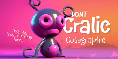 The Cralic font is a great choice for playful and childish designs. It's a cute and quirky display font that will bring a touch of fun to any project. This font is perfect for branding projects, logos, wedding designs, social media posts, advertisements, product packaging, labels, photography, invitations and any other project that needs a handwritten style.
 - Parsnip NF by Nick's Fonts,
$10.00Will Ransom designed the exemplar for this series for Barnhart Brothers & Spindler in the early 1900s. The typeface was originally named "Parsons", after the advertising director of a Chicago department store (evidently a very BIG customer of BB&S). Both versions of this font contain the Unicode 1252 (Latin) and Unicode 1250 (Central European) character sets, with localization for Romanian and Moldovan. - Kinkajou Stew NF by Nick's Fonts,
$10.00This exuberant face was suggested by a piece of French sheet music from the 1930s for the song Sur un Air de Shimmy, The name comes from an Australian song from the 1950s about a noncompliant boomerang. Both versions of this font contain the Unicode 1252 (Latin) and Unicode 1250 (Central European) character sets, with localization for Romanian and Moldovan. - Sponge Bear by Attractype,
$12.00 Sponge Bear is a playful heavy display font, this unique font is suitable for various designs that require thick text and designs with funny, cheerful, happy, spirit, adventure themes. The stylistics of the Sponge Bear font will change the vertical position of the letters randomly, this will make the series of words more unique and interesting. Have fun creating with Sponge Bear.
 - Unjustified NF by Nick's Fonts,
$10.00 No secret here: this typeface was inspired by the opening credits for the television series "Justified." Alternate upper and lowercase letter to achieve the effect, or—in OpenType-savvy programs—activate the Contextual Alternates (calt) feature. Thin numbers can be found in these positions: ~^{}[]|\<>. Both versions of this font support the Latin 1262, Central European 1250, Turkish 1254 and Baltic 1257 codepages.
 - Super Bob Triline NF by Nick's Fonts,
$10.00One of countless variations possible from the modular lettering system called "Super Veloz", developed by Spanish type designer Joan Truchut-Blanchard in the 1930s. This particular variant, for whatever reason, was called "Bob" in the style sheet announcing the system, and it seemed particularly apt. Both versions of this font include the complete Unicode 1252 Latin and Unicode 1250 Central European character sets. - Conrad by Linotype,
$29.00The award-winning Conrad was created by Japanese type designer Akira Kobayashi. Its design was based on the fifteenth-century type by Conrad Sweynheym and Arnold Pannartz, two German printers active in Rome at that time. They produced a unique, slightly unbalanced yet attractive type. Kobayashi says of his typeface, “I have designed a couple of typefaces inspired from the past, but this time the original print acted merely as a reference. The distinctive lowercase ‘a’ and some other letters were inspired by Sweynheym and Pannartz’s second roman type, but I revived the type in a more informal way. Here I used the historical type as a springboard. The resulting type looks different, taking on a rather temporary and lively look. I assume that the Conrad is the first revival of the Sweynheym and Pannartz type, though it does not closely resemble the original.” Conrad won first prize for the text typeface category in Linotype’s Third International Typeface Design Contest (2000) as well as the Certificate of Excellence in Type Design from the Type Directors Club (2001). - Lemon Flush by PizzaDude.dk,
$15.00 According to my own knowledge, and the info found around the internet, lemons are good for your health. Not only do I care about my health, I also care for a good dessert! :) And this is where the lemon enters the the arena! I love the sweet and sour taste of the lemon - I love it in drinks (hot or cold) in ice creams, cakes, sweets ... you name it! I just had to name this font something with the word "lemon" in it, because I find it mouth watering! :)
 - Partenkirchen NF by Nick's Fonts,
$10.00In Lewis F. Day’s 1910 classic, Alphabets Old and New, the author presented the inspiration for this typeface as an example of German monumental lettering, most likely to suggest not that the typeface was really big, but that it had been found on German monuments. Bold yet charming, the face takes its name from a picturesque village in the Bavarian Alps which was the ancestral home of the Gröbl line of Curtii forebears. Both versions of this font include the complete Latin 1252 and CE 1250 character sets, with localization for Romanian and Moldovan. - Karl Geoff by Mas Anis Studio,
$16.00 Karl Geoff is a unique and cool looking handwritten script, ideal for use in projects that need an organic and natural style. This font is great for logotype, signatures, labels, and can add an elegant and classy look to your work. We keep Karl Geoff looks elegant, classy, readable, stylish, eye catching and easy to use. With Modern and Classy style, make this font perfect for project like watermark for photo, wedding, event, invitation, escort card, table number, header menus, editorial, display, logos, slider blog, social media, custom address, stamps, packaging, greeting card, etc. You can easily pair them with sans or serif font from all over the world to make your work more interesting!
 - Cardo - Personal use only

- Expline Variable by Formatype Foundry,
$140.00 Expline typeface finds its roots in modernist design but subtly pays homage to early Modern Industrial Grotesks. This fusion creates a font that encapsulates the essence of tradition while embracing the contemporary. The font incorporates sharp details in select characters and curves, imparting a delicate sweetness while preserving the robust character associated with Grotesk fonts. This unique blend allows Expline to strike a perfect balance between display and text usage, making it a versatile choice for a variety of design projects. Expline's flexibility shines through its extensive weight options. The font family offers eight distinct weights, each thoughtfully crafted to establish a clear typographic hierarchy. Designers can easily choose the right weight to suit the specific needs of their projects, whether it's a bold headline or a refined body text. This variety ensures that your typography will always make the right visual impact. Expline typeface doesn't stop at weights. It provides expansive character sets across each weight, encompassing all Western European diacritics, Punctuation, Mathematics, and Numerics. This ensures that your typography will seamlessly support various languages and punctuation marks, making it a global choice. In addition, the font boasts OpenType features, granting the flexibility to explore multiple subsets. This includes alternate capital letterforms, tabular and lining numerals (both proportional and old-style), enabling endless typographic possibilities. Whether you're designing for print or web, these features allow you to fine-tune your typography for a perfect fit. Expline is a font that bridges the gap between modernist design principles and early industrial influences, resulting in a Neo-Grotesk font with a contemporary twist. Its comprehensive weight options, expansive character sets, and OpenType features make it a versatile choice for any medium between print and screen.
 - Expline by Formatype Foundry,
$39.00 Expline typeface finds its roots in modernist design but subtly pays homage to early Modern Industrial Grotesks. This fusion creates a font that encapsulates the essence of tradition while embracing the contemporary. The font incorporates sharp details in select characters and curves, imparting a delicate sweetness while preserving the robust character associated with grotesk fonts. This unique blend allows Expline to strike a perfect balance between display and text usage, making it a versatile choice for a variety of design projects. Expline's flexibility shines through its extensive weight options. The font family offers eight distinct weights, each thoughtfully crafted to establish a clear typographic hierarchy. Designers can easily choose the right weight to suit the specific needs of their projects, whether it's a bold headline or a refined body text. This variety ensures that your typography will always make the right visual impact. Expline typeface doesn't stop at weights. It provides expansive character sets across each weight, encompassing all Western European diacritics, Punctuation, Mathematics, and Numerics. This ensures that your typography will seamlessly support various languages and punctuation marks, making it a global choice. In addition, the font boasts OpenType features, granting the flexibility to explore multiple subsets. This includes alternate capital letterforms, tabular and lining numerals (both proportional and old-style), enabling endless typographic possibilities. Whether you're designing for print or web, these features allow you to fine-tune your typography for a perfect fit. Expline is a font that bridges the gap between modernist design principles and early industrial influences, resulting in a Neo-Grotesk font with a contemporary twist. Its comprehensive weight options, expansive character sets, and OpenType features make it a versatile choice for any medium between print and screen.
 - Printers Drawer JNL by Jeff Levine,
$29.00 Printers Drawer JNL continues building on a library of letterpress illustrations, cartoons, ad builders, Art Deco ad panels, ornaments, embellishments, and general miscellany. The images are re-drawn from vintage source material, and this font is jam-packed with 89 images spread throughout most all of the standard keyboard positions. This is officially the 1000th release from Jeff Levine Fonts since its inception in January of 2006. Jeff Levine Fonts aims to preserve the almost-lost artwork and lettering styles of the past within a digital type format, and often recreates the designs complete with their evident flaws, idiosyncrasies and eccentricities; allowing for a “real world” and nostalgic look to the computer generated art projects of today.
 - Gorgonzola Gothic by The Ampersand Forest,
$20.00 Gorgonzola Gothic is a geometrically-inspired gothic sans serif family that's robust and versatile. Inspired by the geometric quirkiness of IxD (also by The Ampersand Forest), Gorgonzola Gothic expands into a thirty-style family that works for everything from branding to text. It further mitigates IxD's quirkiness by offering two options in the round and shouldered lowercase glyphs. The standard letterforms, like IxD, have notched joins, giving them an assertive, almost futuristic look. The alternates of those letterforms (housed in Stylistic Set 01, and available as immediate hoverable glyph options in the Adobe Suite) are more conventional (as are the SS01 ampersand, Q, S, a, and s). In this way, Gorgonzola Gothic offers the best of both worlds: a flavorful, slightly futuristic family (in the same world as geometric classics like Eurostile) and a workhorse gothic sans (like the Benton classics Franklin Gothic, News Gothic, etc.). Its three widths: Skinny, Slim, and Standard, give it a wide range of applications, from display to body. Gorgonzola Gothic makes a statement with strength and sureness.
 - Paperlight Script by Putracetol,
$20.00 Paperlight Script - Luxury Calligraphy Font. Paperlight Script is calligraphy font with a classic style and a touch of elegance, inspired by the handwriting of ancient manuscripts. This calligraphy harmony gives the impression of being luxurious, free and sophisticated. The body text of Paperlight Script font has been designed with high details, precisely, smooth and flow. Paperlight Script font carefully designed to work together harmoniously making it perfect for wedding media, book covers, greeting cards, logos, branding, business cards and certificates, even for any design work that requires classic, formal or luxurious The alternative characters were divided into several Open Type features such as Swash, Stylistic Sets, Stylistic Alternates, Contextual Alternates, and Ligature. The Open Type features can be accessed by using Open Type savvy programs such as Adobe Illustrator, Adobe InDesign, Adobe Photoshop Corel Draw X version, And Microsoft Word. This font is also support multi language.
 - Miragem by Vanarchiv,
$55.00 This serif typeface was designed to be simple and neutral on text sizes, there descender proportions are short and the x-height is large. The lowercase italics contain different structure from roman characters, but the most differentiation detail is the fact the ascender and descender strokes don’t contain serifs. Italics characters are slightly more narrow and condensed than roman letterforms.
 - SK Shriftovik by Shriftovik,
$32.00 SK Shriftovik is a geometrical, caps and small caps only, sans serif typeface inspired by the works of constructivists of the early XX century. Due to its structure, this display typeface is good for posters and magazines. The SK Shriftovik typeface supports many languages, including extended Latin and Cyrillic. The font contains many ligature combinations and stylistic alternatives that significantly transform the text.
 - Motoride by Epiclinez,
$17.00 Motoride is an authentic handcrafted lettering that transformed into a font. It was inspired by the world of custom motorcycles. It's vintage style is suitable for every design which needs a timeless typeface, such as logotype, apparel, branding, packaging, advertising, Instagram quotes and more! This font features a wealth of OpenType features including alternate glyphs, ligatures, and swashes. This font is multi-language and also PUA encoded which means you can access all of the alternate glyphs with ease. We hope you will enjoy the font, please feel free to comment if you have any thoughts or feedback.
 - Turkeyes by IKIIKOWRK,
$17.00 Introducing Turkeyes - Bohemian Type, created by ikiiko. Turkeyes is a vintage stylish display type that has both a modern and retro look. This font is inspired by the bohemian era, the perfect one to create layout design in the 60s or 70s. This font have unique shape that to give to your brand logo, poster, food & beverages, and another project to a have unique or vintage look. What's included? Uppercase & Lowercase Number & Punctuation Multilingual Support Works on PC & Mac Enjoy our font and if you have any questions, you can contact us by email : ikiikowrk@gmail.com
 - KERASIH by Product Type,
$15.00 Keraasih is a graffiti display font that combines art, freedom, and the beauty of handwriting. Crafted with boldness and expression, this font is the perfect solution for projects that require a unique artistic touch and beautiful handwriting. With Keras, you can create striking and eye-catching designs. This font gives you the freedom to express your creativity and exudes a style like no other. The expressive look and strong character make Kerasih a standout choice among other fonts. The artistic touch in each letter and the intricate details make Keraasih so attractive. Every cut, line, and stroke exudes boundless creative courage and passion. The bold graffiti design and the feel of beautiful handwriting create a unique and eye-catching combination. Keraasih takes you into the world of art and freedom. Use this font to create eye-catching posters, memorable logos, or cool merchandise designs. With Kerashy, you can bring an interesting and evocative touch of art to your projects. What’s Included : - File font - All glyphs Iso Latin 1 - Ligature, Alternate - We highly recommend using a program that supports OpenType features and Glyphs panels like many Adobe apps and Corel Draw, so you can see and access all Glyph variations. - PUA Encoded Characters – Fully accessible without additional design software. - Fonts include Multilingual support
 - Scamps by Spark Creative,
$39.00 I designed this font because it didn't exist - it’s based on hand rendered type created for black and white line marker scamps used in the advertising industry. I use it that way and it’s saved me a LOT of hand-rendering time over the years. Of course, Scamps works as an informal marker script in its own right too. I’ll be interested to see what you do with it.
 - Lualaba Snake by Scholtz Fonts,
$19.00Lualaba Snake is a bold display font, characterized by the snake-like decoration used in each letter. The design of the font was inspired by the legend of the Lualaba River in Central Africa. Snakes enjoy a special status in Africa, as they are reputed to be messengers of the ancestors, and are therefore good. Near the Lualaba river is a pool in which a big snake called Kabwe lives. Our ancestors are thought to communicate through this snake. - ZsaZsa Galore by Chank,
$39.95Chank created Zsazsa Galore as a fresh alternative to Mister Frisky, another jerky, hypercaffeinated interpretation of the traditional roman alphabet. The difference this time is that the new font has no descenders. Every letter comes to rest hard on the baseline. It sits there firmly rooted with branches wiggling around in the air. It was released as the Chank Font of the Month in October 1999 and it was named after Zsa Zsa Gabor because she is beautiful. - Biff Bam Boom by Comicraft,
$19.00 Thrown from the pages of Spider-Man, Daredevil and Hulk comes BIFF BAM BOOM! Inspired by the Legendary Lettering Legerdemain of comics’ Silver Age, Biff Bam Boom is a font you can’t take a swing at without ending up with a broken nose. If you have any sense, duck and cover!
 - Negotiate by Typodermic,
$11.95 Indulge your senses with the exquisite elegance of Negotiate, a sans-serif typeface that exudes sophistication and style. This alluring font boasts a distinctive blend of rounded and flat stroke ends, creating a striking contrast that is both visually appealing and alluring to the eye. The smooth, curved lines of the rounded stroke ends provide a soft and gentle touch, while the flat strokes add a bold and assertive element that commands attention. This captivating contrast imbues Negotiate with a unique personality, making it a perfect choice for those seeking to convey a message that is both powerful and chic. What truly sets Negotiate apart is its versatility. The typeface is available in five distinct weights, allowing you to customize your design to achieve the perfect balance of grace and strength. Additionally, the italics add a touch of sophistication to your work, giving it a refined and polished edge that is sure to impress. If you’re looking for a font that truly embodies the essence of fashion and elegance, look no further than Negotiate. With its old-style numerals, this typeface is perfect for use in OpenType-capable apps. Its charming design and alluring character are sure to make an impact and leave a lasting impression on all who behold it. Choose Negotiate and let your creativity take flight. Most Latin-based European writing systems are supported, including the following languages. Afaan Oromo, Afar, Afrikaans, Albanian, Alsatian, Aromanian, Aymara, Bashkir (Latin), Basque, Belarusian (Latin), Bemba, Bikol, Bosnian, Breton, Cape Verdean, Creole, Catalan, Cebuano, Chamorro, Chavacano, Chichewa, Crimean Tatar (Latin), Croatian, Czech, Danish, Dawan, Dholuo, Dutch, English, Estonian, Faroese, Fijian, Filipino, Finnish, French, Frisian, Friulian, Gagauz (Latin), Galician, Ganda, Genoese, German, Greenlandic, Guadeloupean Creole, Haitian Creole, Hawaiian, Hiligaynon, Hungarian, Icelandic, Ilocano, Indonesian, Irish, Italian, Jamaican, Kaqchikel, Karakalpak (Latin), Kashubian, Kikongo, Kinyarwanda, Kirundi, Kurdish (Latin), Latvian, Lithuanian, Lombard, Low Saxon, Luxembourgish, Maasai, Makhuwa, Malay, Maltese, Māori, Moldovan, Montenegrin, Ndebele, Neapolitan, Norwegian, Novial, Occitan, Ossetian (Latin), Papiamento, Piedmontese, Polish, Portuguese, Quechua, Rarotongan, Romanian, Romansh, Sami, Sango, Saramaccan, Sardinian, Scottish Gaelic, Serbian (Latin), Shona, Sicilian, Silesian, Slovak, Slovenian, Somali, Sorbian, Sotho, Spanish, Swahili, Swazi, Swedish, Tagalog, Tahitian, Tetum, Tongan, Tshiluba, Tsonga, Tswana, Tumbuka, Turkish, Turkmen (Latin), Tuvaluan, Uzbek (Latin), Venetian, Vepsian, Võro, Walloon, Waray-Waray, Wayuu, Welsh, Wolof, Xhosa, Yapese, Zapotec Zulu and Zuni.
 - Brutal Type by Brownfox,
$45.00 Brutal Type — is a new sans serif typeface with a distinct manly character. It’s based on the shapes of DIN font, however radically reconsidered. Despite the apparent simplicity and obviousness of forms, the Brutal Type design is original and fresh. This font is universal and familiar to all, emotional and catchy at the same time.
 - Coldharbour Gothic by Device,
$39.00 Reminicent of mid-19th century antique type and Victorian cast-iron signage, Coldharbour Gothic lovingly preserves all the eroded and rusted textures in digital form. Characters have been selected to have cleaner and rougher counterparts - by flipping between cases, the user can customise the result and achieve the degree of decay or preservation they desire.
 - Alogical by Nathatype,
$29.00 Alogical is a script font that captures a touch of eloquence. Each letter in this font is crafted with high contrast outlines, adding a dynamic and eye-catching quality to the font. The combination of bold strokes and delicate lines enhancing the overall visual appeal. The swaying circular finish lines bring a sense of movement and grace to the font. With its flowing letterforms, Alogical offers a natural writing style. For the best legibility you can use this font in the bigger text sizes.
 - Giza RE by Font Bureau,
$40.00 Giza brings back the colorful power and variety of the original Egyptian letterforms, a glory of the Victorian era. Designer David Berlow based the family on showings in Vincent Figgins’ specimen of 1845, the triumphant introduction of this thunderous style. This version of the family is part of the Reading Edge series of fonts specifically designed for small text onscreen, having been adjusted to provide more generous proportions and roomier spacing, and having been hinted in TrueType for optimal rendering in low resolution environments.
 - Tropic Fresh by Sign Studio,
$15.00 Tropic Fresh is a serif font that adapts to today's design styles. Equipped with alternative characters and also ligature. High detail in every part of the body. Uppercase and lowercase have the ideal height so this font is still good for writing formal text. Tropic Fresh is a versatile font to support a wide variety of today's designs. All PUA Encoded characters, so they are easily accessible.
 - Cardila by Letterhend,
$17.00 The Cardila is a retro bold script which will bring you back to 60s feel. This typeface has the extrude version so you can create your retro effect font in ease. This font perfectly made to be applied especially in logo, and the other various formal forms such as invitations, labels, logos, magazines, books, greeting / wedding cards, packaging, fashion, make up, stationery, novels, labels or any type of advertising purpose. Features : uppercase & lowercase numbers and punctuation multilingual ligatures alternates swashes PUA encoded We highly recommend using a program that supports OpenType features and Glyphs panels like many of Adobe apps and Corel Draw, so you can see and access all Glyph variations.
 - Savinder by Dora Typefoundry,
$17.00 SAVINDER - ALL CAPS Serif! Savinder is a modern and elegant, classy all-capital typeface with unique curves and cuts making it one of the most memorable fonts, perfect for a magazine brand or title. You can also use this font for logos, branding, and it's versatile for any project too! FEATURES: • Uppercase • Numbers & Punctuation • Characters with accents • Supports Languages This type of family has become a work of true love, making it as easy and enjoyable as possible. I really hope you enjoy it! I can't wait to see what you do with Savinder! Feel free to use the #Dora Typefoundry tag and the # Logo Font Savinder font to show what you've been up to!
