1,121 search results (0.016 seconds)
  1. Lookey Here JNL by Jeff Levine, $29.00
    Lookey Here JNL is an "Alphading" - a term coined by Jeffrey N. Levine to describe dingbat fonts containing both images and letters and/or numbers. This one - partially based on the classic "Kilroy" icon from the World War II era is a newer, cleaner reworking of one of Jeff's early freeware fonts. The typeface used inside the images is Casual Lunch JNL, so you can match this text for a particular project. Limited character set.
  2. Janda Silly Monkey by Kimberly Geswein, $5.00
    Cute and fun handwriting inspired by the playful antics of a child.
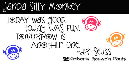
  3. FF Spoken Trial - Personal use only
  4. Dirty Money SRF by Stella Roberts Fonts, $25.00
    Dirty Money SRF is a novelty font with a limited character set emulating the lettering found on U.S. currency. The typeface was designed by Brad O. Nelson of the Brain Eaters Font Company. The net profits from my font sales help defer medical expenses for my siblings, who both suffer with Cystic Fibrosis and diabetes. Thank you.
  5. Easy Money JNL by Jeff Levine, $29.00
    The 1920s Art Nouveau movement spawned a number of beautiful hand lettered pieces of sheet music from that era. Attractive and narrow, the characters found on the title page of one such piece of music was the inspiration for Easy Money JNL.
  6. WIP Money Maker by WIP Fonts, $49.00
    WIP Money Maker depicts the handwriting of man with verve, strength of purpose and resoluteness. The (lower case) characters are joined as it is usual in German speaking countries. Originally designed in 1995 the font has been extended by a lot of new characters such as accented characters, punctuation, symbols and currency symbols.
  7. Mikeys Roman NF by Nick's Fonts, $10.00
    Here's an amalgam of letterforms from two giants of the handlettering pantheon: an uppercase based on the work of Mike Stevens, and a lowercase based on the work of Alf Becker. The two work in perfect harmony to create warm, friendly and engaging headlines. Both versions contain the complete Latin 1252, Central European 1250 and Turkish 1254 character sets.
  8. Take The Money by Kitchen Table Type Foundry, $15.00
    Take The Money is a wonky all caps font, made with a Sharpie pen. The name was inspired by something I read in the newspaper: apparently a Danish artist received €72.000 from a museum to create two works of art. The works of art should depict the average income of someone from Austria and someone from Denmark - in real money. The museum then loaned him the €72.000 and told him he'd receive €3.300 for his work. The artist decided that €3.300 would merely cover the costs, so he delivered two empty canvases and called the work: Take The Money And Run.
  9. Seven Monkey Fury BB - Personal use only
  10. Monkey Messed Gutenberg Caps by Intellecta Design, $22.90
    A collection of fonts by the type foundry Intellecta Design. Distressed and antique, use these fonts in display purposes for a stylized type design. Contains a limited amount of letter designs.
  11. Square Line Icons Money by Howcolour, $17.00
    The square icons focus on maximizing the meaning by minimizing the symbols. Let your viewers understand your data without disorientation. Use a metaphorical icon library, designed for fast, intuitive human recognition.
  12. HG Soei Kakupoptai by RICOH, $199.00
    HG創英角ポップ体は、水本恵子氏がデザインした「創英ポップ体1」を字母とする書体です。店頭広告用文字のスタイルを模して作られた書体で、楽しく、軽快な書体です。極太角ゴシックのイメージをベースに作られていますが、それをやや崩し、柔らかさも取り入れ、フリーハンドで書いたイメージを残しています。見やすくするため、ふところは可能な限り大きくなっています。店頭のPOP、チラシ、看板などに最適の書体です。 HG Soei Kakupoptai is a typeface with a "fresh pop" designed by Mr. Mizumoto Keiko. It is a typeface made by mimicing the style of letters for party-style, fun and light typefaces. It is made on the basis of the image of thickSoei Kakugothic, but it breaks it open, and incorporates softness, leaving the font looking freehand. To make it easy to see, the boldness has become as thick as possible. It is a typeface best suited for store-front fun, leaflets, signboards and so on.
  13. HG Soei Kakugothic by RICOH, $199.00
    HG創英角ゴシックLは、極細のゴシック体で、創英企画によるデザインです。シンプルな線で構成された現代的なゴシック体で、仮名が大きめに作られていて、全体的な印象はとても明るくカジュアルです。HG創英角ゴシックUBは、極太のゴシック体で、水本恵子氏のデザインです。仮名はHG創英角ゴシックLと比較すると小さめに設計されていて、現代的でありながらも、フォーマルさも合わせもっています。
  14. HG Soei Presence by RICOH, $199.00
    HG創英プレゼンスのデザインは、創英企画。横画が太い明朝体系の書体です。データ量を少なくするため、微妙な傾きや太さの変化を避け、始筆部や終筆部の飾りや、はらいの先端部、ゲタやはね、うろこなどの形状は、できる限り、直線化したり、単純化するなどの処理を行っています。そのため、シンプルですっきりとしたデザインの書体になっています。大きなサイズで使用したほうがよいでしょう。
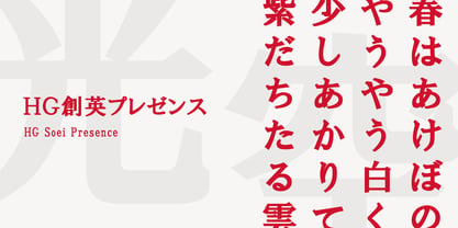
  15. Monkey In The Middle Ages by Intellecta Design, $24.90
    A collection of fonts by the type foundry Intellecta Design. Distressed and antique, use these fonts in display purposes for a stylized type design. Contains a limited amount of letter designs.
  16. Mikey Likes It Corpulent NF by Nick's Fonts, $10.00
    Fat and sassy, this ultrabold brush font is based on the works of lettering legend Mike Stevens as seen in his book, Mastering Layout. A natural choice for can't-miss headlines, this typeface also works surprising well for short blocks of body copy. Both the OpenType and Truetype versions of this font contain the complete Latin language character set (Unicode 1252) plus support for Central European (Unicode 1250) languages as well.
  17. Elpiedra by Dharma Type, $14.99
    Nothing ventured, nothing gained. Smokey and rough textured grunge font.
  18. Karnac - 100% free
  19. Ripple - Unknown license
  20. CA Saygon Text by Cape Arcona Type Foundry, $40.00
    CA Saygon Text is the logic consequence of CA Saygon. It is much calmer and therefore also suitable for reading texts and everyday’s editorial tasks. Basic shapes and proportions were adopted from Saygon and continued in such a way that a font family from Thin to Extrabold resulted. A fundamental inspiration were early static grotesque typefaces such as Akzidenz Grotesk. Nevertheless, the typeface was by no means intended to have a historical look. Thus, a relatively high x-height was chosen, which makes the typeface quite economical in type-setting, since the letters appear visually larger. A relatively small line spacing with good legibility can be achieved due to the small ascenders and the low cap height. Letters like f and t, which otherwise tend to end in curves, were given right angles, which on the one hand meets certain design elements of the original Saygon, but on the other hand also refers to contemporary trends in typeface design. A special feature are the five styles in which CA Saygon Text can be used. The default setting is the Helvetica style, with two-storey a and g. The Futura style has a single-storey a and a two-storey g accordingly. The third style with two-storey a and three-storey g is called the Franklin style. But the real highlight is the Cape style with single-storey a and three-storey g – a real rarity up to now. Let yourself be inspired by this unusual typeface. If you like it even more progressive, you should try the flat style, which continues the right angles in a, g, and y as well. Thanks to the Cyrillic and Latin Extended character sets, a huge linguistic area is covered that even extends to Vietnam! Even the exotic German capital-double-s is available and appears automatically when typed between other capital letters. Numerous OpenType features make life easier for the professional typographer: there are fractions, superscript and subscript numbers, as well as proportional and tabular capitals.
  21. Maassslicer - Unknown license
  22. Clarvoyant by Intellecta Design, $18.90
    Based on “Rough” lettering, by Ross F. George
  23. GALLEDIS - Unknown license
  24. RMU Kontrast by RMU, $30.00
    F. H. Schneidler’s ‚Kontrast‘, released by Weber in 1930, revived.
  25. Potbank by Asdesign, $50.00
    Like many cities in the Midlands and North of England, Stoke-on-Trent has a rich history linked to making and industry. In Stoke’s case it was pottery. In the early 1900s bottle kilns could be seen covering the landscape of the six towns making up Stoke-on-Trent with hundreds of factories producing some of the best ceramics in the world. But by the 1990s most of these had gone. Torn down for development of housing or just left to rot. During the next few decades Stoke continued to change. The industry was in a decline and Stoke itself was seen as another poor midlands city with a dwindling industry. Then in 2008, Spode, one of the largest and most famousceramics factories in Stoke entered into administration. Pens cast aside, drawings left half finished, designs left in the turned-off kilns; Spode factory was abandoned. This was a real shock and the way everything was getting thrown into skips to be put on the tip was heartbreaking. Thankfully people salvaged some of the technical drawings, sketch design, old sample pieces and ceramics that people hard worked so hard on. Potbank has been in development over a number of years taking inspiration from the heritage and designs from the ceramics industry. It has a mixed Clarendon and Antiqua style structure with its main purpose to be used as a printed type.
  26. Deco Blocks - Unknown license
  27. Clarendon Semi by Wooden Type Fonts, $15.00
    One of the classic display types of the 19th century, an Egyptian with bracketed serifs. There are many variants of this face and its uses are many, this a modified version lacking the teardrop or ball terminals on a, c, f, g, j, r, f, y.
  28. Schneider Kontrast by Intellecta Design, $9.00
    a naive interpretation of the F. H. Ernst Schneidler's art deco font...
  29. ITC Scram Gravy by ITC, $29.99
    The 1928 logotype for Sertal Toiletries consisted of a stylized woman's head, a very snaky S, and five fine, fat deco caps spelling out the rest of the brand name. From these five clues, designer Nick Curtis divined the rules" of the typeface and drew a complete alphabet, including a lower case. The result: ITC Scram Gravy. The finished product could be described as Bodoni on steroids. Tight curls in characters like the 'm,' 'r' and 'y' soften the lower case and give the design a light-hearted flavor. ITC Scram Gravy takes its name from one of many running gags in the screwball comic strip "Smokey Stover," which had folks alternately splitting their sides and scratching their heads from 1935 to 1973. Those familiar with Bill Holman's strip will recall Smokey's car, the Foomobile, and one of his famous nonsense declarations: "No foo-ling, that scram gravy ain't wavy.""
  30. Refuse - Unknown license
  31. Double Strike - Unknown license
  32. Fat Pixels - Unknown license
  33. wetalmorker - Unknown license
  34. Durango - Unknown license
  35. BlackForest - Unknown license
  36. Andromeda - Unknown license
  37. Fireworksfont - Unknown license
  38. Ambrosia - Unknown license
  39. ArtlookinOneType - Unknown license
  40. Village - Unknown license
Looking for more fonts? Check out our New, Sans, Script, Handwriting fonts or Categories
abstract fontscontact usprivacy policyweb font generator
Processing