10,000 search results
(0.08 seconds)
- Novia by VladB,
$12.00 Novia is a modern sans serif geometric font, includes upper and lower case characters, Latin, Cyrillic, Latin Extended symbols and other.
 - Konga Pro by RodrigoTypo,
$35.00 Konga is a typeface that was designed in 2012. Konga Pro version is a redesign and now includes Cyrillic And alternatives.
 - The Equestria_Cyrillic font, crafted by Neale Davidson, is a distinctive and playful font inspired by the magical realm of Equestria from the popular My Little Pony franchise. This typeface captures ...
- Better Together by Katsia Jazwinska,
$19.00 Take a look at Better Together, a four-font handwriting family, which was made to look great together in all possible combinations, but also work beautifully on their own. The family consists of: - Better Together Script - a charismatic script, which includes some double-lettered ligatures and alternates for several letters to make your texts look more authentic. - Better Together Condensed - a friendly, fun and quirky font which will give your project illustrative handmade feel. - Better Together Spaced - a specially spaced small font which will give your designs a handwritten feel and a modern aesthetic look. - Better Together Caps - a bold Uppercase font which is indispensable in all occasions where eye-catching headline needed. And one more thing! Each font includes cyrillic and international characters that support most European languages. Hope you like it!
 - Beneta by Linotype,
$29.99Karlgeorg Hoefer designed Beneta in 1991, inspired by the Littera beneventana, the script of the Benedictine scribes from the 10th to the 12th century. During this time, scribes began to use wider pens and set them at a 45 degree angle to the paper, which caused their scripts to have radical stroke contrasts. This script was mainly used for books and certificates but disappeared by the end of the 13th century. Beneta revives the characteristics of this historic script, changing a line of text into an almost ornamental space. Beneta should be used in middle to larger point sizes for shorter texts and headlines. - Amy by AVP,
$19.00 Developed from the simplest possible curves, Amy is a wide hand lettered style with tall straight ascenders and generously looped descenders. The capitals are centred horizontally with the lower case. A handful of ligatures helps copy to flow for easy reading and optional proportionally spaced numerals make the font suitable for quite lengthy chunks of copy.
 - Bernhard Brushscript SG by Spiece Graphics,
$39.00 This extremely heavy informal script was created in the early 1920s by Lucian Bernhard. Like so many of his designs, this typeface has its roots in his earlier poster work. Bernhard Brushscript invokes a rather warm, pleasant feeling despite a number of quirky characters. Originally created for the Bauer Foundry of Frankfurt, Germany, the face looks as though it’s been drawn with a brush and contains looping ascenders and descenders. Perfect for situations where a quaint and casual lettering effect is desired. The Bernhard Brushscript is also available in the OpenType Std format. Some new characters have been added to this OpenType version. Advanced features currently work in Adobe Creative Suite InDesign, Creative Suite Illustrator, and Quark XPress 7. Check for OpenType advanced feature support in other applications as it gradually becomes available with upgrades.
 - Mirabel by Canada Type,
$24.95 Mirabel is based on the handwriting of Beverly Bouwsma (Philip's mother), which she developed in the 1930s in, as she puts it, an act of teenage rebellion. In the 1960s, Philip gave her a broad-edged Osmiroid fountain pen which she took to immediately and has used ever since, along with the computer fonts he made from her script. Since Beverly Bouwsma mixed loops and straight ascenders, two interchangeable fonts have emerged, a formal package that sacrifices some flamboyance for classical balance and legibility, but retains the quality of the writing and celebrates the personality of its creator. The Mirabel fonts are available in all popular font formats, and the character sets cover a wide range of codepages, including Central and Eastern European languages, Esperanto, Turkish, Baltic, Celtic/Welsh.
 - Ablation by VP Creative Shop,
$20.00 Introducing Ablation Sans Serif Typeface - 6 weighs Ablation is casual, clean typeface that contains 6 weights to enchant your next project. They have basic latin, advanced latin, basic Cyrillic and advanced Cyrillic character sets. Very versatile fonts that works great in large and small sizes. Ablation is perfect for branding projects, home-ware designs, product packaging, magazine headers - or simply as a stylish text overlay to any background image. Uppercase, numeral, punctuation & Symbol Hairline Light Regular Bold Extra Bold Black Basic and advanced latin character sets Basic and advanced Cyrillic character sets Feel free to contact me if you have any questions! Mock ups and backgrounds used are not included. Thank you! Enjoy!
 - Alquitran Rust by RodrigoTypo,
$45.00 Alquitran Rust is a dirty version of Alquitran Pro thought of extreme sports, magazines, covers etc .. Alquitran Rust contains alternatives and Cyrillic.
 - The Closed Door by IsteFonts,
$10.00 The Closed Door is a high-contrast and condensed font which can be used for letterings, posters, logotypes. Font supports cyrillic characters.
 - GHEA Narek Serif by Edik Ghabuzyan,
$65.00 This font family can be used as Display as well as text font. The font family includes Armenian, Cyrillic and Latin alphabets.
 - Ivan Zemtsov by K-Type,
$20.00 The Ivan Zemtsov font is based on the lettering of Russian mailartist Ivan Zemtsov, and features both the Latin and Cyrillic alphabets.
 - Refuse Pro by The Type Fetish,
$25.00 Refuse has an extended Latin, extended Cyrillic and Greek alphabet so it will work with most languages in Europe and the Americas.
 - Priva Pro by DSType,
$26.00PrivaPro is available in four styles with italics. It includes Greek and Cyrillic characters, along with small caps, ligatures, alternates and swashes. - Mystical - Personal use only

- Struck Base PERSONAL USE ONLY PERSONAL USE ONLY - Personal use only

- AnjaliOldLipi - 100% free

- Adore by Canada Type,
$24.95 In 1939 the Stephenson Blake Company bought a very popular script called Undine Ronde and began marketing under the name Amanda Ronde. Although Undine/Amanda was quite popular and can be seen in many advertisements from the 1930s and 1940s, there seems to be no surviving record stating the original foundry or designer. We thought that six and half decades of dust layers over the once-popular typeface were enough, so here and now you have its complete and expanded digital incarnation, Adore. It is quite easy to see why this typeface was popular. A round script with graceful meaty curves is rarely found and can be used in plenty of applications. Wedding paraphernalia, chapter titles, posters, poetry, book covers, religious literature... you name it, Adore can fit it. Aside from its totality being unmatched by currently available designs, Adore also possesses some of the most unique and imaginative letter shapes. The narrow loops on the B, P and R, the minuscule-like Z, the looped b and d, the descending h... all these shapes contribute to a breathtaking and adorable calligraphic work unlike any other. The original design came in a basic alphabet, but we have updated it for current digital technologies, and expanded it to include plenty of alternates and ligatures, as well as some ornaments. The Postscript Type 1 and True Type versions come in two fonts, the second containing the alternates and extras, while the Open Type version is a single font containing all the alternates and extras in conveniently programmed features, easily accessible at the push of a button in OpenType-supporting software. We also encourage you to take a look at Typodermic's Mecheria font, which is further experimentation with the same letter forms, resulting in a quirky, friendly, curly, angular gothic-like creature.
 - TT Tsars by TypeType,
$39.00 TT Tsars useful links: Specimen | Graphic presentation | Customization options The TT Tsars font family is a collection of serif display titling fonts that are stylized to resemble the fonts of the beginning, the middle and the end of the XVIII century. The project is based on title fonts, that is, the fonts that were used to design book title pages. The idea for the project TT Tsars was born after a small study of the historical development of the Cyrillic type and is also based on Abram Shchitsgal’s book "Russian Civil Type". At the very beginning of the project, we had developed a basic universal skeleton for the forms of all characters in all subfamilies of the family, and later on, we added styles, visual features, artifacts and other nuances typical of the given period onto the skeleton. Yes, from the historical accuracy point of view it might be that such an approach is not always justified, but we have achieved our goal and as a result, we have created perfectly combinable serifs that can be used to style an inscription for a certain time period. The TT Tsars font family consists of 20 fonts: 5 separate subfamilies, each of which consists of 4 fonts. Each font contains 580 glyphs, except for the TT Tsars E subfamily, in which each font consists of 464 characters. Instead of lowercase characters in the typeface, small capitals are used, which also suggests that the typeface is rather a display than text one. In TT Tsars you can find a large number of ligatures (for Latin and Cyrillic alphabets), arrows and many useful OpenType features, such as: frac, ordn, sinf, sups, numr, dnom, case, onum, tnum, pnum, lnum, salt (ss01), dlig. Time-related characteristics of the subfamilies are distributed as follows: • TT Tsars A—the beginning of the 18th century (Latin and Cyrillic) • TT Tsars B—the beginning of the 18th century (Latin and Cyrillic) • TT Tsars C—the middle of the 18th century (Latin and Cyrillic) • TT Tsars D—the end of the 18th century (Latin and Cyrillic) • TT Tsars E—conditionally the beginning of the 18th century (only Latin) TT Tsars A and TT Tsars B families (both the beginning of the 18th century) have different starting points: for TT Tsars A it is Latin, for TT Tsars B it is Cyrillic. The development of the TT Tsars A family began in Latin, the font is based on the royal serif Romain du Roi. The Cyrillic alphabet is harmoniously matched to the Latin. The development of the TT Tsars B family began in Cyrillic, which is based on a Russian civil type. Characteristic elements are the curved one-sided serifs of triangular characters (A, X, Y), drops appear in the letter ?, the middle strokes ? and P are adjacent to the main stroke. Latin was drawn to pair with Cyrillic. It is still based on the royal serif, but somewhat changed: the letters B and P are closed and the upper bar of the letter A rose. This was done for the visual combination of Cyrillic and Latin and at the same time to make a distinction between TT Tsars A and TT Tsars B. TT Tsars C is now the middle of the 18th century. Cyrillic alphabet itself did not stand still and evolved, and by the middle of the 18th century, its forms have changed and become to look the way they are shown in this font family. Latin forms are following the Cyrillic. The figures are also slightly modified and adapted to the type design. In TT Tsars C, Cyrillic and Latin characters are created in parallel. A distinctive feature of the Cyrillic alphabet in TT Tsars C is the residual influence of the flat pen. This is noticeable in such signs as ?, ?, K. The shape of the letters ?, ?, ?, ? is very characteristic of the period. In the Latin alphabet, a characteristic leg appears at the letter R. For both languages, there is a typical C characterized by an upper serif and the appearance of large, even somewhat bolding serifs on horizontals (T, E, ?, L). TT Tsars D is already the end of the 18th century when with the development of printing, the forms of some Cyrillic characters had changed and turned into new skeletons of letters that we transposed into Latin. The figures were also stylized. In this font, both Cyrillic and Latin are stylistically executed with different serifs and are thus logically separated. The end of the century is characterized by the reduction of decorative elements. Straight, blueprint-like legs of the letters ?, R, K, ?. Serifs are very pronounced and triangular. E and ? are one-sided on the middle horizontal line. A very characteristic C with two serifs appears in the Latin alphabet. TT Tsars E is a steampunk fantasy typeface, its theme is a Latinized Russian ?ivil type (also referred to as Grazhdansky type which emerged after Peter the Great’s language reform), which includes only the Latin alphabet. There is no historical analog to this typeface, it is exclusively our reflections on the topic of what would have happened if the civil font had developed further and received a Latin counterpart. We imagined such a situation in which the civil type was exported to Europe and began to live its own life.
 - Bergamotte by Supfonts,
$15.00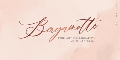 Bergamotte is a modern calligraphic font with exquisite accents. It is perfect for branding, wedding invitations and invitation cards and many more Font includes a full set of gorgeous uppercase and lowercase letters, numbers, a large selection of punctuation marks and ligatures, and Cyrillic support. Includes: Latin languages support Cyrillic languages support Uppercase and lowercase Numbers and punctuation Ligatures Check out my blog: https://www.instagram.com/di.zigner/ pinterest.com/dmitriychirkov7 Enjoy
 - Roller Hesoon by TypeClassHeroes,
$16.00 Retro and refined you can explore and combine creating rhythm for comfortable reading. Roller Hesoon supports more than 100 Latin-based languages and has extensive Cyrillic and Greek support for languages like Russian, Bulgarian, Ukrainian, and many more. Feature Uppercase & Lowercase Number & Symbol International Glyphs Multilingual support Alternative Ligature Cyrillic & Greek Feel free to drop us a message any time and follow my shop for upcoming updates. Hope you enjoy it.
 - Geson Bamer by TypeClassHeroes,
$14.00 Geson Baker is a retro font come with 80's retro style serif. Retro and refined you can explore and combine creating rhythm for comfortable reading. This font supports more than 100 Latin-based languages and has extensive Cyrillic and Greek support for languages like Russian, Bulgarian, Ukrainian, and many more. Feature Uppercase & Lowercase Number & Symbol International Glyphs (Cyrillic & Greek) Multilingual support Alternative Ligature Hope you enjoy it.
 - Etewut Serif by Etewut,
$35.00 Proudly introducing Etewut Serif family. Each font supports extended latin and basic cyrillic alphabet. There are many alternative symbols ligature and special characters.
 - Steinschrift Pro by RMU,
$35.00 Steinschrift Pro is a condensed sans serif font which comes with West and Central European as well as with a Cyrillic character set.
 - OT Puppy by Overtype,
$35.00 OT Puppy is a decorative and fun brush font. Include Latin 2 and Cyrillic 1 language set. Good for postcards, packaging and posters.
 - DearJoeHannes by JOEBOB graphics,
$29.00 A freely written handwriting font with a lot of ligatures added for credibility. The PRO version comes with Greek and Cyrillic glyph sets.
 - Angelviews by Jonahfonts,
$40.00 Angelviews a sans serif font with over 80 variations in the lower case, including Latin and Central European diacritics. Alternates in the lower case can be involked in ONE FELL SWOOP with the the Contextual Alternate Opentype feature (calt), or by selecting each single Alternate (aalt). There are some faint differences in the lower case glyphs but enough to give the designer a creative choice in texts or small captions.
 - Cervino by Typoforge Studio,
$29.00 Did you know that Cervino is the Italian name for one of the highest and most beautiful mountain in Europe - Matterhorn? Just like this majestic peak, our new family is HUGE. Cervino family consist of three width masters, with nine weights in each of them, giving the total amount of 54 instances. It is full of different features - from the wide set of numerals and math signs, by small caps to subscript and superscript. It covers full latin and Cyrillic script. Cervino would be a perfect choice for headlines, newspapers and for the longer texts as well.
 - Banco by Linotype,
$40.99 Designed for Linotype Library GMBH and the International Typeface Corporation in 1997 by Phil Grimshaw. Based on bold script Banco designed by French graphic and poster designer Roger Excoffon and released in 1952 by the Fonderie Olive. Originally Banco was an all-caps bold typeface, and the lower case and the corresponding light weight were created for ITC. The tapering slightly slanted strokes of Banco made by sharp-edged flat brush. The face has the effect of being quickly sketched by a powerful hand. For use in advertising and display typography. Cyrillic version developed for ParaType in 2000 by Tagir Safayev.
 - Helmswald Post by Sharkshock,
$125.00 Helmswald Post is a handsome Blackletter that's been years in the making. There's a mix of wispy terminals, flamboyant caps, and the use of negative space to create contrast. Elements from High German, Old English, and many other styles make their way into this gorgeous display font. The result is a medieval looking script with cleaner, more modern feel. In addition to European accents Helmswald Post is equipped with Cyrillic, alternates and ligatures. Old world numerals are present by default but may be substituted by accessing the stylistic sets. Use it for a book cover, web headings, or a restaurant logo.
 - Nolde by Brownfox,
$21.99 Nolde is a new titling typeface named after the German-Danish painter and printmaker Emil Nolde, one of the first artists to work in the Expressionist style. Not unlike the work of Nolde the artist, the seemingly rhythmical characters of Nolde the typeface conceal expressive tension of form and nervous line quality. While its letterforms hearken to the early-20th c. foundry types, this font makes a fresh and decidedly current impression, making it suitable for cutting-edge display use. Nolde capitals are available in two weights: regular and outline, and support over 60 languages that employ Latin and Cyrillic scripts.
 - UT Laurelle by Uniontype,
$20.00 Laurelle is a polished and smooth script family. The family consists of light, regular, bold and press styles. Laurelle provides advanced typographical support with contextual alternates, final forms, ligatures and swashes. This font also includes Cyrillic, with all OpenType features. It is most suitable for the headlines of all sizes, as well as for the text blocks. Laurelle is versatile and can be used on cards, posters, merchandise, book covers, websites, packaging, and basically anywhere you like. The overall feel of the font is warm, elegant and informal and it is perfect if you want to convey a sense of friendliness and style.
 - Propisi by ParaType,
$25.00The typeface was designed at ParaType (ParaGraph) in 1997 by Manvel Shmavonyan for Russian primary school sample writing schoolbooks. The typeface is based on script fonts presented in the book 'Rodnoy Mir' by. L.I.Tikunova. The first version of the font included just letters of Russian alphabet and basic set of figures and signs. The second version with extended set of alphabetic letterforms was developed in 2004 by Gennady Fridman. Current third version that covers full Cyrillic and Western code pages was prepared by Gennady Fridman and released in 2009. Medium style also was added by him in 2009. - Normative Pro by Green Type,
$37.00 Normative Pro is a sans-serif font family that includes a 12 styles (6 weight and italics), supports Latin, Cyrillic, Greek, Eastern European, Baltic and Turkish scripts. The family uses a large number of useful Open Type features: small caps, contextual alternatives, stylistic alternates, fractions, proportional and tabular figures and more. Normative Pro is a font with a wide sphere of application, legible from very small sizes to very large ones. Can be used both in technical documentation, office work, business communication, as well as in advertising, visual communication, magazines and posters, in branding and packaging.
 - Praho Pro by Picador,
$29.00 Praho Pro is a part of Warsaw Types – a project based on Warsaw’s local typographic heritage. The project, presented at the Museum of Praga, is a collaboration of 12 young Polish typographers. Praho Pro is a multilingual family inspired by the unique, historical character of Praga district of Poland's capital - Warsaw. High contrast, thin serifs, sharp terminals and large x-height are key features for distinctive headlines. The whole family consist of 9 weights and real italics, small caps, superscript and subscript letters, oldstyle, tabular figures and fractions. It covers latin and cyrillic script. Every weight has almost 2000 glyphs.
 - Lorna by FontaZY,
$30.00 Lorna by Fontazy is a rounded connected script of narrow proportion in both vertical and slanted styles. Lorna consist of six fonts (Light, Regular and Bold and matching italics). All fonts in the family have Latin (West, Central and Baltic) and Cyrillic encoding for multilingual support. Lorna has Contextual Alternates to keep a true connected handwriting look and plenty of Swashes Alternates and a bunch of Ligatures for striking appearance. Ampersand and copyright symbols have Stylistic variants (available from Glyph panel), figures made in Standard and Oldstyle variants. Lorna is perfect for all variety of print design, advertising, packaging, logo making, branding etc.
 - Kapra Neue Pro by Typoforge Studio,
$39.00 Kapra Neue Pro is a younger sister of Kapra Neue – he was the #1 bestselling Grotesque Sans released in 2017 on MyFonts and grandson of Kapra. Now you really have a lot of options to choose! New family is full of everything – 96 weights contain a wide range of instances, from Condensed to Expanded, everything with rounded corners or with sharp ones. Now, font has also: small caps, cyrillic script, and old-style figures. Kapra Neue Pro is inspired by a “You And Me Monthly” magazine, published by National Magazines Publisher RSW "Prasa” in Poland, from May 1960 till December 1973.
 - Grotica by Runsell Type,
$24.99 Grotica is a versatile geometric sans serif contains 7 weights from Thin to Bold. IIt's inspired by the beautiful logotype on old labels and by exploring the Retroica font we've created in 2020. This font is suitable for movies, TV, advertising, packaging, logos, posters, music, branding, posters and so on with a modern design style. With over 600 glyphs per style, Grotica supports around 150 languages in Latin and Cyrillic script. Grotica OpenType Features including alternate glyphs, fractions, contextual alternates, oldstyle and lining (proportional and tabular) numerals, numerators/denominators, superiors/inferiors, and a variety of symbols.
 - Casual Face by Letter Collective,
$12.00 Casual Face is a display variable font with a natural handwritten feeling. The font supports Latin and Cyrillic uppercase characters, numerals, and the main set of punctuation and symbols. The character of the font is based on the classic sign-painter casual script. The font’s option variability is upright and slanted letters up to 17 degrees. This enables the designer to define the gradient himself and be free to create designs suitable for advertising, packaging, and events. The font is perfect for headlines and personal products with casual characters and the mood conveyed is warm, and relaxed.


