2,303 search results
(0.008 seconds)
- SlabRoundSerif-Light - 100% free

- Delicate by Cubo Fonts,
$29.00 - FarHat-Quintas - Unknown license

- FarHat-Acordes - Unknown license

- FarHat-Acordes b y # - Unknown license

- Riparo - 100% free

- Speichel - 100% free

- Uchrony Cube - Personal use only

- Datura - Unknown license

- RNS Camelia - 100% free

- Bigplace ExtBd ExtCond - Personal use only

- BitchSlap - Unknown license

- SlabStruct Too - Unknown license

- Biotrip Serif - Personal use only

- Machauer - Unknown license

- Pegyptienne - Unknown license

- Liong by Dikas Studio,
$15.00
- Monthly Statement JNL by Jeff Levine,
$29.00
- Gallatin Medium by Wooden Type Fonts,
$15.00
- KG Holocene - Personal use only

- Card Characters - Unknown license

- Blix Black - Personal use only

- Lousitania - Unknown license

- Garota Serif - Personal use only

- Mementor Bold by Wooden Type Fonts,
$15.00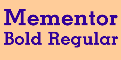
- Mementor Medium Regular by Wooden Type Fonts,
$15.00
- Video Black by Wooden Type Fonts,
$15.00
- Compado by Bogusky 2,
$34.50 - Tabaiba wild ffp - Personal use only

- Sainted Medium by Wooden Type Fonts,
$15.00
- Gallatin Bold by Wooden Type Fonts,
$45.00
- Diversa Std by DSType,
$10.00
- Metrolite by Jonahfonts,
$39.00
- Akimoto by Hiekka Graphics,
$29.00
- Kaluny Pro by Muykyta,
$12.00
- Tea Chest by Linotype,
$29.99 - Front Page Pro by Jonahfonts,
$45.00
- Zeebonk by Hanoded,
$15.00
- Buttercut by PizzaDude.dk,
$15.00
- Ristretto Pro by Mint Type,
$-


