10,000 search results
(0.035 seconds)
- American Christmas by Mans Greback,
$79.00 American Christmas is a funky and decorative season's typeface. As a cozy winter script, it brings a festive touch to every word, with letters that seem to dance joyously across the page. Its bold flow is reminiscent of retro holiday signage, evoking a sense of nostalgia and warmth. This typeface is adorned with stars that twinkle like lights on a tree, adding a sparkle to your seasonal greetings. This typeface family is provided in three starry versions and one clean, and also comes with an extra symbol font for beautiful Xmas icons. Use parenthesis symbols () [] {} to make stars around any word. Example: {Xmas}[Songs] Use underscore _ after any word to make a swash. Example: Santa_ Multiple underscores make longer tails. Example: Yuletide____ The font is built with advanced OpenType functionality and guaranteed top-notch quality, containing stylistic and contextual alternates, ligatures and more automatic and manual features; all to give you full control and customizability. It has extensive lingual support, covering all Latin-based languages, from North Europa to South Africa, from America to South-East Asia. It contains all characters and symbols you'll ever need, including all punctuation and numbers. With American Christmas, Mans Greback has crafted a typeface that captures the essence of the holiday spirit. Each character is designed to convey the excitement and heartfelt connection of the season, making it an ideal choice for those moments when you want your message to be wrapped in the warmth of the holidays.
 - Confitería by Sudtipos,
$39.00 Confitería is the Spanish word for a shop where sweets and chocolates are made and sold, which sometimes has a tea room. And now Confitería is also a font that brings to mind lettering piped on delicate cakes ... sweet but never sickly. This font captures something of that simple and innocent beauty of traditional confiterías, where good manners will never go out of fashion, menus are elegant and time comes to a standstill to make way for life’s little pleasures. A confitería is a perfect place to share sweet tidbits with a friend or date, eavesdrop on the conversation at the next table, read a book, or just people-watch from the window. I celebrated my last birthday at one. There is one iconic confitería in Buenos Aires that I love more than the rest because, some 60 years ago, it put up its marvellous sign and never took it down. Walking by it is sure to bring a smile to your face. It’s big. Very big. And the lettering in its name is written in a timelessly beautiful vertical script – the most attractive I have ever seen. I joined forces with Sol Matas – who worked with me to update the Montserrat font –to design this geometrical connected font with pleasant, even strokes. It is elegant and saccharine-free. And to top it off, it comes in several flavors. Welcome! What can we get you?
 - Caslon Graphique by ITC,
$29.99 The Englishman William Caslon punchcut many roman, italic, and non-Latin typefaces from 1720 until his death in 1766. At that time most types were being imported to England from Dutch sources, so Caslon was influenced by the characteristics of Dutch types. He did, however, achieve a level of craft that enabled his recognition as the first great English punchcutter. Caslon's roman became so popular that it was known as the script of kings, although on the other side of the political spectrum (and the ocean), the Americans used it for their Declaration of Independence in 1776. The original Caslon specimen sheets and punches have long provided a fertile source for the range of types bearing his name. Identifying characteristics of most Caslons include a cap A with a scooped-out apex; a cap C with two full serifs; and in the italic, a swashed lowercase v and w. Caslon's types have achieved legendary status among printers and typographers, and are considered safe, solid, and dependable. Caslon Antique was designed by Berne Nadall and brought out by the American type foundry Barnhart Bros & Spindler in 1896 to 1898. It doesn't bear any resemblance to Caslon, but has the quaint crudeness of what people imagine type looked like in the eighteenth century. Use Caslon Antique for that old-timey" effect in graphic designs. It looks best in large sizes for titles or initials. Caslon Black was designed by David Farey in the 1990s, and consists of one relatively narrow and very black weight. It is intended exclusively for titles or headlines. Caslon Black has a hint of the original Caslon lurking in the shadows of its shapes, but has taken on its own robust expression. Caslon Graphique was designed by Leslie Usherwood in the 1980s. The basic forms are close to the original Caslon, but this version has wide heavy forms with very high contrast between the hairline thin strokes and the fat main strokes. This precisely drawn and stylized Caslon has verve; it's ideal for headlines or initials in large sizes."
 - Stay Love by Din Studio,
$29.00 It can be a tough challenge to find a visually best font for your project as an inappropriate font may ruin the project and make it seem unprofessional and careless. Therefore, Stay Love, through which your project will be outstanding, is here for your perfect font to show lovely nuances and displays leaving the best impressions to your project. Stay Love designs are beautifully crafted to look as similar as the artistic humans’ handwritings for unique, interesting displays. The letters, which connect to each other to create continuity and consistency, have high contrasts to show clear differences between the thick and the thin parts of the letters for stronger and more legible writings. Moreover, the swinging letter ends can add feminine touches and elegant beauty to your designs, which you can use in big text sizes for a legibility reason. In addition, you may indeed enjoy the available features here. Features: Alternates Ligatures Multilingual Supports PUA Encoded Numerals and Punctuations Stay Love fits best for any design projects requiring artistic, elegant displays such as wedding invitations, greeting cards, merchandise designs, and more. For such artistic and elegant displays, this script font is also applicable for logo designs, posters, and packaging. Find out more ways to use this font by taking a look at the font preview. Thanks for purchasing our fonts. Hopefully, you have a great time using our font. Feel free to contact us anytime for further information or when you have trouble with the font. Thanks a lot and happy designing.
 - Morris Sans by Linotype,
$40.99 Morris Sans is a newly revised and extended version of a small geometric family of typefaces originally produced by Morris Fuller Benton in 1930 for ATF. His initial design consisted of an alphabet of squared capital letters with a unique twist that characterized its appearance: corners with rounded exteriors and right-angle interiors. The types were intended for use in the fine print found on business cards, banking or financial forms, and contracts. But over the ensuing decades, this design became a popular element in all sorts of design environments, and several foundries revived the typeface in digital form. Since digital fonts are bicameral, with slots for both upper and lowercase letters, new cuts of the type opted filled the lowercase slots with small caps. In 2006, Linotype commissioned its own version of the typeface-an extension for 21st century use. Under the advisement of Linotype's type director Akira Kobayashi, Dan Reynolds redrew the uppercase and added an original lowercase for the first time. Additionally, a number of extras were brought into the fonts, including six figure styles (tabular and proportional lining figures, tabular and proportional oldstyle figures, and special tabular and proportional small cap" figures). Small caps, which have become an iconic element over time, are accessible in each font as an OpenType feature. To differentiate this version from the original, Linotype's new family is named Morris Sans, in honor of Morris Fuller Benton. All fonts in the Morris Sans family are OpenType Com fonts; they include a character set capable of setting 48 European languages that employ the Roman alphabet, including all Central and Eastern Europe languages, those from the Baltics, and Turkish. This glyph coverage extends to the small caps as well. Morris Sans is a wide typeface, especially in its regular widths; the condensed faces set a more conventional line of text. The new lowercase letters are less geometric than the uppercase, except for those that share the same basic forms (e.g., c, o, and s). Instead of following this geometric trend, the new lowercase tends to strengthen the humanist elements that were present in several characters from the original type, including the uppercase D and the figures 5, 6, and 9. Morris Sans also sports a number of glyphic flares, like the stroke found on the original uppercase Q. Morris Sans is a clean, modern design best suited for headlines, advertising, posters, expressive signage (especially on storefronts), and corporate identity work."
 - Geometria by Brownfox,
$44.99 Although geometric Sans Serifs have been in vogue for nearly a century, they have never been as ubiquitous. It is not improbable that the old adage would be phrased: “When in doubt, set it in geometric sans”, had it been composed today. Have we not had enough? We think, not. Postmodern times demand a variety of expressions. The vision behind Geometria was to revisit the perennial favorite to lend subtle individuality to its tried and true forms. Geometria stands out in the crowd of similar fonts thanks to its complicated nature. It combines dynamic elements with a certain degree of stability. A slightly higher waistline of the capitals contributes to their distinctive appearance. If the upper case refers to the American grotesques of the 19th century, the lower case tends toward the forms of the Renaissance in its proportions. Geometria is a typeface of clean shapes that is well-suited for continuous reading, and it sets remarkably well. At the same time, it can be friendly, even flirtatious. Its distinct personality combines seeming opposites. At times it may appear serious, at times playful. On occasion, it may be deliberate, other times dynamic. It could seem rigid, then elegant. It is a typeface that could be perceived either as cutting-edge, or as nostalgic. A careful and discerning typographer will bring out and emphasize those aspects of its multifaceted personality that are needed to solve the problem at hand. Geometria consists of 24 fonts — eight weights with matching italics and narrow styles. The font includes multiple sets of figures and currency signs, alternate glyphs, a variety of experimental ligatures, and punctuation marks for the two cases. The 835 glyphs support 72 languages. Granshan 2013 award.
 - VLNL Bromfiets by VetteLetters,
$30.00 Vette Letters are thrilled to add maverick designer Dirk Uhlenbrock to the family, with the release of VLNL Bromfiets. Bromfiets (the Dutch word for moped) is a ‘holiday child’, the basic idea coming from a stop at a road junction in the Dutch coastal province of Zeeland. The Dutch signage, the black and white rings of traffic light poles, the symbols for brom- and snorfiets have always appealed to Dirk. While on vacation in Zeeland the first scribbles and digital drafts were created, always in mind that the typeface had to be striking, clear and friendly. The end result is more than that, a strong and instantly recognisable font with a matching dingbat weight full of icons and arrows. Stencil fonts have always interested Dirk, the informal character and the possible universal use as a paint- or spray-stencil on a wide variety of surfaces makes this type of font so interesting for me. The technically necessary dissolution of closed font contours always ensures a special aesthetic: What’HAT and HOW MUCH has to be removed or left, in order to make words easy to read and to avoid a fractal impression. Dirk Uhlenbrock has been working as graphic designer and illustrator in his hometown Essen, Germany for over 30 years. Always interested in typedesign he got in contact with Fontographer in 1996 and started to create and distribute loads of free fonts through his online platforms ‘Eyesaw’ and ‘Fontomas’. A bunch of these type experiments have been extented on request to complete fonts. Still located in Essen in 2009 Dirk started his second owner-based business erste liga büro für gestaltung - ersteliga.de
 - Maggie Sims by Gleb Guralnyk,
$15.00 Hello! Introducing a bold serif font — Maggie Sims. It's a decorative shape bold typeface with lot's of extra characters. Available ligatures and alternative letters helps to create an original lettering compositions. Please make sure that OpenType features are supported & enabled in your software. Maggie Sims Font has a multilingual support (check out a screenshot with available letters and signs). Thank you and wish you a peaceful sky!
 - Astegra by Great Studio,
$19.00 Astegra is a modern serif font with a unique ligature style, a high contrast and light font perfect for feminine logo signs, fashion heads & editorial designs, branding projects, Clothing Branding, packaging, magazine headings, advertising, T-shirts, postcards and much more. Astegra is also included full set of: Uppercase and lowercase letters Automatic ligatures for Uppercase and Lowercase Stylistic Alternates Multilingual characters Numerals Punctuation Thank you!
 - Second Reign by Mans Greback,
$59.00 Second Reign is a decorative medieval typeface. With borders and diamonds, this magic typeface of extreme variability brings us to glorious worlds in the golden times of epic sagas. Second Reign is the typeface of a viking king or a knight order. Use it for a Middle Ages game, a fantasy headline, or as a logotype for anything of historical theme. With usage in any modern software, the letters will automatically overlap and embrace in an elegant way. To make heraldic symbols, copy these icons: 🐉 🐎 👑 🗡 🦁 🦅 🦌 + ♖ × ✝ ⚓ * ⚔ † ‡ Alternatively write %A %B %C ... etc to create the heraldry. (Download required.) Dragon, Horse, Crown, Sword, Eagle, Deer, Cross, Anchor are some of the logos. Use [ ] for side borders. Example: [Royal⚔Thrones] The Second Reign family consists of four variations: The weight styles Thin, Medium and Bold, plus the decorated Border style. The font is built with advanced OpenType functionality and has a guaranteed top-notch quality, containing stylistic and contextual alternates, ligatures and more features; all to give you full control and customizability. It has extensive lingual support, covering Greek and Cyrillic, as well as all Latin-based languages, from North Europe to South Africa, from America to South-East Asia. It contains all characters and symbols you'll ever need, including all punctuation and numbers.
 - Address Sans Pro by Sudtipos,
$39.00 History is always in sight; it is constantly being reconsidered and reformulated in the context of now. We see approaches to art, fashion, textiles, homewares, furnishings … not to mention music, graphics and everything else that culturally enriches our daily lives, revisited and made anew for today. Address Sans indulges in the spirit and aesthetics of mid-century Modern – Italian industrial design, sleek coffee makers, stylish cars, seductive jazz pressed on vinyl – with a charm and charisma that defies time. It evokes history but is decisively created for today. Its design, in reality, is rooted in the condensed structure and block modulation of early 1950s German lettering intended for use in street signage, but when we started to work on the various weights and widths, the result was a set of fonts in a style similar to the typographic work developed by Butti and Novarese in the 60s. The multitude of potential applications for Address Sans then became clear. In a range of 3 widths and 8 weights each, Address Sans includes little verses, true italics, small caps and numerous alternative signs for a total of 48 fonts. The result is a functional typeface that is effortlessly seductive, with geometric features and design details that ooze cool, and take it away from mere reinterpretation towards typographic forms that adapt perfectly for contemporary use.
 - Directa Serif Variable by Outras Fontes,
$170.00 Directa Serif Variable is a text type family in one single font file. It explores new possibilities for the original type family released by Outras Fontes some years earlier, which is designed to save space with the highest readability. The variable font is composed of two axes of variation: Weight (100–900) and Italic (0–1). It also contains 18 predefined styles between Thin and Heavy and their respective italics. So now you can adjust the weight of the type by interpolating it in real time using any variable font compatible app. There are hundreds of possibilities between the values of 100 (Thin) and 900 (Heavy). And if you're feeling adventurous, you can also use the Italic axis to interpolate instances between Roman (0) and Italic (1) and see what happens in the middle. This new technology can be very useful for web and video animations. Directa Serif Variable is also highly recommended for newspapers, magazines, corporate communication and so on. It has a large set of characters, including Western, Central European, Baltic, Scandinavian, Icelandic, Romanian and Turkish unicode ranges. The variable font also includes several ligatures, a complete set of small caps, sets of lining, old style and tabular figures, as well as fractions, superior and inferior numbers. These features can be easily accessed using any OpenType-compatible software.
 - Barbou by Besnowed,
$19.99 Barbou was originally cut in 1925 by Monotype as a counterpart to Fournier, siblings that were different in design but both based on the work of Pierre-Simon Fournier. Whether by choice, accident or oversight, Fournier was preserved digitally, and Barbou was lost to history. Barbou was notably used by Stanley Morrison, in particular as the face of The Fleuron. I fell in love with Barbou when I saw it, and knew that I wanted to bring it to a new generation of designers and readers. This is a revival of Barbou, a faithful recutting with new weights, characters and many of the best features that modern font technology brings. Particular attention was paid to the original Monotype Barbou 178 specimen sheet. Originally only available in a single weight, Barbou has been recut with a variable weight, providing a large degree of flexibility between Regular and Bold. Barbou excels as a comfortable reading face for books, and the variable weight allows you to fine tune the darkness and texture of the page in a way never before possible. Barbou has a distinctive softness, and this revival of Barbou preserves much of the effect the medium of metal type had on the letterforms. This results in a subtly rounded yet defined type, elegant not worn, with the utmost attention and respect to the smallest of details. Barbou was originally cut with disparate x-heights for roman and italic, and this revival of Barbou features both the original italic, as well as a new italic redesigned at the same height as the roman. In Fournier’s time, roman and italic would not be mixed on the same line, but the type must change to meet the needs of a new generation. Barbou also features unique ligatures and alternates, old style numbers, small caps and a full Greek alphabet. Barbou is perfect for books and anywhere a comfortable reading face is required, and excels in flexibility.
 - Neon Backlight by Ditatype,
$29.00 Neon Backlight is a stunning display font that brings the mesmerizing beauty of neon lights to your typography. With its bold uppercase letterforms and a luminous backlight, this typeface demands attention, creating a captivating visual experience that leaves a lasting impression. The defining feature of Neon Backlight lies in its vibrant neon backlight effect. Each letter is imbued with a radiant glow that casts a captivating hue, evoking the nostalgic charm of neon signs illuminating the night. The luminous backlight adds depth and dimension, creating a sense of depth that draws the viewer in. Inspired by the enchanting allure of neon lights, Neon Glow exudes a futuristic energy. The font captures the vibrant spirit of urban nightlife and the excitement of bustling city streets. The neon glow infuses each letter with an electrifying aura, creating a striking visual impact that is both contemporary and timeless. Each letter of Neon Backlight is carefully crafted to balance the neon aesthetic with legibility. The uppercase characters are bold and easily recognizable, ensuring your message remains clear and impactful. The neon backlight enhances the overall composition, making the font truly come alive with an irresistible glow. Features: Ligatures Multilingual Supports PUA Encoded Numerals and Punctuations Neon Backlight thrives in designs that embrace a dynamic and vibrant style. Whether you're creating posters, signage, logos, or digital artwork, this font will add a dazzling element that sets your project apart. It particularly shines in applications related to nightlife, entertainment, fashion, and retro-themed designs. The bold strokes and clean lines exude confidence, making this font perfect for headlines, titles, and statements that demand attention. Find out more ways to use this font by taking a look at the font preview. Thanks for purchasing our fonts. Hopefully, you have a great time using our font. Feel free to contact us anytime for further information or when you have trouble with the font. Thanks a lot and happy designing.
 - Reina Neue by Lián Types,
$29.00 Hey! See Reina Neue in action here! INTRODUCTION When I designed the first Reina¹ circa 2010, I was at the dawn of my career as a type designer. The S{o}TA, short for the Society of Typographic Aficionados, described it as complex display typeface incorporating hairline flourishes to a nicely heavy romantic letterform². And it was like that; that’s what I was pursuing at that time since I was very passionate about ornaments and accolades of Calligraphy. Why? I felt that Typography, in general, needed more of them. These subtle flourishes could breathe life into letters. Maybe, I thought it was the only way I could propose something new into the field of type. However, after some years, I came across a very interesting quote: –Beautiful things don’t ask for attention– Wow! What did this mean? How could something be attractive if it’s not actually showing it. Could this be applied to my work? Sure. I think every type-designer goes through this process (aka crisis) regarding his or her career. At the beginning we love everything. We are kind of blind, we only see the big picture of a project. And that’s not because we are lazy. We actually can’t see the small mistakes nor the subtleties that make something simpler beautiful. We are not able. But, the small subtleties… They are actually everything: With experience, one puts more attention into the details and learns that every single decision in type has to be first meticulously planned. Here I am now, introducing a new Reina, because I felt there was a lot of it that could be improved, also the novelty of Variable Fonts caught my attention and I had to take that to my type library. THE FONT A thing of beauty is a joy forever Now, a decade later, I’m presenting Reina Neue. This font is not just an update of its predecessor: –A thing of beauty is a joy forever– is the first line of the poem ‘Endymion’ by John Keats, and despite the meaning of “beauty” may vary from person to person, and even from time to time (as read in the last paragraph), with Reina I always wanted to bring joy to the eye. In 2010, and now, in 2020. I believe the font is today much better in every aspect. It was entirely re-designed: Its shapes and morphology in general are much more clean and pure. The range of uses for it is now wider: While the old Reina consisted in just one weight, Reina Neue was converted into a big family of many weights, even with italics, smallcaps and layered styles. The idea behind the font, this kind of enveloping atmosphere made out of flourishes, is still here in the new Reina. This time easier to get amazing results due to the big amount of available alternates per glyph and also more loyal from a systemic point of view. However, and as read in the introduction -Beautiful things don’t ask for attention-, if none of the flourishes are activated the font will look very attractive anyway. Reina Neue is ready to be used in book covers, magazines, wedding cards, dazzling posters, storefronts, clothing, perfumes, wine labels and logos of all kind. Like it happened with the previous Reina, I hope this new font satisfies every design project around the world if used, and can be a joy forever. SOME INSTRUCTIONS Before choosing the right style for your project, hear my advice: -Reina Neue Display was meant to be used at big sizes. If you plan to print the font smaller than 72pt, I suggest using Reina Neue, not Display. Otherwise, if the font will be BIG or used on a digital platform, Reina Neue Display should be your choice. For even smaller sizes, use Reina Neue Small. This style was tested and printed in 12pt with nice results. (Note for variable fonts: Print them in outlines) -Reina Italic is not a slanted version of the roman, and this means some flourishes are different between each other. The Italic version has other kind of swirls. More conservative, in general. -All the styles of Reina Capitals have Small Capitals inside. -Reina Capitals Shine should be used/paired ONLY with Reina Capitals Black. The engraved feeling can be achieved if Reina Capitals Black and Reina Capitals Shine are used as layers, with the same word. Variable fonts instructions: -For more playful versions, choose Reina Neue VF, Reina Neue Italic VF or Reina Neue Capitals VF: With them you can adjust between 3 axes: Weight (will change the weight of the font) – Optic Size (will thicken/lighten the thin strokes and open/close the tracking) – Accolades (will modify the weight of the active flourishes). SOME VIDEOS OF REINA NEUE VF https://youtu.be/8cImmT5bpQM https://youtu.be/1icWfPmKAkg https://youtu.be/YC9GkJDL1a8 NOTES 1. The original Reina, from a decade ago: https://www.myfonts.com/fonts/argentina-lian-types/reina/ 2. In 2011, Reina received an honourable mention by S{o}TA. “Great skill is shown in the detailing, and an excellent feel for the correct flow of curves and displacement of stroke weight.” https://www.typesociety.org/catalyst/2011/ Reina was featured in the “Most Popular Fonts of the year” in MyFonts in 2011 https://www.myfonts.com/newsletters/sp/201201.html In 2012, the font was also selected in Tipos Latinos, the most prestigious competition of type in Latinoamerica. https://www.tiposlatinos.com/bienales/quinta-bienal-tl2012/resultados Also, chose as a “Favorite font of the year” in Typographica. https://typographica.org/typeface-reviews/reina/
 - Brendisa by Jamalodin,
$20.00 Brendisa Script is modern calligraphy script font, every single letters has been carefully crafted to make your text looks beautiful. With modern script style this font will be perfect for many different project, examples: invitations, greeting cards, posters, name card, quotes, blog header, branding, logo, fashion, apparel, letter, stationery and more! Brendisa Script come with 540+ glyphs. The alternative characters were divided into several Open Type features such as Swash, Stylistic Sets, Stylistic Alternates, Contextual Alternates. The Open Type features can be accessed by using Open Type savvy programs such as Adobe Illustrator, Adobe InDesign, Adobe Photoshop Corel Draw X version, and Microsoft Word. And this Font has given PUA unicode (specially coded fonts) so that all the alternate characters can easily be accessed in full by a craftsman or designer. Brendisa Script : Uppercase & Lowercase International Language & Symbols Support Punctuation & Number PUA Unicode Range Standard Stylistic Alternates Stylistic Set 1-13 Character Variant Contextual If you don't have a program that supports OpenType features such as Adobe Illustrator and CorelDraw X Versions, you can access all the alternate glyphs using Font Book (Mac) or Character Map (Windows). If you have any question, don't hesitate to contact me by email: jamalodin11@gmail.com
 - Boutinela Script by Jamalodin,
$16.00 Boutinela Script is modern calligraphy script font, every single letters has been carefully crafted to make your text looks beautiful. With modern script style this font will perfect for many different project, example: invitations, greeting cards, posters, name card, quotes, blog header, branding, logo, fashion, apparel, letter, stationery and more! Boutinela Script come with 740+ glyphs. The alternative characters were divided into several Open Type features such as Swash, Stylistic Sets, Stylistic Alternates, Contextual Alternates. The Open Type features can be accessed by using Open Type savvy programs such as Adobe Illustrator, Adobe InDesign, Adobe Photoshop Corel Draw X version, And Microsoft Word. And this Font has given PUA unicode (specially coded fonts). so that all the alternate characters can easily be accessed in full by a craftsman or designer. Boutinela Script : Uppercase & Lowercase International Language & Symbols Support Punctuation & Number PUA Unicode Range Standard Stylistic Alternates Stylistic Set 1-25 Character Variant Contextual. If you don't have a program that supports OpenType features such as Adobe Illustrator and CorelDraw X Versions, you can access all the alternate glyphs using Font Book (Mac) or Character Map (Windows). If you have any question, don't hesitate to contact me by email: jamalodin11@gmail.com. Thanks for your visit :-)
 - Dearly Rose by Jamalodin,
$17.00 Dearly Rose Script is a modern calligraphy script font, every single letters has been carefully crafted to make your text look beautiful. With modern script style this font will be perfect for many different project, example: invitations, greeting cards, posters, name card, quotes, blog header, branding, logo, fashion, apparel, letter, stationery and more! Dearly Rose Script come with 540+ glyphs. The alternative characters were divided into several Open Type features such as Swash, Stylistic Sets, Stylistic Alternates, Contextual Alternates. The Open Type features can be accessed by using Open Type savvy programs such as Adobe Illustrator, Adobe InDesign, Adobe Photoshop Corel Draw X version, And Microsoft Word. And this Font has given PUA unicode (specially coded fonts). so that all the alternate characters can easily be accessed in full by a craftsman or designer. Dearly Rose Script : Uppercase & Lowercase International Language & Symbols Support Punctuation & Number PUA Unicode Range Standard Stylistic Alternates Stylistic Set 1-17 Character Variant Contextual. If you don't have a program that supports OpenType features such as Adobe Illustrator and CorelDraw X Versions, you can access all the alternate glyphs using Font Book (Mac) or Character Map (Windows). If you have any question, don't hesitate to contact me by email: jamalodin11@gmail.com Thanks for your visit.
 - Evita by ITC,
$29.99Gérard Mariscalchi is a self-made designer. Born in Southern France of a Spanish mother and an Italian father, he has worked as a mechanic, salesman, pilot, college teacher – even a poet (with poetry being the worst-paying of these professions, he reports.) “Throughout all this, the backbone of my career has always been design,” Mariscalchi says. “I’ve been drawing since I was five, but it wasn’t until I was twenty-four that I learned that my hobby could also help me earn a living.” It was about this same time that Mariscalchi fell in love with type. He studied the designs of masters like Excoffon, Usherwood and Frutiger, as well as the work of calligraphers and type designers such as Plantin, Cochin and Dürer. With such an eclectic background, it’s no surprise that Mariscalchi’s typeface designs are inspired by many sources. Baylac and Evita reflect the style of the art nouveau and art deco periods, while Marnie was created as an homage to the great Lithuanian calligrapher Villu Toots. However, the touch of French elegance and distinction Mariscalchi brings to his work is all his own. Baylac Who says thirteen is an unlucky number? Three capitals and ten lowercase letters from a poster by L. Baylac, a relatively obscure Art Nouveau designer, served as the foundation for this typeface. The finished design has lush curves that give the face drama without diminishing its versatility. On the practical side, Baylac’s condensed proportions make it perfect for those situations where there’s a lot to say and not much room in which to say it Evita Mariscalchi based the design of Evita on hand lettering he found in a restaurant menu, and considers this typeface one of his most difficult design challenges. “The main problem was to render the big weight difference between the thin and the thick strokes without creating printing problems at small point sizes,” he says. Unlike most scripts, Evita is upright, with the design characteristics of a serif typeface. Mariscalchi named the face for a close friend. The end result is a charming design that is light, airy, and slightly sassy. Marnie Based on Art Nouveau calligraphic lettering, Marnie is elegant, inviting, and absolutely charming. Mariscalchi paid special attention to letter shapes and proportions to guarantee high levels of character legibility. He also kept weight transition in character strokes to modest levels, enabling the face to be used at relatively small sizes – an unusual asset for a formal script. Marnie’s capital letters are expansive designs with flowing swash strokes that wrap affectionately around adjoining lowercase letters. The design easily captures the spontaneous qualities of hand-rendered brush lettering. - Baylac by ITC,
$29.99Gérard Mariscalchi is a self-made designer. Born in Southern France of a Spanish mother and an Italian father, he has worked as a mechanic, salesman, pilot, college teacher – even a poet (with poetry being the worst-paying of these professions, he reports.) “Throughout all this, the backbone of my career has always been design,” Mariscalchi says. “I’ve been drawing since I was five, but it wasn’t until I was twenty-four that I learned that my hobby could also help me earn a living.” It was about this same time that Mariscalchi fell in love with type. He studied the designs of masters like Excoffon, Usherwood and Frutiger, as well as the work of calligraphers and type designers such as Plantin, Cochin and Dürer. With such an eclectic background, it’s no surprise that Mariscalchi’s typeface designs are inspired by many sources. Baylac and Evita reflect the style of the art nouveau and art deco periods, while Marnie was created as an homage to the great Lithuanian calligrapher Villu Toots. However, the touch of French elegance and distinction Mariscalchi brings to his work is all his own. Baylac Who says thirteen is an unlucky number? Three capitals and ten lowercase letters from a poster by L. Baylac, a relatively obscure Art Nouveau designer, served as the foundation for this typeface. The finished design has lush curves that give the face drama without diminishing its versatility. On the practical side, Baylac’s condensed proportions make it perfect for those situations where there’s a lot to say and not much room in which to say it Evita Mariscalchi based the design of Evita on hand lettering he found in a restaurant menu, and considers this typeface one of his most difficult design challenges. “The main problem was to render the big weight difference between the thin and the thick strokes without creating printing problems at small point sizes,” he says. Unlike most scripts, Evita is upright, with the design characteristics of a serif typeface. Mariscalchi named the face for a close friend. The end result is a charming design that is light, airy, and slightly sassy. Marnie Based on Art Nouveau calligraphic lettering, Marnie is elegant, inviting, and absolutely charming. Mariscalchi paid special attention to letter shapes and proportions to guarantee high levels of character legibility. He also kept weight transition in character strokes to modest levels, enabling the face to be used at relatively small sizes – an unusual asset for a formal script. Marnie’s capital letters are expansive designs with flowing swash strokes that wrap affectionately around adjoining lowercase letters. The design easily captures the spontaneous qualities of hand-rendered brush lettering. - Marnie by ITC,
$29.99Gérard Mariscalchi is a self-made designer. Born in Southern France of a Spanish mother and an Italian father, he has worked as a mechanic, salesman, pilot, college teacher – even a poet (with poetry being the worst-paying of these professions, he reports.) “Throughout all this, the backbone of my career has always been design,” Mariscalchi says. “I’ve been drawing since I was five, but it wasn’t until I was twenty-four that I learned that my hobby could also help me earn a living.” It was about this same time that Mariscalchi fell in love with type. He studied the designs of masters like Excoffon, Usherwood and Frutiger, as well as the work of calligraphers and type designers such as Plantin, Cochin and Dürer. With such an eclectic background, it’s no surprise that Mariscalchi’s typeface designs are inspired by many sources. Baylac and Evita reflect the style of the art nouveau and art deco periods, while Marnie was created as an homage to the great Lithuanian calligrapher Villu Toots. However, the touch of French elegance and distinction Mariscalchi brings to his work is all his own. Baylac Who says thirteen is an unlucky number? Three capitals and ten lowercase letters from a poster by L. Baylac, a relatively obscure Art Nouveau designer, served as the foundation for this typeface. The finished design has lush curves that give the face drama without diminishing its versatility. On the practical side, Baylac’s condensed proportions make it perfect for those situations where there’s a lot to say and not much room in which to say it Evita Mariscalchi based the design of Evita on hand lettering he found in a restaurant menu, and considers this typeface one of his most difficult design challenges. “The main problem was to render the big weight difference between the thin and the thick strokes without creating printing problems at small point sizes,” he says. Unlike most scripts, Evita is upright, with the design characteristics of a serif typeface. Mariscalchi named the face for a close friend. The end result is a charming design that is light, airy, and slightly sassy. Marnie Based on Art Nouveau calligraphic lettering, Marnie is elegant, inviting, and absolutely charming. Mariscalchi paid special attention to letter shapes and proportions to guarantee high levels of character legibility. He also kept weight transition in character strokes to modest levels, enabling the face to be used at relatively small sizes – an unusual asset for a formal script. Marnie’s capital letters are expansive designs with flowing swash strokes that wrap affectionately around adjoining lowercase letters. The design easily captures the spontaneous qualities of hand-rendered brush lettering. - DT Paper Type by Dragon Tongue Foundry,
$9.00 DT PaperType has evolved and morphed over time from quite distant origins. I previously created DT Paperside. It was neither Papyrus nor SSI Countryside, but was inspired in some ways by the Papyrus form, although untextured and smoother, and had the more open dimensions and proportions, similar to that of Countryside SSi, with its larger easily readable lowercase body, and more consistent, shorter stems. DT Paperside had an open scripted feel which was pleasing to the eye and easy to read. DT PaperType has since been crafted from of the original Paperside font. The Organic flow and comfortable form of Paperside has been retained, but it has been shifted very much from the feel of a script font, into a quality, extremely readable, organic and friendly, serif font, retaining its clarity, while adding a great deal of pose and class. This font is primarily suited to body text, and as such is extremely readable. It does however also make an excellent Display font, and comes with a full set of over sized Caps that drop below the line to stand out on a headline when required. Paperside can also automatically enhance the first letter of most sentences, and changes other letters to suit their position within words, and the letters they appear beside. Now comes with an italic that curves and softens various letters. For best results, use this ‘smart font’ with Contextual Ligatures turned on. Mulitiple Stylistic Alternatives are included. Inspiration for this fonts predecessor (Paperside) came from two other fonts. Papyrus: designed by Chris Costello and created in 1982, it is a hand-drawn textured typeface, emulating texts written in biblical times. One of the most used (and misused) fonts of all times. Owned by Letraset, and currently published by the Internation Typeface Corporating (ITC). Countryside SSi: The serif font of an unknown designer, currently licensed by Southern Software Inc. Feel free to preview some other Dragon Tongue fonts that are yet to be released, at https://www.dragon-tongue.com/fonts
 - Amiline by Afkari Studio,
$15.00 Amiline Handwritten Signature Font Amiline Handwritten Signature Font is a Signature Handwriting Font script that makes with natural line handwriting. This font is suitable for any branding of your design needs, wedding invitation, romantic project, studio brand, logo, invitations, social media posts, clothing, invitation, poster, cafe/resto sign and others. Features; - Uppercase, Lowercase, Number, and Punctuation - Standart and Special Ligatures - Works on PC & Mac - Simple installations - Accessible in Adobe Illustrator, Adobe Photoshop, Adobe InDesign, even work on Microsoft Word - Fully accessible without additional design software. - Mültîlíñgúãl Sùppört for; ä ö ü Ä Ö Ü ß ¿ ¡ etc. Hope you enjoy our font and this font is useful for your projects!
 - Rages by Gassstype,
$23.00 Here comes a New font,Introducing Rages It's A Rough Brush Font is a Strong Style and classy style, this font is great for your creative projects such as watermark on photography, and perfect for logos & branding, invitation,advertisements,product designs, stationery, wedding designs,label ,product packaging, special events or anything that need handwritting taste. Rages a natural Hand Drawn feel. This handmade font will make your design has a beautiful natural touch for each details. It is perfect for any design project as Invitation,logo, book cover, craft or any design purposes,photos, photography overlays, signs, window art, scrapbooking, tags and so much more!
 - Judgemental Guys by Gassstype,
$23.00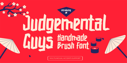 Hello Everyone,introduce our new product Judgemental Guys - Handmade Brush Font is a Signature Style and classy style, this font is great for your creative projects such as watermark on photography, and perfect for logos & branding, photography, invitation, watermark,advertisements,product designs, stationery, wedding designs,label ,product packaging, special events or anything that need handwritting taste. Judgemental Guys a natural handwritten feel. This handmade font will make your design has a beautiful natural touch for each details. It is perfect for any design project as Invitation,logo, book cover, craft or any design purposes,photos, photography overlays, signs, window art, scrapbooking, tags and so much more!
 - Minomisse by Gassstype,
$23.00 Hello Everyone, introduce our new product Font Minomisse is Playful Handwritten Font is a Authentic Style and classy style, this font is great for your creative projects such as watermark on photography, and perfect for logos & branding, invitation,advertisements,product designs, stationery, wedding designs,label ,product packaging, special events or anything that need handwritting taste. Minomisse a natural handwritten feel. This handmade font will make your design has a beautiful natural touch for each details. It is perfect for any design project as Invitation,logo, book cover, craft or any design purposes. photos, photography overlays, signs, window art, scrapbooking, tags and so much more! This font is PUA encoded which means you can access all of ligatures.
 - Playvictim by Gassstype,
$22.00 Here comes a New font,Introducing Playvictim is Bad Brush Font ,This Authentic Style and classy style, Cute Cartoon Font,Bold Display , Inspired from Modern logos of brands that have very strong characteristics, this font is great for your creative projects such as watermark on photography, and perfect for logos & branding, invitation,advertisements,product designs, stationery, wedding designs,label ,product packaging, special events or anything that need handwritting taste. Playvictim a natural Hand Drawn feel. This handmade font will make your design has a beautiful natural touch for each details. It is perfect for any design project as Invitation,logo, book cover, craft or any design purposes,photos, photography overlays, signs, window art, scrapbooking, tags and so much more!
 - Mono Spec Stencil by Halbfett,
$30.00 Mono-Spec Stencil is a monospaced family of sans-serif type. At least in default settings, all characters across the typeface share a common width, which is immediately noticeable for its condensed nature. Mono-Spec Stencil is a sibling of a non-stencil family, simply named Mono-Spec. Characters in each are just as wide, allowing Mono-Spec Stencil to be used together with Mono-Spec, as a secondary typeface. As a typeface whose characters are stencil-shaped, this design channels the spirit of resistance and street culture. When you look at the family, remember that it ships in two different formats. Depending on your preference, you can install the typeface as a single Variable Font or use the family’s five static OpenType font files instead. Those weights run from Light through Bold. While the static-format fonts offer a good intermediary-step selection, users who install the Variable Font have vastly greater control over their text’s stroke width. The Mono-Spec Stencil Variable Font’s weight axis allows users to differentiate between almost 1,000 possible font weights. That enables you to fine-tune your text’s exact appearance on-screen or in print. Whatever format you choose, the Mono-Spec Stencil fonts are equipped with several OpenType features. The most striking of these can be activated via a Stylistic Set. That will replace several letters – like “B”, “E”, “F”, “H”, and “I” with double-width alternates. Those alternates take up as much space as two characters placed next to each other otherwise word. The effect of Mono-Spec Stencil’s double-width alternates is striking, and their use strikes a strong chord in any display typography applying them.
 - Dusty Hands by Bogstav,
$18.00 Dusty Hands - my crunchy legible comic font, originally with a fat marker and then digitally manipulated. I've made 3 versions for you, and they all fit like a glove - use them as they are, or do some layered effects. All versions have the "contextual alternates magic" - and in this case it means 4 slightly different versions of each lowercase letter.
 - Akceler by Adtypo,
$45.00 Many sport publications missed typefaces designed especially for sport communication conditions. We usually see only mechanically slanted or other synthetically destroyed standard typefaces. I want to fill in this space and create a system of fonts, that will be used primarily in sport. It is usable for many prints - logotypes, magazines, catalogues, posters etc. Elasticity of glyphs reflected an adrenalinous shapes of latest bikeframes, skies or sportcars. Maximum open arches guaranteed good readability in very small sizes and prevented interchanges of glyphs „o, c, e“ per poor reading conditions. Softness of lowercase is at uppercase balanced in bottom arches, that are subtly kicked-up. Numerals are an important component of sport communication, so this font offers expressive design, different from numerals of book typefaces. Every font has 9 kinds of numerals. Character case contains over 1000 glyphs, sport icons and othes signs creating the sport feeling. The font name, Akceler, represents acceleration, which is characteristic attribute of this typeface. It’s suitable for display and text usage, too. To see more please visit the PDF specimen. ■24 styles (2 alternatives, 3 grades of dynamics, 4 weights) ■over 1 000 glyphs per font ■9 kinds of numerals ■icons of sport equipment ■8 stylistic sets ■8 kinds of arrows ■23 OT features ■support of latin languages
 - MVB Diazo by MVB,
$59.00 Mundane information—the sort you might ignore—often appears in the form of very simple, utilitarian lettering, devoid of personality, the sort of industrial lettering you find on old blueprints, park restrooms, and electrical boxes. MVB Diazo is such a thing. It looks like lettering done earnestly with a plastic template. The monoline caps—constructed from straight lines and simple curves—have rounded details as if rendered by a blunt pen on a topographical survey or by a router on a rustic campground sign. The MVB Diazo fonts are compact, available in two widths: Condensed and Extra Condensed. Each width offers four weights from Light to Black. The fonts are perfect for wherever plain and boring letterforms are required. All widths and weights are also available in two distressed textures (#1 and #2) that accentuate the industrial character of the design. Rough #1 is gritty, with finer texture for use at larger sizes. Rough #2 exhibits more damage, the roughness apparent when used at smaller sizes. The Rough fonts include alternates of a number of glyphs so that variation of texture is possible when letters repeat in a word.
 - Signal1885 by astroluxtype,
$20.00 Signal1885 is the abbreviated name for "(Sig)nature Jour(nal)" a font that harkens back to an era, when fine handwriting filled journals with observations of science and adventure. Intimate and reflective of an individual entering his thoughts in his personal journal or a ship’s captain documenting his voyage on a daily basis. Signal1885 is penmanship that reflects hand forms from by-gone days. Its a minimal glyph set which can be used at various sizes as small as 18 points. It includes a selection of ink drips and smudges, that are the “mark” of a hand done entry. These can be placed in strategic places on the type to indicate a hand dragging through or dripping fresh ink on to the paper. Set sail- and keep a diary of your voyage.
 - Vintage Feeling by Nathatype,
$29.00 Looking for a font that’ll make your branding radiate elegance? Something that’s versatile, stylish, and eternal? Get ready to transcend to a world of magic, laughter, and butterflies. Your branding will spark delight and engage everyone who sees it! Vintage Feeling-A Script Font A beautifully script font that’ll make your guests sing and elevate your projects! Every stroke, and curve was created to entice happiness and elegance. Use it to create standout headings, promote your online sales, Instagram quotes, and even printed materials like business cards, t-shirts, or invitations. Vintage Feeling includes Multilingual Options to make your branding globally acceptable. Features: Alternates Ligatures Stylistic Sets Bonus Ornament PUA Encoded Numerals and Punctuation Thank you for downloading premium fonts from Nathatype
 - Moksha - 100% free

- Masqualero by Monotype,
$50.99 The Masqualero™ family is a versatile solution for a deep and broad range of applications. In large sizes, the heavier designs are dark and handsome, while the lighter weights are charming and friendly in text copy. Thanks to its many variations and distinctive demeanor, both print and interactive designers will find that Masqualero expands their creative options, while setting the perfect tone to catch and hold readers’ attention. It’s About the Design Like the legendary jazz song of the same name, Masqualero is haunting and sophisticated. Drawn as a tribute to Miles Davis, its letterforms are as beautiful as his “Masqualero” composition. “I approached drawing the letters as if they were marble sculptures,” Says Jim Ford about his typeface. “Many sharp, black, modern sculptures filling a large park. All of them created with the same qualities – the flair of Miles' electric funk and rock sounds, the sparkly smooth finish and serifs like trumpet bells, the sweet lyricism and the tone and clarity of Miles’ horn.” What’s Available With six weights and italics, in addition to Stencil and Groove display designs, Masqualero is available as a suite of OpenType Pro fonts, providing for the automatic insertion of small caps, ligatures and alternate characters. Pro fonts also offer an extended character set supporting most Central European and many Eastern European languages. Thoughts About Use A book or album cover set in the Masqualero design sends a message: what’s inside is of value. Like jazz, the Masqualero typeface takes ordinary basic concepts and slips them into something special. Readers take notice and immediately recognize that what they’re viewing is a cut above – and radiates quality. “I see Masqualero as a luxurious typeface for exquisite typography,” says Ford. “I wouldn’t use it to sell toys or hot dogs. Masqualero sells diamonds, boats, real estate and champagne.” Perfect Pairings Antique Olive™ Neue Kabel® Neue Frutiger® Quire Sans™ Trade Gothic®
 - RePublic by Suitcase Type Foundry,
$75.00In 1955 the Czech State Department of Culture, which was then in charge of all the publishing houses, organised a competition amongst printing houses and generally all book businesses for the design of a newspaper typeface. The motivation for this contest was obvious: the situation in the printing presses was appalling, with very little quality fonts existing and financial resources being too scarce to permit the purchase of type abroad. The conditions to be met by the typeface were strictly defined, and far more constrained than the ones applied to regular typefaces designed for books. A number of parameters needed to be considered, including the pressure of the printing presses and the quality of the thin newspaper ink that would have smothered any delicate strokes. Rough drafts of type designs for the competition were submitted by Vratislav Hejzl, Stanislav Marso, Frantisek Novak, Frantisek Panek, Jiri Petr, Jindrich Posekany, and the team of Stanislav Duda, Karel Misek and Josef Tyfa. The committee published its comments and corrections of the designs, and asked the designers to draw the final drafts. The winner was unambiguous — the members of the committee unanimously agreed to award Stanislav Marso’s design the first prize. His typeface was cast by Grafotechna (a state-owned enterprise) for setting with line-composing machines and also in larger sizes for hand-setting. Regular, bold, and bold condensed cuts were produced, and the face was named Public. In 2003 we decided to digitise the typeface. Drawings of the regular and italic cuts at the size of approximatively 3,5 cicero (43 pt) were used as templates for scanning. Those originals covered the complete set of caps except for the U, the lowercase, numerals, and sloped ampersand. The bold and condensed bold cuts were found in an original specimen book of the Rude Pravo newspaper printing press. These specimens included a dot, acute, colon, semicolon, hyphens, exclamation and question marks, asterisk, parentheses, square brackets, cross, section sign, and ampersand. After the regular cut was drafted, we began to modify it. All the uppercase letters were fine-tuned, the crossbar of the A was raised, E, F, and H were narrowed, L and R were significantly broadened, and the angle of the leg and arm of the K were adjusted. The vertex of the M now rests on the baseline, making the glyph broader. The apex of the N is narrower, resulting in a more regular glyph. The tail of Q was made more decorative; the uppercase S lost its implied serifs. The lowercase ascenders and descenders were slightly extended. Corrections on the lower case a were more significant, its waist being lowered in order to improve its colour and light. The top of the f was redrawn, the loop of lowercase g now has a squarer character. The diagonals of the lowercase k were harmonised with the uppercase K. The t has a more open and longer terminal, and the tail of the y matches its overall construction. Numerals are generally better proportioned. Italics have been thoroughly redrawn, and in general their slope is lessened by approximatively 2–3 degrees. The italic upper case is more consistent with the regular cut. Unlike the original, the tail of the K is not curved, and the Z is not calligraphic. The italic lower case is even further removed from the original. This concerns specifically the bottom finials of the c and e, the top of the f, the descender of the j, the serif of the k, a heavier ear on the r, a more open t, a broader v and w, a different x, and, again, a non-calligraphic z. Originally the bold cut conformed even more to the superellipse shape than the regular one, since all the glyphs had to be fitted to the same width. We have redrawn the bold cut to provide a better match with the regular. This means its shapes have become generally broader, also noticeably darker. Medium and Semibold weights were also interpolated, with a colour similar to the original bold cut. The condensed variants’ width is 85 percent of the original. The design of the Bold Condensed weights was optimised for the setting of headlines, while the lighter ones are suited for normal condensed settings. All the OpenType fonts include small caps, numerals, fractions, ligatures, and expert glyphs, conforming to the Suitcase Standard set. Over half a century of consistent quality ensures perfect legibility even in adverse printing conditions and on poor quality paper. RePublic is an exquisite newspaper and magazine type, which is equally well suited as a contemporary book face. - Neufile Grotesk by Halbfett,
$30.00 Neufile Grotesk has its roots in some of the earliest commercially available sans-serif typefaces. This highly legible sans-serif design is well-suited for many display and text-based typographic uses. Users can apply the fonts effortlessly to a large number of messages and media, from advertising to book design. The typeface family ships in two different formats. Depending on your preference, you can install the typeface as a single Variable Font or use the family’s eight static OpenType font files instead. Those weights run from Extralight through Black. While the static-format fonts offer a good intermediary-step selection, users who install the Variable Font have vastly greater control over their text’s stroke width. The Neufile Grotesk Variable Font’s weight axis allows users to differentiate between almost 1,000 possible font weights. That enables you to fine-tune your text’s exact appearance on-screen or in print. But even the eight static fonts satisfy the need for flexibility, creating harmonious variations of texture and emphasis. Whichever format you choose, the Neufile Grotesk fonts include several sophisticated OpenType features. In addition to standard ligatures, there are a few discretionary ligatures and a stylistic set replacing “a”, “g”, and “R” with geometric-sans-style forms. Other features include numeral variants – there are proportional and tabular versions of lining figures and oldstyle figures – as well as fractions and numbers in circles. The fonts have arrows and a feature for setting case-sensitive forms, too.
 - Axiforma by Kastelov,
$55.00 Axiforma was designed with the single idea of creating a font that starts with the letter A, because let's face it, this is the best letter. For those of you who didn't see it coming, Axiforma is a /drum roll/ geometric sans in 20 weights. If you are thinking "Oh boy, another geometric sans", you clearly know your stuff. Yet, Axiforma is different in at least three crucial ways: 1) It's made by me 2) It's not free 3) It's polite and humble Additionally, Axiforma is packed with Opentype such as oldstyle numbers, fractions, case sensitive alternates, localized forms, stylistic sets, cyrillic alphabets (Bulgarian & Russian) and many more. Basically it's quite extensive and kinda great. Upon using Axiforma, clients will start to behave differently around you and may even start paying you. Your spouse will start working out again just to gain your attention and your kid will become instantly popular at school. After all you are using Axiforma and rumors do spread quickly. That's what we are talking about - raw font power. With Axiforma regular typed text is suddently transformed into first class design. That includes branding, posters, headlines, display, presentation materials, websites, logotypes, etc. The world will now be your playground. To sum it up, Axiforma is badass, thus you should have it and use it everywhere.
 - CoffeeBreak by Andinistas,
$36.00 The coffee made typography. CoffeeBreak is a typefamily designed by Carlos Fabian Camargo G. Its purpose is to communicate similar feelings to the ones you get when you first try the best roasted Colombian coffee early in the morning. That is the reason of the waiting, accompanied, or when you only want to be, nuances your design with its fonts full of flavor, texture and passion. For each time, every time, it gives you hints of flavor to design your day. It unleashes your artistic streak mixing possibilities as you wish, to your taste or the taste of your friends or that special someone. From handwriting to every warm drop of your first mug of the morning, we've always got something for you. Eye catching, modern, beautiful, cool and adventurous styles in the CoffeeBrwak shop ready for you to purchase. - CoffeeBreak A & B: 2 typographic tools with countless swashes and ligatures ideal for use at the beginning, in the middle or end of words that need italics, flavored dancers and rhythm masterfully expressed in gestural strokes for his calligraphic experimental logic. - Coffee Break Script 1 & 2: write them you can easily with decorative letters advocating a return to the artisan product ingenuity of the primacy of man over machine so your upper and lower case letters travel in a single line. - CoffeeBreak Words & WordsBold: It contains words specially designed to attract attention. - CoffeeBreak Dingbats: They are figurative silhouettes with textures that add warmth and a highly communicative environment. All are easily activated glyphs using the Glyphs panel in Illustrator, InDesign and Photoshop. Special thanks: Ilustrations: Eduardo Gomes. Photos: Karen Salvatierra. Texts: Javier Lineares- Description: Ernesto Googolplex. French translation: Marta Cano
 - Black Diamond by Set Sail Studios,
$16.00 Black Diamond isn't your average brush font, it’s raw, edgy & bursting with attitude! Hand-painted with extra attention to quick-strokes and dry textures, Black Diamond is guaranteed to deliver a loud, proud & unashamed message - ideal for logos, handwritten quotes, product packaging, merchandise, advertising, social media & branding projects. Black Diamond comes as a single font packed full of great features. It contains a full set of lower & uppercase letters, a large range of punctuation, numerals, and multilingual support. The font also contains several ligatures and stylistic alternates for those who have opentype capable software. Lastly you can add some finishing touches to your work with the added bonus extras; Just type out any of the square-bracket characters { } [ ] on your keyboard for quick and easy access to 4 different swashes, and the arrow up ^ key to produce paint splatters. Huge Language Update; Black Diamond has now been updated to support Greek & Cyrillic alphabets.
