10,000 search results
(0.037 seconds)
- SK Greenland by Salih Kizilkaya,
$9.99 SK Greenland is a humanist sans serif font family with geometric and organic forms. Synthesizing Greenland's thousands of years of organic history and modern period, this font combines the organic nature of Greenland with the geometric structure of its urban areas. This font family, which contains 14 fonts and 9856 glyphs in total, contains all the typographic elements you will need in your designs. You can use this font family, which includes many unique ligatures, without any problems, from headlines to long text. Greenland offers full support for the Latin alphabet while also supporting many other alphabets.
 - Copadena by Keristyper Studio,
$14.00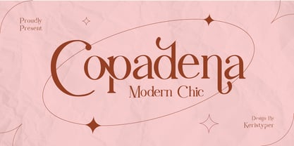 Copadena is a stylish font that is a Modern - Chic, it's an elegant and unique font. This font is good for logo design, Social media, Movie Titles, Books Titles, short text even long text letters, and good for your secondary text font with sans or serif. **Featured:** * Standard Uppercase & Lowercase * Numeral & Punctuation * Multilingual : ä ö ü Ä Ö Ü ß ¿ ¡ * Alternate & Ligature * PUA encoded We recommend programs that support the OpenType feature and the Glyphs panel such as Adobe applications or Corel Draw. so you can use all the variations of the glyphs. Hope you enjoy our fonts!
 - Kelpt by Typesketchbook,
$55.00 Kelpt font is an extra large super family of 54 fonts! Kelpt has such a big abundance of contrast, styles, weights, X-Hight. Typesketchbook consists of a very usable, clean and modern sans typeface with rounded corner. The font looks clean and geometric but it’s designed with unusual stylistic features to give the Kelpt font a special and unique touch. The complete Kelpt type family includes 9 weights with italic and X-Hight (A1-A3) versions for each of them all in all 54 fonts for a multifunctional usage, especially for cooperative work, such as website, magazine, editorial, publishing , as well as packaging.
 - Santo James by Keristyper Studio,
$14.00 Introducing Santo James' handwritten font. This script font comes with a retro, modern, and vintage touch in it. Inspired by the dynamic culture, sign, and badge design. This font looks very natural, perfect for all your large projects that require a handwritten touch. Santo James Font multilingual support: Afrikaans, Albanian, Catalan, Danish, Dutch, English, Estonian, French, Finnish, German, Icelandic, Indonesian, Italian, Malay, Norwegian, Portuguese, Spanish, Swedish, Zulu, and many more. What’s Included : Standard & Multilingual glyphs Ligature Works on PC & Mac Simple installations Accessible in Adobe Illustrator, Adobe Photoshop, Adobe InDesign, and even work on Microsoft Word. Hope you enjoy our font!
 - Lacoste Foliage by Gatype,
$14.00 LACOSTE Foliage is a modern serif font with a unique font. This customizable font will look great on a variety of design ideas such as, inding styles, high contrast and light weight fonts perfect for feminine logo signs, fashion & editorial design heads, branding projects, Clothing Branding, packaging, magazine titles, advertisements, T -shirts, postcards, valentines, posters, invitations, weddings, branding projects, social media posts, magazines, book covers and more ! This will add a fun and friendly touch to any of your projects! This font is PUA encoded which means you can access all the glyphs and sweeps easily and more.
 - Science Fiction by Indian Summer Studio,
$20.00 Geometric sans-serif with clean, ordered, hi-tech, futuristic feeling. For texts, titles, interfaces, logos, technical inscriptions, everything.
 - Deep Fried by Fatchair,
$4.95Designed to be layered, DeepFried is a multi-weight geometric sans-serif with a 70's pop feel. - Market by URW Type Foundry,
$35.99 DTC Black Market is best used for price tags and signs in shops, especially in stores and markets.
 - Momcake Pro by Rivian,
$15.00 Modern geometric sans serif typeface. Suitable for many projects such as logo, printing, social media, website, apps, etc.
 - Decorative Arrows JNL by Jeff Levine,
$29.00 Decorative Arrows JNL is a collection of twenty-six decorative arrows provided in right and left facing directions.
 - Barricade JNL by Jeff Levine,
$29.00 Barricade JNL is Jeff Levine's take on an old favorite that's been around since at least the 1940s.
 - Nubrix Grotesk by Ensor Creative,
$19.99 Nubrix Grotesk is a condensed geometric sans full of curves, character & charm. Perfect for big statements and impact!
 - Fountain Service JNL by Jeff Levine,
$29.00Fountain Service JNL was inspired by an exterior neon sign seen in an old photograph from the 1950s. - Malibu Heights by BA Graphics,
$45.00A beautiful new sans serif great for magazines, ad work, text or headlines works for all your needs. - Cloud - Personal use only

- Antagonist - Personal Use - Personal use only

- Syntha Nova - Personal use only

- Youtube Star - Personal use only

- Gemina - Personal use only

- Plakative Grotesk - 100% free

- Eurofurence Modified - Unknown license

- Hyundai - Personal use only

- Comfortaa - 100% free

- St37k - 100% free

- Telegrafico - Unknown license

- fresh - Personal use only

- PORT118 - Unknown license

- Alex - Unknown license

- VAL - Personal use only

- Magnum - Unknown license

- Pabellona (C) Tríplex - Personal use only

- Pungen - Unknown license

- Planet Megapolis - Personal use only

- Seconda by Durotype,
$49.00 Wait a second... Seconda. A sans serif with its own individuality. A typeface which combines character with legibility. A typeface which combines business with pleasure. Its moderate contrast and narrowing terminals give this typeface a gentle and sophisticated nature. Use it for books, reports, magazines, business letters — and relax. Use it for brochures, posters, signs, corporate identity projects — and enjoy. Seconda has sixteen styles, extensive language support, eight different kinds of figures, sophisticated OpenType features — so it’s ready for advanced typographic projects. For text and display use. When using Seconda in small text sizes, it will be a reliable and legible text face. When using it in big display sizes, it will show its refined details. Seconda has the companion typefaces Seconda Soft, Seconda XtraSoft, and Seconda Round. For more information about Seconda, download the PDF Specimen Manual.
 - iogen by Taner Ardali,
$12.00 The current design of "iogen" is a result of years of alterations since it's original concept was born in 2010 and it needed a hallmark to make it authentic. The idea of "a typeface speaking pleasantly" is the basis on which "iogen" is constructed. Hereby, the letter forms are based on sharp directional changes and curved vertical strokes, allowing it to speak clearly and pleasantly. The sharp corners, open apertures and open counters of iogen also ensure legibility in smaller sizes. The Iogen family has 6 members with 3 basic weights with sans and serif styles. It supports the Latin extended character set and opentype features like stylistic alternates, ligatures, fractions, denominators, numerators, superscript, subscript and ordinals. Iogen is a good fit for all of design needs with it’s wide range of character sets and features.
 - CA Cula by Cape Arcona Type Foundry,
$40.00 CA Cula is standing in the tradition of cool tempered sans serif typefaces like DIN. But at a closer look it reveals a tendency towards rounder reading-friendly forms. The denaturalized ink traps give CA Cula a very special and individual look in display sizes, whereas in smaller sizes the positive aspects of huge ink traps show effect. The text looks clean and bright without black dots in the typographic image. This makes CA Cula suitable even for longer text, while the bold weight makes pretty cool headlines. The choice of weights aims at an easy straight forward use. A set of five well balanced weights ought to be enough to cover most needs without throwing the typographer into questions like: demibold or semibold? If you are looking for the extra kick, look out for CA Cula Superfat.
 - Compasse by Dharma Type,
$24.99 Compasse is a semi-condensed sans-serif family designed by Ryoichi Tsunekawa and the whole family consists of 12 style: six weights from Thin to ExtraBold and their matching Italics. The range of styles provides flexibility for title, headline and body text. And the large x-heights increases legibility and readability. The basic skeleton of their letterform was not designed over-modularly but moderately semi-modularly (adjusted by designer's experience). Therefore the typical artificiality and unnaturalness which come from module-design does not exist in this family. The sophisticated letterform and its universal, neutral, and standard design make it possible to be used across a wide range of applications in all medias, all purposes. Compasse supports almost all european languages: Western, Central, South Eastern Europeans and afrikaans. And superior figures, inferior figures, denominators, numerators and fraction can be accessed by using OpenType features.
 - Vox Round by Canada Type,
$39.95 Vox Round is the softer version of the Vox family. The original brief for Vox was a extensive monoline typeface that can be both precise and friendly, yet contain enough choice of seamlessly interchangeable variants for the user to be able to completely transform the personality of the typeface depending on the application. Basically, a sans serif with applications that range from clean and transparent information relay to sleek and angular branding. When the first version of Vox was released in 2007, it became an instant hit with interface designers, product packagers, sports channels, transport engineers and electronics manufacturers. This new version (2013) is the expanded treatment, which is even more dedicated to the original idea of abundant application flexibility. The family was expanded to five weights and two widths, with corresponding italics, for a total of 20 fonts. Each font contains 1240 glyphs. Localization includes Cyrillic and Greek, as well as extended Latin language support. Built-in OpenType features include small caps, caps to small caps, four completely interchangeable sytlistic alternates sets, automatic fractions, six types of figures, ordinals, and meticulous class-based kerning. This kind of typeface malleability is not an easy thing to come by these days.
 - Frogurt by Missy Meyer,
$14.00 Frogurt is a soft, plump, rounded slab serif font full of fun! Its fat curves make me think of frozen yogurt, and I've always preferred the shorthand "frogurt" to "fro-yo." I was inspired by a 30-year-old hand-carved wooden sign; when I went to try to find a font with a similar look, I couldn't really find anything soft and funky enough! It was a real Goldilocks situation: that one was too thin, that one's corners were too sharp, that one's baseline was too strict. So since I couldn't find something I liked, I made something I liked! I gave Frogurt big pillowy slab serifs, a slightly irregular baseline, and just enough tilt and variation to be fun while still keeping things really clean and readable. The outlines are cleaned up and sharp, so Frogurt will work well for both printing and cutting. Frogurt clocks in with just over 570 glyphs total, including all of the basics (A-Z, a-z, 0-9, and a ton of punctuation), plus over 310 extended Latin characters for language support, and over 50 alternates and ligatures to add some variety and flair. Frogurt is PUA-encoded for easy access to all characters.
 - Tablet Gothic by TypeTogether,
$35.00 Graphic designers of any nationality and background know very well that the art of composing titles correctly is not easy, Especially when it comes to periodical publications where there is need for both flexibility and graphic coherence. Tablet Gothic was originally engineered as a titling type family, meant to help designers working on publications that require output as hard copies and a variety of digital platforms at the same time. As such, it is a grotesque sans serif that looks to the future of publishing with a clear understanding of its history, and reminiscences that go back to nineteenth century Britain and Germany. Tablet Gothic delivers the sturdy, straightforward and clean appearance expected from a grotesque, but it allows itself a good measure of personality to make it stand out on the page. Its 84 styles –six series of condensation and seven weights in each series plus obliques– guarantee that, whatever the publication format is, there's a Tablet Gothic font that will do the job and perform well both technically and aesthetically. Furthermore, the rounder styles, Tablet Gothic Wide, Normal and Narrow achieved amazing results at very small sizes, producing a beautiful texture and highly readable text blocks. Tablet Gothic fonts can be purchased individually, by series or as a complete bundle (best value!)


