10,000 search results
(0.043 seconds)
- Summer Romance by Hanoded,
$15.00 I am not a very romantic type (pun intended…), but a slightly slanted connected script always looks as if it was made for romance! Summer Romance is a beautiful connected script, made entirely by hand using a Japanse calligraphy brush-pen. It looks good on just anything: romantic book covers, beauty products, travel websites advertising romantic get-aways… Comes with double letter ligatures and a whole bunch of diacritics.
 - Swine And Roses by Proportional Lime,
$1.99 It's cool to be square. Among the many strange attempts to conceal writing, these two systems allegedly used by the Masons have a wonderful simplicity and relative ease of use. Both systems, the Rosicrucian and Free Mason, (also called the Pigpen cypher) as simple replacement ciphers never offered very great cryptographic security, but certainly would ensure that the casual observer would not be able to read documents written in such scripts.
 - Agave by Jonahfonts,
$35.00 Agave a sans-serif family with 14 styles and 4 weights. The Light, Regular & Semibold contain Italics and Condensed styles, the Bold comes only in its' upright and Italic styles. A text family designed to easily be read in lower point sizes as well as larger display sizes. Providing a legible print, web or e-book family suitable for reading and not calling attention to its' letter-graphics.
 - Gloriana by Scriptorium,
$12.00Gloriana is based on hand lettered titles from an old fairy tale book. The illustrator isn't credited, and we had to create and modify a lot of characters, but we preserved the interesting personality of the original lettering. In creating Gloriana the popularity of Folkard was kept very much in mind, so it has some of the same features, including special flourished characters accessed with the option/alt key. - Chakie by Garisman Studio,
$20.00 Just call me CHAKIE. I'm born from the old natural brush chalk look from the 60's and 70's. Use meto create very bold and strong design! Great for posters, t-shirt designs, branding, packaging, labels, and more. Bring back me to the 60's brother! :D And why you must grab me? - Simple installation - Support for 23 languages (WOW!) - Compatible with MAC or PC - PUA encoded - Lots of fun!
 - Altogether by PintassilgoPrints,
$29.00 Oodles of doodles! Altogether brings not two or three, but eight - yep! - flavours for each letter. Original, creative, authentic flavours. Sometimes sweet, sometimes fun, sometimes weird. A bit eccentric, let's say. So we can say it different. Let the autopilot cycle all these glyphs by simply turning on the contextual alternates feature inside your application. If you prefer, handpick your choices from a glyphs palette. And, mainly, have fun!
 - Bankster by Pelavin Fonts,
$15.00 With it’s origins in a hand-lettered headline about money managers, Bankster is an alphabet meant to evoke the feelings of currency or financial documents. Multiple styles facilitate the perfectly registered layering of components in a variety of color combinations to enhance impact and provide an enriched dimensional experience. It not be for everyone but, it's a perfect solution for the designer who has no patience for boring type treatments.
 - Deleplace by Typogama,
$29.00 Deleplace is a modern, delicate and refined typeface that is both contemporary and hints at a classical past. Featured in 3 weights, this family includes an extended language support that covers extended latin and cyrillic scripts. It equally includes a series of Opentype features, from ligatures, alternates, different number options and swash letters. Suited for bot text and large display, this versatile family will be a refined addition to your catalogue.
 - Vintage Varsity by Grant Beaudry,
$17.00 Vintage Varsity was inspired by that classic iron-on letterman jacket your "cool" uncle wore in high school (and lets be real, probably still wears today)... Pair with some fuzzy felt textures and you got yourself a killer duo! Strike the fill, throw a stroke on it, and design a retro-slogan t-shirt. Is this starting to sound like a cheesy infomercial? Good, I'm rolling with it. Have fun!
 - Flood by Adobe,
$35.00Flood was designed by Joachim M�ller-Lanc� and is not just another handwritten face. At smaller point sizes it exhibits the natural, dynamic, and spontaneous flow of felt tip marker writing. At larger sizes Flood is immediate, urgent, and provocative in its stylized detailing, without being overly dramatic. Flood�s energetic rhythm is well suited for informal menus, logos, and brief ad copy, as well as personal correspondence. - Sunshine Susie JNL by Jeff Levine,
$29.00 Sheet music for the song "Today I Feel So Happy" from the 1932 motion picture "Sunshine Susie" provided both the visual model and the name for Sunshine Susie JNL, available in both regular and oblique versions. The lettering is a bold Art Deco thick-and-thin design, and comes not from the song's title, but the hand lettered name of the movie as it appeared on the cover the song folio.
 - Josef K Patterns by Juliasys,
$9.60 Franz Kafka’s manuscripts have always been a source of inspiration for designer Julia Sysmäläinen. At first she was just interested in literary aspects but later she noticed that content and visual form can not be separated in the work of this ingenious writer. Analyzing Kafka’s handwriting at the Berlin National Library, Julia was inspired to design the typeface FF Mister – by now a well known classic. Over the years, FF Mister K became a handsome typeface family and even produced offspring: the Josef K Patterns. Some of Kafka’s most expressive letterforms were the starting point for these decorative ornaments. How do the Patterns work? Outlines and fillings correspond to the uppercase and the lowercase letters on your keyboard. You can use them separately or layer them on top of each other. If you write a line of “pattern-text” in lowercase and repeat it underneath in uppercase you get a row of fillings followed by a row of outlines. Now you can color them and then set line space = 0 to get a single line of layered colored ornaments. Alternatively, activating OpenType / stylistic set / stylistic alternates will also unite the two lines to a single layered line. Further magic can be done with OpenType / contextual alternates turned on. On the gallery page of this font family is a downloadable Josef K Patterns.pdf with an alphabetical overview of forms. Hundreds of patterns are possible … we’d love to see some of yours and present them here on the website!
 - Berimbau by PintassilgoPrints,
$29.00 Berimbau is a whimsical narrow hand-drawn typeface. It’s stylish, versatile and loaded with amazing OpenType features that do their magic in OpenType savvy applications. Its sprightly swashes and twisting stylistic alternates (say that 3 times fast!) play together to deliver a really cool contextual feature that, in a push-button way, substitutes the first letter in a word with its left swash version and the last letter with its right swash version (please type a space before and after the words).The feature also applies stylistic variants to some of the intermediate letters. Which button to push? The Contextual Alternates one! If you're not a one-click-way-person you can pick your preferred glyphs through the glyphs palette. There you’ll find at least 4 variations for each letter: left swash, right swash and 2 regular forms that correspond to the upper and lower case keys. Some letters also have a 5th variation that acts as stylistic alternate. This font is conveniently packed with the ‘access all alternates’ functionality, so when you click on a glyph at the glyphs palette you’ll see all variations available for it, making it easier to choose the one that will fit better. A bold weight was made to provide that extra-strength when a bit of… boldness is needed. Please note that it doesn’t have the advanced OpenType features (but is still very charming!). Yet, both weights have a handy set of ornaments for added yumminess.
 - Flefixx by Sun Young Oh,
$54.00 Flefixx is a typeface designed to support a project "Flefixx", an idiosyncratic visual language and typeface system that unfolds narratives based on common combinations of letters. In this visual language, just as individual letters come together like puzzle pieces to form different meanings or words based on combinations, the typeface is also constructed from fragmentary elements, each playing a distinct role as if they are individual pieces. The intentional exposure of the intersections of these fragments emphasizes the typeface's creation through interconnected elements. Furthermore, diacritics and dots are strategically positioned as ornaments, enhancing their presence within the gaps between letters. This concept aligns with the theme of composition and connectivity among fragments, allowing strong rhythmic patterns to emerge as letters and symbols blend in a paragraph. Additionally, the prominent and bold punctuation marks serve to provide pauses and clarity within sentences that incorporate both letters and the visual language. They contribute to articulating sentence structure amidst the dynamic flow of sentences with combined characters and visuals.
 - ITC Adderville by ITC,
$29.99On a cold winter's night, George Ryan, of Galápagos Design Group, began musing on the possibilities for a “truly original” sans serif typeface. What came out of his musing, and his always-present sketchpad, was ITC Adderville, a typeface whose visual impact is immediate and strong. Ryan explains how he did it: “The rounded ends of its strokes and their skewed baseline contact create an illusion of dancing feet. The tops of lowercase stems emit serif buds, suggesting transition into or out of the serifed form. The spear-like lowercase stroke terminators, along with other distinctive elements such as the stylized reticulation of the lowercase 'g' segments, the salute of that same character's spur, and the bold, non-self-conscious 'i' and 'j' dots, all contribute to the playful and unique nature of this design.” The result is a friendly, lively type family whose graduated weights -- book, medium, and heavy -- lend themselves especially well to use at small display sizes and in short blocks of text. - Appelstroop by Hanoded,
$15.00 Appelstroop literally means ‘Apple Syrup’ in Dutch, but it is also know as Apple Butter; a slightly sweet & sour goo that you can use to sweeten things, or, as we do in Holland, spread it on a sandwich. It’s delicious, give it a try! Appelstroop font is a chunky, slightly eroded affair. It is mostly all caps, with a few lower case glyphs thrown in for good measure. Use this sticky font for your product packaging, toys and kids book covers!
 - Lectori Salutem Sans by HoboArt,
$10.00Is it royal, or is it dandyish? Either way it's sure to catch the eye. Prepare for titling figures any movie executive would be jealous of using. Do you write sci-fi, fantasy, costume, or cult; or is your announcement for an off-beat wedding? Lectori Salutem Sans offers salutations to the reader, and an edge. Lectori Salutem Sans is the sans serif counterpart of the Lectori Salutem font. A postmodern font with slightly romantic features, cut off at the stem. - Fingerfood by Hanoded,
$15.00 I made this font using my index finger and Chinese ink. I thought the ink would come off easily, but I can tell you: it doesn’t. I have been walking around with a black stained finger for a week now and I do get strange looks from people every so often… Fingerfood, of course, is hand made. It is a rather playful font - all caps, but lower and upper case differ and like to mingle. Comes with a full diacritics palette.
 - Schadenfreude by Comicraft,
$19.00 We don't mean to gloat, but we have to say that it gives us immense, malicious pleasure and joy to supplant other popular germanesque letterforms with this, remarkably superior font. This successful addition to our DEAD cool POOL of ACHTUNG BABY alphabets will, no doubt, make you feel that your own library of teutonic fonts is now severely lacking. We're that mercenary, we're Mercs with Mouths, you might say. Wait, did we say that we DON'T mean to gloat? Actually, we do.
 - Whalebone by Hanoded,
$15.00 For some reason I had to think of Moby Dick (the classic book by Herman Melville) when I was busy working on this font. No, I don’t live near the sea, nor do I have a pet whale. It’s just one of those things… Whalebone (named after Captain Ahab’s prosthetic leg) is a handmade, all caps brush font. It wasn’t actually made with a brush; I used a broken satay skewer and Chinese ink. Whalebone comes with discretionary ligatures for double letter combinations.
 - Transit Display by KC Fonts,
$24.00 Transit Display is simply two fonts: Regular & Italic. It is an all uppercase based font that takes the grungy look that you love one step further by offering you that do it yourself eroded stamp look with a modern flair. Transit Display will work with any of your stylized design needs! Transit Display also has a larger character set for multilingual support. For a customized look to your works, switch between uppercase and lowercase for a change of grunge to the letters.
 - Pontiac Inline by S&C Type,
$15.00 Pontiac Inline is a layered Art Deco font designed by Fanny Coulez and Julien Saurin in Paris. This finely balanced inline font can be enhanced to improve your designs and bring an unusual and modern feeling. You could change the inside color, then add a 3D or shadow effect. To do so, you can simply superimpose the elements in compatible softwares (Photoshop, Illustrator...) ; The Regular above, the Inside line below, for example. We hope you will enjoy our work. Merci beaucoup!
 - Moksha - 100% free

- Black Butter by Ditatype,
$29.00 Arranging fonts is a difficult, time-consuming process, especially the handwriting arrangement which needs careful considerations and precisions for a natural-looking font. Because you deserve a unique, real essence-catching font, let us introduce you to the Black Letter, an attention-catching script font. This capitalized font designs with brush details have curvy, infirm lines to make the designs look more artistic and unique. The letters’ proportions are similar, yet it has high contrast to add some visual attractions to the font. However, a brush font lacks legibility in lengthy texts. As a result, it is more suitable to apply for short texts or titles only. You can also enjoy the available features here. Features: Multilingual Supports PUA Encoded Numerals and Punctuations Black Letter fits best for various design projects, such as brandings, posters, banners, headings, magazine covers, quotes, printed products, merchandise, social media, etc. Find out more ways to use this font by taking a look at the font preview. Thanks for purchasing our fonts. Hopefully, you have a great time using our font. Feel free to contact us anytime for further information or when you have trouble with the font. Thanks a lot and happy designing.
 - Citizen Kern by Pierre Tur,
$9.00 Citizen Kern is a modern, geometrical grotesk typeface. It comes in 5 different styles and opentype features for a better use of typography: it’s good for both headlines and body copy. It was made from the simplest geometrical shapes for a universal appearance, with enhanced overlaps to ensure an offbeat look. Citizen Kern is meant to work for any graphic project. You can use it for branding, editorial design, signage or even motion design : its simple shapes make it super easy to animate. Do you love the classic sans serif fonts? We all do. But what if you could add some singularity to your projects? Then Citizen Kern is the ideal pick for you. It will never be as perfect as the classics but will definitely offer an alternative, and freshness to your work.
 - Diediedie - Unknown license

- Featherful by Ditatype,
$29.00 Introducing Featherful, a handwritten brush font that embraces the bold and vibrant strokes of a paintbrush. With Featherful, you have a handwritten brush font that speaks the language of artistry. The characters in Featherful boast generous proportions, ensuring a visually striking impact in any design. The thick weight enhances the font's presence, making it suitable for various creative applications. What sets Featherful apart is its rounded letter shapes, creating a friendly and approachable vibe. The details within each letter mimic the expressive strokes of a paintbrush, adding an authentic and artistic touch. Enjoy the features here. Features: Ligatures Stylistic Sets Multilingual Supports PUA Encoded Numerals and Punctuations Featherful fits in headlines, logos, posters, flyers, branding materials, greeting cards, print media, editorial layouts, and many more designs. Find out more ways to use this font by taking a look at the font preview. Thanks for purchasing our fonts. Hopefully, you have a great time using our font. Feel free to contact us anytime for further information or when you have trouble with the font. Thanks a lot and happy designing.
 - Booer by Product Type,
$18.00 Introduce the Booer Font Express Your Creativity with a Powerful and Modern Gaming Style. Booer display is a font that reflects the power and style of the gaming world in a sharp, modern package. Booer is the perfect solution for a variety of projects that require a unique theme, whether it's a film, game, or streaming event. Her bold and exciting style provides room for creativity to flourish. What Makes Booer Special: Powerful Gaming Style, Booer Design exudes power, capturing the essence of the gaming world. Each letter is a statement of dominance and modernity. Two Style Families: The Booer font offers two different style families: Regular and Italic. This advantage allows you to adapt your designs to various contexts, whether requiring a strong presence or an elegant touch. Multilingual Support: Booer Font supports multiple languages, allowing you to connect with a global audience easily. Enhance your designs and make an impact with Booer Fonts. It's not just a font; it's a gateway to a bold, modern, and compelling visual world. Download Font Booer now and experience the thrill of creating unforgettable designs!
 - Metrock by Ditatype,
$29.00 Meet Metrock, a bold and distinctive brush sans-serif font that exudes strength, modernity, and artistic edge. Crafted with large letters, Metrock is the epitome of impactful design with a touch of rugged elegance. The characters in Metrock are deliberately bold, featuring boxy shapes that command attention. The thick weight adds a sense of solidity and substance, while the sharp corners and brush details introduce an element of raw creativity. This unique combination makes Metrock a font that stands out in any display setting. In addition, enjoy the features here. Features: Multilingual Supports PUA Encoded Numerals and Punctuations Metrock fits in headlines, logos, posters, flyers, branding materials, greeting cards, print media, editorial layouts, and many more designs. Find out more ways to use this font by taking a look at the font preview. Thanks for purchasing our fonts. Hopefully, you have a great time using our font. Feel free to contact us anytime for further information or when you have trouble with the font. Thanks a lot and happy designing.
 - Allysa Daguise by Natural Ink,
$12.00 Introducing the latest styles Allysa Daguise Script with the kind of modern calligraphy font, I hope you are interested in this font, if you want to use for your work this font can be used easily and simply because there are a lot of features in it to contain a complete set of letters lower and uppercase letters, assorted punctuation, numbers, and multilingual support. font also contains several ligatures and alternate style Stylistic Sets for those of you who have software that is able to work OpenType (Photoshop / Illustrator / InDesign). Allysa Daguise Script is suitable use for market design developed at this time, this font has a model Trendy, natural and gentle, with this font you can take advantage of the opportunity in every moment of one wonderful way to highlight the celebration of the feast of your best, because this font will be advocates for purposes such as wedding invitations, party, graduation, birthday, gathering, etc. If you need help or have questions, please let me know. I am happy to help :) Thank you & Congratulations on Designing! Thank you,
 - East Gates by Nathatype,
$29.00 East Gates is a mesmerizing display font that commands attention. Each letter is a work of art, meticulously crafted to elevate the overall appearance with a perfect blend of visible contrast and intricate details. The characters in East Gates boast a generous size, ensuring a bold and impactful presence. The visible contrast between thick and thin strokes adds a dynamic quality to the font, creating a sense of both strength and delicacy. What sets East Gates apart is the enchanting ornamentation gracing the letters, enhancing the overall beauty with a touch of intricate design. Enjoy the features here. Features: Multilingual Supports PUA Encoded Numerals and Punctuations East Gates fits in headlines, logos, posters, flyers, branding materials, greeting cards, print media, editorial layouts, and many more designs. Find out more ways to use this font by taking a look at the font preview. Thanks for purchasing our fonts. Hopefully, you have a great time using our font. Feel free to contact us anytime for further information or when you have trouble with the font. Thanks a lot and happy designing.
 - Calista Brighton by Timurtype,
$14.00 Introduced by Timurtype Studio! Calista Brighton is a Handwritten Script Font This font depicts a journey of typography where the art of handwriting transcends the ordinary, revealing the captivating dance of ink on paper. This beautiful font, decorated with stylish alternate ligatures, weaves a narrative of elegance and sophistication. Every stroke is a stroke of creativity, proof of the perfect blend of tradition and modernity. As your eyes trace its curves and turns, you are transported to a world where each character is a work of art, an embodiment of meticulous craftsmanship. The interplay of alternating styles provides a rhythmic rhythm, inviting the eye to linger on the page, enjoying the visual symphony of each letter. It's not just a font; it is a visual poem that whispers tales of timeless charm and unparalleled elegance, leaving an indelible mark on the design canvas." Calista Brighton Font also supports multilingualism. Enhance your designs with our original fonts, feel free to comment or provide feedback, Enjoy the fonts 😊 Thank You
 - Secret Scrypt by Canada Type,
$29.95Emulating real handwriting has always been an aim of font designers in the digital age. The standard mainstream scripts and doodles that were available for the longest time have not successfully reached that goal. A letter always looked the same wherever you placed it. Some workarounds, such as letter alternates and ligatures, were used in many fonts, but they were a bit inconvenient to use, and in some cases didn't work correctly because they had to be placed in separate fonts from the main character set. Not until now, with OpenType technology, have we been able to emulate real handwriting, by including multiple character sets in the same font and programming it for smart form changes through letter sequence counting. Secret Scrypt was the first Canada Type font to make it to the bestseller list in the summer of 2004. In early 2005 a New York restaurant chain picked Secret Scrypt to use on its menus and internal signage, but they wanted to look even more like real handwriting, where two or three instances of the same letter used in one word would automatically change and look different from each other. Using OpenType technology, Canada Type produced a Secret Scrypt Pro for that restaurant chain under the direction of Mucca Design in New York City. That initial version contained three different character sets in the same font, and some intelligent programming that determines the sequence of the letters and change their shapes accordingly. Now the retail version of Secret Scrypt Pro is available, with four character sets built into the font for even more variety on the real handwriting theme. Make sure to check out the Secret Scrypt Pro PDF in the MyFonts gallery for tips on using Secret Scrypt Pro. Secret Scrypt is perfect for menus, handwritten notes, theater programmes, charity organization posters, and any design that attempts to get close to people with the personal magic of real handwriting. - Lust Sans by Positype,
$39.00 Lust Sans is the penultimate exploration of producing a high-contrast sans wholly influenced by its bracketed ancestor. The aspect of this endeavor I enjoyed the most was finding sneaky ways to infuse warmth and whimsy into the letterforms when you least expect it. The result, however, is subtle and uniquely balances against Lust and Lust Didone without becoming cold and overbearing. To accomplish this, Lust Sans has 6 weights. What I found during development was, based on any setting where Lust or Lust Didone were in the same layout, the amount of contrast shown with Lust Sans needed to be adjusted. Expanding the weight offering, produces opportunities for Lust Sans to modulate the rhythm of the layout comfortably while keeping contrast—this is even more obvious with the Italics. I love those. You will too. If you don’t, you do not have a soul. Not sorry. The Lust Collection is the culmination of 5 years of exploration and development, and I am very excited to share it with everyone. When the original Lust was first conceived in 2010 and released a year and half later, I had planned for a Script and a Sans to accompany it. The Script was released about a year later, but I paused the Sans. The primary reason was the amount of feedback and requests I was receiving for alternate versions, expansions, and ‘hey, have you considered making?’ and so on. I listen to my customers and what they are needing… and besides, I was stalling with the Sans. Like Optima and other earlier high-contrast sans, they are difficult to deliver responsibly without suffering from ill-conceived excess or timidity. The new Lust Collection aggregates all of that past customer feedback and distills it into 6 separate families, each adhering to the original Lust precept of exercises in indulgence and each based in large part on the original 2010 exemplars produced for Lust. I just hate that it took so long to deliver, but better right, than rushed, I imagine.
 - Octynaz by Typodermic,
$11.95 The world has ended, and all that remains is chaos and destruction. The remnants of civilization are scattered, and the once-great cities are now nothing more than ruins. In this post-apocalyptic wasteland, communication is more critical than ever. Your message needs to cut through the noise and grab attention, but how can you do that when everything around you is broken and damaged? Enter Octynaz—a typeface that perfectly captures the desperate spirit of this new world. With its severe damage and broken counters, Octynaz embodies the shattered landscape of the post-apocalypse. But it’s not just a broken typeface—in fact, it’s even more powerful because of its flaws. OpenType-aware programs will automatically substitute bespoke pairs to produce a grungy, realistic appearance that will make your message stand out. When you use Octynaz, you infuse your words with frantic authority and shattered vigor. You’re not just communicating—you’re commanding attention. Your message becomes a rallying cry for those who remain, a beacon of hope amidst the darkness. Most Latin-based European writing systems are supported, including the following languages. Afaan Oromo, Afar, Afrikaans, Albanian, Alsatian, Aromanian, Aymara, Bashkir (Latin), Basque, Belarusian (Latin), Bemba, Bikol, Bosnian, Breton, Cape Verdean, Creole, Catalan, Cebuano, Chamorro, Chavacano, Chichewa, Crimean Tatar (Latin), Croatian, Czech, Danish, Dawan, Dholuo, Dutch, English, Estonian, Faroese, Fijian, Filipino, Finnish, French, Frisian, Friulian, Gagauz (Latin), Galician, Ganda, Genoese, German, Greenlandic, Guadeloupean Creole, Haitian Creole, Hawaiian, Hiligaynon, Hungarian, Icelandic, Ilocano, Indonesian, Irish, Italian, Jamaican, Kaqchikel, Karakalpak (Latin), Kashubian, Kikongo, Kinyarwanda, Kirundi, Kurdish (Latin), Latvian, Lithuanian, Lombard, Low Saxon, Luxembourgish, Maasai, Makhuwa, Malay, Maltese, Māori, Moldovan, Montenegrin, Ndebele, Neapolitan, Norwegian, Novial, Occitan, Ossetian (Latin), Papiamento, Piedmontese, Polish, Portuguese, Quechua, Rarotongan, Romanian, Romansh, Sami, Sango, Saramaccan, Sardinian, Scottish Gaelic, Serbian (Latin), Shona, Sicilian, Silesian, Slovak, Slovenian, Somali, Sorbian, Sotho, Spanish, Swahili, Swazi, Swedish, Tagalog, Tahitian, Tetum, Tongan, Tshiluba, Tsonga, Tswana, Tumbuka, Turkish, Turkmen (Latin), Tuvaluan, Uzbek (Latin), Venetian, Vepsian, Võro, Walloon, Waray-Waray, Wayuu, Welsh, Wolof, Xhosa, Yapese, Zapotec Zulu and Zuni.
 - Tecna Dark Up Triangle BNF by Descarflex,
$30.00 The Tecn@ Dark&Light Triangle Background Nomenclature Font family is differentiated by the direction of the triangle tip in the 4 cardinal points. The family were designed to head, enumerate, indicate or highlight writings or design plans, for this reason, the characters are available only in capital letters and some signs or symbols that can serve such purposes. A triangle or empty character is included so that the user can use it overlaying any character of his choice or to be used alone. What is Lorem Ipsum? Lorem Ipsum is simply dummy text of the printing and typesetting industry. Lorem Ipsum has been the industry's standard dummy text ever since the 1500s, when an unknown printer took a galley of type and scrambled it to make a type specimen book. It has survived not only five centuries, but also the leap into electronic typesetting, remaining essentially unchanged. It was popularised in the 1960s with the release of Letraset sheets containing Lorem Ipsum passages, and more recently with desktop publishing software like Aldus PageMaker including versions of Lorem Ipsum. Why do we use it? It is a long established fact that a reader will be distracted by the readable content of a page when looking at its layout. The point of using Lorem Ipsum is that it has a more-or-less normal distribution of letters, as opposed to using 'Content here, content here', making it look like readable English. Many desktop publishing packages and web page editors now use Lorem Ipsum as their default model text, and a search for 'lorem ipsum' will uncover many web sites still in their infancy. Various versions have evolved over the years, sometimes by accident, sometimes on purpose (injected humour and the like). Where does it come from? Contrary to popular belief, Lorem Ipsum is not simply random text. It has roots in a piece of classical Latin literature from 45 BC, making it over 2000 years old. Richard McClintock, a Latin professor at Hampden-Sydney College in Virginia, looked up one of the more obscure Latin words, consectetur, from a Lorem Ipsum passage, and going through the cites of the word in classical literature, discovered the undoubtable source. Lorem Ipsum comes from sections 1.10.32 and 1.10.33 of "de Finibus Bonorum et Malorum" (The Extremes of Good and Evil) by Cicero, written in 45 BC. This book is a treatise on the theory of ethics, very popular during the Renaissance. The first line of Lorem Ipsum, "Lorem ipsum dolor sit amet..", comes from a line in section 1.10.32. The standard chunk of Lorem Ipsum used since the 1500s is reproduced below for those interested. Sections 1.10.32 and 1.10.33 from "de Finibus Bonorum et Malorum" by Cicero are also reproduced in their exact original form, accompanied by English versions from the 1914 translation by H. Rackham. Where can I get some? There are many variations of passages of Lorem Ipsum available, but the majority have suffered alteration in some form, by injected humour, or randomised words which don't look even slightly believable. If you are going to use a passage of Lorem Ipsum, you need to be sure there isn't anything embarrassing hidden in the middle of text. All the Lorem Ipsum generators on the Internet tend to repeat predefined chunks as necessary, making this the first true generator on the Internet. It uses a dictionary of over 200 Latin words, combined with a handful of model sentence structures, to generate Lorem Ipsum which looks reasonable. The generated Lorem Ipsum is therefore always free from repetition, injected humour, or non-characteristic words etc.
 - Rikale by Sensatype Studio,
$15.00 A Fashion Modern serif font that we created special for elegant branding needs, with extra alternates in unique shape will be ready to add value of your brand. It so nice to leverage designer or product owner that need solutions to make their design look more classy and modern. And specially for Gingka font, We prepared any alternate characters to help you create unlimited variations for your creative needs. Rikale Condensed Fashion Modern Font ready with: Any options to get creative variations (combination of Alternate characters) Preview as a inspirations that you can do with Rikale font Ready with Lowercase and Uppercase characters Wish you enjoy our font. :)
 - Quning by Sensatype Studio,
$15.00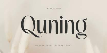 An Elegant serif font that we created special for elegant branding needs, with extra alternates in unique shape will be ready to add value of your brand. It so nice to leverage designer or product owner that need solutions to make their design look more classy and modern. And specially for Quning font, We prepared any alternate characters to help you create unlimited variations for your creative needs. Quning Modern Classy Elegant Serif Font ready with: Any options to get creative variations (combination of Alternate characters) Preview as a inspirations that you can do with Quning font Ready with Lowercase and Uppercase characters Wish you enjoy our font. :)
 - Memorebilia by Pen Culture,
$19.00 Proudly present "Memorebillia - Modern and Stylish Serif Font" Memorebillia is a serif font with ornaments. This font comes with elegant uppercase and lowercase, uppercase and lowercase, number and punctuation, a ton of stylistic alternates and ornaments. you can mix and match stylistic alternate and ornaments to create fun designs with this font. This font perfect for branding/logo, posters, magazines, cricut projects, embroidery and many others. I really hope you enjoy it – please do let me know what you think, comments & likes are always hugely welcomed and appreciated. More importantly, please don’t hesitate to drop me a message if you have any issues or queries. Thank you
 - Golden Radiant by Pen Culture,
$19.00 Proudly present Golden Radiant - Modern Serif Font Golden radiant is a modern serif font with an elegant curve in each letter and also alternates. This font perfect for all kinds of design projects such as branding, logo design, magazine, poster, invitation and many more. This font come with elegant uppercase and lowercase letter, number and punctuation, 60 elegant alternate. This font is PUA Encoded and multilingual support. I really hope you enjoy it – please do let me know what you think, comments & likes are always hugely welcomed and appreciated. More importantly, please don’t hesitate to drop me a message if you have any issues or queries. Thank you

