10,000 search results
(0.075 seconds)
- Welth Catritz by Typetemp Studio,
$16.00 Welth Catritz Serif Typeface is a stylish font It has both Classic Modern look. Comes with alternatives and ligatures, helps to create stunning logos, quotes, posts, blog posts. branding projects, magazine imagery, wedding invitations, and much more. WHAT YOU GET: Unique Letterforms Works on PC & Mac Simple Installations Accessible in the Adobe Illustrator, Adobe Photoshop, Microsoft Word Fully accessible without additional design software. To generate all ligatures, please open Adobe Ilustrator/Photoshop - Type - Glyphs.
 - Debora Celina Script by Gatype,
$5.00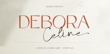 Debora Celina is a font Duo Script and Serif that is simple and unique looking.This customizable font will look great on a variety of design ideas such as Christmas themes,valentines, posters, invitations, weddings, branding projects, social media posts, magazines, book covers and more. This will add a fun and friendly touch to any of your projects.This font is PUA encoded which means you can access all the glyphs and sweeps easily.
 - Nagota Script by Typehill Studio,
$12.00 Nagota Script is a calligraphy script font that comes with beautiful alternative characters. a mixture of copper calligraphy with handleting style. Designed to bring style elegance. Nagota Script attracts such a subtle, clean, feminine, sensual, glamorous, simple and very readable typeface. The classic style is perfect to apply in various formal forms such as invitations, labels, menus, Logos, fashion, make up, stationery, letterpress, romantic novels, magazines, books, greeting / wedding cards, packaging, labels.
 - Buttershine Serif by Typestory,
$25.00 Buttershine is a bold, beautiful and versatile duo font (serif and script). It looks beautiful on a variety of designs requiring a personalized style, such as wedding invitations, thank you cards, weddings, greeting cards, logos and so on. What’s Included : Ligature, Alternate & Swashes Works on PC & Mac Simple installations Accessible in the Adobe Illustrator, Adobe Photoshop, Adobe InDesign, even work on Microsoft Word. PUA Encoded Characters – Fully accessible without additional design software.
 - Scandia by Artyway,
$16.00 Introducing Scandia, a unique geometric Scandanavian font with a beautiful and simple runic and Vikings style to help you bring the soul of the Nordic region into your design works! Based on Scandinavian runes and elegant geometric forms, this unique typeface has 3 weights to fit your needs. It includes some multilingual support, uppercase letters, numbers, and punctuation. It works great in titles, logos, and short quotes in modern and traditional projects. Check it!
 - Lucca by João Henrique Lopes,
$39.00 Inspired by Italian Renaissance fonts like Poliphilus, Blado, Centaur and Arrighi, Lucca presents a simple charm and a powerful classic feel. It is cute, friendly, clear and superbly readable. Its low contrast provides Lucca a firm yet flexible substance, making it sensual and enticing. There’s a certain degree of abstraction in the precise endings, and the whole design was made to survive even in the harshest conditions, conserving its readability and beauty.
 - Lettown Hills by Senzana,
$8.00 Lettown Hills is inspired by urban or freestyle artworks. With casual or marker style and lot of stylistic alternates you can create realistic headers. It’s a font that can be used with vintage, simple and modern styles. Comes also with swashes font. It works beautifully for personal branding, advertising or creative headers. Looks good also with retro style typography or branding. It is very suitable for logos, posters, t shirts and more.
 - Zold by EMME grafica,
$9.90 Zold is the first font designed by EMME Grafica. It's a simple, statuesque, architectural, eye-catcher, tough yet elegant font, particularly suitable for titling, subtitling, branding and typographic amusements. The solemnity of Zold does not affect the the elegance of the curves of the font, but gives it the right visibility and temper, like that of Zold, the surly character who will be the antagonist of a multimedia project currently under development at EMME Grafica.
 - Solvetta by Grezline Studio,
$12.00 Solvetta is a light and charming handwritten font with a unique feel. It will add a bold feel to any design project! You can use Solvetta font to make a logo for branding, typography design, magazine or book cover, website header, product packaging, invitation, quotes, t-shirt design, label poster and more. Feature : - Multilingual Language - Works on PC & Mac - Simple installations - Accessible in the Adobe Illustrator, Adobe Photoshop, Adobe InDesign, even works on Microsoft Word.
 - Squid Ninja by Epiclinez,
$18.00 Squid Ninja is a bold, fun display font with unique characters and playful vibes. It's a good choice for creating exciting logotypes, eye-catching headlines, catchy titles, and more. Squid Ninja offers a wide range of possibilities to make your work look dynamic and more enjoyable. Squid Ninja font includes : Basic Latin Uppercase and Lowercase Numbers, symbols, and punctuations Multilingual Support. Simple Installations & Works on PC & Mac Thank You and happy designing!
 - Hand Retro Sketch Times by TypoGraphicDesign,
$19.00 CONCEPT/ CHARACTERISTICS A serif typeface with modern and fancy handmade haptics. Take the 3 layers for unique designs and create many different variations. From light and warm outline (take the regular style), about heavy and pithy filling (take the bold style) till fancy and modern 3d shadows (take the 3d style). The combination of all 3 font styles = bulky design freedom. Game with it! Handemade sketched for display size. APPLICATION AREA The vintage but modern, the raw but friendly serif font »Hand Retro Sketch Times« with many language support (for a display font) would look good at headlines. Editorial Design (Magazine or Fanzine) or Webdesign (Headline Webfont for your website), party flyer, movie poster, music poster, music covers or webbanner. And and and… TECHNICAL SPECIFICATIONS Headline Font | Display Font | Serif Layer Font »Hand Retro Sketch Times« OpenType Font with 341 glyphs, alternative letters and ligatures (with accents & €) & 3 styles & 3 layers (regular, bold, 3d)
 - Shentox by Emtype Foundry,
$69.00 During a visit to London in 2008 I fell in love with the square font used on the British car number plates. I was immediately inspired to start working on this font and have been developing it intermittently ever since. Several more trips to London and the project evolved before it finally took off and became Shentox. Despite the starting point being inspired by simple, everyday car plates, the font soon evolved into something fine and very rich in detail. Even though the square genre is very restrictive, Shentox is a highly legible contemporary font with a full range of weights, useable not only as a display family for headlines and posters, but as a distinct, clean font family for branding and general editorial use (Especially magazines). It has been carefully drawn paying extra attention to the details, high end finishes that makes Shentox a safe font for use in large scale work. For example, the curves of every individual corner have been adjusted character by character to avoid the common problems encountered with square fonts (Eg. darker corners between weights or a visually inconsistent radius between the Upper and Lowercases as a result of copy/paste). Shentox italic, which has a 12 degree slant, has been corrected to avoid distortion when slanted. The radius of the upper-right and lower-left corners are more pronounced, giving it a more fluid Italic feel. Shentox is available in Open Type format and includes ligatures, tabular figures, fractions, numerators, denominators, superiors and inferiors. It supports Central and Eastern European languages. This type family consists of 14 styles, 7 weights (Thin, UltraLight, Light, Regular, Medium, SemiBold and Bold) plus italics. Shentox PDF
 - Space Armada by Wing's Art Studio,
$10.00 Space Armada - A Science-Fiction Font for Out of this World Designs! Space Armada is inspired by a 1980s interpretation of the future, referencing blockbuster sci-fi action movies of the period, along with the emerging video-game consoles and home computer technologies. It's nine unique fonts are designed to work together in a variety of ways, so you can layer it's different styles on top of each other to retro-futuristic effect!* Here's an example of how it works: Start by placing the Regular font on top of the Bold for a simple base outline. Add contrasting gradients to both fonts for an instant metallic or chrome effect. Take it a step further with one of the readymade Outlines for an embossed look. Overlay the Wireframe font for a glimpse inside the machine! This looks particularly good when you apply a glow effect and reduce it's opacity so the other layers show through. That's just one way to use it. Check out my visuals for more usage ideas! You can also follow my short tutorial! Space Armada is an all-caps font with unique uppercase and lowercase characters, along with a range of alternatives for experimentation with different looks. It also includes punctuation, numerals and language support, plus a selection of underlines and symbols. It's a highly customisable font, perfect for retro designs such as movie titles, posters, games, book covers and more! Every care has been taken to ensure that all fonts align perfectly when layering. Due to the variations in how different software handles text tracking, some minor tweaking may be required for pixel perfect alignment.
 - DT Lythmore by Dragon Tongue Foundry,
$9.00 Lythmore This font is called Lythmore and is inspired by Lithos. Lithos was originally designed for Adobe by Carol Twombly in 1990, based it on the lettering from ancient Greek inscriptions. The Capitals are similar in feel and design, but is totally original and built from scratch. It is designed to be similar intentionally, but it is not a clone or rip off. Lithos is an example of a simple blocky san serif font style, with subtly concave sides, angled ends, and off centred curves. Lythmore is also an example of that same style. But is also different in places where I felt it could be improved. And it has a complete lower case set, which Lithos doesn't. I built Lythmore with 8 different weights. Lythmore can be very effective when used in advertising and general display work, but it can also be used for much more. Although it was never designed to be body copy, when used as such, it is still perfectly readable and adds its own version of sans serif style and flavour. I have included two versions of the Lythmore family. Lythmore A and Lythmore B. In the Lythmore A family, the lighter 4 weights all vary in weight in both the horizontal and vertical axis. The heavier 4 weights all vary in the horizontal axis only. In the Lythmore B family, the transition is even in both directions across the entire family. The result of this difference is that the A and B versions difference is most noticeable between the Regular and Medium weights. While the extreme ends of each family version are virtually identical.
 - Sure! Penmanship Print is a typeface that exudes a casual warmth and personal touch, embodying the essence of handwritten notes and personal correspondence. Drawing inspiration from traditional handw...
- MKristall, created by Manfred Klein, is a distinctive font that captures the essence of crystalline structures through its design. Manfred Klein, known for his prolific output of diverse and often ex...
- Zarlino by Patricia Lillie,
$29.00 Zarlino is an original typeface in the Blackletter style. It does not solidly adhere to any of the historical Blackletter classifications, but draws from all of them, with some characters owing more to the Roman than the Fraktur. Zarlino Delux includes three complete sets of upper case, ranging from the simple to the embellished to the even more embellished, two complete sets of lower case, and two more sets of embellished alternates for selected lower case characters. These alternates are available through Stylisitic Sets in OpenType aware applications. For use in non-OpenType aware applications, Zarlino Delux comes with a set of separate, standard fonts, one for each style. These standard fonts are also available for individual purchase. Zarlino was named by my cousin, a musician. Gioseffo Zarlino was a sixteenth century composer and musical theorist. Among other things, he offered detailed advice on the setting of words to music. With its blends of the old and the new, the simple and the ornate, Zarlino is suitable for many uses, from the elegant to the aggressive.
 - Minah by Afkari Studio,
$17.00 Minah - Handwriting Script Font Minah is the latest modern handwriting Script font made as naturally as possible, minah modern script font is perfectly made to be applied in logo brands, invitations, labels, magazines title, books, greeting cards, wedding cards, packaging, fashion, makeup, stationery, novels, labels or any type of advertising purpose. Minah Handwriting Script font was simple and casual that contained Open Type features such as Stylistic Sets, Stylistic Alternates, Contextual Alternate, and ligatures. This modern script font also contains begin, middle, and ending swash which makes it very easy to use, it will help you to create your own customized design. Just rely on your creativity! Features; - Uppercase, Lowercase, Number, and Punctuation - Special alternates and ligatures - Works on PC & Mac - Simple installations - Accessible in Adobe Illustrator, Adobe Photoshop, Adobe InDesign, and even work on Microsoft Word - Fully accessible without additional design software. - Mültîlíñgúãl Sùppört for; ä ö ü Ä Ö Ü ß ¿ ¡ Hope you enjoy our font and this font is a useful font for your projects!
 - Bilfanny by ryan creative,
$10.00 Hi creative greetings... Introducing the latest fonts. Bilfanny is a script typeface with digitally drawn strokes with a brush preasure that give the font a natural, realistic look Get a simple and fun digital script font touch with glyphs and open type features a Swash binding style, plus Added Ornament, Alternate and Ligature . This font is more decorative and artistic suitable for art or fashion brands. It can be used for various purposes. such as brand name, Wedding, Invitation, product promotion business, etc. FEATURES; -Uppercase, Lowercase, Foreign Support, Numbers and Punctuation. -Otf, Ttf & Woff files -Alternative, Swash, Ligature & Ornament. -Works on PC. -Simple installation. -Accessible in Adobe Illustrator, Adobe Photoshop. Adobe InDesign, it even works in Microsoft Word. -Fully accessible without additional design software. Bilfanny is encoded with Unicode PUA, which allows full access to all additional characters without having to design any special software. Mac users can use the Font book, and Windows users can use the Character map to view and copy any extra characters to paste into your favorite text editor/app. Thank you for visiting;)
 - Honey Ponds by Yumna Type,
$15.00 It is complicated to find an aesthetically charming font in a professional look. The thing is that a wrong font choice can damage your projects. For that reason, Honey Ponds is here for your needs. Honey Ponds is a simple display font in a plain, yet interesting, professional design. To create a better display and to be legible, the font’s form or geometry is presented in a simple style without many details. Additionally, this font provides you a clipart as a bonus. You can enjoy the available features here as well. Features: Multilingual Supports PUA Encoded Numerals and Punctuations Honey Ponds fits best for various design projects, such as brandings, posters, banners, headings, magazine covers, quotes, invitations, name cards, printed products, merchandise, social media, etc. Find out more ways to use this font by taking a look at the font preview. Thanks for purchasing our fonts. Hopefully, you have a great time using our font. Feel free to contact us anytime for further information or when you have trouble with the font. Thanks a lot and happy designing.
 - Rollik by Alit Design,
$19.00 Presenting the ✨Rollik Typeface✨ by alitdesign. Inspired by music posters of the 70s and 80s, the Rollik font was created in a calm and simple style but still gives it a uniquely retro and playful feel. Besides that, combined with a dynamic serif style makes the Rollik font more stylish and retro elegant, especially if the design to be made uses swash on alternative fonts for creativity, for example lettering or logotypes designed to make your design look cool and different. The Rollik font is very suitable for making designs with retro concepts, simple and playful designs, for example making magazine cover designs, music covers, YouTube thumbs, text headers, logotypes and so on with an elegant retort theme. Besides that this font is very easy to use both in design and non-design programs because everything changes and glyphs are supported by Unicode (PUA). The Rollik font has a total of 940 glyphs including symbol, multilingual and alternative glyphs. We really enjoyed the process of making the Rollik font, we hope you are also happy when using the Brolike font.
 - PeaceNow Basic is a distinctive font that exudes a serene and harmonious essence, perfectly mirroring the ideals of peace and unity that its name suggests. Its design is a blend of soft curves and cl...
- Kingthings Xander - Unknown license

- Basque by Monotype,
$29.99Basque is a delicate nineteenth-century upright typeface of angular appearance, reminiscent of Black Letter scripts. The letterforms of the Basque font do not flow, but are made up of straight lines joined to form a rigid shape. - FP Silly by Fontpartners,
$29.00 Silly, as the name suggest, is a somewhat silly font with uppercase letters and it is based on the characteristic expression of the stencil shape. FP Silly is available in two versions, with either rounded or angular shapes.
 - ITC Grapefruit by ITC,
$29.99ITC Grapefruit is the work of Hungarian designer Gyori Attila, an angular, mannered and geometric display face with a loud appearance. ITC Grapefruit combines strong display characteristics with legibility and is suitable for a wide variety of uses. - Autobahn Pro by AVP,
$40.00 Autobahn is a robust masculine sans of near monoline thickness and angular characteristics. Available in four weights (with italics), it has a healthy compliment of OpenType Features and the character set covers most Roman-based letterforms and Cyrillic.
 - Grundee by Ingrimayne Type,
$9.00 Grundee is a grungy serifed face. It is sloppy and irregular but still quite legible. It was one of several efforts to draw a serifed typeface by pen; see also SarahfSlob, which contains a complete family of styles.
 - FS Conrad by Fontsmith,
$50.00 Art into type In 2008, Fontsmith were approached by their friend, Jon Scott, to investigate whether a typeface could assume the aesthetic of one artist’s body of work. Jon’s not-for-profit charity, Measure, was organising an event for the artist, Conrad Shawcross, whose giant mechanical installation, entitled Chord, was going on public display in the long-disused Kingsway tram tunnel in Holborn. Chord explores the way we perceive time, as either a line or a cycle. Two enormous machines with dozens of rotating arms and moving in opposite directions, weave rope with almost infinite slowness. An unusual brief Phil Garnham visited Conrad in his Hackney studio to get a feel for his work and ideas. “Conrad is a very clever and philosophical guy. He struggled to see how typeface design had any relevance to him and his art. This was going to be a challenge.” The artist presented the type designer with a pile of rope and a huge diagram of sketches and mathematical workings. “This was, in essence, my brief.” Phil developed three concepts, the simplest of which ticked all the boxes. “The idea of the strokes in the letterforms appearing and ending at peaks or points of origin fitted perfectly with Conrad’s idea of time occurring and ending at two ends of the sculpture.” Two versions Phil planned modules for two versions of the typeface: one with five lines in the letterforms and one with seven. He then drew the modules on-screen and twisted and turned them to build the machine that is FS Conrad. “This is not a simple headline typeface,” says Phil. “It’s not a rigid structure. It has varying character widths, and it’s informed by real typographic insight and proportions so that it actually works as piece of functioning, harmonious type.”
 - Jugendstil Initials by HiH,
$16.00 Jugendstil Initials were designed by Heinrich Vogeler around 1905, based on the German blackletter tradition. A similar set of initials by Vogeler, but based on roman letters was released by Rudhardsche Geisserei of Offenbach at about this time. I believe the originals were woodcuts. The backgrounds to the letterforms may be seen as examples of Heimatkunst, an art movement within Germany that drew deliberate inspiration from the rural countryside. Like the Arts and Crafts Movement in England a little earlier, Heimatkunst may be seen, in part, as a romantic rejection of urban industrialization, while at the same time representing a back-to-roots nationalism. Like any river, it was fed by many streams. Jugendstil Initials is an experiment with which I am most pleased. It is far and away the most complex font HiH has produced and I was uncertain whether or not it could be done successfully. To oversimplify, a font is produced by creating outlines of each character, using points along the outline to define the contour. A simple sans-serif letter A with crossbar can be created using as few as 10 points. We decided to make a comparison of the number of points we used to define the uppercase A in various fonts. Cori, Gaiety Girl and Page No 508 all use 12 points. Patent Reclame uses 39 and Publicity Headline uses 43. All the rest of the A’s, except the decorative initials, fall somewhere in between. The initial letters run from 48 points for Schnorr Initials to 255 for Morris Initials Two, with 150 being about average. Then there is a jump to 418 points for Morris Initials One and, finally, to 1626 points for Jugendstil Initials. And this was only after we selectively simplified the designs so our font creation software (Fontographer) could render them. The average was 1678, not including X and Y. There was no X and Y in the original design and we have provided simple stand-ins to fill out the alphabet, without trying to imitate the style of the orginal design. We did a lot of looking to find a compatible lower case. We decided that Morris Gothic from the same period was the best match in color, design and historical context. We felt so strongly about the choice that we decided to produce our Morris Gothic font for the purpose of providing a lower case for Jugendstil Initials. The long s, as well as the ligatures ch and ck are provided. at 181, 123 (leftbrace) and 125 (rightbrace) respectively. This font was a lot of work, but I think it was worth it. I hope you agree.
 - As of my last update in 2023, "IDM Minimal" by Emlyn Addison appears to be a niche or possibly a custom font that does not have widespread recognition in mainstream font directories or repositories. ...
- Kingthings Gothique - 100% free

- Kingthings Xander Outline - Unknown license

- Baronessa by Juraj Chrastina,
$39.00 Baronessa is a handmade font with a “once-upon-a-time” world feeling, warm and friendly but not excessively childish. No swashes or ornaments, subtle irregularity and carefully chosen letter shapes make it sweet and funny but not crazy.
 - Metaphysica by Ayca Atalay,
$17.00 Metaphysica is an unorthodox futuristic typeface that provides otherworldly zest without overly compromising typographic aesthetics. Combining weird angular beams and junctions with soft and round forms, Metaphysica finds the middle ground between sci-fi futurism and friendly legible sans.
 - Bradley Texting by Monotype,
$57.99Bradley Texting: a clear, friendly and easily legible calligraphy font, also suited to electronic devices With Bradley Texting, Richard Bradley has published another calligraphic typeface that recalls the style of Bradley Hand and Bradley Type. In this case, however, Bradley has advanced the style with clearer forms for display on electronic instruments and on other formats. Two other font families paved the way to the newly introduced Bradley Texting. In the mid-1990s, Bradley published Bradley Hand, with its rough contours. Since these coarse forms do not cut a good figure in the larger font sizes, Bradley Type followed, with smooth letters. During the development of Bradley Type, the idea for a further font came about ? one in the style of the two other calligraphic typefaces, but with simpler, easily legible forms and suited to electronic devices like mobile phones or tablets. The letters for Bradley Texting began with a marker on paper. Looking back, Bradley describes one of the biggest challenges as having the calm required to draw the relaxed-looking letters repeatedly while still making them fit the general style.The somewhat narrow and dynamically designed letters have round line ends, like those left by a felt-tipped pen. As a hand-written print font, the individual letters are not connected to one another. Nonetheless, they demonstrate the influence of a written font, such as the extended ends and the flowing transitions. Clear forms with open counters and a large x-height guarantee Bradley Texting good legibility in the smaller font sizes. Bradley Texting is also effective under more challenging conditions, such as on mobile phones, e-book readers or tablets; the fonts friendly and lively character comes through. With Regular, Semibold and Bold, Bradley Texting is adequately equipped for use as a headline or text font in various sizes. The selection of characters covers the Western European languages and German typographers will be happy to note the presence of the upper-case ß. Use the dynamic and clear forms of Bradley Texting anywhere you need a friendly character with a personal accent. Bradley Texting is persuasive in the print realm, in advertisements or on posters, as well as on electronic devices. - Editorial Comment JNL by Jeff Levine,
$29.00Editorial Comment JNL is another wood type in the Grotesk (also spelled Grotesque) style of sans serif faces. Popular in newspaper headlines as well as posters, the slightly irregular stroke widths add an old-fashioned charm to any print project. - Akbeatso by Koval TF,
$39.99 Akbeatso is a modern contemporary font for posters, visual identity and striking visual communications. Though Akbeatso is ready to be a text typeface. Modern sans serif with emotional contrast in stems and some irregular construction brings actual vibes to your designs.
 - VTG Watson Steel Pen by Voltage Ltd,
$35.00 If you're regularly compelled to scrawl fiery French poetry, declare independence, or design indie folk albums, then Chris Watson's romantic Steel Pen typeface is for you. With old-school edge and spirited opentype alternates, it's as gallant as type gets.
 - Dschoyphul by Ingrimayne Type,
$9.95 Dschoyphul is a serifed typeface that was crudely drawn with a pen. It is sloppy and irregular. It was one of several efforts to draw a serifed typeface by pen; see also SarahfSlob, which contains a complete family of styles.


