10,000 search results
(0.012 seconds)
- Lyu Lin by Stefan Stoychev,
$25.88
- Lime Blossom Caps - Unknown license

- a bug's life - Personal use only

- Upper Lane Light - Unknown license

- KR Be Mine - Unknown license

- Life in Space - 100% free

- Life in Space - 100% free

- Write Like Jesse - Unknown license

- Living by Numbers - Unknown license

- Shining Like Stars - Personal use only

- Life in Space - 100% free

- Life in Space - 100% free

- Lane Posh Light - Unknown license

- Ben Hard Life - Unknown license

- Dearest Friend lite - Unknown license

- KR Cloud Nine - Unknown license

- Dining Room JNL by Jeff Levine,
$29.00
- Days Like This by Pesic,
$19.00
- Five Link Chain by GarageFonts,
$39.00 - Lite On Condensed by Factory738,
$15.00
- Cine Miroir NF by Nick's Fonts,
$10.00 - Life Cinema Screen by Andrey Ukhanev,
$-
- Like Gutemberg Caps by Intellecta Design,
$22.90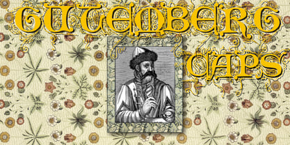
- Drury Lane NF by Nick's Fonts,
$10.00 - Like A Cat by PizzaDude.dk,
$20.00
- Hamuel Nine Five by LightHouse,
$49.00 - French Wine JNL by Jeff Levine,
$29.00
- LTC Vine Leaves by Lanston Type Co.,
$24.95
- Maple Lane Cursive by Okaycat,
$29.95
- Double Life BB by Blambot,
$20.00 - Sporting Life JNL by Jeff Levine,
$29.00 - Nine To FIve by Inumocca,
$16.00
- More Than Life by Ronny Studio,
$19.00
- Dining Car JNL by Jeff Levine,
$29.00
- Vengeance Is Mine by Comicraft,
$29.00
- Dining Out JNL by Jeff Levine,
$29.00
- Emily Lime Brush by Emily Lime,
$16.00
- Linea Nera NF by Nick's Fonts,
$10.00 - Like A Fool by PizzaDude.dk,
$20.00
- Walks Of Life by Epiclinez,
$18.00