10,000 search results
(0.04 seconds)
- Overthink by WTFont,
$20.00 Often it is hard to express ourselves and our emotions. Thus, the idea of emotional typography and fonts was born. This is a detailed font with many lines and shapes. It has been designed to reflect the feeling of overthinking. Overthinking, by nature, is done by logically thinking through all the different scenarios and outcomes for one particular thought or situation. Therefore the appearance of this font is one that is structured and technical. This font is great for architecture, buildings, construction, geometry or even for situations that are heavily detailed! It definitely works great as an overlay on images or photographs. Pair this overthink font with a simple sans serif font to contrast against the details in the former. We hope you enjoy this font as much as we do!
 - BIG Slant Black UltExp - Personal use only

- Ultra System by Set Sail Studios,
$14.00 Introducing Ultra System; A modern exploration of 8 fonts, each carefully designed to naturally compliment one another. With 6 clean sans fonts and 2 textured script fonts, Ultra System gives you a variety of ways to combine and arrange each font, allowing you to create striking & modern typographic designs. This typeface collection consists of 8 fonts; Ultra System Script • A textured, bouncy & flowing marker script font containing upper & lowercase characters, numerals, and a large range of punctuation. Ultra System Script Alt • This is a second version of Ultra System Script, with a completely new set of both upper and lowercase characters. If you wanted to avoid letters looking the same each time to recreate a custom-made style, or try a different word shape, simply switch to this font for an additional layout option. Ultra System Sans • A wide, bold sans font containing uppercase only characters, numerals, and a large range of punctuation. Ultra System Sans Line One • A thick outlined version of Ultra System Sans, pair this with other Ultra System Sans fonts to add emphasis to words or phrases. Ultra System Sans Line Two • A thin outlined version of Ultra System Sans, pair this with other Ultra System Sans fonts to add emphasis to words or phrases. Ultra System Sans Italic • Italic variations are included for all 3 Ultra System Sans fonts. FAQs; Accessing Ligatures • Ligatures are supported by most desktop graphics & text software (not just the fancy ones!), including Photoshop, Illustrator, InDesign, Word, Pages & Keynote. Many programs will automatically have this feature switched on for you, but if you need any help accessing then please feel free to drop me a message. Language Support • All Ultra System fonts support the following languages; English, French, Italian, Spanish, Portuguese, German, Swedish, Norwegian, Danish, Dutch, Finnish, Indonesian, Malay, Hungarian, Polish, Croatian, Turkish, Romanian, Czech, Latvian, Lithuanian, Slovak, Slovenian
 - FS Conrad by Fontsmith,
$50.00 Art into type In 2008, Fontsmith were approached by their friend, Jon Scott, to investigate whether a typeface could assume the aesthetic of one artist’s body of work. Jon’s not-for-profit charity, Measure, was organising an event for the artist, Conrad Shawcross, whose giant mechanical installation, entitled Chord, was going on public display in the long-disused Kingsway tram tunnel in Holborn. Chord explores the way we perceive time, as either a line or a cycle. Two enormous machines with dozens of rotating arms and moving in opposite directions, weave rope with almost infinite slowness. An unusual brief Phil Garnham visited Conrad in his Hackney studio to get a feel for his work and ideas. “Conrad is a very clever and philosophical guy. He struggled to see how typeface design had any relevance to him and his art. This was going to be a challenge.” The artist presented the type designer with a pile of rope and a huge diagram of sketches and mathematical workings. “This was, in essence, my brief.” Phil developed three concepts, the simplest of which ticked all the boxes. “The idea of the strokes in the letterforms appearing and ending at peaks or points of origin fitted perfectly with Conrad’s idea of time occurring and ending at two ends of the sculpture.” Two versions Phil planned modules for two versions of the typeface: one with five lines in the letterforms and one with seven. He then drew the modules on-screen and twisted and turned them to build the machine that is FS Conrad. “This is not a simple headline typeface,” says Phil. “It’s not a rigid structure. It has varying character widths, and it’s informed by real typographic insight and proportions so that it actually works as piece of functioning, harmonious type.”
 - Miss Donna by Scholtz Fonts,
$15.00 Miss Donna - contemporary, powerful, versatile and casual. Curvy, sassy, fast-talking, and utterly useable, she takes you into the world of movie posters, decor ads, fashion posters and tags, greeting cards and invitations. Her lines are bold, clean and legible. The Miss Donna family comes in four styles: - REGULAR - clean good lines and generous curves - for decor ads, greeting cards, copy - NARROW - slim (more compact), and elegant with contained curves - for greeting cards, invitations, copy - BLACK - bold statement, round, generous curves - for movie posters, fashion posters - BLACK CAPS - especially designed for "all-caps" printed text. Use for headings & subheads. Miss Donna Black Caps contains capitals in two sizes and this gives you the ability to generate text of two types: - a correctly spaced and kerned upper case, OR - a TRUE Small Caps -- as opposed to the false Small Caps produced by a well-known word processing application. In a correctly proportioned Small Caps the stroke width should not be reduced in the same proportion as the letter height is reduced. The stroke width of the small capitals should rather be equal or close to the stroke width of the corresponding upper case characters. Note: When using script fonts it is NOT usually advisable to use text in ALL caps. The best effects for headings and subheads are obtained with an initial upper case letter followed by lower case characters. BUT, Miss Donna will still produce excellent results with all caps if you are using an application that supports kerning. If you are using upper and lower case then it is not necessary to use kerning, although it may make a slight difference on occasion. Miss Donna contains over 235 characters - (upper and lower case characters, punctuation, numerals, symbols and accented characters are present). It has all the accented characters used in the major European languages.
 - Mayence by Isaco Type,
$39.00 Mayence is the French name of Mainz, German city where Johannes Gutenberg was born. It's a manuscript font inspired in the author's calligraphy, with an angular structure, marked by a certain impulsiveness. Besides being a continuous-line font, Mayence explores some deviations and imperfections in the calligraphy practice, as accumulations of paint and anomalies in the thickness variation, characteristics which gives it more naturality. Its main difference is the set of over 430 ligatures (Premium version), based on the research and selection of important character sequences, rather frequent in several languages. For this, a study was done about the diphthongs, triphthongs and di-tri-tetra-pentagraphs more common in languages such as English, Spanish, French, German, Italian, Portuguese, Dutch, Hungarian, Croatian, among others. Ligatures with up to 2 characters are enabled by default and with more than 2 characters are enabled by the Discretionary Ligatures option. Mayence also contains several ligatures based on common words in English and Spanish, exclusive ligatures with numbers and another standard, discretionary, historic and Unicode ligatures. It has 9 different ampersands (&), which can be chosen by the user according to the application context. When you enable the Titling Alternates (in OpenType-savvy programs), these 9 ampersand styles are converted to their forms of seal, with different purposes of use. To enrich your graphic applications, Mayence brings the Ornaments Version, for construction of impressive lines, borders, textures and the geometric shapes that you want, according to your creativity! To see the features available in each version, open or download the User Guide pdf, in the Gallery section. All text fonts are available in OpenType PS format and have extended character set to support CE, Baltic, Turkish, as well as Western European languages and additional Celtic characters.
 - Verdana Pro by Microsoft,
$40.00 The Verdana typeface family was designed specifically to address the challenges of on-screen display. Verdana was originally designed by world-renowned type designer Matthew Carter, and tuned for screen display by the leading TrueType hinting expert, Tom Rickner. The Verdana fonts are unique examples of type designed specifically for the computer screen.The Verdana family received a major update in 2011 as a collaboration between The Font Bureau, Monotype Imaging and Matthew Carter. The original Verdana family included only four fonts: regular, italic, bold and bold italic. The new and expanded Verdana Pro family contains 20 fonts in total. The Verdana Pro and Verdana Pro Condensed families each contain 10 fonts: Light, Regular, Semibold, Bold and Black (each with matching italic styles).Verdana exhibits characteristics derived from the pixel rather than the pen, the brush or the chisel. The balance between straight, curve and diagonal were meticulously tuned to ensure that the pixel patterns at small sizes are pleasing, clear and legible. Commonly confused characters, such as the lowercase i j l, the uppercase I J L and the number 1, have been carefully drawn for maximum individuality - an important characteristic of fonts designed for on-screen use. Another reason for the legibility of the Verdana fonts on the screen is their generous width and spacing.Designed by David Berlow and David Johnathan Ross of the Font Bureau, with typographic consultation by Matthew Carter, the new Verdana Pro includes a variety of advanced typographic features including true small capitals, ligatures, fractions, old style figures, lining tabular figures and lining proportional figures. An OpenType-savvy application is required to access these typographic features. The expanded weights and completely new condensed range of fonts provide designers with an expanded palette of typographic options for use in print and on-screen, in both small text sizes and headlines.
 - Port by Onrepeat,
$25.00 Detailed guided tour available here. Port is an experimental Didone typeface with a modern twist, inspired in the well known forms of typography masters such as Bodoni and Didot and the exuberance and elegance of calligraphy typefaces. Port melds the straight lines and strong contrasts of the Didone typefaces with the elegant lines of calligraphy in a geometric way, resulting in exuberant characters with geometric swashes that can be combined in countless ways. The result of this experiment is Port, an unique and rich display typeface meant to be used on big sizes and it’s main perk is the amount of alternative characters it features. Port is Open-Type programmed and includes hundreds of alternates, from swashes to titling alternates, ligatures and stylistic sets with each character having a thin version of itself, giving complete freedom to all your creative needs. Port is available in several flavours: Port Regular, being the base version and featuring the whole base character set; Port Regular Decorated, featuring richer forms and containing more ornamentated and more extravagant characters; Port Medium and Port Medium Regular, designed for the occasions you need a bit more thickness and the decoration variants: Port Ornaments, containing a wide set of elements meant for the creation of fillets, vignettes and fleurons, resulting in an almost infinite number of possible combinations to embellish your designs and Port Words, a set of some of the most common words used in English, Spanish, French, German, Italian and Portuguese. It’s strongly recommended that you use it on big sizes, for better performance you can also set the Photoshop text anti aliasing settings to Strong when you type, for a better understanding of all the uses of Port and the full character list I recommend the reading of the manual.
 - FormPattern Color Six by Tarallo Design,
$14.99 Use this font to make lines, borders, patterns, backgrounds, unique bullets, or use it inline within text. Let your imagination explore the possibilities to combine these geometric shapes. Use letter spacing to connect the shapes in a continuous pattern, or space them apart horizontally. Stack them vertically and control their distance with leading (line spacing). Make fields of pattern and explore layering and opacity for color mixing. FormPattern Color Six takes inspiration from mosaic patterns seen in the south of Italy. It is easier to use this font to make patterns than to use drawings because you can control the size, color, and spacing from the type menu. It is also an effective way to make web graphics that are responsive with text. Using it is simple. As you type, forms will appear instead of letters. Each font in this collection is a colored set. The sets are primary, secondary, tertiary, analogous, dark, old world, vintage, greyscale, cool grey, and warm grey. There is a solid font that can be colored in the same way as regular fonts. The color fonts are accessed in the type menu where you would normally find the different weights or italics Most design software, such as Illustrator, InDesign, and Photoshop provide a glyphs palette where you can choose the precise form you want. It can work with the simplest text editors too. However, these may not support the color options. FormPattern Color Six is a vector-based and fully scalable SVG OpenType format. Color fonts are supported by Photoshop 2017, Illustrator 2018, and QuarkXPress 2018 (and later versions). This version of FormPattern Color Six is compatible with all FormPattern fonts by Tarallo Design. The display artwork shows it paired with the typeface Scanno.
 - Eksja by Protimient,
$29.00 Eksja is a modern slab serif available in four weights, each with a corresponding italic. All the fonts in the family have small caps, the extended latin character set, diacritical f-ligatures, enclosed numerals (numbers in circles) and case-sensitive punctuation. The general design of the typeface has been with a strong human touch in mind. The ends of the serifs have been given a subtle rounding, just enough to take the edge off which, when coupled with the largely humanist structure of the design, creates an open, friendly and approachable design, abandoning the usual geometric severity commonly associated with slab serif typefaces. Eksja contains quite a comprehensive numerals system. Obviously, each font has the standard proportionally and tabularly spaced lining and old-style figures but, crucially, the tabular numerals share the exact same width in each font variant. That means that you can choose to use the thin, regular, bold, black and their italic forms all in the same setting and they will always line up. In addition to the 'normal' numerals there are super-script and sub-script numerals and OpenType fractions that can be automatically composed as you type. There are also the enclosed numerals, numbers inside a circle, that are useful for numerically listing items and, thanks to the wizardry of OpenType, they can contain any number of digits (typically, enclosed numerals are precomposed single digits, only encompassing the 0–9 range, the enclosed numerals in Eksja can go to double digits, triple digits or, in fact, any number of digits*). *The automation of the enclosed numerals is accessed via either "Stylistic Set #1" or "Stylistic Alternates" which requires the use of an application that supports OpenType stylistic sets or stylistic alternates, such as Adobe's InDesign or Photoshop.
 - Malow by Putracetol,
$28.00 Malow - Display Font Malow is a stunning display font that will bring elegance and sophistication to any project. This font was designed with a contemporary style that still maintains a classic look, making it perfect for a wide range of applications. The idea behind the creation of Malow was to develop a font that combines a modern aesthetic with a touch of timeless elegance. The result is a typeface that looks fantastic on branding projects, logos, packaging designs, posters, and more. Malow is a versatile font that can be used in a variety of design contexts, whether it's for print or digital projects. Its clean lines and bold appearance make it an excellent choice for headlines and titles, while its legibility also makes it ideal for body text. This font comes with a range of features that make it even more appealing. It includes uppercase and lowercase letters, opentype alternates and ligatures, and full multilingual support, ensuring that it can be used for projects in any language. In the font package, you will find three different file formats, including OTF, TTF, and WOFF. This makes it easy to use the font across a range of design software, including Adobe Illustrator, Photoshop, InDesign, and more. If you're looking to add a touch of sophistication to your design project, then Malow is an excellent choice. Its clean lines and elegant style make it a versatile font that will elevate any design. In summary, Malow is an elegant display font that combines modern and timeless styles, making it a great choice for a wide range of design projects. Its features include multilingual support, opentype alternates and ligatures, and three file formats in the package. This font is perfect for anyone looking to add a touch of sophistication to their project.
 - Betaphid by Typodermic,
$11.95 Introducing Betaphid, a sleek and modern display typeface designed to embody the principles of science and technology. Its minimalist aesthetic, inspired by the bold lines and raw textures of brutalist architecture, evokes a sense of futuristic innovation that is perfect for science fiction themes. But Betaphid is more than just a visually stunning typeface—its austere features are also designed to enhance the technical precision and geometric accuracy of your creations. With its clean lines and perfect proportions, Betaphid will lend a sense of order and logic to your designs, making them appear more polished and professional. Whether you’re creating a website, a product label, or a scientific report, Betaphid is the ideal font for conveying a sense of scientific authority and technical expertise. So why settle for less when you can achieve perfect geometric precision with Betaphid? Try it today and take your designs to the next level. Most Latin-based European writing systems are supported, including the following languages. Afaan Oromo, Afar, Afrikaans, Albanian, Alsatian, Aromanian, Aymara, Bashkir (Latin), Basque, Belarusian (Latin), Bemba, Bikol, Bosnian, Breton, Cape Verdean, Creole, Catalan, Cebuano, Chamorro, Chavacano, Chichewa, Crimean Tatar (Latin), Croatian, Czech, Danish, Dawan, Dholuo, Dutch, English, Estonian, Faroese, Fijian, Filipino, Finnish, French, Frisian, Friulian, Gagauz (Latin), Galician, Ganda, Genoese, German, Greenlandic, Guadeloupean Creole, Haitian Creole, Hawaiian, Hiligaynon, Hungarian, Icelandic, Ilocano, Indonesian, Irish, Italian, Jamaican, Kaqchikel, Karakalpak (Latin), Kashubian, Kikongo, Kinyarwanda, Kirundi, Kurdish (Latin), Latvian, Lithuanian, Lombard, Low Saxon, Luxembourgish, Maasai, Makhuwa, Malay, Maltese, Māori, Moldovan, Montenegrin, Ndebele, Neapolitan, Norwegian, Novial, Occitan, Ossetian (Latin), Papiamento, Piedmontese, Polish, Portuguese, Quechua, Rarotongan, Romanian, Romansh, Sami, Sango, Saramaccan, Sardinian, Scottish Gaelic, Serbian (Latin), Shona, Sicilian, Silesian, Slovak, Slovenian, Somali, Sorbian, Sotho, Spanish, Swahili, Swazi, Swedish, Tagalog, Tahitian, Tetum, Tongan, Tshiluba, Tsonga, Tswana, Tumbuka, Turkish, Turkmen (Latin), Tuvaluan, Uzbek (Latin), Venetian, Vepsian, Võro, Walloon, Waray-Waray, Wayuu, Welsh, Wolof, Xhosa, Yapese, Zapotec Zulu and Zuni.
 - ÉconoSans Pro by Ingo,
$41.00 The most space-saving sans serif This font saves more space than any of its kind! Slim proportions, but not “condensed” Characters which nearly touch Sparse ascenders and descenders Distinct forms How close to each other can the characters of a font get? Theoretically, as close as you want. But obviously, the words should still be legible. And as any designer knows, body clearance of characters also depends on other parameters such as point size and line spacing. In practice, there are always situations in which as much information as possible has to be positioned in as little space as possible. The ingoFont ÉconoSans is made for exactly this purpose. Even the name of the font implies its function: French for the infinitive “to save” is “économiser.” Now if that doesn’t sound good… The shapes of the upper and lower case letters are completely matter-of-fact, the way a modern font has got to be. The letters c e, and s are wide open to their neighbors. An especially distinguished trait of this font is the design of the “triangular” characters v w y x k z and A V W Y Z K X M N. And the open form of B R and P is also not typical in a sans serif. The distance between letters is kept tight and often the characters nearly touch, but only nearly. With ÉconoSans you gain approximately 20% more text in a line than with »Tahoma«, and even still more than 10% compared to »Helvetica«. ÉconoSans also includes tabular figures as well as ligatures. Among the ligatures, the double mm is especially unusual and is hardly familiar, but can contribute greatly to saving space without catching the reader’s eye.
 - TT Ricks by TypeType,
$19.00 Attention! Important information! There is no Cyrillic support in TT Ricks! TT Ricks useful links: Specimen | Graphic presentation | Customization options About TT Ricks: We are glad to present you the new font TT Ricks, which continues the line of trendy and yet affordable TypeType Starter Kit fonts. TT Ricks is a flamboyant elzevir-type serif, for which the words “cute” or “calm” are not a fitting definition. TT Ricks can be classified as a display title typeface that works especially well at large and medium sizes in packaging design, book graphics and posters. The typeface is inspired by the pre-digital font “De Vinne”, which was designed in 1892 by the designer Gustav F. Schroeder. We liked certain aspects of the historical prototype, but at the same time, when creating TT Ricks, we did not want to limit ourselves—on the contrary, we were eager to discover a completely new spirit and bring bright details to the font. The TT Ricks typeface stands out for its strong contrast, noticeable sharp serifs, narrow letterforms with a pronounced displacement of flows in the arches. The typeface has very dense spacing, and in the bold style, the text set begins to resemble Gothic by its richness and tension. Important visual features of TT Ricks are the dashing shapes of ascenders and descenders, the thin and sharp stroke endings, and the “elzevier legs” of the letters R K k. In the lowercase round characters c e s, you can notice the pronounced slope of the oval, which contrasts with the general set of the font. These "slanted" signs and ascenders and descenders of the letters f and y are designed to cut the monotony of a set and to entertain the reader's eyes. The TT Ricks typeface consists of three weights (Regular, Medium, Bold) and one variable font. Each style consists of 553 glyphs and contains 18 OpenType features. The most interesting features are stylistic alternates for the letters R K k with alternative short leg shapes, two sets of figures for working with upper and lower case characters, and a set of original icons that further reveal the spirit of the family. Please note! If you need OTF versions of the fonts, just email us at commercial@typetype.org Attention! Important information! There is no Cyrillic support in TT Ricks! TT Ricks OpenType features: aalt, ccmp, locl, numr, ordn, tnum, onum, lnum, pnum, case, liga, calt, ss01, ss02, ss03, ss04, ss05, ss06 TT Ricks language support: Acehnese, Afar, Albanian+, Aleut (lat), Alsatian, Aragonese, Arumanian+, Asu, Aymara, Azerbaijani +, Banjar, Basque +, Belarusian (lat), Bemba, Bena, Betawi, Bislama+, Boholano+, Bosnian (lat), Breton +, Catalan+, Cebuano+, Chamorro+, Chichewa, Chiga, Colognian+, Cornish, Corsican +, Cree, Croatian, Czech+, Danish, Dutch+, Embu, English+, Esperanto, Estonian+, Faroese+, Fijian, Filipino+, Finnish, French, Frisian, Friulian+, Gaelic, Gagauz (lat), Galician+, Ganda, German+, Gikuyu, Guarani, Gusii, Haitian Creole, Hawaiian, Hiri Motu, Hungarian+, Icelandic+, Ilocano, Indonesian+, Innu-aimun, Interlingua, Irish,
 - TT Lovelies Script by TypeType,
$29.00 TT Lovelies Script useful links: Specimen | Graphic presentation | Customization options About TT Lovelies Script: Without any false modesty we can say that TT Lovelies Script is one of the most complicated projects we have ever carried out – there are 1115 glyphs, more than 2000 contextual alternates, 10000 kerned pairs and a large number of OT features, including ligatures and Old Style numbers. The most important characteristic of this font is that it is really seamless. We've done the impossible: in TT Lovelies Script, even capital letters are connected to lower-case letters without any breaks. The base for our typeface is original calligraphy by Russian designer Alena Korobanova. The beautiful handwriting was painstakingly crafted into a fully functional font. TT Lovelies Script is a very lively and playful typeface with some unpredictable nuances. Turn on the use of OpenType features CALT & DLIG in your graphic editor and use the font to the full. Every lower-case letter has characteristic pen strokes which begin and end a word. The pen strokes are turned on automatically when you accordingly type two hyphens at the beginning and at the end of a word. For instance, type '- - apricot - -' and you'll see the beautiful pen strokes at the beginning and at the end of the word. TT Lovelies Script uses a great number of contextual alternates and ligatures which help maintain the handwritten impression. For each letter, a separate grapheme is created for the end of a line, and we've also integrated the Case Sensitive OpenType feature to make working with upper-case characters easier. We've enabled onum, sups, sinf, numr, dnom, frac, ordn as well in order to work with figures. To benefit from all of these wonderful options, you need to use software which supports OpenType features. TT Lovelies Script language support: Acehnese, Afar, Albanian, Alsatian, Aragonese, Arumanian, Asu, Aymara, Banjar, Basque, Belarusian (cyr), Bemba, Bena, Betawi, Bislama, Boholano, Bosnian (cyr), Bosnian (lat), Breton, Bulgarian (cyr), Cebuano, Chamorro, Chiga, Colognian, Cornish, Corsican, Cree, Croatian, Czech, Danish, Embu, English, Erzya, Estonian, Faroese, Fijian, Filipino, Finnish, French, Friulian, Gaelic, Gagauz (lat), Galician, German, Gusii, Haitian Creole, Hawaiian, Hiri Motu, Hungarian, Icelandic, Ilocano, Indonesian, Innu-aimun, Interlingua, Irish, Italian, Javanese, Judaeo-Spanish, Judaeo-Spanish, Kalenjin, Karachay-Balkar (lat), Karaim (lat), Karakalpak (lat), Kashubian, Khasi, Khvarshi, Kinyarwanda, Kirundi, Kongo, Kumyk, Kurdish (lat), Ladin, Latvian, Laz, Leonese, Lithuanian, Luganda, Luo, Luxembourgish, Luyia, Macedonian, Machame, Makhuwa-Meetto, Makonde, Malay, Manx, Maori, Mauritian Creole, Minangkabau, Montenegrin (lat), Mordvin-moksha, Morisyen, Nahuatl, Nauruan, Ndebele, Nias, Nogai, Norwegian, Nyankole, Occitan, Oromo, Palauan, Polish, Portuguese, Quechua, Rheto-Romance, Rohingya, Romansh, Rombo, Rundi, Russian, Rusyn, Rwa, Salar, Samburu, Samoan, Sango, Sangu, Scots, Sena, Serbian (cyr), Serbian (lat), Seychellois Creole, Shambala, Shona, Slovak, Slovenian, Soga, Somali, Sorbian, Sotho, Spanish, Sundanese, Swahili, Swazi, Swedish, Swiss German, Swiss German, Tagalog, Tahitian, Taita, Tatar, Tetum, Tok Pisin, Tongan, Tsonga, Tswana , Turkish, Turkmen (lat), Ukrainian, Uyghur, Vepsian, Volapük, Võro, Vunjo, Xhosa, Zaza, Zulu.
 - Patron - Personal Use - Personal use only

- Avante Go - Personal use only

- Avante Return - Unknown license

- VTC Krinkle-Kut - Unknown license

- VTC Krinkle-Kut - Unknown license

- Stoehr numbers - Personal use only

- ITC Atmosphere by ITC,
$29.00The Algerian designer Taouffik Semmad created the fonts in 1997. Taouffik Semmad grew up speaking Algerian-Arabic dialect and French, studied Russian, and is now living in Montreal. This could perhaps explain his current passion, to "find a universal writing", which he admits is a Utopian idea. Created with brush and Chinese ink, the characters of ITC Atmosphere came from Semmad's hand but only after they were fully formed in his mind's eye. - Gibbs by Typetanic Fonts,
$39.00 Gibbs is a tough, sophisticated sans, inspired by the unique cast aluminum signs found on board the 1950s luxury liner SS United States and named for its designer, William Francis Gibbs. The design is appropriately transatlantic, somewhere in between industrial American vernacular lettering and English humanist styles. The result is both uniquely stylish and comfortably readable in both text and display sizes. Gibbs received a Type Directors Club award for excellence in 2015.
 - Abigail Script by Roland Hüse Design,
$15.00 Abigail Script is a handwritten, monoline cursive font. All the uppercase letters has stylistic alternates and some lowercase letters as well, ligatures and positional forms. Also have a few ornaments in place of numbers 1-9 best fit under words up to 5-6 characters long. See the gallery for preview. It contains Eastern and Western European accented characters. I hope you like this font, good luck with your project and let the creativity flow!
 - Micaroline by Martype co,
$19.00 MICAROLINE The Classic Art Deco Font with Alternates & Ligatures Micaroline is a family Sans Serif font designed with carefully handcrafted. Also suitable for branding, T-shirt, Wedding Invitation, Classic Design, Logotype, and any project. Comes with a tons of ligature make your life more than comfortable, easier to design and adjust frustrating space in font. All Caps Fonts. You can access the stars by typing (S+1) and then put it anywhere you want.
 - Dreadnought by Hanoded,
$15.00 With Dreadnought I go back to my roots: one of my very first fonts was a scary brush typeface called Face Your Fears - a very popular typeface with horror lovers, thrill seekers and gangsta rappers. Dreadnought was created using a stiff brush and some very high quality paint on textured paper. The result is a lively, scary and very legible font. Use it for your movie, book or album: you won't be disappointed!
 - Skunkling by Jason Mark Jones,
$15.00 Skunkling was born out of a contest, where its initial design won first place. It was inspired by a real-life encounter between a spraying skunk and a defenseless designer. Skunkling is carefully designed to be playful and even awkward. Unique letter forms and ligatures allow the letters to fit snugly together. The two "weights" can be used individually or they have the unique capability to be overlaid to create a two-color font.
 - Punkto by Ahmet Altun,
$19.00 The Punkto font family comes in nine weights of Normal and Italic. With the Punkto font family, you can create beautiful works for the web, including logos, banners, body copy, and presentations. Punkto typeface also works nicely in print formats such as posters, T-shirts, magazines, and affiches. Because of its eye-pleasing style, this font is both effective and versatile. It supports a wide range of languages, including Extended Latin and Cyrillic.
 - Poptis by Abbasy Studio,
$10.00 The combination of two different font styles 'script and sans' . Poptis font available in Regular, Bold, and Rough version as a choice to mix and match your design. This script font comes with multiple alternates that will make your words look like a custom lettering. With additional Serif font you will be able to create the beautiful combination. Both of these font is great for Logos, Lettering, Clothing Design, Poster, Label, Quotes, etc.
 - Faubourg by Positype,
$39.00 Faubourg marks the first professional typeface release by Marie Boulanger. As much traditional as it is unconventional in its celebration of letterforms, this typeface dances on the page and screen as it moves from a more conventional appearance to monoline and back again. The flowing silk-like undulation only accentuates this distinguishing feature and produces one opportunity after the next for headline settings where the word is as important as the content supporting it.
 - Typewriter Sans JNL by Jeff Levine,
$29.00 At first glance, Typewriter Sans JNL seems to look like the pantograph lettering of an engraved sign or the rounded-end lettering from an architect's templates. It might also be mistaken for plastic pin-back lettering used on some bulletin boards. In actuality, the design is based on examples of an electric typewriter ball element with a sans font named "Dual Gothic", suggested for use "in credit reports and other financial applications".
 - Farm House by Vozzy,
$5.00 A vintage look label font named "Farm House".Typeface includes five styles for clean version and five styles for rough version, for sample look at 4th preview. This font will good viewed on any retro design like poster, t-shirt, label, logo etc. For using effects layers (for clean or rough version): - Type your text in Regular. - Copy that and paste at the same position. - Change the style to Shadow or Texture.
 - Dom Casual by URW Type Foundry,
$89.99 Dom Casual is a very condensed script, almost monotone, with irregular vertical strokes ending at different heights, and which suggests a freehand effect. It was designed by Pete Dom in 1951 for American Type Founders. As its name suggests, the Dom Casual font gives the appearance of a quick brush-like lettering and is suitable for setting titles, subheadings and short copy. There is some variations of stress in the rounded letters.
 - Pinky Cupid by Attype Studio,
$15.00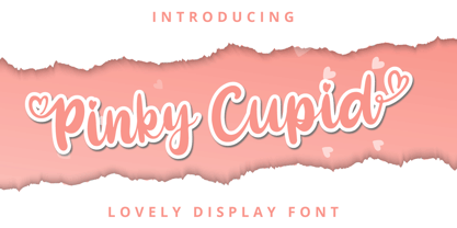 Pinky Cupid is lovely display font, including stylistic alternates that perfect for any combination for your design. Pinky Cupid perfectly macth for design with valentine theme, any product like book cover, t-shirt, branding, promotion, social media post, quotes, wedding, photography and more. What's included: - Multilingual Support - Support OpenType features - Works on PC & Mac - Simple installations - Accessible in the Adobe Illustrator, Adobe Photoshop, Adobe InDesign --- Hope you enjoy with our font! Attype Studio
 - Core Narae by S-Core,
$59.00 CoreNarae is an upright, casual handwriting style font and all glyphs have been hand-crafted. This typeface is live and friendly because of its bending strokes and rhythmic feeling, so it is good for fun text for posters, headers or cards. Supported codepages are MS Windows 1252 Latin1 and MS Windows 949 Korean consisting of 11,172 Korean letters and Symbols except Chinese. This font will make your works more friendly and emotional.
 - SK Gothenburg by Salih Kizilkaya,
$9.99 SK Gothenburg is a double-weighted sans serif font designed with inspiration from the blending of the historical structure of the city of Gothenburg with its modern life. It contains all the typographic elements you will need. It offers full support for the Latin alphabet, and includes basic characters in Cyrillic and Greek alphabets. SK Gothenburg contains 48 different fonts and 34,176 glyphs. It includes a free version for you to experience.
 - Sirenia by Floodfonts,
$49.00 Sirenia is designed by nature! A friendly display typeface with organic letterforms and flowing transitions, as if naturally grown. This authentic natural look is ideally suited for lifestyle products, the food & beverage sector and for sustainable design. Sirenia’s 1270 characters contain many decorative letters and swash variations for initial, medial and final letters. This allows the designer to create lively logotypes according to her/his own ideas, matching the respective letter combination.
 - Albe Sans by Hackberry Font Foundry,
$24.95Albe Sans is a font family that began life when I was struck by a full-color back page ad in a 1935 copy of Better Homes & Gardens. I loved the readability and general cleanliness of the design. This font is drawn from memory after that experience. It is loosely based on Palton for proportion, but heaviily modified (not to mention, Palton is serif): Lower case numbers, Euro, ballot box in the section slot. - Little Love by Attype Studio,
$14.00 Little love is lovely display font, including stylistic alternates that perfect for any combination for your design. Little love perfectly match for design with valentine theme, any product like book cover, t-shirt, branding, promotion, social media post, quotes, wedding, photography and more. What's included: - Beginning & Ending Swash - Multilingual Support (Afrikaans, Albanian, Catalan, Danish, Dutch, English, Estonian, Finnish, French, German, Icelandic, Italian, Norwegian, Portugese, Spanisch, Swedish, Zulu) --- Hope you enjoy with our font! Attype Studio
 - Bavaroir by URW Type Foundry,
$39.99 Bavaroir looks like a techno party in the throne room of Neuschwanstein: grandiose, original and still high-tech, modern, stylish and chic? anything but lifeless. The design experiment was to create a sans serif based on ?dropping endings?. Something between elegance and protest, Bavaroir coquettishly hides its edges. Although pretty narrow in design, Bavaroir still flows easily, openly and well readably, even in very small sizes. Bavaoir was designed for the URW++ FontForum.


