10,000 search results
(0.021 seconds)
- Made For Japan by Font Aid V,
$20.00 In March 2011, the Society of Typographic Aficionados began organizing a collaborative project that would unite the typographic and design communities. The goal of Font Aid V: Made for Japan was to raise funds to expedite relief efforts after the devastating earthquake and tsunami in Japan. Nearly 300 contributors from 45 countries sent in over 500 glyphs in a single week. Behind the scenes, volunteers Neil Summerour, Silas Dilworth, Delve Withrington, and Grant Hutchinson were up to their elbows in Adobe Illustrator and Fontlab assembling the typeface. The sheer number of submissions coupled with the complexity of some of the designs caused unforeseen delays in completing the typeface. The team not only managed the immense influx of submissions, it also had several technical hurdles and multiple content reviews to mitigate before the final font could be produced. Several months after the project was initiated, Font Aid V: Made for Japan was finally ready for distribution. With the help of Sogo Japan, all proceeds from sales of this typeface will be delivered directly to organizations in Japan, such as Second Hand and AMDA International (Association of Medical Doctors of Asia). Sogo Japan strives to help circumvent regular international charity channels and the inefficiencies associated with them. Thanks to everyone who participated and helped us spread the word about the Font Aid V: Made for Japan project. In particular, we would like to acknowledge the following individuals and groups for their participation and involvement: Jonathan Abbott, Rui Abreu, Frank Adebiaye, Tim Ahrens, Anonymous, Eero Antturi, Leonardo Aranda, Hector Carrillo Aspano, Danielle Atnip, Alejandro Cabrera Avila, Christophe Badani, Joanne Gyo Young Bae, Ben Balvanz, Cynthia Bataille, Priyanka Batra, Donald Beekman, Hannes Beer, David Berlow, Kevin Beronilla, Fabian Bertschinger, Nicole Bittner, Bart Blubaugh, Dathan Boardman, Andrew Boardman, Joel Vilas Boas, Konstantin Boldovskiy, Scott Boms, Michael Browers, Vickie Burns, Matt Burvill, Daniele Capo, Seymour Caprice, Mauro Caramella, Matevž Čas, Eli Castellanos, Sarah Castillo, Tom Censani, Pinar Ceyhan, Ivette Chacon, Hin-Ching Chan, Sarah Charalambides, Karen Charatan, Sinde Cheung, Todd Childers, Justin Chodzko, Felipe Coca, Antonio Coelho, Jefferson Cortinove, Alan Lima Coutinho, Nick Cox, Nick Curtis, Girish Dalvi, Christopher DeCaro, Thomas C Dempsey, Matt Desmond, Chank Diesel, Anum Durvesh, Suzie Eland, Engy Elboreini, Craig Eliason, Emi Eliason, James Elliott, Grace Engels, Exljbris, Hillary Fayle, Carol Fillip, Jeff Fisher, Scott Fisk, John Foley, Stuart Ford, Mathias Forslund, Brock French, Anina Frischknecht, Eric Frisino, Chiyo Fujimori, Kaela Gallo, Ayesha Garrett, Harald Geisler, Alfonso Gómez-Arzola, Adriana Esteve González, Richard Gregory, James Grieshaber, Grupoingenio, Kemie Guaida, Carlos Fabián Camargo Guerrero, Rachel Han, Erin Harris, Stefan Hattenbach, Magnus Hearn, Marissa Heiken, Georg Herold-Wildfellner, Jamie Homer, Ed Hoskin, Dav[id Hubner], Jonathan Hughes, Rian Hughes, Grant Hutchinson, Xerxes Irani, Masayuki Izumi, Jan Janeček, Hyun Kyung Jang, Julien Janiszewski, Dušan Jelesijevic, Cal Jepps, Meghan Jossick, Evamaria Judkins, July Twenty Fourth, Erica Jung, William K, Claes Källarsson, Kapitza, Asutosh Kar, Arno Kathollnig, Sami Kaunisvirta, Hajime Kawakami, Scott Kaye, Richard Kegler, Anna Keroullé, Bizhan Khodabandeh, Lara Assouad Khoury, Ilona Kincses, Becky King, Sean King, Megan Kirby, Max Kisman, Keith Kitz, Romy Klessen, Akira Kobayashi, Kokin, Kozyndan & Silas Dilworth, Atushi Kunimune, Andreas Kuschner, John Langdon, Ray Larabie, Jess Latham, Kelly D Lawrence, Matic Leban, Chien-Hao Lee, Bryan Levay, Enrico Limcaco, Andreas Lindholm, Andrew Loschiavo, Chris Lozos, Ian Lynam, John Lyttle, Gustavo Machado, Jonathan Mak, Ricardo Marcin, Jeannie Mecorney, Steve Mehallo, Cristina Melo, Martin Mendelsberg, The Midnight Umbrella Studio, Goro Mihok, Ojasvi Mohanty, Ahmed Mohtadi, Alixe Monteil, Veronica Monterosso, Dani Montesinos, Masanobu Moriyama, Misa Moriyama, Pedro Moura, John Moy Jr, Marc Marius Mueller, Shoko Mugikura, Joachim Müller-Lancé, Diane Myers, John Nahmias, Yoshihisa Nakai, Hiroshi Nakayama, Reiko Nara, Nathoo, Titus Nemeth, Nathanael Ng, Ngoc Ngo, Antoninus Niemiec, James Ockelford, Kunihiko Okano, Naotatsu Okuda, Toshi Omagari, Onikeiji, Ozlem Ozkal, Jason Pagura, Hrant Papazian, Brian Jongseong Park, John Passafiume, Patrick Griffin, Alejandro Paul, Vian Peanu, Dylan Pech, Rebecca Penmore, Peter Brugger, Jean François Porchez, Carolyn Porter, Andrew Pothecary, James Puckett, Rachel Hernández Pumarejo, James Random, Liam Roberts, Tom Rogers, David Jonathan Ross, Sumio Sakai, Sana, Stuart Sandler, Rafael Saraiva, Riccardo Sartori, Ai Sasaki, Yee Wen Sat, Agnes Schlenke, Giovanna Scolaro, Roland Scriver, Alessandro Segalini, Shawn Semmes, Jane Sheppard, Josh Sherwood, Paulo Silva, Mark Simonson, Luis Siquot, Greg Smith, Owen Song, James L. Stirling, Nina Stössinger, Tanya Turipamwe Stroh, Kevin Strzelczyk, Neil Summerour, Superfried, Shiho Takahashi, Shuji Takahashi, Yusuke Takeda, Naoyuki Takeshita, Bruno Tenan, Chung-Deh Tien, Tom, Ryoichi Tsunekawa, Alex Tye, Matthew Tyndall, TypoVar, Virginia Valdez, Beatriz Valerio, Tom Varisco, Brayden Varr, Catarina Vaz, Andy Veale, Yvette Claudia Velez, Marie-Anne Verougstraete, Abbie Vickress, Ray Villarreal, Pat Vining, Courtney Waite, Hoyle Wang, Viola Wang, Jim Ward, Grace Watling, Terrance Weinzierl, Robert Weiss, Stuart Weston, Kevin Wijaya, Dave Williams, Beau Williamson, Delve Withrington, Katherine Wood, Neil Woodyatt, Jesvin Yeo, Yokokaku, Kazuhi Yoshikawa, YouWorkForThem, Matt Yow, Charlton Yu, Yuriko, Ron Za, Jayson Zaleski, Víctor Zúñiga
 - Romance Fatal Sans - Personal use only

- Celebrate The Day Pro by CheapProFonts,
$10.00 The freeflowing and quite feminine style of this script appealed to me, but it needed a bit of taming. Quite a few of the letterforms have been normalized - to better accommodate the diacritics. :) All fonts from CheapProFonts have very extensive language support: They contain some unusual diacritic letters (some of which are contained in the Latin Extended-B Unicode block) supporting: Cornish, Filipino (Tagalog), Guarani, Luxembourgian, Malagasy, Romanian, Ulithian and Welsh. They also contain all glyphs in the Latin Extended-A Unicode block (which among others cover the Central European and Baltic areas) supporting: Afrikaans, Belarusian (Lacinka), Bosnian, Catalan, Chichewa, Croatian, Czech, Dutch, Esperanto, Greenlandic, Hungarian, Kashubian, Kurdish (Kurmanji), Latvian, Lithuanian, Maltese, Maori, Polish, Saami (Inari), Saami (North), Serbian (latin), Slovak(ian), Slovene, Sorbian (Lower), Sorbian (Upper), Turkish and Turkmen. And they of course contain all the usual "western" glyphs supporting: Albanian, Basque, Breton, Chamorro, Danish, Estonian, Faroese, Finnish, French, Frisian, Galican, German, Icelandic, Indonesian, Irish (Gaelic), Italian, Northern Sotho, Norwegian, Occitan, Portuguese, Rhaeto-Romance, Sami (Lule), Sami (South), Scots (Gaelic), Spanish, Swedish, Tswana, Walloon and Yapese.
 - Pirates Gold Pro by CheapProFonts,
$10.00 This stylish swashbuckling typeface had a very limited character set, but with the CheapProFonts treatment this buried treasure is ready to be rediscovered. Character map included. "Arrr! Shiver me timbers!" ALL fonts from CheapProFonts have very extensive language support: They contain some unusual diacritic letters (some of which are contained in the Latin Extended-B Unicode block) supporting: Cornish, Filipino (Tagalog), Guarani, Luxembourgian, Malagasy, Romanian, Ulithian and Welsh. They also contain all glyphs in the Latin Extended-A Unicode block (which among others cover the Central European and Baltic areas) supporting: Afrikaans, Belarusian (Lacinka), Bosnian, Catalan, Chichewa, Croatian, Czech, Dutch, Esperanto, Greenlandic, Hungarian, Kashubian, Kurdish (Kurmanji), Latvian, Lithuanian, Maltese, Maori, Polish, Saami (Inari), Saami (North), Serbian (latin), Slovak(ian), Slovene, Sorbian (Lower), Sorbian (Upper), Turkish and Turkmen. And they of course contain all the usual "western" glyphs supporting: Albanian, Basque, Breton, Chamorro, Danish, Estonian, Faroese, Finnish, French, Frisian, Galican, German, Icelandic, Indonesian, Irish (Gaelic), Italian, Northern Sotho, Norwegian, Occitan, Portuguese, Rhaeto-Romance, Sami (Lule), Sami (South), Scots (Gaelic), Spanish, Swedish, Tswana, Walloon and Yapese.
 - Lahab by Arabetics,
$39.00 A connected typeface design with a calligraphic flavor. The Lahab (Arabic for flame) font family employs visual features from the Arabic Diwani Calligraphy. It has six members, normal, bold, and light, all of which come in two styles, regular and left-slanted italic styles. This font family design follows the guidelines of Mutamathil Taqlidi type style with one glyph for every basic Arabic Unicode character or letter, as defined in the latest Unicode Standards, and one additional final form glyph, for the freely-connecting letters in traditional Arabic cursive text. Lahab employs variable x-height values. It includes only the Lam-Alif ligatures. Soft-vowel diacritic marks, harakat, are selectively positioned. Most of them appear by default on the same level, following a letter, to ensure that they would not interfere visually with letters. Tatweel is a zero-width glyph. Keying the tatweel key before Alif-Lam-Lam-Ha will display the Allah ligature. Lahab includes both Arabic and Arabic-Indic numerals, in addition to standard punctuations.
 - Fallujah by Arabetics,
$39.00 A typeface design with extra isolated scattered letters and random careless look. It has six members, normal, bold, and medium, all of which come in two styles, regular and left-slanted italic styles. This font family design follows the guidelines of Mutamathil Taqlidi type style with one glyph for every basic Arabic Unicode character or letter, as defined by the Unicode Standards, and one additional final form glyph, for the freely-connecting letters in traditional Arabic cursive text. Fallujah employs variable x-height values. It includes only the Lam-Alif ligatures. Soft-vowel diacritic marks, harakat, are selectively positioned. Most of them appear by default on the same level, following a letter, to ensure that they would not interfere visually with letters. Tatweel is a zero-width glyph. Keying the tatweel key before Alif-Lam-Lam-Ha will display the Allah ligature. Fallujah includes both Arabic and Arabic-Indic numerals, in addition to standard punctuations.
 - Dialtone - Unknown license

- Divina Proportione by Intellecta Design,
$29.00 Divina Proportione is based from the original studies from Luca Pacioli. Luca Pacioli was born in 1446 or 1447 in Sansepolcro (Tuscany) where he received an abbaco education. Luca Pacioli was born in 1446 or 1447 in Sansepolcro (Tuscany) where he received an abbaco education. [This was education in the vernacular (i.e. the local tongue) rather than Latin and focused on the knowledge required of merchants.] He moved to Venice around 1464 where he continued his own education while working as a tutor to the three sons of a merchant. It was during this period that he wrote his first book -- a treatise on arithmetic for the three boys he was tutoring. Between 1472 and 1475, he became a Franciscan friar. In 1475, he started teaching in Perugia and wrote a comprehensive abbaco textbook in the vernacular for his students during 1477 and 1478. It is thought that he then started teaching university mathematics (rather than abbaco) and he did so in a number of Italian universities, including Perugia, holding the first chair in mathematics in two of them. He also continued to work as a private abbaco tutor of mathematics and was, in fact, instructed to stop teaching at this level in Sansepolcro in 1491. In 1494, his first book to be printed, Summa de arithmetica, geometria, proportioni et proportionalita, was published in Venice. In 1497, he accepted an invitation from Lodovico Sforza ("Il Moro") to work in Milan. There he met, collaborated with, lived with, and taught mathematics to Leonardo da Vinci. In 1499, Pacioli and Leonardo were forced to flee Milan when Louis XII of France seized the city and drove their patron out. Their paths appear to have finally separated around 1506. Pacioli died aged 70 in 1517, most likely in Sansepolcro where it is thought he had spent much of his final years. De divina proportione (written in Milan in 1496–98, published in Venice in 1509). Two versions of the original manuscript are extant, one in the Biblioteca Ambrosiana in Milan, the other in the Bibliothèque Publique et Universitaire in Geneva. The subject was mathematical and artistic proportion, especially the mathematics of the golden ratio and its application in architecture. Leonardo da Vinci drew the illustrations of the regular solids in De divina proportione while he lived with and took mathematics lessons from Pacioli. Leonardo's drawings are probably the first illustrations of skeletonic solids, an easy distinction between front and back. The work also discusses the use of perspective by painters such as Piero della Francesca, Melozzo da Forlì, and Marco Palmezzano. As a side note, the "M" logo used by the Metropolitan Museum of Art in New York City is taken from De divina proportione. “ The Ancients, having taken into consideration the rigorous construction of the human body, elaborated all their works, as especially their holy temples, according to these proportions; for they found here the two principal figures without which no project is possible: the perfection of the circle, the principle of all regular bodies, and the equilateral square. ” —De divina proportione
 - Zabatana Poster - 100% free

- Ongunkan France Glozel Runic by Runic World Tamgacı,
$100.00 In March 2010, Émile Fradin, a modest peasant farmer from central France, died at the age of 103. To his grave he took the secret behind one of the most controversial archaeological discoveries of the 20th century. A discovery which put into question the very origins of the written word and the paternity of European culture. It was the uncovering of peculiar artefacts would come to be known as the Glozel runes. The discovery of the Glozel runes On the first day of March 1924, a not yet 18-year-old Fradin was ploughing his family’s field in the hamlet of Glozel, when his cow stumbled into a hole. When he and his grandfather, Claude, looked closer, they discovered a mass of broken stone, under which lay an underground chamber. Within, they discovered pottery fragments, carved bones, and a peculiar clay tablet covered in bizarre characters that neither of the two could decipher. The family requested a subsidy for excavation works to be carried out, but were refused by the regional authority. With that disappointment, it seemed as though the discovery would fade into obscurity. However, the following year, news of Fradin’s unusual clay tablet reached the ears of the physician and amateur archeologist, Antonin Morlet. By the end of May 1925, Morlet began the first of his excavations.4 Within the first two years alone, he had amassed some 3,000 finds.
 - Pattheda - Personal use only

- Blantick Script - Personal use only

- 50's Headline DSG - Unknown license

- Salvador by Homelessfonts,
$49.00 Homelessfonts is an initiative by the Arrels foundation to support, raise awareness and bring some dignity to the life of homeless people in Barcelona Spain. Each of the fonts was carefully digitized from the handwriting of different homeless people who agreed to participate in this initiative. A biography/story of each homeless person captures their story, to help raise awareness and bring some dignity to the life of homeless people. Monotype is pleased to donate all revenue from the sales of Homelessfonts to the Arrels foundation in support of their mission to provide the homeless people in Barcelona with a path to independence with accommodations, food, social and health care. Salvador was born in a small village in the province of Seville, Spain where he lived until 2002. During many years he worked in restaurants, construction, and in the fields, until he decided to go try his luck in Palma de Mallorca. There he worked in hotels and in construction, until the economic crisis erupted and he was left without work or benefits of any kind and he began to live in the street: “The street has few good things, but it teaches you to be more selfless, to share with others what you have, even if it isn’t much.” In 2006, a friend encouraged him to come along to Barcelona and bought his plane ticket. Once there, things did not go much better and he had to continue living in the street. A year ago he left behind that life and now he explains his experience in guided tours to school groups: “I like it because I see that many of them are interested and they ask questions. It is good that they learn.”
 - Resagnicto - 100% free

- Harb - Unknown license

- disc - Unknown license

- Lightmorning - Unknown license

- Teacher_A - Unknown license

- disc_black - Unknown license

- Gear - Unknown license

- PEZ_font - Unknown license

- Krizi Amo Pro by CheapProFonts,
$10.00 Inspired by the lettering on a perfume, Halmos extrapolated a complete uppercase alphabet, and he also created a matching lowercase. Now the character set has been expanded completely, and this stylish Art Deco font is ready to create some headlines, new logos and wordmarks in many more languages. ALL fonts from CheapProFonts have very extensive language support: They contain some unusual diacritic letters (some of which are contained in the Latin Extended-B Unicode block) supporting: Cornish, Filipino (Tagalog), Guarani, Luxembourgian, Malagasy, Romanian, Ulithian and Welsh. They also contain all glyphs in the Latin Extended-A Unicode block (which among others cover the Central European and Baltic areas) supporting: Afrikaans, Belarusian (Lacinka), Bosnian, Catalan, Chichewa, Croatian, Czech, Dutch, Esperanto, Greenlandic, Hungarian, Kashubian, Kurdish (Kurmanji), Latvian, Lithuanian, Maltese, Maori, Polish, Saami (Inari), Saami (North), Serbian (latin), Slovak(ian), Slovene, Sorbian (Lower), Sorbian (Upper), Turkish and Turkmen. And they of course contain all the usual "western" glyphs supporting: Albanian, Basque, Breton, Chamorro, Danish, Estonian, Faroese, Finnish, French, Frisian, Galican, German, Icelandic, Indonesian, Irish (Gaelic), Italian, Northern Sotho, Norwegian, Occitan, Portuguese, Rhaeto-Romance, Sami (Lule), Sami (South), Scots (Gaelic), Spanish, Swedish, Tswana, Walloon and Yapese.
 - Breeze by Linotype,
$29.99Breeze is a fun font from Frank Marciuliano where the letters are formed like the sails from the boat. He may have been inspired from the sailboats which he sees on the walks along the shore on the Hudson River. There are two forms available. Left and right define the direction of the blowing wind. - Charlize by GRIN3 (Nowak),
$26.00 Charlize is a handwritten, fully connected script with ligatures to help with flow and readability. It can be used for invitations, greeting cards, posters, advertising, weddings, books, menus etc. Charlize pro is the most complete style, it contains over 740 glyphs. Every lowercase letter has six variations (uppercase letter has two). To get the alternate glyph just add "+","*","--","__","++" or "==" before the letter in any OpenType savvy application or manually chosen the characters from Glyph Palette. Charlize One and Charlize Two have less glyphs than the Pro one, they contain less alternates and ligatures. Language support includes Western, Central and Eastern European character sets, as well as Baltic and Turkish languages.
 - Parma by Monotype,
$29.99Giambattista Bodoni (1740-1813) was called the King of Printers; he was a prolific type designer, a masterful engraver of punches and the most widely admired printer of his time. His books and typefaces were created during the 45 years he was the director of the fine press and publishing house of the Duke of Parma in Italy. He produced the best of what are known as modern" style types, basing them on the finest writing of his time. Modern types represented the ultimate typographic development of the late eighteenth and early nineteenth centuries. They have characteristics quite different from the types that preceded them; such as extreme vertical stress, fine hairlines contrasted by bold main strokes, and very subtle, almost non-existent bracketing of sharply defined hairline serifs. Bodoni saw this style as beautiful and harmonious-the natural result of writing done with a well-cut pen, and the look was fashionable and admired. Other punchcutters, such as the Didot family (1689-1853) in France, and J. E. Walbaum (1768-1839) in Germany made their own versions of the modern faces. Even though some nineteenth century critics turned up their noses and called such types shattering and chilly, today the Bodoni moderns are seen in much the same light as they were in his own time. When used with care, the Bodoni types are both romantic and elegant, with a presence that adds tasteful sparkle to headlines and advertising. Parma was designed by the monotype Design Team after studying Bodoni's steel punches at the Museo Bodoniana in Parma, Italy. They also referred to specimens from the "Manuale Tipografico," a monumental collection of Bodoni's work published by his widow in 1818. - Youth Hidalea by Jinan Studio,
$10.00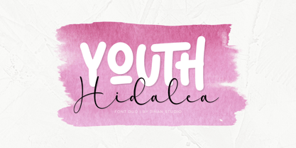 Youth Hidalea! is a fantastic font duo (sans serif & script), offering a modernity, playful, and artistic flair. Suitable for your design project needs, such as; logotype, wedding, packaging, social media posts, quotes, overlays on images, posters, and more. Features Uppercase and lowercase glyphs Number, symbol, punctuation, and multilingual support Some alternates and ligatures Thank you for buying and using this font for your projects. Enjoy this font and happy creating! Jinan Studio
 - Mother VP by VP Creative Shop,
$20.00 Introducing Mother Serif Typeface - 5 fonts Mother is named after all the moms and children left behind. This typeface is feminine, fragile typeface with 5 fonts loaded with ligature glyphs, alternates and multilingual support to enchant your next project. Very versatile fonts that works great in large and small sizes. Mother is perfect for branding projects, home-ware designs, product packaging, magazine headers - or simply as a stylish text overlay to any background image. Uppercase, lowercase, numeral, punctuation & Symbol Light Regular Medium Bold Black ligature glyphs ab ac ad ae ag ai al am an ap ar as at au ba be bi bl bo br ca cc ce ch ci cl co cr cs ct cu da de di do dr ea ec ed ee ei el em en eo ep er es et eu fa fb ffb fh ffh fj fk ffk ft fft ga gi gl gn go gr ha he hi ho hy ic id ie il im in io ip ir is it iv ka ke la le li ll lo lu ma me mi mo mp na nc nd ni no nt oc od ol om op or os ot ou pa pe pi po ra rc rd re ri ro sh si sm sp su ta te th ti to tr ts tt ul um un ur us ut ff fi fl ffi ffl st alternates Multilingual support How to access alternate glyphs? To access alternate glyphs in Adobe InDesign or Illustrator, choose Window Type & Tables Glyphs In Photoshop, choose Window Glyphs. In the panel that opens, click the Show menu and choose Alternates for Selection. Double-click an alternate's thumbnail to swap them out. Feel free to contact me if you have any questions! Mock ups and backgrounds used are not included. Thank you! Enjoy!
 - Crop by Thinkdust,
$10.00 Crop is the guy who works till 3am, striving for greatness. Crop is the one in the gym at six in the morning, pushing harder every time. Taking no for an answer, just isn't part of the deal. Crop is the one with fire in his heart and eye intense enough to achieve the unthinkable. If you've never stopped pushing boundaries, if you think second place isn't worth getting out of bed for, if you can stand on the top of the world and ask, 'What's next?' - Crop might just be the one for you!
 - Love Story by Latinotype,
$29.00 Love story is a display hairline typeface for use in big sizes and short texts. It’s inspired by different kinds of love and specially designed for Valentine’s day. Its soft curves and sweet style give it a lovely personality. Designed by Luciano Vergara and his wife Guisela Mendoza who has been studying ornaments since 2007 and has done her best for each project. You can see in her dingbats specially Printa and Abel designed for generate patterns. Now she integrated her passion to the ornament in a clean set which includes dingbats, ornaments and patterns. Luciano Vergara has designed very strong fonts with a particular work in the lines study and close to the geometry since 2005, getting a structure style, you can see in his fonts specially Regia and Kahlo. Now he integrated his study of lines, in a hairline font delicate, continuous and beautiful. In this story both designers have been merged their worlds creating a gorgeous product. This is a romantic type story, a love story.
 - Saratoga Slim AOE by Astigmatic,
$19.95He's rough around the edges, but he's an outlaw from the Old West, what did you expect? He's Saratoga Slim, a playful shaken up dust devil of a typeface. With a shaken appearance and rough hewn letters, he steps onto the scene, yet is clearly legible to read. He's alot like a one of those ruffigans that is crude around the edges, but when he looks at you and says, "Get what I'm saying partner?", you know exactly what he means. Put some rough and tumble type into your designs with Saratoga Slim. He's been through the ringer a few times but keeps coming back for more. Isn't that what you look for when you create a design...durability...? Here it is, Saratoga Slim, looking at you! Get it today! - Bleeding Cowboys Pro by CheapProFonts,
$10.00 A very popular grungy font, now made even more useful! With this Pro version you have the possibility to tone it down a bit - I have made alternate letters without swashes (use the OpenType Swash feature to switch them) and without so much bleed (use the OpenType Stylistic Alternates/ss01 feature). And then you can turn it up again by adding six different swashes to any letter! Write { or after a letter to add a swash to the right side, _ will add one below. Added fun and language support! ALL fonts from CheapProFonts have very extensive language support: They contain some unusual diacritic letters (some of which are contained in the Latin Extended-B Unicode block) supporting: Cornish, Filipino (Tagalog), Guarani, Luxembourgian, Malagasy, Romanian, Ulithian and Welsh. They also contain all glyphs in the Latin Extended-A Unicode block (which among others cover the Central European and Baltic areas) supporting: Afrikaans, Belarusian (Lacinka), Bosnian, Catalan, Chichewa, Croatian, Czech, Dutch, Esperanto, Greenlandic, Hungarian, Kashubian, Kurdish (Kurmanji), Latvian, Lithuanian, Maltese, Maori, Polish, Saami (Inari), Saami (North), Serbian (latin), Slovak(ian), Slovene, Sorbian (Lower), Sorbian (Upper), Turkish and Turkmen. And they of course contain all the usual “western” glyphs supporting: Albanian, Basque, Breton, Chamorro, Danish, Estonian, Faroese, Finnish, French, Frisian, Galican, German, Icelandic, Indonesian, Irish (Gaelic), Italian, Northern Sotho, Norwegian, Occitan, Portuguese, Rhaeto-Romance, Sami (Lule), Sami (South), Scots (Gaelic), Spanish, Swedish, Tswana, Walloon and Yapese.
 - Boscribe by Monotype,
$29.99Bo Berndal's handwriting was terrible in his younger days, and he could not even read his own notes. When he started out as an apprentice in a printing shop, he started to copy Garamond italic and formed his own style of writing. Later he was inspired by both Alfred Fairbanks and his reform-writing and by Paul Standard in the U.S.A and created the Boscribe font. - Wiggles - Unknown license

- Wobbles - Unknown license

- Wibbles - Unknown license

- Morning Cookie by Bogstav,
$17.00 Yet again, a font inspired by my work as a kindergarten teacher! The other day, I had a conversation with some of the kids, about what they ate for breakfast. Some had oatmeal, some bread and others yogurt. But this kid - he insisted that every morning, his mother would serve him cookies, “morning cookies”. It sounded too good to be true, and when I asked his mother, it turned out that “cookies” were actually bread, but to make it sound more appetising, they called it cookies! The letters are rounded and in some way quite naive, but still clear and legible. With an extreme ascender and descender, the font stands out with its oddities. I’ve added 3 different versions of each lowercase letter!
 - Foot Print by Bureau Bunk,
$14.95 While Walking along the shore of our Main Port to Europe in Rotterdam, The Netherlands, my 14 year old son Jules first hardly dared to step in the mud for he was wearing his brand new sneakers. Concentrating in where he put his feet, he noticed he made a character! The FootPrint-Regular was born! The FootPrint-Regular is a powerful header-typeface, but funny enough it's usable as small copy too! Blaze your Trail! Anything you can imagine on Police investigations, Bloodhound Thrillers, Trails, Tracks and Traces, anything about Outdoor Stores, Tracking or even maybe Pedestrian Clubs, or things like Survival Sports, Walking Events or Hiking Gear; Blaze'm your FootPrint-Regular Trail on all Banners, Blimps, Ads and Doormats!
 - Stencil Patterns JNL by Jeff Levine,
$29.00Stencil Patterns JNL collects into one digital file a number of decorative stencil patterns from decades past. These charming illustrations were re-drawn by Jeff Levine using images of vintage oilboard stencils made over fifty years ago. While these are useful as stand-alone embellishments for any print projects, they can also be scaled and printed out onto card or acetate stock for hand-cutting as new stencil templates. A special note of thanks goes to fellow type designer and author, Leslie Cabarga. He supplied the bulk of the images used in designing this font file. There are left and right pointing hands on the parenthesis keys, and a decorative ampersand on its respective key. - Frambuesa by Sudtipos,
$39.00 Organic versus geometric are two different universes that converges on nature systems and has its reflection on this new sans serif typeface. Frambuesa is a half humanist-half geometric sans that merges decorative curves with straight lines looking for a balance. The result: a solid but somewhat romantic, nostalgic type program that go ahead harmoniously, dancing to the rhythm of a naturally imperfect melody. Frambuesa can’t hide its family genetics. Structure and proportions come from Elisetta, her older sister they so both have a really good text performance. Regular variables and italics feel comfortable in a lot of contexts and are useful for little words or big title compositions. All seven weights are carefully adjusted to achieve soft transitions between one and the other resulting in high readability levels on program combinations and complex uses. This new font family name is a tribute to Lucia’s childhood, a very happy one. Frambuesa honors this sweet intense red fruit that her grandpa’s Coco gave to his grandchildren every Sunday in the summer.


