10,000 search results
(0.029 seconds)
- Beach Fool by PizzaDude.dk,
$19.00 People might consider me a fool - they might even consider me a fool on the beach...because I take a swim in the ocean, even in the wintertime! Beach Fool is a simple but yet very strong headline font. It has its roots in both grafitti and comics, which makes it really powerful for graphical expressions that needs an extra punch!
 - P22 Dwiggins by IHOF,
$24.95 Dwiggins Uncial is based on calligraphy by William Addison Dwiggins that he created for a self-penned short story, which appeared as an insert in the book-arts publication The Dolphin in 1935. This self-described “experimental uncial” lettering features rather unusual treatments of letterforms which combine manuscript calligraphy with modern idiosyncrasies. Dwiggins Extras is a set of decorative extras features 62 stencil and woodblock motifs adapted from abstract and representational Dwiggins designs. Although Dwiggins illustrated a number of books using conventional media, he is best known for his method of illustration that uses a series of hand-cut celluloid stencils or what he called “machine ornaments.” With these stencils Dwiggins (and other designers who use his ornaments) build-up repeated motifs and patterns into abstract designs and/or representational images which have a look that is uniquely Dwiggins’ own. Unlike other illustrators, Dwiggins’ style has not been commonly imitated and therefore his style is as distinctive today as it was 70 years ago.
 - Astoria Titling by Nick's Fonts,
$10.00Somewhat of a mongrel, this font combines uppercase letters from an oriental font designed by Paul Carlyle and Guy Oring in 1938, and lowercase letters based on yet another variant of Joan Truchut-Blanchard’s Super Veloz system. As its name implies, it’s quite suitable for titles of all kinds. The Opentype version of this font supports Unicode 1250 (Central European) languages, as well as Unicode 1252 (Latin) languages. - Vianova Serif Pro by Elsner+Flake,
$59.00 The font superfamily Vianova contains each 12 weights of Sans and Slab and 8 weights of the Serif style. The design from Jürgen Adolph dates back into the 1990s, when he studied Communication Design with Werner Schneider as a professor at the Fachhochschule Stuttgart. Adolph started his carrier 1995 at Michael Conrad & Leo Burnett. He was responsible for trade marks as Adidas, BMW, Germanwings and Merz. He has been honored as a member of the Art Directors Club (ADC) with more than 100 awards. On February 26, 2014, Jürgen Adolph wrote the following: “I was already interested in typography, even when I could not yet read. Letterforms, for instance, above storefronts downtown, had an irresistible appeal for me. Therefore, it is probably not a coincidence that, after finishing high school, I began an apprenticeship with a provider of signage and neon-advertising in Saarbrücken, and – in the late 1980s – I placed highest in my field in my state. When I continued my studies in communications design in Wiesbaden, I was introduced to the highest standards in calligraphy and type design. “Typography begins with writing” my revered teacher, Professor Werner Schneider, taught me. Indefatigably, he supported me during the development of my typeface “Vianova” – which began as part of a studies program – and accompanied me on my journey even when its more austere letterforms did not necessarily conform to his own aesthetic ideals. The completely analogue development of the types – designed entirely with ink and opaque white on cardboard – covered several academic semesters. In order to find its appropriate form, writing with a flat nib was used. Once, when I showed some intermediate designs to Günter Gerhard Lange, who occasionally honored our school with a visit, he commented in his own inimitable manner: “Not bad what you are doing there. But if you want to make a living with this, you might as well order your coffin now.” At that time, I was concentrating mainly on the serif version. But things reached a different level of complexity when, during a meeting with Günther Flake which had been arranged by Professor Schneider, he suggested that I enlarge the offering with a sans and slab version of the typeface. So – a few more months went by, but at the same time, Elsner+Flake already began with the digitilization process. In order to avoid the fate predicted by Günter Gerhard Lange, I went into “servitude” in the advertising industry (Michael Conrad & Leo Burnett) and design field (Rempen& Partner, SchömanCorporate, Claus Koch) and worked for several years as the Creative Director at KW43 in Düsseldorf concerned with corporate design development and expansion (among others for A. Lange & Söhne, Deichmann, Germanwings, Langenscheidt, Montblanc.”
 - Vianova Slab Pro by Elsner+Flake,
$59.00 The font superfamily Vianova contains each 12 weights of Sans and Slab and 8 weights of the Serif style. The design from Jürgen Adolph dates back into the 1990s, when he studied Communication Design with Werner Schneider as a professor at the Fachhochschule Stuttgart. Adolph started his carrier 1995 at Michael Conrad & Leo Burnett. He was responsible for trade marks as Adidas, BMW, Germanwings and Merz. He has been honored as a member of the Art Directors Club (ADC) with more than 100 awards. On February 26, 2014, Jürgen Adolph wrote the following: “I was already interested in typography, even when I could not yet read. Letterforms, for instance, above storefronts downtown, had an irresistible appeal for me. Therefore, it is probably not a coincidence that, after finishing high school, I began an apprenticeship with a provider of signage and neon-advertising in Saarbrücken, and – in the late 1980s – I placed highest in my field in my state. When I continued my studies in communications design in Wiesbaden, I was introduced to the highest standards in calligraphy and type design. “Typography begins with writing” my revered teacher, Professor Werner Schneider, taught me. Indefatigably, he supported me during the development of my typeface “Vianova” – which began as part of a studies program – and accompanied me on my journey even when its more austere letterforms did not necessarily conform to his own aesthetic ideals. The completely analogue development of the types – designed entirely with ink and opaque white on cardboard – covered several academic semesters. In order to find its appropriate form, writing with a flat nib was used. Once, when I showed some intermediate designs to Günter Gerhard Lange, who occasionally honored our school with a visit, he commented in his own inimitable manner: “Not bad what you are doing there. But if you want to make a living with this, you might as well order your coffin now.” At that time, I was concentrating mainly on the serif version. But things reached a different level of complexity when, during a meeting with Günther Flake which had been arranged by Professor Schneider, he suggested that I enlarge the offering with a sans and slab version of the typeface. So – a few more months went by, but at the same time, Elsner+Flake already began with the digitilization process. In order to avoid the fate predicted by Günter Gerhard Lange, I went into “servitude” in the advertising industry (Michael Conrad & Leo Burnett) and design field (Rempen& Partner, SchömanCorporate, Claus Koch) and worked for several years as the Creative Director at KW43 in Düsseldorf concerned with corporate design development and expansion (among others for A. Lange & Söhne, Deichmann, Germanwings, Langenscheidt, Montblanc.”
 - Vianova Sans Pro by Elsner+Flake,
$59.00 The font superfamily Vianova contains each 12 weights of Sans and Slab and 8 weights of the Serif style. The design from Jürgen Adolph dates back into the 90th, when he studied Communication Design with Werner Schneider as a professor at the Fachhochschule Stuttgart. Adolph started his carrier 1995 at Michael Conrad & Leo Burnett. He was responsible for trade marks as Adidas, BMW, Germanwings and Merz. He has been honoured as a member of the Art Director Club (ADC) with more than 100 awards. On February 26, 2014, Jürgen Adolph wrote the following: “I was already interested in typography, even when I could not yet read. Letterforms, for instance, above storefronts downtown, had an irresistible appeal for me. Therefore, it is probably not a coincidence that, after finishing high school, I began an apprenticeship with a provider of signage and neon-advertising in Saarbrücken, and – in the late 1980s – I placed highest in my field in my state. When I continued my studies in communications design in Wiesbaden, I was introduced to the highest standards in calligraphy and type design. “Typography begins with writing” my revered teacher, Professor Werner Schneider, taught me. Indefatigably, he supported me during the development of my typeface “Vianova” – which began as part of a studies program – and accompanied me on my journey even when its more austere letterforms did not necessarily conform to his own aesthetic ideals. The completely analogue development of the types – designed entirely with ink and opaque white on cardboard – covered several academic semesters. In order to find its appropriate form, writing with a flat nib was used. Once, when I showed some intermediate designs to Günter Gerhard Lange, who occasionally honored our school with a visit, he commented in his own inimitable manner: “Not bad what you are doing there. But if you want to make a living with this, you might as well order your coffin now.” At that time, I was concentrating mainly on the serif version. But things reached a different level of complexity when, during a meeting with Günther Flake which had been arranged by Professor Schneider, he suggested that I enlarge the offering with a sans and slab version of the typeface. So – a few more months went by, but at the same time, Elsner+Flake already began with the digitilization process. In order to avoid the fate predicted by Günter Gerhard Lange, I went into “servitude” in the advertising industry (Michael Conrad & Leo Burnett) and design field (Rempen& Partner, SchömanCorporate, Claus Koch) and worked for several years as the Creative Director at KW43 in Düsseldorf concerned with corporate design development and expansion (among others for A. Lange & Söhne, Deichmann, Germanwings, Langenscheidt, Montblanc.”
 - Collect Em All BB by Blambot,
$12.00 Blambot’s first font featuring Contextual Alternates: COLLECT EM ALL BB! As you type, you'll discover six versions of every letter, three versions of every number, three versions of the exclamation point and question mark, auto-correction of serif-I per standard American comic book tradition, and if you type from three to six of any letter, you'll get a bouncy baseline! All this, plus a hefty set of European characters.
 - Alright, prepare yourself for a journey into the whimsical world of Oramac, courtesy of the creative cosmos of Iconian Fonts. Imagine, if you will, a font that decided to go on an adventure, mixing t...
- Ravenholm by NREY,
$19.00 Hello, Friends! Introducing Ravenholm -a new modern gothic font family. Font looks amazing as single words and as full text blocks. It has support for many languages as: Czech, Danish and Norwegian, Deutsch, English, Espanol, French, Italiano, Magyar, Nederlands, Portuguese, Finnish, Swedish, Turkish, Russian etc. Ravenholm font family cast: - Ravenholm Color (color OTF font) - Ravenholm Bold - Ravenholm Inline - Ravenholm Thin - Ravenhol Slant WARNING #1 Color fonts are pretty new technology - they currently show up in Photoshop CC 2017+, Illustrator CC 2018 and some Mac apps. Learn more about color font support on third-party apps here: https://www.colorfonts.wtf/ Enjoy it on your best projects! For any help regarding this font, please feel free to contact me through my profile page and I’ll be glad to offer support. Thanks for buying!
 - BoiTu by Vei Vei,
$16.00 BoiTu is a typeface in the BoiTu project designed by Vei Vei. BoiTu has a strong contrast between bold bars and long sharp hook strokes inspired by pheasant feathers on the hat in Hat Boi costume. "Tuong or Hat Boi is a form of Vietnamese classic opera, combining various elements of arts such as stage, music, fine art, literature, dancing, and martial arts. Older Tuong plays are usually about historical events or tales. Allegories, melodramas, soliloquies, modes of expression, forms of performance, repartee singing and recitative conventions, etc., are constantly updated and elevated, and are quintessential elements in the art of Tuong." Boi Tu is a classic design to bring traditional art and culture closer to everyone. Boi Tu is a Vietnamese font that supports multiple languages.
 - School Age by Jeff Levine,
$29.00 The “Trixy Toy Educator” was a 1930s-era set of letters and numbers (along with a few animal shapes) for teaching children, and was manufactured by the Durrel Company of Gardner, Massachusetts. Die cut from thick cardboard, the 40 piece set also included a rack to display the characters, presumably for little ones to practice the correct order of the alphabet and basic numerals or to spell simple words like ‘dog’ or ‘cat’. Whomever came up with the idea, they used the most rudimentary and unusual ‘type design’ shapes in the A-Z and 0-9, but they were just odd enough to inspire a digital type version of them. School Age JNL is available in both regular and oblique versions.
 - Capital Love by Harald Geisler,
$68.34 Capital Love just contains capital letters decorated with hearts. By pressing a lowercase button a alternative to the uppercase letter will appear. All shapes are drawn individually and do not oblige a geometrical system. The lighthearted vivid ductus remind me of a quality that can be found in the dynamics of Keith Haring drawings. Capital Love is a part of the Light Hearted Font Collection that is inspired by a recording of Jean Baudrillard with the title, "Die Macht der Verführung" (The Power of Seduction) from 2006. Further inspiration came from the article, "The shape of the heart: I'm all yours". The heart represents sacred and secular love: a bloodless sacrifice. by British writer Louisa Young printed in EYE magazine (#43) London, 2002.
 - Hollywood Revue JNL by Jeff Levine,
$29.00 Hollywood Revue JNL gets its design inspiration and name from a vintage movie poster for "The Hollywood Revue of 1929". The letter style shows early Art Deco influences, yet the hand lettering was done in the late 1920s toward the end of the Art Nouveau period. MGM produced this early "talkie" all-star musical with a cast that included Jack Benny, John Gilbert, Conrad Nagel, Laurel and Hardy, Buster Keaton, Joan Crawford, Norma Shearer, Polly Moran and many others. This is the motion picture where Cliff ("Ukelele Ike") Edwards introduced "Singin' in the Rain" (composed by Arthur Freed and Nacio Herb Brown). Years later, Freed was a producer at MGM and gathered up many of the songs he and Brown wrote during the 1920s to form the musical core of the 1952 Gene Kelly-Debbie Reynolds-Donald O'Conner musical "Singin' in the Rain".
 - Quayside by Eclectotype,
$40.00 Quayside is a deliciously thick and bulbous baseball script, with a wealth of OpenType features. Features include: Contextual alternates - I would suggest having these on by default; they make letters connect more smoothly (uppercase letters like M and H, which are normally non-connecting for all-caps purposes, connect to lowercase letters. The swash variant of J, and all o and b characters connect to any e character at a lower junction for a smoother join). Contextual alternates also make sure special end-forms of lowercase letters are used at the ends of words. Ligatures - A nice collection of useful ligatures which make the text flow smoother. Swash - Gives you more exuberant capitals. Not recommended for all-caps usage! The swash function also gives a variation of the ampersand and turns # into a nice numero symbol. Oldstyle Figures - lining figures are default but with the flick of a switch in OpenType savvy applications, you get expressive oldstyle figures. Quayside is a versatile typeface. Depending on the mood you're after, it can easily be retro or modern, fun or (fairly) serious. I'm often pleasantly surprised by the wide variety of uses my fonts get put to, and I can't wait to see what you do with this one!
 - Mere by Josh Grzybowski,
$19.99 Loosely based on a Jan Tschichold specimen, Mere is a clean geometric sans-serif with simple lines that are best viewed as larger print but still have an impact at smaller point sizes. In addition to ligatures and fractions, Mere’s other OpenType features include old style numbers and small caps.
 - Scandal by Haiku Monkey,
$10.00Scandal is a handwriting font that is meant to sit big and bold on the page, calling all kinds of attention to itself. - Pocket Initials JNL by Jeff Levine,
$29.00Pocket Initials JNL contains twenty-six initials inside of a white-into-black pattern for monograms, page headers, stationery and other creative projects. - Jacoby Modular by Jacoby Type Co,
$12.00 Jacoby Modular is a geometric sans serif display typeface with six styles. Jacoby Modular is a dynamic, bold typeface with a sculptural feel.
 - Decorative Panels JNL by Jeff Levine,
$29.00Decorative Panels JNL is a collection of twenty-six border design panels inspired by old decal and rubber stamp catalogs of the 1940s. - Vanilla Cream by Larin Type Co,
$14.00 Vanilla Cream this beautiful handwritten font duo, is light and elegant and light, they go well together and complement each other, it looks amazing on wedding invitations, thank you cards, quotes, greeting cards, logos, t-shirts, business cards and any other design that needs a handwritten touch. This font is easy to use, has OpenType features, and supports PUA encoding.
 - Valentine Moon by Yoga Letter,
$12.00 Valentine Moon is a unique and beautiful font. This font is decorated with natural letters and is very unique. Not only that, the decorations on the letters are also specially designed so that they are very easy to use. This font is perfect for Valentine's, weddings, invitations, birthdays, promotions, promotions on social media, product promotion, beauty, logos, branding, banners, posters, typography.
 - Yes Dear by HiH,
$8.00 Yes Dear is a hopefully humorous acknowledgement that men and women communicate differently — one of those Mars-Venus things. Women tend to talk about their feelings. Men hide in the cave. It sounds funny, but it can have serious consequences in people’s lives and their relationships. T. D. Jakes deals with the subject effectively in his DVD, He-Motions. We guys need to find our way out of the cave. Our women need to recognize what is going on and gently help us emerge from the cave. Men and women were certainly never meant to be identical, but it would be useful if we could learn to communicate our feelings in more healthy and effective ways. Yes Dear has a full character set, including accented caps. Two empty frames are provided at positions 135 & 137. The Gallery includes a PDF file showing some text and the full character set and a JPG looking out from the cave. A lot going on outside the cave. Be sure and take a look.
 - Avalon by Lipton Letter Design,
$25.00 Friedrich Neugebauer is known for the cutting power of his calligraphic invention. As a prisoner of war in Egypt, he wrote with toothpaste when all else failed. The irrepressible style of this Austrian artist inspired Richard Lipton to capture his calligraphy as a typeface. Avalon plays sweeping freedom in the capitals against the vital discipline of a lowercase relieved by alternative ascending characters.
 - Graphit by HVD Fonts,
$40.00 Graphit is a typeface designed by Lit Design Studio & curated by HvD Fonts. It combines clear, geometric shapes with edgy yet finely-crafted details. Graphit features uncompromising characters such as G, Q, f, k and 1. It works well both for impactful headlines and for reading sizes. The type family consists of six weights plus matching italics. In early 2018, Livius Dietzel & Tom Hoßfeld started developing the typeface’s essential character and released a free font named after the studio, Lit. Just a few months later, Hannes von Döhren had a look at the typeface and suggested expanding it into a family – then publishing it with HvD Fonts. They drew every single letter from scratch, and also decided to give the font a new name — Graphit. The family features six low-contrast weights, ranging from Black to Thin. Every character has been crafted to give it a distinctive and individual feel. Medium, Regular and Light are optimized for usage in copy text. For smaller font sizes & longer body copy, the alternate character set features a double-story a and a simplified Q, f, r and t for improved legibility. All fonts are manually hinted for optimal performance on digital devices.
 - Amedina by Bungletter,
$12.00 Amedina is a modern script font that features a classic and elegant touch. Amedina are attractive because they are sleek, clean, feminine, sensual, glamorous, simple and very easy to read, thanks to their many fancy letter joints. I also offer a decent number of stylistic alternatives for some of the letters. Classic style is very suitable to be applied in various formal forms such as invitations, labels, restaurant menus, logos, fashion, make up, stationery, novels, magazines, books, greeting/wedding cards, packaging, labels or all kinds of advertising purposes . . . . . . . . Files include: • Amedina Contains full set: -Uppercase -Lowercase -Alternative -Ligatures -Punctuation -Number -Multilingual support. need help or have questions let me know. I'm happy to help. Thanks & Congratulations on the Design!
 - Ongunkan Khazar Rovas A by Runic World Tamgacı,
$50.00 Khazar, member of a confederation of Turkic-speaking tribes that in the late 6th century CE established a major commercial empire covering the southeastern section of modern European Russia. Although the origin of the term Khazar and the early history of the Khazar people are obscure, it is fairly certain that the Khazars were originally located in the northern Caucasus region and were part of the western Turkic empire (in Turkistan). The Khazars were in contact with the Persians in the mid-6th century CE, and they aided the Byzantine emperor Heraclius (reigned 610–641) in his campaign against the Persians. Although the Khazar Empire had a secular administrative structure, the administrative staff chose the Jewish religion. The Khazars are the only Turkish state that converted to Judaism.
 - Wafterby by Paramajan,
$8.00 Wafterby is a handsome sans serif typeface family. It comes in eight weights which have a minimal and clean feel. Its design is based on circle and line geometric shapes. It can be used as a cute minimal-style header display or as a stylish text for magazine, blog, corporate branding, packaging, wedding invitation project, etc.
 - Solidaritha Script by Great Studio,
$15.00 Solidaritha Script is a stylish calligraphy font that features a varying baseline, smooth line, classic and elegant touch. Can be used for various purposes.such as headings, signature, logos, wedding invitation, t-shirt, letterhead, signage, lable, news, posters, badges etc. Solidaritha Script features 389+ glyphs and 194 alternate characters. including initial and terminal letters, alternates, ligatures and multiple language support.
 - Asteria by RagamKata,
$12.00 Asteria is Retro Display Font. This typeface is perfect for various purposes such as Magazine Title, Poster, Logo, T-Shirt, Sub Title, Business cards, Magazines, Book Covers, Wedding Invitations,Templates Instagram Story Post, Greeting Cards, Quotes, etc. Asteria Features: • Uppercase & Lowercase • Alternates • Numerals & Punctuation • Accented characters • Multilingual Support • Unicode PUA Encoded Thanks and have a wonderful day .
 - Rose Colored by Letterhend,
$12.00 Rose Colored is a Handwriting Script which is beautifully crafted with feminine touch. This font is perfect as a logo, quotes, apparel design, wedding invitation, and any design needs especially for a girly / feminine theme. You can play with the ligatures, stylistic alternate, swash, etc to create your own customized lettering. This font is also support multi language
 - Better Rouge by Fargun Studio,
$14.00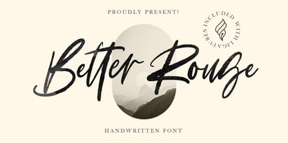 Better Rouge is handwritten stylish copperplate calligraphy fonts, combines from copperplate to contemporary typeface with a dancing baseline, classic and elegant touch. Can be used for various purposes. such as headings, signature, logos, wedding invitation, t-shirt, letterhead, signage, lable, news, posters, badges etc. Features All Uppercase and Lowercase Number & Symbol Supported Languages Ligatures PUA Encoded
 - Brenda Script by Seniors Studio,
$23.00 Brenda Script is a beautiful formal script, contemporary typeface with classic roots and an elegant touch. It can be used for various purposes.such as logos, wedding invitations, headings, t-shirts, letterhead, signage, lable, news, posters, badges etc. Brenda Script features 405+ glyphs and 160 alternate characters. including initial and terminal letters, swashes, alternates, ligatures and multiple language support.
 - Aesthetic Notes by Letterhend,
$19.00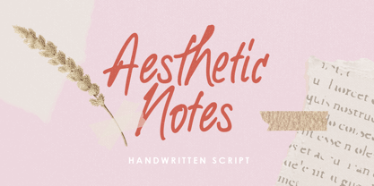 Introducing Aesthetic Notes! This font is perfect for branding, packaging, logotype, headline, wedding, invitation, quotes, etc. Features : uppercase & lowercase numbers and punctuation multilingual alternates and ligatures PUA encoded We highly recommend using a program that supports OpenType features and Glyphs panels like many of Adobe apps and Corel Draw, so you can see and access all Glyph variations.
 - Frieda by driemeyerdesign,
$19.00 Frieda is a handwritten calligraphy script equipped with contextual alternates features and ligature variations for a customised look. Just add "+" before the letter or manually choose the character from Glyph Palette. Authentic, chic, but also relaxed with a set of beginning and ending extensions. Frieda can be used for weddings, greeting cards, invitations, books, menus, advertising, etc.
 - Chalysta by BaronWNM,
$12.00 Introduces an old lettering style font. looks elegant, luxurious and classy. Chalysta is a form of handwriting with a sideways drag, which looks like it was handwritten in old scripts. Each lowercase has an alternate pull before the letter to make it look more natural. Very suitable for use in branding, wedding invitations, quotes, cards, etc.
 - Carolinea by Seniors Studio,
$17.00 Carolinea is a hand lettered script fonts, using brush & ink combines a style brush calligraphy, irregular baseline, a rough edges, bold and organic. Including initial and terminal letters, ornament, ligatures and multiple language support. Can be used for various purposes such as posters, logos, t-shirt, signage, businnes card, magazines, book cover, wedding invitation, greeting cards etc.
 - Switnesa Script by Seniors Studio,
$17.00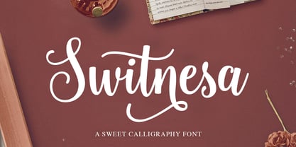 Switnesa Script is a soft and sweet calligraphy font with characters that dance along the baseline. It has a casual and yet elegant touch. It can be used for various purposes such as logos, wedding invitations, headings, t-shirts, letterhead, signage, lables, news, posters, badges etc. The fonts include OpenType features with stylistic alternates, ligatures and multiple language support.
 - Bologna Script by Hrz Studio,
$16.00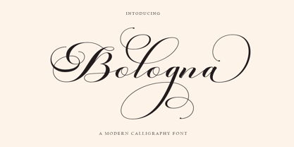 Welcome to the Bologna Script font is a modern, casual, and beautiful calligraphic typeface with a swash. It can be used for many purposes. such as titles, signatures, logos, wedding invitations, letterheads, nameplates, labels, newsletters, posters, badges, etc. Bologna Script Features Open type, including initial and terminal letters, alternatives, binders, and International support for most Western languages included.
 - Meatball by Parkinson,
$25.00 Meatball is a fat and happy display font based on some lettering on a mid-20th century poster for the movie Bringing Up Baby. The lettering for the names of the stars, AudryHepburn, Cary Grant and Charles Ruggles, was the basis for Meatball. The sample was all caps and as it evolved, a lower case started to appear, etc.
 - Quentes Fleur by FallenGraphic,
$20.00 Quentes Fleur is stands out as a diverse selection of typefaces, beautiful alternates character that maintain a coherent look and feel throughout. font is perfect for branding, headings, signatures, logos, blog, wedding invitations, t-shirts, letterhead, merchandise, signage, labels, news, posters, badges etc. FEATURES: Character Set A-Z Numeral Accents (Multilingual characters) PUA encode Alternates MULTILINGUAL ACCENT žŠŒšŸÀÁÂÃÄÅÆÇÈÉÊËÌÍÎÏÐÑÒÓÔÕÖØÙÚÛÜÝßàáâãäåæçèéêëìíîïðñòóôõöøùúûüýÿ