10,000 search results
(0.029 seconds)
- Maliska Script by Gatype,
$12.00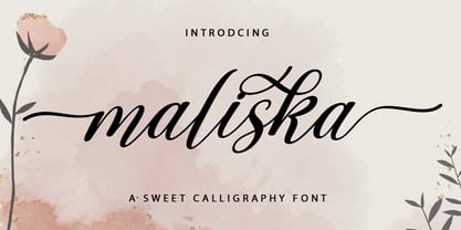 Maliska Script is a handwritten style calligraphy font featuring a varied baseline, smooth lines, a classic and elegant touch. Can be used for various purposes such as headings, signatures, logos, wedding invitations, t-shirts, letterheads, signage, labels, osters, badges etc. This typeface comes in uppercase, lowercase, punctuation, symbols & numbers, alternative style sets, ligatures, etc. also supports multilingual and is PUA encoded.
 - Mangotea by FHFont,
$17.00 Mangotea is bold script brush font with a hand-lettering brush style, and includes Opentype features. It is suitable for design, element design, wedding, event, t-shirt, logo, badges, sticker, and awesome work, etc...
 - Kinantey by MaxnorType,
$12.00 Kinantey is an elegant monoline signature script font with smooth lines and many alternates of swashes. It can be used for various purposes, such as signature, branding, watermark, greetings, logos, stationery, wedding invitations, etc.
 - Lambency by Ali Hamidi,
$12.00 Lambency is a modern script font with an elegant and natural touch. Every character comes with an initial tail and an ending tail. This font is perfect for wedding invitations, quotes, branding, logos, etc.
 - Butter Luchy by FHFont,
$17.00 Butter Luchy is Handwritten script font with handlettering Brush Style, so much opentype feature include of the font. Suitable for design, element design, wedding, event, t-shirt, logo, badges, sticker, and awesome work, etc...
 - Smokers by Vozzy,
$5.00 A vintage look layered label font named "Smokers".Typeface includes six styles (including effect styles), for sample look at 4th preview. This font will good viewed on any retro design like poster, t-shirt, label, logo etc. For using effects layers: - Type your text in Regular. - Copy that and paste at the same position. - Change the style to Shadow or Texture. - Alternates in first letters - just type letter in caps. For alternates in last letters - just use alternates for small letters. Thank you!
 - Kingbirds by Letterhend,
$14.00 Kingbirds! The 6 styles of monoline script! Tired of ordinary monoline script? Now we are proudly presenting you a one-of-a-kind monoline script that has six styles of monoline which will satisfy all your design needs. Playful theme? Elegant theme? Vintage theme? you name it. This typeface comes with many opentype features such as ligatures, stylistic set alternate, etc and also support multilingual. You also will get ready to use logo template that you can edit the text easily.
 - Lovingly by Happy Letters,
$6.00 Welcome to Happy Letters shop :) Happy St. Valentine's Day! Lovingly includes unique heart flourishes that give a charm and romantic love holiday mood ornaments, Valentine greeting cards, invitations, etc. Thin, elegant calligraphic lines like a light breeze give freshness and dreaminess to your handmade creations. Ornament font Lovingly is mapped to regular keyboard keys, so you don't need any additional programs to use them. Just install font, type and go! Lovingly is perfect for: decorating your albums, for holidays, logos, phrases, gift shops, Valentine's Day card, gift cards, tags, labels, stickers, wedding invitations, header images, Etsy presentations, ideal for handmade, scrap booking, printed paper items, promoting seasonal blog posts, social media posts, Pinterest, Instagram and much more.
 - Helvetica Monospaced by Linotype,
$42.99 Born in 1831, Hermann Berthold was the son of a calico-printer. On completion of his apprenticeship as a precision-instrument maker and after practical experience gained abroad in galvanography, Hermann Berthold founded his "Institute for Galvano Technology" in Berlin in 1858. Very quickly he discovered a method of producing circular lines from brass and not, as customary at that time, from lead or zinc. The soldering normally necessary could also be dispensed with. The lines were elastic and therefore highly durable. They produced outstandingly fine results. Most of German's letterpress printers and many printers abroad placed their orders with Berthold. His products became so popular that the print trade popularized the saying "As precise as Berthold brass". In 1878 Hermann Berthold was commissioned to put an end to the confusion of typographic systems of measurement. With the aid of Professor Foerster he succeeded in devising a basic unit of measurement (1m = 2,660 typographic points). This was the birth of the first generally binding system of typographic measurement. It is still used in the trade. Hermann Berthold served as the head of the Berthold type foundry until 1888.
 - Hesse Antiqua by Monotype,
$21.99 Hesse Antiqua is the very first typeface designed by Gudrun Zapf von Hesse. It was a pioneering project originally created by her over 70 years ago as a set of brass punches to stamp into leather book covers and spines at the Bauer Type Foundry in Germany. In celebration of her 100th birthday on 2 January 2018, Ferdinand Ulrich and the Monotype Studio team collaborated with her to bring her brass punches to live as a digital font. Hesse Antiqua was developed with careful considerations and decisions to capture the nuance of the beautiful letterforms as they originally appeared in gold and blind stampings. We are pleased to introduce this modern OpenType typeface featuring a proper set of capitals and small capitals, figures, punctuation and some ornaments as well. Hesse Antiqua is best used at 36 points and above, as the designer intended.
 - Taffee by Suomi,
$25.00 A friendly family with six weights.
 - Eldwin by The Northern Block,
$49.50 Eldwin is a connected script type family with a friendly demeanour. With two styles of Script and Capitals, they combine playfulness with functionality, which allows it to perform best in display and headline situations. The inspiration for Eldwin was drawn from traditional Italian and American sign paintings. Details include six weights in two styles, 526 characters per Script font and 431 characters per Capitals font. Opentype features consist of stylistic alternates, ligatures, fractions, arrows and language support covering Western, South and Central Europe, and Cyrillic.
 - Electric Newspaper JNL by Jeff Levine,
$29.00 Around 1931, the Los Angeles Times (in partnership with the Richfield Oil Company) installed on its building a moving message board similar to the one at the New York Times in New York City which they dubbed an “electric newspaper”. The style of characters used on this electronic sign were the basis for the namesake font Electric Newspaper JNL, which is available in both regular and oblique versions. A blank space to place between words is available on both the solid bar and broken bar keystrokes.
 - Sully Jonquieres ND by Neufville Digital,
$45.25 Sully-Jonquières is Mendoza’s most original calligraphic alphabet. It was commissioned by the French publisher Henri Jonquières. Its characters are based on the shape of cursive letters. Its range of possible usages is very varied: signage, headlines, packaging, etc. It brings personality and elegance to any design. Sully-Jonquières is a trademark of BauerTypes SL
 - Hyperpolar by Bisou,
$12.00 Made in La Chaux-de-Fonds (Switzerland), hyperpolar is born while the designer (Bisou) watches "Godard mon amour", a biopic about Jean-Luc Godard's depression in 1967-68. A parade of murder mystery books is staged at the middle of the movie and at exactly 56 minutes and 47 seconds, the book "Confrontation" strikes Bisou's eye. It is the first inspiration for this awsome retro font. Hyperpolar is thought from ground up to give a strong impact. It’s retro 50’s crime stories style makes it best suitable book covers. It works perfectly with short texts for advertisement like a trench coat or a smoking pipe store. Just hang it over a video club and see what thrilling cinephiles will come in.
 - ITC Johnston by ITC,
$29.00ITC Johnston is the result of the combined talents of Dave Farey and Richard Dawson, based on the work of Edward Johnston. In developing ITC Johnston, says London type designer Dave Farey, he did “lots of research on not only the face but the man.” Edward Johnston was something of an eccentric, “famous for sitting in a deck chair and carrying toast in his pockets.” (The deck chair was his preferred furniture in his own living room; the toast was so that he’d always have sustenance near at hand.) Johnston was also almost single-handedly responsible, early in this century, for the revival in Britain of the Renaissance calligraphic tradition of the chancery italic. His book Writing & Illuminating, & Lettering (with its peculiar extraneous comma in the title) is a classic on its subject, and his influence on his contemporaries was tremendous. He is perhaps best remembered, however, for the alphabet that he designed in 1916 for the London Underground Railway (now London Transport), which was based on his original “block letter” model. Johnston’s letters were constructed very carefully, based on his study of historical writing techniques at the British Museum. His capital letters took their form from the best classical Roman inscriptions. “He had serious rules for his sans serif style,” says Farey, “particularly the height-to-weight ratio of 1:7 for the construction of line weight, and therefore horizontals and verticals were to be the same thickness. Johnston’s O’s and C’s and G’s and even his S’s were constructions of perfect circles. This was a bit of a problem as far as text sizes were concerned, or in reality sizes smaller than half an inch. It also precluded any other weight but medium ‘ any weight lighter or heavier than his 1:7 relationship.” Johnston was famously slow at any project he undertook, says Farey. “He did eventually, under protest, create a bolder weight, in capitals only ‘ which took twenty years to complete.” Farey and his colleague Richard Dawson have based ITC Johnston on Edward Johnston’s original block letters, expanding them into a three-weight type family. Johnston himself never called his Underground lettering a typeface, according to Farey. It was an alphabet meant for signage and other display purposes, designed to be legible at a glance rather than readable in passages of text. Farey and Dawson’s adaptation retains the sparkling starkness of Johnston’s letters while combining comfortably into text. Johnston’s block letter bears an obvious resemblance to Gill Sans, the highly successful type family developed by Monotype in the 1920s. The young Eric Gill had studied under Johnston at the London College of Printing, worked on the Underground project with him, and followed many of the same principles in developing his own sans serif typeface. The Johnston letters gave a characteristic look to London’s transport system after the First World War, but it was Gill Sans that became the emblematic letter form of British graphic design for decades. (Johnston’s sans serif continued in use in the Underground until the early ‘80s, when a revised and modernized version, with a tighter fit and a larger x-height, was designed by the London design firm Banks and Miles.) Farey and Dawson, working from their studio in London’s Clerkenwell, wanted to create a type family that was neither a museum piece nor a bastardization, and that would “provide an alternative of the same school” to the omnipresent Gill Sans. “These alphabets,” says Farey, referring to the Johnston letters, “have never been developed as contemporary styles.” He and Dawson not only devised three weights of ITC Johnston but gave it a full set of small capitals in each weight ‘ something that neither the original Johnston face nor the Gill faces have ‘ as well as old-style figures and several alternate characters. - Snoofer by Cool Fonts,
$19.95 Snoofer is a modern font that works for both display and text. It comes in 4 weights(Regular, Italic, Bold, Bold Italic). Snoofer was inspired by a character in stories my dad told me as a kid. Somehow they always ended with "... and they never left home again." Enjoy!
 - FF Rian's Dingbats by FontFont,
$41.99 British type designer Rian Hughes created this pi and symbols FontFont in 1993. The family has 5 weights, and is ideally suited for poster and billboards.It provides an extensive collection of wonderful dingbats and expressive graphic cartoons. It comes with tabular lining and proportional lining figures.
 - Panther Black by Device,
$39.00 Developed from Rian Hughes’ Black Panther logo for Marvel, Panther Black is a sharp and stylish three-weight headline sans. Built from sweeping curves and tapered crossbars, its bold, dynamic design is seen to best effect in shorter settings. Available in condensed, normal and extended variants.
 - 1589 Humane Bordeaux by GLC,
$38.00 This family was created inspired from the Garamond patern set of fonts used by S. Millanges "imprimeur ordinaire du Roy", in Bordeaux, circa 1580-1590. Especially for reprint L'instruction des curés (Instructions to parish priests), from Jean Gerson. The set contains two styles, Normal and Italic, the second one with a lot of caps and ligatures variants. The initials, except a few decorated letters (six in total) where only large caps, covering no more than three lines. Added are a few fleurons. It can be used as variously as web-site titles, posters and flyers design, publishing texts looking like ancient ones, or greeting cards, all various sorts of presentations, as a very elegant and legible font... This font supports strong enlargements as easily as small size (legible from 6 points when printed) remaining very smart and fine. Its original cap height is about five millimeters. Decorated letters like 1512 Initials, 1550 Arabesques, 1565 Venetian, can be used with this family without anachronism.
 - Blank Manuscript by Aah Yes,
$14.95Blank Manuscript allows you to produce sophisticated musical scoresheets even on basic Word Processors - anything from simple plain staves to complex full-page orchestral scores of your own design, to write in the notation yourself. The basic stuff is really easy and straightforward, but there's some quite advanced things you can do as well. So Copy and Save these Instructions. • The main stuff is simple and tends to follow the initial letter. Treble, Bass and Alto clefs are on upper case T B A (there are more clefs, below). The 5 Lines for the clefs are on L or l. • A small v will give a small vertical line (like a bar line) and a Big U will give a Big Upright - these can start or end a line or piece. • Time Signatures - type the following letters: Think of W for Waltz and it's easy to remember that 3/4 time is on W. Then from that they go up or down together like this: V=2/4 W=3/4 X=4/4 Y=5/4 Z=6/4 Compound Times are on H I J K like this: H=3/8 I=6/8 J=9/8 K=12/8 Common Time and Cut Common symbols can be found on semi-colon and colon respectively (all begin with Co- ). 2/2 3/2 are on lower case a and b, 7/4 and 7/8 are on lower case c and d, 5/8 is on small k (think POL-k-A) • Flat signs are on the numbers. Flat signs on LINES 1 to 5 are on numbers 1 to 5. Flat signs on SPACES 1 to 5 are on numbers 6 to 0 (space 1 being above line 1, space 5 being above the top line of the stave). Sharp signs are on the letters BELOW the long-row numbers. Which is q w e r t for the sharp signs on Lines 1 to 5, and y u i o p for sharp signs on spaces 1 to 5. Doing it this way means it works the same for all clefs, whether Treble, Bass, Alto, Tenor or any other. Sharp and Flat Signs always go in this order, depending on how many sharps or flats your key signature requires: Treble Clef Sharps t i p r u o e Flats 3 9 7 4 2 8 6 Bass Clef Sharps r u o e t i w Flats 2 8 6 3 1 7 = Alto Clef Sharps o e t i w r u Flats 7 4 2 8 6 3 1 • Guitar Chord Boxes are on G and g (G for Guitar) Upper Case G has a thick line across the top Lower case g has an open top, for chords up the fretboard TAB symbols are available: Six-string Tablature is on s & S for Six. Four-string Tablature is on f & F for Four. (Lower case has the "TAB" symbol on it, Upper Case has just the lines to continue.) Five-string tablature, is on lower case "j" (as in BAN-j-O) and of course L or l will continue the 5 lines. •RARE CLEF SIGNS including Tenor Clef, are on various punctuation marks, i.e. dollar, percent, circumflex, ampersand & asterisk, above the numbers 4 to 8. NOTE: The important symbols were kept on the letter and number keys, which are fairly standard all over, but some of the less important symbols are on various punctuation keys, which in different countries are not the same as on my keyboard. If it comes out wrong on your system, all I can say is it's right on the systems we've tried, and they'll be in here somewhere, probably on a different key. CLOSING THE ENDS OF THE LINES and BAR-LINES is done with the 3 varieties of brackets - brackets, brace and parentheses - Left/Right for the Left/Right end of the line. Parentheses L/R () which are above 9, 0 give a clef with a small vertical upright (the same as a bar line). Brace L/R and Brackets L/R (both on the 2 keys to the right of P on my keyboard) will close off a staff line with tall upright bars. Brace gives a double upright - one thick, one thin. Brackets give a single tall upright. A Big Upright is on Big U, (Big U for Big Upright) and a small vertical line is on small v (small v for small vertical). The Big Upright is the maximum height, and the small vertical is exactly the same height as a stave. And there's a tall upright Bar, on Bar (which is to the left of z on my keyboard, with Shift,) which is the same height as the bar on upper case U but twice as broad. • There's a staff intended for writing melodies, which is a little bit higher up than an ordinary treble clef giving a space underneath to put lyrics in - on m and M for Melody line. Lower case has the Treble Clef on, Upper case M has just the higher-up staff lines with no clef. (Use mMMMMMMM etc.) However this clef will be in the wrong place to put in sharp and flat signs, key signatures and so on, so if you use this clef you'll have to write the sharps, flats and key signature yourself. There's also a clef that's smaller (less tall) than the ordinary clef, but with the same horizontal spacing so it will align with other standard-sized clefs - on slash (a plain clef) and backslash (with a Treble Clef). • There are some large brackets for enclosing groups of staves, such as you'd use on large orchestral scores, on Upper Case N O P Q R, which can aid clarity. N and O on the left, Q and R on the right. P is a Perpendicular line to be used on both sides to increase the height of the enclosure, in this way but with the staff lines in between: N Q P P P P P P O R OTHERS —————————————— • Repeat marks are on comma (left) and period/full stop (right). • Hyphen is left as a sort of hyphen - it's a thin line like a single staff line, with the same horizontal spacing as ordinary staff lines - in case you want to draw a line across for a Percussion Instrument, or a Title or Lyric Line. • Space is a Space, but with HALF the width or horizontal spacing as ordinary staff lines, so 2 space symbols will be the same width as a clef symbol or line. • Grave (to the left of 1 on the long row, or hold down Alt and type 0096 then let go) gives a staff line that is one eighth the width of an ordinary staff line. • If you want manuscript in a clef and key which requires a flat or sharp sign in the space underneath the 5 lines, they’re on = equals and + plus . SYMBOLS • Many of these symbols will only be useful if you have worked out in advance which bars will need them, but they are here in case you've done that and wish to include them. • Symbols for p and f (piano and forte) are on 'less than' and 'greater than' < > (above comma and full stop) and m for mezzo is on Question, next to them. They can be combined to make mp, mf, ff, pp, etc. These signs -- and other signs and symbols like Pedal Sign, Coda Sign and so on -- can be found on various punctuation mark keys, including above 1, 2, 3 in the long row, and others around the keyboard. There's a sort of logic to their layout, but in different countries the keys are likely to give different results to what is stated here, so it's probably best to just try the punctuation and see if there's any you might want to use. (But on my keyboard a Coda sign is on circumflex - because of the visual similarity. Pedal sign is on underscore. A "Sign" symbol is on exclamation mark.) They were only included in case you really need them to be printed rather than handwritten. • However, a Copyright symbol is deemed necessary, and also included are a "Registered" symbol and a TradeMark symbol. They are found in the conventional places, and can be accessed by holding down ALT and typing 0169, 0174 or 0153 respectively in the numberpad section and letting go. • Staff lines with arco and pizz. above are on capital C and D respectively ---C for ar-C-o. • An empty circle above a staff line (to indicate sections by writing letters A, B, C or 1,2,3 inside for rehearsal marks) is on n. The actual signs for an A, B, C and D in a circle above the staff line can be produced by holding down ALT and typing 0188, 0189, 0190 and 0191 respectively and letting go. • The word "Page", for indicating page numbers, is on the numbersign key. • The two quotes keys, (quote single and quote double) have symbols representing "Tempo is", and "play as triplets", respectively. • INSTRUMENT NAMES There's a whole lot of Instrument Names built in (over a hundred) which can be printed out above the clef, and you do it like this. Hold down Alt and type in the given number in the numberpad section, then let go. For Piccolo it's 0130, for Flute it's 0131, Cornet is on 0154, Violin is on 0193, and the numbers go up to over 0250, it's a fairly complete set. There's also a blank which is used to align un-named clefs on 0096. Put them at the very beginning of the line for the best results. Here they are: WOODWIND Piccolo 0130 Flute 0131 Oboe 0132 Clarinet 0133 Eng Horn 0134 Bassoon 0135 Soprano Sax 0137 Alto Sax 0138 Tenor Sax 0139 Baritone Sax 0140 Saxophone 0142 Contrabassoon 0145 Recorder 0146 Alto Flute 0147 Bass Flute 0148 Oboe d'Amore 0149 Cor anglais 0152 Pipes 0241 Whistle 0242 BRASS Cornet 0154 Trumpet 0155 Flugelhorn 0156 Trombone 0158 Euphonium 0159 Tuba 0161 French Horn 0162 Horn 0163 Tenor Trombone 0164 Bass Trombone 0165 Alto Trombone 0166 Piccolo Cornet 0167 Piccolo Trumpet 0168 Bass Trumpet 0170 Bass Tuba 0171 Brass 0172 VOICES Vocal 0175 Melody 0176 Solo 0177 Harmony 0178 Soprano 0179 Alto 0180 Tenor 0181 Baritone 0182 Treble 0183 Bass 0197 (see also PLUCKED STRINGS) Descant 0184 Mezzo Soprano 0185 Contralto 0186 Counter Tenor 0187 Lead 0206 BOWED STRINGS Strings 0192 Violin 0193 Viola 0194 Cello 0195 Contrabass 0196 Bass 0197 Double Bass 0198 Violoncello 0199 Violin 1 0200 Violin 2 0201 Fiddle 0252 PLUCKED STRINGS Harp 0202 Guitar 0203 Ac. Gtr 0204 El. Gtr 0205 Lead 0206 Bass 0197 Ac. Bass 0207 El. Bass 0208 Slide Gtr 0209 Mandolin 0210 Banjo 0211 Ukelele 0212 Zither 0213 Sitar 0214 Lute 0215 Pedal Steel 0216 Nylon Gtr. 0238 Koto 0239 Fretless 0244 KEYBOARDS + ORGAN Piano 0217 El. Piano 0218 Organ 0219 El. Organ 0220 Harpsichord 0221 Celesta 0222 Accordion 0223 Clavinet 0224 Harmonium 0225 Synth 0226 Synth Bass 0227 Keyboards 0228 Sampler 0249 PERCUSSION and TUNED PERCUSSION Percussion 0229 Drums 0230 Vibes 0231 Marimba 0232 Glockenspiel 0233 Xylophone 0234 Bass marimba 0235 Tubular Bells 0236 Steel Drums 0237 Kalimba 0240 OTHERS Harmonica 0246 Mouth Organ 0247 FX 0251 Intro 0243 Verse 0245 Refrain 0248 Chorus 0250 un-named 0096 (this is a small spacer stave for aligning clefs without a name) ALSO copyright 0169 registered 0174 TradeMark 0153 Rehearsal marks 0188-0191 (giving A, B, C, D in a circle, an empty circle is on n ) Clef signs for Treble Bass Alto without any staff lines 0253-0255 An Alphabetic List of all signs: a 2/2 time b 3/2 time c 7/4 time d 7/8 time e sharp sign, centre line f Tab sign for 4-string tab g Guitar Chord Box, no nut h half-width stave I sharp sign, third space up j Tab sign for 5-string tab k 5/8 time l Lines - 5 horizontal lines for a stave m Melody Clef - a standard clef but placed higher up, with Treble sign n Stave with an empty circle above o sharp sign, fourth space up p sharp sign, space above stave q sharp sign, bottom line r sharp sign, fourth line up s Tab sign for 6-string tab t sharp sign, top line (fifth line up) u sharp sign, second space up v vertical line (bar-line) w sharp sign, second line up x Fretboard, four strings y sharp sign, first space up z Fretboard, five strings A Alto Clef B Bass Clef C “arco” above stave D “pizz.” above stave E Double Vertical Lines F Four Horizontal lines (for 4-string tab) G Guitar Chord Box with nut H 3/8 time I 6/8 time J 9/8 time K 12/8 time L Lines - 5 horizontal lines for a stave M Melody Clef - a standard clef but placed higher up, plain N Bounding Line for grouping clefs - top left O Bounding Line for grouping clefs - bottom left P Bounding Line for grouping clefs - Perpendicular Q Bounding Line for grouping clefs - top right R Bounding Line for grouping clefs - bottom right S Six Horizontal lines (for 6-string tab) T Treble Clef U tall, thin Upright line V 2/4 time W 3 / 4 time X 4/4 time Y 5/4 time Z 6/4 time 1 flat sign, first line up (the lowest line) 2 flat sign, second line up 3 flat sign, third line up 4 flat sign, fourth line up 5 flat sign, fifth line up (the top line) 6 flat sign, first space up (the lowest space) 7 flat sign, second space up 8 flat sign, third space up 9 flat sign, fourth space up 0 flat sign, space above stave - Macho by Dada Studio,
$29.00 Macho has a complex nature. He’s a true “gentle giant”. He kicks asses as a splendid fighter, but also, being a gentle lover, leaves girls breathless. You can count on him in any situation and it’s always good to have him by your side. The brave Macho supports all Latin languages, as well as Cyrillic. His família consists of nine weights plus matching italics. It is stuffed up with various OpenType features such as small capitals, fractions, local forms, ordinals, alternates, ligatures and a full set of superscript and subscript glyphs. A good buddy of Clavo, Servus and Sharik.
 - Urban Sketch - Personal use only

- Systematic J - Unknown license

- Twentytwelve Serif C by ABSTRKT,
$50.00Twentytwelve typefaces are the outcome of my project at the Jan van Eyck Academie in 2012. There're two sets of numbers: lowercase proportional and uppercase tabular (OpenType Stylistic Set 1). - Twentytwelve Slab N by ABSTRKT,
$50.00Twentytwelve typefaces are the outcome of my project at the Jan van Eyck Academie in 2012. There're two sets of numbers: lowercase proportional and uppercase tabular (OpenType Stylistic Set 1). - Twentytwelve Serif N by ABSTRKT,
$50.00Twentytwelve typefaces are the outcome of my project at the Jan van Eyck Academie in 2012. There're two sets of numbers: lowercase proportional and uppercase tabular (OpenType Stylistic Set 1). - Twentytwelve Sans C by ABSTRKT,
$50.00Twentytwelve typefaces are the outcome of my project at the Jan van Eyck Academie in 2012. There're two sets of numbers: lowercase proportional and uppercase tabular (OpenType Stylistic Set 1). - Twentytwelve Sans N by ABSTRKT,
$50.00Twentytwelve typefaces are the outcome of my project at the Jan van Eyck Academie in 2012. There're two sets of numbers: lowercase proportional and uppercase tabular (OpenType Stylistic Set 1). - Twentytwelve Sans G by ABSTRKT,
$50.00Twentytwelve typefaces are the outcome of my project at the Jan van Eyck Academie in 2012. There're two sets of numbers: lowercase proportional and uppercase tabular (OpenType Stylistic Set 1). - Twentytwelve Sans R by ABSTRKT,
$50.00Twentytwelve typefaces are the outcome of my project at the Jan van Eyck Academie in 2012. There're two sets of numbers: lowercase proportional and uppercase tabular (OpenType Stylistic Set 1). - SK Cuber by Shriftovik,
$10.00 SK Cuber™ is an expanded monumental pseudo-pixel typeface. It is based on a strict grid that is not broken in any glyph. This makes the type more organic and consistent. The type's characters are monospaced, but they do not look ridiculous and do not cause discomfort as it usually happens. This could only be achieved by carefully working out each glyph. The type also deliberately uses the contrast between geometric strokes and smooth transitions. It adds to his liveliness and character. SK Cuber is inspired by the monumental architecture of our days. It is brutal and extremely stable, which makes it an excellent font for working with posters, headlines, etc.
 - Optic Art by Eurotypo,
$32.00 Opticart is a family of glyphs inspired by Op Art (Optical Art). They include 133 models -- each letter is a subfamily that can combine overlapping (A, a, a.salt and A.swsh) and thus generate more than 365 glyphs, or thousands if we combine different letters or symbols. Opticart is so easy to use, user does not need guidance, just repeat typing [aaaa, bbbb, etc.] or do overlap them and repeat [(a + A) (a + A) (a + A), etc.] You may overlay and combine shapes with colors as you please.
 - Amassian by Akifatype,
$12.00 Amassian is a modern smooth brush and natural handwritten font, organic, dynamic and energetic sytle.Can used for various purposes. such as the title, signature, logo, correspondence, wedding invitations, letterhead, signage, labels, newsletters, posters, badges, etc.
 - Sandria Script by Attract Studio,
$12.00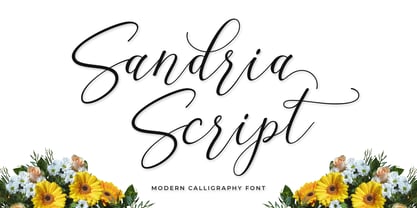 Introducing the latest styles Sandria Script, a sweet calligraphy font, casual and dynamic with a dancing baseline, This font can be used easily and simply, perfect for Branding, Logos, Greeting Cards, Wedding Stationery, Quotes etc.
 - Granding Script by Romie Creative,
$13.00 Granding Script is a very easy to read Script typeface, a beautiful, classy and elegant typeface. Can be used for various purposes such as logos, wedding invitations, t-shirts, letterhead, signage, news, posters, badges etc.
 - Aubrielle by Awanstudio,
$13.99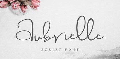 Introducing Aubrielle script font! It allows you to create stunning and easy hand-lettering in an instant. Ideal for the logo, quotes, wedding, product label/packaging, fashion, letter, advertising, invitation, poster, merchandise, greeting cards, etc.
 - Knife Fight - Personal use only

- Veru Serif - Unknown license

- Mrs Eaves by Emigre,
$125.00 This typeface is named after Sarah Eaves, the woman who became John Baskerville’s wife. As Baskerville was setting up his printing and type business, Mrs. Eaves moved in with him as a live-in housekeeper, eventually becoming his wife after the death of her first husband, Mr. Eaves. Like the widows of Caslon, Bodoni, and the daughters of Fournier, Sarah similarly completed the printing of the unfinished volumes that John Baskerville left upon his death.


