10,000 search results
(0.382 seconds)
- Al Sinerva by Aluyeah Studio,
$120.00 This font is the result of my play with letters. Inspired by Indonesia's great cultural heritage, Batik. I wanted to create a font that has an alternative that highlights a small part of Indonesian batik culture by taking a shape like a bird's feather which is often applied to Batik. A simple, yet distinctive, elegant font that can be applied to many areas of design. Sinerva is a quilly display typeface. Coming with 130+ stunning and super easy to use alternates. Very suitable for magazine, headline, website, ads, product package and all type of design project you have. Features: OpenType support Multilingual support (15 languages) PUA Encoded Super Easy to Use alternates - It's OpenType support but you can easily call alternates character using special combination like A.2 R.3 h.5 etc. so you don't need special software. To get results like the preview just type S.4INERV.3A.8 Thanks for checking out my font. I really hope you enjoy using it!
 - Coffeedance by Chank,
$49.00Shortly after the creation of Chauncy Deluxxe, Chank realized that he needed a condensed font to go with the regular version of his handwriting. The solution was Coffeedance, a fun, light, dancing, dandy handmade font. Makes me think of frozen treats as the lines wiggle a bit like they’re shivering. Brrrr. Coffeedance was Chank’s Font of the Month for November 1998. - Glandian by TM Type,
$12.00 Glandian is a romantic and sweet calligraphy typeface with characters that dance along the baseline. It has casual yet elegant features. It is perfect for wedding invitations, logo designs, social media, wedding greetings, etc. This font is PUA encoded, which means you can access all of the glyphs and swashes with ease.
 - GF Halda Smashed - Unknown license

- GF Halda Normal - Unknown license

- GF Hubert Caps - Unknown license

- Eveningnews by Wiescher Design,
$39.50 Since many years I live in Munich and read the daily newspaper Abendzeitung. One morning they had redesigned the paper, using Eric Gill's Joanna for the body copy and a tweaked version of Franklin Gothic for the headlines. Since both typefaces are my all-time favorites, I was very pleased. The old hand-lettered title lettering designed by in-house designer Ernst Friedrich Adler around 1947 or 48 was untouched as it always was. Adler had worked for the newspaper an incredible 47 years! Ernst Friedrich Adler celebrated his 100th birthday in the summer of 2007 looking very healthy. But someone had adapted his title lettering for use in the chapter headings, and I did not like the way that was done. Every morning I saw those letters and thought "one day I have to clean that up". About 15 years later I finally did it! Being at it, I designed the whole typeface and added a second fancy cut. And, what do you know, the people at the Abendzeitung called me up and said they liked what I did and started using it. So since that day in 2005 I can read my morning paper without having to wonder about the chapter headings. Well maybe one day they will do another redesign and maybe they will use another one of my fonts. Your editorial typeface designer, Gert
 - Nice and Easy JNL by Jeff Levine,
$29.00 The hand lettered title and credits for the 1937 film “Easy Living” (starring Jean Arthur and Edward Arnold) featured playful, casual Art Deco sans serif lettering. This became the working model for Nice and Easy JNL, which is available in both regular and oblique versions.
 - Coriander by Adobe,
$29.00Coriander is the work of British designer Timothy Donaldson. It started out as a doodle one afternoon Donaldson was bored and uninspired. He wrote the word Coriander" and was then distracted by the sun beating through an adjacent window. He taped the writing paper up on the window as a shade. He took it down a few months later, folded it up, and stuck it in his pocket. When the piece of paper fell out of his pocket a week later, he was inspied to draw the rest of the characters, two alphabets in his sketchbook. The final digitized characters were created by Donaldson using a Wacom tablet and later refined on the screen." - Uncial Romana ND by Neufville Digital,
$29.60 There are many Uncial types in the type catalogues around the world, but most of them have a rough and stiff appearance. The Roman Uncial ND by Ricardo Rousselot stands out for the realism of its strokes, which look as if they are handwritten, bringing freshness and authenticity to its applications. Uncial Romana is a Trademark of BauerTypes SL
 - Velvet Hammer by Great Lakes Lettering,
$40.00 The Velvet Hammer is a true hand calligraphy font that offers the viewer a sense of strong elegance. This font can be used for all things such as cards, posters, signage, wedding invitations, catalogs, book covers and so much more! The Velvet Hammer’s simple unique style can stand strong on its own or sit comfortably side by side with any display or text font!
 - Tuberosa by Blankids,
$19.00 Introducing of our new product the name is Tuberosa a beauty font. Tuberosa inspired by modern calligraphy this font is a fun theme very good for display, valentine theme, wedding, logotype and etc
 - Beautiful Agatha by Yoga Letter,
$30.00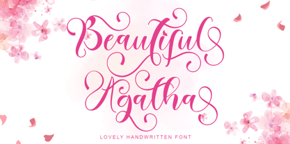 "Beautiful Agatha" is the best beautiful handwritten font. This font comes with uppercase, lowercase, ligature, swash, alternate, punctuation, and multilingual support. very suitable for weddings, engagements, invitations, Christmas, Valentine's, spring, summer, autumn, etc.
 - Business Helpers JNL by Jeff Levine,
$29.00 Duluth, Minnesota's Horace P. Brouillet Syndicate (later known as Syndicuts, Inc.) was one of a number of stock cuts providers to the letterpress trade in the decades preceding paper, then electronic clip art. Brouillet's "Typeps" catalogs offered a wide range of images covering numerous subjects, as well as cartoons, catch words and automotive logos. Many of these images have been reproduced in a number of royalty-free clip art publications over the years. Twenty-Six of these newly-redrawn catch words are found within Business Helpers JNL in two styles. On the capital keys are the original white-on-black designs, modeled from the vintage source material. The lower case keys have the phrases separated from the decorative ovals and are in black type.
 - Film Crew JNL by Jeff Levine,
$29.00It's not a new idea, but it's always a fun one... a typeface comprised of 35mm film frames. Film Crew JNL is Jeff Levine's version, utilizing his Koehler Sans JNL as the lettering inside the frames. The lesser and greater keys have solid black frames for end caps or word spacing, and there's an alternate pair of frames with clear centers on the brace keys. - Hamburger Heaven NF Pro by CheapProFonts,
$10.00 A stylish retro script where I have completely redone the spacing to make the text look more even. All of the diacritics have been redone, too - and the character set expanded in our usual fashion. So now this little gem from Nick Curtis is ready for the big time! Nick Curtis says: “This font is basically a design exercise, influenced by a number of contemporary fonts, but unique in its own way. The gentle, fluid motion reminded me of diner lettering from the 30s and 40s, hence the name.” ALL fonts from CheapProFonts have very extensive language support: They contain some unusual diacritic letters (some of which are contained in the Latin Extended-B Unicode block) supporting: Cornish, Filipino (Tagalog), Guarani, Luxembourgian, Malagasy, Romanian, Ulithian and Welsh. They also contain all glyphs in the Latin Extended-A Unicode block (which among others cover the Central European and Baltic areas) supporting: Afrikaans, Belarusian (Lacinka), Bosnian, Catalan, Chichewa, Croatian, Czech, Dutch, Esperanto, Greenlandic, Hungarian, Kashubian, Kurdish (Kurmanji), Latvian, Lithuanian, Maltese, Maori, Polish, Saami (Inari), Saami (North), Serbian (latin), Slovak(ian), Slovene, Sorbian (Lower), Sorbian (Upper), Turkish and Turkmen. And they of course contain all the usual “western” glyphs supporting: Albanian, Basque, Breton, Chamorro, Danish, Estonian, Faroese, Finnish, French, Frisian, Galican, German, Icelandic, Indonesian, Irish (Gaelic), Italian, Northern Sotho, Norwegian, Occitan, Portuguese, Rhaeto-Romance, Sami (Lule), Sami (South), Scots (Gaelic), Spanish, Swedish, Tswana, Walloon and Yapese.
 - Reghitta by Jinan Studio,
$10.00 Hello World, Introducing, Reghitta! is a stylish script font with 89 stylish ligatures that exudes elegance and charm. Its versatility makes it an excellent choice for various design purposes, including weddings, branding, social media post, quotes, prints, and more. No matter the project, Reghitta will elevate your designs to the next level, leaving a lasting impression on anyone who lays eyes on them. Features A set of uppercase and lowercase glyphs Number, symbol, and punctuation Multilingual Support Alternates Ligatures Swash Slant Version Thank you a million times for buying and using this font for your projects. Enjoy this font and happy creating! Jinan Studio
 - Frank Flowers by Wiescher Design,
$15.00 Frank Flowers are fonts with flowery embellishments. They are useful for all kinds of celebrations, but they also have lots of impact. There are only uppercase letters even on the lowercase keys. Uppercase and lowercase look different, so you can mix them. You can even mix the two sets, it'll look great. I had a lot of fun doing these fonts and I want you to have some fun as well. That's why I sell them very, very cheap, even cheaper if you buy the pair! -Your typedesigner for unusual solutions Gert Wiescher
 - 99 Names of ALLAH Kids by Islamic Calligraphy75,
$12.00 We have transformed the “99 names of ALLAH” into a font. That means each key on your keyboard represents 1 of the 99 names of ALLAH Aaza Wajal. The fonts work with both the English and Arabic Keyboards. We call this Calligraphy "Kids" because it looks as if a child is writing the names. The first "Alef" has a "hamzit wasel", this indicates that the name can be pronounced both as "AR-RAHMAAN" or "R-RAHMAN" (in the zip file you will find a pdf file explaining the differences in the "harakat", pronunciation and spelling according to the Holy Quran). Some of the letters in the calligraphy are unusually big, they look as a child is writing them. No decorative letters are used in this calligraphy. Purpose & use: - Writers: Highlight the names in your texts in beautiful Islamic calligraphy. - Editors: Use with kinetic typography templates (AE) & editing software. - Designers: The very small details in the names does not affect the quality. Rest assured it is flawless. The MOST IMPORTANT THING about this list is that all the names are 100% ERROR FREE, and you can USE THEM WITH YOUR EYES CLOSED. All the “Tachkilat” are 100% ERROR FREE, all the "Spelling" is 100% ERROR FREE, and they all have been written in accordance with the Holy Quran. No names are missing and no names are duplicated. The list is complete "99 names +1". The +1 is the name “ALLAH” 'Aza wajal. Another important thing is how we use the decorative letters. In every font you will see small decorative letters, these letters are used only in accordance with their respective letters to indicate pronunciation & we don't include them randomly. That means "mim" on top or below the letter "mim", "sin" on top or below the letter "sin", and so on and so forth. Included: Pdf file telling you which key is associated with which name. In that same file we have included the transliteration and explication of all 99 names. Pdf file explaining the differences in the harakat and pronunciation according to the Holy Quran.
 - ABC Idea by Alphabets by Chileans (A.B.C.),
$18.00 ABC Idea is a contemporary geometric sans full of opentype features in Regular, Bold and very "fast" Italic. The design is an experimental fusion or mix between Humanist, Geometric and Grotesque models. The fine drawing in all letters and signs has precise ink traps to highlight contrast jus like lettering and calligraphy does, then ABC Idea re-creates this exquisite graphic details into the digital world. Designed by Miguel H. Montoya Fonts in Use Images by letargo.cl Magazine. Art Direction by studioprado.cl
 - Royal Stencil JNL by Jeff Levine,
$29.00 An image spotted on the internet of a brass shipping stencil for the Royal Quality Brand (for the John H. Fitch Company of Youngstown, Ohio – a coffee and spice merchant). The lettering style for “Royal Quality” was a hand-cut, condensed, slightly flared sans serif with various character flourishes, giving the letters a stylish, somewhat regal look. Expanding on this idea, a full character set was developed and redrawn digitally as Royal Stencil JNL, which is available in both regular and oblique versions.
 - Windsor by URW Type Foundry,
$35.99 Windsor is an unusual design cut by Stephenson Blake in 1905. Windsor is a bold face with heavy rounded serifs and strong diagonal stress. Capitals M and W are widely splayed, P and R have very large upper bowls. The Lowercase a h m and n of the Windsor font have angled right hand stems, e has an angled cross-stroke. The overall effect is one of friendliness and warmth. Use the Windsor font in advertising, on posters and for general display work.
 - Windsor by Monotype,
$40.99 Windsor is an unusual design cut by Stephenson Blake in 1905. Windsor is a bold face with heavy rounded serifs and strong diagonal stress. Capitals “M” and “W” are widely splayed, “P” and “R” have very large upper bowls. The Lowercase “a”, “h” “m” and “n” of the Windsor font have angled right hand stems, “e” has an angled cross-stroke. The overall effect is one of friendliness and warmth. Use the Windsor font in advertising, on posters and for general display work.
 - Binner Gothic by Monotype,
$29.99Binner Gothic is a very narrow sans serif thought to have been cut by the Bruce Typefoundry, in New York, around the turn of the century. The capitals are rather heavy with an elongated appearance, accentuated by the high-waisted treatment of characters such as B E F H M N P and R. The lowercase ascenders and descenders of the Binner Gothic font are cut at an angle. Binner Gothic is a display face particularly useful where space is at a premium. - Darling Emily NF by Nick's Fonts,
$10.00The typeface Weiner Grotesk, designed by Rudolf Geyer for the H. Berthold AG foundry of Berlin in 1912, provides the pattern for this classic Jugendstil font. The design is very versatile: used as all caps, you can create elegant, compact headlines; and, as upper and lower, you can create subheads with decidedly dramatic contrast. Either way, this one is a "Weiner". All versions of this font include the Unicode 1250 Central European character set in addition to the standard Unicode 1252 Latin set. - San Angelo NF by Nick's Fonts,
$10.00A heavy unnamed Gothic typeface from the 1890 William H. Page Foundry woodtype specimen book provided the template for this bold, brash, no-nonsense face. It's designed to set tight, so your headlines will definitely get noticed. Named for a town in West Central Texas which is noted for being the home of the Buffalo Soliders in the late 1800s. Both versions of this font contain the Unicode 1252 (Latin) and Unicode 1250 (Central European) character sets, with localization for Romanian and Moldovan. - Casthago by BustanType,
$24.00 Casthago is a transitional, humanist serif typeface family, comes with some contrast in the stroke and medium curve braketed serif that creates a very classic and traditional feel. Casthago designed for body text, creating a steady and readable rhythm, made for immersive reading. Some Character comes with alternate style 'a,h,m,n' that inspirated by Carolingian manuscript that was popular in medieval European period. Casthago consists of 16 styles from Extralight to black including italic styles and 2 variable fonts addition.
 - Stempel Schneidler LT by Linotype,
$29.99 F .H. Ernst Schneidler, type designer and teacher, originally designed Schneidler Old Style in 1936 for the Bauer foundry. Stempel Schneidler is based on the typefaces of Venetian printers from the Renaissance period and possesses their grace, beauty, and classical proportions. The Stempel Schneidler, a completely reworked and tuned font family made by D. Stempel AG in Frankfurt, is a fine, legible text font that also works well in display. One of Schneidler's more unique features is its question marks.
 - Refinery Stencil JNL by Jeff Levine,
$29.00 A vintage brass stencil used for marking oil drum lids for the Standard Oil Company of Kentucky served as the model for Refinery Stencil JNL, which is available in both regular and oblique versions.
 - Iso - Personal use only

- Brass by HiH,
$8.00 The Brass Family has a lineage that extends into English history. About five hundred years ago a devout, but anonymous Englishman gave glory to the God he worshipped by designing the capital letters and decorations of these two fonts. Originally recorded in The History Of Mediaeval Alphabets And Devices by Henry Shaw (London 1853), they are described by Alexander Nesbitt in his Decorative Alphabets And Initials (Mineola, NY 1959) as “Initials and stop ornaments from brasses in Westminster Abbey.” I wish I could say I remember seeing them when I was there, but that was forty-two years ago and all I remember was seeing the tomb of Edward the Confessor. One definition of “stop” as a noun is a point of punctuation. I have heard people from the British Isles speak of a “full stop” when referring to a period. Some may remember a 19th century form of communication called a telegram being read aloud in an old movie, with the use of the word “stop” to indicate the end of a sentence or fragment. A full dozen of these stop ornaments are provided. They occupy positions 060, 062, 094, 123, 125, 126, 135, 137, 167, 172, 177 & 190. The Brass Family consists of two fonts: Brass and Brass Too. Both fonts have an identical upper case and ornaments, but paired with different lower cases. Although the typefaces from which the lower cases were drawn are both of modern design, both are interpretations of the textura style of blackletter in use in England when the upper case and ornaments were fashioned for the Abbey. Brass is paired with Morris Gothic, which matches the color of the upper case quite well. Brass Too is paired with Wedding Regular, which is distinctly lighter than the upper case. I find it very interesting how each connects differently. The resulting fonts are unusual and most useful for evoking an historic atmosphere.
 - Rachelle JNL by Jeff Levine,
$29.00One of Jeff Levine's friends kept requesting that he name a font after her, and he finally obliged with Rachelle JNL. The font gets its inspiration from the antique wood type version of the popular font most often known as a Latin typeface - complete with spur serifs and all of the usual quirks of wooden type. - Alisal by Monotype,
$29.99 Matthew Carter has been refining his design for Alisal for so long, he says, that when he was asked to complete the design for the Monotype Library, it was almost as if he were doing a historical revival of his own typeface. The illusion even extended to changes in his work process: although he now does all his preliminary and final drawing on screen, the first trial renderings of Alisal were done as pencil renderings. Alisal is best classified as an Italian old style design. Originally created between the late 15th and mid-16th centuries in northern Italy, the true Italian old styles were some of the first roman types. They tend to be the most calligraphic of serifed faces, with the axis of their curved strokes inclined to the left, as if drawn with a flat-tipped pen or brush. These designs offer sturdy, free-flowing and heavily bracketed serifs, short descenders, and a modest contrast in stroke weight. Alisal has nearly all the classic Italian old style character traits, plus a few quirks of its own. It is calligraphic in nature, with more of a pen-drawn quality than faces like Palatino or Goudy Old Style. It is more rough-hewn than either Goudy's Kennerley or Benton's Cloister, and is generally heavier in weight than most of the other Italian old style designs. One place where Alisal makes a clean break with traditional old style designs is in the serifs. While sturdy and clearly reflecting pen-drawn strokes, Alisal's serifs have no bracketing and appear to be straight strokes crossing the main vertical. Like Caslon or Trajanus, Alisal is a handsome design when viewed as a block of copy. Ascenders are tall and elegant, and serve as a counterpoint to the robust strength of the rest of the design. Alisal is available as a small family of roman and bold with a complementary italic for the basic roman weight, providing all that is needed for the majority of text typography. Alisal is not as well-known as some of Carter's other typefaces, but this lovely and long-incubated design was certainly worth the wait.
 - Pine Forest by Dikas Studio,
$15.00 Pine Forest is a display sans serif typeface inspired from outdoor activity, they have a verry handrawn and playfull character. Pine Forest come with two fonts styles press and press italichand. Suitable and applicable to create typography design, branding, logos, product packaging, invitation, qoutes, t-shirt, label badge poster etc. Caps Only Fonts
 - Ringo by typoland,
$9.00 Whassup y’all! Me and my bros got this li’l gang together: we is Ringo, and we got da bling, yo! We is da typeface family for ya all! We got some real sweet stuff for ya, some nice characters. We got all ’em OpenType features like fractions and proportional figgers, we even got da cubic root, man! And check out da question mark, man, is real sweet. And the ampersand, yeah! I luv ’em ampersands. Now my brothers over here got some light action for ya, and they got some real bold action for ya. We got some nice foxy curves goin’ on, some nice tension, and some nice relaxation. My bro Light over here is kind of like the subtle guy, ya know. He’s in for the female fans, ya know. Heh! Hell, yeah! And man, we speak like 84 languages: we speak the German, and the French, and the Spanish, and we speak the Polish, and the Czech, and the Hungarian, and we even speak Shambala and Swahili and Rundi, and we got some Esperanto thing as well for ya. And check out my bro Black right over here, he’s like the action superhero, man! He’s got impact, man! Yeah yeah, but you know, my bros Regular and Bold are the real deal. Them is like da word of da street, man! Like da word of you, and you. And we got a message for y’all: life is hard, life is real, but you should work your mojo, be smooth, be nice, chill. We got all them kerning pairs, and all them weights, and we got ’em alternate letters. So check us out, yo!
 - Bobby Jones by Tom Chalky,
$19.00 Introducing The Loud & Proud Bobby Jones Font Collection Inside you'll find 16 quirky handcrafted fonts, oozing with personality, ripe and ready to take center stage within a variety of creative and fun design projects. If you're looking to grab eyeballs with an ad campaign, a logo design, apparel, printed stationery, and all that other good stuff, then worry not. Bobby has you covered. We all come with imperfections and Bobby is no exception! His outlines are slightly off, his corners are irregular, his straights aren't straight, but he's cool with it. In fact, he's too busy strutting his stuff. - What's Inside? Each of the fonts listed below boast multilingual glyph ranges and their own individually handcrafted outline style! (16 fonts in total!) - Bobby Jones - The original Bobby.J - Bobby Jones Soft - A rounded version of the above - Bobby Jones Condensed - The thinner and leaner sibling to Bobby Jones - Bobby Jones Condensed Soft - A rounded version of the above - Bobby Rough - A high-res textured version of the original - Bobby Rough Soft - A textured version of Bobby Jones Soft - Bobby Rough Condensed - A textured version of Bobby Jones Condensed - Bobby Rough Condensed Soft - A textured version of Bobby Jones Condensed Soft Designed a little over five years ago, the original Bobby Jones Font was my first ever product. This new and improved version has been entirely redesigned from bottom to top. Holding dearly to the punch that the original had, while adding a whole lot of extra power. I hope you enjoy the Bobby Jones Family as much as I do and have, and as always if you have any questions or comments, please do not hesitate to get in touch. I'd love to hear from you. (tom[at]tomchalky.com)
 - P22 Sneaky Pro by IHOF,
$39.95 P22 Sneaky is the newest font by award winning type designer Michael Clark. Sneaky is a connecting-script and sibling of his popular Pooper Black type which shares a similar flow and casual elegance. It features shared details and relative size so that with careful design, the two can be mixed and matched. Sneaky Pro features over 500 glyphs with alternates and a Central European character set.
 - Caslon 540 by URW Type Foundry,
$89.99 William Caslon (1692-1766) laid the foundation for English typefounding, when he cut his first roman face in London in 1722. He modeled his designs on late seventeenth-century Dutch types; thus his typefaces are classified as Old Styles. The original Caslon punches have been preserved, enabling a perfect recutting of his faces. Notice the hollow in the apex of A and the two full serifs or beaks in the C. The italic capitals are irregular in their inclination. The Caslon font family is distinctive for use in subheadings or continuous text.
 - Aquascape by Goodigital13,
$20.00 It will make your design project more beautiful. The font is suitable for any design like branding, fashion, print template, quotes, wedding and etc. Perfect to use for Logotype, Letterhead, Poster, Apparel Design, Label and etc. perfect for cards, prints, logos, invitations, arrange illustration and decoration. It has upper and lower case letters, numbers, special characters, accents. Perfect for Children!
 - Santhana by Rochart,
$10.00 Santhana is a font collection that contains more of alternate and some Ornament. The collection of fonts that are designed to complement each other in their use. Santhana is perfect for logo design, t-shirts, flyers, apparel, packaging, advertising, Wedding Invitation etc. This typeface contain of Uppercase, Lowercase, Alternate, Swash, Number, Symbol, Punctuation, Ligature etc. Also support multilingual and already PUA encoded.


