10,000 search results
(0.024 seconds)
- genotype H BRK - Unknown license

- H-AND-S by AND,
$89.00 A common creation: (to pass from one hand to the other): For the first time, various hand-signs from diverse sources are unified into one single visual style. This compendium is the result of 15 years of incubation and 7 years of creation. In his travels throughout the world, graphic designer Jean-Benoit Levy, principal of the visual studio AND, has collected pictures of multiple hand signage. Uncertain what to do with those signs, he kept them year after year until the idea came to unify almost 200 handsigns into one single family. In accordance with this entire collection, the name of the typeface is a mix: "h-and-s". A global collection: (To put in good hands): We all have one thing in common: Hand-signs are an international language, they are meant to be understood by all of us. Each of us regularly comes in contact with modern hieroglyphs such as the hand-sign-codes that are so prevalent in our daily life. This way of communication belongs to no one in particular and to all of us in general. Even if the sense of certain signs varies from one culture to the other, there is a common hand-sign language. We are surrounded by this language of handsigns each time we step in a store, we eat, open a container of milk, we clean up, use package of wash-powder, by shaving, when we work, use tools, at home, by tearing the envelope of a condom, by traveling, etc. When we encounter these signs, we all understand them easily. A visual connection: (To go hand in hand): This typeface is a global visual statement. Collecting, ordering, redrawing, unifying. Reconstructed and assembled into one original alphabet, H-AND-S is a unique and complex signs program. Our choice is based on daily gestures and global hand-codes. Logically this typeface starts with the "American Sign Language" and expands on two type-variations, each on two levels of keyboard. The international team of H-AND-S would like to send his special thanks to all of the anonymous graphic designers throughout the world who designed different hand-signage and who influenced and inspired to create such a sign collection into one unified family. We, the global nomad team of AND, hope that you will enjoy our H-AND-S. Additional Credits Production: Studio AND. www.and.ch. Concept, Idea & Creative Direction: Jean-Benoît Lévy, Switzerland / USA. Research & Sketches: Eva Schubert, Germany. Illustration, Graphic Design & Visual Fusion: Diana Stoen, USA. Transfer, Adaptation & Refining: Moonkyung Choi, Korea. Finalization & Checking: Sylvestre Lucia, Switzerland. Coaching & Technical Advice: Mike Kohnke, USA. Creative Energy & Implementation: Joachim Müller-Lancé, Germany / USA.
 - ViabellaT H Pro by Elsner+Flake,
$40.00 The script version of the typeface Viabella introduces us to the calligraphic side of the Berlin type designer and typographer Karl-Heinz Lange. The sketches for this script typeface, which resulted from the close cooperation with Veronika Elsner and Günther Flake, found their roots in sketch drawings which Karl-Heinz Lange had already drawn in the 1980’s. For the Viabella design, Karl-Heinz Lange drew the basic letterforms of the Black and Regular cuts with a brush. He then re-worked the drawings and transferred them on to tracing paper. The design studio Elsner+Flake in Hamburg cut these typeface extensions and later digitized them manually with the help of the IKARUS Sustem. With the Regular cut as a basis, Elsner+Flake extended the family with the Light version and interpolated and re-worked the Medium weight. The completion of the family was taken over by the type designer Björn Gogalla who had done the same kind of work on Rotola, a design which Karl-Heinz Lange had also created for Elsner+Flake. While Viabella was originally conceived as a headline typeface, its lighter weights can certainly be used for shorter text applications. The Black version creates powerful headlines with highly effective accents. With the help of swashes, which are available for all weights, the user can lighten up longer texts and add special character to titles. In contrast to pure headline fonts, Viabella has been enriched by an extensive complement of special characters. In addition to the Europa-Plus character set which allows setting type in over 70 latin-based languages, the user will find multiple versions of numerals as well as oldstyle figures, tabular and proportional lining figures, diagonal fractions, and a complete set of superior and inferior figures and fractions (60%). With such a rich character set, Viabella is not only ideal for many different uses in the areas of newspaper, magazine and advertising but it will surely be chosen for the design of greeting cards, invitations and other design projects within the privat sphere.
 - Victorian Alphabets H by Intellecta Design,
$20.00 Victorian Alphabets H is an incredibly cool and classic display font. Elegant and distinct, this font will most certainly elevate your creations. Add it confidently to your projects, and you will love the results. You have a great set of letters "H" using the uppercases, lowercases and numbers keys on the keyboard. Plus, acquiring the Titivilus font you get GREAT DUO combinantion, like you can see i the banners
 - Ian - Unknown license

- Jan by Linotype,
$29.99Jan Regular combines an experimental, bold, mono-weight geometric sans serif with the Arabic writing system's means of joining letters. Adding in script-like letter connections, a feature that is found in both western cursive and Arabic type, as well as distinctly Arabic-like accents above and below certain letters, Michael Parsons has created a cross cultural typographic statement. Jan Regular is best used for headlines, and small strings of text, in sizes large enough to view and appreciate the unique counter forms within the letters. This font is one of 10 creations from the young Swiss designer Michael Parson included in the Take Type 5 collection, from Linotype GmbH." - Sila by Khoir,
$15.00 Introducing, Sila, Modern Serif. This font has an attractive and elegant alternative and several ligatures that enhance it, making your font / logo more attractive. This font has a bold and smooth shape, making this font look unique but doesn't leave an elegant impression. This font is suitable to be applied especially in logos, invitations, novels, books, magazines, labels, greeting / wedding cards. So what are you waiting for! What's included? Uppercase Characters Lowercase Characters Support 75+ Language FEATURES So what are you waiting for? immediately purchase this font, feel free to comment, or send me my PM or email at khoirtypework@gmail.com Thank you for seeing
 - Silo by TypeUnion,
$25.00 Designed and built in London by TypeUnion, Silo is a fluid sans serif typeface embodying energetic curves and a clean, functional structure. The Silo Family is made up of 6 weights, which range from a delicate Extra-Light, all the way through to a punchy, loud Extra-bold and each carry a versatility for multiple applications and uses. Silo features open type alternate characters, and extensive language support to provide a flexible, substantial user experience.
 - Syl by Intellecta Design,
$28.90 A classic and antique font design remastered by the type foundry Intellecta Design. Great display face for headers and antique-like projects. Contains a limited amount of letter designs, all uppercase letter designs.
 - grotto Med - Personal use only

- Med Splode - Unknown license

- Darah Erc - Unknown license

- Home Education by Hanoded,
$15.00 Just before the end of 2020 all schools in Holland closed for the second time, because of an increase in the number of COVID 19 cases. This means that my wife and I have to educate our three kids at home. The kids are great and take their tasks seriously, but it is difficult, as all three of them require different educational levels. I am sure you parents understand. Trying to get some work done is virtually impossible, so my wife and I made a schedule and we live by ‘on duty’ and ‘off duty’ days. I was thinking of this when I created this font (obviously on an ‘off duty’ day). Home Education is a handwritten scribble font. It was made with a Sharpie pen (possibly used by one of my kids, because I noticed tiny ink stains on my wooden dining table…). It comes with all the diacritics you can hope for and lovely double letter ligatures for you to play with.
 - An Education by David Engelby Foundry,
$25.00 Go ahead, and call it a rational serif. After all, An Education owes its basic style to the neoclassical typefaces like Bodoni and Didot. But it’s more than simply a rational approach – An Education is pure love for a classic expression of elegance (combined with a touch of European decadence, I mean, who needs Le Corbusier all the time?). An Education is a tailor made text font for those of you who crave elegant typographic design. Elegantly spice up your reports, your book layouts, your posters and many other designs – without sacrificing legibility or contrasts.
 - Educator JNL by Jeff Levine,
$29.00Educator JNL joins the large library of Jeff Levine's stencil fonts and was re-drawn from a set of individual letter stencils with the distinctive look of Franklin Gothic. All of the irregularities of the original die-cut letter forms were left intact, giving a "real world" look to the font. - jey - Personal use only

- Hexi by Sign Studio,
$9.00 Hexi is a modern style serif font. It has 9 thicknesses (Thin to Black) to provide more support when designing and also Oblique version to give your texts more different or contrast. Have bold serifs to reduce the pixel effect on digital devices. Minimized the nodes in each design to keep the glyphs bodies clean. Give the extrema point on each curve, it will make Hexi look smooth and neat. There are several subpackage options for you to save even more.
 - Keys by URW Type Foundry,
$39.99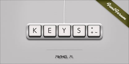
- Geis by Galapagos,
$39.00In 1978 I went to work at Mergenthaler as a letter drawer. Being an inquisitive sort I decided that I should take a stab at this type design 'stuff'. I drew 25 or 30 glyphs before the work found its way to a high shelf in a dark corner of my apartment. Just 23 years later I found the drawings on a different shelf, in a different home, in a different city and decided to finish what I had started. I'm still trying to deal with my predisposition toward procrastination but I've finished the font. The name of the font is the last name of somebody I played softball with before I moved to Beantown. Ronnie Geis was one of the courageous firefighters we lost on September 11th when the WTC collapsed. - Hewy by Kaer,
$19.00 HEWY is an elegant sans serif font family in Scandinavian design style. Simple line letters will add a touch of style to your projects. What you will get: Line and regular styles Uppercase and lowercase glyphs Numbers and symbols Multilingual support Ligatures Please feel free to request to add characters you need: kaer.pro@gmail.com
 - Thei by Andfonts,
$29.00 Thei is a calligraphy font that helps designers to create beautiful compositions. It looks stunning on wedding invitations, cards, quotes, greeting cards, logos, business cards and every other design which needs a customized touch. How quickly to create main decor element: 1.Type == (equal signs). Or type any Text========== Then move decor elements in the right position. ***Don’t change size of text during this process, because it may not create decor elements (ligatures). Or choose the décor element in Glyphs category.
 - Hex by Hanoded,
$15.00 Hex is an uneven, spiky font with an evil twist. The glyphs look like they have been scratched onto paper (which is indeed the case), so it will be perfect for your scary halloween postcards or posters. Hex font comes with extensive language support.
 - blue jeans - Unknown license

- Juan Miro - Unknown license

- Pea Jean - Unknown license

- Diane Script by GroupType,
$27.00 In 1995, FontHaus came upon a rare opportunity to create a revival of Aries, a little known and previously unavailable typeface by the legendary Eric Gill. Discovering a lost typeface by one of the major designers of the 20th Century, was the discovery of a buried treasure, and being the first type company to release it was an honor. Thirteen years later, FontHaus came across another little known typeface treasure: Diane. Designed by the legendary French designer Roger Excoffon in 1956, this remarkable script has never been faithfully recreated until now. In close collaboration with Mark Simonson, FontHaus and Mr. Simonson painstakingly researched rare type books, publications, European metal type services, and period showings from the United States, England, Germany and from the University of Groningen in the Netherlands. Finding full specimens of the font turned out to be quite a challenge. In most cases, only the caps and lowercase were shown. Furthermore, the more we researched Diane, many curious facts came to light. The caps in earlier specimens of Diane are completely different from specimens published later, suggesting that the face was redesigned at some point, perhaps in the mid-1960s. So we are left with two different sets of caps. The original had very elaborate, swirly strokes, very characteristic of Excoffon¹s gestural designs for posters and logos. Later on, these appear to have been replaced by a set of simpler, more traditional script caps. The original caps are criticized in one source Mark found (Practical Handbook on Display Typefaces, 1959) as being "exquisite" but "not highly legible". Perhaps this is what led to the simpler caps being introduced. Nevertheless, FontHaus's release includes not only both sets of caps, but a range of alternates and a number of new characters not originally available such as the Euro, and a magnificent alternate Ampersand to name a few.
 - Loose Jeans by Epiclinez,
$18.00 Loose Jeans is a fun, playful, and quirky display font. It has a modern yet whimsical style an it will undoubtedly immerse your designs into a magical world. So what's included : Basic Latin A-Z & a-z Numbers, symbols, and punctuations Accented Characters : ÀÁÂÃÄÅÆÇÈÉÊËÌÍÎÏÑÒÓÔÕÖØŒŠÙÚÛÜŸÝŽàáâãäåæçèéêëìíîïñòóôõöøœšùúûüýÿžß Thank you
 - Nichole Jean by Throndsen,
$19.99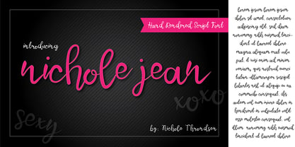
- Diane Amorta by Grezline Studio,
$10.00 Diane Amorta is a cute handdrawn sans serif font crafted very carefully. Diane Amorta is perfect use for a logo for branding, typography design, product packaging, invitation, quotes, t-shirt design, label poster, special events and anything that need handwriting taste.
 - SP Jean by Remote Inc,
$39.00I met her in a saloon called Little Texas. I was drinking mescal like it was vodka. She, tossing midgets like they were lawn darts. When the betting was closed, she launched an extra from The Wizard of Oz an impressive five meters, grabbed her margaritta and sat down. - Giane Sans by XdCreative,
$25.00 Description Giane sans. is contemporary and stylish sans serif with large x-height, low/minimal stroke contrast and large chunky sans with closed apertures. Giane san is matching pair with Giane Serif (https://www.myfonts.com/fonts/xdcreative/giane/) Giane sans Perfectly suited for graphic design and any display use ( for the logos, t-shirts, the web as well as for print, and also great for headings), Thank You _xd
 - Friday Jeans by PizzaDude.dk,
$19.00 Got a favourite pair of jeans? I do, and I wear them every Friday when it's time to PAAAARTYYYY! Well, that was 30-something years ago, but the memory of those jeans lives happily in my mind :) The font, Friday Jeans is a happy-go-lucky sans font with inky edges and lively lines. Playful as a Friday night out!
 - Joane Stencil by Compañía Tipográfica de Chile,
$25.00 Joane Stencil™ is Joane's fearless sequel. Mixes the elegancy of French didones, calligraphic endings, glyphic serifs and the split of the Stencil is treated very carefully. Thus its features convey a warm unique style. Moreover, it has powerful OpenType features for each style, including stylistic sets, extended language support, beautiful ligatures, contextual alternates, lining figures, oldstyle figures, fractions, and many more. Joane Stencil is perfectly suited for magazines headlines, branding, advertising, labels, web and packaging.
 - Joane Pro by W Type Foundry,
$16.00 Joane Pro is a new typeface based on Joane (2018). This project has its roots in French typography from the 16th century, Dutch models from the 17th century, and English typography from the 18th century. The result is a high-contrast typeface with sharp features which provides an organic texture. Joane Pro is a contemporary typeface with 79 styles that work in display and small sizes.
 - Fox Diane by Fox7,
$14.00 Fox Diane is a cute and fun color font. This font is your go-to for crafting cute greeting cards that express affection and warmth. Fall in love with its authentic feel and use it to create gorgeous invitations, beautiful stationary art, eye-catching social media posts, and cute greeting cards. 🌺🌺 Please note that the Canva do not support color fonts! 🌺🌺
 - Pearl Jean by Maulana Creative,
$18.00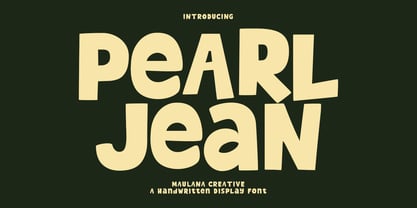 Pearl Jean is a casual handwritten display font. With medium low contrast stroke, fun character with a bit of ligatures and alternates. To give you an extra creative work. Pearl Jean font support multilingual more than 100+ language. This font is good for logo design, Social media, Movie Titles, Books Titles, a short text even a long text letter and good for your secondary text font with sans or serif. Make a stunning work with Pearl Jean font. Cheers, Maulana Creative
 - Juan Carlos by Homelessfonts,
$49.00 Homelessfonts is an initiative by the Arrels foundation to support, raise awareness and bring some dignity to the life of homeless people in Barcelona Spain. Each of the fonts was carefully digitized from the handwriting of different homeless people who agreed to participate in this initiative. A biography/story of each homeless person captures their story, to help raise awareness and bring some dignity to the life of homeless people. Monotype is pleased to donate all revenue from the sales of Homelessfonts to the Arrels foundation in support of their mission to provide the homeless people in Barcelona with a path to independence with accommodations, food, social and health care. Juan Carlos was born in Barcelona, Spain 46 years ago. Since the age of 17 – and during eleven years – he worked double shifts of eight hours every day in a factory. Excessive work and family problems debilitated his health and he lost his job. He then faced a dilemma: to spend unemployment benefits to pay for rent or for food. For a few years, he worked helping in the kitchens of different restaurants while he lived on a pension, until he was definitively left without work and ended up living in the street for 10 years. “In the street I tried to find rest in the ATMs of banks. I preferred to be alone, and if I ran into conflictive people, I looked for somewhere else” he explains. Living in the street he was the victim of an aggression. Since then, with the help of Arrels he moved into a pension. Today, Juan Carlos is a volunteer in the shower service of Arrels, the same showers he used during years. He also collaborates with the maintenance team, helps prepare hygienic and cleaning material, and participates in activities such as the theatre group and the football team.
 - Blue Jeans by Resistenza,
$29.00 Blue Jeans, is a new unconnected brush script font designed with Pentel brush sign. More about Opentype Features: https://bit.ly/opentype-rsz
 - Selfish Jeans by Bogstav,
$16.00 The song "Selfish Jean" by Travis inspired me to name this font, and a runny pen made me draw the letters. Actually, I started making the font while listening to that particular song - and the whole atmosphere about that situation, suited me perfect to make this handmade font! :)
 - EF Garamond Rough H by Elsner+Flake,
$35.00


