8,987 search results
(0.023 seconds)
- Gonk Droid by Edd's Aurebesh Fontworks,
$5.00 Making some Star Wars stuff? This Aurebesh font is designed to look like something you would see on a piece of quick and dirty graphic design in the Star Wars universe, like a wanted poster or a warning sign. The font includes the additional Aurebesh glyphs beyond the 26 basic characters (all in lowercase & uppercase) as well as numbers and symbols.
 - BMF Zodiac Pi by BuyMyFonts,
$25.00BMF Zodiac Pi is part of the BMF Symbols Collection, a gorgeous, versatile and highly original family of symbols (drawings, icons, pictograms). Zodiac Pi is probably the funniest and most playful collection of astrology-related images you’ll likely to find. The signs of the Zodiac are included in several styles, and the symbols of the planets are included in informal, hand-rendered versions. - Christmas Tree by Trim Studio,
$12.00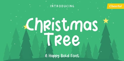 Christmas Tree is fun display font created to help spread holiday cheer. Get inspired by its charming appearance! Its perfectly suited for crafter and graphic artist to complete their design such as invitation, advertisement, poster, logo, birthday, product sign, and many more! Christmas Tree Font is also Lightweight and contains All Standard glyphs and punctuations and can be used beside any font.
 - Soylent Blu by Tail Spin Studio,
$20.00 Soylent Blu is an original wedge serif, single font designed by Steve Zafarana. Its high contrast character style and bouncy baseline create a visual impact that makes it a good candidate for Signs, headlines, logos and advertisements. The full lowercase set with balanced white space also functions quite well in text. Soylent Blu, with OpenType features, is clearly an attention-getter!
 - Pedrera by Etewut,
$20.00 Introducing a vintage typeface Pedrera It is simple pleasure for your eyes. But in the same time, fonts from the family could be used for card signing or product design, they have characters with tiny details that fascinate your attention. Each font is PUA encoded and has foreign symbols. Pedrera family has 6 fonts: - Regular - Bold - Italic - Italic Bold - Script - Script Bold
 - Casual Friday JNL by Jeff Levine,
$29.00An old rubber stamp printing set called the Aristocrat Sign Marker was the inspiration for this font from Jeff Levine. The letter shapes are truly reminiscent of the 1920s and early 30s with their casual playfulness, hence the font's name of Casual Friday JNL. To add a more nostalgic touch, the characters show slight imperfection of shape, as if hand-lettered. - Shera Display by Alandya TypeFoundry,
$18.00 Shera display font are elegant and subtle with touch of luxury. Shera Display represents a classy typeface best suitable for magazines, posters, advertising or any kind of fine and sensitive design. The font includes a full set of uppercase and lowercase letters, diacritics, currency signs, numerals, Unique, playful and versatile display font with ligatures and alternates to enrich your design work.
 - Eastside Brush by Adam Fathony,
$12.00 Eastiside Brush is Inspired by a casual style from sign painter who create a beautiful lettering trademark. A classical, timeless, and contemporary. Eastside Brush comes with 3 style, That's script style, cursive style, and capital style for all caps letter. It s should be easy to mix and match which best style for your design. Multiple language are available to all fonts.
 - Becker Monoline Modern NF by Nick's Fonts,
$10.00The first in a series of typefaces based on the work of legendary lettering artist Alf Becker, whose works appeared in Signs of the Times magazine for almost thirty years. Originally titled "Extreme Thin Gothic", this was Becker’s 185th design for the magazine. Both versions of the font include the 1252 Latin and 1250 CE character sets (with localization for Romanian and Moldovan). - Oblygasi by Wildan Type,
$14.00 Oblygasi is a modern serif font with a unique ligature and aletrnate style. A simple serif with a touch of curves on the top and bottom of the stemp gives a special impression. Combaine with high contrast and slat style perfect for feminine logo signs, fashion heads & editorial designs, branding projects, Clothing Branding, packaging, magazine headings, advertising, T-shirts, postcards and much more.
 - Kruda Handcrafted Sans by Akufadhl,
$29.00 Kruda is a Handcrafted display sans with 3 widths and 5 weights with accompanying slanted version. inspired by a vintage grotesk on a worn out signs and this was an initial sketch for our typeface Naratif, but it went too far. so we completed the language support for LATIN, CYRILLIC, and GREEK. and decided to take the risk to release it.
 - Child by Trim Studio,
$12.00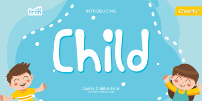 Child is a cute and quirky display font. It will attach a very playful and childish style to any design you wish to develop! Its perfectly suited for crafter and graphic artist to complete their design such as invitation, advertisement, poster, logo, birthday, product sign, and many more! Child Font is also Lightweight and contains All Standard glyphs and punctuations.
 - Casual Slab Serif JNL by Jeff Levine,
$29.00 Samuel Welo’s “Studio Handbook for Artists and Advertisers” (published in both 1927 and 1960) showcased this talented man’s hand-lettered alphabets; used as inspiration for the sign trade and for graphic designers. A particularly interesting slab serif from the 1960 edition has many unusual character shapes, and served as the model for Casual Slab Serif JNL – available in both regular and oblique versions.
 - Xtencil lc by John Moore Type Foundry,
$25.00 Xtencil is a typeface inspired by the shapes of the drawing templates letters, based on the letter forms from my teacher Milton Glaser who at the same time was influenced by the modernism of Paul Renner. Xtencil is a round letter to create funny signs, ideal for posters and headlines. Xtencil not come as a drawing template, but as OpenType typography.
 - Iowan Old Style by ParaType,
$30.00 Iowan Old Style was designed for Bitstream in 1990 by noted sign painter John Downer. Iowan Old Style is a hardy contemporary text design modeled after earlier revivals of Jenson and Griffo typefaces but with a larger x-height, tighter letterfit, and reproportioned capitals. Cyrillic letters were designed by Natalia Vasilyeva in 2016. Iowan Old Style Cyrillic was released by Paratype in 2017.
 - Luxgard Steel by Tadiar,
$23.00 Luxgard Steel is an unique vintage color gradient vector SVG font created for such areas as Media & Entertainment, Food & Drinks, Clothes, Music, Games & Applications, etc. with Multilingual support. Well use in vintage labels, headers & titles, Posters, Street Signs and other Outdoor, Package Design. Luxgard Steel is derivative from Luxgard Layered font (it is also cool and flexible): https://www.myfonts.com/collections/luxgard-font-tadiar
 - Rigton by Boyanurd,
$90.00 Rigton is a low-contrast contemporary display typeface, by applying rigid characters and comedy touch as an identity. This family consist of 6 weights with corresponding italics plus variable font, amounting 13 individual fonts style. The characters set contains complete punctuation, curency signs with several alternates characters, supported by powerful opentype features like ligatures, stylistic alternates, ordinals, fractions, case-sesitive, and numerals figures.
 - Howdy by Ben Buysse,
$45.00 Howdy is a modern French Clarendon revival typeface inspired by late 19th-century woodblock type and sign painting. Its ties to the American West evoke a distinctive western and retro flair. It was designed with flexibility in mind. Intended for use as a display type, its reverse contrast forms make an impact from tall or wide headlines and anything in between.
 - Masserini by Studio Sun,
$16.00 Masserini is inspired by the 20's art deco era of colorful posters, fonts, and typography with a vintage flair. With its strong geometric shapes and letters, like a style of sans serif that was used in signs and posters during that time period. This collection consists of a variety of widths, weights, and variants to suit your creative needs.
 - Alea Weiqsaw by Sitintahitam,
$25.00 Alea Weiqsaw inspired from victorian era, art neuveau, psychedelic art and music. This font comes with unique trippy style, it will be interesting to make a headlines, packaging design and vintage style logotype like a cover album, sign logotype, vintage headline. Alea Weiqsaw also bring some alternative glyph and unique ornament. This combination allows you to easily develop awesome designs.
 - The Dark & Black II font is a highly decorative typeface, predominantly classified as a serif style with significant flourishes and swashes. The font combines both&n...
- Gineso Soft by insigne,
$29.99 Handcrafted signs line the stoned walkways of old Italy. Some a century old, these often forgotten works of unknown artists remain etched across cities and villages. But now, they make their inviting impressions once again as the inspiration for insigne design’s Gineso Soft typeface. Gineso Soft absorbs the personality of northern Italian posters, headlines and logotypes, providing a type especially nice for signs and titling with its condensed qualities. The font contains matching italics for the the eight weights and three widths. We’ve also included small features along with fractions and superior / inferior characters to broaden your options. Even more, Gineso Soft is ready for all applications and features a large character set for the languages and literature of Europe. So add a soft touch the next time you’re in a tight spot. Add Gineso Soft and make your project a work to be remembered.
 - Texta Pro by Latinotype,
$29.00 Because all good things can get better. Texta was born in 2014, a collaborative project of the study of humanist models from Edward Johnston to Adrian Frutiger. Texta Pro is a contemporary and rational sans, almost invisible, but not quite. It is a workhorse for any type of project. New design of symbols such as Section, Partialdiff, Dagger, approxequal, among others. Expansion of monetary signs (Bitcoin, Peso, Franc, etc.) Basic ligatures fi, fl. Includes Cyrillic. Added set of small caps for Latin, Cyrillic, numbers, punctuation and monetary. Increased set of monetary and mathematical symbols. Set of 983 glyphs, 487 more glyphs than the update. New ligatures ff, ffi, ffl, It has two stylistic sets, ss01 and ss02 (tails). Set of numbers with versions: higher, lower, denominators, numbered, old, modern and tabular for the last two cases. New fractions added. Set of case sensitive signs.
 - BD Gitalona Variable by Balibilly Design,
$139.00 We introduce our Variable Font from the high-complex BD Gitalona font family. Consisting of 3 axes; weight, optical size, and serif, that will give you a different experience extending the family of BD Gitalona. We don't want to mention how many families can be generated from this variable font. During the development process, we got up to more than 50 families and stopped to allow you to continue to play with the slide buttons. And again, BD Gitalona is filled with an explorative and experimental decorative version that we present separately. Figure out the decorative version BD Gitalona Moxa to make the aesthetic appeal of this whole typeface here! Inspiration The world of entertainment moves non-stop. One by one, figures appeared and left. We expect to create something to entertain previous trends with packaging more relevant to the present. More specifically, we admire and are inspired by some of the world's leading and top singers with a segmented nature. We imagine so many figures that can affect every viewer. However, each artist or singer has a segment because almost all of them have characteristics. The Design The basic design of this typeface begins with a transitional serif shape with sharp, shapeless corners. Then in the middle of the invention, there was an opportunity to explore it further from the readability side by adding an optical variable that can adjust the serif thickness when used together between large, medium to paragraph text sizes for editorials. The shift from serif to sans-serif with the contrast initiated by the shift of the serif family form as a different variable also makes this font richer in terms of the features it contains. Parts are expected to add to the user satisfaction with the complexity of this font. The Features BD Gitalona consists of one sub-family intended for body text with nine weights from Thin(100) to Black(900) and four other display sub-families such as Display serif, Flick, Harmony Sans and Contrast Sans. Each consists of four weights Thin(100), Regular Weight(400), Bold(700), and Black(900). And again, there are also retailed separately; the BD Gitalona Variable font, which is designed to accommodate all Subfamily in 1 font file, and BD Gitalona Moxa, an experimental typeface. A total of 700+ glyphs in each style. Advanced OpenType features functionally and aesthetically, such as Case-sensitive forms, small caps, standard and discretionary ligatures, stylistic alternates, ordinals, fractions, numerator, denominator, superscript, subscript, circled number, slashed zero, old-style figure, tabular and lining figure. Supports multi-languages including Western Europe, Central Europe, Southeast Europe, South America, and Oceania.
 - BD Gitalona by Balibilly Design,
$22.00 We introduce our high-complex typeface. A wide range of serifs for text and display titles are divided into one prominent sub-family and four display sub-families. Comes shifted from serif to sans serif to fulfilling the completeness of this font family that we named BD Gitalona. In addition to these massive things, this font family is filled with an explorative and experimental decorative version that we present separately. Figure out the decorative version BD Gitalona Moxa to make the aesthetic appeal of this whole typeface! Inspiration The world of entertainment moves non-stop. One by one, figures appeared and left. We expect to create something to entertain previous trends with packaging more relevant to the present. More specifically, we admire and are inspired by some of the world's leading and top singers with a segmented nature. We imagine so many figures that can affect every viewer. However, each artist or singer has a segment because almost all of them have characteristics. The Design The basic design of this typeface begins with a transitional serif shape with sharp, shapeless corners. Then in the middle of the invention, there was an opportunity to explore it further from the readability side by adding an optical variable that can adjust the serif thickness when used together between large, medium to paragraph text sizes for editorials. The shift from serif to sans-serif with the contrast initiated by the shift of the serif family form as a different variable also makes this font richer in terms of the features it contains. Parts are expected to add to the user satisfaction with the complexity of this font. The Features BD Gitalona consists of one sub-family intended for body text with nine weights from Thin(100) to Black(900) and four other display sub-families such as Display serif, Flick, Harmony Sans and Contrast Sans. Each consists of four weights Thin(100), Regular Weight(400), Bold(700), and Black(900). And again, there are also retailed separately; the BD Gitalona Variable font, which is designed to accommodate all Subfamily in 1 font file, and BD Gitalona Moxa, an experimental typeface. A total of 700+ glyphs in each style. Advanced OpenType features functionally and aesthetically, such as Case-sensitive forms, small caps, standard and discretionary ligatures, stylistic alternates, ordinals, fractions, numerator, denominator, superscript, subscript, circled number, slashed zero, old-style figure, tabular and lining figure. Supports multi-languages including Western Europe, Central Europe, Southeast Europe, South America, and Oceania.
 - Bowling Script by Sudtipos,
$69.00 There is plenty of lyric and literature about looking over one's shoulder in contemplation. What would you have done differently if you knew then what you know now? This is the kind of question that comes out of nowhere. When it does and whether its context is personal or professional make very little difference. It's a question that can cause emotions to rise and passions to run hot. It can trigger priority shifts and identity crises. It's never easy to answer. Three years ago, I published a font called Semilla. My aim with that was to distill the work of Bentele, a lettering artist from early 1950s Germany. Picking such an obscure figure back then was my way of pondering the meaning and efficiency of objectivity in a world where real human events and existences are inevitably filtered through decades of unavoidably subjective written, printed and oral history. And maybe to pat myself on the back for surviving surprises mild and pleasant. Having been fortunate enough to follow my professional whims for quite some time now, I took another, longer look at my idea of distilling Bentele's work again. I suppose the concepts of established history and objectivity can become quite malleable when personal experience is added to the mix. I say that because there I was, three years later, second-guessing myself and opining that Bentele's work can be distilled differently, in a manner more suited to current cultural angles. So I embarked on that mission, and Bowling Script is the result. I realize that it's difficult to reconcile this soft and happy calligraphic outcome with the introspection I've blathered about so far, but it is what is. I guess even self-created first world problems need to be resolved somehow, and the resolution can happen in mysterious ways. Bowling Script is what people who like my work would expect from me. It's yet another script loaded with all kinds of alternation, swashing and over-the-top stuff. All of that is in here. These days I think I just do all that stuff without even blinking. But there are two additional twists. The more noticeable one is ornamental: The stroke endings in the main font are of the typical sharp and curly variety found in sign painting, while the other font complements that with ball endings, sometimes with an added-on-afterwards impression rather than an extension of the actual stroke. In the philosophical terms I was mumbling earlier, this is the equivalent of alternate realities in a world of historical reduxes that by their very nature can never properly translate original fact. The second twist has to do with the disruption of angular rhythm in calligraphic alphabets. Of course, this is the kind of lettering where the very concept of rhythm can be quite flexible, but it still counts for something, and experimenting with angular white space in a project of a very dense footprint was irresistible. After playing for a bit, I decided that it would interesting to include the option of using optically back-slanted forms in the fonts. Most scripts out there, including mine, have a rhythm sonically comparable to four-to-the-floor club beats. So the weirdly angled stuff here is your chance to do the occasional drumroll. Everyone knows we need one of those sometimes. Bowling Script and Bowling Script Balls fonts comes with 1600 characters and features extended Latin-based language support. There are also a basic version of both fonts without all the alternates and extra OpenType features. Bowling family ships in cross-platform OpenType format. We also want to present “Mute”, a visual essay narated by Tomás García and Valentín Muro, about digital life created specially to introduce Bowling Script.
 - GummiType AOE by Astigmatic,
$19.00 GummiType is a wildly wobbly and clumsy gummy/jelly style letter font. This was a weird typeface that I originally designed back in 2000 but never finished it. Coming across it again recently, I thought it would be a fun font family to get out there. Perfect for a range of designs that require a spooky or gooey-gooey typestyle. Sometimes the inspiration for my typefaces comes from random everyday things, and this is the perfect example of that. My daughter is addicted to those little peach gummy rings and gummy worms, and gummy anything, but it was my own prior addiction to gummy peach rings that inspired this font. Pulling and distorting the ring sparked the inspiration for the droopy warped characters.
 - Mixa by Fontfabric,
$29.00 Neo-grotesque Sans Serif mixed with the classical handwritten Script in slanted geometric shapes - that’s the way Mixa was born. Those two faces of the new font family makes it as much as unique and recognizable. When you’re using the Capitals only nobody will suspect that there is script hidden in the lowercase. That’s why all eight weights can be combined perfectly with wide list of classical Sans Serif, Slab Serif and Serif typefaces. The font offers wide range of ligatures to ensure smooth readability and beautiful letter combinations. The decorative swashes in some of the Capitals presented as a stylistic sets give unique touch in any design. Mixa has it’s own style and personality, but without lacking of legibility.
 - Hello Radio by Invasi Studio,
$18.00 Say hello to Hello Radio font, the perfect font to add a touch of vintage charm to your designs! With its monoline stroke script style, this font brings back the good old days with a fun and quirky twist. The best part? It supports multilingual characters, so you can spread the retro vibes in any language you desire. Every character in Hello Radio font has a delightful imperfect shape, giving your designs a natural and handcrafted feel. It's like having your vintage radio station right at your fingertips! This font is a true team player, cooperating effortlessly with other elements in your design. Whether you're creating traditional-style logos, labels, package designs, or awesome lettering for t-shirts, Hello Radio Font has got you covered.
 - M XiangHe Hei SC Pro Variable by Monotype,
$1,049.99The M XiangHe Hei Simplified Chinese typeface merges traditional brush strokes with modern letterforms to carefully balance traditional calligraphy with humanist design. Named for the smooth movements of a flying crane, the M XiangHe Hei typeface is designed to glide across the page, and features strokes that are partly derived from the Kaishu calligraphic style – an everyday script which dates back hundreds of years. Seol Sans features Neue Frutiger for its Latin glyphs, and works harmoniously with Neue Frutiger World and Monotype’s CJK typefaces Tazugane Info (Japanese) and Seol Sans (Korean). M XiangHe Hei is a great choice for global brands using sans serif Latin typefaces looking to maintain their visual identity, and communicate with a consistent tone of voice with Simplified Chinese. - Schooner Script by Three Islands Press,
$39.00 I happened to mention to the proprietor of an antique barn near here that I'd be interested in any old typewriters she happened to come across. A conversation ensued, the proprietor withdrew into a back room, and she re-emerged with an old handwritten letter, dated 18 Sept. 1825 and spanning nearly three pages. The letter, penned by Samuel Clarke, a Princeton, Mass., pastor, sought donations for the victims of an accident at sea. I thought his script unique, stylistic, and definitely something worth digitizing, so I bought the old letter and took it home. Had to come up with several uppercase characters to round out the set, but the results seem good and proper. Full release has complete character set.
 - Abort Mission by PizzaDude.dk,
$12.00 This is the kind of letters I drew in school back in the 1980ies. I would never have guessed that I would do the same thing like 40 years later! I remember making a simple space game for my VIC-20 computer, and I needed some "data letters" (as I called it) - as far as I can remember, this is close to what I made 40-like years ago. Also, I was inspired by the well known series "Stranger Things" - you know, all that 80ies theme stuff took me down memory lane! :) Anyway, all the letters are handdrawn, using a squared paper as guide - at it may look simple, but it took me quite some time to finish this font (hence the name!)
 - Speed Bump by Three Islands Press,
$19.00 I, uh, don't know quite what to say. I'd toiled so long over Pumpkinseed back in '96 that I guess I needed a good, wild ride to shake out the head cramps, or something. Whatever grabbed me, it forced me to sit down and design a typeface real fast directly in Fontographer (had never done that before). Took less than two hours to finish the regular character set. No way to explain it, but the exercise actually paid off -- I think. And now that there was Speed Bump, there simply had to be a companion dingbat set. (Beats the heck out of me.) So check out Speed Bump's wacky character(s) and, if you're really bored, the 200-some-odd little pictures in Speed Bump Pi.
 - Stumble by Letterhend,
$19.00 The Stumble is a retro bold script which will bring you back to 60s feel. This font perfectly made to be applied especially in logo, and the other various formal forms such as invitations, labels, logos, magazines, books, greeting / wedding cards, packaging, fashion, make up, stationery, novels, labels or any type of advertising purpose. Features : uppercase & lowercase numbers and punctuation multilingual ligatures alternates swashes PUA encoded We highly recommend using a program that supports OpenType features and Glyphs panels like many of Adobe apps and Corel Draw, so you can see and access all Glyph variations. For accessing opentype feature, kindly check this link letterhend.com/tutorials/using-opentype-feature-in-any-software/ Email us to letterhend@gmail.com if you need something! Happy Designing!
 - Longshanks by Mysterylab,
$21.00 Longshanks is a condensed serif display font with a low waist, blade-like strokes, and other unusual detailing. This font features a medium-low x-height and works very well at larger display sizes. It's an excellent choice for any headline, banner, or title that would benefit from an old-world, historical, fantasy, magic, or sword & sorcery vibe. It also harks back to the metallic foil stamped type treatments from 1980s – 1990s romance novel book cover design. The offbeat features are subtle enough to leave this font with a very high degree of legibility in spite of its strong and dynamic treatment of certain serifs and finials. The namesake for this typeface is King Edward I of England, whose nickname was Edward the Longshanks.
 - Billanta by Letterhend,
$19.00 Billanta is a retro bold script which will bring you back to 60s feel. This font perfectly made to be applied especially in logo, and the other various formal forms such as invitations, labels, logos, magazines, books, greeting / wedding cards, packaging, fashion, make up, stationery, novels, labels or any type of advertising purpose. Features : uppercase & lowercase numbers and punctuation multilingual ligatures alternates swashes PUA encoded We highly recommend using a program that supports OpenType features and Glyphs panels like many of Adobe apps and Corel Draw, so you can see and access all Glyph variations. For accessing opentype feature, kindly check this link letterhend.com/tutorials/using-opentype-feature-in-any-software/ Email us to letterhend@gmail.com if you need something! Happy Designing!
 - Redrail Superfast by astroluxtype,
$20.00 Bold mutant typography. Retro-futuristic. Sixties meets 1990’s comic book inspired, superfast for your superhero? The pencil tissue was dragged out from the very back of the file cabinet, stuck in the metal rail, it was lost then found- to bring a unique look to your project. A companion font to astroluxtype’s Spacepod, both fine ways to mark and identify your spacecraft. Note the lowercase letterforms that make connectors such as g, j, y, b, d and g. See the posters at myfonts.com for examples of how to you might use this feature. Redrail Superfast is a minimal glyph set which can be used at various sizes, we consider it a headline/display font and best applied larger than 36 points in size.
 - Margin by Ahmad Jamaludin,
$17.00 I'm present to you, new retro serif called Margin! Margin is a stylish font that is both retro and bold font. It's thick curves give a 70s groovy vibe with the serifs bringing it slightly back to traditional Margin fits perfectly into those nostalgic moodboards and vintage logos. It come with a unique lower and uppercase plus numbers, punctuation & multilingual letters. What you get OTF Letters, numbers, punctuation, multilingual support, alternate and ligature Regular and Italic version Follow my shop for upcoming updates including additional glyphs and language support. And Please message me if you want your language included or If there are any features or glyph requests, feel free to send me a message, I would like to update it. Enjoy!
 - Credit Extension by Comicraft,
$19.00At Comicraft we're always looking for new ways to help our loyal customers get more bang for their buck. There are times when when the big financial institutions turn their backs on the average working Joe, but that’s why we want to help you restructure your finances, renegotiate your commitment to font purchases... We're here to help you stretch your dollars a little further. With that in mind, our latest release is twice as wide as our usual fare and will help you make it to the end of the month in ways other fonts won't! It’s not so much a bailout or a refi... It’s more of a credit extension. I wonder what we should call it? See the families related to Credit Extension: Credit Crunch. - Sagona by René Bieder,
$39.00 Sagona is a contemporary slab serif building on the clarendon/ionic model dating back to the 19th century. Like its most famous representative Clarendon, Sagona features strong serifs and a variable stroke contrast resulting in a versatile typeface working great in headlines and small text sizes. Where great typefaces like Sentinel, Belizio or FF Hertz are staying close to the industrial and strict appearance, Sagona is focusing on a warm and welcoming approach, emphasizing a subtle elegance especially in the mid weights. The family comes in nine weights with matching true italics. It is equipped with a large set of alternative glyphs, ligatures, old style numbers, initials and finitials, two sets of arrows and many more opentype features making it a perfect choice for professional type setting.