8,661 search results
(0.02 seconds)
- Sign Man JNL by Jeff Levine,
$29.00Sign Man JNL is a reworking of Sign Shop JNL, with a lighter font weight and a number of changed characters (including extended horizontal crossbars on the B,E,F,H,K,P and R). - Sign Department JNL by Jeff Levine,
$29.00 For decades - until the advent of affordable computer-generated signage - die-cut display letters were used for many applications. Stores, theaters, schools, charities and religious organizations would have their local sign shop design attractive posters and show cards utilizing these sturdy cardboard letters and numbers, giving a three-dimensional effect to the message. Sign Department JNL recreates one of the many styles of letters available at the time.
 - Ghost Sign JNL by Jeff Levine,
$29.00 Ghost Sign JNL is a spurred serif type design based on the faded lettering of an antique brick wall sign for Homer Hardware [located in Homer, NY] and is available in both regular and oblique versions. From Wikipedia: “A ghost sign is an old hand-painted advertising sign that has been preserved on a building for an extended period of time. The sign may be kept for its nostalgic appeal, or simply indifference by the owner. Ghost signs are found across the world with the United States, the United Kingdom, France and Canada having many surviving examples. Ghost signs are also called fading ads or brickads. In many cases these are advertisements painted on brick that remained over time. Old painted advertisements are occasionally discovered upon demolition of later-built adjoining structures. Throughout rural areas, old barn advertisements continue to promote defunct brands and quaint roadside attractions. Many ghost signs from the 1890s to 1960s are still visible. Such signs were most commonly used in the decades before the Great Depression. Ghost signs were originally painted with oil-based house paints. The paint that has survived the test of time most likely contains lead, which keeps it strongly adhered to the masonry surface. Ghost signs were often preserved through repainting the entire sign since the colors often fade over time. When ownership changed, a new sign would be painted over the old one.”
 - Informational Sign JNL by Jeff Levine,
$29.00 A vintage metal sign saying "No Dogs Allowed" was the model for the ultra-bold Art Deco-influenced lettering comprising Informational Sign JNL.
 - Sign Crafters JNL by Jeff Levine,
$29.00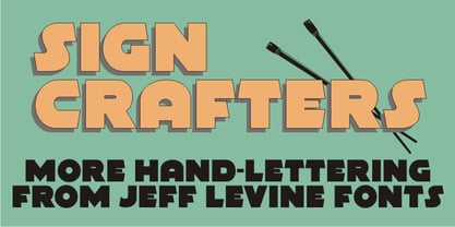 Sign Crafters JNL is a solidified version of the Deco-flavored Eckhardt Dualine JNL.
 - Sign Kit JNL by Jeff Levine,
$29.00During trips to the Miami Beach Public Library as a youth, Jeff Levine first caught sight of the signs made with a product called the Webway Sign Cabinet, manufactured by the Holes- Webway company of St. Cloud, MN. Having purchased an old set, Jeff has carefully re-drawn the alphabet and unique contrasting numbers from the original assortment, adding in an extended character set to his font. - Sign Painter JNL by Jeff Levine,
$29.00A sales catalog sheet from the American Decalcomania Company circa the late 1940s-early 1950s provided some hand lettering that served as the inspiration for Sign Painter JNL. Emulating the look of characters made with a round pen nib, this Deco-style typeface conveys nostalgia and charm seldom found in advertising of today. - Sign Lettering JNL by Jeff Levine,
$29.00 In the 1909 edition of the Atkinson Sign Painters’ instruction books is an extra bold sans serif alphabet and numerals called “Advertisers’ Thick and Thin Plug”. This hand lettered display face is now available digitally as Sign Lettering JNL in both regular and oblique versions.
 - PIXymbols Highway Signs by Page Studio Graphics,
$139.00A font with all the symbol signs used by the U.S. Department of Transportation, as provided for in the MUTCD (Manual on Uniform Traffic Control Devices). Drawn to meet the US DOT's exact specifications for highway signs. - PIXymbols ADA Signs by Page Studio Graphics,
$40.00Signage mandated by the Americans with Disabilities Act of 1990, plus additional accessibility signs, in both font and EPS format in the same package. - Sign Merchant JNL by Jeff Levine,
$29.00 There was a time in this country when many young people studied a trade via a correspondence course through the mail. While this method still exists, it's now more common to find students taking online classes. From an early-1960s course in sign painting comes Sign Merchant JNL, a classic brush stroke type design popularized on show cards and posters.
 - Sign Maker JNL by Jeff Levine,
$29.00In 1948, Joseph Struhl pioneered an innovative do-it-yourself sign kit for retail merchants. Die-cut letters and numbers made from flexible sheets of vinyl with the ability to adhere to smooth surfaces by static electricity; his "Magic Master Interchangeable Sign Kits" became a great success. Jeff Levine has paid tribute to this innovative method of in-store advertising with Sign Maker JNL. Because of their die-cut shapes, the design style of the static cling letters have unique characteristics. Companion fonts (based on other Struhl sign kits) are Cling Vinyl JNL and Cling Vinyl Clear JNL. - Sign Stencil JNL by Jeff Levine,
$29.00 Sign Stencil JNL was modeled from some vintage lettering stencils spotted in an online auction that were part of a store sign making kit. A variety of styles, sizes and designs were contained within a carrying case along with paints, brushes and instructions on how to paint attractive signs.
 - Window Sign JNL by Jeff Levine,
$29.00 Window Sign JNL is a solidified re-working of Sign Stencil JNL; originally modeled from some vintage lettering stencils that were part of a store sign making kit.
 - Stock Signs JNL by Jeff Levine,
$29.00 Stock Signs JNL is a collection of fifty-two signs resembling those made by engraving letters into plastic using a pantograph process. There is also a pair of blank signs on the parenthesis keys. To make your own signs or layouts emulating this classic look, try Sign Engraver JNL, which is the font used for these designs.
 - Sign Writer JNL by Jeff Levine,
$29.00 Sign Writer JNL was found within the pages of an early 1900s manual on the art of sign lettering and is a style typical of those times.
 - Sign Production JNL by Jeff Levine,
$29.00Sign Production JNL somewhat resembles Sign Kit JNL but there are some noticeable differences. The letters and numbers in Sign Production JNL are bolder, wider and have some slightly different character shapes. The common theme is that both fonts were designed from die-cut letters and numbers found in the Webway Sign Cabinet, manufactured by the Holes-Webway Company of St. Cloud, Minnesota until its demise in the 1980s. - Sign Decal JNL by Jeff Levine,
$29.00Sign Decal JNL is an outline version of Sheldrake JNL - lettering based on original water-applied decal transfers once made by the Duro Decal Company (now Duro Art Industries) of Chicago. - Sign Template JNL by Jeff Levine,
$29.00 Sign Template JNL is based on one of the many plastic lettering guides manufactured by the now-defunct Wright-Regan Instrument Company (also known as WRICO). Aside from their engineering and drafting templates and tools, WRICO had a line of "Sign-Maker" sets which featured various styles of lettering, special ink pens and metal alignment guides to assure clean, crisp lettering with little effort.
 - Donkey Sign Graffiti by Sipanji21,
$18.00 Donkey Sign is a spectacular decorative font with a Graffiti style and with a sign decorative inside for your design look awesome. It will elevate a wide range of design projects to the highest level, be it branding, headings, wedding designs, invitations, signatures, logotype, wall art illustration, apparel, labels, and much more.
 - Sign Card JNL by Jeff Levine,
$29.00 The addition of serifs to an existing typeface can drastically change the look and feel of a design. Sign Card JNL and its oblique version is just such a treatment of Sign Shop JNL. By adding the serifs, there is not only a brand-new Art Deco typeface possessing a regal and formal style, but a distant resemblance to a Russian Cyrillic font with its mechanical form and function.
 - Aztec Day Signs by Deniart Systems,
$15.00 Contains the 20 Days of the Mexican Calendar Stone in outline and silhouette mode NOTE: this font comes with an interpretation guide in pdf format.
 - Big New Sign by Thaddeus Typographic Center,
$49.00 - Sign Expert JNL by Jeff Levine,
$29.00 An elegant, yet informal Roman alphabet with Art Nouveau influences was found amidst the pages of the 1922 edition of “The Expert Sign Painter”. It is now available digitally as Sign Expert JNL in both regular and oblique versions.
 - Sign Shop JNL by Jeff Levine,
$29.00Sign Shop JNL was inspired by a set of ceramic titling and display letters similar to those used to model Entitled JNL and made by the Mitten's Display Letter Company of Redlands, California. The distinctive retro feel adds a great touch to any project. Bold, Deco and Oblique versions were created by Jeff Levine for extra visual impact. - Odense by Linotype,
$40.99Franko Luin, Odense's designer, on this typeface: With Odense I entered the field where Optima reigns in royal majesty. The first question I received was, in fact, why I designed another Optima. Look closely: Odense has as much in common with Optima as Garamond with Baskerville. Am I right? Odense Neon is a special variant that can be used for logos or single words. I had the idea for it when I noticed that the neon tubes in a sign over a store only partially followed the characters. The name comes from the Danish town Odense, the town of the famous storyteller Hans Christian Andersen, author of, e.g., 'The Little Mermaid.' Odense is also the place where the first book in the Nordic countries was printed, the 'Breviarium Ottoniense', in 1482. - Contenu EBook by Hackberry Font Foundry,
$19.95 Because ebooks will not normally accept .otf fonts, and they don't support Opentype features, this font family was designed to be used for the ebook conversions of print books. It uses old style figures. The italics are slanted a bit more. And Heavy is a little bolder than the bold in Contenu Book.
 - Content Creator by Dumadi,
$20.00 Content Creator – Playful Typeface is a comic themed font that can be used for your design needs. as the title suggests, this font is specifically for content creators to improve the quality of the designs and projects you are working on. Content Creator is perfect for design, logos, social media, brands, advertising, product design, handwritten quotes, product packaging, headers, posters, merchandise, and other designs. What’s Included : + Standard glyphs + Ligature + Web Font + Multilingual Accent + Works on PC & Mac, Simple installations Accessible in Adobe Illustrator, Adobe Photoshop, Adobe InDesign, even work on Microsoft Word. PUA Encoded Characters – Fully accessible without additional design software. Fonts include multilingual support + Image used: All photographs/pictures/vectors used in the preview are not included, they are intended for illustration purposes only. Thanks
 - Nonsense Note by Bogstav,
$19.00 There really is no nonsense in this font - but the name comes from my original sketches, where I drew a lot of nonsense! Actually, I couldn't figure out what letters to use from the sketches, so I picked them all!!! That's why each letter has 10 different versions! And what is cool is that they automatically cycles as you type. All you have to do is turn on Contextual Alternates, and the rest is magic!
 - Contenu Book by Hackberry Font Foundry,
$24.95Because Contenu is designed for text use, it is spaced for body copy in the 9-12 point range. That is far too much spacing for heads, subheads, and the like. So I made the display version of Contenu Book to use for headers. In the process of tightening the spacing at the very large sizes, I also made some minor modifications to the glyph shapes to make this version a little more elegant. Contenu Opentype has two Opentype families for print design. Contenu Book has five fonts: Regular, Italic, Bold, Bold Italic, and Display. Contenu has Medium, Medium Italic, Black, and Black Italic. The name is French for content and this is what the family is designed for: text, body copy, and book layout. If it has a style, it is a modern take on oldstyle serif font using Jenson as a mask. There are no plans for display versions of the bolder weights or the italics. If you want them, use Contenu Medium, Book Bold, Contenu Black, or any of the four italics and tighten the tracking. - Conversation Hearts by Harald Geisler,
$- Conversation Hearts are inspired by the sweethearts and conversation hearts that can be found all over the US and Britain, but not in Germany. A source of endless fun and surprise. As a typographer to me they are also a surprising document of written communication. Most people complain that nowadays the inscriptions are not as sweet as they used to be. While they used to held romantic and promising inscriptions like “Be True” “Sweet Talk”, today they carry “Tweet me” “Ur Hot” and “Party Girl”. So i took this as a motivation to work with conversation sweetheart on a conceptial inspirational and typographical level. The obvious: every letter pressed on the keyboard brings out a conversation heart that starts with the letter - i.e. L = Loverboy, H = Heartless but what to write? Since i didn't want to reproduce the old “Fax me” and “Email me” I had to come up with something new. Something with a personal relation and of course something that I Love - what else could i write in the shape of the heart? So I tried to access my upper subconsciousness and looked for two words for every letter in the alphabet. One for the capital letter pressed and one word for the lowercase letter. Resulting in a Kurt Schwitters worthy assemblage of vocables "Post-office" “Internship” “Zebra” “Answers” etc. It is not easy to read a text set in Conversation Hearts but easier as a text set in Zapf-Dingbats. To sparkle the visual appearance uppercase letters are filled hearts with “carved” inscription, while lowercase letters are an outlined heart with written inscription. Conversations Hearts is a part of the Light Hearted Font Collection that is inspired by a recording of Jean Baudrillard with the title, "Die Macht der Verführung" (The Power of Seduction) from 2006. Further inspiration came from the article, "The shape of the heart: I'm all yours". The heart represents sacred and secular love: a bloodless sacrifice. by British writer Louisa Young printed in EYE magazine (#43) London, 2002.
 - Caldense Stencil by Tiago Cândido,
$20.00 The typeface was baptized as “Caldense" in order to honor the city of Caldas da Rainha, a small city in Portugal, the typography's birth place. It has three weights, Regular, Demi Bold and Bold and it is a stencil font, sans serif and grotesque. Each character was based on a grid and was built in modules, having round edges and straight finishes. The font is best used in titles.
 - Series A Signage JNL by Jeff Levine,
$29.00 The basis for Series A Signage JNL is Highway Gothic; a type style design formally known as the FHWA Series. The font was developed by the United States Federal Highway Administration, and originally consisted of only capital letters and figures. Each Letter designation represented a character width from "A" (condensed) to "F" (wide). Due to poor visibility at high speeds, Series "A" was discontinued. At one point lower case characters were added to the various widths of the design, but this typeface revival is based on the original guidelines specified in the 1948 (reprinted 1952) book "Standard Alphabets for Highway Signs" [this was the original name for the FHWA series fonts preceding the eventual name change to Highway Gothic]. Unlike the original, Series A Signage JNL is available in both regular and oblique versions.
 - FS Siena for Walbusch by Fontsmith,
$80.00Siena is a luxurious type. A modern contrasted sans serif. Over 25 years in the making, FS Siena is tailor made for high-end brands. Sumptuous, elegant and eclectic, a nonconformist typeface with classical roots. It’s been a long time coming, but with its heady mix of elegance and quirky charm, FS Siena is worth the wait. - Aracne Ultra Condensed Regular - Personal use only

- SF Movie Poster Condensed - Unknown license

- SF Movie Poster Condensed - Unknown license

- SF Chrome Fenders Condensed - Unknown license

- PF Tempesta Seven Condensed - Unknown license

- SF Diego Sans Condensed - Unknown license


