3,822 search results
(0.056 seconds)
- Frutiger Stones by Linotype,
$29.00In Adrian Frutiger, the discipline of a mathematically exact mind is joined with an unmistakable artistic sense. His independent work possesses the controllable language of letterforms. Personal and intensive, this work is the manifestation of his expressive will. Frutiger's precise sense of outline reveals itself two- or three-dimensionally in wood, stone, or bronze, on printing plates and in the form of reliefs. However, even his independent work can be understood as objectivized signs; in their symbolism, they are embedded in the fundamental questions of human existance. They might have developed in the spirit of playfulness, but their nature is always conceptual, directed towards a complex, yet harmonic, whole. Following function, form also necessarily follows the content of the language. The entire spiritual world becomes readable through letters. Essentially, Adrian Frutiger attempts to fathom the basic, central truth which defines our lives: change, growth, division - beginning and end. In a virtual synthesis, he seems to close the circle in which the world reflects itself in symbolic forms. Frutiger Stones is for Adrian Frutiger the example of his formal artistic sensibility par excellence. Searching for the fundamental elements in nature, he has discovered the pebble, rounded and polished over innumerable years by gently flowing water. And out of this, he has created his complete system, a ruralistic typeface of letters and symbols. It depicts animals and plants, as well as astrological and mythical signs. Because of its unique aura, Frutiger Stones is particularly well-suited to different purposes - in headlines and prominent pictograms, as symbol faces, illustrations, and more. - Wedding by HiH,
$10.00 Wedding Regular was originally designed by Morris Fuller Benton for ATF and released as Wedding Text in 1901. It is a lighter version of his ENGRAVER'S OLD ENGLISH of the same period. Wedding Regular is based on the Textura style of blackletter that continued in popularity in England into the 16th century, long after the Dutch, French and Italians had moved to a Roman model that expressed the Renaissance humanism of the period. Wedding Headline is a still lighter version of the regular text face, suitable for setting larger sizes while still preserving the delicacy of the decorative hairlines. Textura continues in use in England and the United States for newspaper mastheads, gift shop signs, wedding invitations and programs and other applications where a feeling of tradition is desired. I recently saw an 1980ish photo of a “Tubby Isaac” sign in London using textura. I believe Benton’s design captures that feeling without being heavy-handed and still remaining quite readable for eyes accustomed to Roman lettering. Both Wedding Regular and Wedding Headline convey a comfortable familiarity. These two fonts may be purchased together at an attractive discount or they may be purchased separately. The full character set may be found in the pdf file that you can download from the gallery section. The two monks (alt-0172 and alt-0177) are from a set of sixteenth century decorative initial letters by Gering and Renbolt. Please note that there are two different eszetts, the blackletter style at alt-0126 and the antiqua style at the alt-0223.
 - Night Light Neon by Wing's Art Studio,
$24.00 Night Light is a specially created collection of seven neon inspired fonts giving designers the power to replicate traditionally hand-made lettering from the comfort of their own computer. Choose from the selection of script, sans serif and outline fonts to set your text. Then apply our custom graphic styles for a life giving jolt of electricity! The appeal of neon lettering lives in its power to display a message in a functional, eye-catching and timelessly cool way. How many times have you stopped in the street to admire a bar sign or shop front blazing with neon colors? It's aesthetic works equally well for a Hot Dog stand or high-end fashion brand, providing a tried and tested technique for grabbing customer attention. I've designed these fonts to make the power of neon accessible to all, investing time to research real neon signs and how they are made, paying attention to their human imperfections and inherent limitations (all of which makes them). This research has been distilled into these essential styles; Script, Outline, Inline, Square and Compressed. These seven core fonts give designers a new opportunity to take advantage of realistic neon lettering in their print and online projects, perfect for music promotion, film titles, YouTube tutorials and gig posters. Ready to be moulded to any requirement, the power of neon is in your hands. Neon Graphic Style Presets Available Here The link above provides access to the graphic styles seen in the visuals with support for Adobe Photoshop, Adobe Illustrator, Adobe After Effects. Simply download and follow the instructions provided.
 - Duos Pro by Underware,
$50.00 Duos Pro, a script for illusionists, comes in 10 styles. Whatever style you pick: apply this speedy monolinear handwriting font in large sizes, because it is made for catching the attention. Take Duos Sharp, which comes with speedy strokes and sharp endings in light, regular and black weights. Or pick Duos Round, and its 3 styles with a softer voice and round endings. Some people call those endings “funky ball noses“, an odd but appropriate description. Round styles look more like round tip speedball lettering, but contrary to most speedball letterings they're written with a very high speed. Especially Duos Round Black is more cuddlesome than its sharper counterpart. For an even more intuitive feel, we added two more sets: Duos Brush & Duos Paint. Duos Brush combines monoline strokes with brush beginnings and endings, for that graphical, freshly lettered touch. A closer look will reveal how its brushed tails vary all the time. Duos Paint is made up out of rough & artistic painted strokes, with all its accompanying shortcomings. In contradiction to the finesses of lighter weights, Duos Paint Black scores in being the most nonchalant and impressionistic. Poésie brutale! As well as having the option to choose between (or mix) these 10 styles, Duos Pro has additional hidden functionalities. For example, every style has many alternate lettershapes and ligatures, offering various different results and lengths to display every single word. Or manually add one of the swashes for more emphasis. A bonus font, Duos Tools, includes tool icons, strokes and banners. If that ain’t enough, throw in some polysemic letters for smart, ambiguous communication if you like. Want to become a signpainter? Then be a signpainter. Always wanted to be an artist? This is your chance! Duos Pro boosts your look. Make your visual vocabulary as grandiose, dramatic, sensitive or picturesque as you want. But whatever you do, don't hesitate to apply Duos Pro “short & big”!
 - P22 Albers by P22 Type Foundry,
$24.95 This set of typefaces was produced in conjunction with the Guggenheim Museum and the Josef Albers Foundation. Josef Albers was one of the most important artists and educators of the twentieth century. He was a member of the Bauhaus first as a student and then as a teacher from 1920 until its closing in 1933. He then moved to America, where he continued making art and teaching at numerous institutions until his death. Known principally as an abstract painter, he was also an accomplished designer, draftsman, typographer, and photographer. His works explore permutations of form, color, and perception using a restricted visual vocabulary. Created when he was at the Bauhaus, his Kombinationschrift alphabets exemplify the school's ethos. Using 10 basic shapes based on the circle and the rectangle, he created a system of lettering that was meant to be efficient, easy to learn, and inexpensive to produce. These 10 shapes in combination could form any letter or number. The letterforms of this computer version were taken directly from Albers' drawings and notes.
 - Pegasus by chicken,
$23.00 Pegasus scrapes the DNA of a great twentieth century painter who scattered text across his work like no other… not any kind of facsimile, but tough, playful, adaptable display type forged from the bones of a unique writing hand. Three weights - Skinny, Domestic and Peso - each offer five alternates for each letter, three for each numeral and multiple versions of many punctuation and other symbols. Letters are uppercase only with the lowercase providing one of the alternate forms of each letter… with OpenType Contextual Alternates switched on, you get automatic variation between the two… and you can manually throw in wilder variations from the remaining alternates. Some repeated punctuation - periods, question marks, etc. - are automatically varied too. OpenType Stylistic Set 1 switches to a rowdier selection from the alternates… Set 2 flips all the E’s to distinctive ‘skeleton’ alternates… Set 3 introduces automatic variation into numerals. Save some $$$ by purchasing the Whole Livery Line - all three weights at a nice discount... or, if you're really hurting, Cheapskate offers just two alternates for each letter and a single set of numerals.
 - Futura Maxi by Monotype,
$29.00 First presented by the Bauer Type Foundry in 1928, Futura is commonly considered the major typeface development to come out of the Constructivist orientation of the Bauhaus.movement in Germany. Paul Renner (type designer, painter, author and teacher) sketched the original drawings and based them loosely on the simple forms of circle, triangle and square. The design office at Bauer assisted him in turning these geometric forms into a sturdy, functioning type family, and over time, Renner made changes to make the Futura fonts even more legible. Its long ascenders and descenders benefit from generous line spacing. The range of weights and styles make it a versatile family. Futura is timelessly modern; in 1928 it was striking, tasteful, radical - and today it continues to be a popular typographic choice to express strength, elegance, and conceptual clarity. The PL Futura Maxi font family was created by Victor Caruso in 1960 to add more display weights to Paul Renner's 1927 Futura family. Typefaces in the same style like Futura are: Avenir, Metromedium, Neuzeit Grotesk,
 - P.I. by Hanoded,
$20.00 As he eyed the bloody corpse of Lefty Jones in the hallway, Mac figured the crook had it coming: he always seemed to end up in the wrong place at the wrong time. Mac sighed, his head heavy with last night's alcohol; this meant another day behind his desk, typing endless reports and drinking the bureau's poor excuse for coffee…
 - Centrifuge by Midwest Type,
$12.00 Originally inspired by manufacturer badges on old laboratory equipment, Centrifuge sports soft geometric shapes, wedge serifs, and sharply-angled terminals. Quirky but versatile, Centrifuge can appear anywhere from formal and elegant to funky and chunky depending on how it’s set. Centrifuge is suitable for short-form text and headlines but really sings in an all-caps setting with generous tracking.
 - Moonlight Serenade by Hanoded,
$15.00 Moonlight Serenade is a 1939 song composed by Glenn Miller, with lyrics by Mitchell Parish. Moonlight Serenade font is an all caps affair - very legible, very recognizable and very useful. Upper and lower case differ slightly and are quite happy to mingle. In the words of Mitchell Parish: I bring you and sing you a Moonlight Serenade! Comes with a universe of diacritics.
 - Register by Device,
$29.00 The capitals of Register share a similar construction to Morris Fuller Benton’s 1930 Bank Gothic for American Type Founders, but iron out the broader curves and add ‘ink traps’ to emphasise the machine aesthetic. Register also provides the lower case missing from Bank Gothic. Available in two main widths, each in five weights plus reweighted italics with cursively-derived letterforms, plus a bold condensed, Register has been used for the Sochi Winter Olympics, Source magazine and releases from Transient Records.
 - Snow Blue by Girinesia,
$17.00 Hello guys... We proudly presenting our new font. It's name SNOW BLUE. SNOW BLUE is modern display font. SNOW BLUE is a bold decorative font perfect for your celebration party like Halloween, Chrismast or New Year. SNOW BLUE would perfect for Titles for kid`s book, scrapbook, logo, icon, phrases or quotes for winter greeting cards ( Halloween, Christmas or New Year holidays), photo overlay, short phrases, children’s book, gift shops tag, presentation in social media Pinterest, Instagram, Facebook or others.
 - Look by insigne,
$25.00 Look, folks! From what may just be the vernacular sign capital of the world, Chattanooga, Tennessee, it’s a brand new hyperfamily from insigne! Look includes three different related fonts, with three weights each. That’s over 70 fonts! Imagine: you turn onto a stretch of open country road. On the distressed, red background of an old barn wall, a large block of crisp white letters shout out: “See Rock City.” You soon realize this barn is not alone in competing for the passing eye. Far from it, ladies and gentlemen. This is just one of the many pieces of historic, hand-painted advertisements dotting the great Southern United States. Yes, these are the pieces of true Americana--the barns, the roadside signs, the machinery, the soda fountains, and more--that now inspire this splendid new set of three font families. This new, easily readable type from insigne digs deep to capture the very heart and passion of this splendid country’s lettering of the post-war era. Look’s compact frame quickly draws the audience to your headline, logo, subheading, or pull quote, working well in those compact spots of text without overpowering your content. You'll easily put the feeling of those days gone by into every piece with the natural beauty and simple usefulness of the Look hyperfamily. Each of the individual sub-families incorporates a variety of font weights with distressed attributes. Think Woodtype. Jeans. Antiques, folks. That deep, ingrained texture--that quality that will stand the test of time. And Look is flexible, too. Take, for example, Look Script. This powerhouse of a font offers thinner weights to give your work an easy-going, down-to-earth design. But bring in those heavier weights, and you'll have a muscular, assertive font that will go the whole nine rounds. Combine any of the Look families with Ornaments to really give your layouts a zing. Build an extraordinary design as well with Look’s swashes and alternates. To activate any of these alternates, just click on Swash, Stylistic or Titling Alternates in any OpenType-savvy application, or choose from the Glyph Palette. Explore hundreds of included extras to find that “cherry on top” for your one-of-a-kind project. There are over 70 fonts to choose from, including subfamily sans, serif, script and ornament fonts! You can't go wrong. To get the most bang for your buck, order the whole Look family now! Note on SHADOWS: Increase depth and make your designs pop! Add shadows to any of the Look fonts by duplicating the text content layer in place and switching it to its corresponding shadow. Color and offset to taste. Look shadows are offset automatically. In Illustrator, you may need to turn on Em Box Top for proper shadow alignment.
 - Wasleyton by Uncurve,
$30.00 Introducing "Wasleyton," a vintage ephemera font that weaves the elegance of a bygone era into your modern design projects. Drawing inspiration from the timeless charm of elegant signage, gold leaf craftsmanship, and the artistry of old label products, Wasleyton is more than just a font—it's a journey into the aesthetics of the past. Unleash the power of nostalgia as Wasleyton offers a plethora of alternate characters, ensuring your designs are not just eye-catching but also uniquely authentic. The versatility of this font makes it a perfect choice for a range of applications, from authentic logos and elegant headings to the artistry of sign painting and captivating posters. Infuse your projects with a touch of vintage sophistication as Wasleyton lends its charm to letterheads, branding materials, magazines, album covers, and book covers. Watch as your designs come alive in movies, apparel, flyers, and label designs, each one telling a story of craftsmanship and timeless style. Combine Wasleyton with other fonts, be it a script for a touch of fluid elegance, a serif for classic appeal, or a sans serif for a modern twist. Add a few effects, and suddenly, your project transforms into a masterpiece—classic yet contemporary, elegant yet bold. Elevate your design game with Wasleyton's ability to transport your audience to a different era. Whether you're working on product packaging that demands attention or creating an atmosphere on a movie poster, Wasleyton brings that touch of vintage authenticity that turns your project from ordinary to extraordinary. In summary, Wasleyton isn't just a font; it's a time machine to the aesthetics of yesteryears. Perfect for logos, signage, posters, branding, magazines, album covers, and much more, Wasleyton is your key to infusing a timeless vintage charm into the modern design landscape. Add it to your toolkit, and let your creativity unfold in a tapestry of nostalgia and elegance.
 - Americanic, created by GemFonts and the talented typographer Graham Meade, is a font that encapsulates the spirit of American typography with a contemporary twist. This typeface stands out for its bo...
- Pavement is a contemporary font that resonates with the gritty, raw essence of urban streets and the vibrant subcultures that thrive within them. Its design captures the improvisational and unrestrai...
- HT Pasticceria by Dharma Type,
$19.99 HT Pasticceria is extremely eye-catching and high-contrast font. It is a chic typeface with a?sweet?and?perhaps?girly touch. HT Pasticceria is great for use in all kinds of display typography. Holiday Type Project offers retro hand drawing scripts. Inspired by retro script on shopfront lettering, wall paint advertisements in Italy around 1950s. Check out the script fonts from Holiday Type!
 - Red Klin by ParaType,
$25.00 A decorative сaps-only typeface designed for ParaType in 2004 by Gayaneh Bagdasaryan. Inspired by Russian fine art from the beginning of the 20th century - lettering by Sergey Chekhonin (1878-1936), graphic design by El Lissitzky (1890-1941) and the Suprematism painting. Sketch design of the font (under the name Klin) was awarded a TDC2 2000 diploma. For use in advertising and display typography.
 - HT Osteria by Dharma Type,
$19.99 HT Osteria is a monoline script, but you don’t feel it monotonous because of distinctive shapes of the characters. HT Osteria is suitable for signage, package, and posters or any other kind of display use. Holiday Type Project offers retro hand drawing scripts. Inspired by retro script on shopfront lettering, wall paint advertisements in Italy around 1950s. Check out the script fonts from Holiday Type!
 - Santhen by Wacaksara co,
$10.00 Introducing Santhen! A handlettering styles brush font inspired by classic styles of paint stripped typography. It's the perfect choice for personal branding projects, handwritten quotes, homeware designs, product packaging or simply as a modern & stylish text overlay to any background image. Santhen is available in two styles. Santhen also comes with uppercase, lowercase, numerals, punctuations, common ligatures and also additional swash to let you customise your designs.
 - Branding Autumn by Rotterlab Studio,
$14.00 Branding Autumn introducing our new "Branding Autumn" Modern Calligraphy Script in Modern Elegant Style perfect for branding, logos, invitations, master heads and more. Branding Autumn Features: - Many languages - Alternative - PUA encoded - Ligature - Very easy to use in any software (Included Instructions) - No special software installation required. Compatible with Windows and Mac OS. Supported by Microsoft Word, Paint, Adobe, Corel draw, Cricut and other applications. Thank you...
 - Merlandio by FadeLine Studio,
$14.00 Introducing! Merlandio is a hand painted font with a style natural, sweet and simple. Made with great care to provide the natural and modern elements. This font will look great if used single even with other pairing fonts. The great thing about this font is you can find some style when you use it, examples such as natural handwriting style, unique, simple, elegant, and bold.
 - Brush Maker by UICreative,
$23.00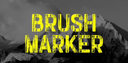 Introducing our new product the name Brush Marker Hand Painted Font. Modern Display font that is beautiful classy, elegant, and modern. This font is perfectly suited for a wide variety of projects, such as signature, stationery, logo, wedding, typography quotes, magazine or book covers, website headers, clothing, branding, packaging design, and more. Also for fashion-related branding or editorial design and displays both masculine and feminine qualities.
 - HT Libreria by Dharma Type,
$19.99 This font consists of thin lines, we get very delicate impression.The straight lines are regularly arranged, at the same time, this font has very beautiful curved lines. So its overall atmosphere is intelligent and sophisticated. Holiday Type Project offers retro hand drawing scripts. Inspired by retro script on shopfront lettering, wall paint advertisements in Italy around 1950s. Check out the script fonts from Holiday Type!
 - Best Mommy by Dhan Studio,
$23.00 Best Mommy is a beautiful hand-painted font that looks more natural and fun, combines a mixture of lowercase ligatures, uppercase alternatives and several lowercase alternatives and makes it look attractive and unique, also includes some cute extras that you can use your designs for. This fonts can be used for various purposes such as headings, logos, invitations, t-shirts, letterhead, signage, labels, news, posters, badges etc.
 - Kunstschau by Hanoded,
$15.00 The 1908 art exhibition in Vienna (Kunstschau 1908) featured works by Josef Hoffmann, Cark Otto Czeschka and Gustav Klimt, who showcased his famous painting 'The Kiss'. Kunstschau font was modeled on a stamp, designed by Austrian artist Bertold Löffler, for the 1908 exhibition. Kunstschau is a loose, handwritten font which comes with a distinct all caps upper and lower case, plus an extensive language support.
 - Press Grotesk by Studio Vachement,
$19.99 Press Grotesk is a handmade sans serif, condensed font that takes inspiration from old letterpress printing processes & handcrafting. The font's slightly imperfect, uneven appearance works perfectly for surfing, skating, motorcycling, coffee shops, health, wellness, adventure brands, and much more. Press Grotesk features 2 weights (fat and skinny), upper- and lowercase, many advanced characters and illustrations in order to achieve a truly hand painted look.
 - Framboisier by Hanoded,
$15.00 Framboisier means ‘Rasberry Bush’ in French. Even though it’s early spring, I already spotted raspberries at the greengrocers, so I figured a nice raspberry-related name would suit this font just fine. Framboisier is a hand painted script font. It’s a little messy, a little shaky, but legible and cute as well. Comes with all the diacritics and a whole bunch of alternate glyphs.
 - Cinta Adhesiva by Wordshape,
$20.00 Cinta Adhesiva began as a typeface designed for the masthead of a graffiti fanzine called Free Copy. The monumental letters painted by L.A.-based graffiti writers Crae and Hael greatly influenced the feel of the typeface. The availability and ease-of-use of tape as a medium to write with is apparent on a multitude of surfaces, and this approach led to the creation of Cinta Adhesiva.
 - Mates Malty by Typesketchbook,
$45.00 Mates Malty was created by mixing different styles of hand writing fonts that derived from various tools such as painting brushes, markers and inkpen in order to develop a new and diverse font styles. We also keep incomplete details and uneven textures that resulted from the writing process. We provide various font styles to help you mix and mach them to suit your creative work harmoniously.
 - Moon Pretty by Forberas Club,
$16.00 Moon Pretty, Font by Forberas Modern and beautiful handwritten script font! Great for wedding greeting cards, logos, branding materials, Invitation, business cards, quotes, posters, Cricut artwork and more! • No special software is required. The fonts can be opened and used in any software that can read standard fonts! • This font works with any application Microsoft Word, Adobe Photoshop, Microsoft Paint, Corel, Adobe Illustrator, Cricut, and many others!
 - Linotype American Indian by Linotype,
$29.99German designer Georg Popp designed Linotype American Indian in 2002. This symbol font contains mostly-triangular elements, which were inspired by paintings and other arts practiced by the North American Plains Indians. The symbols in Linotype American Indian, and Popp's other fonts, add a delightful touch to any design, especially when used in repetition. Try setting them large in your next flyer or brochure. - Brosley by RCKY Studio,
$18.00 Brosley is a beautiful hand-painted font, a contemporary approach to design and unique in each letter. Suitable for use in title designs such as clothing, invitations, book titles, stationery designs, quotes, branding, logos, greeting cards, T-shirts, packaging designs, posters, and more. Brosley contains a complete set of lowercase, uppercase, alternative, binder, punctuation, numbers, and multi-lingual support. Thank you for your purchase!
 - HT Gelateria by Dharma Type,
$19.99 Gelateria is characterized by its dots and tails. This font is as a whole smooth and elegant. But because its dots and end of the tails are little points, Gelateria impressed you very much. Holiday Type Project offers retro hand drawing scripts. Inspired by retro script on shopfront lettering, wall paint advertisements in Italy around 1950s. Check out the script fonts from Holiday Type!
 - Hipetype Vector by Get Studio,
$17.00 Introducing Hipetype, a handwritten font with a unique and strong character crafted with high-definition paint textures. Hipetype can be used for various types of design needs such as branding materials, t-shirts, social media templates, business cards, logos, promotional flyers, posters, and more. With multilingual support, this font is also suitable to be combined with san-serif to get an extraordinary result for your design projects.
 - Pittsburgh by Greater Albion Typefounders,
$18.00 Pittsburgh is the latest (as at August 2011) in a range of inter-war American inspired commercial faces, and takes its place alongside the popular Bettendorff and the Spargo family. These shaded stab-serif capitals speak of the heyday of heavy manufacture and engineering and bring a gritty feel of the 20s and 30s to any project. Why not indulge in a little heavy engineering today?
 - Super Ride by Realtype,
$16.00 Super Ride is a manual written font to get the best texture for each letter. Super Ride is perfectly designed, each letter character will make your design strong and dazzling. Each letter and symbol is painted using the best brushes and ink. Super Ride contains uppercase and lowercase characters, numbers and various punctuation marks ready for you to use with unique and charming characters.
 - mathieu by Gino Belassen,
$10.00 mathieu was created with a Krink K-60 marker – a paint marker that allowed gravity to dictate the outcome of each handwritten letterform. The font is the union of 26 mixed-case letters, 10 numbers, and roughly 100 glyphs, and has been seen in videos by artists Marshmello and Louis the Child. mathieu reflects Gino’s abstract style of writing, and reveals beauty in imperfection.
 - Reiseburo Display by Elyas Beria,
$5.00 Pack your bag, Reisebüro is about to take you on a romp to the most wunderbar destinations around the globe. This quirky and playful display font is inspired by hand painted lettering. Pick a city from the list in the travel agency’s window and book your flight—your glass of champagne will be waiting for you in First Class. 4 Styles included: Regular Oblique Thin Thin Italic
 - Blossomy by kapitza,
$99.00 Blossomy is a pictographic font consisting of 72 plant and flower illustrations, designed by kapitza. The font explores the beauty of shapes and structures in nature. The illustrations are based on photographs which have been traced by hand and are the result of a long term interest in the organic and erratic lines of naturally growing plants. The idea for Blossomy originated several years ago via a series of paintings exploring forms and structures in nature. The outlines for those paintings were traced in Illustrator and then transferred onto canvas. The outcome was so simple and beautiful that the designers decided to keep working on new illustrations and combine them in a font. Blossomy can be used as individual illustrations or to create patterns. The font covers a wide variety of flora and fauna, including pot flowers, a bonsai trees, leaves, blooms and grasses, and gives creatives a wide variety of shapes to get inspired by and use in their work.