10,000 search results
(0.048 seconds)
- LD Hot Betty by Illustration Ink,
$3.00Hot Betty combines clean, modern lines with the fun of mixing it up a bit. Who says you can't substitute an uppercase for a lowercase? or vice versa? Go ahead...have some fun! - sideburnBob by JOEBOB graphics,
$19.00 A handwritten font created with a 0.5 - 1 mm felt tip pen that works great with illustrations and comics. It seems a bit creepy because of the strokes getting smaller at the bottom.
 - Blaze Stanley by Ditatype,
$29.00 Blaze Stanley is a casual, fun handwritten font, created by using a brush pen. Clean and a little bit quirky, this font is the perfect fit for all of your logos, branding, social media, and crafty DIY projects. Featured : Accents (Multilingual characters) PUA encoded Numerals and Punctuation (OpenType Standard) Full Support Dita Type
 - Fidusmager by PizzaDude.dk,
$17.00 This is definitely a font suitable for kids toys. The letters are legible, and at the same time totally wacky! Kinda like what a kids toy should be! Fidusmager started out as a handdrawn, slightly rugged looking fon. However I ended up manually tracing each letter in order to have those smooth lines. By the way, Fidusmager is danish and actually means someone who’ll trick you - but as a kid I didn’t know that, and found that it most likely was something positive! :)
 - Plasto by Eko Bimantara,
$19.00 Plasto is a complete grotesk sans serif family. The quirky letterforms and its slight width variation characterized the typeface as fun and playful as "plastic" in a graphic layout, fit for various design spaces, fit for both informal or functional purposes, fit for large display and also small text. Plasto complete family contains 54 styles with two axes; Weight and Width. The weight consists of 18 styles from Thin to Black, and the width consists of 3 styles, condensed, normal and expanded.
 - Expletive Script by Barnbrook Fonts,
$50.00 Expletive Script is a modular font based on a circular form. Its characters can sit above or below the baseline to create unusual display typography and complex repeating patterns. Expletive Script has a playful spirit and simple geometry that makes it suitable for a variety of uses from fine detailing to expressive headlines.
 - Pyragy by Belli Creative,
$9.00 Pyragy is a display font with a classical vibe. It has beautifully crafted nine swashes. It’s genuine, interesting, and perfectly fits different design works, such as posters, book or album covers, digital spaces, or any other media. It supports various Latin-based languages and comes with powerful open-type and true-type features.
 - Chillerz by Hanoded,
$15.00 I was doodling away on a piece of paper, when I noticed that the weird letters I was producing were in fact a nice font. So, I decided to build it! Chillerz is a lovely, messy handmade script font. It comes with double letter ligatures, a healthy attitude and a relaxed fit.
 - Munich Sans by Eldertype Studio,
$13.00 Munich Sans is minimalist and modern sans serif font. This font fits in any project. You can use it for a title, logo, quotes, or as a pairing in any script font. It is inspired by minimalist and geometric forms. This font creates modern minimal style. This font also supports multi-language!
 - Estienne by Solotype,
$19.95Many fonts have carried this name. Ours goes back to just before 1900 in France. This general style had considerable popularity among job printers all over Europe. We have even seen it used for name imprints on medical school diplomas, which seems a bit grotesk. Surely you can do something better with it. - Sugary Pancake by Hanoded,
$15.00 Sugary Pancakes - ahh, my kids love them. We don't make them too often, as they are 'energetic' enough as it is. This calorie-rich font is ideal for Children's Books and posters: it is fun, bouncy, very legible and full of character. Comes with a topping of diacritics and a stack of happiness.
 - Wonder Dream by Sabrcreative,
$15.00 Welcome to Sabr Creative, where imagination comes to life through fonts like our delightful Wonder Dream. This display font is designed to bring smiles to kids and kids at heart with its cute and happy style. The Wonder Dream font is perfect for adding a touch of whimsy to your creative projects, from children's books to playful invitations and more.
 - Quietism Variable by Michael Rafailyk,
$150.00 A smooth contemplative Antiqua with aspiring to the sky ascenders, inspired by the Quietism philosophy. Clarity of the mind is achieved by bringing the body into a state of calm and contemplation, and this is reflected in the design – the quiet horizontal serifs (body) are opposed to the peaky soaring ascenders (mind). The design also features four optical size subfamilies with different x-height and contrast, oldstyle diagonal stress, oldstyle figures by default, smooth details and slightly dark texture. Variable axes: Weight, Contrast, X-Height. Scripts: Latin, Greek, Cyrillic. Languages: 480+. The complete list of supported languages: michaelrafailyk.com/quietism Kerning: 4553 class-to-class pairs. Hinting: Not applied. Format: TTF – OpenType with TrueType outlines. Variable Font: Quietism Variable provides more options than static versions, and has three axes: Weight (Thin–Black), Contrast (Low-High), and X-Height (Low-High). Variable fonts includes thousands of styles that you can access using a sliders on graphic editor or via CSS on web browser. Mixing different axes gives you extra styles not represented by static fonts. Optical Size: The typeface is represented by four subfamilies: Text (low contrast, high x-height – for paragraph 10-20 pt), Deck (medium contrast, medium x-height – for subheading 20+ pt), Display (high contrast, medium x-height – for heading 72+ pt), Poster (high contrast, low x-height – for big size 120+ pt). Small Caps: Lowercase letters and Oldstyle Figures are replaced with Small Capitals forms. Capitals to Small Caps: Uppercase letters, all figures, and some punctuation are replaced with Small Capitals forms. Case Sensitive Forms: ()[]{}‹›«»-–—•·#%‰@ and Arrows are centered on capitals. Oldstyle figures are replaced with Lining figures. Oldstyle Figures: 0123456789 #%‰. Designed to work with lowercase letters. Used by default. Lining Figures: 0123456789 #%‰. Figures are the same height as uppercase letters (cap height). Proportional Figures: Lining, Oldstyle, Small Caps, Capitals to Small Caps. Tabular Figures: Lining, Oldstyle, Small Caps, Capitals to Small Caps. Ordinals: adehnorst. Superscript, Subscript, Numerator, Denominator: 0123456789. Fractions: ¼½¾⅐⅑⅒⅓⅔⅕⅖⅗⅘⅙⅚⅛⅜⅝⅞⅟ (precomposed). Any other fractions (even those typed through a slash) will also be displayed correctly, with the automatic replacement to Numerator + fraction + Denominator. Slashed Zero: All 0 figures. Contextual Alternates: Number sign character (#) before uppercase letters is replaced by its version centered on capitals. Hyphen character (-) between two uppercase letters is replaced by its version centered on capitals. First of two TT letters is replaced by its alternate form. Letters vwy before the letters fijmnprtuvwxy are replaced with an alternate shorter versions that fits better in the context. Contextual Alternates (Greek): ΆΈΉΊΌΎΏ. Greek uppercase accented characters lose their tonos accent and retain only dieresis in All Caps and Small Caps modes. Turned on by default. If you need tonos accents in All Caps then turn off Contextual Alternates (calt) feature. Stylistic Alternates: FTГТИЦЩцщ and their versions with diacritical marks. Stylistic Set 01 “Arrows”: Left <- Right -> Up Left Right <-> Up Down North West South East \> South West Stylistic Set 02 “Round-Square Cyrillic”: ДИЙЍЛФвгджзийѝклнптцчшщьъю characters are replaced with its Bulgarian or Russian forms. Stylistic Set 03 “Cyrillic Tse Shcha short tails”: ЦЩцщ characters are replaced with its alternate form with short tail. Stylistic Set 04 “Cyrillic I full serifs”: ИЙЍӢ characters are replaced with its alternate form with inner serifs. Stylistic Set 05 “FT bent inward serif”: FTГ characters and their versions with diacritical marks are replaced with its alternate form with right head serif that bent inside. Stylistic Set 06 “Small Caps centered on Capitals”: Small Caps are vertically centered on uppercase letters. Standard Ligatures: fi fl fb ff fh fj fk ffb ffh ffi ffj ffk ffl. Discretionary Ligatures: Th ct st. Localized Forms: 52 character substitutions for Azeri, Bulgarian, Catalan, Dutch, German, Kazakh, Macedonian, Moldavian, Polish, Romanian, Serbian, Tatar, Turkish. Glyph Composition/Decomposition (Diacritics): Full Latin and based Vietnamese set of diacritics (571 characters). Precomposed.
 - Nazare by Ndiscover,
$39.00 It all started with a Portuguese soap packaging from the first half of the 20th Century. The 5 uppercase letters that spell NAZARÉ were sufficient to drive the creation of this design. Nazaré fits in a semi-serif category and it has a large contrast. It works outstandingly in display use specially in the bolder weights that have even more contrast. The regular weights have a more moderate contrast and an overall less extravagant design, fitting best in the typographical conventions. this provides a better render in text use. You can use this font in large headlines, logos, posters, book covers, and general display use as well as short strings of text. Nazaré is the name of a small Portuguese fishing village known for its giant waves and peculiar people.
 - Milk Soda by Olivetype,
$18.00 Milk Soda is an all caps display typeface that's bold, fun and playful. It's clean and versatile, making it a perfect addition to any designer's kit. Packed with personality, this font screams out loud. Suitable for headlines, logos and more! So what’s included : Basic Latin Uppercase and Lowercase Numbers, symbols, and punctuations Multilingual Support. Accented Characters PUA Encoded and fully accessible without additional design software Simple Installations works on PC & Mac Thank You !
 - Plague Master by Hanoded,
$15.00 I admit: I had a bit of a crazy week when I thought up an drew this font. I broke my arm during kickboxing training on monday, leaving me in a cast - unable to do most everyday things, like getting a good night's sleep (try sleeping with a humongous cast on your arm). Thank goodness, it is my left arm, so I can still draw letters and use my laptop. So… this font has been made entirely using one arm! It is a bit of a horror font - it sort of sums up my mood right now. Glyphs have very little spacing, adding to the evil look of Plague Master. Comes with a lethal amount of diacritics.
 - DT Squished Stuff by Dragon Tongue Foundry,
$15.00 DT Squished Stuff is a font made for fun. This uneven simple blocky sans-serif font has wonky letters that adapt automatically and change shape to fit against their neighbours. Use with contextual ligatures turned on to allow Squished Stuff to operate correctly. If a particular letter decides to do something that you don’t want it to, turn ‘contextual ligatures’ off for that letter. But do remember to turn it back on afterwards. This font lives and breathes when ‘contextual ligatures’ are turned on. Also, there are easter eggs and quirky surprises hidden inside. Watch it squish and move to fit together. This is a wacky, crazy, fun, mad, party, toonified font. Enjoy
 - Treacle by Hanoded,
$15.00 One of the best desserts I have eaten in my life was a treacle tart. I do know that it was in England and I do know that it was delicious. I really don’t know why I was thinking of that, but that pleasant memory did give me a name for this font. I am still learning my new font software, which is a bit of a slow process. The software I used for this font allows me to add several languages, which, hitherto, I couldn’t access. So, in short, this is my most multilingual font ever: it even includes Vietnamese and a bit of Hiragana and Katakana for you to get creative with!
 - RV Park by Komet & Flicker,
$10.00 Hit the open road with RV Park! This font was inspired by the typography seen on the signage for quirky roadside attractions. Use it anywhere you’re looking to inject a little fun and whimsy.
 - Parque by Celtibérica,
$24.00 What was the inspiration for designing the font? Parks and nature. What are its main characteristics and features? Wooden, Children, kids. Usage recommendations: in advertisement for parks, for animation films, Cartoons, as you like.
 - Haworthia by Cmeree,
$12.00 Haworthia is a handwritten font. Its shape is inspired by self-titled succulent plant - the font has long and a bit swirled endings. Haworthia provides multi-language support which includes cyrillic glyphs as well.
 - Redtab by MKGD,
$13.00 With Redtab I tried to create a typeface that could be used equally well in either in body copy, or in headline form. I like to think that, although it has a more traditional look to it, it still possesses a bit of a creative flourish that sets it apart from similarly designed fonts. Whether used sparingly or in paragraph form, Redtab has the ability to not only read well, but stand out while doing so.
 - School Fiesta by Mvmet,
$12.00 School Fiesta is a cool font that will be perfect for your school festival theme or other event displays. The fun, festive, and happy vibe will be there when you use it. You can use it for anything ranging from t-shirts, other merchandise, kids’ book designs, and greeting cards to stickers and posters, or anything that needs a casual touch. Fall in love with its incredibly versatile style, and use it to create lovely designs!
 - Archaz Negras by Mans Greback,
$59.00 Archaz Negras strikes a chord with its rough rock band logo aesthetic. Its symmetric and captivating character makes it a fit for movie posters, Halloween invites, or a heavy metal t-shirt that demands attention. Dark, daring, and undeniably striking, Archaz Negras channels the raw energy of death metal and an eerie aura of horror. Designed with precision by Mans Greback, this destroyed font resonates with the rebellious spirit of punk and its haunting allure of the unknown.
 - Knip by Hanoded,
$15.00 Knip, in Dutch, means ‘cut’. You can tell by the glyphs that I made this font by cutting out the shapes from black paper, gluing it onto white paper and photographing the result so I could digitalise it! I don’t make too many cut out fonts, as it is a lot of work and it often leads to nothing. Besides that, I depend on the paper supply from my kids and they happened to have black paper this time!
 - Vicious Story by Mvmet,
$16.00 Vicious Story is a very cool and playful hand-drawn display font, it can be used for your kids friendly horror themed designs and many more. It works great for creating cool designs that scream for attention. It’s ideal for anything ranging from t-shirts, book designs, restaurant menu, blog writing, greeting cards to stickers, or anything that needs a casual touch. Fall in love with its incredibly cool style, and use it to create lovely designs!
 - Paverify by Esintype,
$14.00 Paverify is an all-caps geometric slab serif display face inspired by a particular pavement tile component which is evoking a blocky “I” letter. All other characters were interpreted based on its look and drawn accordingly. There are three uppercase Roman fonts in different weights and widths substantially. With the additional versions, type family consisting of 7 fonts in total. Over 220 Latin, Cyrillic and Greek script languages supported. Each font contains an extensive multilingual support with more than 1600 glyphs and OpenType features, including number forms, fractions, and stylistic alternate sets those provide different looks by the typographic preferences. For the lowercase letters there are small caps variants, i.e., shorter caps. These also have identical glyphs and matching marks to enable “Small Capitals From Capitals” feature. Narrower Medium and Bold styles was produced to accompany the Black first design. Paverify comes with an ornaments font named as “Extras”, which contains geometric graphical elements, i.e., paver stone patterns, banner/sticker background sets, star comps and a collection of catchwords to simplify creating feature rich layouts. As is known as interlocking paver in certain regions — a rectangular shape with the distinctive diagonal tabs — transcribing the simplest letter to draw into the whole alphabet was a challenging task. Not only it was the single thing that can be used as a source, considering its thick form in roughly 1.2:1 proportions compared to the sophistication of letterforms was the challenge. Starting point was keeping design consistent while both avoiding and preserving a particular appearance to achieve a similar texture, basically a repeating pattern on the streets. In contrary of a traditional approach, Paverify tend to have more contrast than the other slab serifs which helps to reduce massive stem weight of the source form. This look contributes to its hand painted sign effect achieved in a certain degree, which may otherwise impractical to transform because the source material is an inorganic, static form by definition. Tight and even spacing of the pavement tiles was inspirational for the kerning balance of the letters. Although the lighter weights have more space between the letter pairs, black weight adjusted as to be close to each other as the original grid. Tight spacing can be ignored by using Capital Spacing OpenType feature for the Outline versions as layer fonts. In one stroke, this gives an extra space between the letters to avoid diagonal armed letter terminals overlap. Black typographic colour and texture gives a sturdy appearance to the lines, it is useful for the projects where a robust display faces preferred for the titling, strong headlines, letter stacks, dropcaps, initials, short names on materials such as advertisements, book covers, posters, logotypes, wordmarks, package designs, and more in print or digital. Paverify can be paired as a complimentary face in a combination with broader type systems, where vintage look compositions and woodcut style fusions requiring an extra stunning texture.
 - 112 Hours by Device,
$9.00 Rian Hughes’ 15th collection of fonts, “112 Hours”, is entirely dedicated to numbers. Culled from a myriad of sources – clock faces, tickets, watches house numbers – it is an eclectic and wide-ranging set. Each font contains only numerals and related punctuation – no letters. A new book has been designed by Hughes to show the collection, and includes sample settings, complete character sets, source material and an introduction. This is available print-to-order on Blurb in paperback and hardback: http://www.blurb.com/b/5539073-112-hours-hardback http://www.blurb.com/b/5539045-112-hours-paperback From the introduction: The idea for this, the fifteenth Device Fonts collection, began when I came across an online auction site dedicated to antique clocks. I was mesmerized by the inventive and bizarre numerals on their faces. Shorn of the need to extend the internal logic of a typeface through the entire alphabet, the designers of these treasures were free to explore interesting forms and shapes that would otherwise be denied them. Given this horological starting point, I decided to produce 12 fonts, each featuring just the numbers from 1 to 12 and, where appropriate, a small set of supporting characters — in most cases, the international currency symbols, a colon, full stop, hyphen, slash and the number sign. 10, 11 and 12 I opted to place in the capital A, B and C slots. Each font is shown in its entirety here. I soon passed 12, so the next logical finish line was 24. Like a typographic Jack Bauer, I soon passed that too -— the more I researched, the more I came across interesting and unique examples that insisted on digitization, or that inspired me to explore some new design direction. The sources broadened to include tickets, numbering machines, ecclesiastical brass plates and more. Though not derived from clock faces, I opted to keep the 1-12 conceit for consistency, which allowed me to design what are effectively numerical ligatures. I finally concluded one hundred fonts over my original estimate at 112. Even though it’s not strictly divisible by 12, the number has a certain symmetry, I reasoned, and was as good a place as any to round off the project. An overview reveals a broad range that nonetheless fall into several loose categories. There are fairly faithful revivals, only diverging from their source material to even out inconsistencies and regularize weighting or shape to make them more functional in a modern context; designs taken directly from the source material, preserving all the inky grit and character of the original; designs that are loosely based on a couple of numbers from the source material but diverge dramatically for reasons of improved aesthetics or mere whim; and entirely new designs with no historical precedent. As projects like this evolve (and, to be frank, get out of hand), they can take you in directions and to places you didn’t envisage when you first set out. Along the way, I corresponded with experts in railway livery, and now know about the history of cab side and smokebox plates; I travelled to the Musée de l’imprimerie in Nantes, France, to examine their numbering machines; I photographed house numbers in Paris, Florence, Venice, Amsterdam and here in the UK; I delved into my collection of tickets, passes and printed ephemera; I visited the Science Museum in London, the Royal Signals Museum in Dorset, and the Museum of London to source early adding machines, war-time telegraphs and post-war ration books. I photographed watches at Worthing Museum, weighing scales large enough to stand on in a Brick Lane pub, and digital station clocks at Baker Street tube station. I went to the London Under-ground archive at Acton Depot, where you can see all manner of vintage enamel signs and woodblock type; I photographed grocer’s stalls in East End street markets; I dug out old clocks I recalled from childhood at my parents’ place, examined old manual typewriters and cash tills, and crouched down with a torch to look at my electricity meter. I found out that Jane Fonda kicked a policeman, and unusually for someone with a lifelong aversion to sport, picked up some horse-racing jargon. I share some of that research here. In many cases I have not been slavish about staying close to the source material if I didn’t think it warranted it, so a close comparison will reveal differences. These changes could be made for aesthetic reasons, functional reasons (the originals didn’t need to be set in any combination, for example), or just reasons of personal taste. Where reference for the additional characters were not available — which was always the case with fonts derived from clock faces — I have endeavored to design them in a sympathetic style. I may even extend some of these to the full alphabet in the future. If I do, these number-only fonts could be considered as experimental design exercises: forays into form to probe interesting new graphic possibilities.
 - Fortuita by Typographias,
$28.00 Fortuita is a versatile sans fit for text or display. The name carries some of its history as it was born from logo sketches that fortuitously grew into a type family over eight years. It comes with a tall x-height, rendering it readable at smaller sizes. It has sixteen weights, eight regular ones, and their italics, each with small caps, something you may not see very often with sans serifs. It counts with old-style numbers that can switch to its lining, small caps, or tabular versions through open-type features. The family carries a distinct personality in its design that will lend itself to its subject, all the while without becoming distracting or detracting from it.
 - OldHaroldRee by Ingrimayne Type,
$12.95 OldHaroldRee is a modification of PhederFrack, a calligraphic fraktur face. It keeps the lower case letters and inserts a completely different set of upper-case letters, which is in the “Old English” rather than the “Old German” or fraktur style. It comes in two weights, a bit unusual for an Old-English style typeface.
 - Cashmere by Larin Type Co,
$12.00 Cashmere - sweet handwritten font with an incredible charm. Clean, elegant, it fits and turns any design project into a true stand out! Use this font for branding or create a logo, a beautiful frame for your home, decorate any project. Or just use it for book covers, stationery, marketing, a blog, magazines, and more.
 - Budrick BB by Blambot,
$8.00 Budrick BB is a slick, clean body copy font family that's just a bit rounded. It is available in four weights: Regular, Italic, Bold, and Bold Italic. (And those Italics have some slightly different letter forms than the plain versions!) To top it all off, Budrick BB has a hefty collection of European characters.
 - Homade by Eko Bimantara,
$18.00 Homade is sans font family that created in a way that give an ease-looking, close to casual typeface. It's fit for branding, product, food or culinaire theme and various others. Its consist of 5 styles from regular to extra bold with each matching italics. Its contain 388 glyphs that covered broad latin languages.
 - Emerge BF by Bomparte's Fonts,
$40.00 Emerge BF was inspired by Admiral, c.1900, from the Keystone Type Foundry. Its relatively condensed proportions allow for a close fit in a distinctive, yet highly legible form. It's a great choice for headlines and text settings (where it shows a beautifully crisp, typographic color) on book covers, magazine advertisements, posters and so forth.
 - Bleeding Heart by Romie Creative,
$15.00 Bleeding Heart is a smooth, elegant and flowing handwritten font. It has a beautifully balanced character and as a result, it fits into a wide set of designs. Bleeding Heart has a varied baseline, smooth lines, gorgeous glyphs and amazing alternatives. Add to your most creative ideas and watch how they bring them to life!
 - Pistacho by Estudio Calderon,
$20.00 Are you looking for an appropriate typeface for coffee shops concept? We want to introduce Pistacho, the new type family of Estudio Calderon that contains 18 fonts to design great illustrations and to be applied, especially, in coffee shops, bakeries, ice-cream shops, candy stores, pastry shops, fruit shops and all those places where food is the center. Pistacho was designed by hand using pencils and markers that let us get a handcrafted and rough texture. Below, a brief description of each style: Display: A fresh and modern type, perfect to be used in coffee shops outdoor signs. The logotype of “Central Perk”, the coffee shop of the tv show “Friends” was our inspiration to develop this beautiful font that contains 317 characters and three variables: Display 1, Display 2 and Display 3, each one has specific characteristics that will be an excellent resource for your designs. Sans: Style that contains 7 fonts that can be mixed to get interesting finishes in your designs, each variable has 363 characters with standard ligatures and stylistic alternatives. You can find this styles as: Sans 1, Sans 2, Sans 3, Sans 4, Sans 5, Sans 6 and Sans 7. Good news, you can get Sans 5 DEMO for free. Script: Script 1 and Script 2, two monolineal fonts with a generous spacing that provides contrast and movement, being a suitable complement for the rest of the types of Pistacho family. Serif: Font with a lot of style and personality, inspired in the interlock alphabets shown in «Photo-Lettering´s One Line Manual of Style». Serif 1, Serif 2, Serif 3 and Serif 4 contain a great number of ligatures that generate nice compositions by combining them. One of the characteristics of this style is the combination of upper case and lower case giving as a result a different touch in each design. Soft: Humanist type with a rustic texture and geometric forms ideal for long texts and small sizes. Dingbats: We have designed a package of 244 graphics, illustrations and ornaments that are the perfect complement to combine with each font of this family. Get Pistacho type family, enjoy using it… and do not forget your cup of coffee.
 - As of my last update in April 2023, the font "Drinking" is not a widely recognized standard typeface in the graphic design industry, which suggests it could be either a new creation or a custom font ...
- As of my last update, I don't have specific access to a font named "Cheaptype" by Fenotype, and details about such a font may not be readily available in the public domain or might be a newer release...
- Just Believe by Seemly Fonts,
$12.00 Just Believe is a simple and organic handwritten font. Natural and a bit quirky, this font will brighten up each of your designs. Add it confidently to your projects, and you will love the results.
 - Cute Bubble by Creaditive Design,
$14.00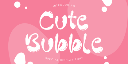 Cute Bubble is a fun, playful and friendly display font. It is perfect for any kid or cute design that need bubble effect. Just choose this font, your special cute project can be more cuteness.