10,000 search results
(0.094 seconds)
- Ebola - Unknown license

- 3 of 9 Barcode - Unknown license

- Dungeon - Unknown license

- Agrafie by Linotype,
$29.99This typeface was developed by Roland John Goulsbra in 1995. Almost like the printing of a child, the irregular forms of Agrafie make a unique impression. - Kithan by Ixipcalli,
$26.00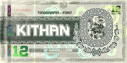 Kithan is a font that provides three weights and three compressed from semi-fine to bold, while the compressed have a reduced contrast creating a tall and soft look. Bold font sizes allow letterforms to be appreciated, with the same restraint and focus. Creates a smooth texture for small font sizes and long reads. Kithan's theme is inspired by the Mexican currency of the year 2000.
 - Baremy by Luxfont,
$19.00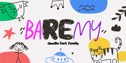 Get ready to wow the world with inspiring 'Baremy' family of doodle fonts. Three unique styles, one art. Unleash your creativity! These three unique typefaces, while diverse in appearance, share a common theme—they add a unique handcrafted charm and artistic touch to your projects. Features: - 3 doodle fonts in the family - All fonts of different types, combined with a style. - Multilingual - Kerning ld.luxfont@gmail.com
 - SaminoaDisplay - Unknown license

- Biggen - 100% free

- Penstyle - Unknown license

- Jellybean - Unknown license

- Pocono - Unknown license

- Inland Edwards NF by Nick's Fonts,
$10.00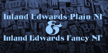 Variations on a theme by Nicholas J. Werner for St. Louis' Inland Type Foundry provided the pattern for this happy family, released in 1895 and 1899. Both flavors of this font feature the 1252 Latin, 1250 Central European, 1254 Turkish and 1257 Baltic character sets.
 - Telegraph by Solotype,
$19.95Charles Beeler Jr. designed this in 1895 for Mackellar, Smiths and Jordan, which was part of the American Type Founders combine. The font had a short life because five years later ATF began an "off with the old, on with the new" program, and this font was an early victim. - Medina Gothic by Design is Culture,
$39.00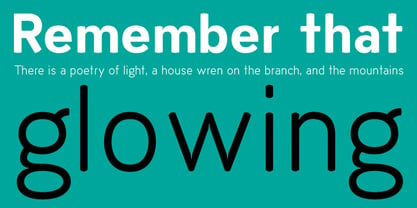 Medina Gothic is a three-weight sans serif inspired by Latin American moderne. It was designed in response to the 2002, Altos de Chavon design conference in The Dominican Republic, which celebrated utilitarian driven gestures in graphic design. "There’s a rigor to Medina Gothic that takes care of all sorts of tenets of a hard-working, highly legible, objective font. But at the same time, it’s human. All the curved terminals and open counter forms make for a sort of kindness. For all the discipline, it doesn’t sacrifice its friendliness." – William Morrisey, Professor of Typography, Parsons The New School for Design.
 - Nebulae by LucasFonts,
$19.00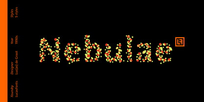 Almost every type designer feels the need, from time to time, to interrupt his or her serious work on complex text type systems for something more playful. In Luc(as)'s case this has often meant designing more typefaces. In the early 1990s, while working on Thesis, Luc(as) drew several display faces which were based on the shapes of TheSans but were either de(con)structive versions or experimental variations. Probably the most innovative of these was Nebulae, in which the lettershapes have been dissolved into clouds of bubbles; the three versions can be layered to obtain a denser (and more legible) structure which can also be multi-coloured. A fourth version called ThreeDee (3D) offers a convincing simulation of three-dimensional bubble-like type floating in space.
 - P22 Durer Caps by IHOF,
$24.95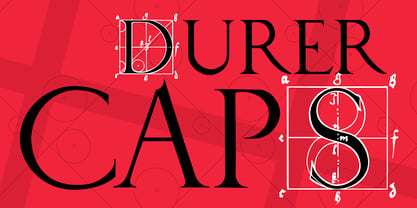 Durer Caps is three fonts in one. Based on master artist Albrecht Dürer’s 1525 geometric construction of Roman capitals, this font features A to Z as caps only. But there are three variations included: filled construction, unfilled construction, and the solid fill letters by themselves.The user can layer the unfilled and the solid fill letters to do two-color overlay effects.
 - Diva Doodles by Outside the Line,
$19.00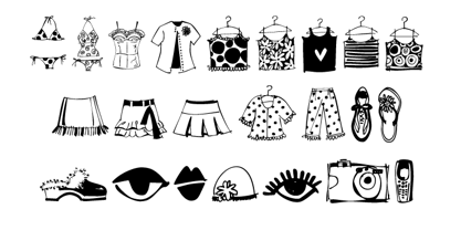 Diva Doodles is a picture font from Outside the Line. It has 40 little icons... of girl things such as lipstick, nail polish, perfume, shoes, hats, camera, phone, iPod, purses, shirts, skirts and a pair of PJs. If you liked the font Doodles, Doodles Too, Holiday Doodles or Holiday Doodles Too you should love Diva Doodles as it is more of the same style. It can be found in the book "Indie Fonts 3, a Compendium of Digital Type from Independent Foundries".
 - Rospo Wood by Typoforge Studio,
$30.00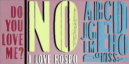 Font Rospo-Wood is two-element font inspired by the weekly "Tygodnik Ilustrowany” from the 1933. Font has three alternative glyphs that are automatically replaced.
 - Linotype Rezident by Linotype,
$29.99Flyers, Intros from James Bond films and PlayStation games as well as the typeface Senator from Zuzane Licko inspired the Dutch designer Paul van der Laan to create his font Linotype Rezident. To its design, van der Laan says, I was designing a business card for a friend and I had a certain mood in mind for the typography. I tried to capture this mood in a couple of sketches, drew a few characters directly onscreen and just expanded them into a typeface." And so began Linotype Rezident, with its cool, technical and constructivist appearance which brings to mind computers and virtual reality. And the name? " The name of the font comes from the game Resident Evil. One of the main characters in the game is called Leon and the typeface was initially drawn for a friend of mine called Leon. It also refers to the city of The Hague - where I live and got my education - since it's often called 'de residentie'", where the queen and parliament of The Netherlands are seated." - Filou by Volcano Type,
$19.00Filou is a genuine bastard inspired by three different typefaces. It consists of three weights: "Regular", "Medium" and "Extra" which can be easily mixed together. - Bodie MF - Unknown license

- Moonshine - Unknown license

- Bodie MF Holly - Unknown license

- Dogs on Mars? - Unknown license

- Upperclass by Enrich Design,
$24.95Upperclass was a font I created back in 1995. I had a brainstorm about the uppercase letter “A”. I noticed that the cross bar for the letter A is always toward the bottom, what if I moved it toward the top. The result is a unique font, a great addition to your font collection. - Architectural Lettering by Outside the Line,
$19.00 This font is for architects everywhere. This all cap font was created for use with CAD programs. It gives the handlettered look of old to computer generated blueprints. Architectural Lettering Bold is the heavier weight for Architectural Lettering. This additional weight makes a best selling font even more versatile. It has all the international currency symbols. Architectural Lettering Regular was redesigned in 2006 to include the same. It can be found in the book “Indie Fonts 3, a Compendium of Digital Type from Independent Foundries”.
 - Sesame Street - Unknown license

- Xanthine by Hanoded,
$15.00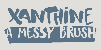 Xanthine… is a purine base found in most human body tissues. Yes, you can forget that. I don’t even know what it means, but I suddenly realised that I was running low on fonts with an ‘x’ in the name. Xanthine font is a messy brush: it is all caps, but upper and lower case mingle freely. It comes with a whole bunch of diacritics and some interesting ligatures as well. I have included a very handy shapez pack and a truckload of arrows - anything to make you happy…
 - Jongleur by PintassilgoPrints,
$29.00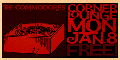 Jongleur is a multifaceted hand-drawn display typeface based on a Maury Nemoy lettering from 1957. Packed with handy OpenType features, the font makes automatic substitutions when you turn on the contextual alternates, creating an interesting hand-lettered feel. If you're in a messy mood, use the stylistic alternates instead! The font also brings an extra set of alternate letterforms you can pick by hand to spice up your compositions. Great choice for titles and small amounts of text, perfect for posters, book covers and a wide range of applications.
 - Smashing by PintassilgoPrints,
$26.00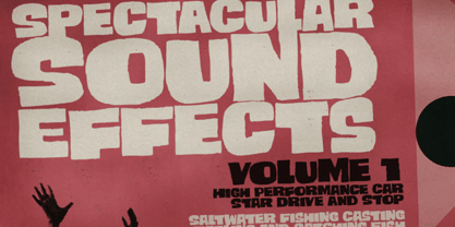 Smashing is a stout typeface, with a twist. It’s a massive all-caps font with bouncing glyphs, positively bold yet quite good-humored. Its upper and lower case slots stores different lettershapes, providing handy options to choose from. When working with OpenType savvy applications you can turn on the contextual alternates feature to instantly get alternating glyphs, which add spontaneity to your artwork and prevent neighbor double letters from using the same glyph. Also try the discretionary ligatures feature to get some cool interlocking pairs. A smashing font for truly smashing designs!
 - Walbaum Antiqua Pro by RMU,
$40.00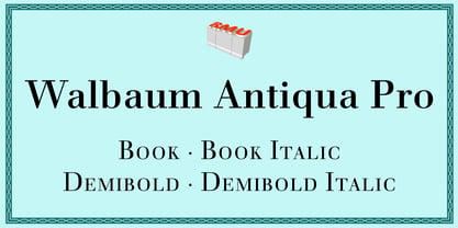 Walbaum Antiqua Pro is an RMU redesign of a German font classic, with three different number forms and small caps throughout all font styles.
 - Sketchimpact by Librito.de,
$12.00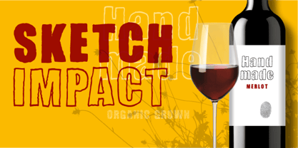 The design for the font “sketchimpact” is based upon the typeface Impact. The font family consists of three different versions: solid, outline and lines.
 - Beast Maker by Remedy667,
$18.00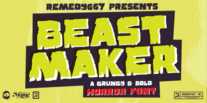 Unleash the beast with Beast Maker, the ultimate gritty horror font from Remedy667. Inspired by 1970s Giallo films and perfect for creating a powerful and sinister vibe, Beast Maker is an essential tool for any horror designer. Beast Maker is perfect for spooky posters and flyers, horror-themed video games and movies, or any project that needs an eerie touch. Beast Maker - because fear is always in fashion. Doubles Elimination for letters and numbers gives you a more natural look. All caps font design. Includes a Remedy667 Font Catalog PDF, all your favorite fonts in one handy catalog. Unleash the Beast Maker!
 - Kasper by Linotype,
$29.99Kasper was designed by Franco Luin in 1995. It is an informal script typeface and its playful, dynamic characters are perfect for greeting cards and other personal correspondence. - Spire by GroupType,
$19.00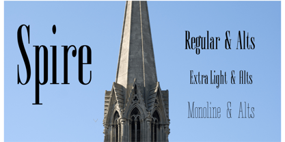 Originally designed by Sol Hess for the Lanston Monotype Foundry in 1938, this revival was designed by Ann Pomeroy in the early 90s. Spire is a condensed serif with a very 1930s retro look. PLEASE NOTE: Each Spire font (Regular, Extra Light and Monoline) include a companion Expert font in the download. The Experts feature several alternate glyphs. The Family includes three Styles and three Expert styles. 6 fonts all together.
 - Fosho by Chank,
$49.00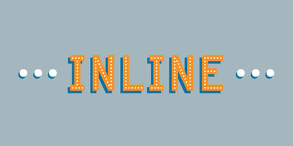 For more than 70 years the 10-foot tall letters displaying the word FOSHAY have illuminated the Foshay Tower in the Minneapolis skyline. However, the typestyle has never been made into a font before. This new modern font family, dubbed Fosho Book, is optimized for book print usage as well as functioning as big bold display type on screen. The Fosho fonts are available in three styles: Outlines, Dotted Bulb Inlines and Composite with both. You can use the three styles in overlapping colors for dramatic chromatic effects.
 - FT Brush by Fenotype,
$14.95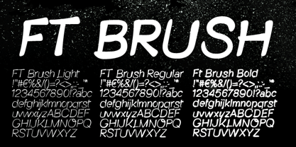 FT Brush is a calligraphy style font family of three members - light, regular & bold. Combine different cuts for vivid outcome.
 - FranTique NF by Nick's Fonts,
$10.00The 1905 Barnhart Brothers & Spindler catalog featured an ultrawide face called "French Antique Extended". The letterforms have been faithfully rendered here, but this font’s kerning calls for a lot of overlapping and interlocking that the original cast-metal face wouldn't have been able to duplicate. Both versions of the font include 1252 Latin, 1250 CE (with localization for Romanian and Moldovan). - Pax by Linotype,
$29.99Pax is clearly a didone, using Vox classification. The contrast between the thin lines and the thicker ones is noticeable, as you would expect from a didone. The basic form is relatively narrow, therefore I designed another Pax, slightly wider and darker, and called it Pax #2. Otherwise they are more or less identical. Pax is Latin for peace, on everyone's want list in 1995 - as well as every single year before and after that. Pax was released in 1995. - Pax 2 by Linotype,
$29.99Pax is clearly a didone, using Vox classification. The contrast between the thin lines and the thicker ones is noticeable, as you would expect from a didone. The basic form is relatively narrow, therefore I designed another Pax, slightly wider and darker, and called it Pax #2. Otherwise they are more or less identical. Pax is Latin for peace, on everyone's want list in 1995 - as well as every single year before and after that. Pax was released in 1995.


